

CHAPTER 12 | Expressions of Material
30-minute read

Light and material
… all material in nature — it being, as I said before, the mountains and the streams and the air and we — are made of light which has been spent. And this crumpled mass called material casts a shadow. And the shadow belongs to light. So light is really the source of all being.
— Louis Kahn 1
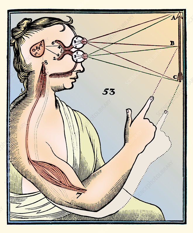
The ancient Greeks believed that the perception of reality occurred with the coincidence of two lights: one that projected from our own eyes and one that projected from the heavens. To them, the convergence of the two lights upon objects was a precondition for the perception of the material world. We know now that light only comes from a source external to the body. But as artists, we can still find a useful metaphor in the light of the eye — the arrow-in-the-eye metaphor used by Renaissance artists — bringing new form into the light.
We perceive sunlight as essentially a radiant “white” color. Yet, even though it is only a small sliver of the entire electromagnetic spectrum, this light is a container for any color the human eye can perceive. When we see the world, we are not in reality looking at material. Rather, we are observing the macroscopic result of a complex microscopic dance. Materials absorb certain frequencies of light and allow others to reflect out to our eye. We don’t see stuff. We see the light stuff allows us to see.
Renderers use various algorithmic shading methods that effectively model this process. At a fundamental level, all our modeling efforts manipulate this model of light. The process it models is almost infinitely more complex than any processor can handle. However, we’ll see how certain light models can create images that are almost indistinguishable from the reality they represent.
A spectrum of properties
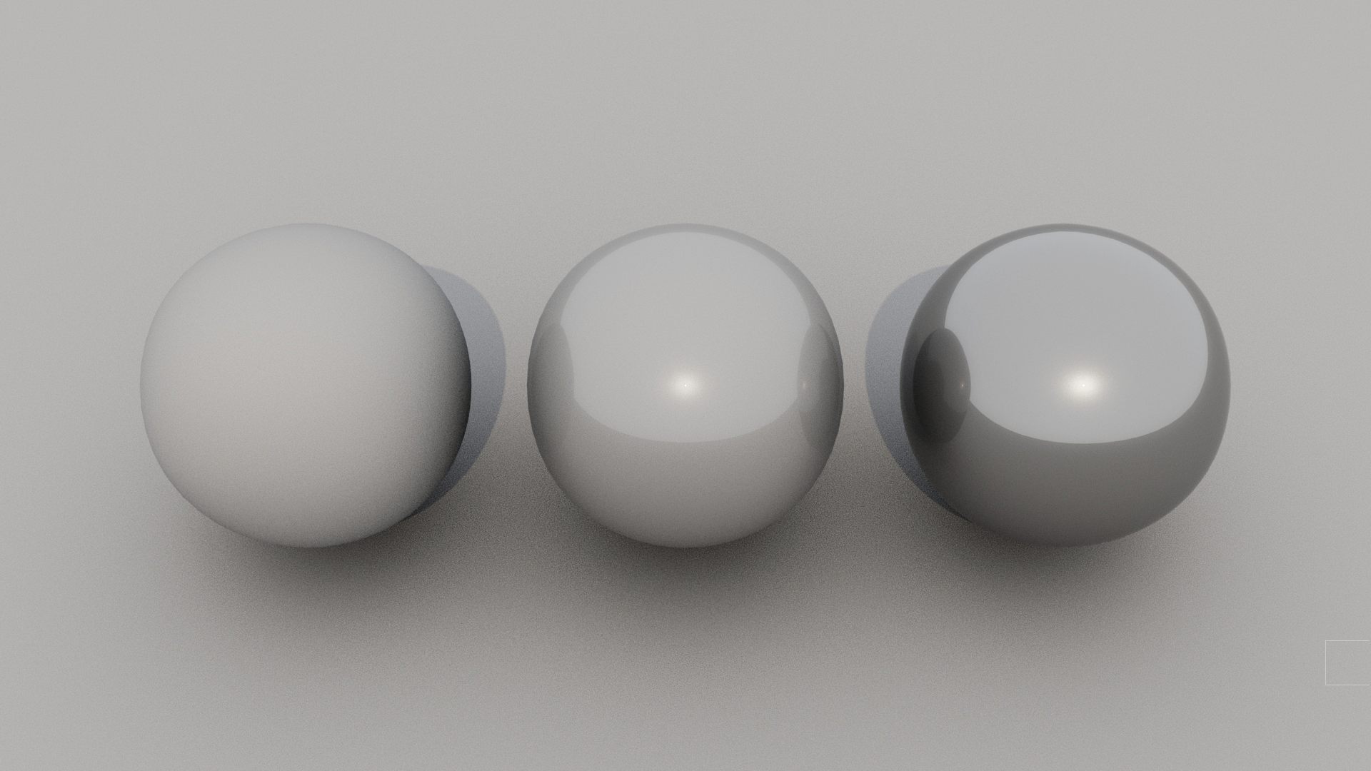
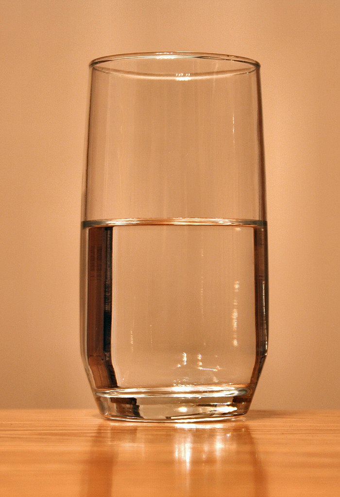
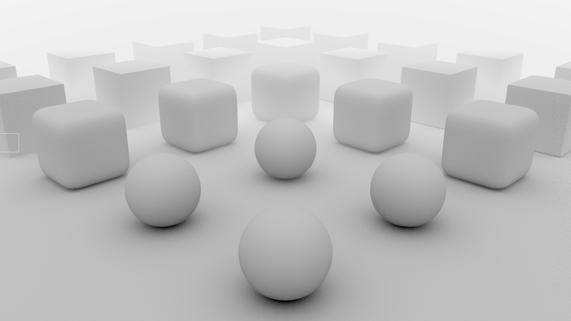
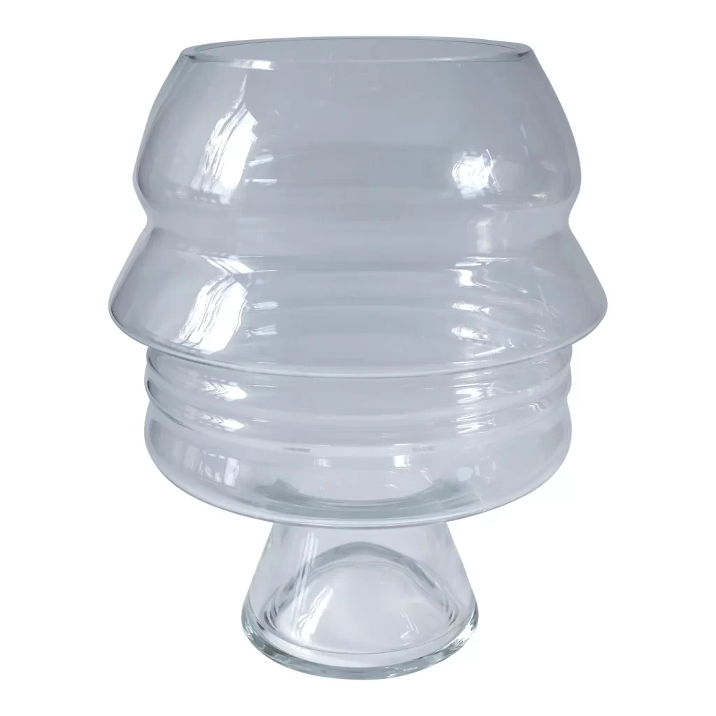
We know that what we see is the interaction of light with material. Therefore, we must understand the physical properties of materials that allow or restrict the reflectance of light. Observe the spectrum of properties from opaque through translucent to transparent illustrated here.
A spectrum of physical properties of a material interacting with light. Behind each mass is a star:
1. Opacity, where the material allows no light to pass through its mass, so the star is unseen.
2. Translucency, where the material allows light to pass but diffuses it (see below) such that a clear view of the star that lies beyond the mass is not permitted.
3. Transparency, where the material allows light to pass through with a minimum of interference (see below), allowing full or near-full optical transmission of the star.
Opacity
Opaque materials are rarer than one thinks. Generally, metals and very dense, matte materials are considered opaque. The misperception is that dark materials are opaque, but dark things can be, and often are, translucent. Darkness is not a characteristic indicator of opacity. Because they reflect a lot of light, we don’t think of mirrored surfaces as opaque, but indeed they are.
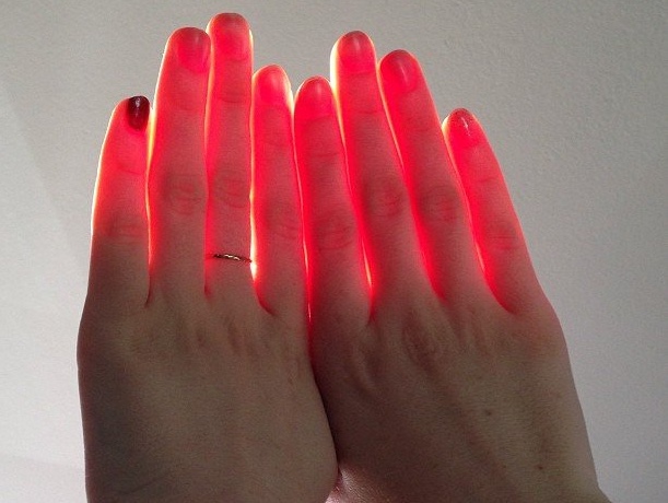
Translucency
Translucency is more common than we think. It is not a difference in degree somewhere between opacity and transparency, but rather a difference in kind. Why? Because it is a manifestation of the diffuse reflection of light under the material surface, as seen in the diagram.
The algorithm for Sub-Surface Scattering (or SSS) is found in light modeling to handle this phenomenon. One of the effects that generates the highest sense of realism in rendering is the modeling of this phenomenon. As we study material texture, we’ll encounter a surprising number of materials that we think are opaque but are instead translucent.
Transparency
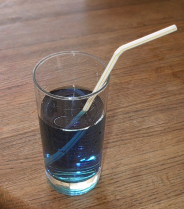
Like the other properties, we carry false generalizations about transparent materials. While transparent materials allow light to pass through, that doesn’t mean the material doesn’t affect the light. The thickness, density, and surface topology of the material refract the light path, bending the direction. We assume some materials like water have a color tint. However, we have to debunk the horrible stereotype of blue water. It’s simply reflecting its surroundings! Other, nearly fully transparent materials are in reality just ultra-translucent. That is, we assume they are colorless when in fact they have a tint, absorbing slight amounts of a broad spectrum wavelength. When modeling transparent materials, don’t assume. Observe!
Light and diffusion
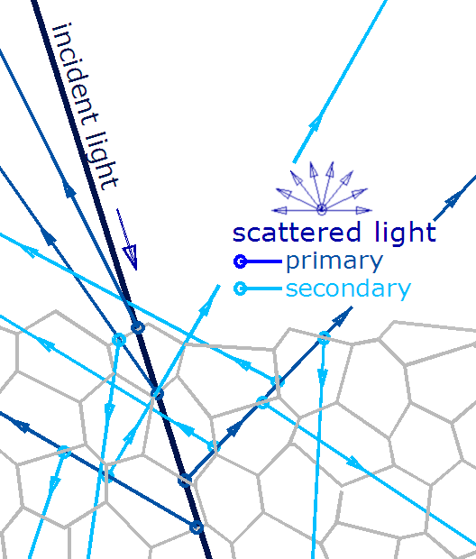
Light models and rendering
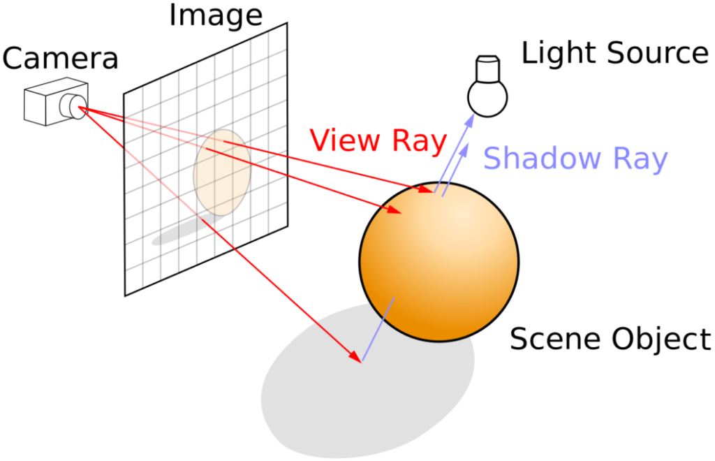
An environment receives light that bounces around like an infinite quantity of crazed super-balls. These refuse to lose momentum until either absorbed by something or bounced back out. Each super-ball is a metaphor for a photon vector. Simple light models calculate one vector path for a given super-ball. The vector enters a space and bounces off a surface one time in a direction aimed at the eye.
Sony Bravia Commercial, circa 1990. The creative team dropped 250,000 bouncy balls down a hilly street in San Francisco.
These kinds of direct illumination models give a sense of light and surface color, but they appear unnaturally flat. To achieve a higher fidelity in the real world, software develops models that bounce light vectors before they enter the camera. To be sure, the number of photons bouncing in a real room is incalculable, so these models are restricted. While they fall far short of processing the full complexity of reality, they come very close to generating images that satisfy our perception of real-world light conditions.
The simplest light models, such as scanline rendering, geometrically project an object in the scene to an image plane. The more complex raytracing adds optical laws of reflection intensity, shadow casting, diffusion, refraction, and others to build a more realistic image. It is a bit like the Greek idea of light emanating from the eye, in that it calculates an image by extending vectors, or rays, from the camera point into the scene. Of course, raytracing is more processor-intensive than direct illumination rendering, making it better for pre-rendered situations like still images or movies.
Radiosity
We add radiosity to the model to achieve the “super-ball” effect described above. In other words, because light bounces off of things, raytracing treats everything in the scene as a light source. It uses an algorithm that processes a selected number of times light reflects diffusely around a scene. The higher the number of bounces, the higher the fidelity of the image. Radiosity can account for such variables as the area of the light source. Take a look at your shadow in the sun and you’ll see the edge of the shadow diffuses, because the sun (or any other light source) does not project light from a single geometric point.
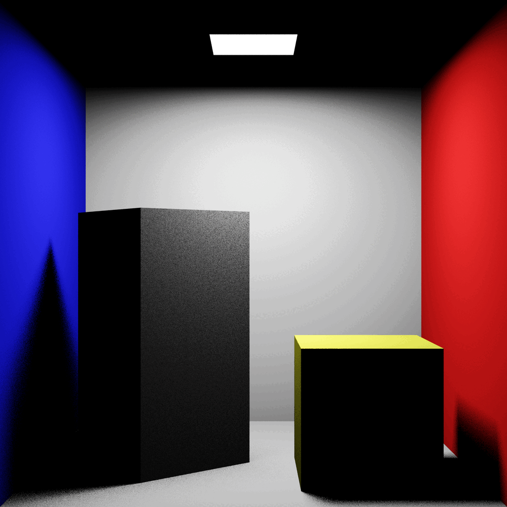
Through all these viewpoint-independent calculations, radiosity creates the diffuse light and shadow edges we encounter in the real world, yielding the highest fidelity images among the rendering models you’ll encounter in software. Of course, it comes at a price: radiosity modeling takes the most time to generate.
Atmospheric perspective
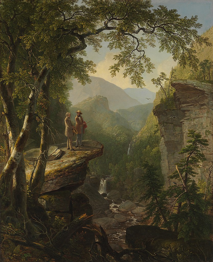
Diffusion can also occur as a function of the atmosphere. Painters have long used atmospheric perspective to achieve a sense of pictorial depth. Hudson River School painter Asher Durand illustrates the effect. Particles in the atmosphere reduce detail, colors desaturate, values become lighter, and longer wavelengths of light are blocked, causing all colors to shift to the blue-violet end of the light spectrum.
One way software can emulate the effect an atmosphere has on light is by using an environmental effect known as fog. One of Maya’s Arnold materials is aiFog, which we can apply in the Render Settings window under Environment.
They are a lot of fun, but the use of environmental effects can be exaggerated. Be discriminating in your use of an effect, and base it, as you do other decisions about light, on observation of real-world phenomena. Your portfolio should include the use of fog when it’s appropriate. With that said, with long shots or panoramic vistas, atmospheric perspective is almost always present.
Color as a material (not optical) property
Earlier, we discussed light as a reflective phenomenon: we only see the light waves that bounce off a surface. But color can be a signifier of the substance and state (including internal state) of objects. Linguistic evidence demonstrates that color includes optical and non-optical properties of objects more closely related to the material of the object than light reflectance alone. It is more sensible for us to embrace the full phenomenology of color when we model material.
Behavioral science suggests that color is relevant only insofar as we can correlate it to the substance and circumstance of a thing seen. A principal (and purely optical) function of color is to separate a figure from its ground. Typically an object of interest — an edible fruit, let’s say — is of a different material than the background — the bowl it sits in. This material difference is only partially explained by reflectance.
Semiotic functions
A second, more semiotic function of color is recognition of a state — an edible fruit is a different color than one that must ripen or one that is over-ripe. This external state signals the internal state of an object. All the color theory in the world will do little to inform the artist about the need for color to have a material connotation.
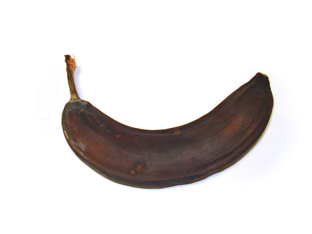
From green to yellow to brown, the banana signals an inner state through color. The ripe banana in this series is the infamous Comedian by Italian artist Maurizio Cattelan. After the first edition of the work sold in 2019 for $120,000, performance artist David Datuna plucked the banana off the wall and ate it at Art Basel in Miami as stunned onlookers watched.
Some may argue that color is only a simple, abstract physical property, such as reflectance, and that all the rest is psychosocial babble, but when modeling we should think otherwise:
Color is fundamentally concrete, material, and deeply embedded in the lives, ecologies, and evolutions of the organisms that perceive it. Abstraction comes later, if at all, from an attempt to give a simple scientific description of the phenomena. This is the reason that color does not enter into any fundamental physical theories: it is not a physical, but a psychobiological category.
Much of the difficulty with color arises from trying to reconstruct a folk concept as a scientific or philosophical concept. This is unnecessary. We have or can define the scientific concepts that we need, such as surface spectral reflectance and productance. Further, the attempted reconstruction is counterproductive, for it diverts us from the interesting and important task of elucidating the rich and concrete phenomenology of color as it is actually experienced by humans and other animals.
— Bruce Maclennan 2
For a deeper discussion of the optical and technical aspects of color as a visual element, return to Part 2 – Viewport Visual Design and visit Chapter 7 – Optical Visual Elements. In that chapter, we also discuss the optical nature of texture, but here we’ll take a deeper dive since the word texture has a special connotation specific to modeling.
Texture and material
Computer science has systematized qualitative phenomena such as color, but texture remains a more elusive and ambiguous animal. In everyday speech, texture refers to tactile surface qualities: smooth, rough, hairy, sandy, fuzzy, slick, etc. Awareness of texture is sensory-based, part of attaining awareness and understanding of the world we call perception.
Like light and color, texture is an element of visual design. In concert with other elements, it is used to generate emphasis, contrast, rhythm, and the spectrum of other visual principles we’ve encountered. Recall that, as a visual element in art, we appreciate texture in three overlapping categories: physical texture, visual texture, and implied texture.
Physical, visual, and implied
PHYSICAL TEXTURE
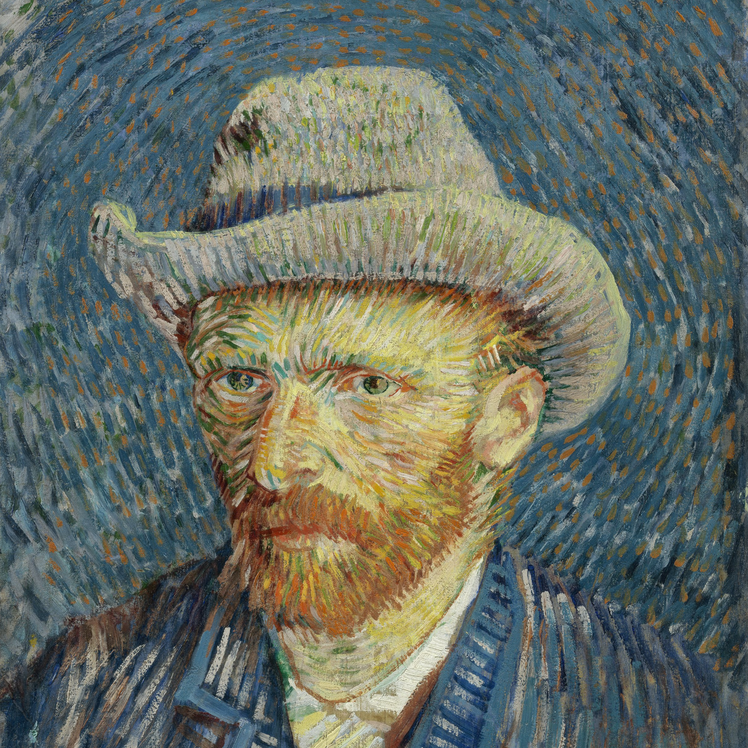
A physical texture is tactile, one that can be felt as well as seen. Although it would get you in trouble with museum guards to actually touch a Van Gogh, you can imagine what the texture of his impasto painting technique would be like to “see” with your fingers. Physical texture acts like a displacement map, adding geometry to a basic shape.
VISUAL TEXTURE
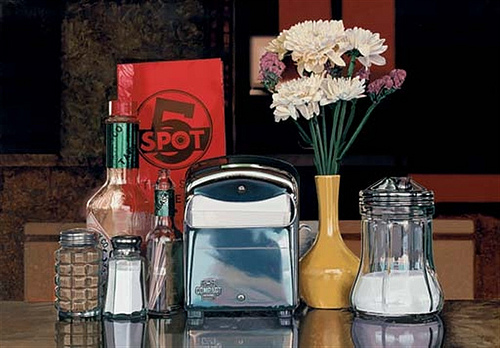
The brushwork of this Photo-Realist painter is physically smooth, yet Goings creates many textures the eye can “feel” ranging from the reflective smoothness of metal to the grittiness of pepper. The texture is an illusion: seen, but only referencing physical texture. Visual texture acts like a bump map, suggesting texture but not adding geometry.
IMPLIED TEXTURE
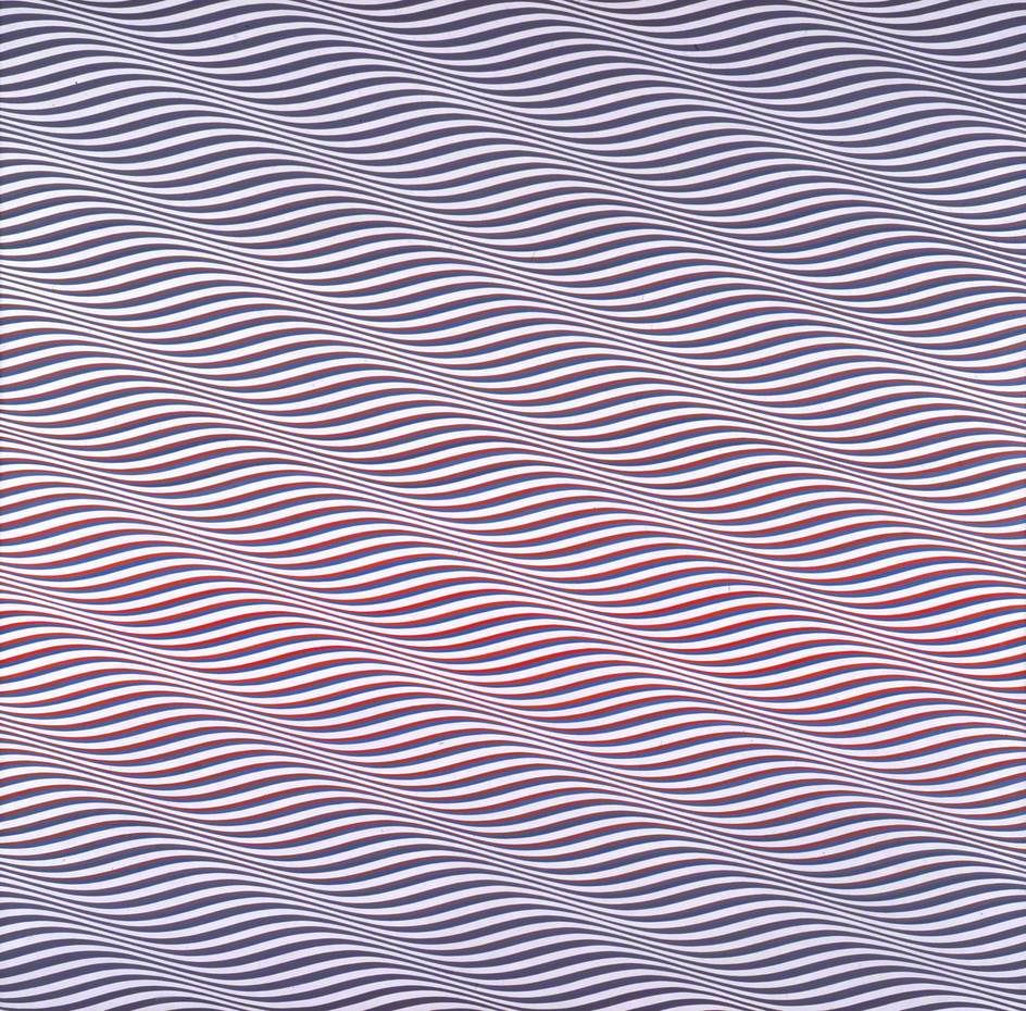
Riley uses line, repetition and high contrast to create the visual conditions of texture in her abstract Op-Art work. The working visual definition of texture is present, seen as texture quality but not referencing physical texture in objective ways. Implied texture acts like a procedural map, where parameters are manipulated to achieve a result.
Texture properties
What sets texture apart from the other visual elements is this: it is not primarily visual! As children, we explore the world as perceptual sponges, recording memories of hair and dirt and wood, so that as we see these later in life, we can imagine their texture without having to touch them. Like other non-visual perceptual phenomena (odor, taste, sound), texture is nearly impossible to fully describe in words. What words we do have are fairly informal, emotional, or metaphorical — hardly the kind of hard-core, quantitative information required to resolve human perception with computational models in the way light and color have been.
Psychologists who study perception have nonetheless attempted to systematize texture, but no matter how these systems develop, they almost always devolve into descriptions: fine or coarse, smooth or rough, regular or random, et cetera. We can think of some of these properties as dichotomous, so we can set them up as axes or complements, roughly analogous to the way we treat color. In other words, these properties can be thought of as spatial coordinates, much like the way the HSV color model creates a color space.
The Tamura Texture Model: six dimensions of texture
In 1978, a team of psychologists led by H. Tamura conducted perception experiments in which his team isolated a set of texture qualities that we can feel and describe visually: coarseness, contrast, directionality, line-likeness, regularity, and roughness. 3
Without going into a deeper definition of each term, we can think of each as a pole with an opposite: coarse vs. fine, high vs. low contrast, linear vs. non-linear, regular vs. random, rough vs. smooth — with directionality referencing compass-like vectors relative to some fixed point. Computational models typically select three out of the six qualities to generate a kind of “texture space” — a set of coarseness, contrast, and directionality coordinates that can be algorithmically manipulated through what are called procedural textures.
If coarse vs. fine describes the resolution of a texture seen straight on, rough vs. smooth refers to the relationships perpendicular to that, making roughness a more useful quality for 3D modeling than image searching.
To visualize the difference between coarseness and roughness, one might think of looking at a golf course. The fairway grass is coarser and rougher, while the putting green surface is finer and smoother.
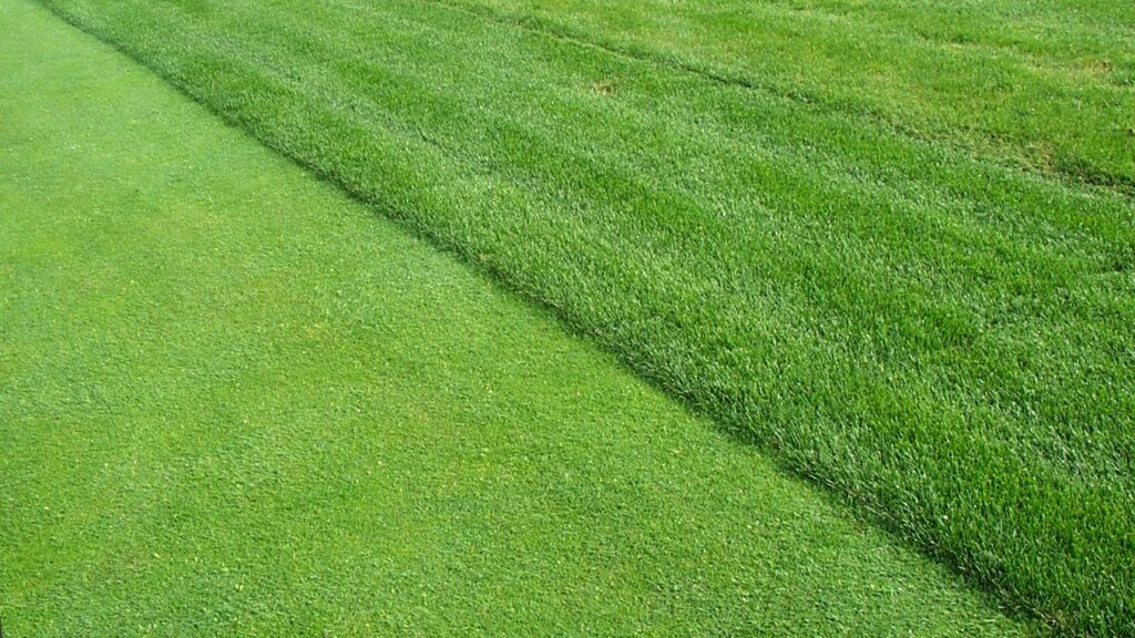

Coarseness describes the distance between the blades of grass and whether the grass is Bermuda (broad) or Kentucky Blue (thin). Roughness refers to how high the grass is mowed. In other words, coarseness is a horizontal phenomenon, and roughness is vertical. This implies a 3D coordinate system for describing texture.
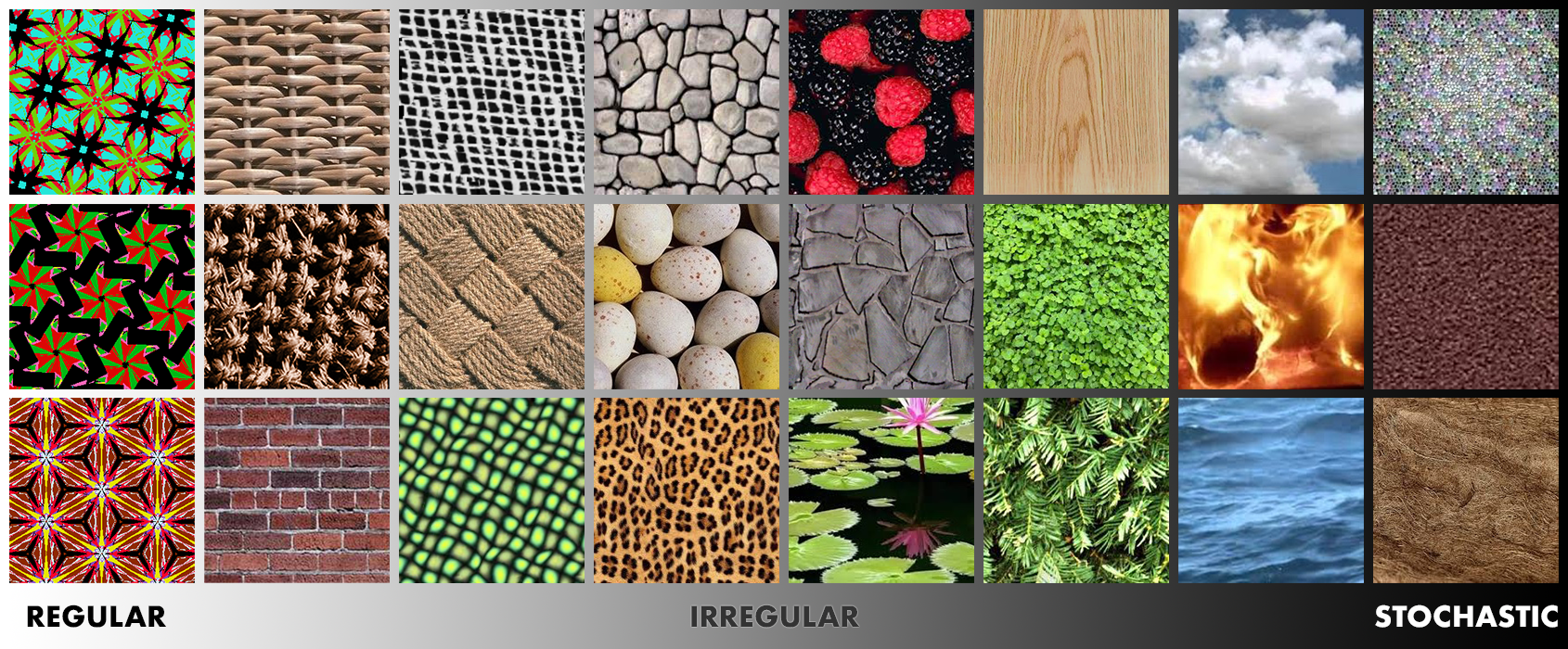
Pattern as texture: a spectrum
The remaining Tamura qualities, line-likeness, and regularity can be useful for thinking about that special case of texture known as Pattern. We recognize pattern in the frequency of repetition of an element — a hair, a brick, a particle of sand — set in a predictable spatial organization. A sandy beach is not a pattern, but a tiled wall is. We can gauge pattern predictability on a spectrum from regular (highly predictable) to stochastic (highly randomized). Stochastic patterns are what we recognize as pure, unstructured textures.
Texture mapping
When mapping the Earth, cartographers face the same problem 3D modelers face: how to represent the features of a curving object on a flat surface. Cylindrical map projections such as the Mercator are familiar from grade school, but they contain distortions that make the poles feel larger than they should. Polar distortions are relieved by other kinds of projections, some of which are seen here, but at the expense of distorting the equator. We live with distortion at the poles because most of us don’t live there!
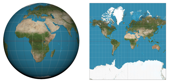
To pull a flat texture off of a curving surface, distortions must be introduced, like the familiar distortions that occur at the poles in a Mercator projection map derived from the 3D sphere of the planet Earth.
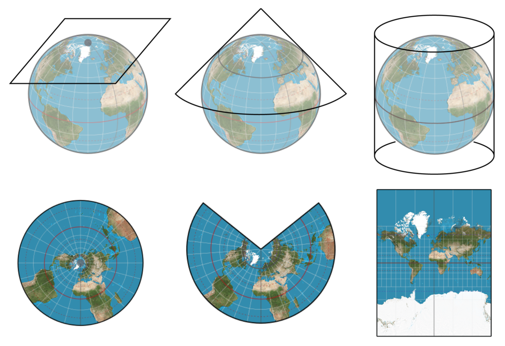
A texture can be stretched, wrapped, or projected in many ways. Planar (left), conic (center), and cylindrical (right) map projections are somewhat analogous to the different Maya texture projections.
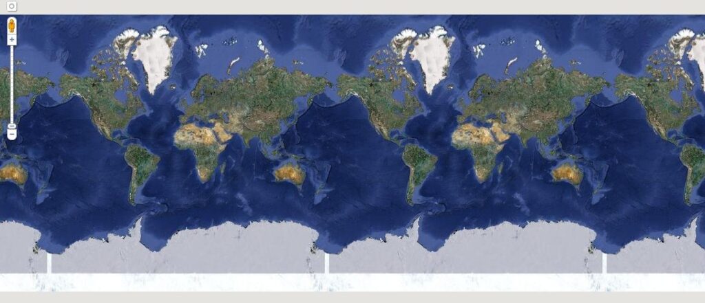
Depending on how the flat texture is developed, it inevitably has “seams” which lead to the familiar “wallpaper” metaphor for texture application, an example of which can be seen in this screen capture from Google Maps.
Unlike the globe, Mercator maps have seams that one can join at a line of longitude, suggesting a kind of tile or wallpaper idea that does govern a good bit of image texture creation in 3D modeling. Well-designed texture maps don’t reveal their seams. But, once we design the map, how do we figure out how to project it back onto the surface?
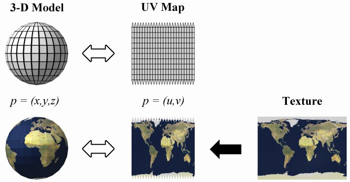
Mapping coordinates: UVW
Designers of 3D programs have developed an independent set of coordinates for texture maps called UVW coordinates. UVW values in the texture space are analogous to XYZ values for the geometry space of the model. In most 2D cases, we only use UV coordinates. These tell the software how to place the 2D texture onto the 3D geometry. The mechanism differs depending on whether the geometry is polygons or NURBS, and each has advantages and drawbacks.
NURBS is parametric by nature, so the software determines texture placement that way. Polygon surfaces act like the maps described above. Planar, conic, cylindrical, and other kinds of global map projections are analogous to polygonal texture projections found, for example, in Maya. These are Planar, Spherical, Cylindrical, and the special case method somewhat misleadingly called Automatic Mapping. A texture placed without UV mapping develops at the whim of the program’s algorithms. UV mapping solves this by putting you in charge.
Texture projection
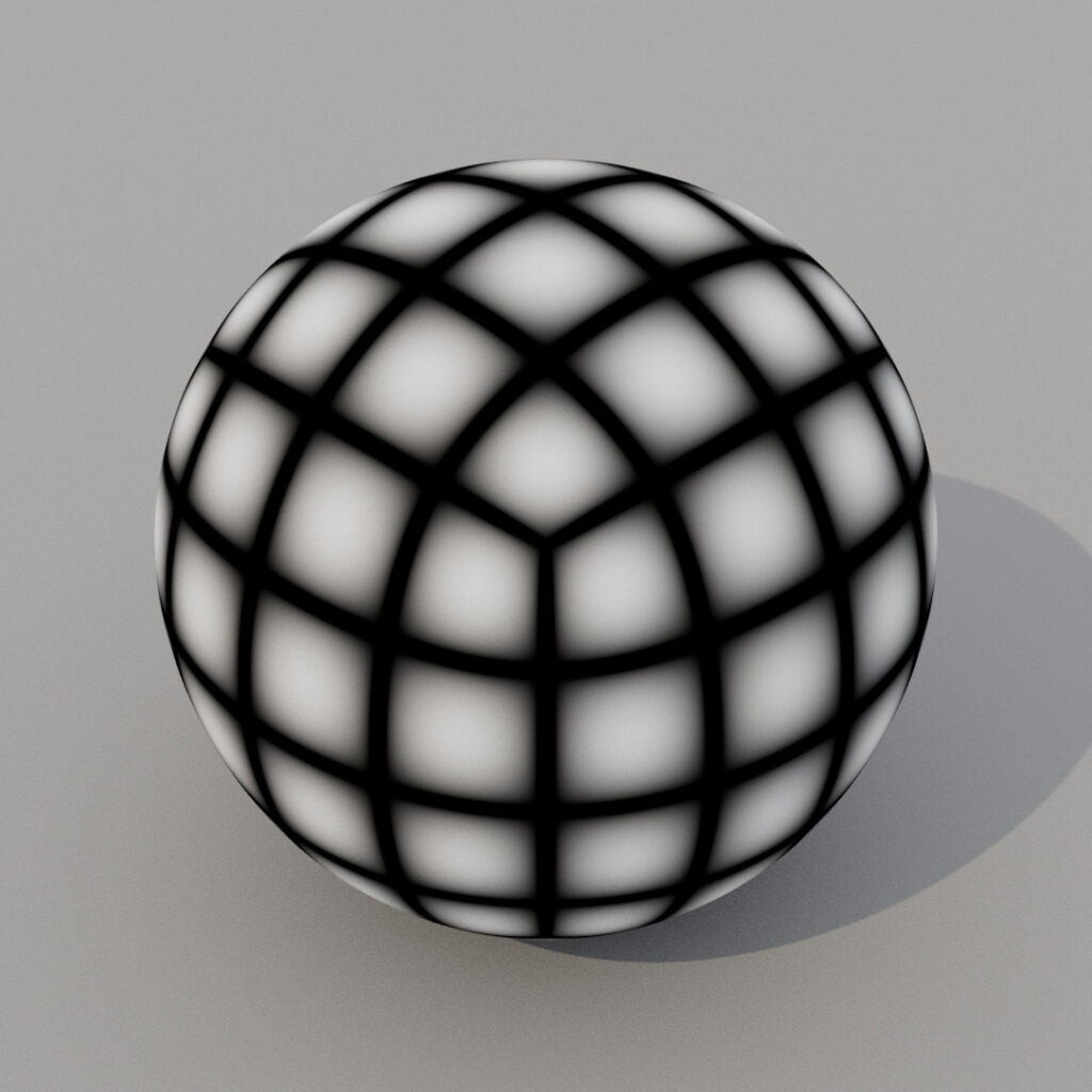
If we place a 2D texture on a sphere with Planar projection, odd distortions occur at areas perpendicular to the projection. Spherical projection solves the problem but introduces the same issue that crops up with a Mercator map. We call the pinching condition at the poles singularities, where we can see the top and bottom of the image squeezed down to a single point! We must construct the texture image with this distortion in mind — a bit like Mercator projecting in reverse. Thankfully, in planar geometries, UV map creation is a simpler process.
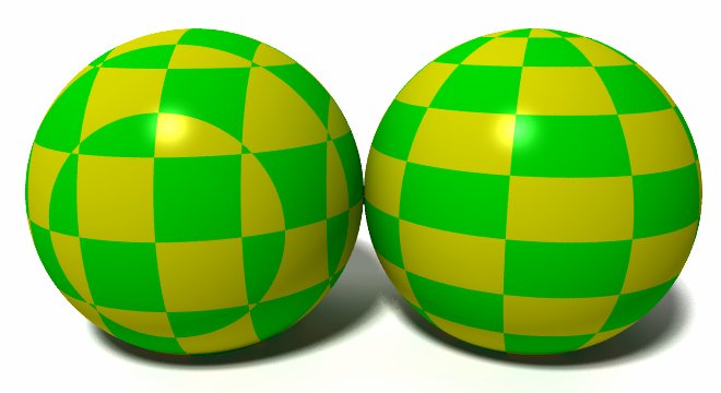
A sphere rendered with a checkered image map, without UV mapping at left, and using UV mapping at right.
The process of UV mapping a sphere. Maya “unwraps” the polygon vertices (p) and, after pulling them out of 3D Cartesian space, flattens them out to create a UV map. A texture is created and applied to the UV map, then Maya “rewraps” the texture in Cartesian space. Note the distortions necessary at the poles to account for singularities.
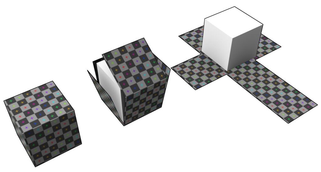
The process of UV mapping a cube creates a polyhedron net that can then be used to texture the cube in Cartesian space. Unlike the sphere, no distortion occurs, because pixel information is distributed in a congruent, rectilinear geometry.
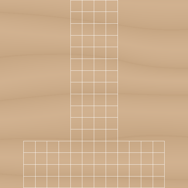
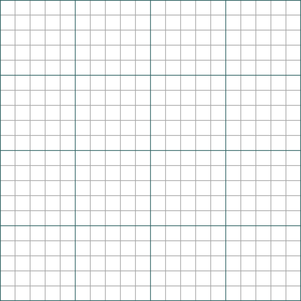
A graph paper analogy
When thinking of UV mapping, it helps to imagine your texture image as a piece of graph paper. The paper can be drawn on, then folded, or curved into various shapes. Need a coffee mug? The graph paper will curve into a cylinder, emulating the Cylindrical projection in the software. For a more complex shape, like a shoe, the graph paper gets folded or sliced to conform to the geometry, emulating something like Automatic Mapping (for polygons) or parametric mapping to multiple NURBS patches. Highly irregular geometries cause the graph paper to crumple up.
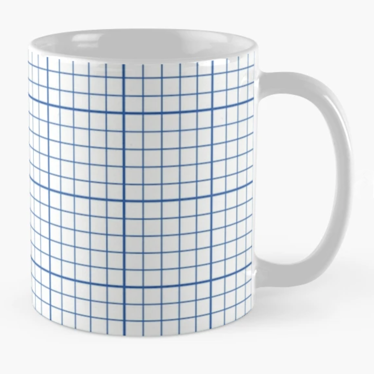
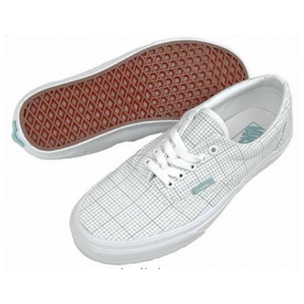
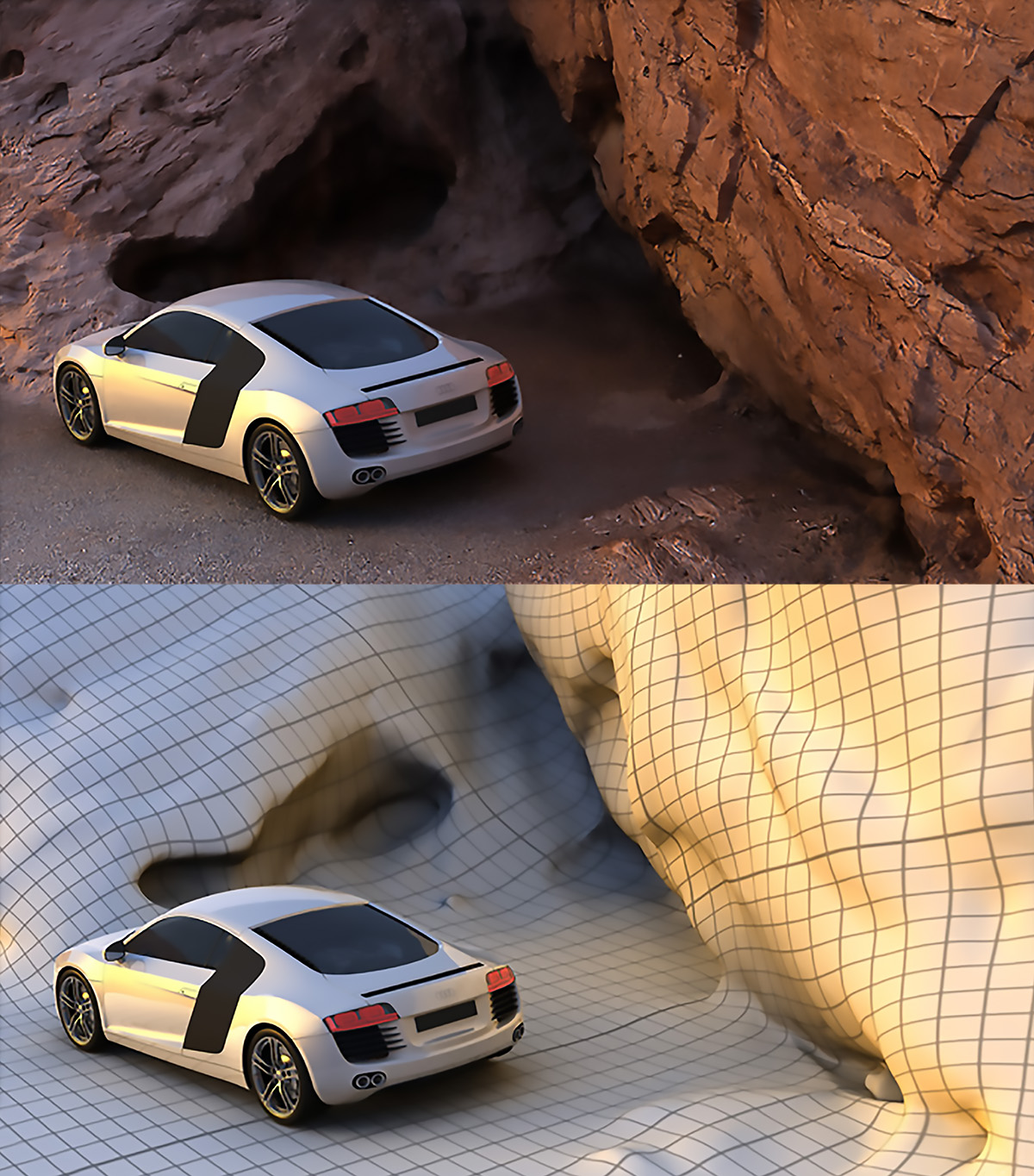
A common graph paper pattern applied to a cup is analogous to the cylindrical projection of a UV map. When applied to a more irregular surface like sneaker fabric, the edges seen where fabric changes direction are analogous to the selective application of a map to NURBS patches or faces in a polygon mesh. In this promotional image from Martin Duerr’s Models From Mars, the rock is an image scan, mapped onto the surface seen with an alternate texture: graph paper.
The key to understanding UV space is this: relationships among the UV grid vertices remain constant, regardless of the surface complexity of the XYZ geometry to which it is applied. Distances might distort, but pixel order remains the same. The goal of UV mapping is to either minimize distance distortions or to use them to one’s advantage.
Varieties of mapping
Image maps
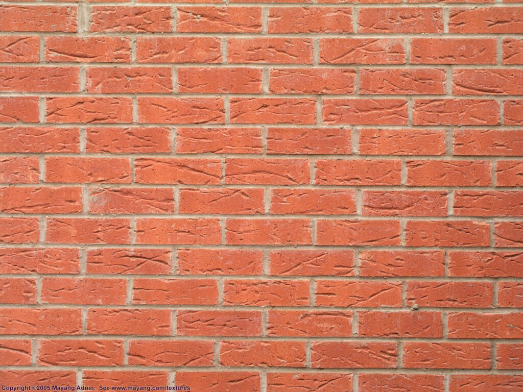
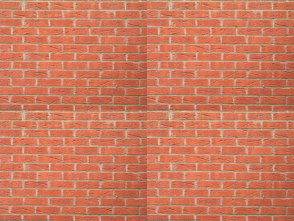
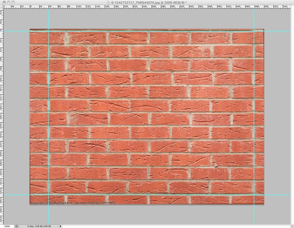
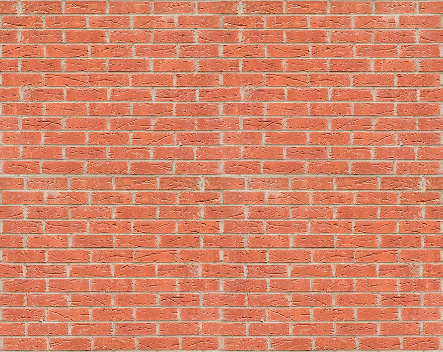
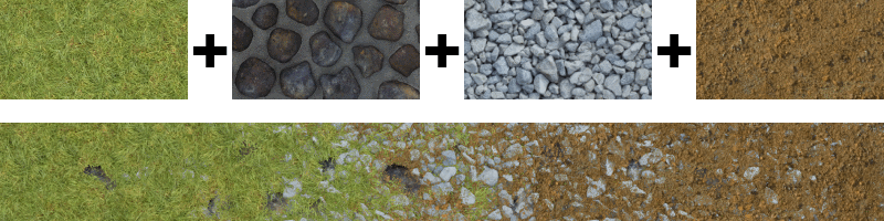
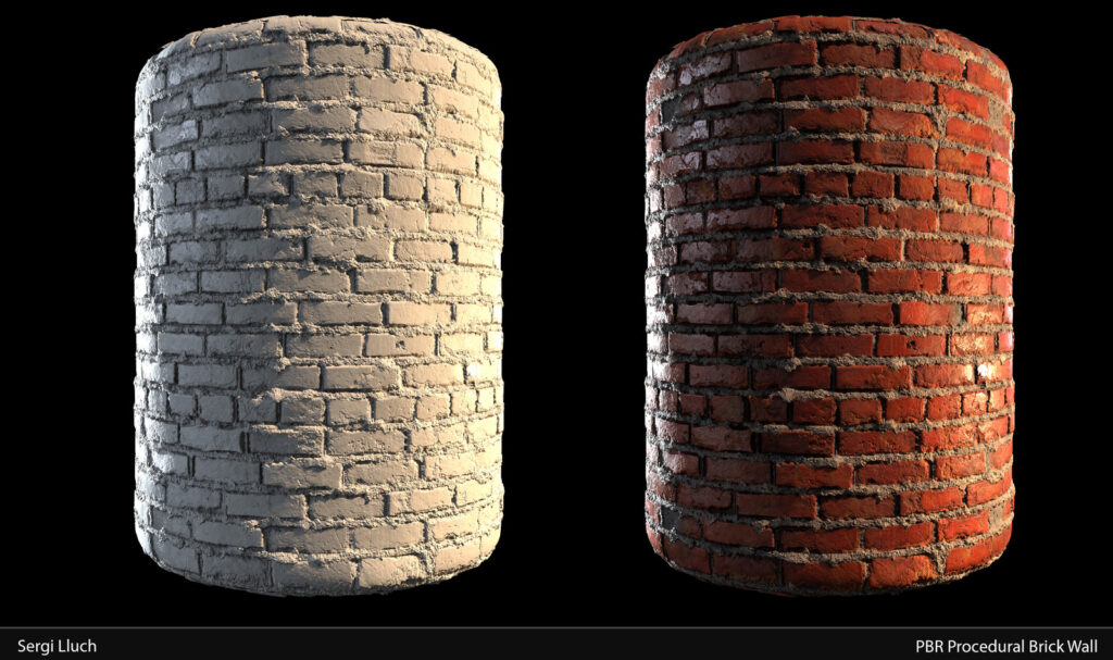
Image maps are simply raster images we have specially formulated to act as bitmap textures in UV space. We can generate image maps in an image-editing program, or simply use a scan or photograph to represent actual material. A pattern like the brick seen here should be edited carefully at the edges to avoid obvious edge-to-edge tiling as the UV map repeats over the geometry’s surface, and it should be large enough that any periodic repetition is not noticeable.
Multiples: atlases and mipmaps
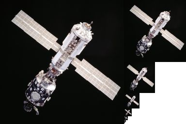
In many cases, an image map contains a texture atlas: a file with many images laid out like a paper doll cutout or a decal sheet. We see here the strange appearance of texture atlases generated for a low-poly game character. The artist directs the UV editor to apply specific pieces of the texture atlas to specific objects or polygon faces in the geometry.
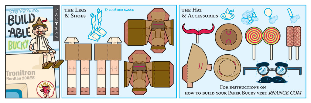
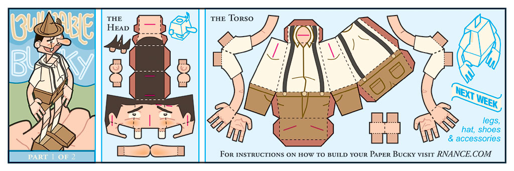
Rob Nance, Buildable Bucky, a flat 3D cardboard doll from his comic archive, 2006. In principle, the same strategy is used for a texture atlas.
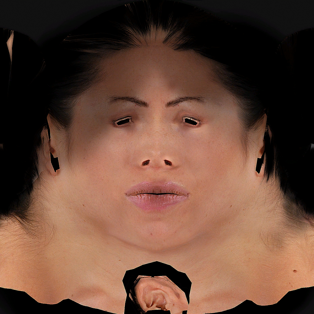
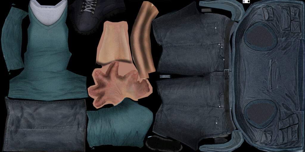
Crytek, Helena Rosenthal, 2007. The head UV map only has one ear because it’s mapped onto the geometry twice. A careful observer will notice both reflection and variation of pixels in the face. Below, like the Bucky paper doll, Helena’s body UV map is laid out for efficient use of the smallest possible image area. Because any part of the image can be selected to map to any part of the geometry, it doesn’t need to correlate to anatomy. Like the ear, one hand and one shoe are mapped twice. Helena is a character from the game Crysis.
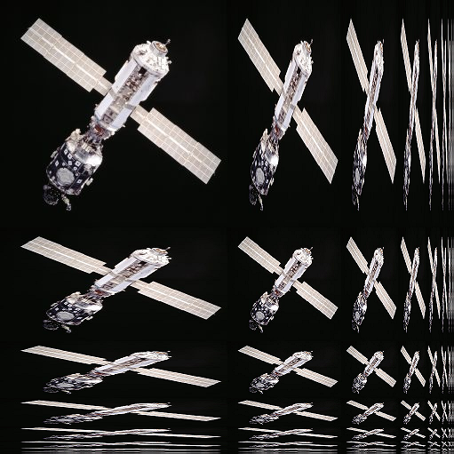
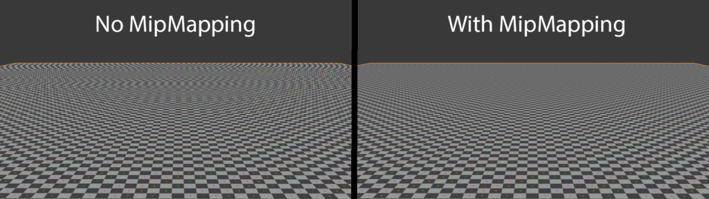
We can use another kind of atlas known as a mipmap in contexts where we must maximize processing speed. MIP stands for the Latin phrase multum in parvo, meaning much in a small (space). Not only do these render faster, but they can also get rid of undesirable aliasing artifacts.
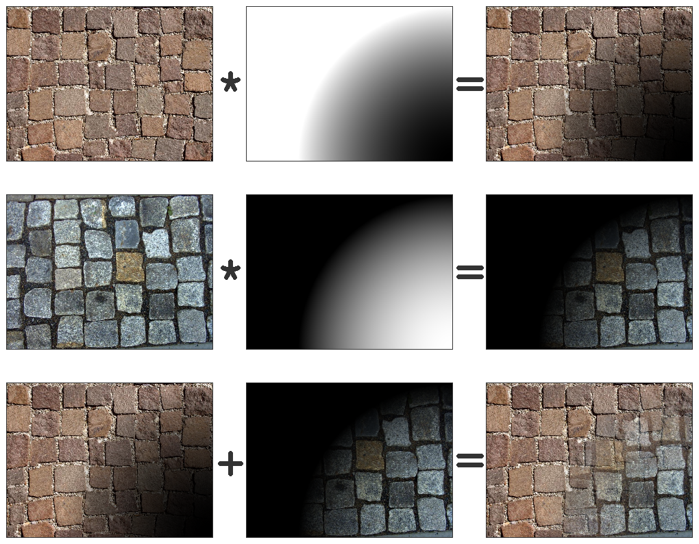
Texture splatting
Other kinds of image map manipulations like texture splatting make sophisticated-looking texture blends out of relatively simple alpha-channel manipulations. As you become more sophisticated in your image map-making, you’ll encounter some of these techniques.
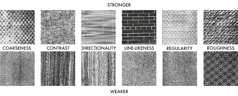
Procedural maps
Image maps are great but they do have some liabilities — processing time, resolution, and the inevitable periodic repetition of small detail. Often, it’s better to use a procedural map. Procedural maps are a calculated texture, analogous to the implied texture of Bridget Riley’s painting.
Patterns such as brick and tile are so regular that we can represent them with a simple mathematical formula. We can even generate non-periodic materials like granite, wood, and water using mathematical “noise” randomizers like fractals and turbulence. Because they are parametric, we can adjust procedural maps to create and refine all kinds of phenomena, so the artist doesn’t have to settle for whatever image map is available. Noise randomizers vary at every point in space, to avoid periodic repetition. In the special case of 3D procedural maps discussed below, the map permeates 3D space, thus avoiding the problems associated with 2D projection.
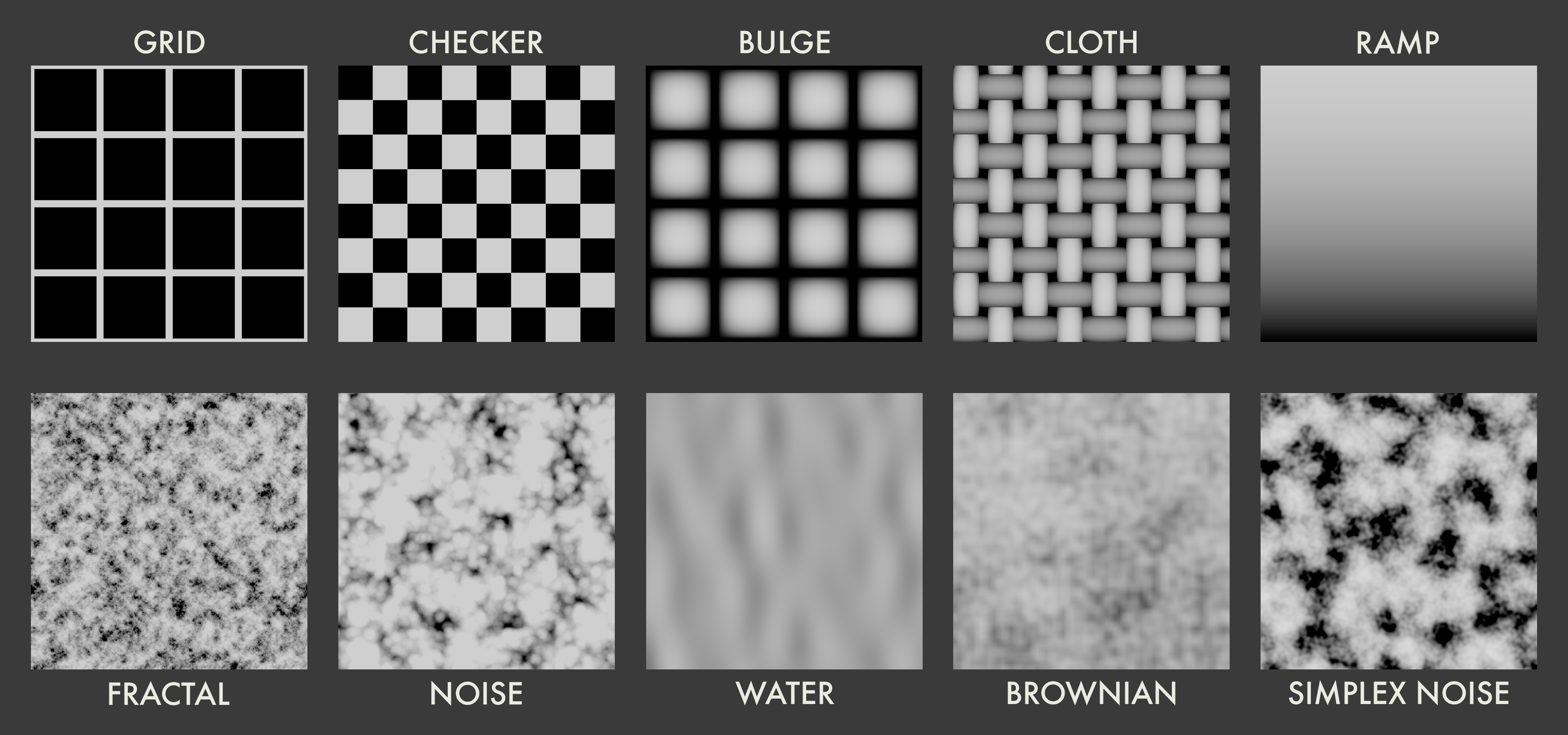
2D procedurals
A 2D procedural is like a calculated form of an image map. Maya and other software packages contain a range of 2D procedurals, including regular patterns (including Grid, Checker, Bulge, Cloth, and Ramp) and noise patterns (including Fractal, Noise, Water, Brownian, and Simplex Noise). A formula creates the image, then the image is projected onto the 3D geometry. In that respect, 2D procedural maps are subject to all the possibilities and limitations inherent in traditional image mapping.
3D procedurals
3D procedurals exist mathematically throughout the entire 3D space. When applied, the surface of the object defines where you see the texture.
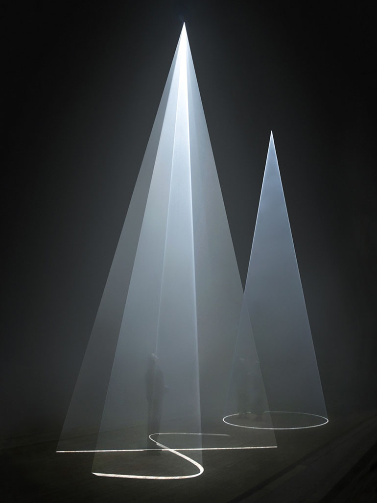
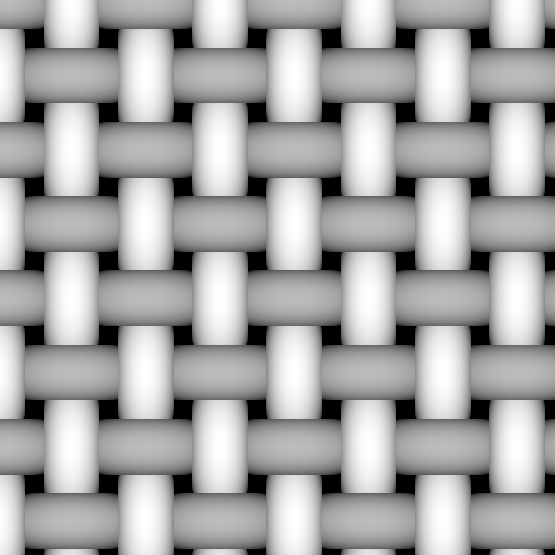
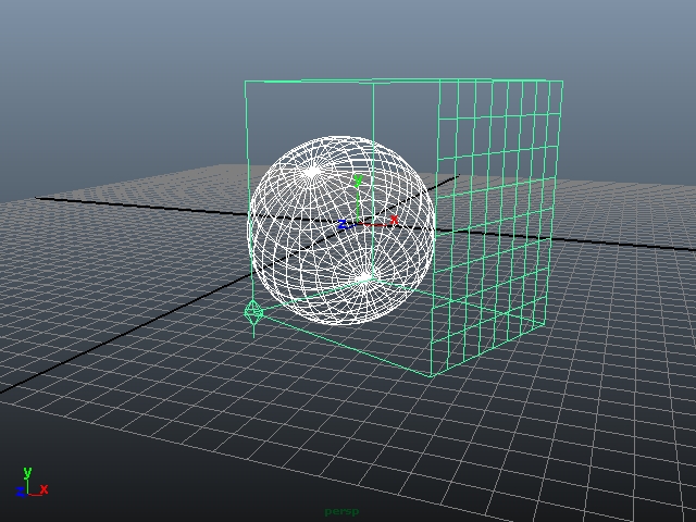
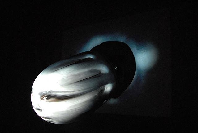
If a 2D map projects onto a surface, we might say a model intersects a 3D map. It is similar to the way light intersects the CO2 fog in the installation by Anthony McCall — the audience is unaware of the fog outside of the light, though it’s still there.
With 3D procedurals, the artist never has to worry about projection distortions of the map. To illustrate the relationship between 3D procedurals and geometry, observe the illustrations here. The lattice represents the presence of a marble-based material, and as it moves and rotates with respect to the sphere, it dynamically intersects the geometry, giving the illusion of cloud motion seen in the video.
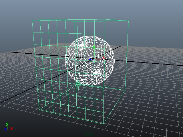
Almost all 3D procedurals are random. Many, such as wood and marble effects, seem limited to imitating specific material types. But as you observed in the “cloud” video, we used the marble to synthesize quite a different phenomenon. So don’t be fooled by the names! We can use wood, for example, to texture fish in sushi!
Bump and other depth maps
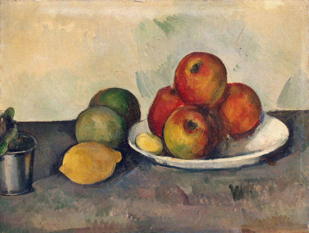
The flowers in Ralph Goings’s still-life look hyper-real when observing the painting from the normal point of view: that is, frontally. This kind of painting uses the trompe l’oeil (French for “fool the eye”) technique to create the illusion of texture and shadow we associate with flowers. It can be said that most image mapping indulges in trompe l’oeil, but in the case of a highly textured object, the image map falls short because it doesn’t generate proper surface shadows. To achieve higher realism in this instance, we turn to bump maps.
Sometimes called normal maps, bump maps use color values to assign additional depth to the surface of a simple object. The renderer reads this depth and calculates shadows without having to add complex, processer-clogging geometry. For textures like oak grain, skin pores, orange rinds, brickwork, and tile grout lines, a bump map is the perfect solution, because we don’t read these kinds of textures as changing the appearance of a shadow. Once coarser and rougher textures are modeled, the artist must judge whether the effect of surface texture alone is enough.
Imagine looking at the Goings painting at a steep angle (a parallax view) and you can predict the flowers won’t look real anymore. Parallax maps calculate apparent depth with respect to the view angle, partially solving the problem. But, no matter how sophisticated the bump map might be, the shadow cast by a bump-mapped object never contains real geometric texture.
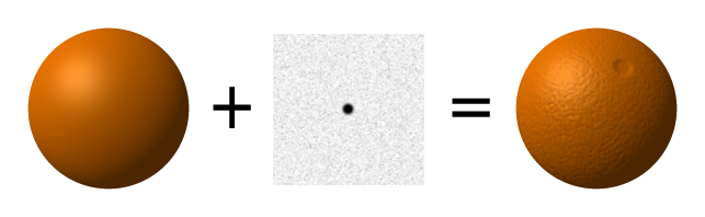
The simplest bump map applies a grayscale image to an object to give an appearance of depth without adding geometry. It’s a useful technique for small-scale depth effects like skin pores, wood grain, or this orange.
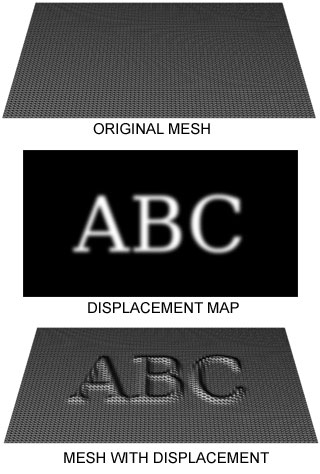
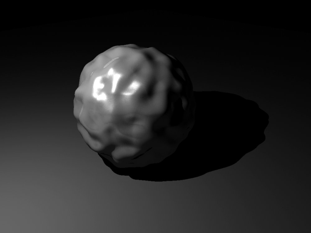
Displacement maps
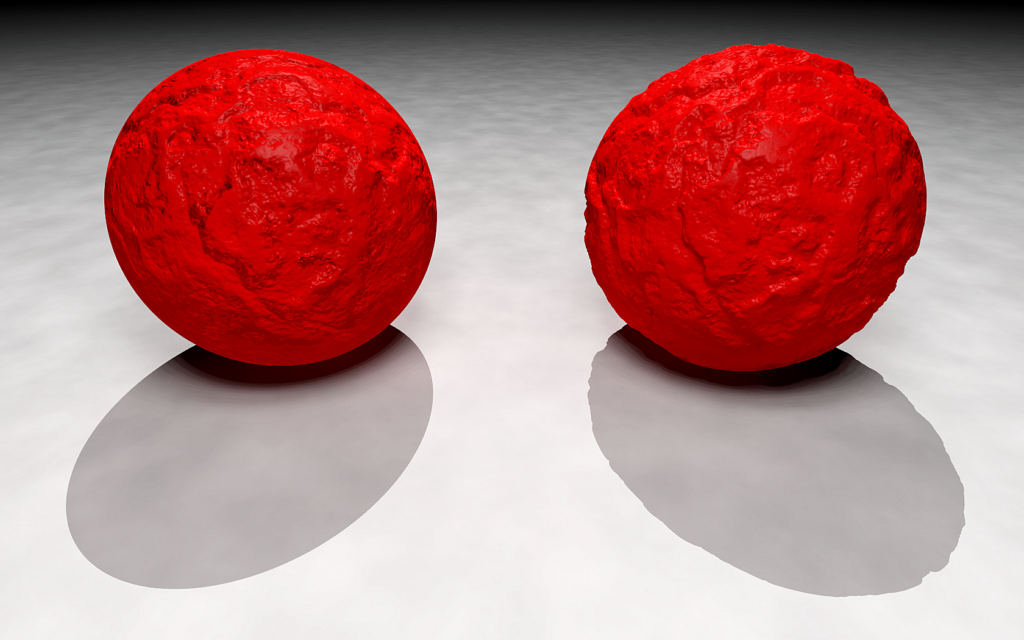
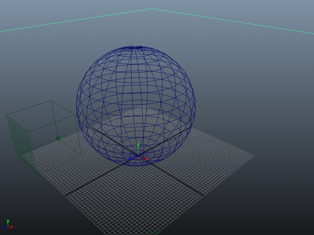
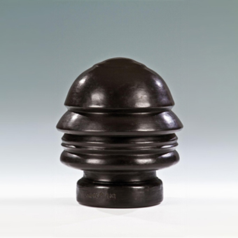
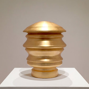
For heavier textures, bump mapping is unsatisfactory. Here, the crumpled surface is textured on the ball at left, but look at the incongruous silhouette and shadow! The geometry of the volume itself must be changed, as seen on the ball at right.
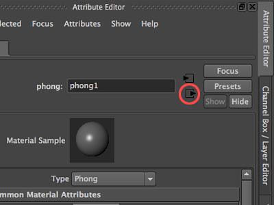
When realism demands an effect like our red ball above, we rely on displacement mapping. Like impasto in Van Gogh’s painting or bas-relief in sculpture, a displacement map adds geometry to the basic form, and this geometry casts actual texture shadows. In Maya, one might expect this to be applied like a bump map under Common Material Attributes. But Maya treats displacement mapping as a discrete material under the Shading Group Attribute. This is accessible by clicking on those nameless arrow-in-a-box “mystery” icons to the right of the material name in the Attribute Editor.
Another caution when working with displacement mapping: the results ONLY show up in rendering. The artist needs to do several test renders while developing displacements.
Combining maps
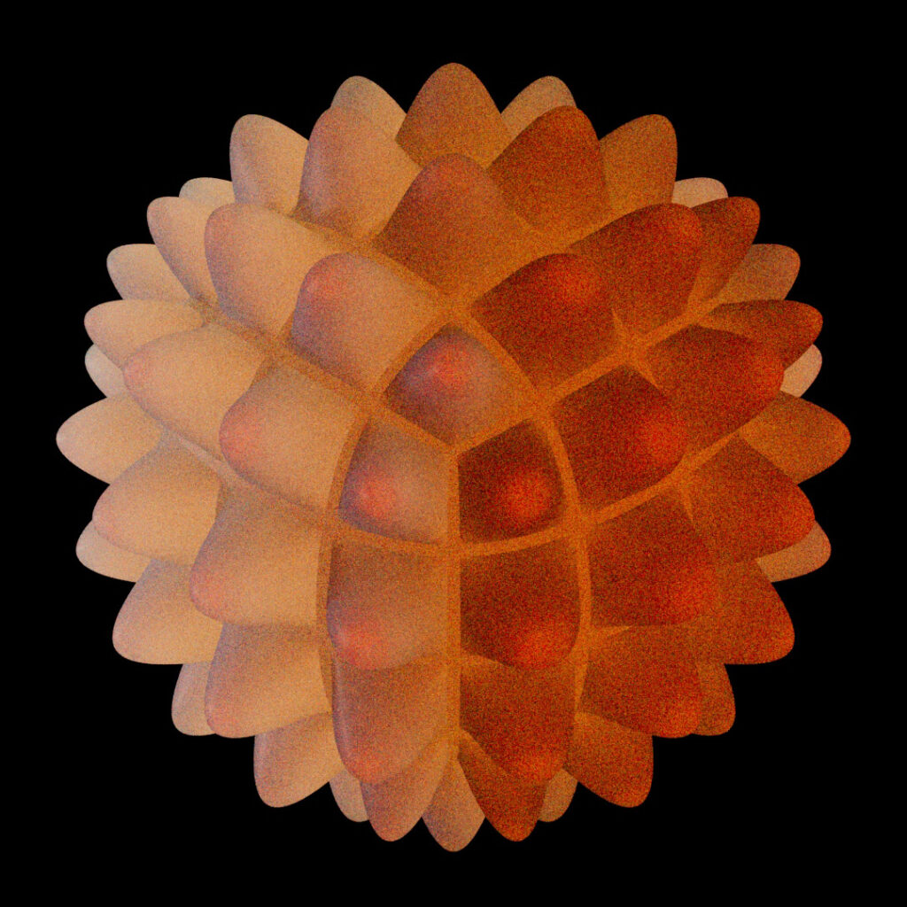
We can combine image, bump, and displacement maps in one material to achieve sophisticated material rendering effects. Below is a gallery using the Bulge procedural applied to a quad-ball, also known as a non-polar sphere. In the first three images, we see the procedural applied one time each for an image map, a bump map, and a deep displacement.
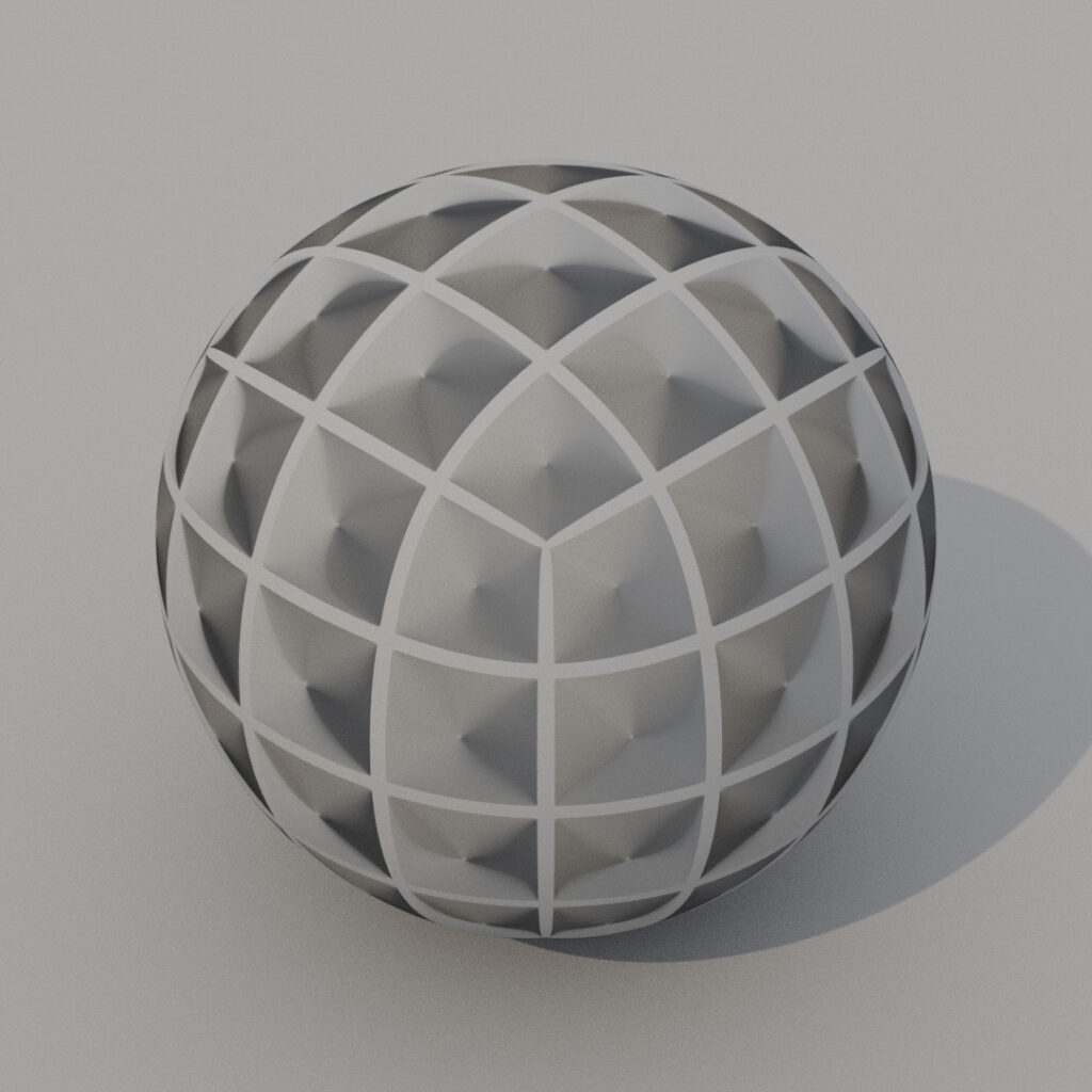
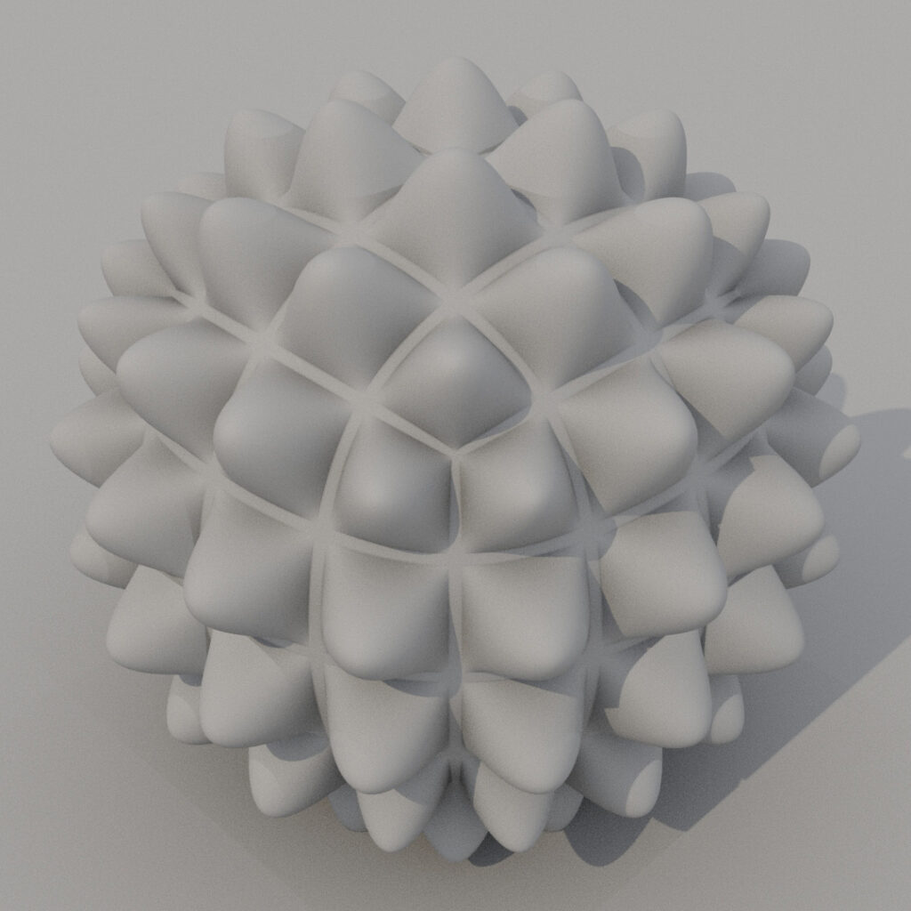
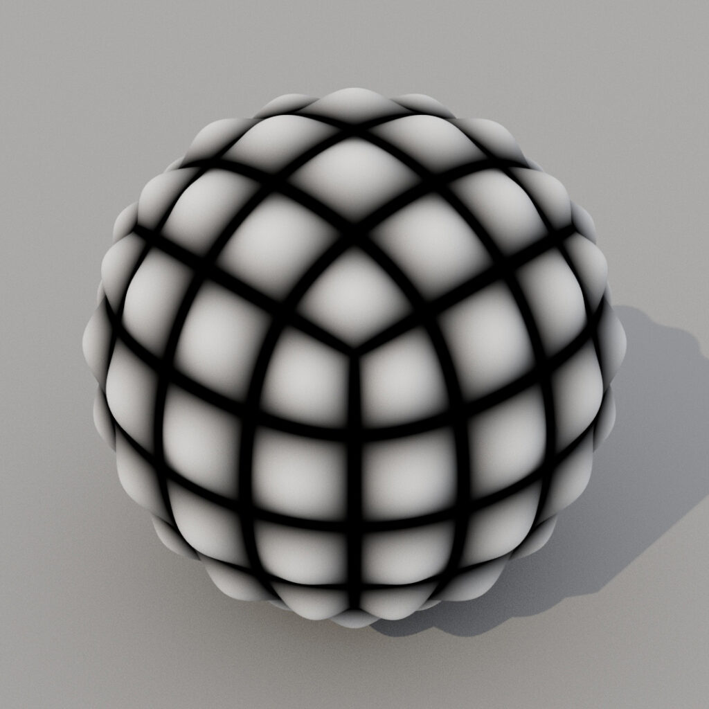
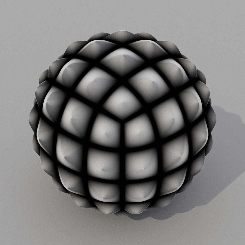
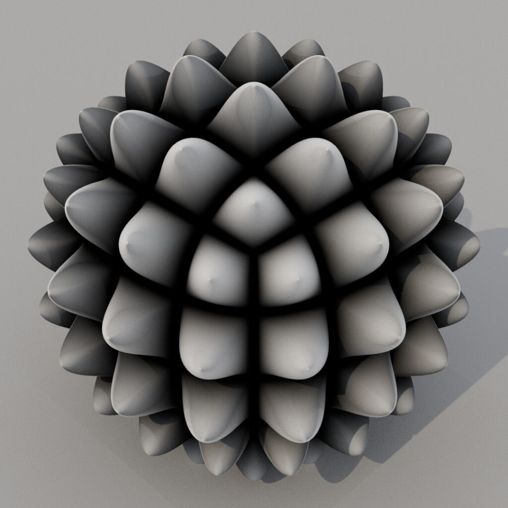
Now, in the final three images, we see a variety of superimposed map types creating different effects. We’re able to allude to anything from a waffle to a hand grenade to a squeaky dog chew toy to a pineapple to a creepy virus-like structure, all by combining various map types developed from the same Bulge procedural!
Texture quality
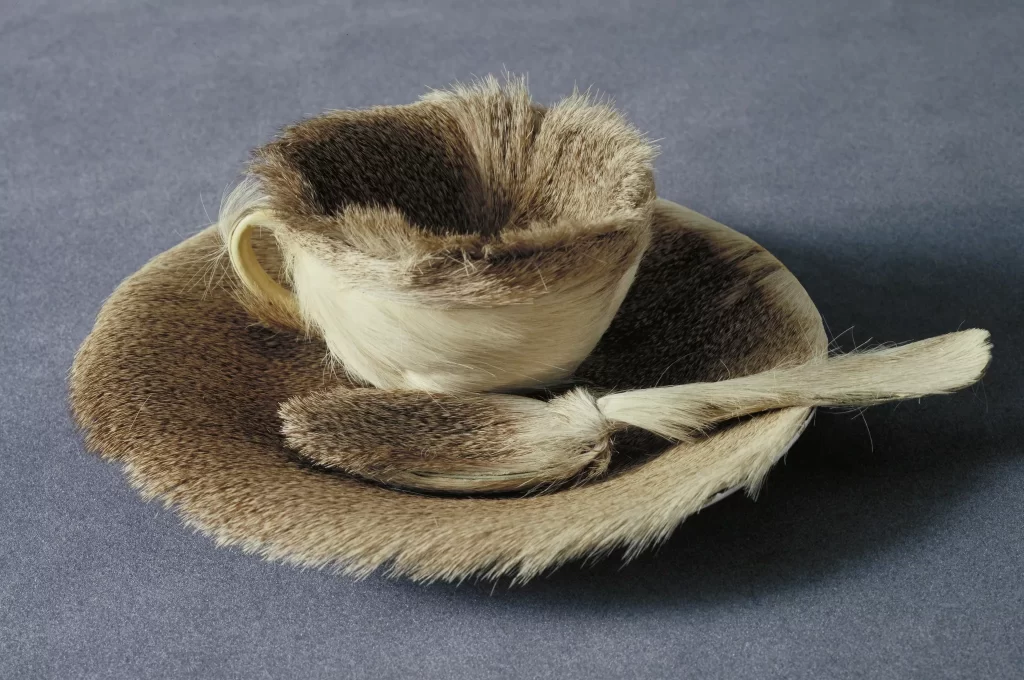
In the Object by Meret Oppenheim, we see a deliberate incongruity between material and geometry. This manipulates our normal understanding of the teacup into a highly charged and poetic condition. Oppenheim, a Surrealist and proto-feminist, is able to touch on gender, ritual, and eros in this simple and well-crafted act. As an artist, your choices of material are deliberate. They meet an aesthetic or conceptual goal, whether real or surreal, abstract or objective. In this final discussion of material quality, we’ll explore only a few metaphors and phenomena as case studies of how we can intertwine material and meaning.
As wallpaper
Material as wallpaper or textile has ramifications, particularly for patterns. We wish to see the periodic repetition of the pattern, but we usually wish to avoid the obvious tiling of the image map, the clearest metaphor for wallpaper.
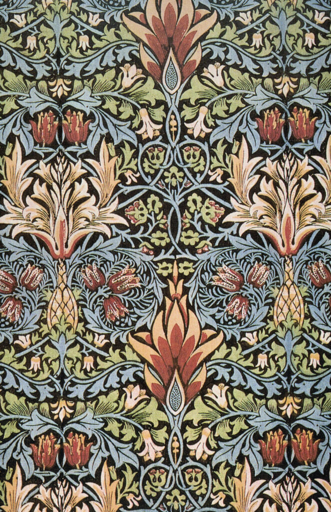
William Morris, Snakeshead printed textile, 1876. How would you develop an image map that would repeat periodically? Look for the repeating element that can be exploited as a periodic “node”. Here, the double red flower closest to the corners can become the node. Everything necessary to repeat the pattern endlessly is enclosed by those four points.
As paint
Modeling software provides texture “painting” tools that you’ve learned about in tutorials. Recall that texture painting creates a bitmap, but the distinctive character of this bitmap differs from the use of a scanned and applied image. It usually doesn’t repeat, and the form of the painted texture is intimately tied to the form of the geometry. An irregular pattern is possible, as is a stochastic, Pollock-esque texture.
As projection
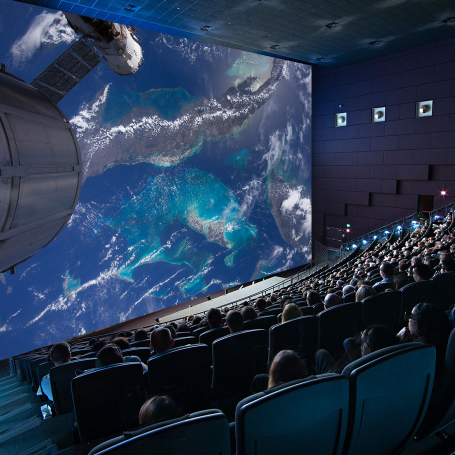
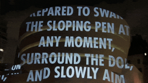
A movie screen can contain a million different potential narratives, yet it remains the same object. An advanced technique in the software allows one to use a movie as a texture in an animation, but thinking less literally, we can speculate about those instances when a texture feels projected — a slightly surreal situation, a sense of impermanence or incipient change, a shifted scale or point of view.
The large IMAX screen at the National Air and Space Museum, Smithsonian Institute, Washington DC
As anamorphosis
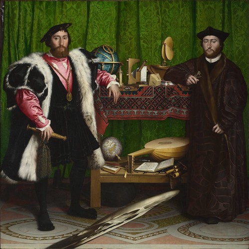
Recall from earlier reading that “projection” is an act with many ramifications. A special condition of projection is anamorphosis, a deliberate distortion of an image. The Mercator map projection encountered earlier is similar to an anamorphic image. Here we see an image distorted to be read by a particular viewing device; here, a mirror.
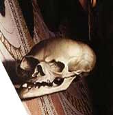
Another kind of anamorphosis uses a particular point of view as a means to remake the image — in some ways, the reverse of the mirror anamorphosis. A plausible hypothesis for the particular distortion of the skull in the painting: to surprise a viewer who observes the work from the top of the stairs in a formal foyer: is this a site-specific installation?
Hans Holbein the Younger, The Ambassadors, 1533
Digital manipulation of the skull in The Ambassadors shows how the anamorphic image would appear to a viewer from an angle.
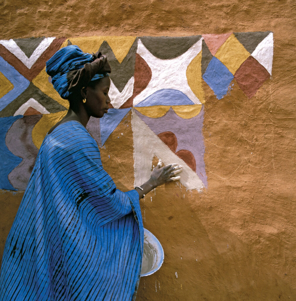
Today, we use this technique in both projection and mural installation art.
As chameleon
Any geometry in our model can have any material applied to it. When a sculptor makes a mold for a casting, they may cast many potential materials into the mold — plaster, metal, acrylic resin. It’s not uncommon to see one artist make many editions of one work in several casting materials. It’s also not uncommon to see a form appropriated, with the act of appropriation signified by a new material expression.
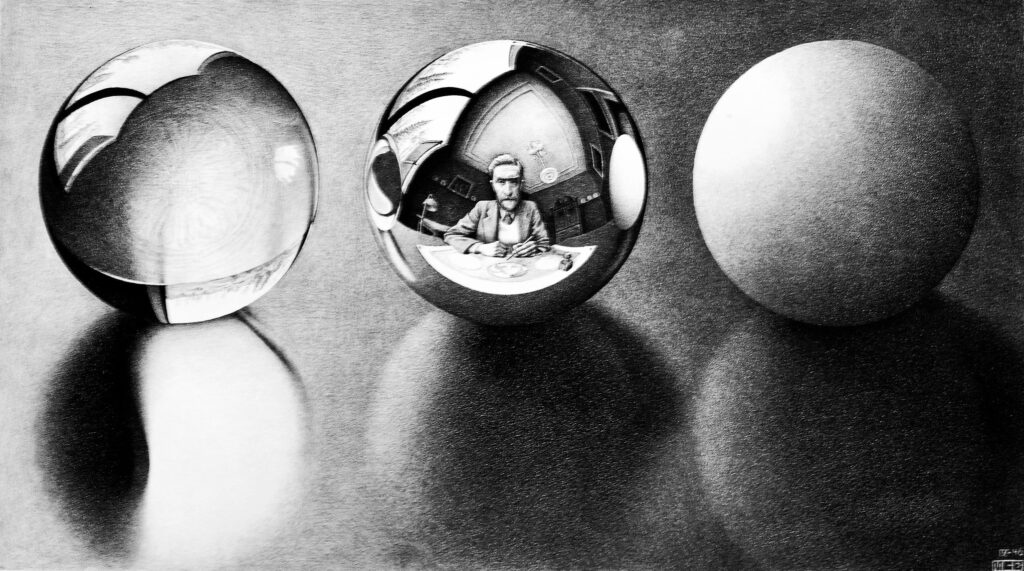
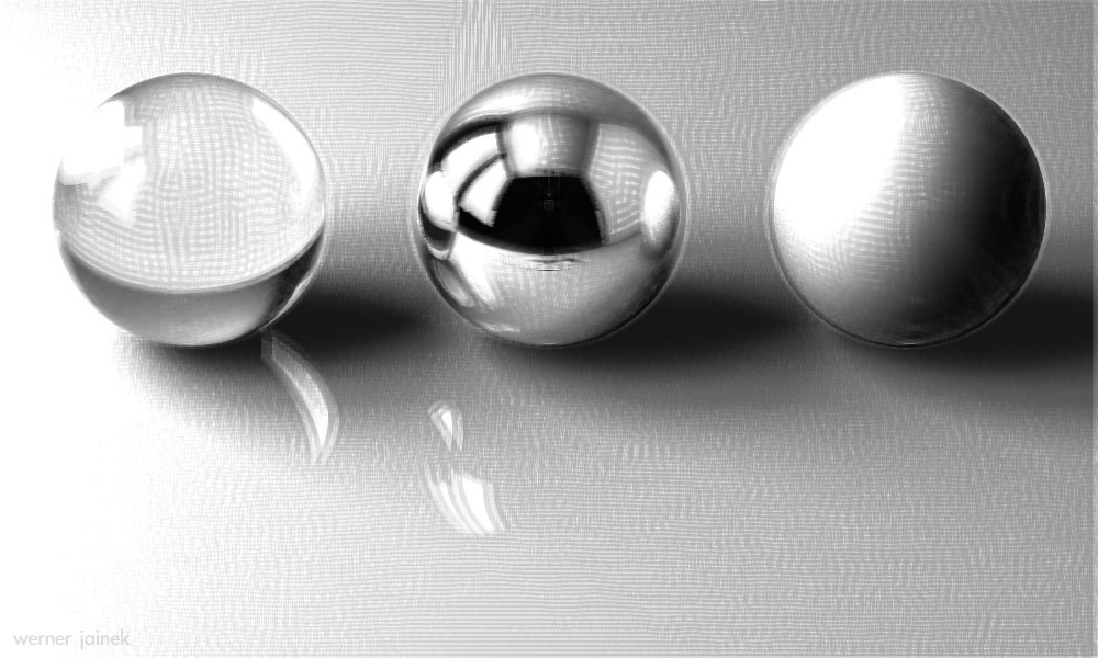
We can see an interesting take on the ubiquitous rendered spheres here. The goal of most rendering is photo-realism, but here Jainek’s work attempts to emulate the textures of Escher’s original lithograph.
As skin
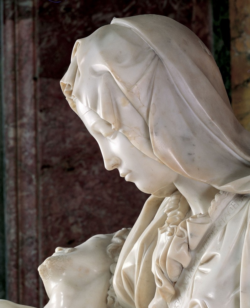
As an artist becomes more aware of material quality, it becomes clear that the relationship between light and material is much more complex than photons bouncing off of a surface. With marble, as we’ve seen before, light enters the material. It disperses inside before either being absorbed or projecting back out of the material. The effect is one of a subtle glow, seen in the detail of Mary’s thinly carved veil in Michelangelo’s Pieta. It turns out that marble has a similar translucency to that of human skin. That explains why this material is so prized among figurative sculptors.
According to Henrik Wann Jensen, all non-metallic materials possess a degree of translucency. 4 Absorbing and scattering of light in translucent materials is called subsurface scattering. In the Arnold Standard Surface shader, we can select a preset called Skin, which creates a convincing subsurface scattering effect.
That’s not the only thing we need for a convincing human skin. Here we find Arvid Schneider’s illustration of a skin material that, among other tricks, includes the use of the Arnold Standard Surface shader. Not many people loved it when Solid Angle, Arnold’s developer, deprecated the original Skin Shader, but at his site, Arvid now demonstrates how to get an excellent subsurface scatter effect at the ear and the bridge of the nose.
The laws of physics
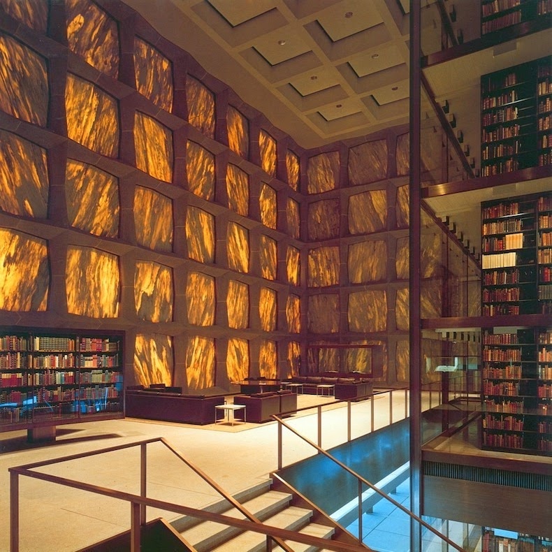
Based on our experiences in the world, we have certain expectations of material. Stone is solid, opaque, and heavy. Downy feathers float in the air. Yet these expectations sometimes turn out to be stereotypes. In the real world, of course, material is incapable of doing things that go against the laws of physics. Yet as we saw with the translucent marble walls of the Beinecke Rare Book Library, the material is capable of doing surprising things.
Architectural weightlessness
The history of architecture embodies the struggle against gravity that marks the progress of humankind, even from the time the first human stood erect. In these illustrations, we can see the architectural tendency toward this expression: the magic of heavy material exhibiting a quality of weightlessness.
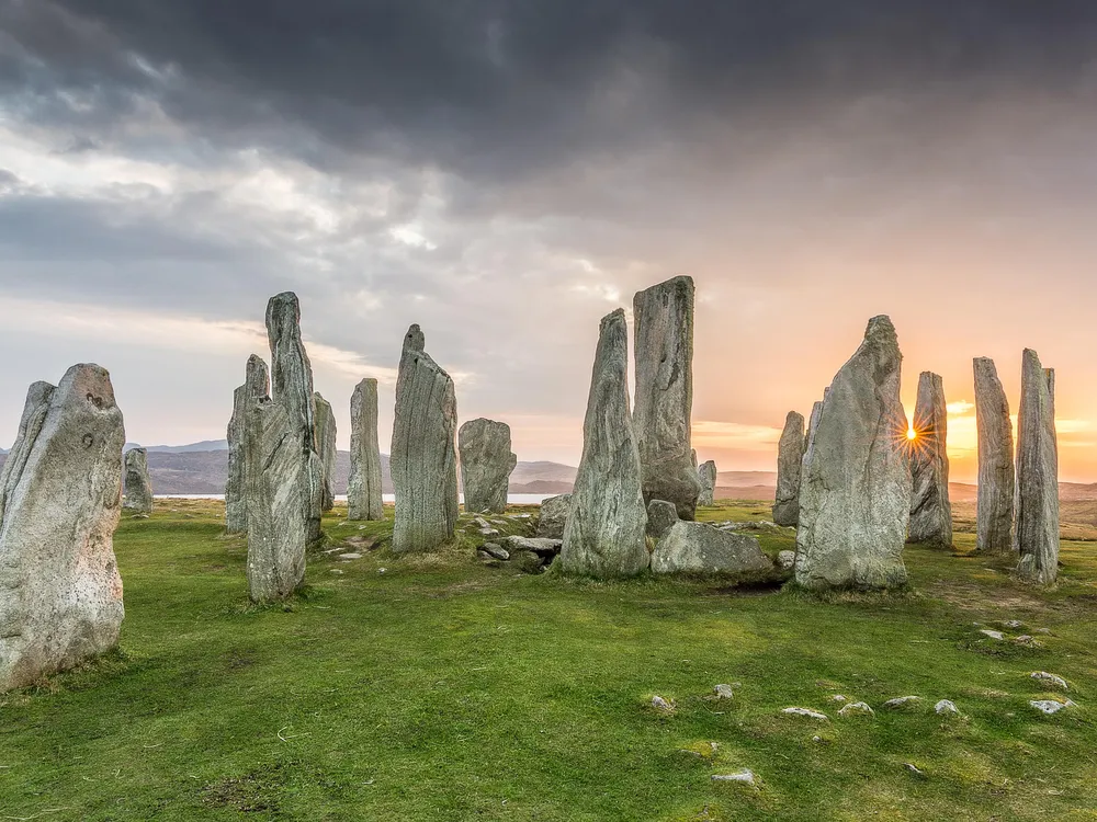
Callanish Standing Stones, circa 2500 B.C.E., Isle of Lewis, Scotland. In the 17th century inhabitants of Lewis called the stones fir bhrèige: Scots Gaelic for false men, a reference to their upright posture.
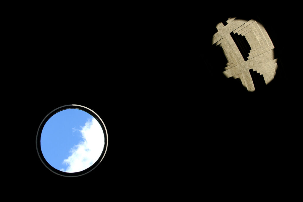
The Pantheon in Rome, 126 C.E. This was the world’s largest dome for a millennium. The coffers seen in the sunlight reduce the weight.
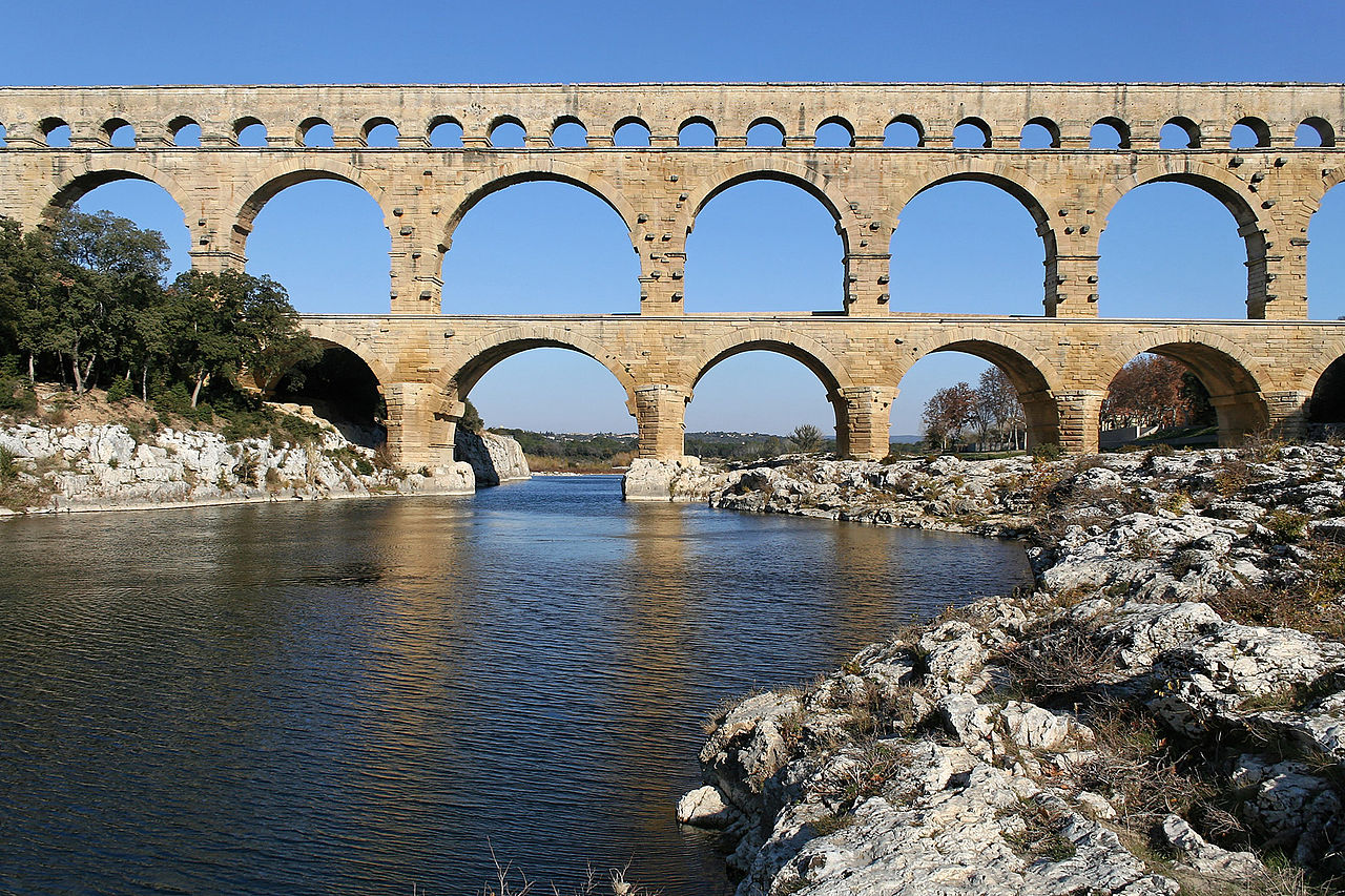
Pont du Gard, 1st century C.E., demonstrates the lightness an arch brings to stone.
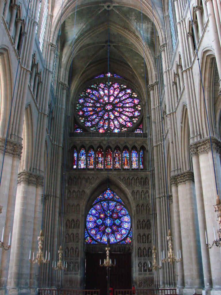
Notre-Dame de Reims, 13th century C.E., uses the pointed arch to bring masonry to the pinnacle of expression of weightlessness.
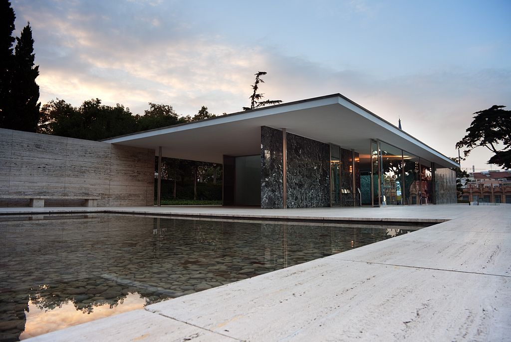
Ludwig Mies van der Rohe, Barcelona Pavilion, 1929, reconstructed 1986. Weightless and massless, with thin walls that no longer need to carry structure, which is supported by thin, reflective steel columns.
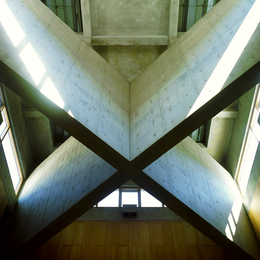
Louis Kahn, Phillips Exeter Academy Library, 1971. Kahn revives the expression of mass in architecture but with lightness remaining. Massive cross beams in the atrium diffuse the light from above.
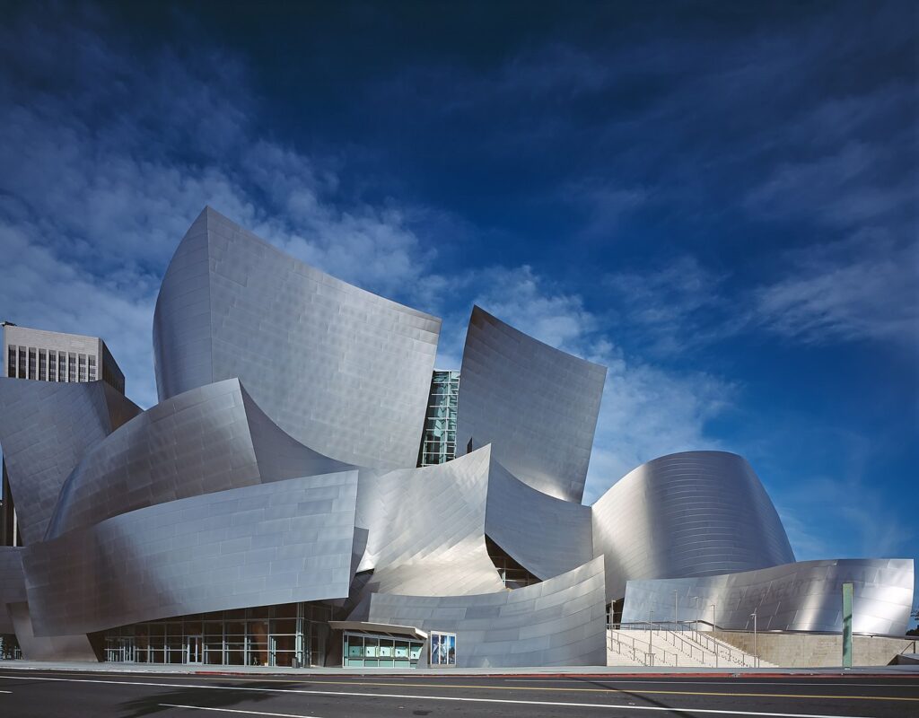
Frank Gehry, Disney Hall, 2003, uses flowing form and reflective titanium to suggest weightlessness.
Inventing laws
Of course, artists can invent a set of physical laws. An artist needs to invent or adapt a set of physical laws for his or her world. Whether real or surreal, what gives that world the same magic we see in our own is a deep understanding of the surprises that material is capable of within a consistent physical world. That world might be a complete fabrication of the artist’s mind. But it’s always subconsciously evaluated by the spectator in relation to our world.
René Magritte, The Castle of the Pyrenees, 1959
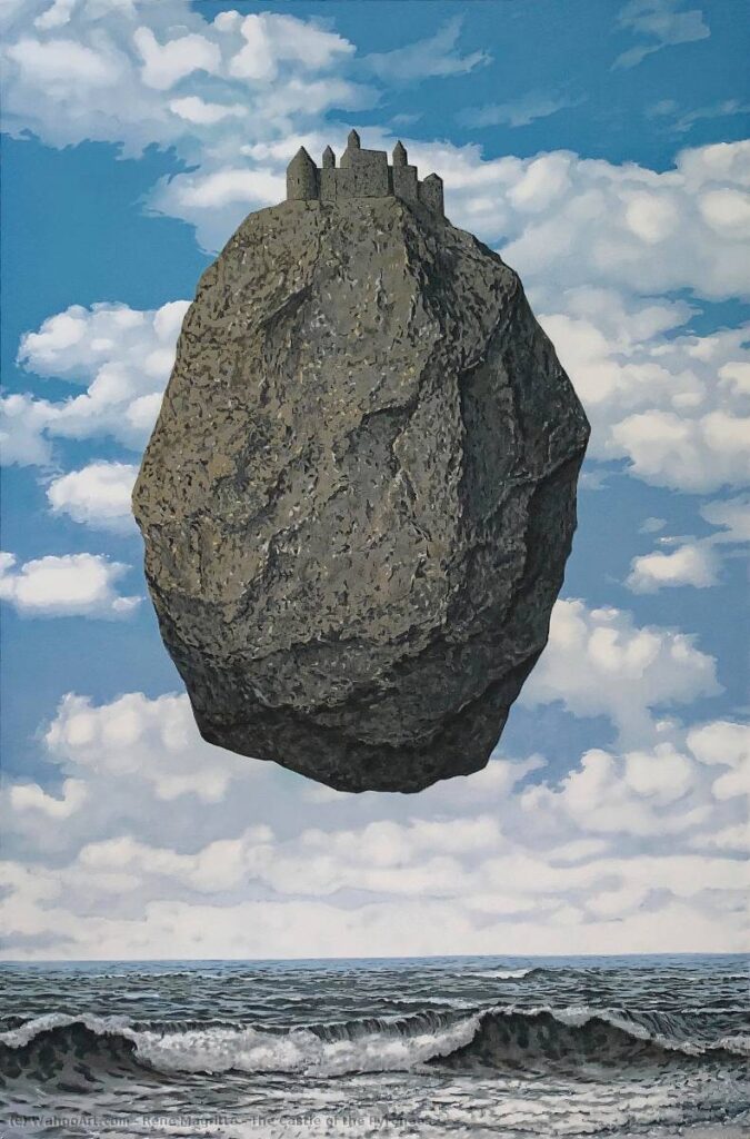
The longer a 3D artist practices the craft, the more he or she needs to observe the material world deeply. Next time you want to model stone, don’t look at a picture. Pick it up. Feel it. Carve it. Shine several kinds of light on it. This kind of understanding is tactile and concrete, not abstract.
Stories in material
A final note on the deep resonances material associations have with culture, history, personal encounters, and relationships to place:
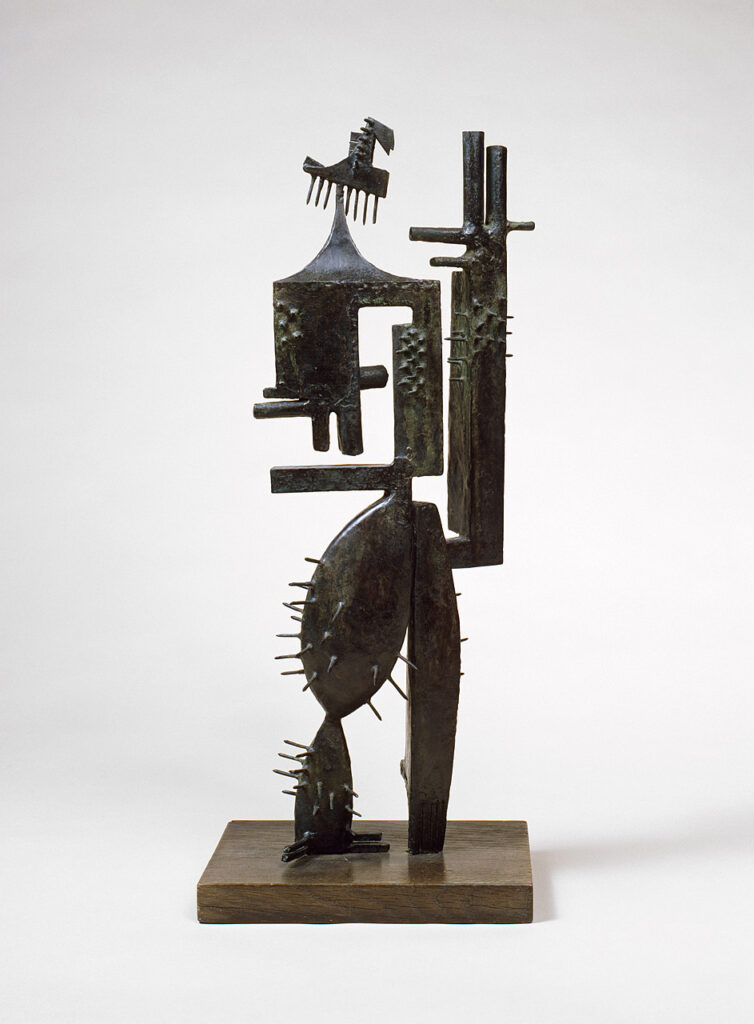
Julio González, Monsieur Cactus, 1939
González was a pioneer of welding construction in sculpture, but for him, there was a message in the use of the material:
The age of iron began many centuries ago by producing very beautiful objects, unfortunately, for a large part, arms. Today, it provides as well, bridges and railroads. It is time this metal ceased to be a murderer and the simple instrument of a super-mechanical science. Today the door is wide open for this material to be, at last, forged and hammered by the peaceful hands of an artist…
— Modern Art Masters website
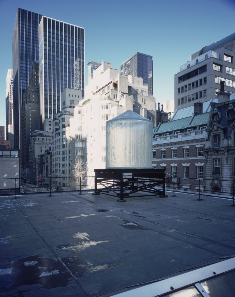
Rachel Whiteread, Water Tower, 1998
Water Tower, a translucent resin cast of the interior of a 12’2″ high by 9′ wide wooden water tank, was raised 7 stories to rest upon the steel tower frame of a SoHo rooftop. Water Tower was visible from street level at the corner of West Broadway and Grand Street… it was described by the artist as a “jewel in the Manhattan skyline.” On a cloudy day, the weathered surface of the original tank’s interior was visible, providing a ghostly form. In bright sunlight the translucent resin became a beacon of refracted light, and at night the unlit sculpture disappeared against the darkened sky. Poetic yet incongruous, Whiteread’s Water Tower powerfully represented a need for public sculpture to be physically present yet ephemeral.
— Public Art Fund website
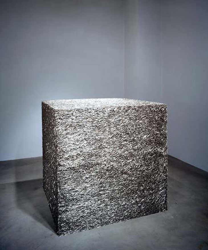
Tara Donovan, Untitled (Pins), 2003
More than four decades later, Minimalism remains one of the primary modes of operation in the art world. And over the past couple of years, the ICA’s big solo-artist surveys have catalogued its permutations… It wasn’t hard to spot descendants of Smith’s Die. Donovan’s show included a gravity-defying cube of straight pins…
This is a kinder, gentler, more crowd-pleasing Minimalism. The shift in tone is partly just what happens when people fiddle with the same idea for four decades. But some of it has to be credited to ’70s Feminism…
— Boston Phoenix
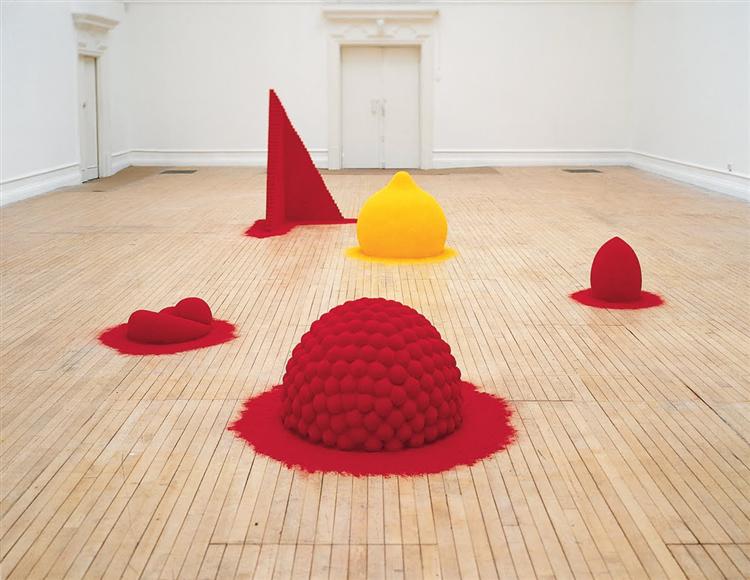
Anish Kapoor, To Reflect an Intimate Part of the Red, 1981
Red is a colour I’ve felt very strongly about. Maybe red is a very Indian colour, maybe it’s one of those things that I grew up with and recognise at some other level. Of course, it is the colour of the interior of our bodies. Red is the centre.
— AnishKapoor.com
- Kahn, Louis. “Lecture at Pratt Institute (1973).” In Twombly, Robert, ed. Louis Kahn: essential texts. W. W. Norton. 2003. p. 275.[↩]
- https://www.researchgate.net/publication/2857478_Color_as_a_Material_not_an_Optical_Property [↩]
- H. Tamura, S. Mori, and T. Yamawaki. “Texture features corresponding to visual perception.” IEEE Transactions on Systems, Man, and Cybernetics. Vol. SMC-8, No. 6. 1978. pp. 460 – 473.[↩]
- http://graphics.ucsd.edu/~henrik/images/subsurf.html[↩]