

CHAPTER 7 — Optical Visual Elements
20-minute read

Light
Related terms: Value | Tone
Light is reflected into our eyes. But this is only one among many interactions light has with material, the mechanics of which we will explore more specifically in Chapter 12. The source, color cast, intensity, and order of the light on that material greatly affect how things appear in nature. Of course, this extends to your model. An artist’s ability to manipulate these phenomena grants light its status as an optical visual element and as the wellspring for the others: color and texture.
Light and meaning
Of all those variables, a simple change in the ordering of light energy, such as its direction or intensity, can fundamentally and dramatically change the content of a work. James Turrell uses finely calibrated light levels to achieve something akin to magic.
Direction
Margaret French Cresson recounts a famous example in the story of how Daniel Chester French, her father and the sculptor for the statue of Abraham Lincoln in the famous memorial in Washington, dealt with the problem of unfortunate lighting in the installation of the work.
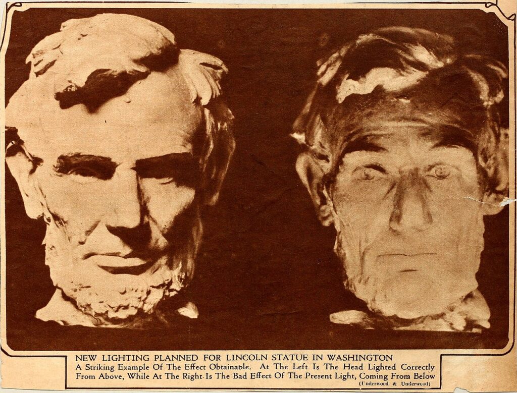
Daniel Chester French, Abraham Lincoln, 1921. One of the first deliberate uses of artificial lighting by a sculptor, French maintains his intended narrative of a strong, confident Lincoln at left, using downlighting which imitated the light of the studio where he carved the work. When the sculpture was originally installed in the monument, Lincoln exhibited a frightened look at right, due to sunlight reflecting up off the floor. Light fundamentally changes meaning!
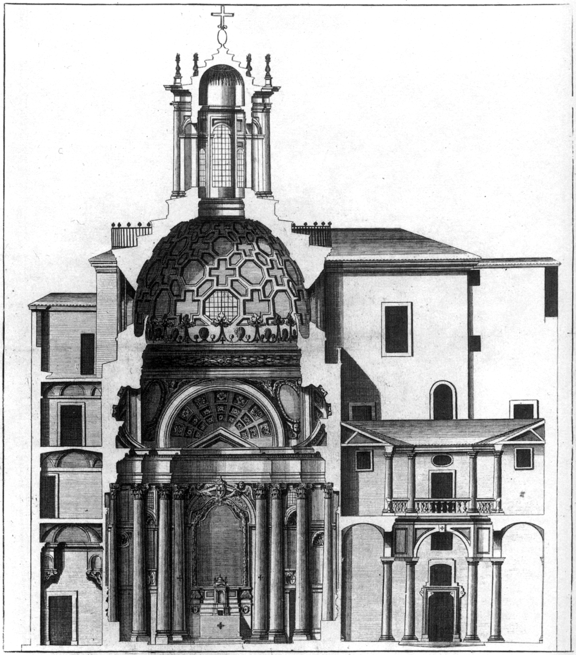
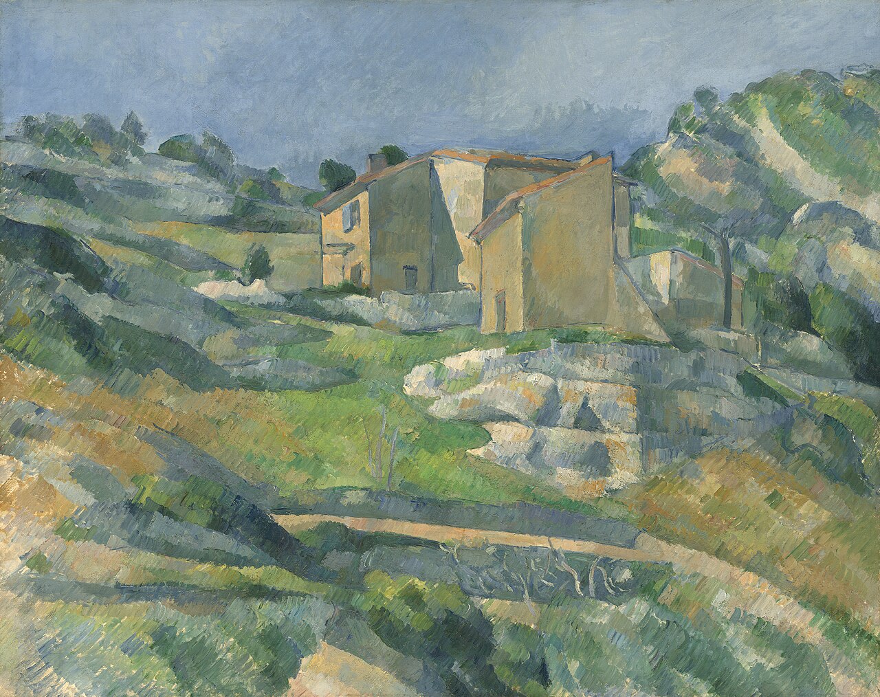
The position of light changes the perception of form. Raked light (directed from the side) emphasizes material texture and depth, more clearly articulating 3D form. Frontal light flattens the features and emphasizes outline or shape over mass. Baroque painters, sculptors, and architects are among the most facile artists manipulating the dramatic possibilities of a light source. Francesco Borromini was a master of manipulating the hidden light source in a church, bouncing light off textures and layers to achieve high drama.

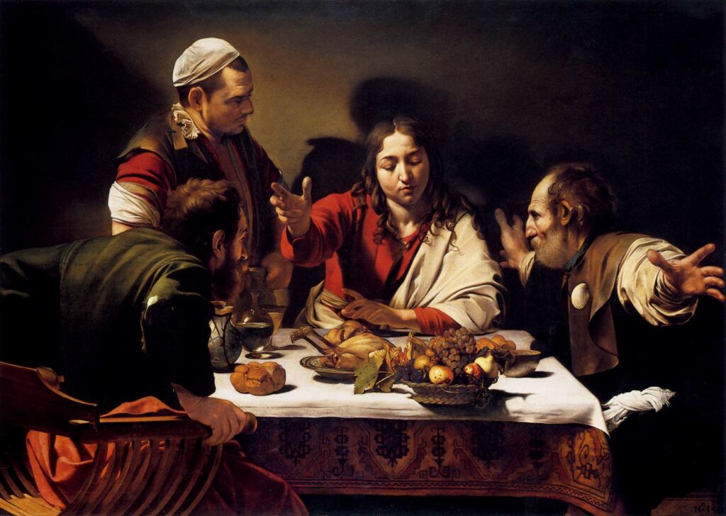
Caravaggio achieved light dramatics by using a technique he dubbed tenebrism, or night effects. Light, for Caravaggio, was a means of generating compositional hierarchy.
Optical realism
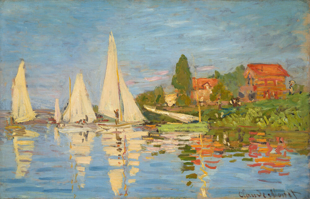
The period of the Enlightenment ushered in unprecedented scientific discoveries. By the 19th Century, we began to understand the true nature of light. The advent of technologies like photography compelled the Impressionists to begin painting in an entirely new way.
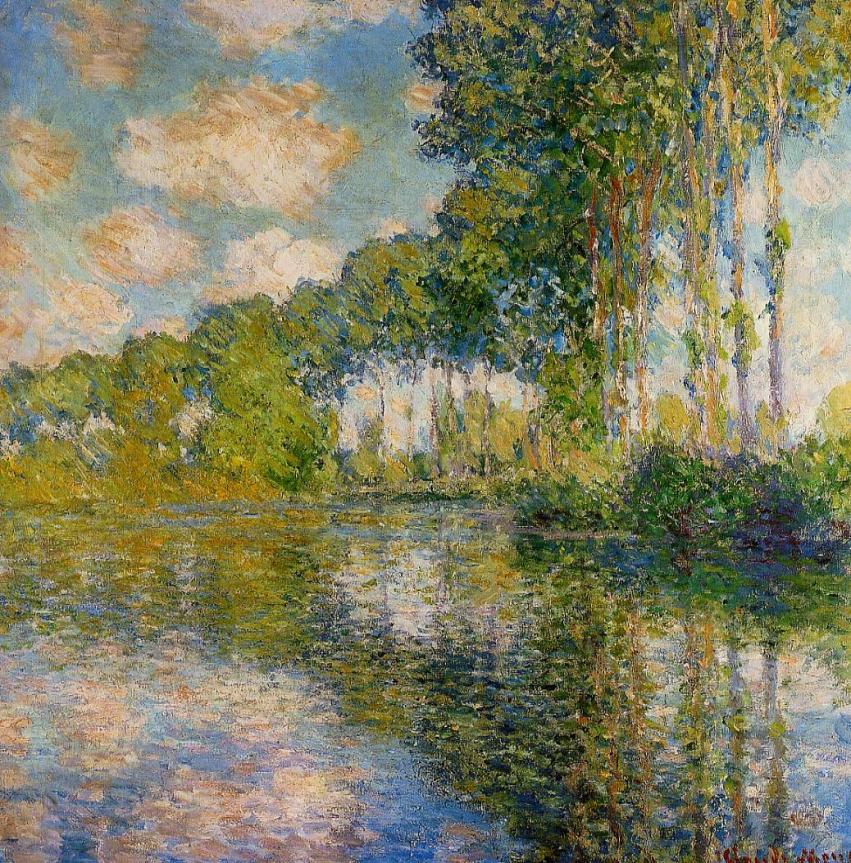
Interested in the camera and the scientific study of optics, Claude Monet developed a style he called “optical realism.” It wasn’t about painting things, it was about painting light. The misperception of critics at the time was that Impressionists were sloppy, sketchy painters. The nature of their exploration — capturing the chromatic and optical effects of light — demanded a rapid, plein-air approach to craftsmanship.
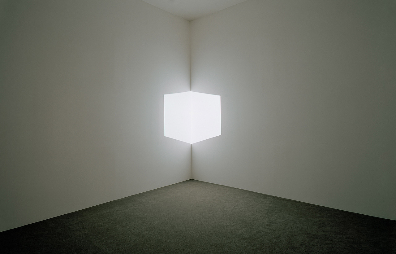
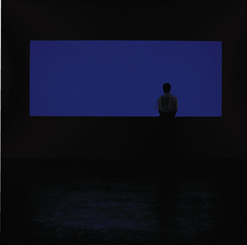
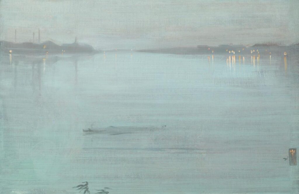
A century later, James Turrel continued an artistic fascination with the phenomenology of light in his large-scale, immersive environments. More akin to the grandeur of ancient architectural monuments than anything else, he sculpts light into mass in Afrum 1 (White) seen above, and makes the volume of space “disappear” in Night Passage, all through the careful arrangement of light and material.
Today, Raphael Lozano-Hemmer generates surreal encounters through manipulations of projected light levels in interactive, public works such as Under Scan. The video with a good interview provides a full understanding of the phenomenon he creates.
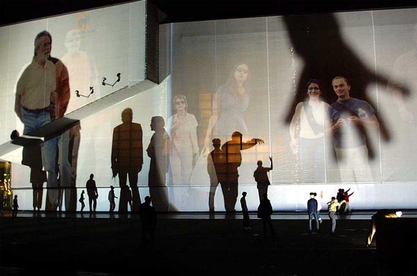
Video documentation of Under Scan and interview with the artist.
Color
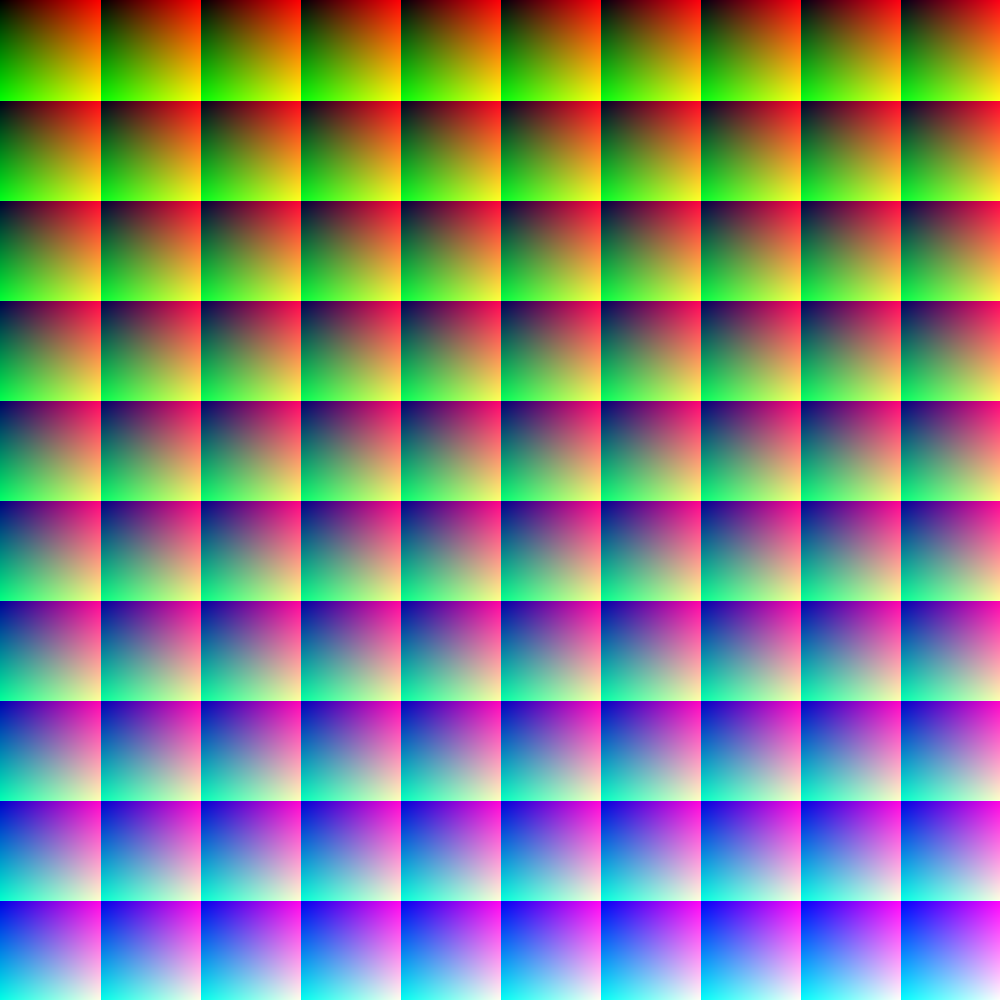
One Million Colors. When viewed at full resolution (1000 pixels wide and high), the image contains one million pixels. By changing values incrementally for red, green, and blue, each pixel contains a unique color value. The human eye is sensitive enough to detect about 10 million colors, although the number of colors possible is theoretically infinite. See the full-resolution version at this link.
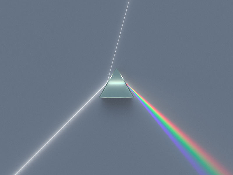
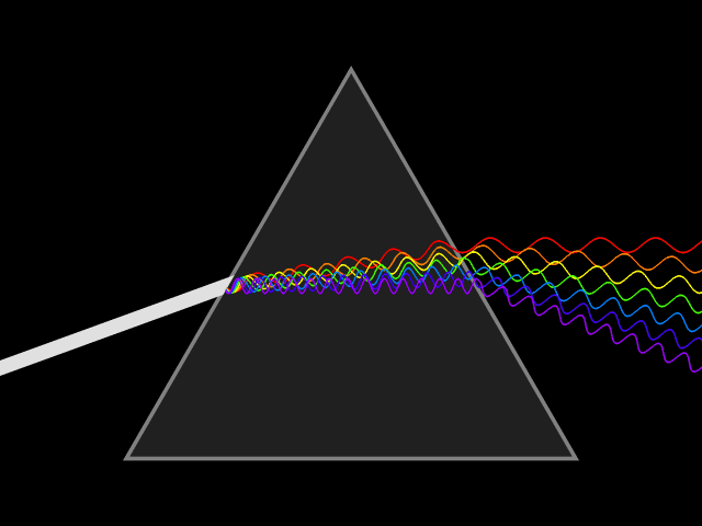
Color is a property of light. Our eyes can perceive and distinguish different wavelengths of light. We categorize these by name as red, green, blue, and other hues. Color is associated with material as well as light source. It is generated by the physical properties of a material such as light absorption, reflection, diffusion, and other optical properties discussed above. The nature of physical optics was revealed by Sir Isaac Newton in Opticks, one of the primary documents in the history of science. His experiments with the prismatic dispersion of light into the spectrum associated with the rainbow led to the development of an understanding of one aspect of light as a wave phenomenon. Longer frequency waves yield human sensations of reds and shorter yield violets.
Color models
The terms and definitions used to describe color can often be contradictory and confusing. This is probably because the perception of color is an intuitive, subjective condition. Terms are often used without great precision, yet even when they are precisely defined, their specific use depends on the color model being used. A color model is an abstract, mathematical description of the components of a color. Multiple color models exist, not because they compete with one another, but because each has their proper use in a certain context. In our work, we will discuss three kinds of models:
- the Additive model, …
- the Subtractive model, and …
- the HSV model, based on the three properties of color known as hue, saturation, and value.
Before we explore the models, let’s define those last three terms.
Hue
Hue is the property that gives color its color. It is the degree to which one color wavelength can be distinguished by name from another. The International Commission on Illumination (abbreviated CIE for the French Commission internationale de l’éclairage) defines hue as “the degree to which a stimulus can be described as similar to or different from stimuli that are described as red, green, blue, and yellow.” These are colors that have been described as psychological primaries or unique hues, which humans perceive to be irreducible. Other hues on the spectrum have names, to be sure — orange, and violet — but they are perceived as hues built from other hues.
Saturation
Saturation is the property that describes the amount or intensity of a hue present in a color. Other synonyms in various color models include colorfulness, chroma, and purity — the idea is intuitively understandable. A red’s red contains the brightest possible hue at the narrowest possible wavelength with no presence of a value bias. That is, there is no white (tint) to pink it up, gray (tone) to dull it, or black (shade) to darken it down.
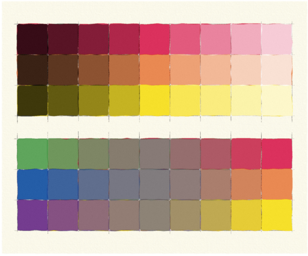
At top, values are applied to hues from shades to tints.
At bottom, saturation studies between complementary colors. In painting, this can be done by adding one complement to another. Note how the middle value, a pure desaturation, approaches a middle value gray.
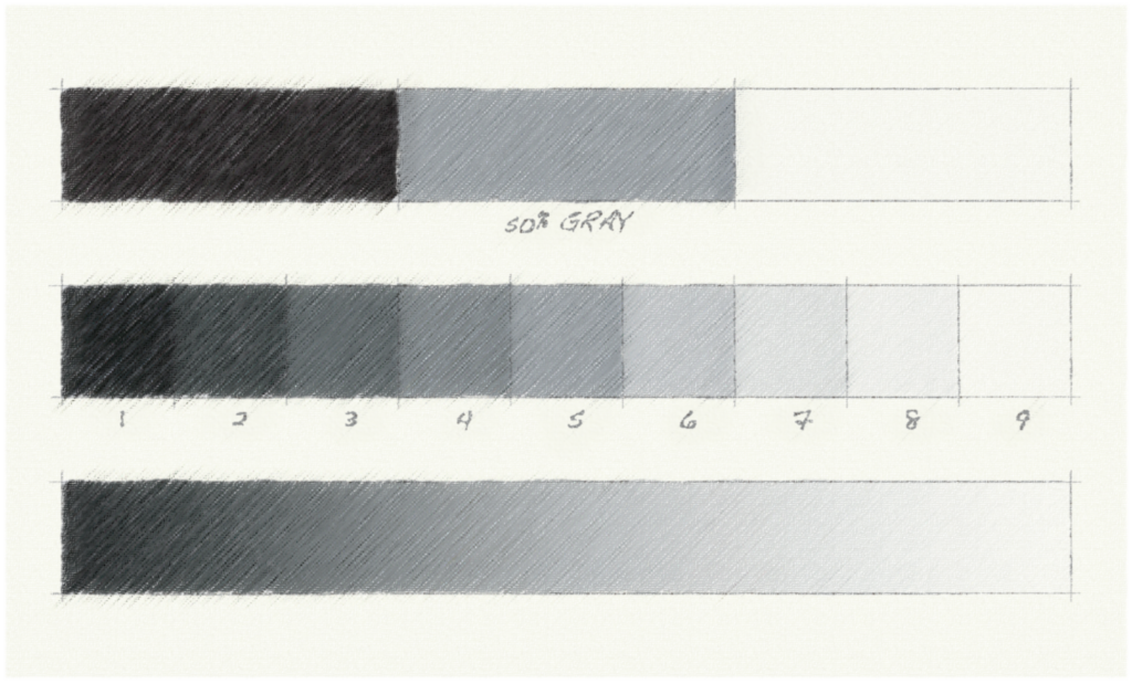
Value
The final property of color is Value, defined by the relative perceived lightness or darkness of a color. Depending on the kind of color model one uses, this property is also known by the synonym lightness or brightness. We also use the term shading, usually to describe subtle manipulations of value in a drawing. When we assess the Value property under pure white light with no hue bias, it becomes a spectrum of gray values from white to black, as seen here. We call this a grayscale. Note the interesting property of relativity demonstrated by using the middle value gray, perceived as midway between black and white, as a frame.

The problem with primary hues
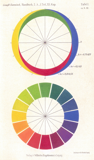
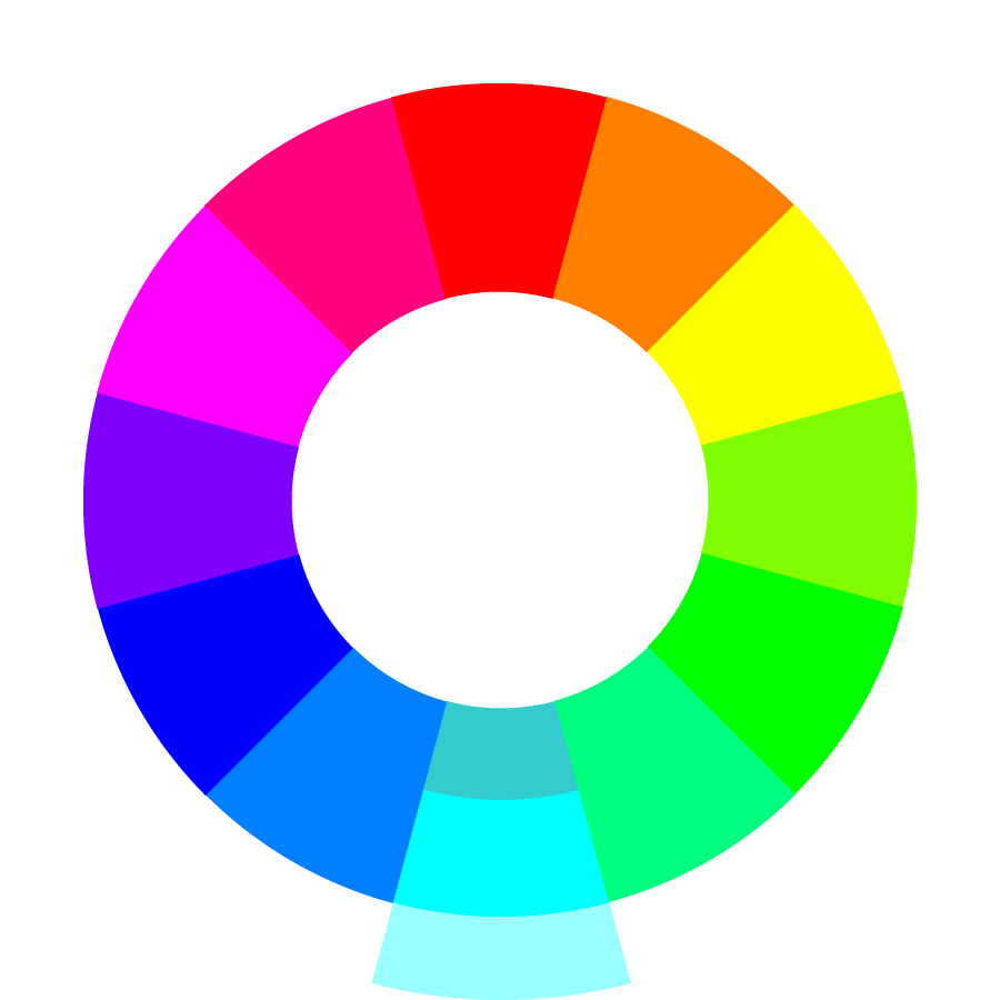
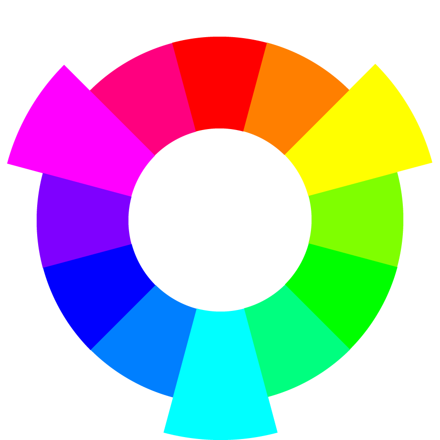
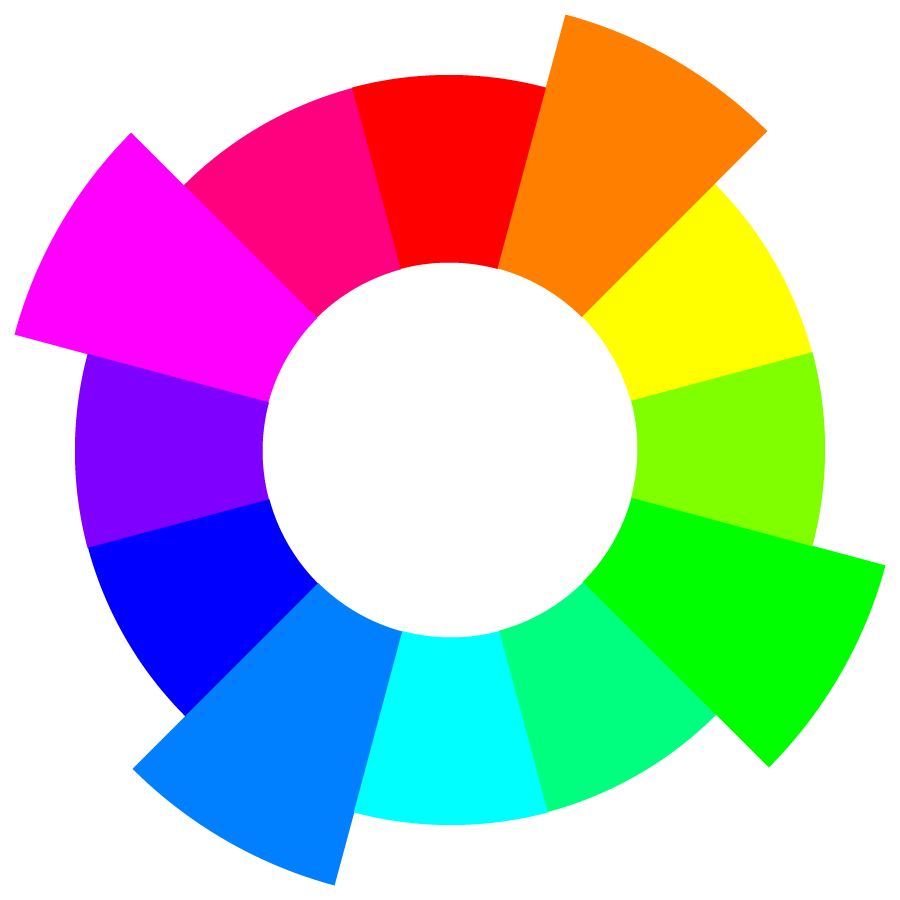
While discussing hue, the odd phrase psychological primaries was mentioned. We are all familiar with the idea of primary colors — red, yellow, blue, right? The so-called secondary colors are considered mixtures of the primaries, with red and blue mixing to achieve violet, blue with yellow to get green, and yellow with red to find orange. If we bend a spectrum around to create a circle and connect violet to red, we get the color wheel.
We know this historical color wheel as RYB or Red-Yellow-Blue. We recognize it in the traditional color wheel that we’ve seen since grade school. Regard this as obsolete dogma, because for modern color science, it is as fatally flawed as the concept of a flat earth!
First, we must understand that the primary color concept is not a fundamental physical property of light. Rather, it is based on the physiological response of our eyes to light. Human sight is trichromatic. That is, we have receptors in our eyes that absorb light in three different frequency ranges. These combine to create the millions of colors we can perceive. The spectrum of hues is not itself made of mixtures, but rather of pure, discrete wavelengths. Primaries are biology, not physics.
Creating a gamut
Because we mix three colors in our eyes, we psychologically react to colors with the sense that some are irreducible. Now, the choice of any three primary colors can be arbitrary. However, some colors work better to mix as primaries than others. The mixture of primaries creates what is known as a gamut — an adequately wide range of mixable colors. The larger the gamut derived from a set of primaries, the more useful that set of primaries. The RYB model is not a terribly useful set for digital color, because the gamut it creates is fairly limited.
So, how do we determine a good set of primaries? There are two ways we know color mixes in the material world. We can mix colors by generating colored light, or we can mix them by mashing compounds like ink or paint together. The results yield two radically different, yet related and equally valid, sets of primaries.
Additive and subtractive color models
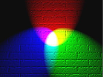
When we combine colored lights, they mix to form the perception of a new color. When we add enough of the right colors of light together, they combine to form pure, white light. A color model using a mixture of light is therefore known as an Additive color model. In an additive color model, the primaries that yield the largest gamut are red, green, and blue, making up the model known as RGB.
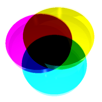
When pigments such as inks or paints are mixed, they form the perception of a new color as well. But as more pigments are combined, they subtract the amount of light that would be reflected off of the white surface upon which they are mixed. A color model using a pigment mixture is therefore known as a Subtractive color model. The largest gamut achieved in a subtractive color model is generated by cyan, magenta, and yellow, and we call it a CMY model.
It’s possible with very pure pigments or filters to achieve a black. However, in most color mixing, creating a fourth layer consisting of an undertone of black pigment makes color mixing easier and more economical. This adjusted model is known as CMYK, with K standing for Key Black. In the four-color printing process, the black printing plate is the one used to register, or key, the other plates.
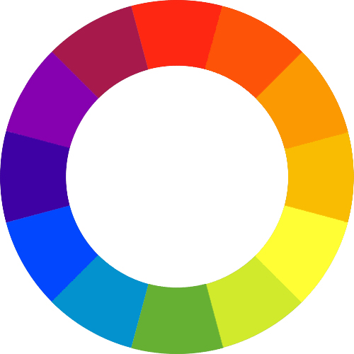
An integrated color wheel
A careful observer will note that, when the primaries of the additive color model are mixed, they create secondary colors which are none other than the primaries for the subtractive model, and vice versa! Additive red and green mix to form yellow. Green and blue mix to make cyan. Blue and red wavelengths create magenta. Subtractive cyan and magenta combine to make blue, magenta and yellow make red, and yellow and cyan generate green.
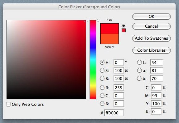
This reciprocity between the two models makes it easy to combine them into one integrated color wheel. This replaces the traditional, limited-gamut RYB wheel. So when we shift our orientation from one color model to the other, we simply shift the identity of primary and secondary triads. In our new color wheel, observe sets of numbers that show you the mixture of values in the respective color models. For CMYK, these numbers are expressed as percentages. For RGB, they are expressed in increments from 0 (no illumination) to 255 (maximum illumination). This is typical of how monitors, televisions, and projectors process information. The third set of “numbers” is known as the hexadecimal system, which encodes standard RGB values for use in web design. F is the highest value (equivalent to 16 in a base 10 system) and 0 is the lowest.
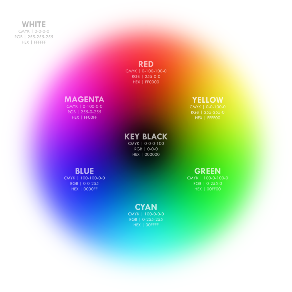
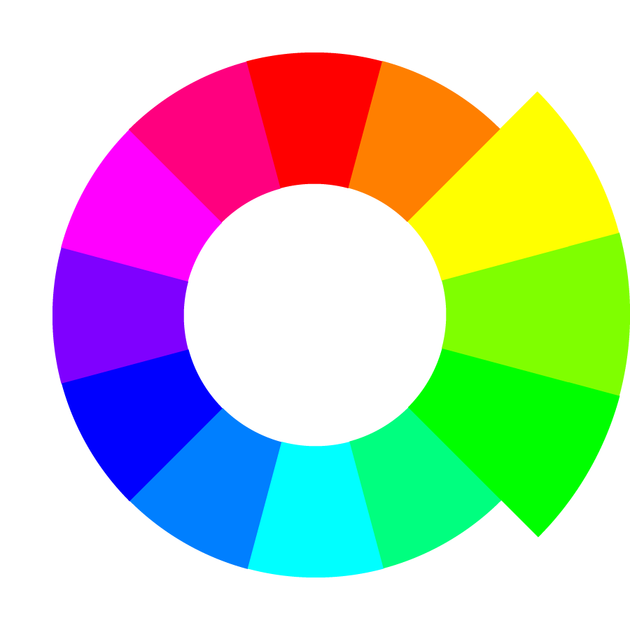
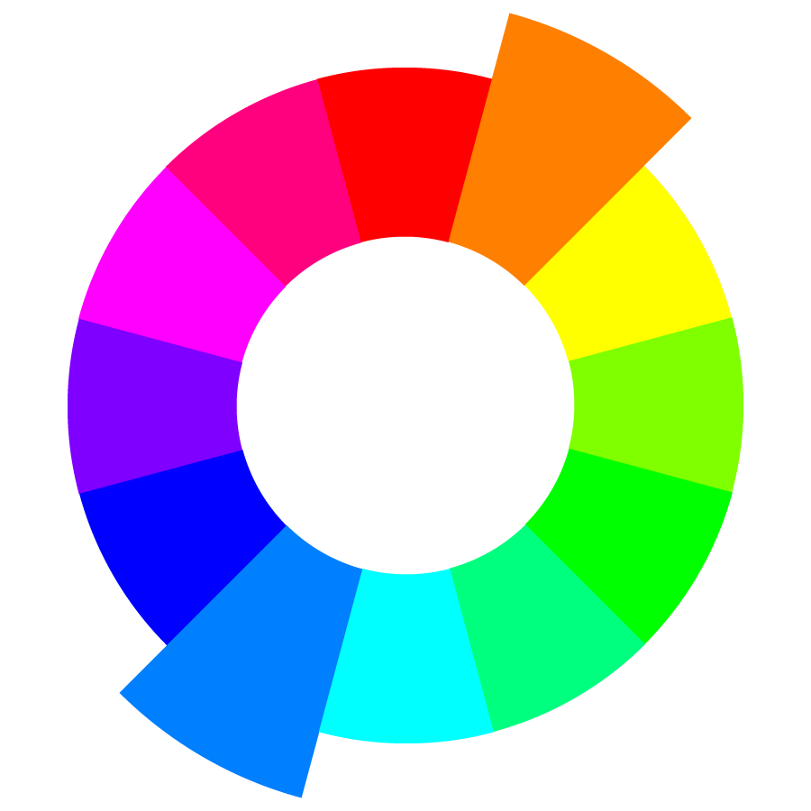
The integrated RGB-CMY color wheel
Rethinking complementary hues
The integrated color wheel gives us a standard set of hues that work as well in tactile color mixing as they do across computer applications. The next time you attempt to mix blue and yellow paint to make a green, find a tube of turquoise or cyan paint instead of a dark pthalo blue. The new wheel acts like the traditional color wheel. However, we need to reassess some assumed relationships. For example, complementary colors are shifted: the complement for red is cyan, not green.
With hues well-defined by modern optical science, let’s focus on one particularly useful color model.
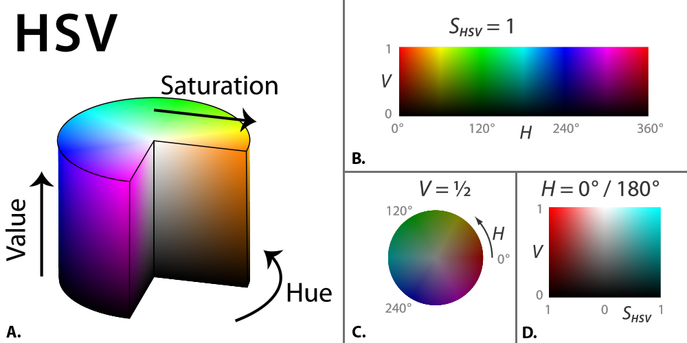
The HSV color model
One limitation of a color wheel is its ability to model all of the properties of color. As a flat plane, it has area, and can therefore show two variables. For example, one can create a wheel that shows all the hues as one variable, and the saturation level as another. Or, one can show hue and value — or saturation and value. But it’s impossible to show all 3 variables without turning to a 3 coordinate system. Imagine trying to describe 3D space while only using an XY coordinate system!
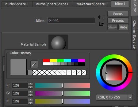
Hence, color standards have been developed that are known as color spaces. One common cartesian-based, 3-coordinate color space uses RGB as values along the 3 axes and is computationally very useful. However, the resulting RGB color space makes it difficult to visualize neutral gray tones graphically. The gray values run along a diagonal bisector of the RGB color cube. Using an HSV color space instead reorients the geometry of the RGB space to solve these perceptual deficiencies.
The HSV color “space”
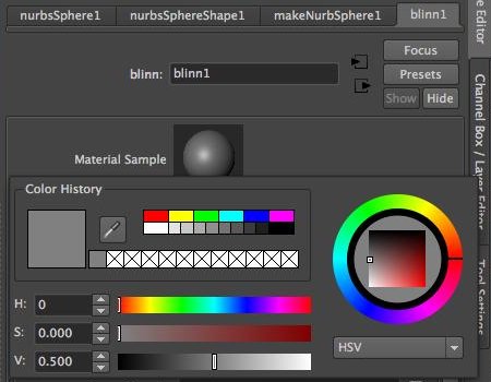
HSV stands for Hue-Saturaton-Value, as you might already have guessed. In some applications (like Photoshop) it is called HSB, where value is replaced with the synonym brightness, but they are equivalent. The HSV model creates an abstract, cylindrical “space” that we can conceptualize as containing all “possible” colors in the gamut.
The cylinder is useful because we can recognize the color wheel as the hue values march around one set of degree coordinates. We can perceive saturation as most intensely represented at the skin of the cylinder and desaturated at the center. Finally, we can see the grayscale of value from black at the bottom to white at the top. The brightness of pure color in the HSV model is equivalent to the brightness of white (other models, like the HSL model, create different value-based equivalencies, so make sure you are clear on the definitions in a given model!). Explore the components of the HSV color cylinder below.
Color “space” in a color picker
The HSV cylinder aspect used in color pickers such as we see in Photoshop was specifically developed for computer applications. However, it is very intuitive for artists and not difficult to understand once we visualize it as a “space.” In the Maya color picker, you can alternate the selector between an RGB cube and an HSV cylinder at the lower right drop-down.
Color is a fascinating topic, which we’ve only been able to scratch the surface of in this title. If you wish to go in greater depth, we recommend a visit to David Briggs’ comprehensive website The Dimensions of Colour.
Color and spatial relationships
Warm and cool
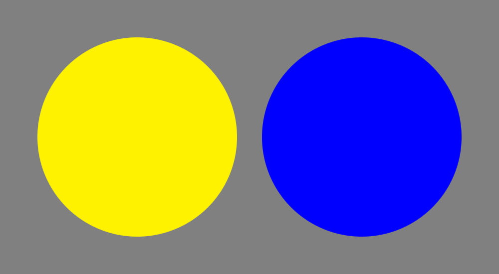
We sometimes stereotype color as a purely graphic or surface phenomenon. But as color begins to interact it begins to suggest spatial relationships both actual and illusionistic. One way that color generates a sense of space is through the juxtaposition of warm and cool colors. Although not a hard and fast rule, warm colors (based on magentas, reds, and yellows) tend to advance visually in most contexts. Cool ones (based on greens, cyans, and blues) tend to recede.
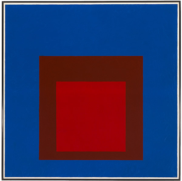
In Joseph Albers’ painting, we can see the effects of warm and cool being used to achieve a really astounding spatial illusion known as phenomenal transparency.
Phenomenal transparency
If one sees two or more figures overlapping one another, and each of them claims for itself the common overlapped part, then one is confronted with a contradiction of spatial dimensions. To resolve this contradiction one must assume the presence of a new optical quality. The figures are endowed with transparency… . Transparency however implies more than an optical characteristic, it implies a broader spatial order. Transparency means a simultaneous perception of different spatial locations. Space not only recedes but fluctuates in a continuous activity. The position of the transparent figures has equivocal meaning as one sees each figure now as the closer now as the further one….
– Gyorgy Kepes, Language of Vision
The color-based geometric abstraction of Josef Albers presents us with a sense of layered space through color interaction and an illusion of transparency fostered by color relationships. Here we first see three squares: on top a high-saturation lighter red, in the middle a high-saturation darker shade orange (a.k.a. brown) and lastly a high-saturation middle-value cyan-blue. As we observe, a strange phenomenon begins to take place: the brown, containing a high level of red, begins to associate with the top square, while at the same time, its darker value begins to associate with the cyan-blue. We start to see the cyan-blue as a transparent filter, laying on top of a red square sitting behind it, with a hole — the smallest square — opening to it.
Not only has Albers made three squares become two, and made one square feel like a hole, he’s made the “advancing” warm color appear to sit behind the “receding” cool one. Even more astounding, he’s made the dark orange (technically a warm color) feel like it contains cyan-blue — its complement! These are byproducts of color interaction and phenomenal transparency techniques, of which Albers was the acknowledged master.
Palettes
Other color relationships begin to generate a sense of pictorial space, but we can also use them to manipulate actual space in a 3D model. Among the many are these:
Monochrome
This painting uses tints, tones, and shades based on the same or nearly the same wavelength of light. Monochrome palettes tend to create a sense of color unity that binds and camouflages form, compresses space, and creates a psychological sense of relative stability.
Analogous
This painting uses hues adjacent to a dominant color to create variety, hierarchy, balance, focal points, and other visual phenomena. Analogous colors create more distinct forms but maintain a sense of spatial and pictorial unity, since the colors on either side of the dominant color tend to be, at some level, a mixture containing some aspect of the dominant color.
Complementary
This painting creates stronger figure-ground relationships that develop uniqueness, contrast, and spatial depth. Interesting situations can develop with complementary palettes whereby a hot color rendered on a far-away object can tend to shoot forward in a cool environment, creating a strong sense of spatial tension and ambiguity.
Triadic
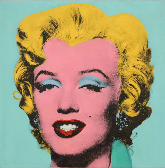
A triadic color scheme usually focuses on one color, with the other two evenly spaced colors serving an accent function. Triadic colors stand and make for a vibrant, lively color palette regardless of the choice of the dominant color. Triadic color harmony defines the pleasing appearance triadic colors have when used together.
Tetradic
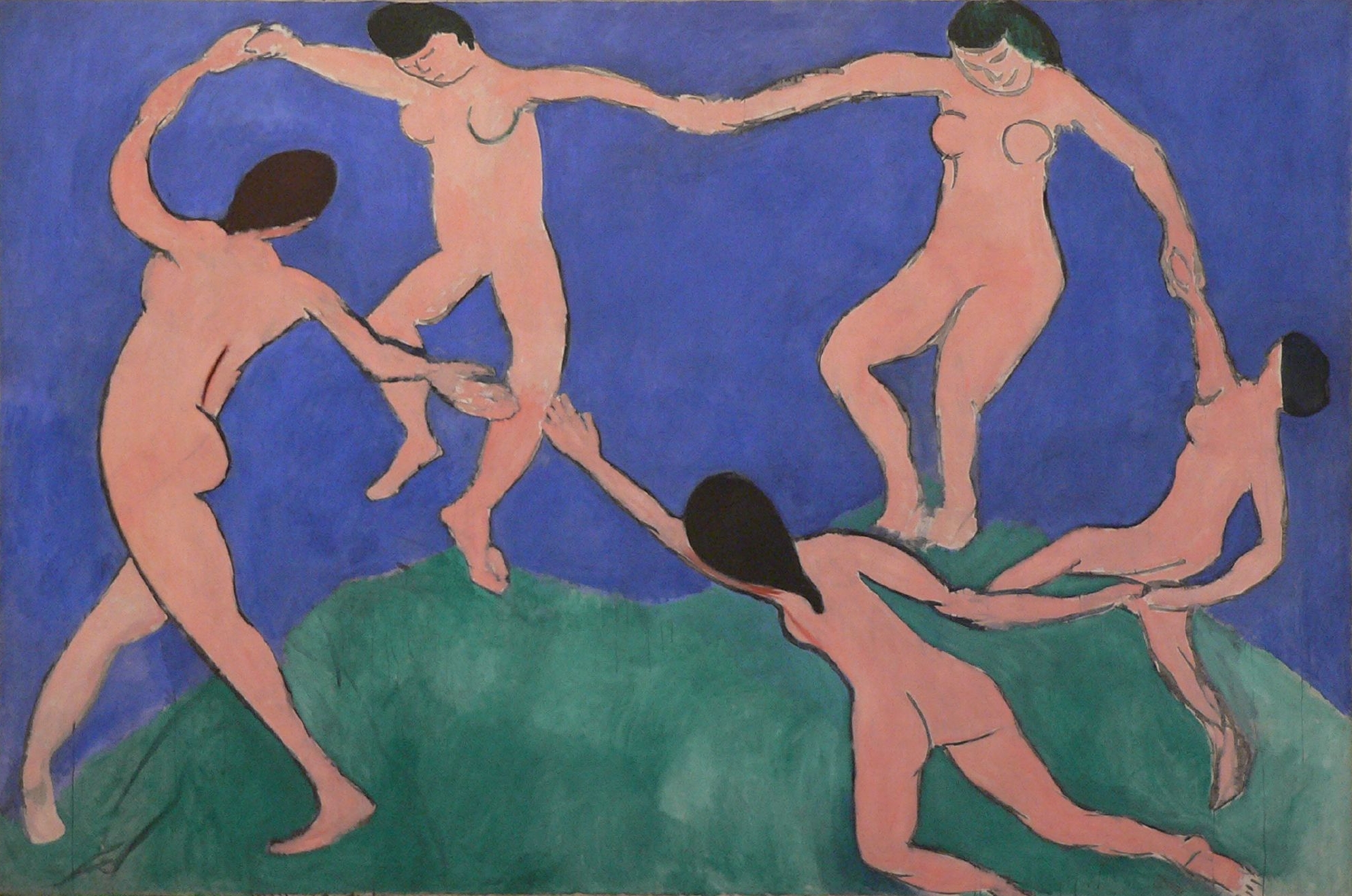
The tetradic color scheme is sometimes called a double complementary. It is the most complex of schemes, needing careful planning because it uses four colors organized into two complementary color pairs, a scheme that can be difficult to harmonize. This painting develops a square tetrad, but tetrads can also be rectangular, creating analogous color relationships.
Color tools
There are many tools online to help an artist select a color palette based on HSV. A few of our favorites below include:
- Coolors | Generate 5 colors in a palette to share
- Canva Color Wheel | A good primer on color theory accompanies this color picker
- Adobe Color | Interactive color wheels in various models develop multiple swatches
- Palletton | Intuitive interactive that isolates a saturation and value widget for various palettes
Revisiting balance
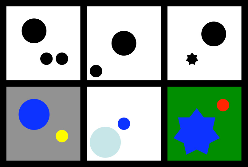
As the use of these various palettes establishes spatial relationships for the artist, we begin to better understand how form and color interact to manipulate visual phenomena in complex ways. Revisiting the illustration from our discussion of asymmetrical balance, we can perhaps better appreciate how the “rules” can be overturned by the perceptual changes color brings to the compositional mix.
Texture
Like light and color, texture is an element of visual design. In concert with other elements, we can use it to generate emphasis, contrast, rhythm, and the spectrum of other visual principles we’ve encountered. As a visual element in art, we appreciate texture in three overlapping categories: physical texture, visual texture,implied texture.
Physical texture
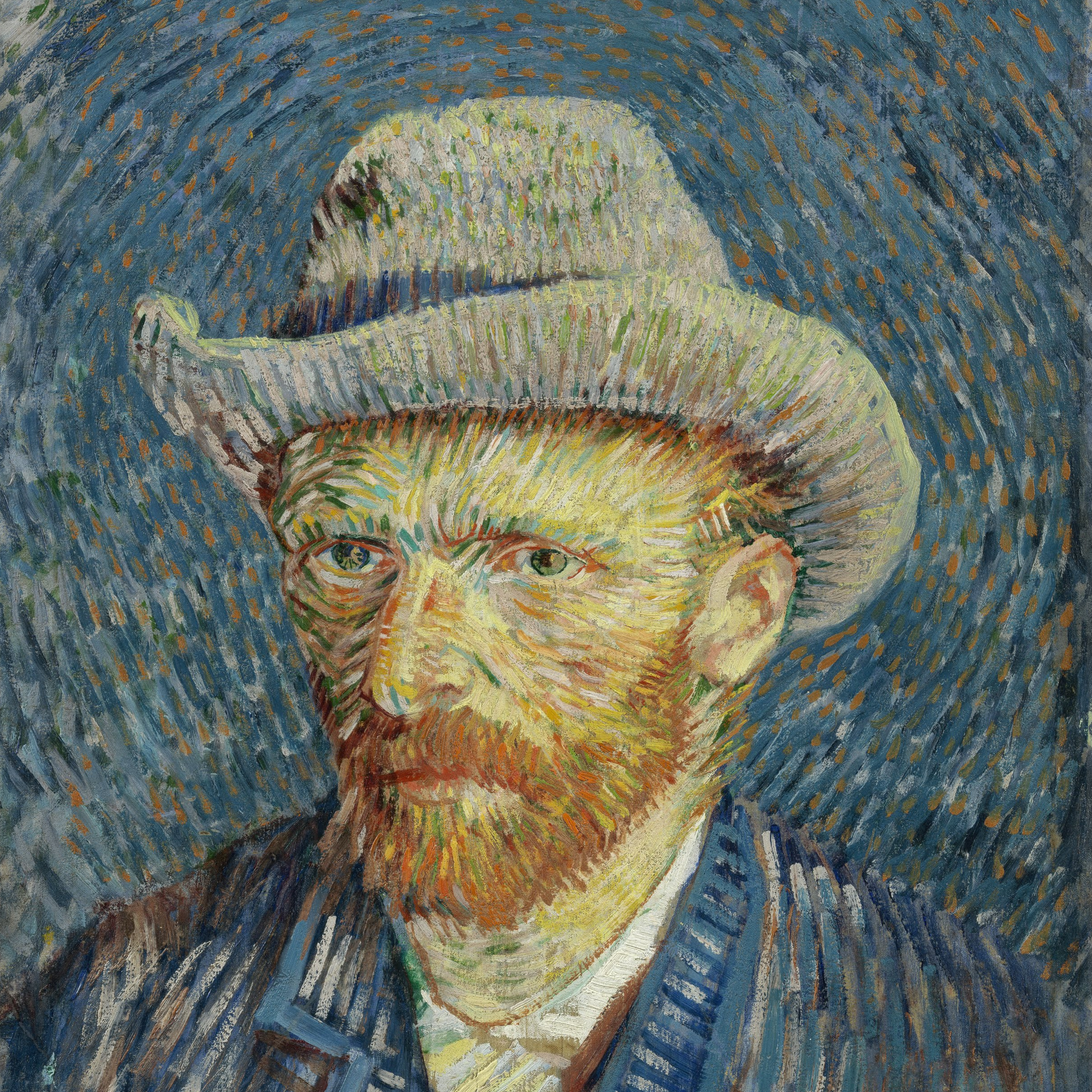
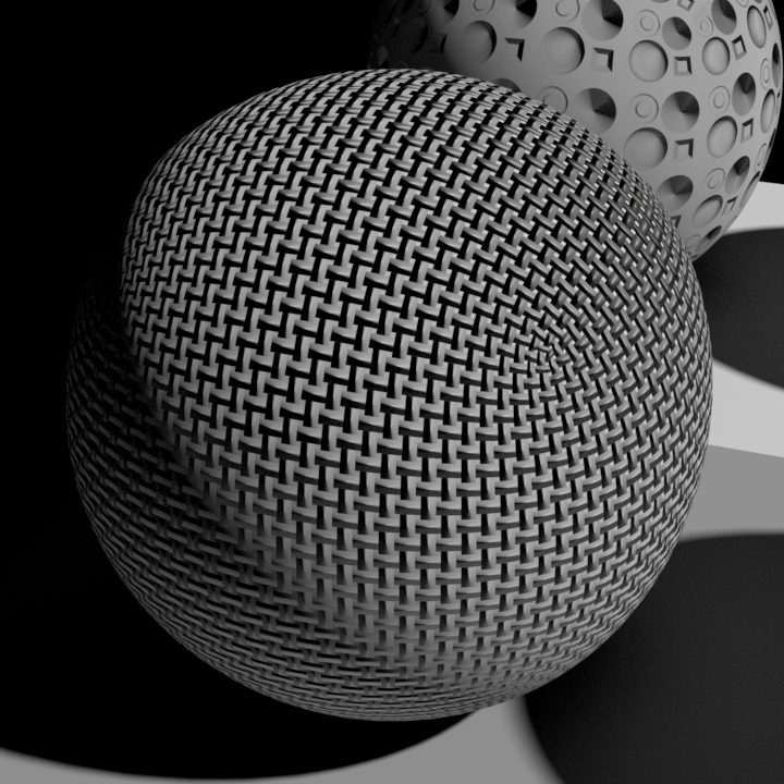
A physical texture is tactile, one that can be felt as well as seen. Although it would get you in trouble with museum guards to actually touch a Van Gogh, you can imagine what the texture of his impasto painting technique would be like to “see” with your fingers. Physical texture acts like a displacement map, adding geometry to a basic shape.
Visual texture
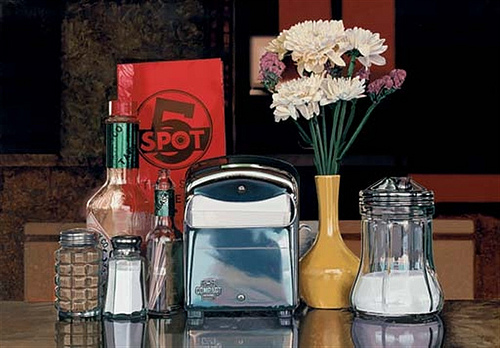
The brushwork of this Photo-Realist painter is physically smooth. Yet Goings creates many textures the eye can “feel” ranging from the reflective smoothness of metal to the grittiness of pepper. The texture is an illusion — seen, but only referencing physical texture. Visual texture acts like a bump map, suggesting texture but not adding geometry.
Implied texture
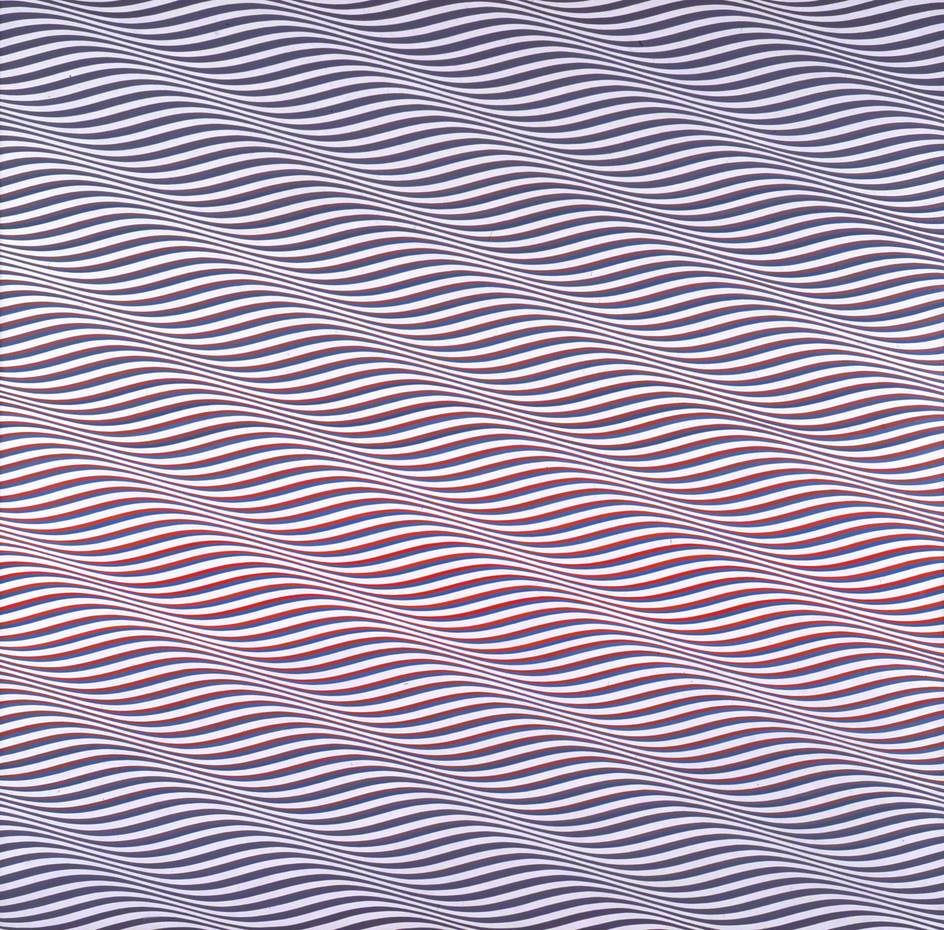
Riley uses line, repetition, and high contrast to create the visual conditions of texture in her abstract Op-Art work. The working visual definition of texture is present. We see it as a texture quality, not referencing physical texture in objective ways. Implied texture acts like a procedural map, which we can manipulate to achieve a result.
Haptic quality
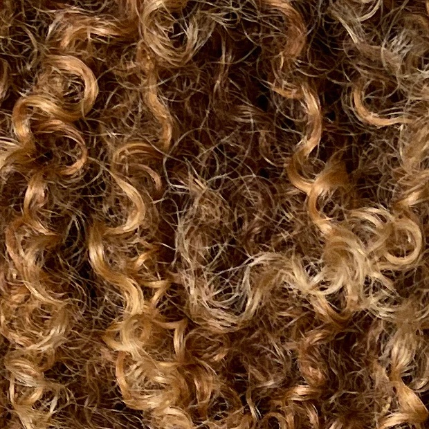
What sets texture apart from the other visual elements is this: it is not primarily visual! It is also haptic because we can touch it. As children, we explore the world as perceptual sponges. We record memories of hair and dirt and wood so that as we see these later in life, we can imagine their texture without having to touch them. Like other non-visual perceptual phenomena (odor, taste, sound), texture is nearly impossible to fully describe in words. What words we do have are fairly informal, emotional, or metaphorical. These are hardly the kind of hard-core, quantitative datasets required to resolve human perception with computational models in the way light and color have been.
In Chapter 12, we will explore the specifics of light, color, and texture as they relate to the practice of material modeling and mapping.