CHAPTER 10 | Expressions of Geometry
18-minute read

The Idea of a Model: Forms and Primitives
Picasso’s “art is the lie that makes us realize the truth” statement is based on a fairly ancient idea. Making art, we have argued elsewhere, is fundamentally an act of modeling. Merriam-Webster defines modeling as an act of designing or imitating forms, an act of shaping, molding, or planning. It defines a model as a material representation or embodiment of an ideal.
Picasso’s art/lie statement is cagey for effect. He’s arguing that art is an embodiment of ideals, a giving form to things that should, but don’t, exist. What he’s saying is that the artist sees the world of the ideal, the suitable model for that which ought to be in the world and which it is the artist’s task to show, through the imperfect material lens of art. This is another way of saying that artists give form to Forms, a basic and ancient idea that permeates Western philosophy.
The Theory of Forms
Plato first postulated the Theory of Forms. He argues that immaterial abstractions known as Forms, which some authors translate tellingly as Ideas, possess a more fundamental reality than the objects that we see and touch. Tangible objects, in other words, are imperfect, mimetic copies of the Forms. The Forms are true, and the objects we see are a dull kind of mirror, a partial reflection of the truth embodied in the Forms. A partial truth is not the whole truth, and it is in that sense that Picasso’s “lie” should be understood.
Plato’s Theory of Forms provides an early definition of modeling and can be considered a rigorous formulation of the philosophy of modeling. Among the tools Hellenistic philosophers had for describing Forms included words and images, and images are governed among many other things by — what else? — Geometry.
Platonic solids
Beloved by the Greeks because it could describe abstractions and perform mathematical calculations, Geometry was a subject intertwined with the Forms. Although Plato did not discover them, he features the Platonic Solids prominently in his writings on the classical elements. He associates fire, earth, air, and water with the tetrahedron, cube (or hexahedron), octahedron, and icosahedron respectively. He links the fifth solid, the dodecahedron, to the construction of the heavens. There are only 5 Platonic Solids by definition: a closed, regular polyhedron consisting of the same polygon for each face. Any polygon larger than a pentagon creates a flat plane or an impossible tiling.
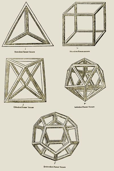
Leonardo da Vinci, Platonic Solids, illustration for Luciano Pacioli’s text De Divina Proportione, 1509. Top: tetrahedron, cube (hexahedron). Middle: octahedron, icosahedron. Bottom: dodecahedron. Da Vinci represented the solids in both open form (seen here) and solid form. The open form suggests a computer modeling view known as wireframe modeling, wherein one can see all sides of a solid simultaneously, although here da Vinci gives the “wire” some thickness to avoid spatial ambiguity — that is, he gives the mathematical construct a tactile geometric reading. For more on Platonic Solids, visit the demonstration videos at the Wolfram MathWorld website.
Pre-platonic polyhedra
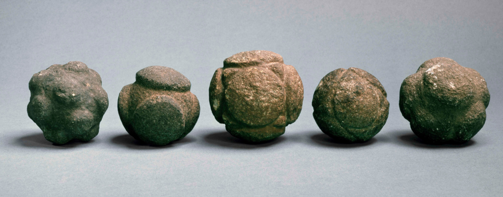
Some attribute the discovery of the Platonic Solids to the Greek mathematician Pythagoras, but they turn out to have been known in some form since prehistory. Hundreds of intricately carved stone balls suggesting knowledge of polyhedra have been found in Scotland and dated to the Neolithic period, a millennium before Plato’s birth. We can only speculate about their use absent any kind of written record. However, we can be certain the Neolithic Pictish people who occupied Scotland understood these volumes to have exceptional properties and therefore manifested the presence of something exceptional in the world, even if they did not possess the mathematical understanding of the later Greeks. Modeling is indeed an ancient enterprise.
Primitives
3D modeling is the closest means we have yet devised to peek through our dark glass of material existence into Plato’s rarefied world of pure Form, and one can see homage paid to the Platonic Solids in certain modeling user interfaces. Another homage often exists in the UI: the world of what we call Primitives.
Primitives overlap slightly with the special-case convex polyhedra that constitute Platonic Solids. We see one example in the cube and another in the 3-sided pyramid known as the tetrahedron. We see shapes — the sphere, cylinder, cone, torus, and others — as the fundamental building blocks of more complex geometries. The painter Paul Cézanne explained in a conversation with Emile Bernard that a painter “must first of all study geometric forms: the cone, the cube, the cylinder, the sphere. When one knows how to render these things in their forms and their planes, one ought to know how to paint.” 1
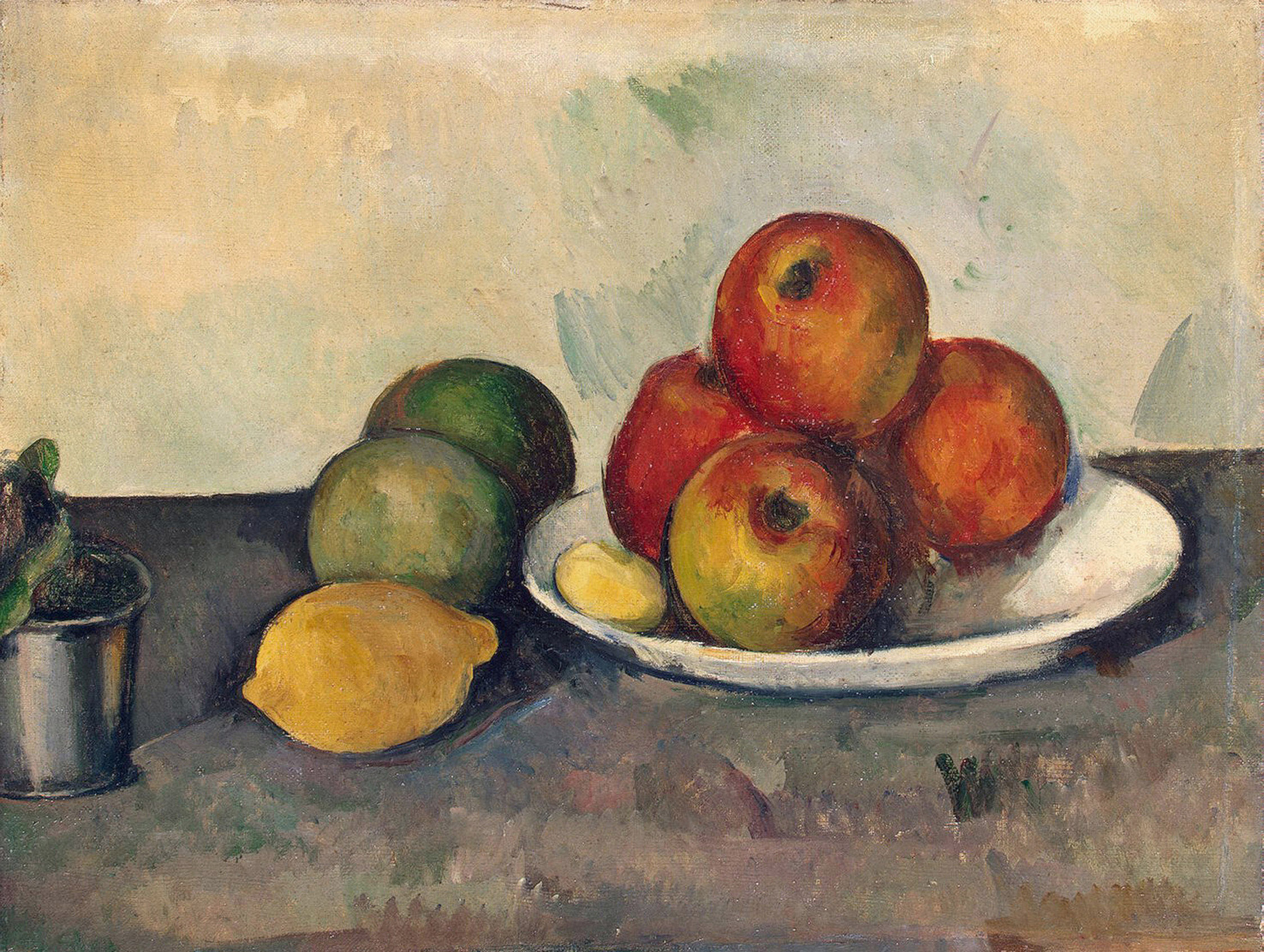
Paul Cézanne, Still Life With Apples, 1890. One level of geometric structure exists in what you see — apples being structured by the sphere, for example. The next level of structure exists in what controls what you see — a tetrahedral organization for the apples. We discover an even deeper level in the brushwork — note the V-shaped shadow below the far right apple. It visually aligns with shadows on the wall to suggest a purely compositional/spatial cone.

Geometric Primitives in digital modeling. Cézanne’s Primitives — cone, cube, cylinder, sphere — are at right in the image. Other Primitives include the pyramid, plane (technically, a 2D object), torus, and pipe. Modeling often employs distortions and combinations based on these simple volumes.
Digital primitives
Cézanne did not invent the Primitives. However, his sophisticated empirical study of these building-block geometries, which simultaneously structure and are structured by our perception of the natural world, led to the first complete reinvention of space in painting since the invention of Renaissance perspective, ultimately inspiring Picasso to develop Cubism. Today, a 3D modeler can manipulate Cézannesque geometric primitives into complex forms in the same analytical way. This analysis is not something software will do, any more than a brush makes a painting for a painter.
Digital modeling allows us to see and manipulate Forms and Primitives with unheard-of precision. Yet, we usually view them filtered through an imperfect mechanism: the two-dimensional computer monitor representing the 3D world through a fairly clumsy window. Regardless, we are privileged to witness an unprecedented development in the history of visualizing geometry.
Coordinates
Plato and Cézanne share the view that a precise, pure, invisible geometry controls our perception of the less pure reflections of geometry in the material world. The abstract geometry of the Forms and Primitives is a mathematical construct. As such, we have devised several mathematical means to make that geometry tangible.
Cartesian coordinate system
In Enlightenment Europe, another philosopher, René Descartes, developed a system for linking geometry with algebra that bears his name. The Cartesian coordinate system allows a given point to be specified relative to unit measure distances from a point of origin. We prescribe this origin by two perpendicular lines (in the case of a 2D plane) or three mutually perpendicular and intersecting lines (in the case of a 3D space). Digital modeling uses this mathematical means to define the volumetric elements you create.
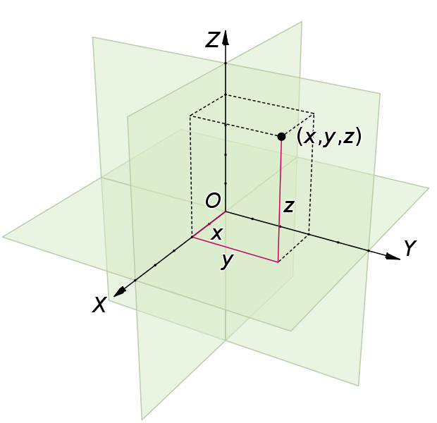
Cartesian coordinate system. In 3D, we define the origin (O) as the intersection of 3 mutually perpendicular lines X, Y, and Z, from which each reference plane — XY, XZ, and YZ — gets its name. The XY plane is traditionally the horizontal reference plane, but…
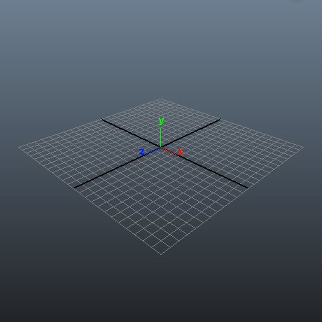
… it is an eccentricity of Maya that it uses Y to measure height and Z to measure depth. If you are coming to Maya from another 3D program or are already familiar with the conventions of Cartesian orientation, this can cause minor confusion.
This system for quantifying and systematizing geometry seems fairly dry and straightforward, but it contains powerful metaphorical implications. Of one kind of tactile expression of Cartesian geometry, Jorn K. Bramann writes:
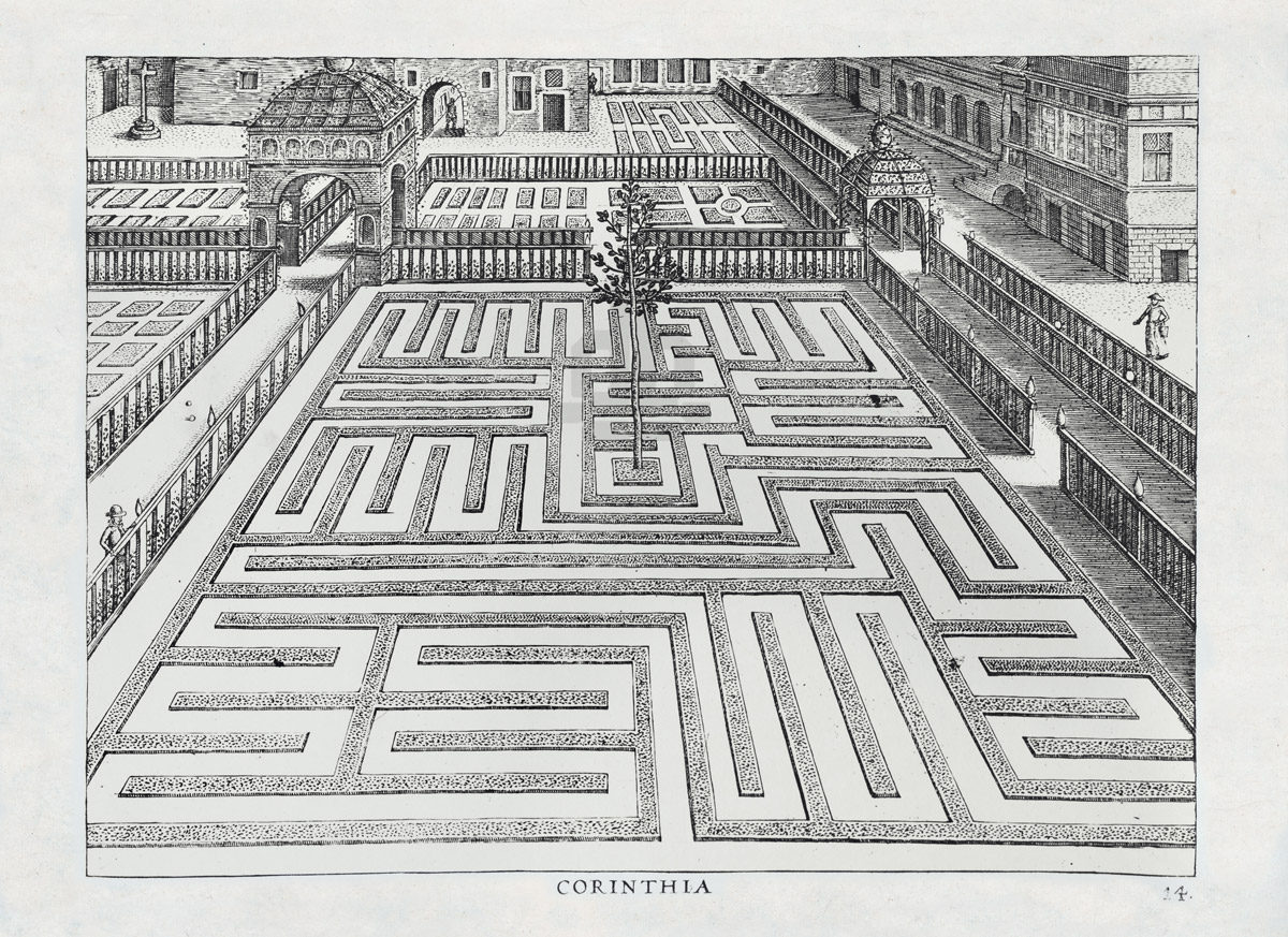
The French garden architecture of the 17th and 18th centuries is a striking demonstration of the spirit of Cartesian thinking. This type of landscaping, which was widely copied throughout Europe, is characterized by the demonstrative superimposition of geometric shapes and figures on nature. The natural terrain of a garden is not allowed to remain as it is found, but is carefully leveled, and then sectioned into regular parts until it resembles a mathematician’s blueprint. Plants are placed in such a way that they form straight lines, circles, ellipses, or artfully designed mazes. Individual trees and bushes are clipped until they represent perfect spheres, cones, squares, or other geometrical figures. It was the most deep-seated passion of the age to press nature into designs that are not natural. Pure geometry is a human creation, a creation of the abstract mind. To superimpose geometry on what otherwise grows in irregular forms was the lustful demonstration of the detached sovereign mind’s power over the external world. 2
Axis Mundi
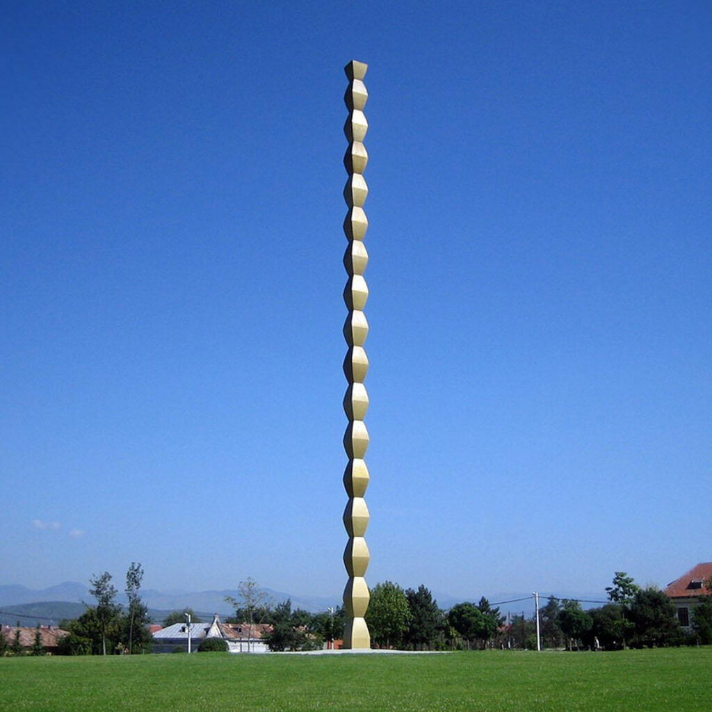
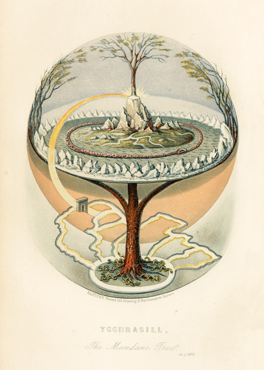
Note especially the tree in the center of the garden, acting as a kind of vertical axis to the horizontal plane. Even the axial system underpinning the Cartesian grid itself contains symbolic power. The concept of the Axis Mundi, a mythological center of the world, is another example of convergence between mathematical and tactile expressions of geometry. A powerful transcultural metaphor, the axis mundi is a vertical axis or column expressing both an umbilical and phallic origin of the world, a link between earth and sky. Sculptor Constantin Brancusi used this symbolism in The Endless Column, a monument to Romanian war dead.

GeoMATER: Joyce, Frascari, and three kinds of geometry
Now, aqua in buccat. I’ll make you to see figuratleavely the whome of your eternal geomater. And if you flung her headdress on her from under her highlows you’d wheeze whyse Salmonson set his seel on a hexen-gown.
— James Joyce, Finnegans Wake [emphasis by the author]3
Geometry is a very specific way of creating order, and modeling is a very specific way of working with geometry. But there is more than meets the eye — literally — when we discuss the use of geometry to create a model.
Marco Frascari, an Italian architect and design theorist, formulated three specific ways geometry is used in creative work, channeling the Irish author James Joyce to do so. Frascari appropriates the pun word geomater, a rich and metaphorical term coined by Joyce, who was famous (or infamous) for mashing up words to create new meanings.
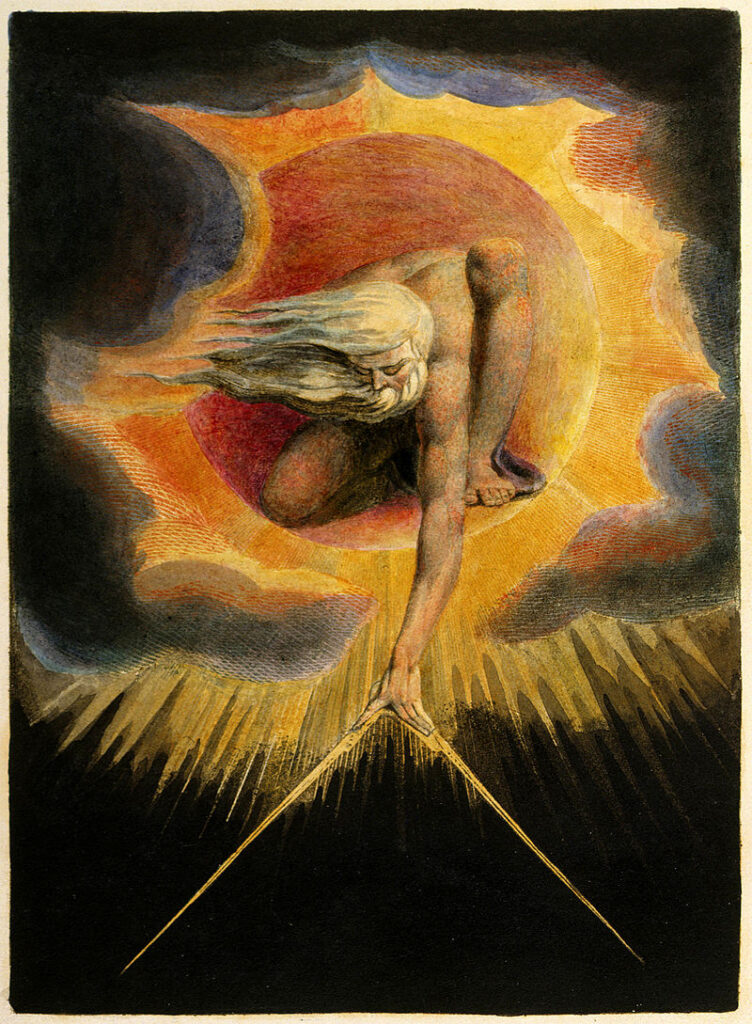
Frascari reveals how Joyce combined the words matrix, mater, and meter with geology and geometry in a pregnant (literally and figuratively) metaphor describing geometry as a discipline of prediction (the Mantic), creation (the Structure), and observation (the Body). He defines artists and designers as image makers constructing geomaternal figures in, about, and on this world. These figures are paintings, drawings, buildings, sculptures, and designed objects of every kind. They are, in his words, “material manifestations of the geometric science of visualization.” Frascari’s useful concept of geomater connotes that human-made things are developed in three coincidental and co-equal parts:
The Ancient of Days
Mantic
geometry
Mantic is a term associated with prophecy and divination. We see it as a root for words such as romantic (as in visionary).
Mantic geometry projects a possible future, making thinkable the yet-to-be-imagined, associated with layout and format.
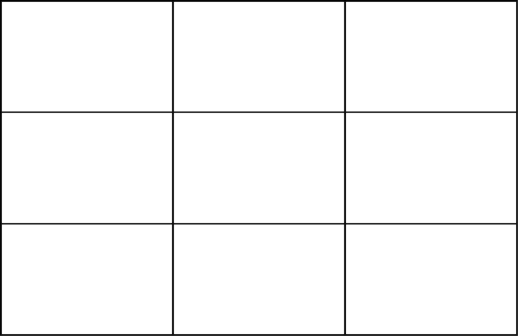
An example will be how we use a layout device, such as the rule-of-thirds grid, for composition:
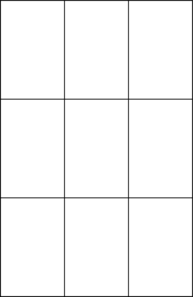
in a vertical format
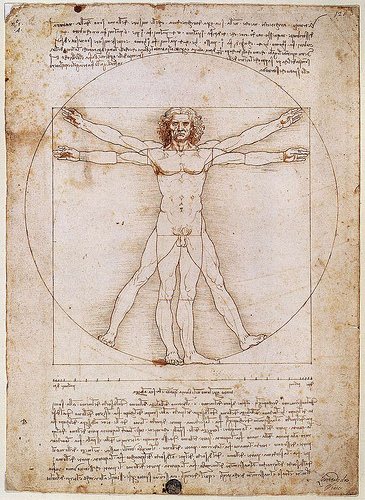
Vitruvian Man
Structure
geometry
Structure is an organization of interrelated elements in an object or a system.
Structural geometry controls pattern and hierarchy, making invisible relationships visible, associated with creation through ratio and proportion.
An example will be how we use polygon construction in developing a drawing structure:
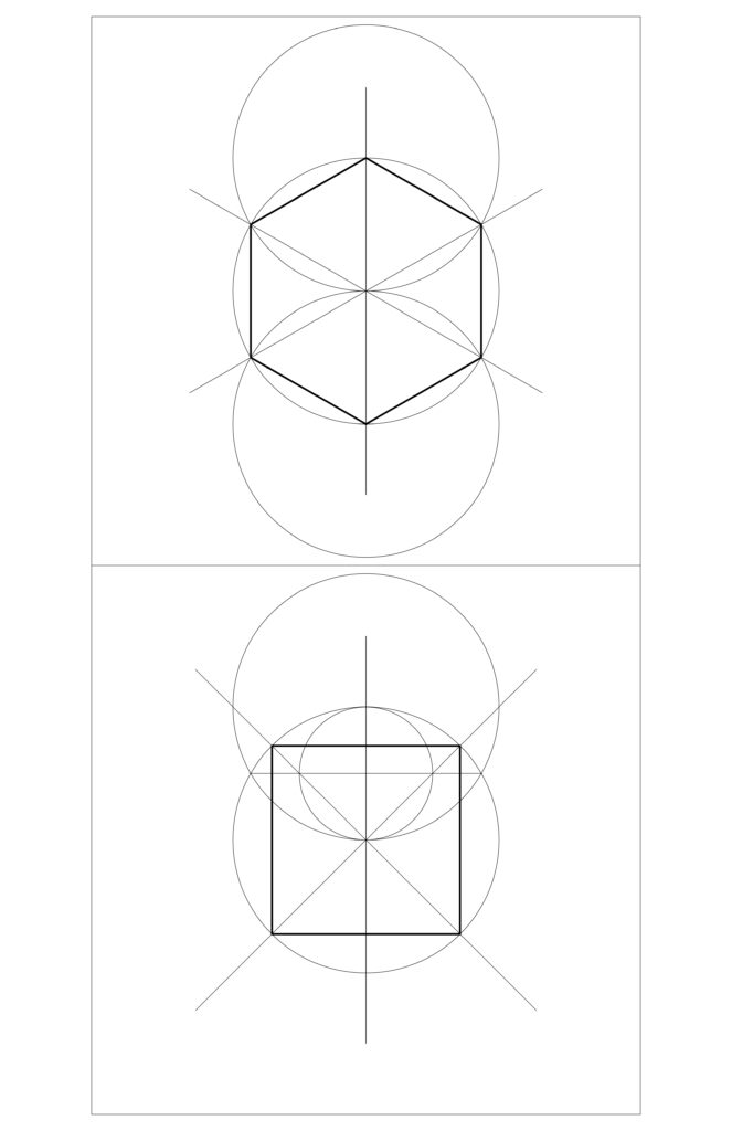
Bottom: square construction
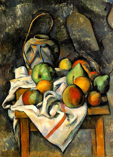
La Vase Paillé
Body geometry
In physics, a body is a discrete unit of material that is movable in 3-dimensional space. A body is also one’s physical self.
Body geometry determines tangible volumes, spaces, and surfaces, making material immaterial, through the application of geometric primitives: polygons, polyhedra, cones, cylinders, and spheres.
An example will be how we develop shapes and color into meaningful visual elements:

geometric construction
Frascari formulates these types of geometry to describe and control the image-making potential of visualization. They are not differences in kind, but rather different co-existing and co-reinforcing aspects of geomater, sharing the process of geometric construction and the logic of poetics, in the mechanical sense of an extended visual image or metaphor. Digital modelers may use these concepts of geometry to guide the creation of work.
Mantic geometry in creating a proportioning system
Format

Frascari’s Mantic geometry establishes the format and orientation of a composition. In painting, even the orientation of a canvas presents an authorial choice: horizontal or vertical — or omnidirectional? This creates what is known as the format: the basic ratio relationship of height to width of the visual field, or the volume of a mass or void space. While there are unusual formats to be found in the world — square, diamond, oval, and circles — the common choices in basic drawing are these:
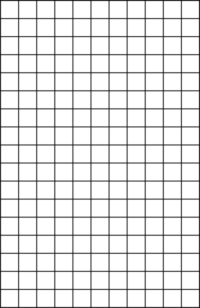
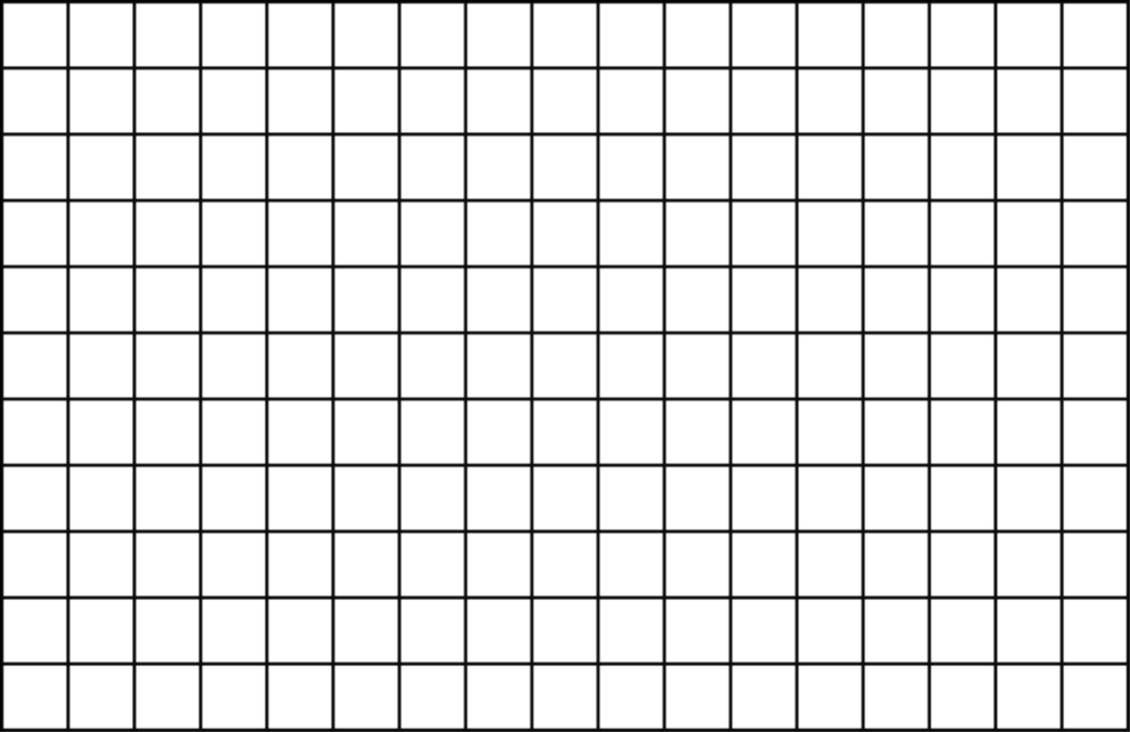
Recall that Bauhaus Master Wassily Kandinsky called the visual field of the paper or canvas the Basic Plane. He described vertical and horizontal as having an innate character he terms tonality. He considers the vertical basic plane to be warm and therefore active, while the horizontal is cool and therefore passive. So we make our first decision, the format, based on whether we wish to develop an energetic or calming presence in our work. We often see a blank piece of paper or a void space and we freeze, not knowing where to make the first move. Once we realize a blank is not blank, but instead contains innate Mantic clues, it becomes less difficult to create a composition.
Proportion grids in the format
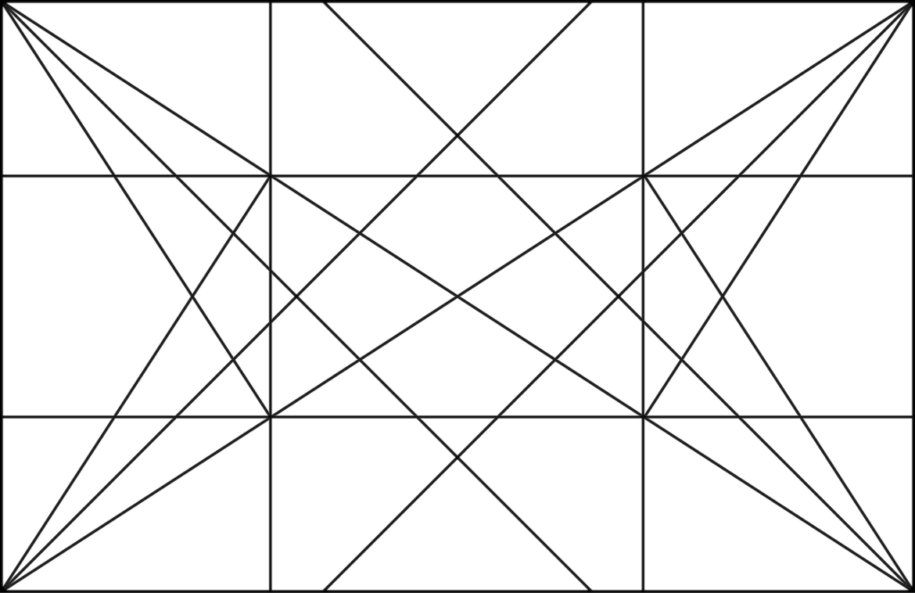
Any visual field format contains intrinsic geometric relationships that can be expressed by drawing controlling grids or geometries. Just a few of the major types, compared to the ratio of an 11 x 17 piece of paper:
Dynamic Symmetry Grid
Rule of Thirds Grid
Golden Ratio ( ɸ )
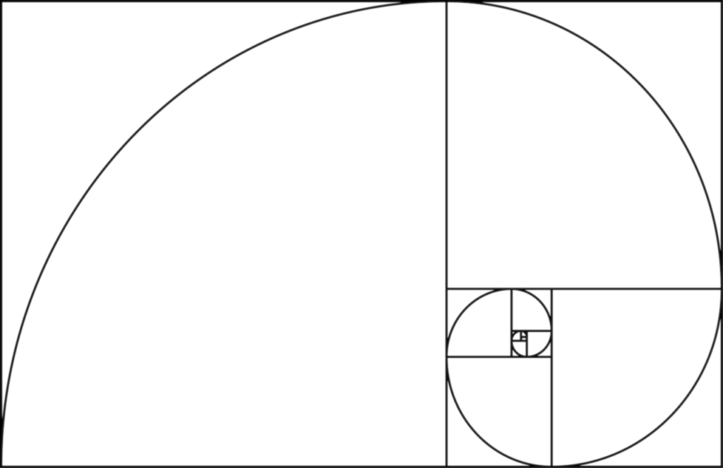
equals the Golden Ratio, ɸ (phi).
The inverse of the Golden Ratio:
1/0.61803… = 1.61803…
Fibonacci Sequence ( Fn )
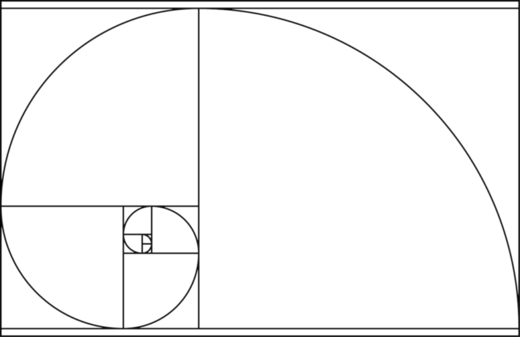
gives the sequence:
0, 1, 1, 2, 3, 5, 8, 13, 21, 34,… ∞.
As Fn rises, ratios approach ɸ!
Some smartphone photo apps contain these types of grids, and we see a rule-of-thirds grid in Photoshop’s Crop tool. A modeled primitive solid divided into faces and edges can be modulated in the manner of these grids. The various geometries help to predict symmetry or asymmetry, stable or dynamic compositions, focal points, and hierarchies. They can be flipped horizontally or vertically, and can even be combined.
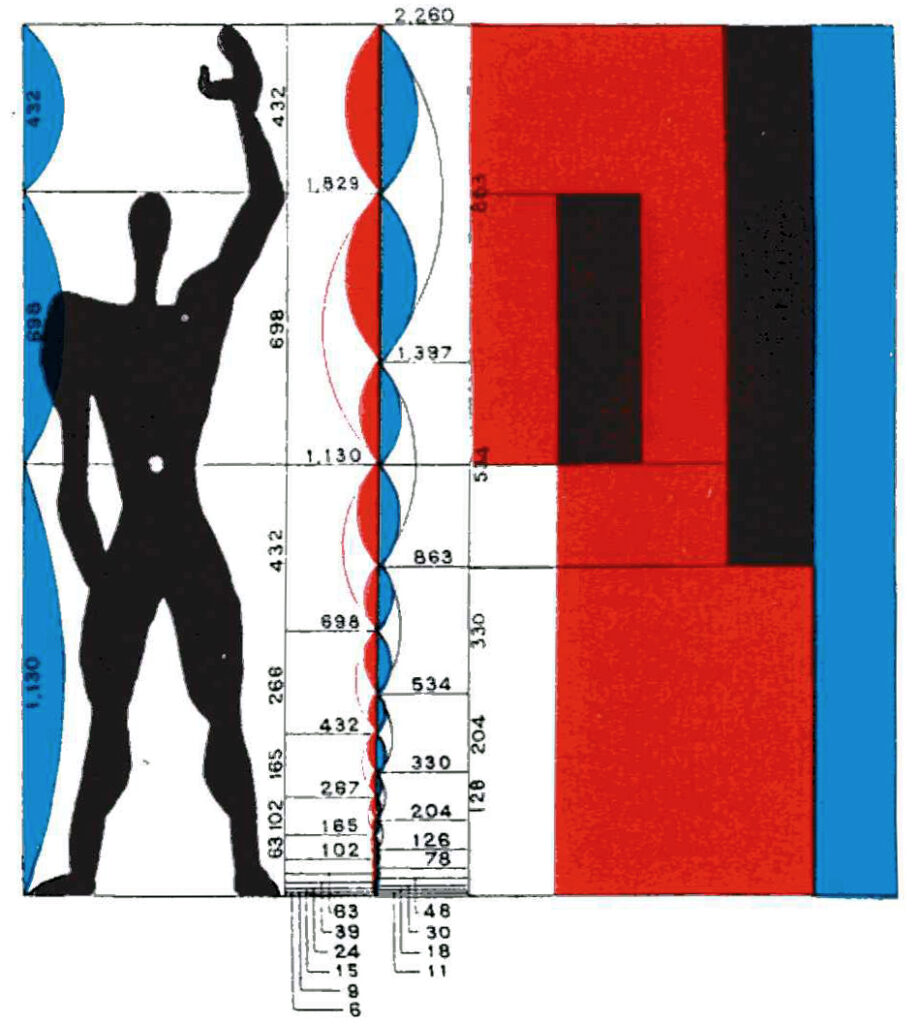
There is no set recipe for using any proportioning system, but one painter-architect of the 20th century, Le Corbusier, found a way to reconcile competing units of measure (the English and Metric systems) with human proportion and three-dimensional space. He called this system the Modulor. Notice how the values in the system relate to the Golden Ratio ɸ, and how some sequences behave in a Fibonnaci-like manner.
Of Le Corbusier’s system, Albert Einstein said: “It is a scale of proportions which makes the bad difficult and the good easy.” 4
Structure geometry for internal proportioning

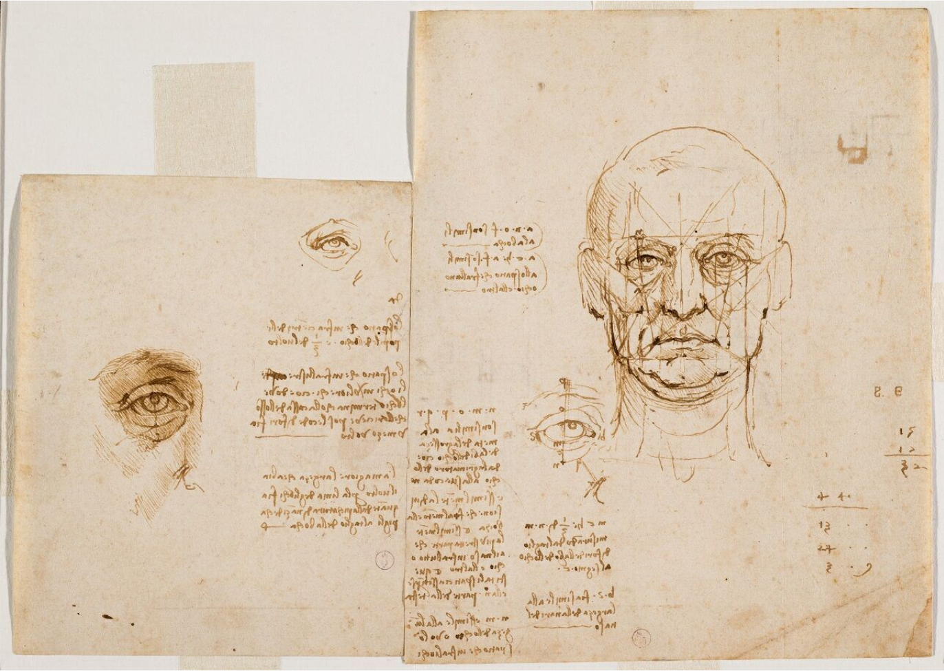
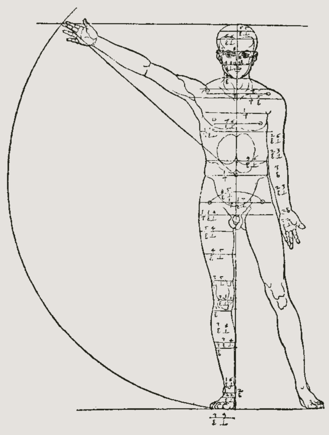
The Modulor Man relates the human form to the built environment. As such, it builds a bridge between Frascari’s Mantic state of proportioning and his Structure state of geometry. Where Mantic grids control compositional relationships among objects, Structure is a geometry that controls what you see within an object. The easiest expression of structural geometry to understand is that of an axis of symmetry. Recalling da Vinci’s Vitruvian Man, we understand there is a line, an axis, that runs down the center of the human form — it’s not there, but we all see it inferred by left-right correlations.
Branching off of that geometric axis, several other lines of geometric proportioning can be derived, as we see in da Vinci’s sketchbooks:
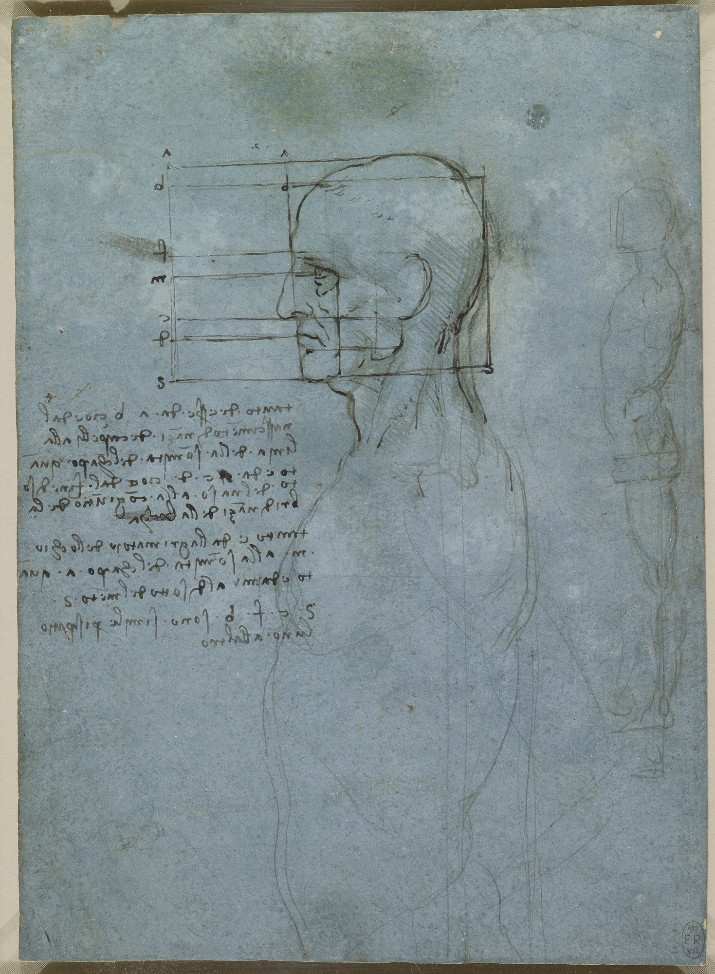
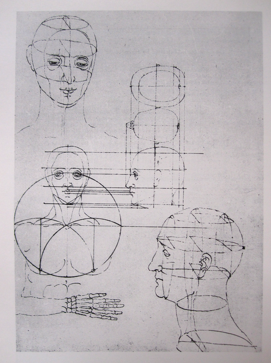
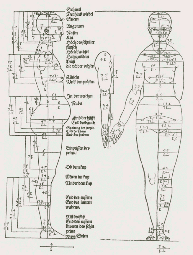
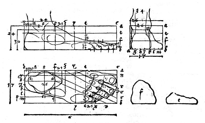
Da Vinci’s method of geometric analysis was also employed by Albrecht Dürer, whose volumetric analysis presages wireframe modeling, as Structure geometry approaches the condition of Body geometry:
Body geometry and the visible world

Mantic geometry predicts a compositional logic and Structure analyzes found proportion within individual composed elements, but both are hidden geometries — a topic we’ll explore in greater depth. It is Frascari’s Body geometry that articulates the things one sees. We’ll explore this by returning to Cézanne and the Primitives, and observing how he works with Body geometry.
Here, we’ll analyze his Still Life With Apples that we introduced the Primitives with:

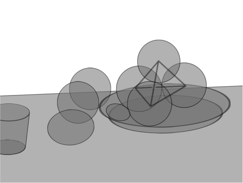
Notice it’s not enough to say “OK, the apples are round.” For example, he incorporates fruit based on elliptical solids that create a transition between more spherical fruit and perceived oval states of plate and cup. Rationally, we know the plate and cup to be based on cylindrical and conic primitives, but visually they generate ellipses. Groups of elements, such as the stack of apples, create a larger hierarchic element that is in turn controlled structurally by a tetrahedron. Even without color and contrast, the shapes themselves begin to develop a tension of pairings and groupings controlled by geometry.
Now, we understand that Cézanne creates an abstraction of these forms, not a highly realistic image. He distills and presents shape and color. When we further isolate shape, we begin to perceive the Primitives, but they are still peeking out from underneath the veneer of color. So we can say that Body geometry, while more apparent to the eye, is still hiding a bit under the surface of the object we see — an apple, after all, is not perfectly round like a primitive sphere.
So, if all of Frascari’s three kinds of geometry are hiding to one degree or another, how can we use them in modeling?
Hidden geometry
Let’s expand on those geometries by seeing how we might express them visually. The samples are visual descriptions of such hidden geometries as the datum, various axes of symmetry, orthographic drawing, and systems for drawing irregular, curving forms.
Expressing a datum
The Axis Mundi we learned about above is the first example of a fanciful, metaphorical datum. A datum is an arbitrary but conventionally agreed-upon point of reference, something used as the basis for measure or calculation. Among many others, some historical expressions of a datum include:
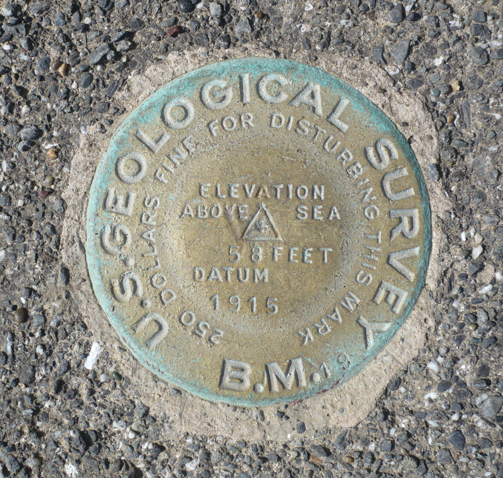
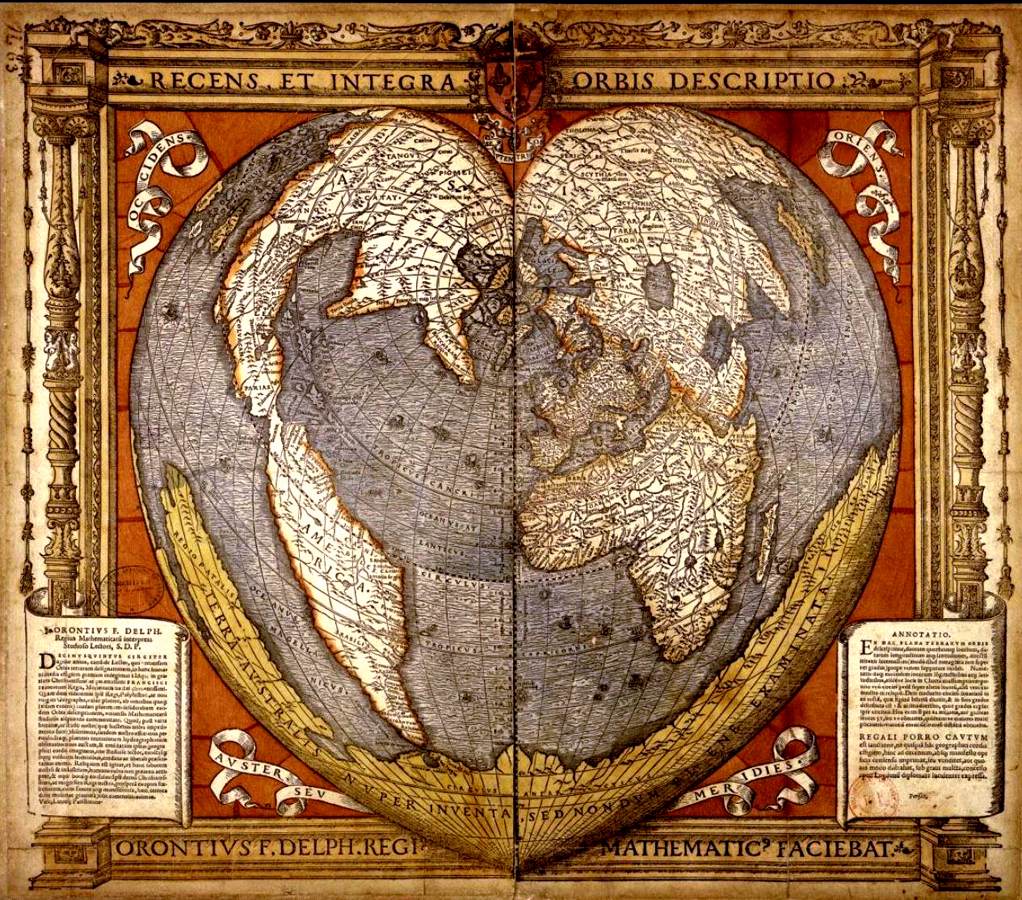
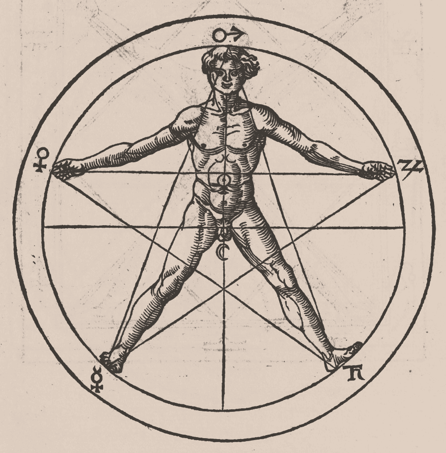
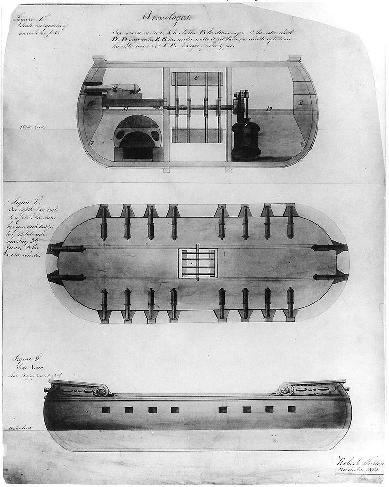
Expressing axes of symmetry
One datum in particular that is often hidden but important to express is the axis of symmetry.
Bilateral symmetry
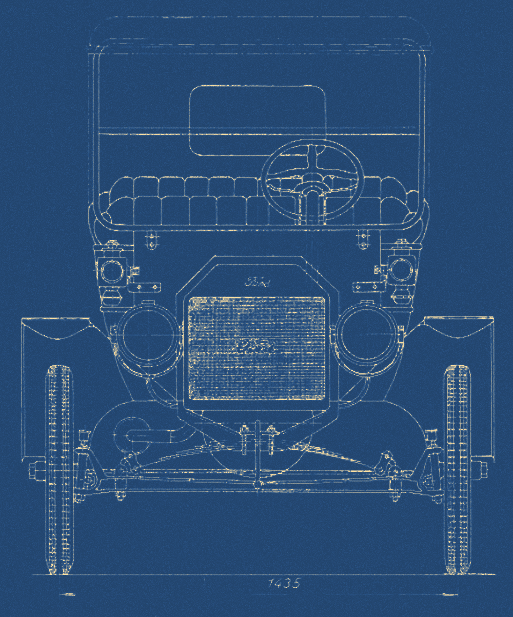
As we see da Vinci’s drawing of the Vitruvian Man above, humans along with many other living beings are biologically organized along an axis of bilateral symmetry. Many machines and architectural constructions also harbor bilateral axes of symmetry.


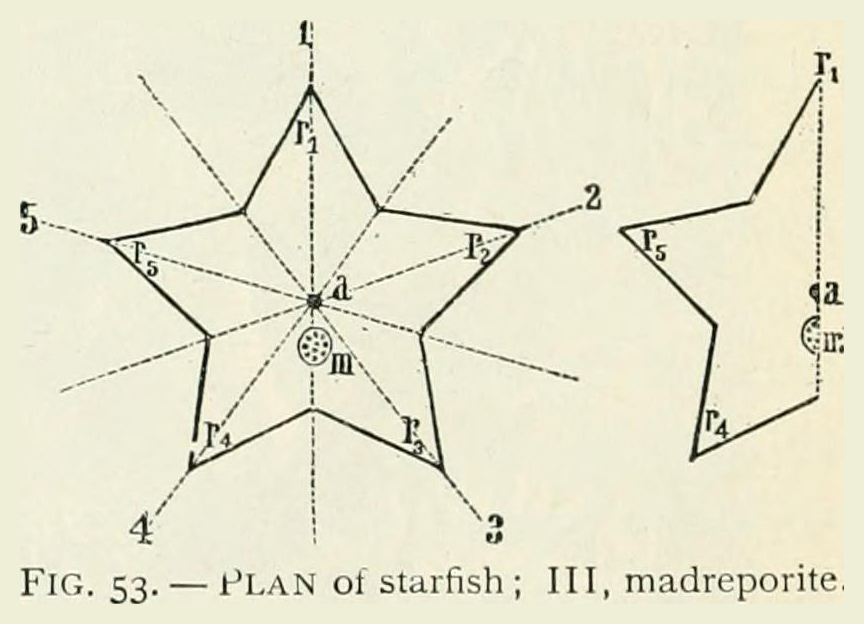
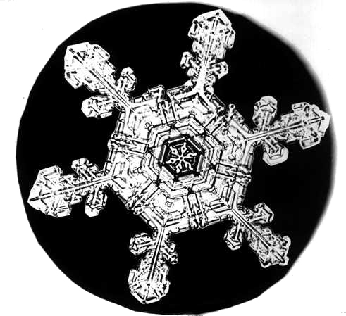
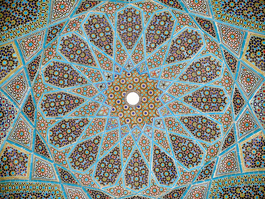
Radial symmetry
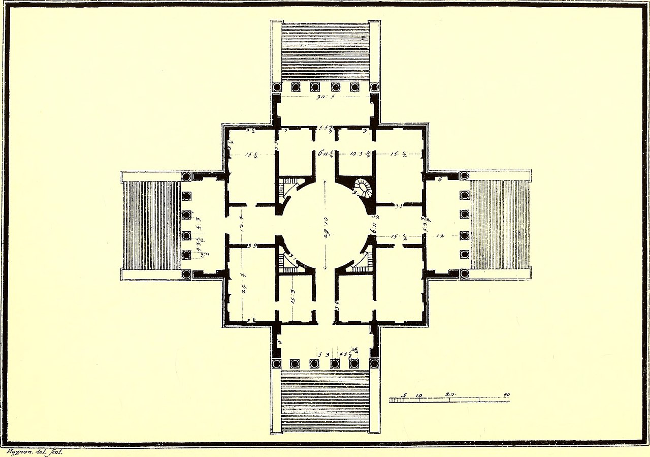
In the Villa Rotonda facade we see bilateral symmetry. In its floor plan, we see axes of symmetry in multiple directions, creating the condition of radial symmetry. Many types exist:

Self-similarity: symmetry in scale
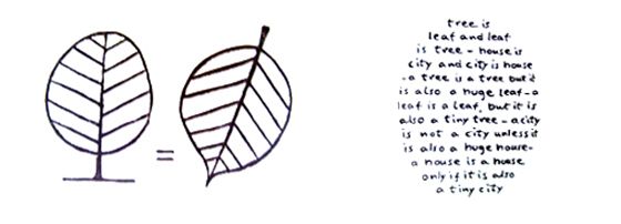
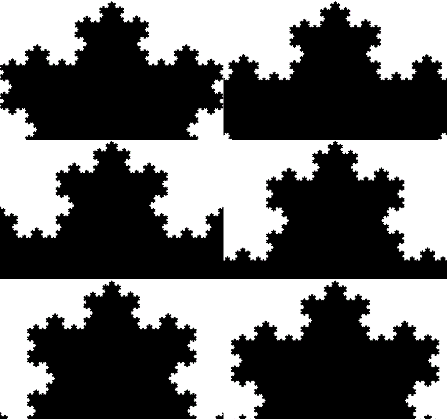
When a part is similar to its whole, such an object exhibits self-similarity. It is a scalar complement to symmetry.

“Near” symmetry
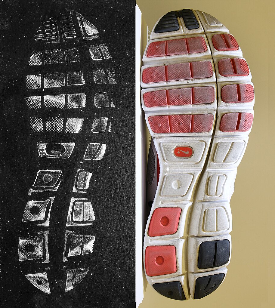
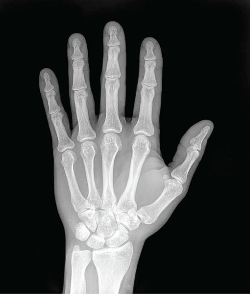
Certain objects display a tendency toward symmetry. We may even recognize an axis, although it (or the object controlled by it) exhibits distortion.

Expressing coordinate systems
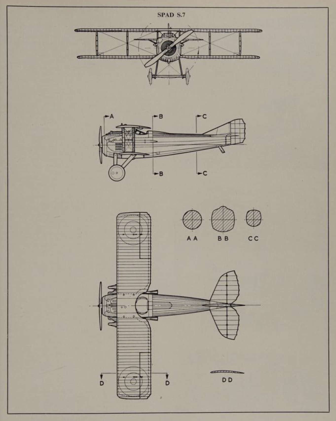
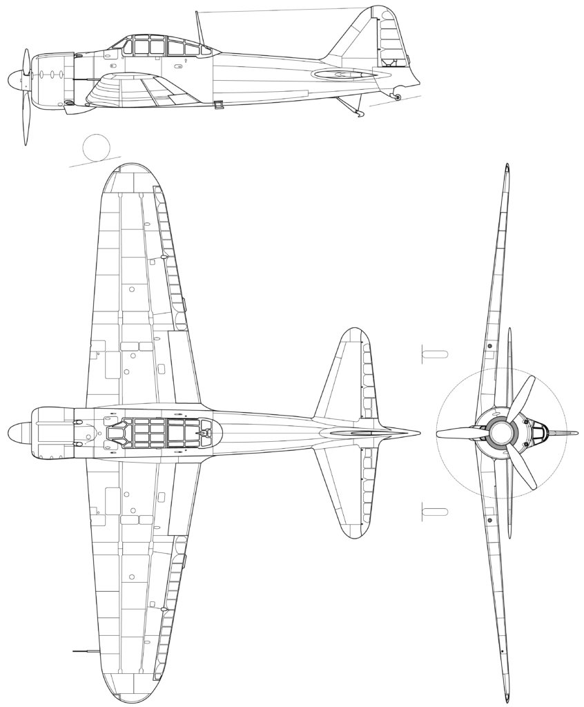
Orthographic and 3-view drawings
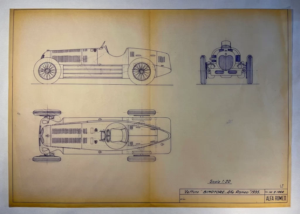
The orthographic 3-view drawing remains an important tool to visualize coordinate systems, even in a post-mechanical-drafting workflow. We’ll drill much deeper into orthographic projection in another chapter.
As a practical tool, it verifies that information seen in one coordinate view correlates with information seen in others, guaranteeing the precision of data.
Section drawings
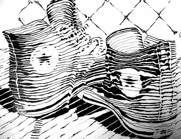
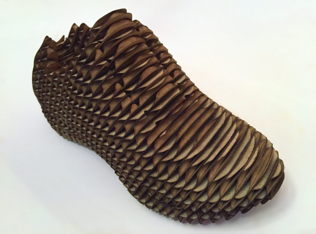
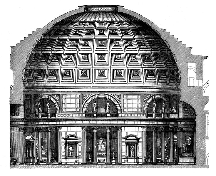
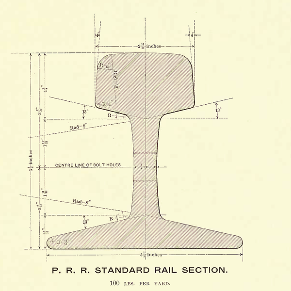
If orthographic drawings show us the surface, sections oriented to particular coordinate planes will reveal the interior of the object: the topological division between the mass of the object and the void that surrounds it. Let’s explore Dürer’s head analysis visualizing formal slices, along with other examples.

Generating irregular form
Topographic lines
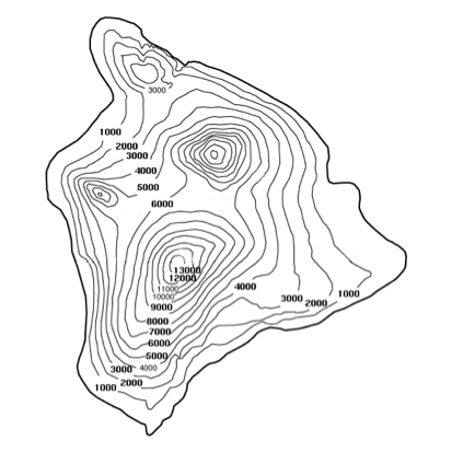
A topographic map uses a stack of horizontal sections: a regular division of elevation to describe the height of land above sea level. Think of the topographic levels as slicing planes parallel to the plane of sea level. This modulates an irregular surface, making it easy (ok, easier) to describe. Here are three topographic descriptions of the island of Hawaii for comparison, the bottom one interactive.

Animated SVG: drag or tap to turn
Boat lofting
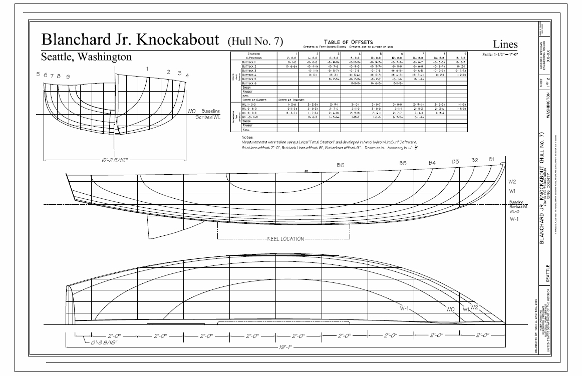
Like topographic lines, the drafting technique of lofting can generate complex curving forms. We use lofting in boat building to describe the streamlined shape of the hull. Usually, we divide a profile into 10 or so equal parts, creating a series of parallel sections that describe the shape of the hull. Because the boat is bilaterally symmetrical from the front coordinate orientation, you can see how the drawing is “halved” to describe the rear, then the front, of the boat. The deck plan is also a half-drawing, cut at the centerline as a datum.
- Loran, Erle. “Cézanne’s Composition.” University of California Press. 2006. p. 9.[↩]
- Bramann, Jorn K. “Descartes: The Solitary Self.” Philosophical Forum at Frostburg State University. 2004. http://faculty.frostburg.edu/phil/forum/Descartes.htm[↩]
- Joyce, James. Finnegans Wake. Penguin Books. 1999. pp. 296-7.[↩]
- Quoted by Le Corbusier in “The Modulor: A Harmonious Measure to the Human Scale, Universally Applicable to Architecture and Mechanics, Volume 2.” Birkhäuser. Basel, Switzerland. Reprint 2004. p.58. [↩]

