

videoMashHTML
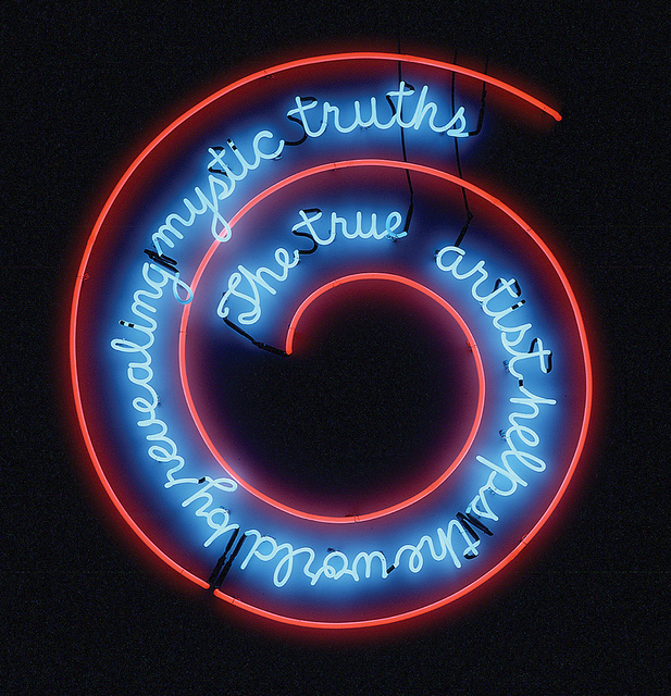
Intermediate HTML (with a dash of CSS)
We’ll use HTML tools that allow a great deal of visual order to create a curated website in an exercise we call Video Mash.
Video Mash is a small, curated website that requires directory skills, a simple navigation link strategy, knowledge of embedding video via iframe, and control of screen real estate through the use of Semantic HTML. Though we’ll need a bit of CSS, the focus in this exercise is on expanding your HTML skills.
TangenT ArT CollaboraTive, First Cut Sketch, 2010 — one of the video embeds in the sample site.
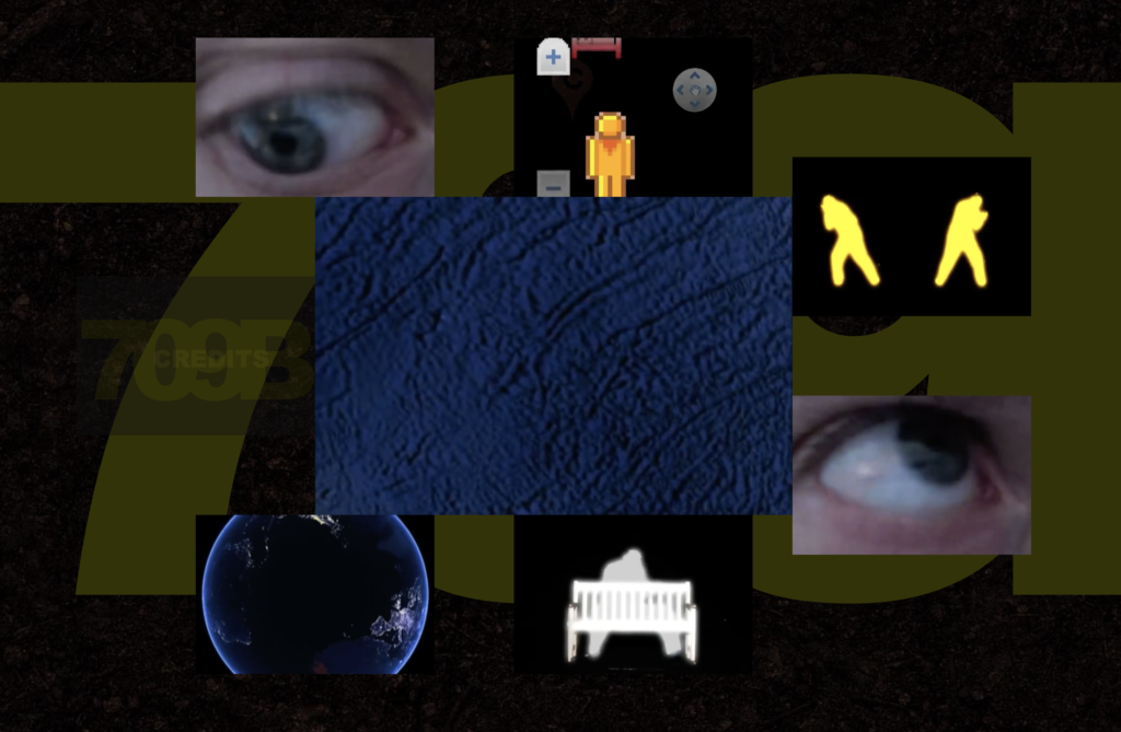
TangenT ArT CollaboraTive, 709b, 2010-11
Before doing the exercise, visit TangenT Art Collaborative’s 709b, a web “installation” using embedded videos. The site demonstrates the importance of adjacency and positioning as formal principles. 709B places multiple video embeds in one page, allowing them to be seen simultaneously. TangenT was active between 2008 and 2020, when the pandemic forced the collaborative to disband.
Creating a curated website
Below, we’ll go step by step through the creation of a website where we appropriate video and motion graphics, creating a story framed by some kind of iconic group. In our sample Video Mash, we chose Rock Paper Scissors. You can use that, or you can develop something similar with a small group of 3 or 4, like:
THREES
- Earth, Air, Fire, Water
- Blood, Sweat, Tears
- Red, Green, Blue
- Father, Son, Holy Ghost
- Life, Liberty, Pursuit of Happiness
FOURS
- Diamonds, Clubs, Hearts, Spades
- Cyan, Magenta, Yellow, Black
- Dawn, Day, Twilight, Night
- Leonardo, Michelangelo, Donatello, Raphael
- Solid, Liquid, Gas, Plasma
You get the idea, right? With idea in hand, let’s code!
Bare bones
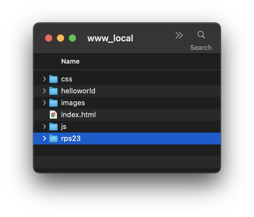
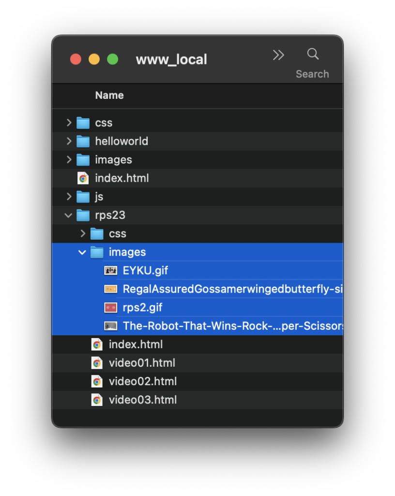
Define a site in Dreamweaver in a directory folder named video-mash or something equally logical. Our folder was named rps23, standing for Rock Paper Scissors plus the year it was made. Place this folder in your local root folder. It will be a subdirectory in the root folder, in effect partitioning the work to become an autonomous mini-site in the same manner as your helloworld exercise.
Step 1: Semantic HTML
In Hello World, you structured your site using <div> and <span> tags. These are great, but when you’ve created a highly structured complex web page, it gets hard to tell what kind of role has been assigned to one of these tags. Does that <div> hold a navigation bar? Even worse, when you get down to the closing tags, you can see this kind of nightmare:
         </div>
      </div>
   </div>
</body>
</html>
Even if you’ve been careful with tabs on your nesting <div> tags, it’s nearly impossible to tell which closing tag belongs to which element.
If you just had something more descriptive, you might be able to keep track of the hierarchy. You could, for example, use HTML comments. The comment tag is distinctive: <!-- comment goes here -->. This is a way of making notes on the code that the browser won’t display:
         </div><!--end content-->
      </div><!--end footer-->
   </div><!--end container-->
</body>
</html>
But while we dearly love and encourage carefully commented code, this solution is a sludgy one, almost as bad as the problem it tries to solve. Fortunately there is something that brings clarity to the chaos: Semantic HTML!
A semantic element clearly describes its meaning to you. It also helps a browser that’s been trained to recognize semantic tags understand what and how to display an element, and it’s an accessible assist to users with a screen reader. Almost all modern browsers understand semantic tags.
So if you have a footer with some content, all sitting within an overall container, your close looks like this:
         </div>
      </footer>
   </container>
</body>
</html>
Semantic elements as building blocks in a wireframe
Most websites have a structure. You may recognize elements like a header title, a bar for navigation, a main content area, perhaps a sidebar, and a footer at the bottom. Many contain code like <div id="header">, <div id="nav">, or <div id="footer"> to indicate a header, navigation, or footer. In Semantic HTML some semantic elements can be used to intuitively and clearly define different parts of a web page without resorting to IDs or comments. We can visualize these in a wireframe:
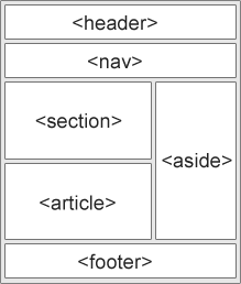
A wireframe structure of a typical website
We’ll keep our site structure pretty simple for this exercise. Open the link for Step 1 to inspect the code.
- In Dreamweaver, create a new HTML document in our new directory. Name the file index.html, and note it comes automatically loaded with a
<head>pair, a<title>inside the head, a<body>, and other elements. - Nested inside
<body>, write in the semantic<container>tag. Don’t forget the close:</container>! - Semantic elements can nest just like generic
<div>tags. Inside<container>, add a<header>,<nav>,<main>, and<footer>tag. You can use Dreamweaver’s Menu Insert > to add most of these, or you can write them by hand. - Inside each element, create an empty
<div>. If you use Dreamweaver’s menu to add this HTML element, it will contain the boilerplate text Content for New Div Tag Goes Here.
Save and open the page in a browser. This doesn’t look like much, but open the source code and you’ll see the beginning of a structure.
Step 2: Descriptive content in a tabbed hierarchy
Open the link to Step 2 to see the sample code. You’ll see some comments to guide you with the steps below.
Let’s change the boilerplate to something we might use in the site:
- First, take some time to change the
<title>tag content in the<head>so this title will display in a browser tab. Our sample site is Rock Paper Scissors. - In
<header>, title the work. Notice we’re adding a special character known as a non-breaking space — — so that it won’t word-wrap when the browser resizes. - In
<nav>, create some<span>tags to contain a generic navigation flow: previous, home, and next. We’re using a few non-breaking spaces to visually separate the text. By the way, don’t worry that there’s nothing to link to at the moment. The code on this page will eventually become a template for other pages, and you’ll see this is a big time-saver. - In
<main>, just write a brief introductory phrase to introduce the site. In our sample, we used let’s settle this like adults as a cheeky phrase people use when playing the rock-paper-scissors game. - Finally in <footer>, include something appropriate to suggest purpose and authorship. In our sample, we used a web art installation by williamCromar 2023.
Save the file and inspect it in a browser. There’s not a lot to see, but the descriptive content is starting to create a sense of purpose.
Structure and style
Step 3: External CSS to style fonts, links, and sizes
Open the link to Step 3 to see the sample code, and note that there is an external CSS document linked. You’ll see some CSS comments there: /* comment goes here */. These comments will guide you through the steps below.
In your directory, create a subdirectory and name it css. In Dreamweaver, create a new CSS file and give it a logical name. For the sample file, we named ours rps-styles.css. Place it in the css folder.
- Recall from the previous exercise: it’s easy to attach a CSS document using the Properties palette, finding the Class button, and selecting Attach Style Sheet… to navigate to our file.
- Once we’ve attached the CSS, we’ll use Properties: CSS: Page Properties to open the Page Properties dialog box.
- As we did in the previous exercise: we’ll select a Page font family, choose a text and background color, and style the links. As before, it will generate the code in the HTML head, so we have to copy and paste it into the CSS, and then delete it from the HTML.
- Now, for most of the elements, we want to create a unique color to help us visualize the sizes we’ll create. You can use CSS Designer or hand-code these element styles. Note that we are not creating classes or IDs here: we are styling by selector. So, for example, to apply style to the
<header>tag, we simply writeheader { }.
Add properties to elements
These are the color and size values for the elements in our sample. Breaking this down a bit:
- Colors are just arbitrary shorthand hex notation for gray tones, like
#cccand#999. These are temporary and will be changed later. - Heights are accomplished by a combination of
heightandpaddingvalues. So, for example, the header is 100px tall: 60px for height plus + 2•20px for padding. Notice there is only padding for<main>, because its height can vary with its content. - What about
width? One of the benefits of Semantic HTML is that browsers assume a 100% width for structural elements like a header or footer, so no declaration is necessary!
header {
    background-color: #ccc;
    color: #fff;
    height: 60px;
    padding: 20px;
}

nav {
    background-color: #999;
    color: #fff;
    height: 20px;
    padding: 20px;
}

main {
    color: #fff;
    padding: 20px;
}

footer {
    background-color: #999;
    color: #fff;
    height: 20px;
    padding: 20px;
}
Open the file in a browser window and inspect it. Notice how the width changes automatically as you resize the browser window horizontally.
Step 4: Create a heading, centered text, and a sticky footer
Open the link to Step 4 now, commented as above to assist with the work.
We’re doing some formatting in this next step that provides more structure and a measure of responsive design. Though our code is not fully responsive in this exercise — that’s going to take more skill-building than we have time for — you’ll see how this page will work on a variety of browser window sizes.
- Select the title text and use the Properties palette HTML: Format: Heading 1 to format it as
<h1>. Observe the text change in size, but notice the header element does not change height. - Now, select each element from open to close (for example: select <header> and all the contents up to and including the
</header>close). For each element, use the Properties palette CSS: Align Center icon — it looks just like a justification icon from Word. Notice that the property and valuetext-align: center;are written directly in the CSS file now!
What is a “sticky” footer?
Now comes the tricky part: we need to create a “sticky” footer. That’s a footer that will stay at the bottom of the browser window no matter the size of the content in <main>… except when that content is taller than the browser window! In that case, we want the footer to “stick” to the bottom of the content, not the window. This seems like a super tricky thing to pull off, but the answer is deceptively easy, if not entirely intuitive. We find it in Chris Coyier’s post on the topic at CSS Tricks, a widely respected developer site. The simplest coding solution involves the use of the CSS calc() function:
- In the CSS, find the
mainelement and add amin-height:property with thecalc( )function inserted as a value. - Here’s the secret sauce: we can make the minimum height for
mainvariable by subtracting the total height of all the other elements from 100% of the viewport height.- In CSS, the viewport height can be expressed as a unit: vh.
100vhis 100% of the viewport height. - The total height of all other elements is 256px. The bottom line math is this:
- In CSS, the viewport height can be expressed as a unit: vh.
main {
    color: #fff;
    min-height: calc(100vh - 256px);
    padding-top: 20px;
    padding-left: 20px;
    padding-right: 20px;
    text-align: center;
}
100px (header height + 2X padding)
+ 60px (nav height + 2X padding)
+ 20px (main top padding)
+ 60px (footer height + 2X padding)
+ 16px (2x default browser border)
= 256px (fixed heights to subtract from variable main height)
By tying the minimum height of <main> to the viewport height, whenever the content height is taller than the viewport — that is, more than the minimum — the footer will stick to the bottom of the content, not the window. But whenever the content height is shorter than the viewport — that is, less than the minimum — the footer will stick to the bottom of the window, not the content. Get it?
Step 5: Create site pages, customize navigation, and link
Open the link to Step 5 now:
We’ve spent a lot of time just working on one page. Is it going to as long to create all the other pages?
Thank goodness, NO! Most everything we’ve done for index.html will work for other pages. We’ll simply copy and paste index.html in the directory window, change file names, and then do some tweaking.
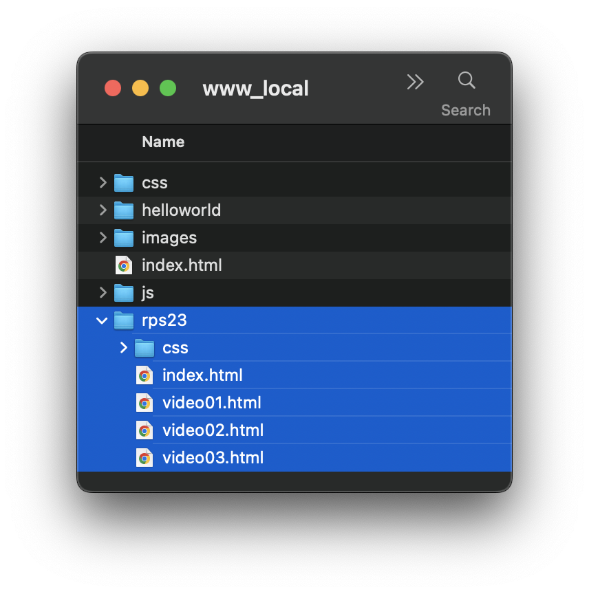
- In the directory, copy index.html 3 or 4 times, depending on the pages needed.
- Rename the files. In the sample, we named them video01.html, video02.html, and video03.html.
Open each of the files in Dreamweaver to adjust navigation and create links:
- In index.html, you’ll need at least one entry into the cycle of pages. In ours, we deleted previous and home along with all spans and non-breaking spaces associated with them. Your scheme can be similar, or not. An alternative, for example, could be changing previous, home, and next into rock, paper, and scissors, and linking to all the pages.
- On all other pages, we leave existing spans and text intact. This provides links to return home anytime or travel forward or backward along the cycle.
- Back in index.html, we select next and use the Properties palette HTML: Link to connect to video01.html. We use the folder icon to navigate and select that file. Note the code Dreamweaver creates.
- Now go into each file, and create links in the same manner, as appropriate to each page’s position in the cycle. For example, video01.html navigation will link previous to video03.html, home to index.html, and next to video02.html.
Use File > Save All as a quick way to save all the work being done in multiple pages, then open the home page in a browser window and test all the links.
Content and refinement
Now the fun starts! We’ve manufactured the digital equivalent of a blank book, now let’s fill it. Video Mash is an appropriation project throwing lots of motion together on a page. Appropriation is an art-historical term that refers to the practice of artists using pre-existing objects or images in their art. Much of web art is based on mash-ups, remixes, and transformations. These are not the same as stealing or plagiarizing, though there is a gray area here one should be very mindful to avoid. The best way to stay out of trouble is to create a citation or a link back to the original material, which we will do.
Our goal here is to appropriate existing motion graphic elements and transform their content by collaging them in HTML and CSS.
Step 6: Add animated background images
The humble looping GIF animation is a favorite of many artists working on the web, including this author. Visit the Step 6 link for the sample file to see how we used GIFS as background images:
For this step, we spend some time doing intelligent keyword searching in a browser for images that relate to our topic. This can take some time as you consider myriad choices! The material we found for 4 discrete pages includes the following. Click on each one for the source:

First, some directory work:
- After collecting your moving images and making note of the sources, create a subdirectory in the root folder named images.
- Insert your images in that folder. If the names are unwieldy, you may choose to rename them.
Now, to Dreamweaver:
- Go to index.html.
- Use Properties palette CSS: Page Properties to open the Page Properties dialog box.
- Under Appearance (CSS), Browse for the Background image: and select. You’ll see the URL populate the field.
- Under Repeat: select no-repeat. Click OK.
- Repeat for the other pages.
Observe how Dreamweaver places the images. Depending on the size of the original, you may feel disappointed, but fear not: we can introduce some code by hand that can make the background responsive:
This is the code Dreamweaver created in the <head> in our sample:
<style type="text/css">
   body {background-image: url(images/rpc2.gif);
   background-repeat: no-repeat;
   }
</style>
We’ll add the following properties and values, highlighted in red:
<style type="text/css">
   body {background-image: url(images/rpc2.gif);
   background-repeat: no-repeat;
   background-attachment: fixed;
   background-position: center;
   background-size: cover;
   }
</style>
Observe the image again by opening it in a browser and resizing the window. You should see the background image shift to fill the entire viewport, no matter the size. Do this for each page.
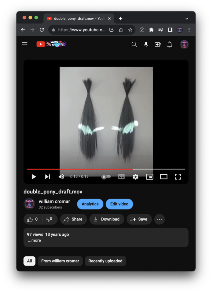
Step 7: Add iframes and customize videos
The <iframe> tag will allow us to embed videos from other sites. Visit Step 7 and click on the interesting new link elements to see the embedded videos on all the pages:
In this step, we’re seeking out videos that embody our theme: one for rock, one for paper, and one for scissors. Using keywords in a browser search for videos, we spend some time deliberating how these would affect each other when we juxtapose a pair of videos on one page. In the Rock-Paper-Scissors game, we know rock dulls scissors, paper covers rock, and scissors will cut paper. So that’s driving our choices, and it will also create an opportunity to make other minor refinements.
Here are the videos we chose, embedded in iframes, and since they link back to the sources, you can find where we found them:
You might find these YouTube videos present in a unique way. Their sound is muted, they resize, and they loop when they play, among other behaviors (and if you happen to see a warning instead of a video, refresh this browser screen). We’re going to learn how to customize video iframe presentation using a combination of CSS and the YouTube iFrame Player API, both discussed below.
Create the iframe
YouTube will generate an iframe embed for you:
- Visit the video you wish to embed on YouTube and find the Share button.
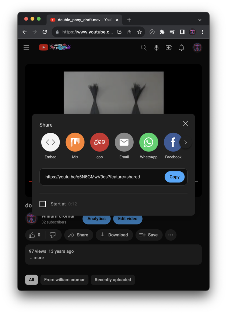
- After selecting Share, find the Embed button in the dialog box.
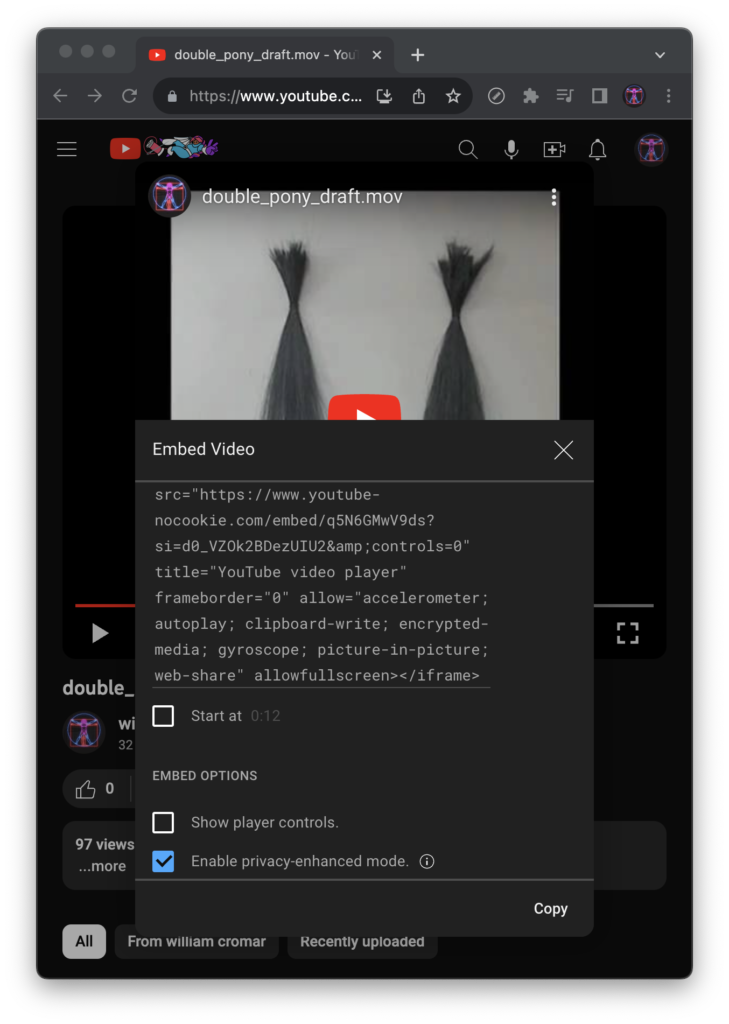
- Uncheck share player controls and check enable privacy-enhanced mode, then copy the code.
The embed written on YouTube is this:
<iframe width="560" height="315" src="https://www.youtube-nocookie.com/embed/q5N6GMwV9ds?si=t0oDSbNDwxvfmUcW&controls=0" title="YouTube video player" frameborder="0" allow="accelerometer; autoplay; clipboard-write; encrypted-media; gyroscope; picture-in-picture; web-share" allowfullscreen></iframe>Modify with CSS
Some of that code, we don’t need. For other parts of it, we’ll work with CSS. So the first step is to get rid of the following:
- Delete all instances of
width="XXX" height="YYY". - Delete all instances of
title="YouTube video player".
Now, we head to CSS, where we will add the following element-level style:
- A
spect-ratio:value of1/1will create a square proportion for the frame. Width:value of100%will resize the frame to fit its container. Because the aspect-ratio is a square, the height will follow this width.- Setting a
max-widthvalue will allow frames to stack when the viewport is in portrait mode, and present side-by-side when in landscape. In our sample, we set it to540px.
iframe {
	aspect-ratio: 1/1;
	width: 100%;
	max-width: 540px;
}
Modify with YouTube API
The API in YouTube API stands for Application Programming Interface. Application Programming refers to the specific player parameters found on the YouTube website. Interface can be thought of as a way for your code to conform to those parameters. Some of the parameters YouTube pushes to your site are defaults that can make an embed kind of a hot mess. Knowing the API allows you some control over those parameters, turning some on and others off.
With YouTube’s more annoying embed functionality out of the way and other non-default functionality added, your iframe embed is cleaner and more professional on your site. The additions we made within the iframe tag after controls=0 include the following (with the playlist video ID copied in from the embed URL). Each parameter is separated in the code string with a &:
mute=1(turns on mute)autoplay=1(turns on autoplay)loop=1(turns on looping)playlist=q5N6GMwV9ds(works in conjunction with loop)start=X(used in cases where the video starts somewhere other than the beginning — here, only for illustration)
<iframe src="https://www.youtube-nocookie.com/embed/q5N6GMwV9ds?si=t0oDSbNDwxvfmUcW&controls=0&mute=1&autoplay=1&loop=1&playlist=q5N6GMwV9ds&start=0" frameborder="0" allow="accelerometer; autoplay; clipboard-write; encrypted-media; gyroscope; picture-in-picture; web-share" allowfullscreen></iframe>A word of caution regarding YouTube API
CAUTION: YouTube’s API is shifting sand. Many controllable behaviors that made YouTube a desirable sharing site have been revoked in recent years. Most changes have involved pushing a “core user experience” to your embeds. I call BS: these are not “core” to any “experience” … they are marketing for YouTube! If you don’t want to deal with YouTube’s increasingly pushy branding or chrome, visit a site like Vimeo, which may yield better results.
Deprecated parameters I’ve successfully used in the past are long gone, often breaking the experience I intended in my artwork. They include the following:
rel=0 means YouTube will NOT display the related videos feature when playback ends.(Deprecated in 2018: use a loop instead to avoid related videos.)showinfo=0 means YouTube will NOT display the video title and uploader identity before the video starts.(Deprecated in 2018: the closest you can get to this is to use a loop.)modestbranding=0 means YouTube will NOT display a persistent logo in the control bar. Note it WILL still display a modest logo and link at the lower right when the player is paused.(Deprecated in 2023: the closest you can get to modestbranding is using controls=0.)
In short, caveat elit: let the developer beware.
Step 8: Add final refinements
We’ve attained the essential behavior we wished for in Step 7. But there are some cool things we can add in the Final Step. A few of these are optional refinements.
Add a video clipping mask
We’re going to play around with a cool effect using a clip-path property to make our videos appear to have a special shape that will also appear to glow. Before we do, let’s get rid of the temporary background-colors we’ve been using to “see” the header, nav, and footer elements.
Observe the footer from the CSS as an example. Instead of just deleting the property, we’re “commenting it out” with a CSS comment, seen here in red. This is an important habit to acquire! You can test whether you like changing something, and if you decide you’d rather keep it, you don’t have to remember what it was! Commenting out is also a powerful tool to use when you’re debugging ornery code problems.
With that cleared up, let’s explore the clip-path pro
footer {
    /*background-color: #999;*/
    color: #fff;
    height: 20px;
    padding: 20px;
    text-align: center;
}
With that cleared up, let’s explore the clip-path property. This is like having an Illustrator clipping mask right inside your code!
It’s deceptively easy to implement: observe the code we added to the iframe element in the CSS, here in red. Because it’s applied universally to the iframe element, every video will now be rendered as a circle. A version of the effect can be seen at the top of this wiki title.
iframe {
    clip-path: circle(28% at 50% 50%);
    aspect-ratio: 1/1;
    width: 100%;
    max-width: 540px;
}
Add a glow effect
Finally, let’s add a glow effect to the text and videos. This is not entirely decorative: in the case of text applied over moving backgrounds, it provides additional contrast for legibility. But it’s also just a cool way to manipulate a couple of drop-shadow properties.
The first of these will be to add a text-shadow: property to the body, td, th element in the CSS document. The values here represent the following:
- The first
0is the horizontal offset. - The second
0is the vertical offset. We have no offset because we want this to look more like a glow effect and less like a drop shadow. 6pxis the amount of blur applied.#f00is a shorthand hexadecimal color code for pure red.
body,td,th {
    font-family: Impact, Haettenschweiler, "Franklin Gothic Bold", "Arial Black", sans-serif;
    text-shadow: 0 0 6px #f00;
}
The glow for the clipping mask is a bit more obscure, though the code is an easy one. Chris Coiyer at CSS Tricks provides the solution:
- First, in HTML, wrap the two video iframes in a
<div>. - Next, create a new class .iframe-wrap in CSS.
- Assign this class to the new <div>.
- Place a filter: drop-shadow( ) in .iframe-wrap and give it values in parentheses. The values we used:
- The first
0is the horizontal offset. - The second
0is the vertical offset. Like the text, we have no offset because we want this to glow. 40pxis the amount of blur applied.#f00is pure red.
- The first
HTML
<main>
   <div class="iframe-wrap">
      <iframe src="...></iframe>
      <iframe src="...></iframe>
    </div>
</main>
CSS
.iframe-wrap {
    filter: drop-shadow(0px 0px 40px #f00);
}
Add citations in comments
The last “mandatory” refinement here is to include citations in a comment between <html> and <head>. We include the following:
- URLs for all images we downloaded for the backgrounds.
- Mention that the video embeds will open in YouTube, providing a link back.
- A statement of copyright. Here we apply a Creative Commons Attribution-ShareAlike 4.0 International license. We make it clear that the license applies only to material we authored — primarily, this is the code — and not to the appropriated content — the images and videos. Those remain under a license applied by the authors of those materials. Choosing this license means we are allowing anyone to use our code for any purpose, so long as we are given attribution (usually in the form of a URL in a comment as we did) and that such use must apply at least the same license level as we have here.
Optional refinements
There are a couple of minor tweaks here that are purely optional but fun to explore.
The first of these is to change each page <title>. This is the text that shows up in a browser tab. In our sample, we used Paper Covers Rock, Rock Dulls Scissors, and Scissors Cut Paper as the titles for the three videoXX.html pages.
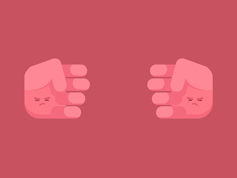
The second was to replace the previous, home, and next navigation text with symbols or emojis. We decided to use pointing hands since Rock Paper Scissors is a game played with the hands.
After we did this, we found the need to change the nav font size to make the symbols more legible, so we applied font-size: 2rem; to the nav element in CSS. What is rem? Well, there are absolute units and relative units of measure in CSS. The px value is equivalent to 1/96 of an inch, hence is absolute. The rem value is a function of the font-size of the root element and hence is relative. If the absolute value of the root is 12px, 2rem is double that, or 24px. Read more about relative units at MDN Web Docs.
Go live!
You’ve completed a curated web “installation” artwork! Post the results of the Video Mash exercises to your server space through SFTP, and share it with the world!