Unity
Multiples: creating unity
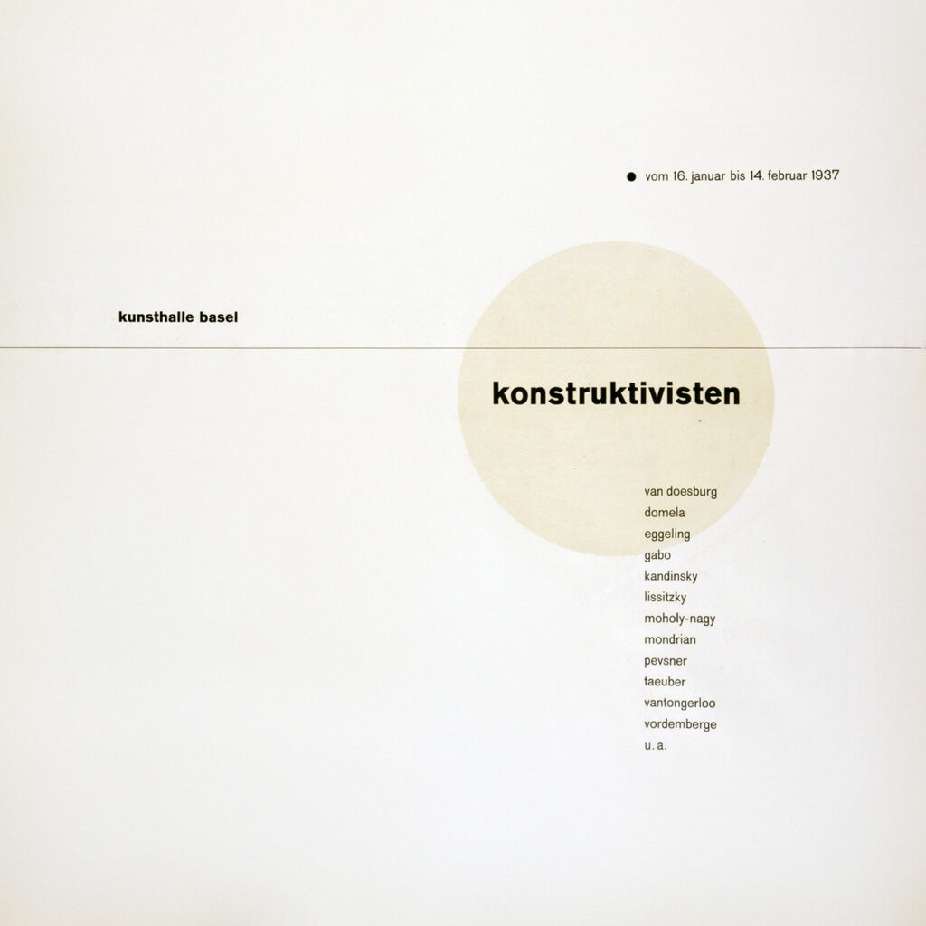
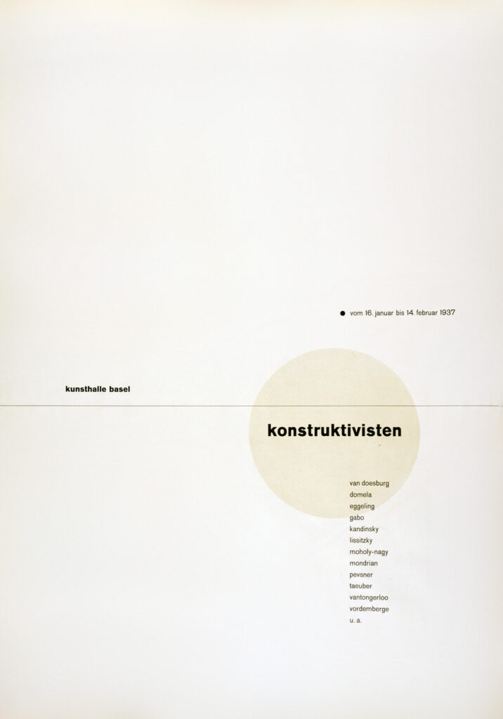
When creating multi-page documents, the typographic grid is the principal way of organizing page elements. A grid divides a page into columns. An artist can follow the columns strictly, or use them as a rough guide to work within. In this exercise, we will start a two-page product, the first of which will honor Modernist typographic pioneer Jan Tschichold, whose elegant and harmonious work can be seen in an example here.
Strict grids
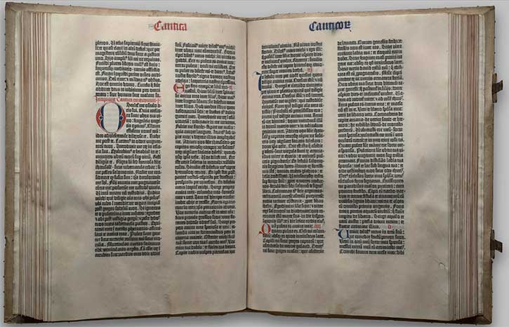
The Gutenberg Bible visual example follows a very rigid grid structure: the two columns of text have the same line length, which is a measurement of how long a line of text is before it breaks into a new line. The two columns of text also have the same vertical length. When two pages are viewed together in an open book such as this, the pages are read together as a spread. The pages in this spread follow the grid in the same manner.
Flexible grids
However, the grid can also be used with much flexibility, creating a visual hierarchy. In the New York Times layout from 1918, seen here, the grid is more complex and versatile. This grid divides the page into eight columns. Counting the columns on this page is easy: find the smallest column and measure its width. Then divide the width of the page with the width of the smallest column. An eight-column grid creates a very flexible layout. Instead of eight even columns of text flowing down the front page of the newspaper, some larger graphic elements like the headline at the top of the page expand across all eight columns.
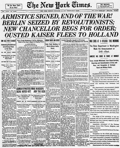
Other text blocks are given visual emphasis, or create a visual hierarchy on the page by spanning multiple columns. Also, notice the distribution of negative space on the page. Since there is a lot of text on this front page, contrast is created by increasing the leading in some areas of the page and by allowing some of the text blocks to expand beyond one column.
The Tschichold canon
In The Form of the Book, the Modernist typography pioneer Jan Tschichold expands on a historically reconstructed geometric structure for the design of book pages and spreads. This structure creates text area and margin proportions that relate harmoniously to the blank page proportions. Although the structure works for any page size, Tschichold’s contribution to the canon includes a discussion of deliberate page proportion. While strongly preferring 2:3 as an ideal ratio, he also suggests 1:1.618 (Golden Section) and 1:√2, among others.
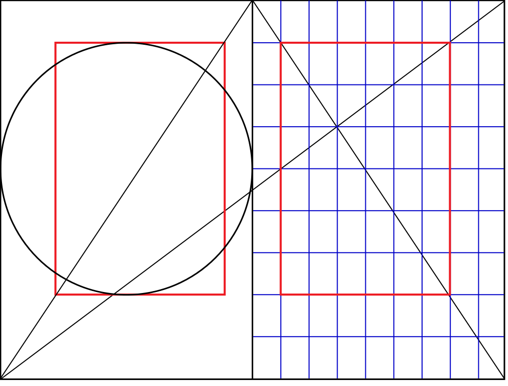
The Tschicold canon is a mantic geometry such as we explored in our Mandala project. Superficial discussions of this geometry suggest Tschichold is rigidly doctrinaire about such matters as the 2:3 ratio of the page. While he declares it an ideal, he discusses it within a wide range of formatting, page division, and other options in his essay Consistent Correlation Between Book Page and Type Area, excerpted from The Form of the Book, which you can read at this link.
Creating Tchichold’s mantic canon in InDesign
New document
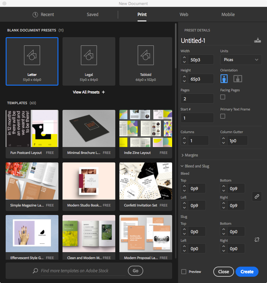
Open InDesign and create a new document by choosing File>New>Document. Notice many options in the dialog that opens. We’ll start by choosing Print at the top and:
- In this exercise, we will enter a custom page size that is standard in the magazine industry: Width: 50p3 and Height: 65p3. In inches, this equals 8 ⅜” x 10 ⅞”, nominally an 8.5 x 11 but with room for a page trim after binding. Although it is not the canonical 2:3 or 1:√2, it is an Imperial unit approximation of 10:13, a rationalization of two Golden Rectangles stacked on top of one another.
- Uncheck Facing Pages
- Enter 2 for the number of Pages
- Leave Columns and Margins as defaults for now
- Under Bleed and Slug, set a linked Bleed value of 0p9 (about ⅛”)
Save the document at this point and name it unity.indd.
Canonical guides and grids on Master pages
We will create a document grid, margins, and guides that will allow us to easily incorporate the Tschichold canon, creating proportional unity between page and content.
First, go to View > Show Rulers and open the rulers if they are not visible. Use the ruler CONTROL+click trick from our earlier discussion of Units to change the measuring unit for each ruler to Pica if needed.
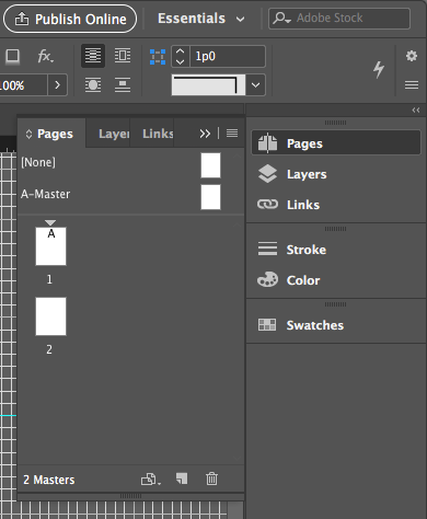
Open the Pages Palette, and notice that along with our 2 pages, there is a list of Master pages. Master pages commonly contain a grid and any recurring design elements. They allow you to create a consistent layout throughout the pages in a publication and they make it possible to automate layout changes because any modification you make to a master page is automatically reflected on all the pages to which it is applied. You can create multiple master pages, which can be applied to any page within the document. By default, a new document’s pages are all based on A-Master, even though A-Master is empty. But not for long: double-click on A-Master to edit.
Harmonizing grids
Harmonize the grids in the Preferences as follows:
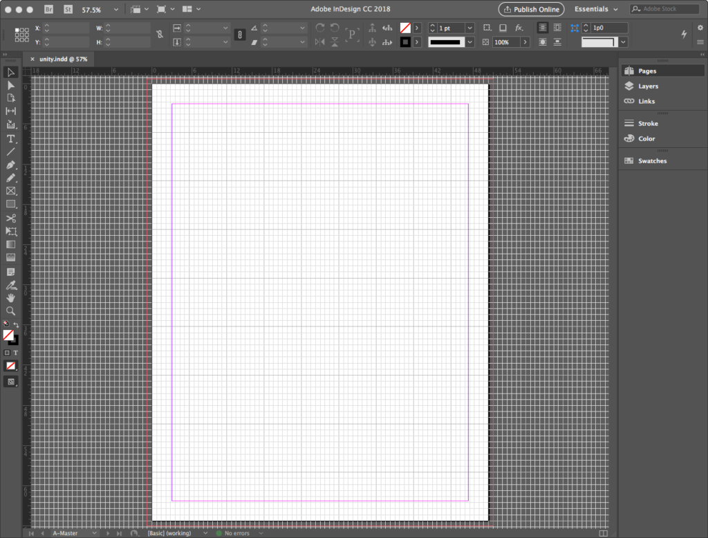
- Go to View>Guides & Grids>Show Document Grid to view if you don’t see it. While here go to View>Guides & Grids>Show Baseline Grid to view it.
- Go to InDesign CC>Preferences>Grid and:
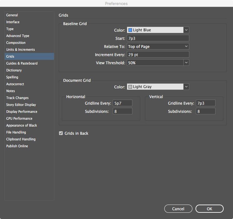
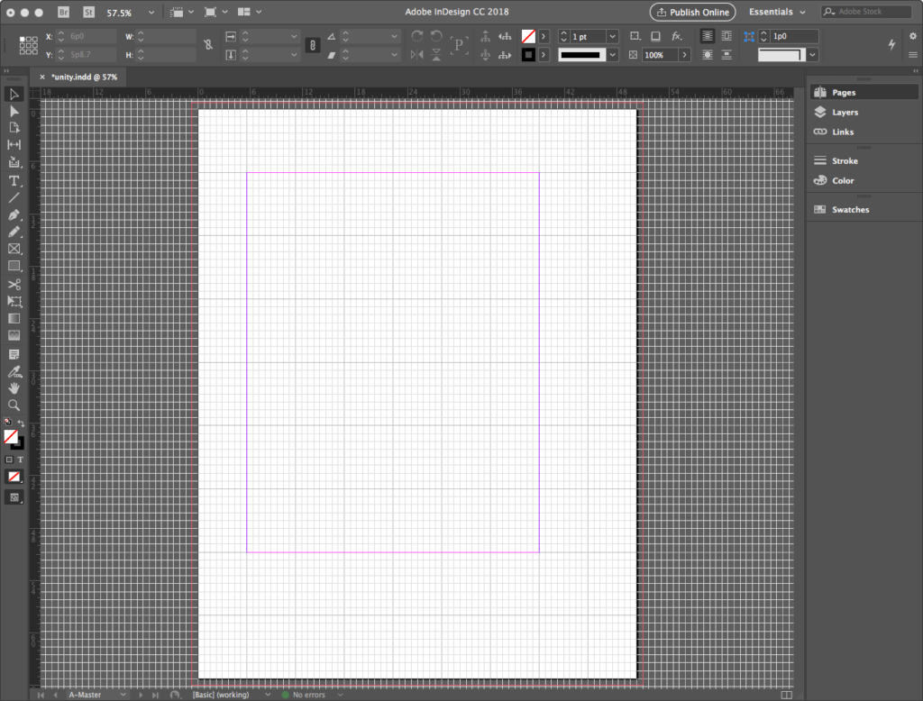
- Change Document Grid units to Horizontal: 5p7 and Vertical: 7p3. We arrive at these values by dividing the overall page width (50p3) and height (65p3) by 9. This divides the page into 9 modules horizontally and vertically, as prescribed by the canon.
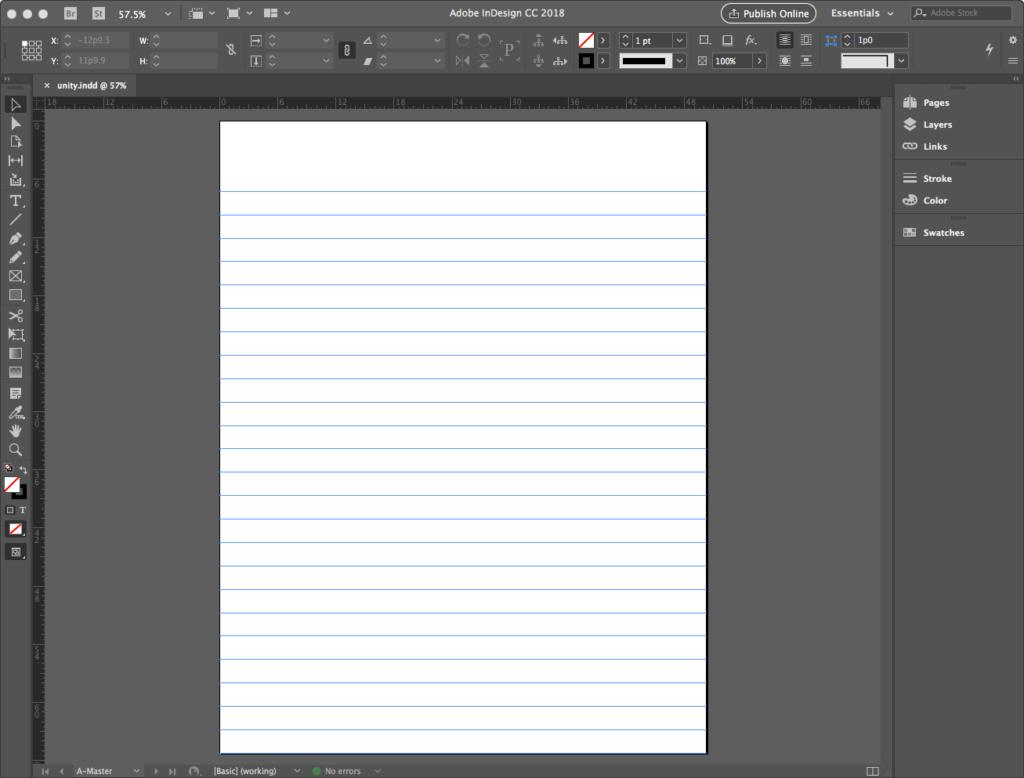
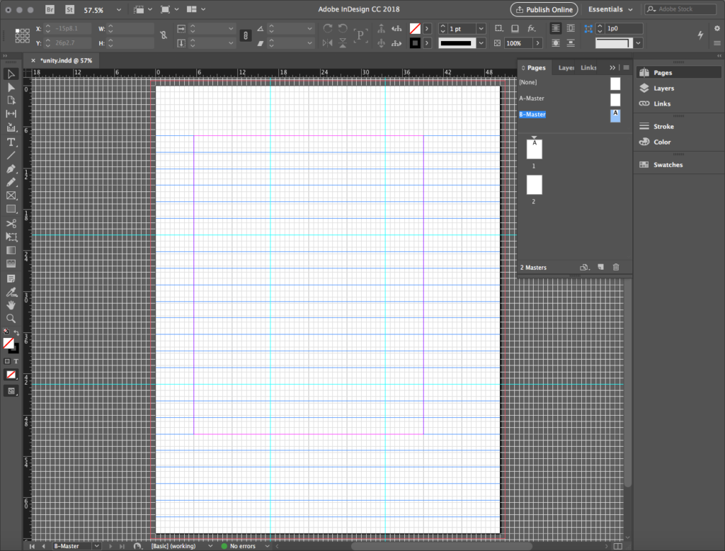
- Change the Baseline Grid value to Start: 7p3, an Increment Every: 29pt, and a View Threshold: 50%. The baseline is a mantic line upon which your type’s bottom edge rests, and the blue baseline grid organizes lines of type. It does not and should not always line up with the document grid, but it can harmonize with it.
Harmonizing margins
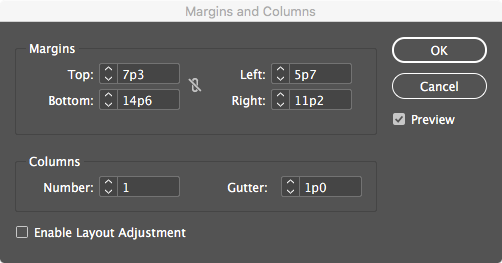
Next, harmonize the margins with the grid by going to Layout>Margins & Columns… to unlink Margins and set Top: 7p3, Bottom: 14p6, Left: 5p7, and Right: 11p2. If done correctly, margins align with the document grid canonically.
Creating a Rule of Thirds grid
Finally, we will set up a small set of guides diving the page in a Rule of Thirds grid. Guides are created by dragging them from the horizontal and vertical rulers in all Adobe programs. To set up, first go to View > Guides & Grids > Snap to Document Grid to help align the guides with the grid. Then start dragging and releasing them OUTSIDE the bounds of the page, so they can be seen spanning to other pages and spreads:
- Starting with the horizontal ruler at the top of the document window, click into the ruler and drag the first guide to 21p9, using the vertical ruler at the left of the document window as a reference. Drag the second guide to 43p6.
- Follow this by dragging a first guide from the vertical ruler to 16p9, using the horizontal ruler as a reference. Repeat for the final guide at 33p6. If done correctly, the guides align with the primary divisions in the document grid.
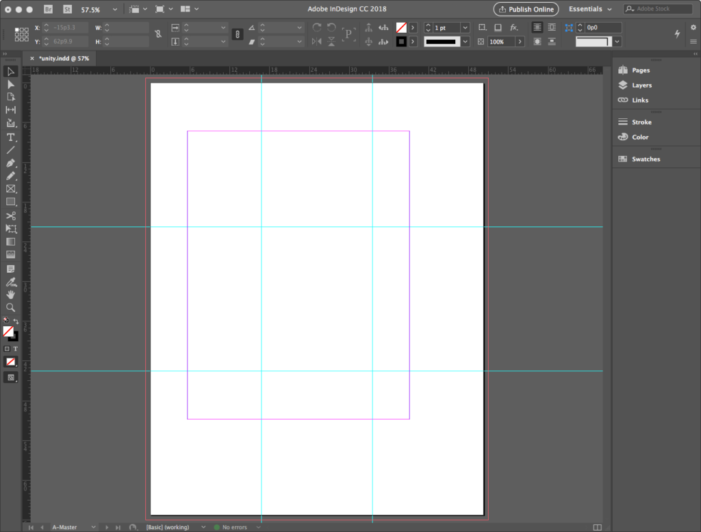
Exit A-Master, right-click on Page 1 in the Pages Palette, in the dropout options select Apply Master to Pages…, and in the dialog select A-Master. Notice the Rule of Thirds guides are applied now to Page 1 — notice also they are locked because master page items cannot be edited on a regular page.
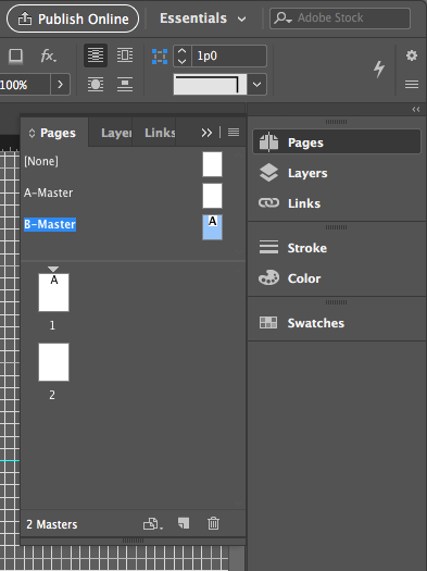
Creating a B-Master
Our final master page creation task is to develop a B-Master. To avoid repeating work, we’ll base it on the A-Master. Return to highlight A-Master in the Pages Palette, right-click to open dropout options, and select New Master… to open a dialog box. Here, under Prefix: B, choose Based on Master: A-Master. Observe your new master created in the Pages Palette. Apply B-Master to Page 2.
Adding a font and adding text to A-Master
Now that canonical guides, grids, and margins are established, we want to add a text element to a master page. Like the guides, any text or shape element that shows up on a master page will automatically show up on any regular page to which the master is applied. And, like the guides, it will not be editable on a regular page, only on a master.
To add our text element, we have an administrative task to do first. In our design, we wish to use the font named Tschichold by Peter Weigel. This font is licensed free for non-commercial use such as ours, and was designed in honor of Jan Tschichold. We can add it to our system on a Mac using Font Book. This is one of the few administrative tasks our students can do on networked machines in the studio. Keep in mind, however, that the font will not permanently install, so keep your folder of fonts handy in a folder in the cloud or on an external drive to install before working on a file that contains it.
Find and install the font
There are many font service websites out there where you can find the Tschichold font. We used FFonts.net at the link https://www.ffonts.net/Tschichold.font#. Find the font and download it. There may be several fonts in a font family when you download. Observe the fonts in a Finder window (below left), and click on one to automatically open it in the Font Book app.
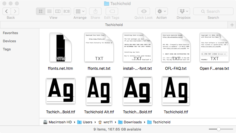
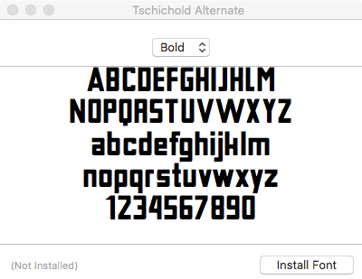
Double-click on each .ttf font to open it in Font Book, then click Install Font to load them into the system. In the Font Book window, you’ll see all the fonts listed as they install, illustrated below.
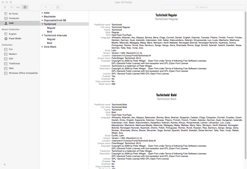
Create master text
Use the Type Tool to create the text on A-Master using our new font. All text in InDesign is box-based; there is not a single-line type option like there is in Illustrator. So click-hold-drag to generate a type box as illustrated below. The data for this box is X: 16p9 and Y: 19p4 for the origin of the box at the upper right, with the width at 33p6 and height at 4p10.
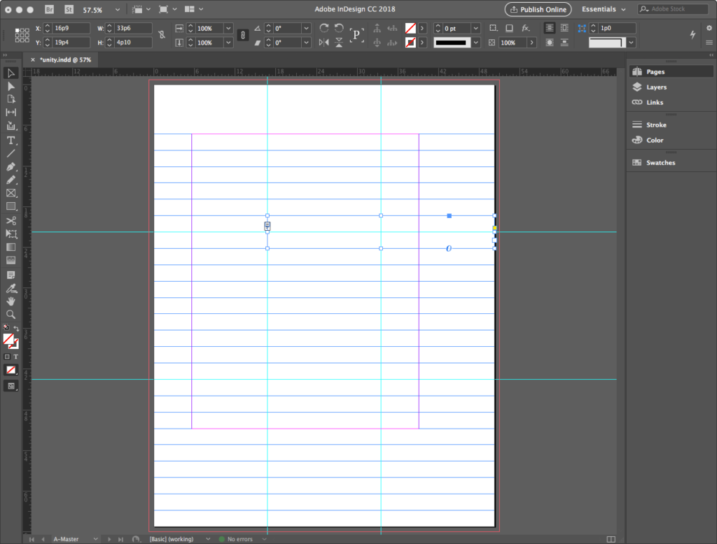
With the type tool active, type in “tschichold” in all lowercase, using Tschichold Bold at 60pt.
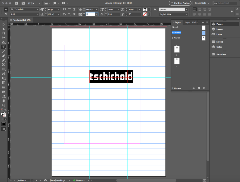
Select the type and notice that the Fill Color at the bottom of the Toolbar turns into a Type Color option. Set this Type Color by double clicking on it to open the Color Picker, and set every channel in CMYK to equal 50%. Next, look for Tracking in the Options Palette, set the Tracking for 280 — a large number, so you have to type it in.
Tracking vs. Kerning
Let’s review the difference between Tracking and the option right above it in the Options Palette, called Kerning. Both involve letter spacing but in different ways. Tracking adjusts the spacing across a group of letters at the top right, while Kerning adjusts the space between two letters for more fine grain control. Note the space between the V and the A in the sample at the bottom right.

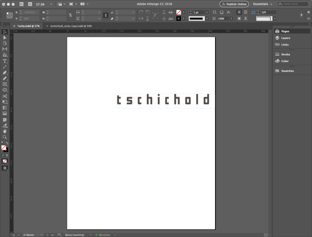
When done with color and tracking, the master text expresses itself on Page 1 as you see below left. Here, we’ve turned off the guides and grids so you can see the negative space around the letterforms.
Finish our master manipulations by selecting B-Master in the Pages Palette. Notice there is a version of “tschichold” loaded here, even though we didn’t add it — remember that B-Master is based on A-Master, so when we added the type in A it shows in B. However, we can manipulate this. First, with B-Master selected, go to the dropout menu and select Override All Master Page Items. This will “unlock” the master elements like the type box that migrated from A-Master. Next, we’ll select and change the color of the type on B so that every channel in CMYK=15%. Note the changes in both the Masters and the pages applied.

Creating a line
The remainder of our work for this exercise will happen on Page 1. Page 2 will be used in the next exercise, named Tension.
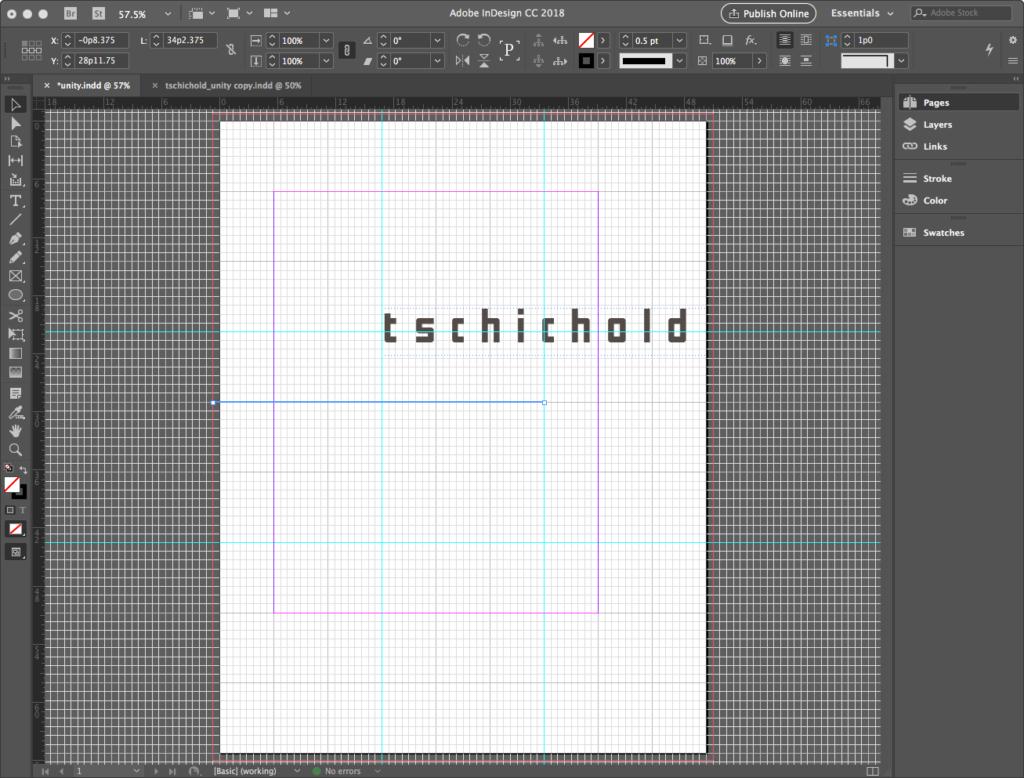
Creating a line in InDesign is as simple as it is in Illustrator. Using the Line Tool, found just below the Type Tool in the Toolbar, click-hold-drag to start the line, then release to end it. SHIFT+click will constrain the line orthogonally. Lines thus formed can be moved with the black arrow Selection Tool, and its endpoints can be adjusted with the white arrow Direct Selection Tool, in a similar manner to Illustrator.
Our line starts at the bleed margin off the page to the left and concludes at the right-hand Rule of Thirds guide. It aligns horizontally at a primary division in the document grid around 29p on the vertical ruler. Using View > Guides & Grids > Snap to Document Grid along with SHIFT+click helps to keep the line drawn precisely. The line does not go all the way across but uses the Rule of Thirds guide as an endpoint to keep the negative space flowing and active. While the line is still selected, set it in the Options Palette to be 0.5pt thick.
Creating and linking text boxes
Create a new text box, and visit the link at the button to find the text we will use in a cloud-based shared text file. Copy and paste the text labeled for PAGE 1 in the file. Ignore the other text.
Do not edit the text or type it in by hand. The text we are copying and pasting in are names of fonts designed by Jan Tschichold, along with his birth and death dates.
PRO TIP: When you receive a text from a copywriter, as the designer you are not responsible for text content. You should not even correct an obvious typo or error. Instead, contact the copywriter who will update the text.
After copying and pasting, position the upper left corner of the text box and resize it approximately as shown. The one important datum in the illustration below is the left hand border of the text box located at the left-side Rule of Thirds guide, aligning with the t in “tschichold” text above it.
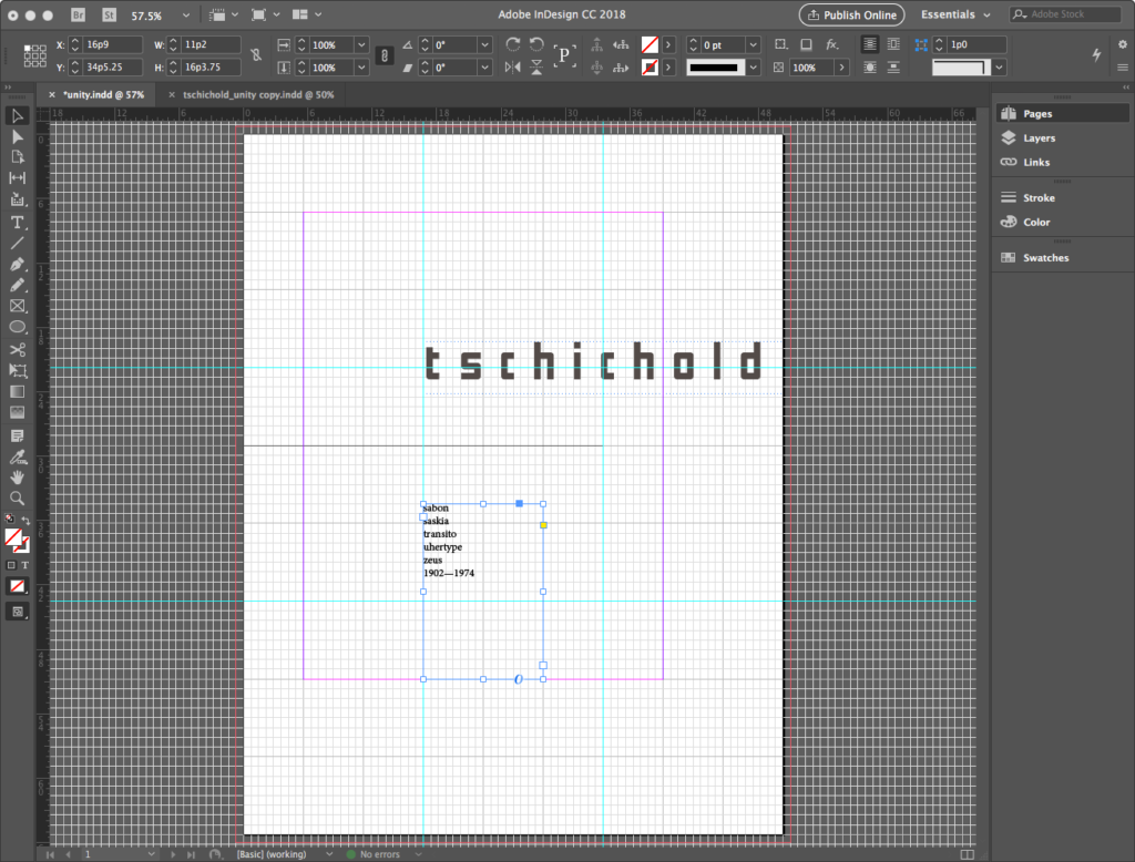
Use the Selection Tool to move and resize the text frame so the last line is “lost” by moving the bottom of the frame higher than the date text. Look at the bottom right corner of the text frame and notice the red square that surrounds a plus sign. This icon means that there is more text stored (but not visible) in the text frame.

Red + indicates text exceeds frame size
Understanding the loaded cursor
Using the Selection tool, click on the plus sign. Notice that your cursor has changed to a loaded cursor. InDesign “knows” that you are ready to either 1) link this first text frame to another text frame in the document or 2) click elsewhere to create and link a new text frame to continue displaying content. We will do the latter.
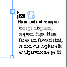
A loaded cursor after clicking the +
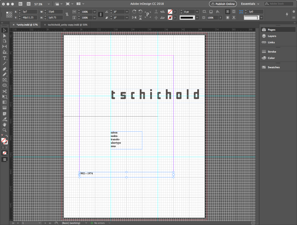
With the loaded cursor, click and drag a text frame near the bottom margin. The overflow of text in the first frame will automatically flow into the second text frame as seen below. Using the Selection Tool, adjust sizes if necessary so that only the dates are in the second box, and all the font names are in the first box.
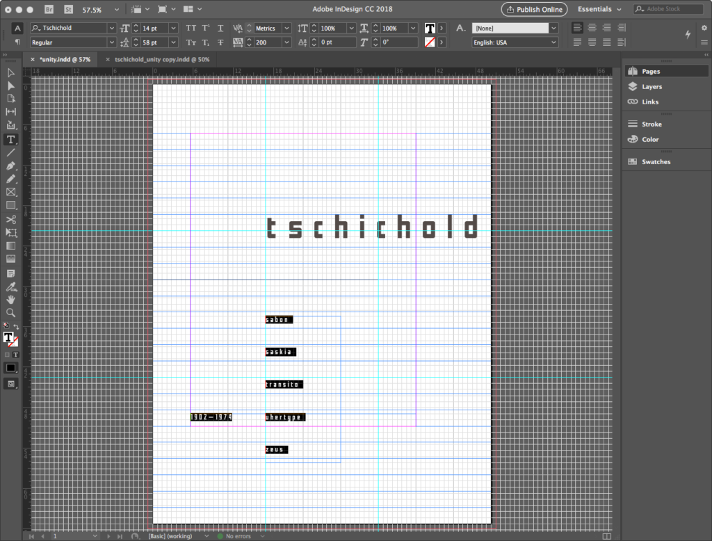
Using the Type Tool, click inside either of the two text frames and press COMMAND+A to select all of the text. Make a change to the typeface using the Type > Font menu. You can also the Font Family dropout in the Options Palette, or the Character Palette (Window > Type & Tables > Character). Set the type with Tschichold Regular with a Font Size of 14.5pt, Leading (the space between the baselines) set at 58pt, and Tracking at 200. Notice that the typeface changes in both text frames because COMMAND+A (or Edit > Select All) selects the text in all of the linked frames. After resizing leading and tracking values, you will need to resize the text boxes so that the font names and the dates are in separate boxes as seen below.
Refining the text boxes
With text formatted, refine the locations for the text boxes as shown here. In particular, note the text box containing dates is rotated to read vertically from bottom to top, using SHIFT to snap to vertical.
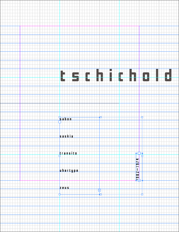
For clarity, toggle the grids off, as we see here:
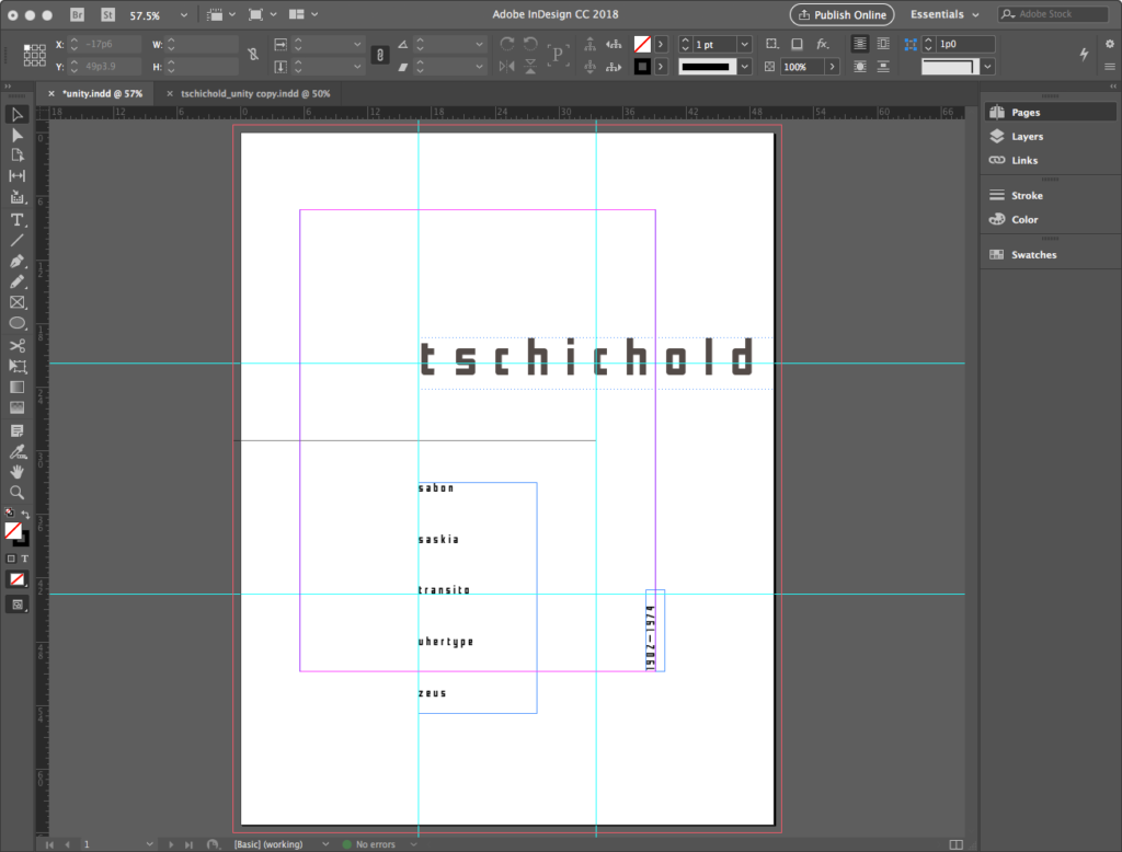
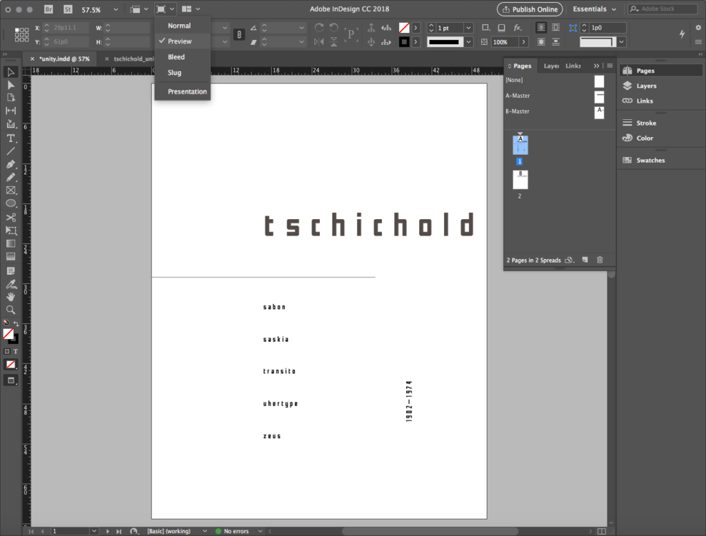
Another way to visualize the elements without the grids is to change out of the default Normal Mode of view and use Preview Mode. Look for this in View > Screen Mode and select Preview or look for the icon in the title bar of the window, just above the Options Palette, illustrated below.
Creating a shape
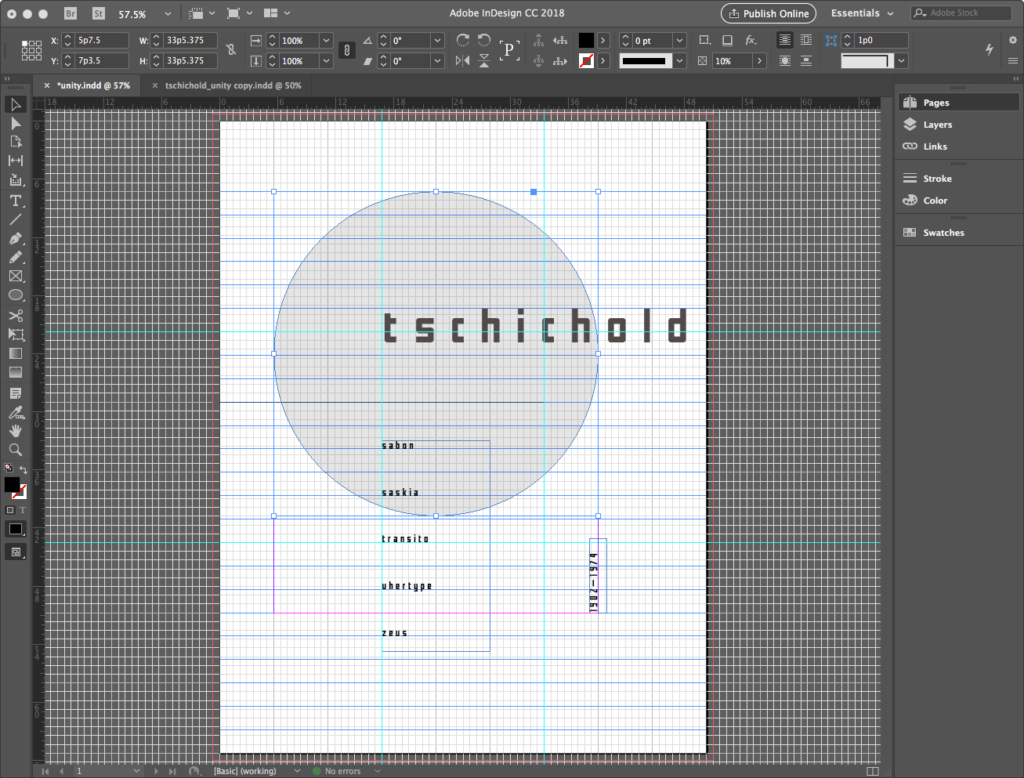
Our final design element is a large light gray circle that creates a focal point, similar in function to the light yellow circle in the Konstruktivisten poster at the top of this title.
Use the Ellipse Tool with a SHIFT constraint to draw a circle tangent to margins as shown below. It should touch the left, top, and right margin. Reverse the fill and stroke in the Toolbar so that the fill is black and the stroke is empty. Then use Opacity at 10% in Options Palette to lighten the tone and reveal the text. When done, the file looks like the illustration below.
Looking at this in Preview Mode, we get a good sense of how it will look as a finished print:
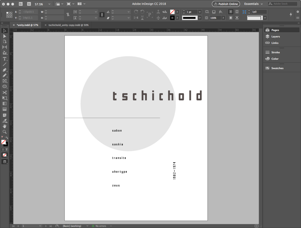
The Unity portion of the file, celebrating the refined sense of proportion and Gestalt figure and ground perfected by Tschichold, is complete.
Save and share
Save a copy of the file to share in your blog at this time, by going to File>Export and saving as a JPG. This InDesign file will become the basis for the next exercise: Tension.
Credits
For portions of these sections:
- Multiples: creating unity
- Creating and linking text boxes
Contents have been adapted from Digital Foundations by xtine burrough and Michael Mandiberg, modified by williamCromar. Please see the newMediaWiki licensingNotes regarding Digital Foundations derivatives, which are governed by a Creative Commons Attribution-NonCommercial-ShareAlike 3.0 Unported license.
