

Type drawing

Drawing with type
The word typography means drawing with type. Our Latin alphabet evolved from systems comprised of simple pictures called ideograms, representing intangible ideas, or pictograms, representing objects. While phonetic alphabets representing sounds evolved in the West, poetically charged ideograms and pictograms persist in Asia. The Chinese character for “human” looks like a person striding confidently forward, doesn’t it?

Our Western letterforms have lost their pictorial origins. We are so over-familiar with them, we don’t see this anymore. This exercise will de-familiarize you with letters so that you may approach them as drawings, a classic warm-up exercise in most design courses.
Types of type
Type comes in thousands of font styles, but there are some basic classifications:
Aa Bb Cc Dd
Serif
Designed in antiquity in response to the technical needs for text inscriptions carved in stone, the extra serif stroke would neaten up the ends of the carved letters. A well-designed serif font aids legibility in body type. Popular serif fonts include Times New Roman, Garamond, Baskerville, Georgia, and Courier New. A slab serif font like Rockwell makes a good headline.
Aa Bb Cc Dd
Sans-serif
Often used to convey modernity, these fonts grew in popularity with mass-printed headlines and advertisements a century ago. Some sans-serif fonts are based on simplified serif font proportions, while others take on a more purely geometric form. Examples include Arial, Helvetica, Proxima Nova, and Calibri. The geometric font Futura was used for the newMediaWiki logo.
Aa Bb Cc Dd
Display
AKA Ornamental or Decorative or Fantasy
Eye-catching fonts that carry a theme or specific cultural allusion, will often have more eccentric and variable designs than typefaces generally used for body type. Common display fonts include Copperplate, Papyrus, Cooper Black, and Averia. The overuse (some would say abuse) of Comic Sans has led to aversion among designers (though dyslexic readers find it to be more legible than other fonts).
Aa Bb Cc Dd
Script
AKA Cursive or Handwriting
Based on the letterforms made with calligraphy pens or casual mark-making tools, some script fonts contain varied strokes that suggest handwriting. Brush Script, Zapf Chancery, Marker Felt, and Lobster are examples you’ll recognize. Calligraphic fonts like Zapfino make use of ligatures (connecting characters) and character variation to emulate hand-drawn letterforms.
The majority of fonts you see on the web and in print are serif or sans-serif.
Type as image
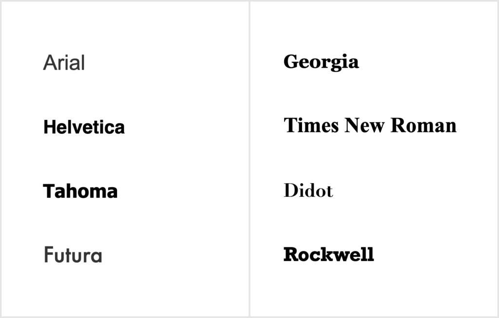
Here we have names of common typefaces of the sans-serif and serif varieties. This type is rendered in an image, similar to print.
Type as code
The same in HTML. If you don’t see identical typefaces, your computer does not have the font and will replace it with a default.
|
Arial Helvetica Tahoma Futura |
Georgia Times New Roman Didot Rockwell |
Thinking with type
Read the Anatomy section of Ellen Lupton’s Thinking with Type to understand the basic terminology we’ll use in the studio when discussing how to use letterforms.
Exercise 1: Installing a font and analyzing the typeface
1 — Find a font
For your artwork project, you may want to find and install a font your computer doesn’t have (and yes, in our networked lab, you can temporarily install a font). Visit 3 font library sites: Google Fonts, Adobe Fonts, and Font Squirrel.
- How are these sites similar and different? Which sites offer free fonts? Can you download fonts? Are there any limits (for example, free but only for non-commercial use)?
- At ONE of these sites, do a font search. Find an example of ONE of each: serif, sans-serif, display, and script font. Your choice should NOT include one of the fonts listed above.
- Download ONE serif OR sans-serif font for the next part.
2 — Install your font
- On a personal machine, use instructions for Windows 10, Windows 11, or Mac OS.
- In our networked lab, use instructions for Font Book. Remember: your installation will only last as long as your working session. Keep a copy of your font in your Digital Archive, where you can easily find it to re-install for your next session.
3 — Understand the typeface properties of your font
Using Ellen Lupton’s Anatomy guide, figure out the following:
- Is the x-height more than half the size of the cap height?
- Which ascenders, if any, extend higher than the cap height?
- Which letters, if any, overhang the baseline?
- Any outstanding or unusual features? Are there ligatures or character variants? Unusual ascenders or descenders? Is the character proportion narrow, condensed, compressed, wide, or extended?
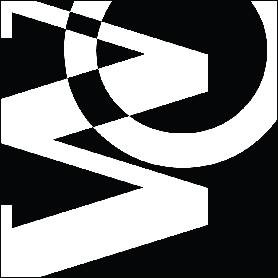
Exercise 2: Figure-ground manipulation with Pathfinder
This exercise was inspired by a tutorial originally found at the now-defunct Vector Art Blog and takes advantage of Gestalt by playing with one of my favorite Illustrator palettes.

Recall that figure-ground is one of the Gestalt principles and is widely used in graphic design, especially in logos. The perceptual factors of Gestalt create visual frames of reference that provide the designer with the psychological basis for the relational organization of graphic elements. By using contrast between elements, figure-ground allows the viewer’s eye to “read” imagery. Figures are positive elements defined by spatial relationships existing among them. The ground becomes the white space, a negative space that completes the visual image.
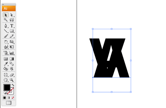
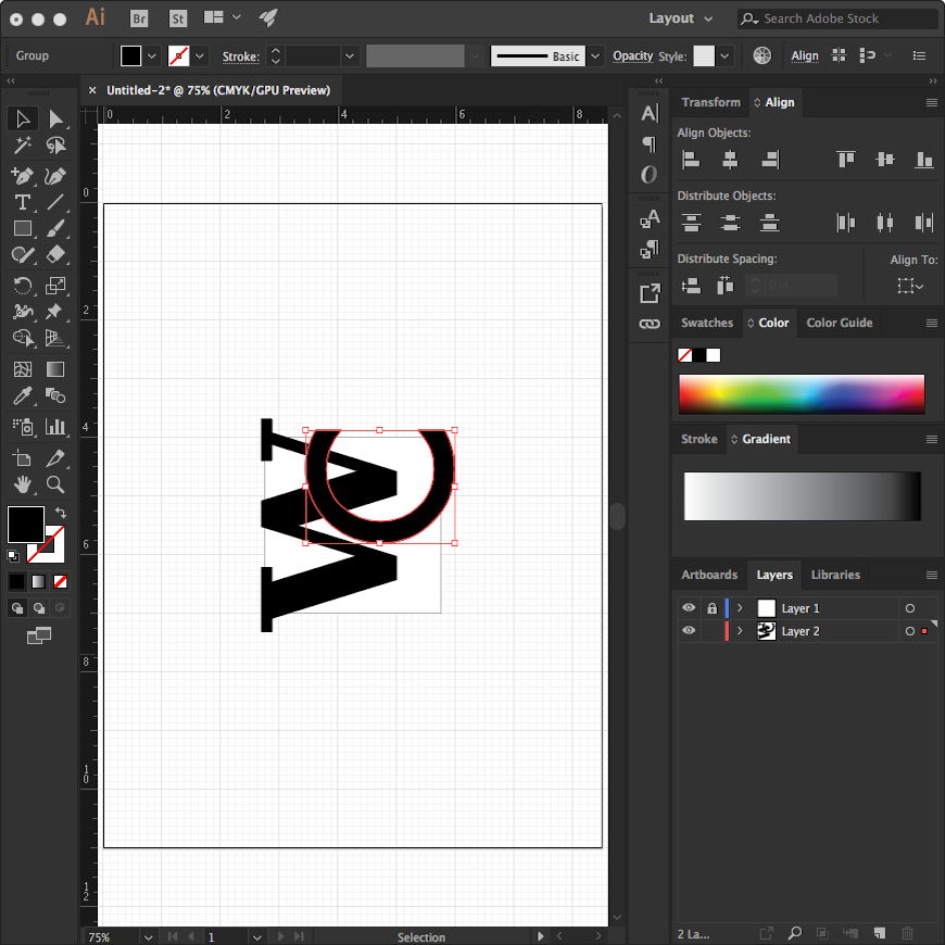
In the pre-digital past, designers had to put a lot of effort into precisely illustrating figure-ground concepts. Illustrator has made the process easier. In this exercise, we will create a simple figure-ground vector. We will overlap letterform elements and create a spatial relationship between them by using the Pathfinder palette. For this warmup example, use the letterforms V and A.
1 — Create a new file and create the letters
- Open Illustrator and create a new letter-size document with inches as units. Select Essentials Classic as your workspace.
- Select the type tool, choose a bold sans-serif typeface at 72 point size, and using black for the fill color, click once to avoid dragging, then type the first letterform V. Deselect this, then with the same tool click once again somewhere else and type the second letterform A.

2 — Use Create Outlines and overlap letters
- Important step! With both letters selected, go to the Menu and select Type>Create Outlines. This changes the text into geometry we can manipulate with Pathfinder.
- Using the selection tool select the second letterform (in our case A).
- Move the A over the V so that parts of the letter-forms overlap.
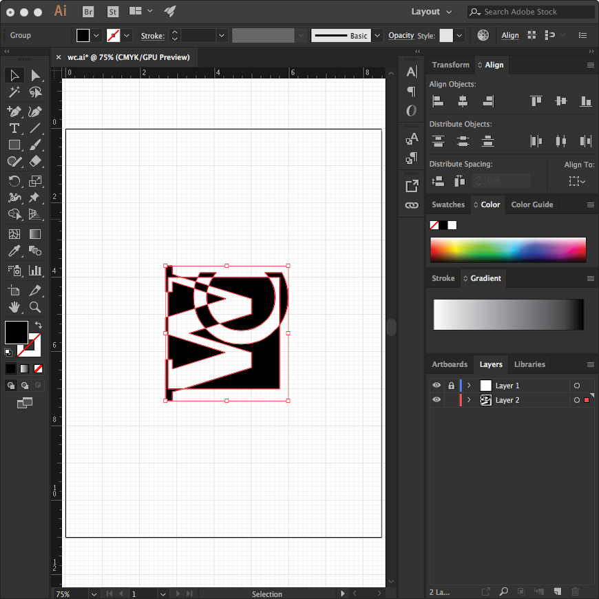
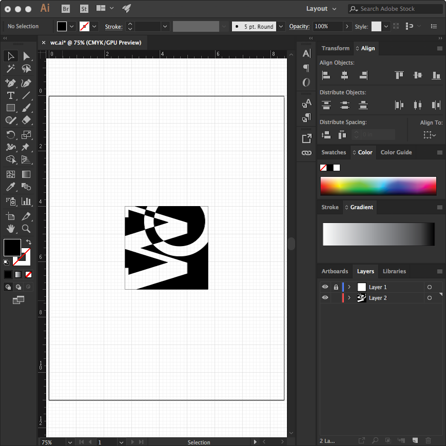
3 — Use Pathfinder
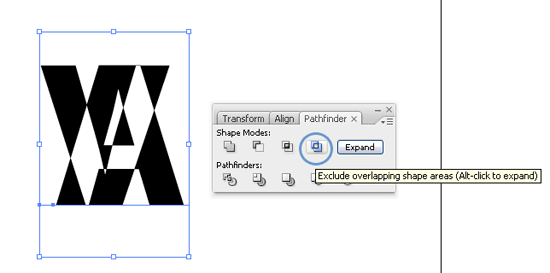
- Open the Pathfinder palette at Window>Pathfinder or Ctrl+Shift+F9 (PC) or Command+Shift+F9 (Mac).
- Select both letterforms with the Selection Tool and then click on Exclude Overlapping Shape Areas.
- Note the interesting and unexpected shapes and Figure-Ground inversions that result from Pathfinder!
Exercise 3: Your personal logotype
Logos and logotypes
A major activity in the graphic design world is the creation of effective logos. Logos for leading brands like Nike are instantly recognizable around the world, without even having the word “Nike” anywhere near its “swoosh” form. Logos like these are known as iconic logos.
For startups (like you), the abstraction of an iconic logo doesn’t work as well from a recognition standpoint. So we’ll turn to the logotype, a distinctive use of letterforms to generate a graphic identity in this exercise. An example of a recognizable logotype is the blue “F” that stands for Facebook.
Our logotype exercise will be more challenging, as we’ll be making it using the phenomenon of figure-ground inversion we learned above.
Create your logotype
1 — Generate an idea
- Select two typefaces. One should be the font you downloaded, and the other will already on your machine. If the font you downloaded was sans-serif, the other font should be serif (or vice-versa). Avoid using a display or script font for the exercise.
- Use your first name and last name initials, and assign one typeface to each letter. You may switch that assignment as you experiment.
- In an idea-generating tool like a sketchbook or Jamboard, develop 3 concepts combining the two letterforms to generate a unified image that plays with figure-ground relationships, scale, and defamiliarizing the original identity of the letter. Look at general geometry, patterning, and contrast in the letters.
2 — Create a new file and create the ground
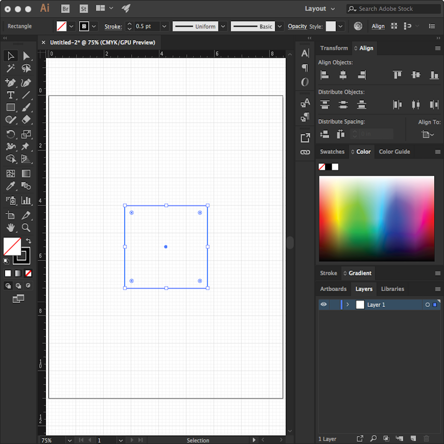
- Open Illustrator and create a new letter-size document with inches as units. Select Essentials Classic as your workspace.
- Create a 3” square with a 0.5 point black stroke and white fill (the stroke is just so you can see: we’ll eliminate it later).
- Open the dropout menu at the upper right-hand corner of the Align Palette and select Show Options. In the options area that opens up in the lower right-hand corner, select Align to Artboard. Select your square and place it using Horizontal and Vertical Align Center. Go back to the options area and select Align to Selection. Lock this layer.
- This becomes your ground.
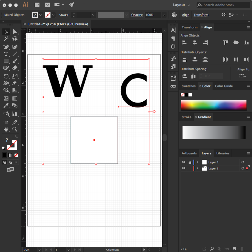
3 — Create the figures
- Generate the initial letterforms on a new layer, Layer 2. In the downloadable sample file, this starts with a capital W at 200 points using Bitstream Vera Serif Bold, and a capital C at 200 points using Futura, both with black fill and no stroke. You’ll use your own letters and fonts.
- Apply Text>Create Outlines to turn the letterforms into geometry.
4 — Develop one of your ideas into a composition
- Figure-ground relationships are especially engaging when they are ambiguous, so to achieve this, scale and/or rotate one letter to touch or overlap at least 3 of the edges of the 3” square. Do NOT distort the proportions of the letterforms in any way (i.e. no skewing, changing aspect ratio, etc.). Respect the design of your chosen font. If you want wider or more narrow letters, select a different font that is designed as such!
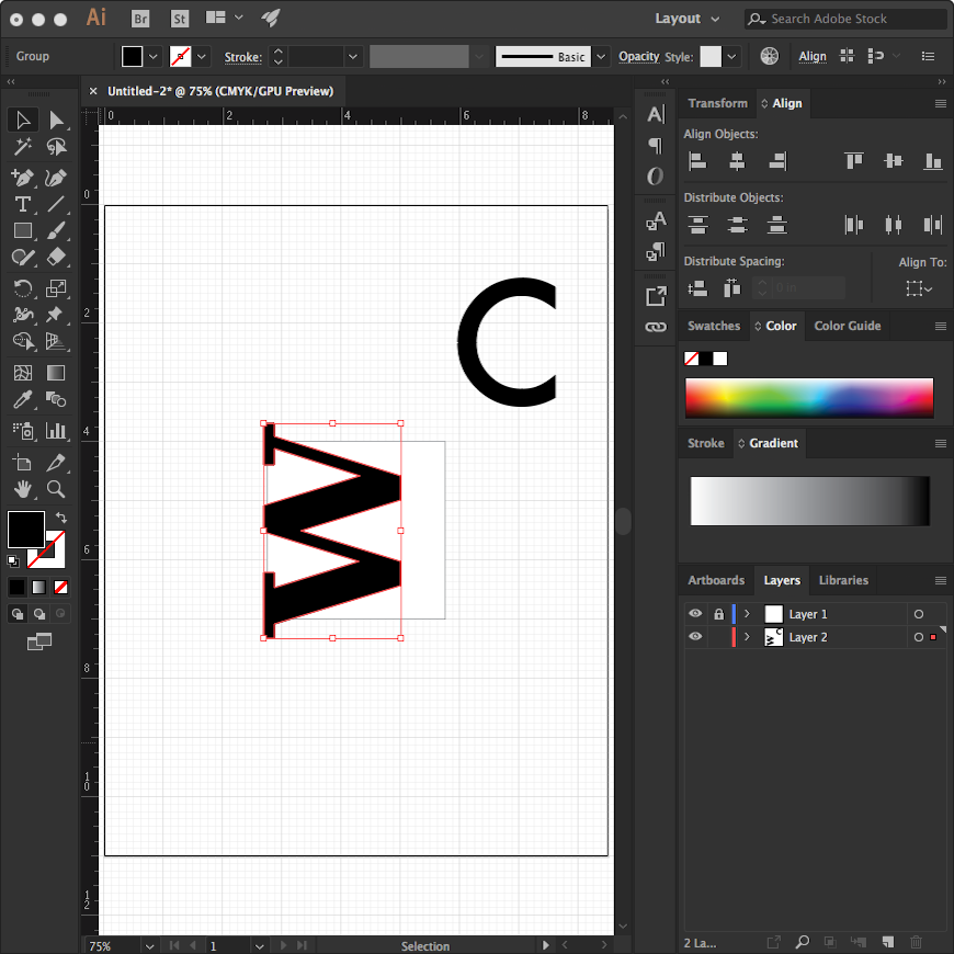
- Move the second letter into place, also scaling and/or rotating. Pay attention to the negative spaces this will passively create.
5 — Use Pathfinder to finish the composition
- Select the white square ground and the two black letterform figures, and using the Pathfinder, apply Exclude. This creates overlapping shapes, as well as a Figure-Ground inversion.
- As a final step, delete any overlapping shapes that extend beyond the original square. Because Pathfinder always creates a grouped set of objects, apply Object>Ungroup first.
- If any strokes remain, or if you don’t like where the fills ended up, you can delete strokes or reassign fills to your preference.
- Save the file.
Video demo
Here is a 12-minute viewing of the process outlined above. I speak slowly so I won’t take it personally if you run it at 1.25 or 1.5 speed!
Exercise 4: Saving and sharing
File types and their common uses
You’ll need your file to eventually escape out of the proprietary .ai file type for people to see it!
Different kinds of file types have specific functions in particular contexts, as detailed below. For some of these file types, we access a Save As function, while for others, we Export.
Using the chart as a guide, save your file, first as a .ai type, then as a .jpg, a .png, a .gif, an .svg, and finally a .pdf.
.ai
Illustrator File
CREATE:
- File>Save
SAMPLE FILE SIZE:
- Size: 1.6 MB
ART TYPE:
- Vector
USES:
- Working in Illustrator
- Proprietary format
Portable Document Format
CREATE:
- File>Save As
SAMPLE FILE SIZE:
- Size: 776 KB
ART TYPE:
- Vector
USES:
- Cross-platform
- Edit-safe file creation
- Open format

.svg
Scalable Vector Graphic
CREATE:
- File>Export>Export As…
SAMPLE FILE SIZE:
- Size: 2 KB
ART TYPE:
- Vector
USES:
- Cross-platform
- Cross-application
- Scalable web images
- Transparency
- Animation in HTML5
- Open format
.jpg
.jpeg
Joint Photographic Experts Group
CREATE:
- File>Export>Export As…
- Save Highest Quality
- RGB color model
- Resolution 300 ppi
SAMPLE FILE SIZE:
- Size: 103 KB
ART TYPE:
- Raster: bitmap EXIF or JFIF file
- Lossy compression
USES:
- Cross-platform
- Cross-application
- Small web images
- No transparency
- No animation
- Open format

.png
Portable Network Graphic
(lossless compression)
CREATE:
- File>Export>Export As…
- Resolution 300 ppi
- Transparent background
SAMPLE FILE SIZE:
- Size: 21 KB
ART TYPE:
- Raster: bitmap file
- Lossless compression
USES:
- Cross-platform
- Cross-application
- Small web images
- Transparency
- Animation (using APNG)
- Open format
.gif
Graphics Interchange Format
CREATE:
- File>Save For Web (Legacy)
- Deselect Clip to Artboard
SAMPLE FILE SIZE:
- Size: 3 KB
ART TYPE:
- Raster: indexed color (256) bitmap file
- Lossless compression
USES:
- Cross-platform
- Cross-application
- Small web images
- Transparency
- Animation
- Open format
1 — Save each file type
- Use the logotype file you created to generate each of the file types listed above.
2 — Embed and link the files
- Embed or link (as appropriate) each in your process journal or blog. Which ones give you trouble with embedding, forcing you to create links instead? Which ones look better as an embed? For embedding assistance, use the Embeds guide.