The Large Print
Your first tactile print project
There is no solution because there is no problem.
— Marcel Duchamp
So, what will your work be? You have done several projects with fairly specific conceptual goals. But for this one, the agenda is a purely strategic and technical one: synthesize the ideas of framing, modularity, variation, working with multiples, and techniques of cloning and/or masking to make a large image.
In other words, you and you alone supply the basis for content! It can be anything you wish. It can be representative, abstract, or non-objective in its expression.
Too open-ended? Make the work autobiographical. This could mean any kind of visual exploration from a self-portrait to a depiction of a deeply held personal interest, in some activity that you partake in. In your sketchbook, sketch/write about some aspect of your biography. This will help you determine what kind of photographic material to collect, and will generate ideas for what kind of large scale output you might want to use for our final review.
Of course, this should be an opportunity to explore what you’ve learned in Photoshop. Perhaps most importantly, we will pay no small attention to the material output of this project — the large print. You’ll be expected to work with craftsmanship and skill, breaking the boundaries of the conventional printed page and margin in scale and format.
In other words, you will combine digital and tactile media strategies in this, your first of two print projects.
Concept
You are not expected to be a photographer in this project, but the raw material to build the work is certainly digital imagery in raster form, and that strongly implies photography. But remember that Photoshop can be a powerful painting and drawing tool if you break away from the darkroom metaphor. It’s also possible to draw in Illustrator, and then export that work at a high resolution to rasterize and bring to Photoshop.
Acquiring images
Whatever you decide to acquire as image material, you need to make sure it’s at an adequately high resolution to make a large print. For ballpark purposes, your images should be as big as you can find. Remember that print work needs a resolution of 300 pixels per inch. So if you have an image that is 300 pixels square, the print you can make from it will be 1 inch square. Tiny! You’d need hundreds of these in some kind of multiple array to make something large.
So massively large files are the most useful. Most up-to-date phone cameras can create images just larger than 4000 X 3000 pixels. That sounds enormous until you divide by 300 px/in. How large will your phone image print? About 13 X 10 inches. Bigger but still not big enough. You’d need perhaps a half-dozen images from a modern phone to get to the right scale.
400 square inches
To qualify as large, we ask for an image that occupies 400 square inches. We’ll discuss formatting a bit later, but let’s ballpark this number as a square: you get a print that’s 20 X 20 inches. How many pixels will that need to be? 6000 X 6000!
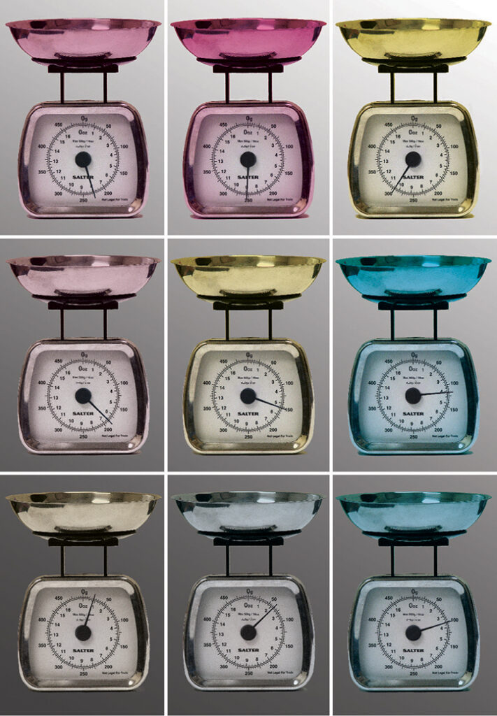
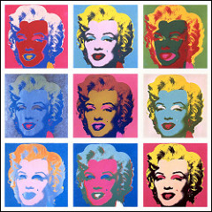
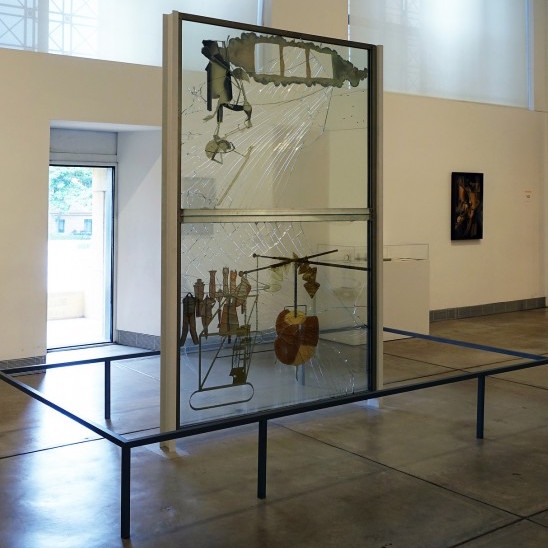
In most instances, therefore, you will work with multiples. You could collage many images together to make one like Doug and Mike Starn did with their twin portrait. Conversely, you could take one image and make variations on it, multiplied and manipulated, as Andy Warhol did with Marilyn. It’s possible to make a series of images of one thing from many points of view, as Cezanne did with his haystacks. You might create panel work, like the diptych Duchamp made with The Large Glass.
Sources
Digital photography
Sources of digital images can include, but are not limited to, the following:
- Hi-Res Camera | If you want to try and achieve one large, single photographic image, you’ll need a hi-res camera (i.e. not your phone or tablet). Not easy to come by.
- Low-Res Camera | Older phone cameras create 5-megapixel images… around 5 X 7 printed. This doesn’t mean you cannot use your old low-res friend. It simply means that, like Hockney with his Polaroid, you are joining many small images together. If you have a phone or tablet that’s more modern, you might get a resolution that allows a diptych or triptych.
- Existing Photos | You may have pre-existing photos you might wish to use. This gets tricky because often they are not hi-res images; open the image in Photoshop and analyze the pixel data to see. Do you have printed photos? Scan them, remembering you can scan at 600ppi or 1200ppi to enlarge them.
Other sources
- Appropriation | Certainly, images can be found on the Internet. But remember your obligations toward citation of sources and the requirement that your work with them be transformative. We know that truly large images are a rarity on the web, where image resolution only has to be about 72 or 144 pixels per inch to satisfy the technical needs of a monitor.
- Drawing | You can sketch, draw, or paint, virtually or actually, and either scan or export such material to a raster context.
Resampling an image: changing resolution
It’s challenging enough to acquire the high pixel dimensions required by the scale of the project, so it’s unlikely you are resizing any image to downsample. More often, people are tempted to do the opposite: scale a low-resolution image up to hi-res. We’ve mentioned upsampling before, and we know it is a cardinal sin of digital imaging.
It is rarely successful to upsample an image, but it can be done with a bit of luck and a dash of filters, blurring, adding noise, etc. If you MUST upsample, try to limit the size increase to around 120% size of the original.
Although no serious digital image editor will endorse upsampling if there is any other option, there are those “once-in-a-lifetime” images that cannot be manipulated any other way. Let’s explore a case study of this “forgivable” sin.
Upsampling: when there’s no other choice
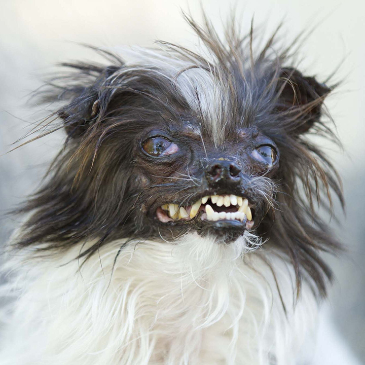
This is a photograph of Peanut, a contestant in the Ugliest Dog Contest held in San Francisco. The original is 10 inches square and 72 ppi. We want to print at 20 inches square and 300 ppi. That means we need an image that’s 833% larger… or we must upsample! Can this sin be forgiven? Let’s analyze.
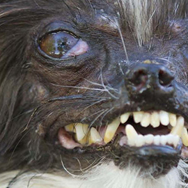
Here is a detail of pixels zoomed into the center, shown 1:1 with monitor pixel size. What looks good on a monitor, however, is terrible in print unless we print it at 2.4 inches square (720 pixels/300 ppi). Too small!
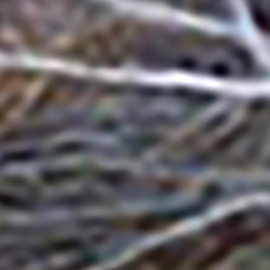
Zoom again to the center. Here is a detail shown 1:1 with monitor pixel size. We’ve done a raw upsample. The original 10×10 at 72ppi is manipulated under Image>Image Size to 20×20 at 300ppi using Resample: Automatic. Peanut is now even uglier than in real life! Blurry image noise, a mess not worthy of printing.
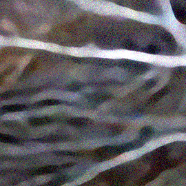
The same detail, but upsampled as follows:
- Double the original Resolution 4 times using Resample: Preserve Details 2.0: 72 to 144, 144 to 288, 288 to 576, 576 to 1152. This is super massive!
- With the image now 10×10 at 1152 ppi, add a Noise filter (5% or so) and then a mild Blur.
- Downsample to 300 ppi using Resample: Bicubic Sharper (Reduction).
- Finally, tweak edge contrast using Unsharp Mask, a filter we’ll explore below.
While better, this upsampling trick will never be perfectly clear as a print. However, it will look quite convincing with your eye about 3-4 feet away from the print plane, and that’s about as close as anyone ever wants to get to this ugly dog anyway!
If you’d like to see the actual files from this case study, they are available at the upsampling demo directory at the top of this title.
Iteration
You have a concept and some raw material at this stage. What’s next?
Formatting your image(s)
We mentioned that to be considered a large-scale printing project, the final work will comprise approximately 400 square inches of printed area. But the format is not prescribed. This means 400 square inches could become:
- one large 20 X 20-inch square
- one large horizontal or vertical rectangle (18 x 22, 17 x 24, 16 x 25, 14 x 29, 10 x 40, etc.)
- a group of images organized with Gestalt proximity, creating a polyptych (10 images at 5 x 8, 16 at 4 x 6, 5 at 8 x 10, 2 at 12 x 18, etc.)
- a Starn-esque or Hockney-esque overlapping collage (? x ?, factoring to fill out the required area)
VARIATIONS ON FORMATTING
Any of these formats and orientations will work for the project, as long as the print area equals ~400 square inches.
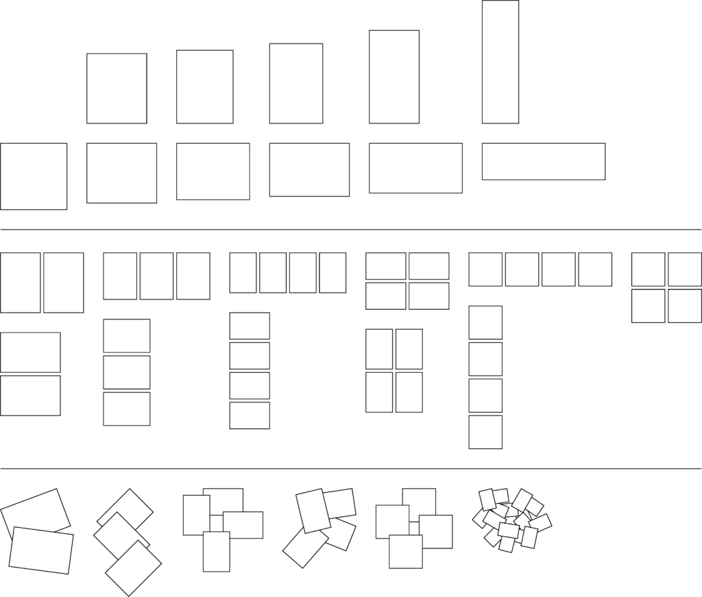
This isn’t rocket science; the figures can be slightly more or less than the target area. In the examples above, we can calculate a range of areas from about 380 to about 450. So the magic number 400 simply exists as a guide to guarantee no one does less (or more) work than the project objectives require.
Image refinements
Unsharp Mask
Recall the Unsharp Mask filter. This filter increases contrast at edges, and newbies are scared of the filter results on a monitor. But ink spreads: this fact is what the Unsharp Mask accounts for. Especially useful in an image that has gone through a great deal of manipulation.
Color fidelity
Many people come away from a print job a bit unhappy with the results: color on a monitor is typically more saturated than color output. If you want to maintain saturation, consider paying for glossy paper instead of our complementary matte finish stock. If you like printing on matte finish paper, bump the saturation up 10-15%. It might look garish on the monitor but it will give the expected results in print.
Filters and other tricks
Remember you have a large toolbelt from which to choose: adjustment layers, filters, blending modes, selection sets with quick-mask, cloning, vector shapes, text, and the like. But be selective: you don’t have to use everything you know! Let the image concept drive the choice of these tools.
Ask the hive mind
You have an idea in your head but you can’t get it right. Remember that we’ve only scratched the surface of what Photoshop can do. If you want to achieve a certain effect, it’s possible. Make your face look like neon glow? Stretch a building to ten times its height? Make your cat green? Go online with a question, and you’ll find a dozen tutorials that address the workflow. If you use a tutorial, be sure to share it in your blog post.
Bleed, border, or hybrid?
You’ll remember the options we explored in Need to Bleed: what kind of figure/ground relationship does your image (or images) have to the paper edge(s)? Let’s explore 2 case studies.
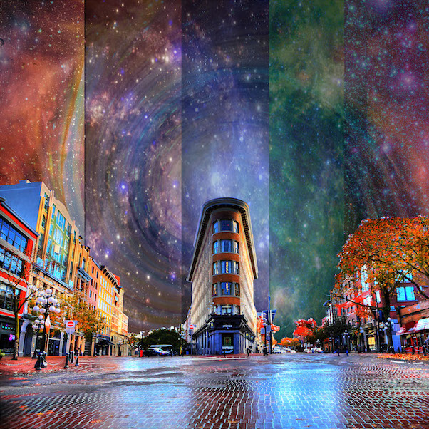
FULL BLEED 20 X 20
BORDER PAPER, 10 X 13 IMAGE
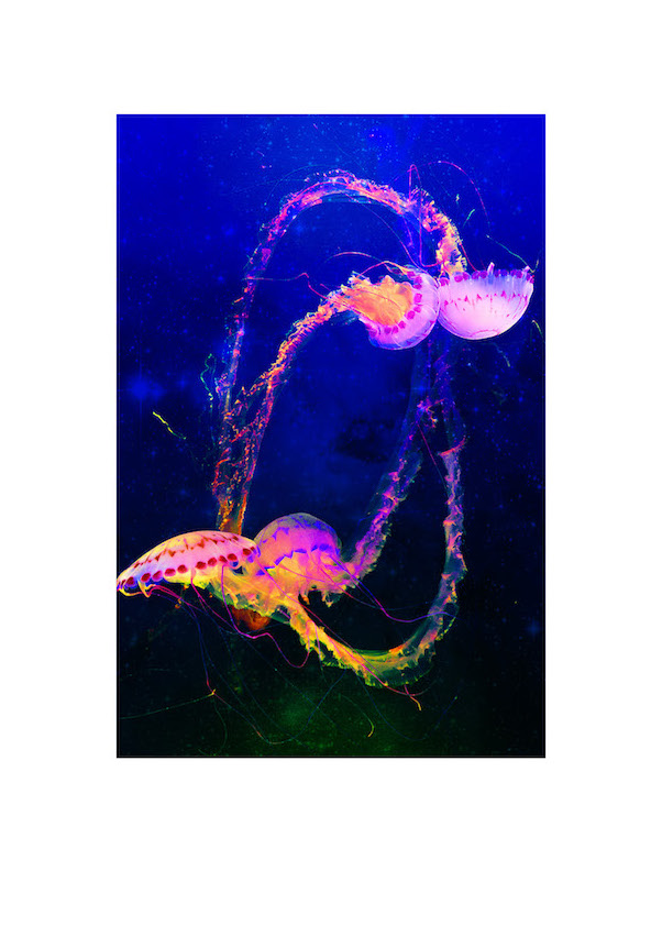
In the full bleed image, there is no visible white space on the paper. In the border image, although the white space is empty of image data, it still contributes to the image in a Gestalt manner. Therefore, the white space is part of the concept and therefore “counts” as part of the image area.
IMPORTANT: if you are considering a full bleed at this Iteration stage, make sure you understand a small portion of your image edge is cropped away in the final print. Many people fail to account for the need to bleed at this point! If you’re not sure which way this will go, assume you’ll need some room for a bleed. You can always crop away, but it’s difficult/impossible to add image data to the edge to achieve the bleed!
As we transition to the Synthesis stage, we continue this discussion and reveal how exactly to express the bleed in your print-ready file.
Synthesis
Creating your print-ready file
Whatever bleed, border, or partial bleed scenario you use, you’ll need to introduce the cropping device we discussed in Need to Bleed. Sometimes called crop marks, sometimes trim marks, these synonymous terms describe the same thing: a visual device that guides you in trimming the print to the target size.
Take a careful look at the files available in the case study directory at the top of this title.
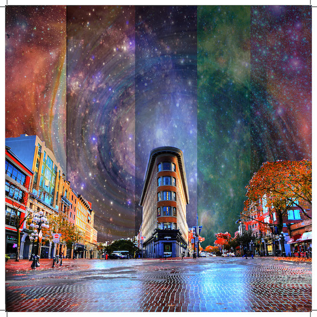
FULL BLEED 20 X 20
Crop marks emphasized
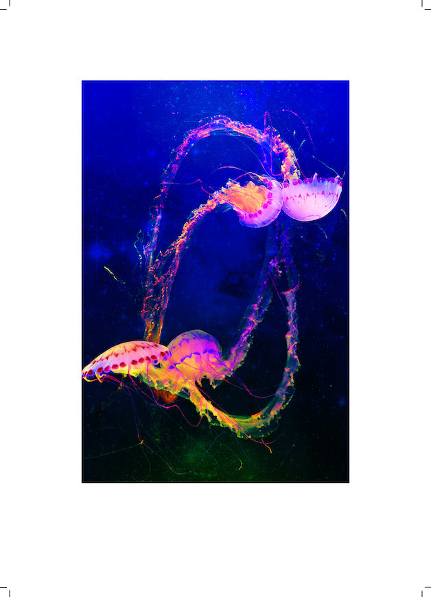
BORDER PAPER, 10 X 13 IMAGE
Crop marks emphasized
The workflow
- Create the Photoshop digital manipulation and save as TIFF at 300 ppi.
- Create an Illustrator document, and:
- Size the artboard appropriate to your goal.
- If a bleed, the artboard will be about ⅛ inch smaller on each side than the image.
- If a border, the artboard will be larger than the image.
- The size of the artboard will determine the location of the crop marks.
- import the TIFF, then embed the TIFF. Position it appropriately to the goal.
- Save as an AI file, and print to PDF with trim (a.k.a crop) marks checked ON in the print output dialog box. If a full bleed, make sure bleed settings permit the bleed to overlap outside of the artboard.
- Size the artboard appropriate to your goal.
- Open the PDF in Adobe Acrobat to inspect:
- If you don’t see crop marks at all, discard them and go back to the AI file to reprint to PDF, taking care to turn crops on in the dialog.
- If you see crops on a full bleed but don’t see overlap, discard them and go back to the AI file. When printing to PDF, double check:
- The position of the image relative to the artboard (it should overlap outside).
- The bleed settings in the print dialog.
- From the PDF file, export a medium-resolution JPG to show crop marks.
- You now have 4 files: TIFF, AI, PDF, JPG, created in that order:
- The PDF is sent to a service bureau to print.
- The JPG is posted to your process journal or blog.
Working with your physical print
After your service provider finishes your print, get a craft knife, a long straightedge, and a good cutting surface to trim your work to crop marks. If you are at our campus, these tools are available in the makerspace. This process will be demonstrated live, if you are in a studio I teach. If not, or if you miss the demo, we have videos below.
Basic Xacto knife safety
Trimming a large print
Optional: mounting or framing
You may have noticed instructions in the video for mounting your print. In the studio I teach, this is entirely optional, not required.
Some people like to frame their work, which can be done with our without mounting. Again, this is entirely optional in the studio. Framing can get quite expensive, especially for custom sizes!
Presenting the print
When we present this project, we don’t present digitally. We magnetically pin them to the wall and look at the physical work. It’s an entirely different experience than viewing the work on a monitor, which is why we print!
Hall of Fame
Below, we present a large sample of some large prints from previous studios:
