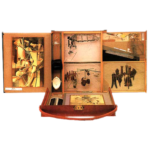
Portfolio
Your second tactile print project
So instead of lamenting “woe is me”, try this: Don’t create a resume, create a portfolio.
— Chase Jarvis

As the final project for the term, the portfolio is a logical look back at your progress. At the same time, it is an opportunity for you to apply the principles learned in the readings and InDesign exercises.
The portfolio consists of two interlocking parts:
- A tactile portfolio in the form of a leporello book, designed in InDesign, printed by a service bureau, and assembled by you.
- A digital portfolio in the form of a publicly accessible link to a well-organized cloud-based directory of files.
These two portfolios are just two ways of seeing the same content! So, you create a link between the digital and tactile portfolio elements by incorporating a QR code into the design of the book.
Concept: a multi-page spread and mantic grid
In the download above are several files, including two radically different design approaches that we’ll detail below. They are called unity_portfolio and tension_portfolio, and you’ll see .pdf, .jpg, and inside the documents folder, .indd versions of each. It’s fairly clear by the naming schema that these files will reflect the aesthetic philosophies embodied in our Unity and Tension exercises.
Let’s stress, however, that these are not binary choices! There are as many ways to combine strategies as there are designers. The careful observer will see that there is a bit of Tension in the Unity portfolio, and vice versa. Think of these as defining a spectrum of opportunities to experiment with to discover a personal vision. Don’t think of them as narrow categories you have to force your vision to fit within.
Common design criteria
However you decide to work, there are technical design criteria that any project must follow:
- The leporello must contain 7 pages in one multi-page spread, 6 of which are visible, 1 of which mounts a cover and is left blank.
- Page size is 30p0 X 30p0. The total length of the spread does not exceed 210p0 (that’s 35 inches).
- All finished artwork projects must be represented in the portfolio. Exercises are welcome as well but are optional.
- Your name, project titles, and descriptive text must be included.
- Access to your video from Readymade and to your digital portfolio must be included in the form of a working QR code scannable with a mobile device. Other websites, like your project journal, are welcome but optional. You want to take care not to overload with too many QRs!
Can you break the rules? Well, you’ll see several instances in our Hall of Fame below where people have, in fact, successfully created a publication without following these criteria! So: yes. But that yes comes with a but: talk to me. Propose something. Convince me that it’s interesting and equivalent in scope.
Creating the multi-page spread
Create your leporello in one long multi-page spread. The default condition in InDesign is a spread with two facing pages. You can define this otherwise as you create a new file.
Go to File>New and in the dialog, choose the following under Print:
- Width and Height: 30p0. Units are Picas. Being a square format, Orientation does not matter
- Pages:7. Uncheck Facing Pages
- We’ll set Columns and Margins later
- Bleed and Slug: Set Bleed only at 0p9 for all sides
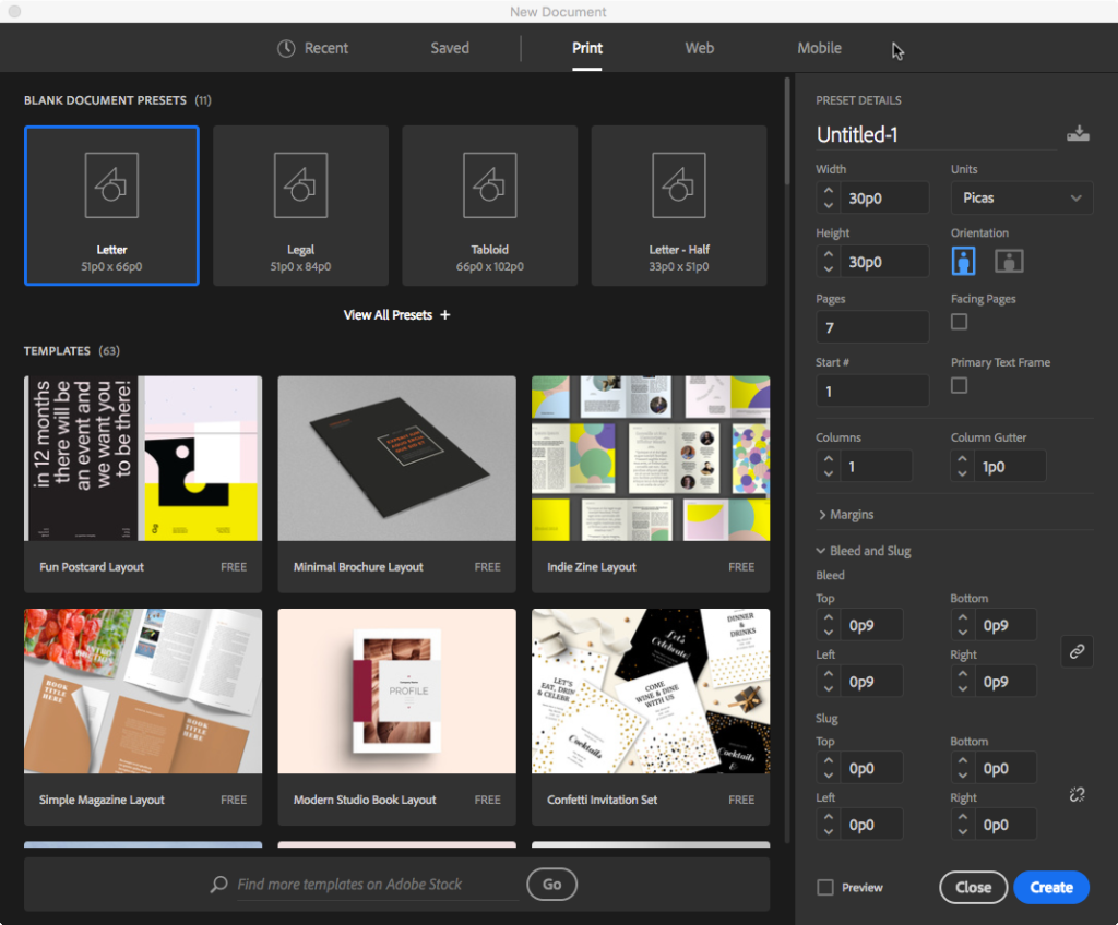
Hit Create and after the new document populates the viewport, organize the pages into a multi-page spread. First, open the Pages Palette and resize it so you can see all the pages in a vertical stack. Open the dropout menu at the upper right-hand corner of the palette and notice the check mark next to the item Allow Document Pages to Shuffle. I know, it doesn’t sound like human language. Take it on faith. Select this item to uncheck it.
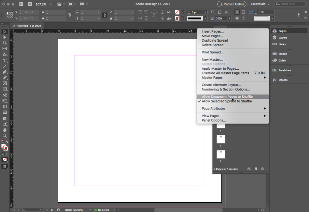
Never mind that this command is unintelligible — it allows you to join pages up by moving them around in the palette. Click on Page 2 and hold-drag it up to Page 1 until you see a light gray rectangular bracket appear. This can be a bit of a haptic exercise, so be patient.
When you see the rectangular bracket, release Page 2 and it snaps adjacent to Page 1.
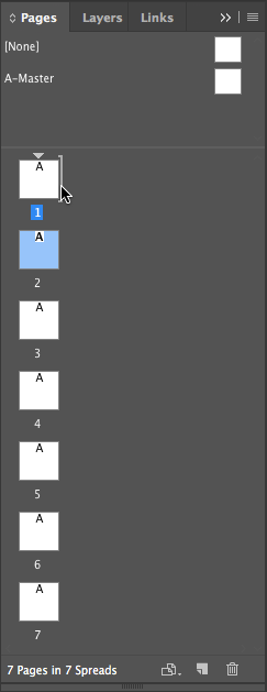
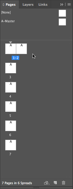
Repeat this for all pages, and when complete you’ll see a 7-page spread in both the Pages Palette and the viewport itself. Resize the palette as needed.
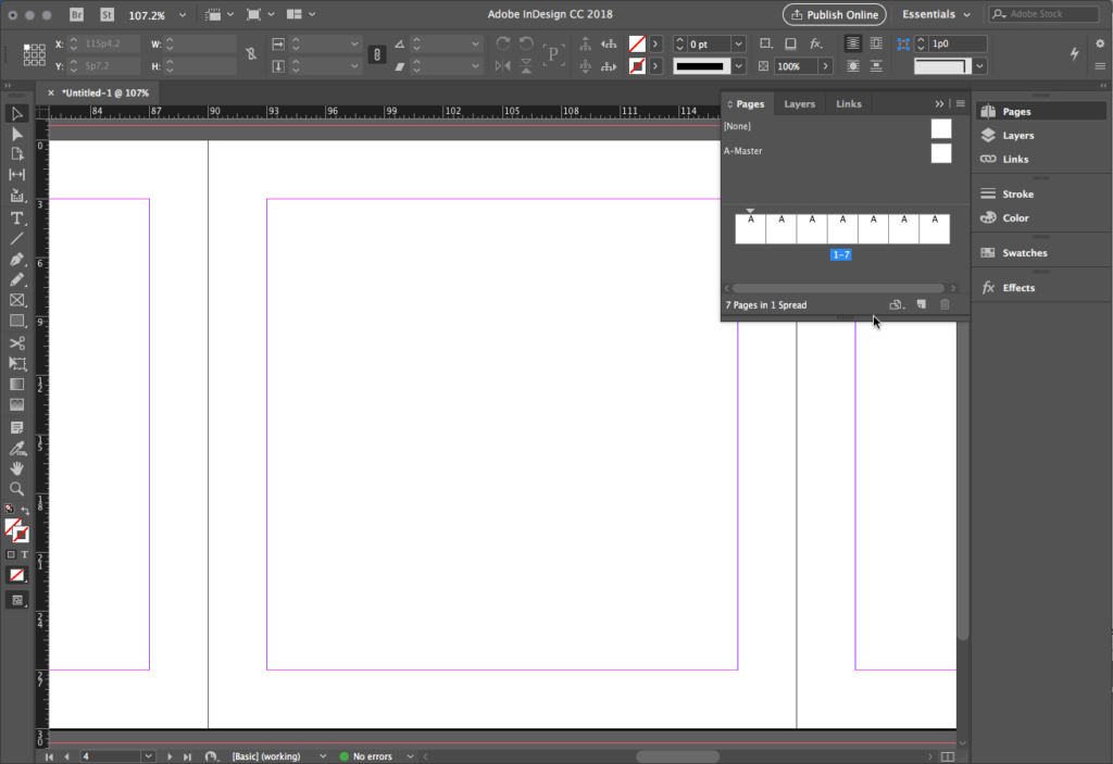
Create an A-Master modular grid
After the Unity exercise, you may be tempted to develop a Tchichold canonical grid to structure your pages. Tchichold notoriously detested the square format book, and it’s easy to see why if you try. His canonical grid presupposes a relationship to the Golden Ratio or other non-uniform formatting.
However, noted Swiss graphic designer and typographer Karl Gerstner celebrates the square with the Capital Grid, an overlay of several modular divisions of the square. Developed for Capital magazine in 1962, this layout grid develops, in his words, the “optimum balance between necessity and freedom; or, in other words, a maximum number of constants with the greatest possible variability.”
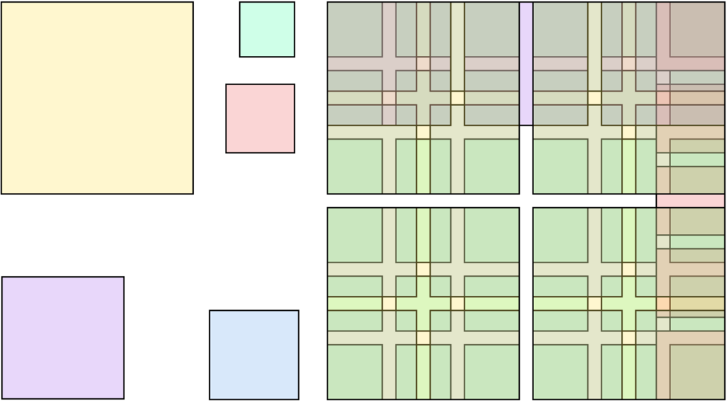

In our new file, we can develop a Gerstner-inspired grid for our square pages rather quickly, and use a nice trick with master pages to hide and reveal it. Note that in the screenshots below, we are turning the overlapping grids on and off for clarity of illustration.
Harmonize the grid systems
In the Pages Palette, select A-Master and do the following:
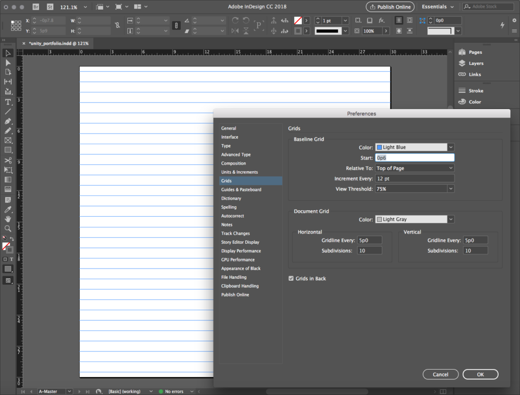
- With 2×2 and 3×3 grids overlaid, we need a common denominator, so we’ll divide the page using the Document grid into 6×6 sub-modules. Open InDesign > Preferences and under the Grid option, set the Horizontal and Vertical gridlines every 5p0 (30p ÷ 6). We set the Subdivisions for this at 10 to get a subunit grid of 6 points (5p = 60 pt).
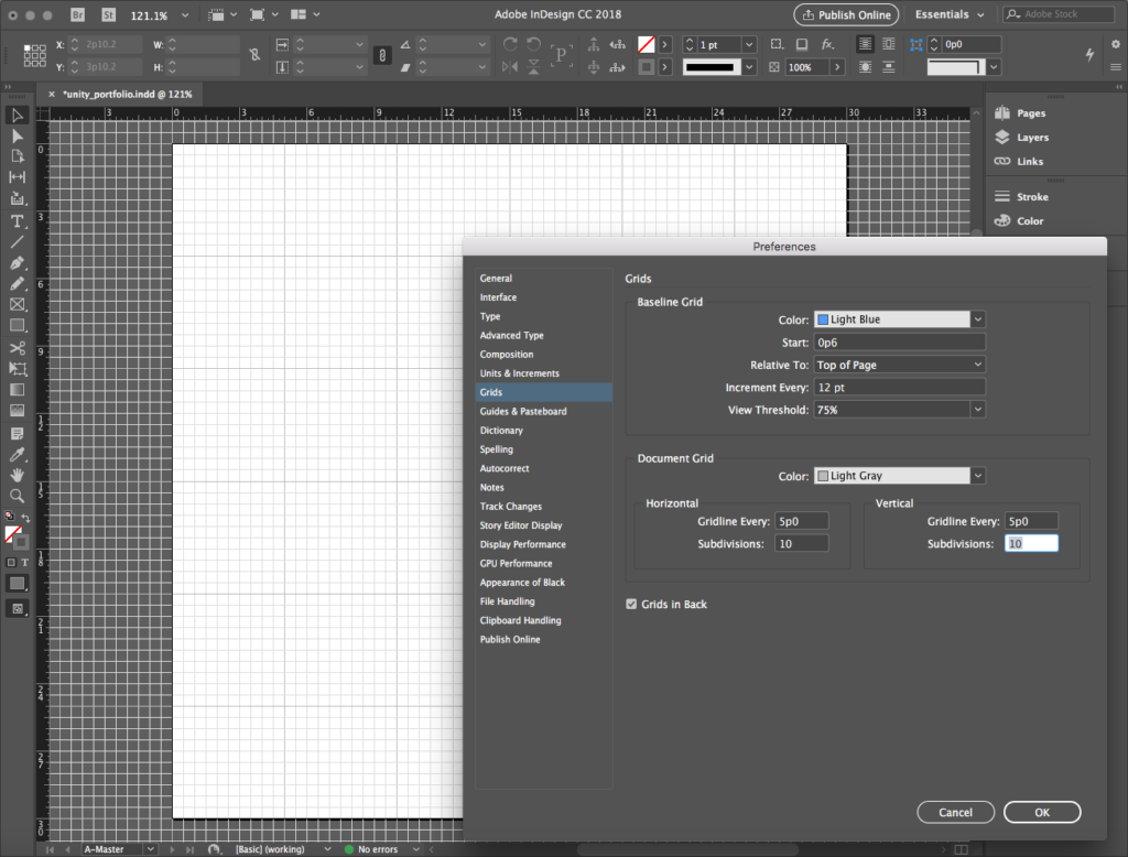
- While in Grids, set the Baseline Grid to Start: 0p6 and Increment Every: 12 pt.
Harmonize the margins and columns
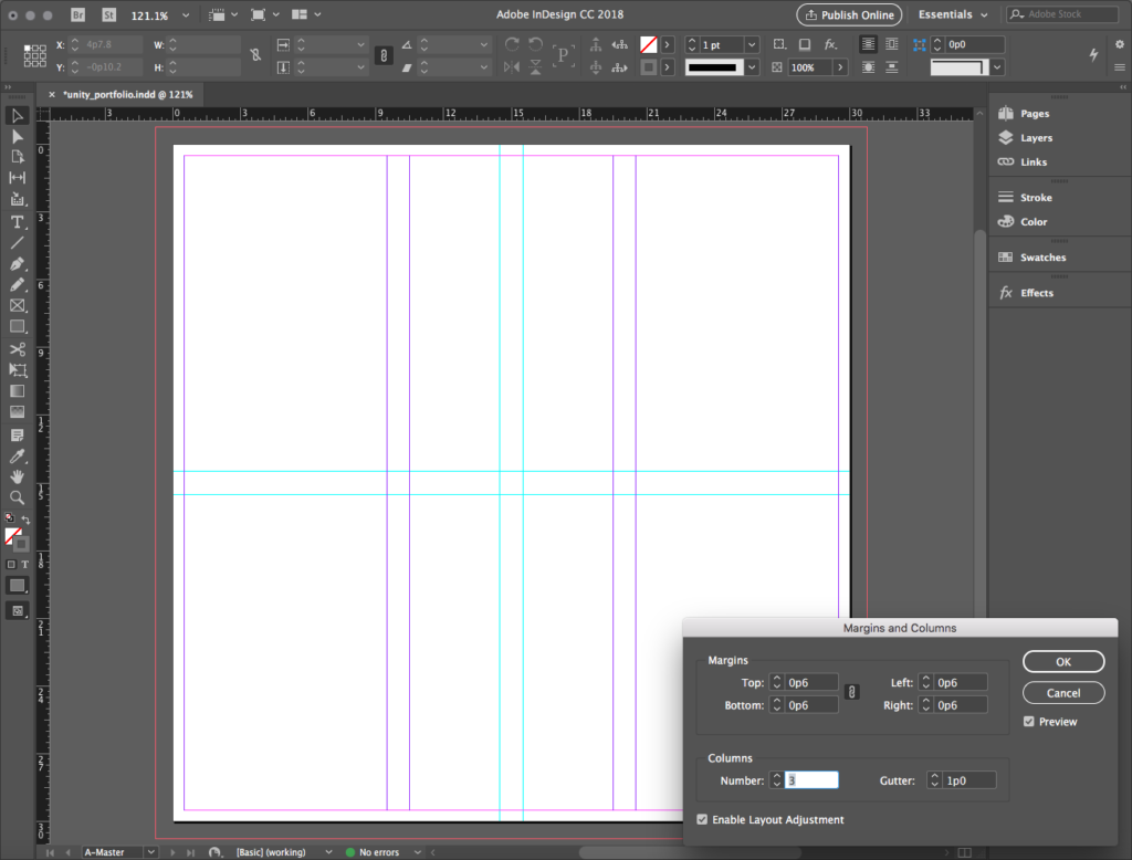
- Now go to Layout > Margins and Columns… where we set Margins at 0p6 uniformly, and Columns at Number: 3 and Gutter: 1p0. This creates the division by thirds.
- With Rulers visible (View > Show Rulers) and Snap to Document Grid on (View > Grids & Guides > Snap to Document Grid), from the vertical ruler drag out vertical guides at 14p6 and 15p6 as read on the horizontal ruler. From the horizontal ruler, drag horizontal guides at the same values as read on the vertical ruler. This creates the division in halves.
Create squares to visualize modules
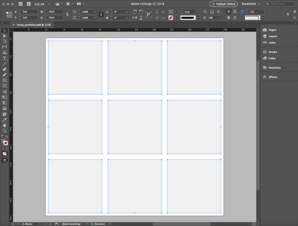
- Using these guides and margins, create a square that aligns inside the left-hand 3 X 3 column at the upper left corner of the page — it’s the magenta grid created by columns and gutters.
- Don’t fight to get it right: use grid snaps!
- Use SHIFT to constrain, and you’ll see why we didn’t bother with horizontal guides.
- Style the square with black fill at Opacity:10% (don’t style it a light gray: we need transparency!).
- Copy, paste, and move squares until you fill the page with a nine-square grid aligned with the guides and margins. Grid snaps ON for precision!
- Repeat this process, creating squares that align with the 2 X 2 guides — the cyan grid created by the guides.
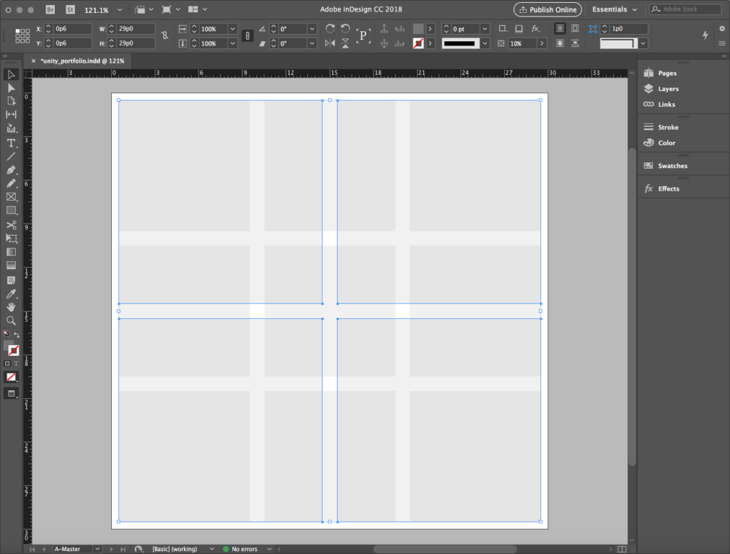
This A-Master looks like the illustration with all the guides and grids turned on. You can now apply this master to any page in the spread simply by selecting it and dragging it over a page. This action applies the Gerstner grid to the page for you to work with. To hide the grid, simply select the NONE master and drag it over the page.
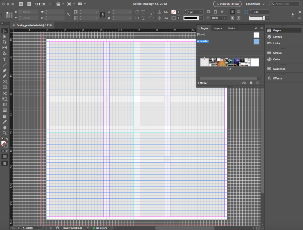
This complex, interwoven grid is almost like a tartan weave! It provides both variety and consistency, freedom and structure, allowing a designer to experiment efficiently with concepts. And because it’s not overly simple, the overlapping modules create interesting, unpredictable visual rhythms. We’ll take a look at its use in the unity_portfolio sample below.
Choosing a design approach
In our download samples above, we have two sample .indd files that typify the ideas of Unity and Tension respectively. Again, we don’t wish to present these as exclusive options; aspects of each can be combined. Think about your personal goal for your project and this will help determine the approach you take.

Unity or Tension, anyone?

Unity: present your work
A UNITY APPROACH
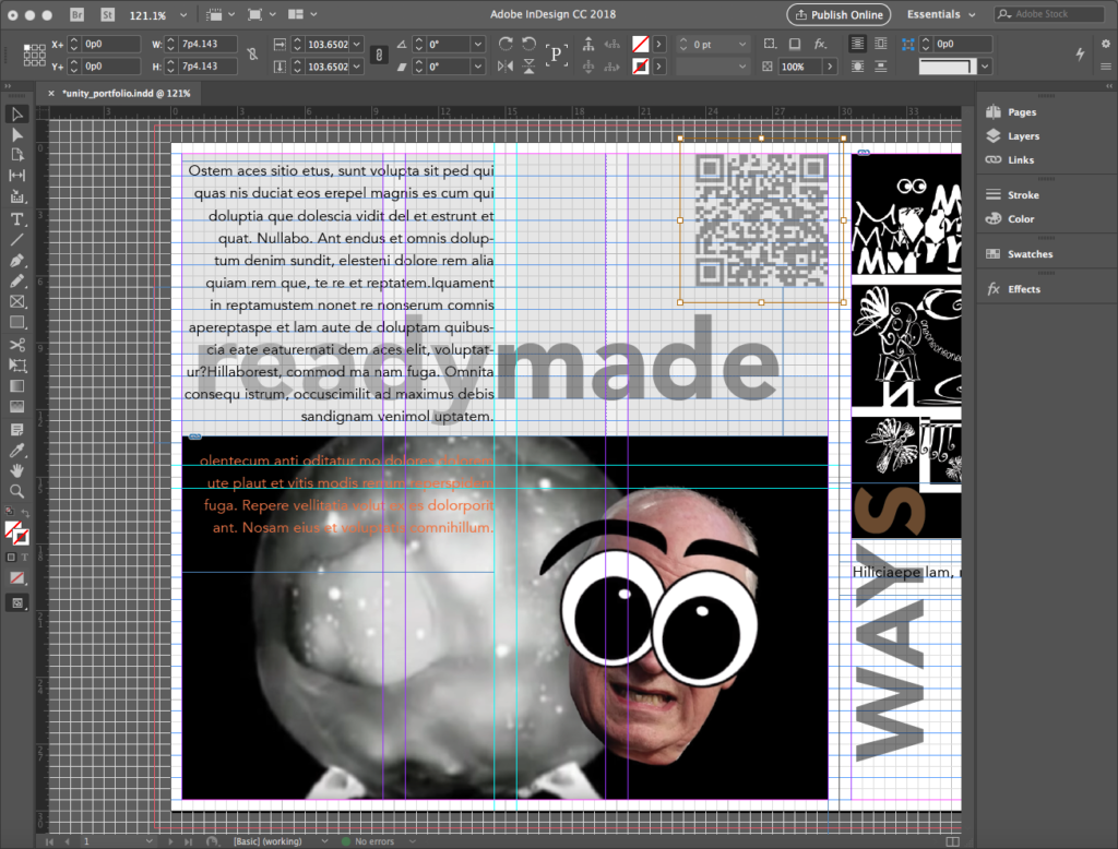
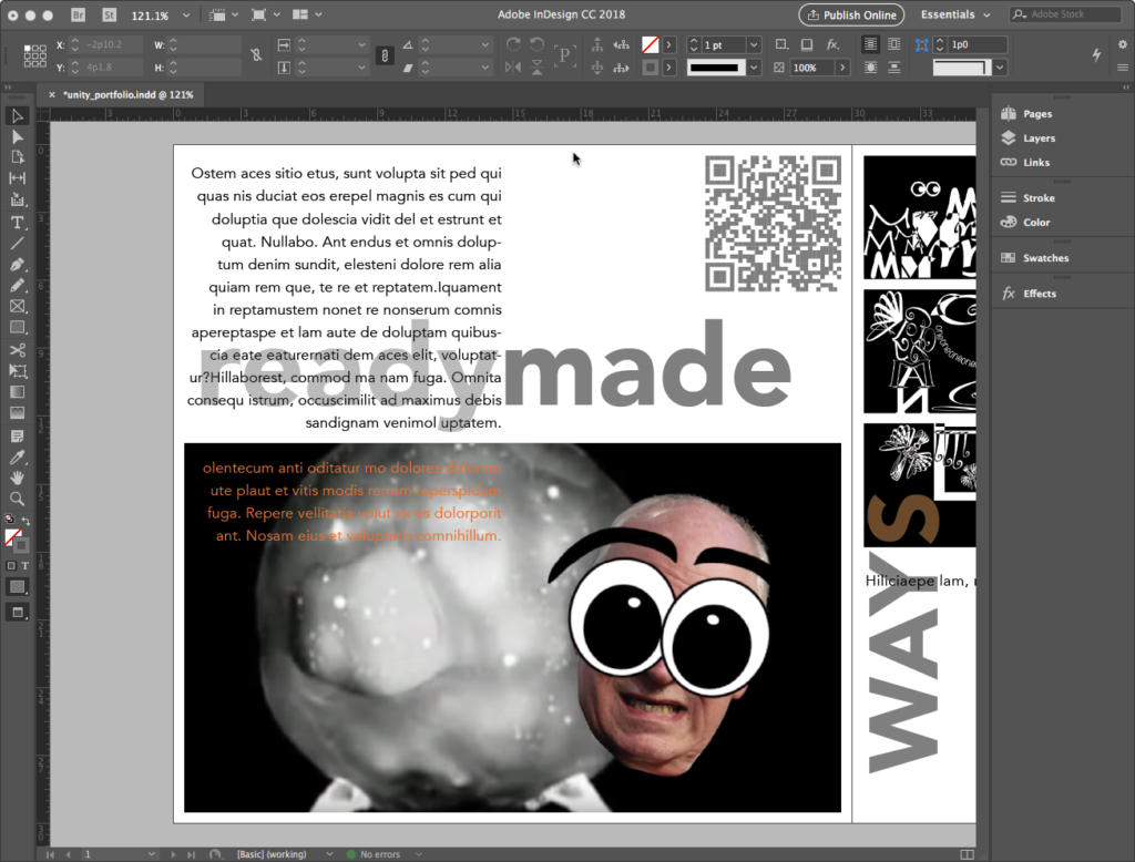
The grid has a strong but not overpowering presence in this sample…

… although there is a touch of tension-inspired layering.
In this approach, the work is brought to the spectator with clarity and a sense of autonomy for each project. This is reinforced by each project occupying a page, although we see exceptions to this. Each page contains the artwork, a title, some descriptive text, and the introduction of exercise material the author believes will help the spectator understand the intentions of the artwork.
Tension: interpret your work
A TENSION APPROACH
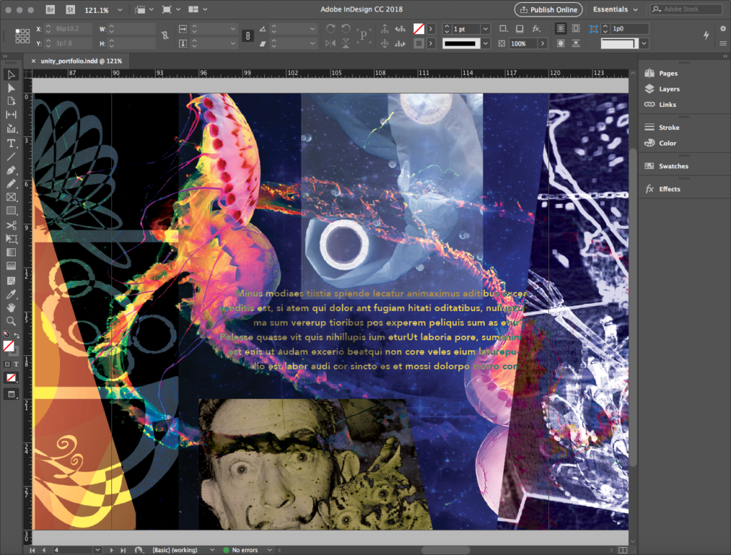
The same source material, with layering providing visual hierarchy…

… although some grid-based unity-esque ordering sneaks in.
The grid takes a back seat but it does drive the placement of select elements. Liberal use of layering and blending modes blurs the boundaries among images. Autonomy among projects is highly ambiguous and uncertain. Projects are not necessarily in order but placed in alignment with formal analogs — curves next to curves, grids next to grids, etc. Images can repeat. The Direct Selection tool creates trapezoids with dynamic, angular frames.
Iteration: content and common technical issues
After you’ve selected a philosophical approach for the look of the book, compose your content. Most authors find the book is hierarchically dominated by images. And it should be. However, it’s easy to forget there are required text elements.
The one that goes missing most often — one that continues to surprise me — is this:
DON’T FORGET YOUR NAME
Each project also has a title or at minimum a number. Think of this as equivalent to feature text or a headline.
Lastly, each project has some kind of reflection or description. The pages are tiny by design, so the amount of text should reflect the nature of the container. A one-sentence, elevator-pitch approach is more successful.
Nearly everyone deals with the following common technical issues for the book.
QR links to the web
A QR code, like barcodes or other “required” graphic matter, can often feel like a sore thumb, not integrating into the overall design. The stark black-and-white contrast stereotypical of these elements is not necessary. We just need a sufficient amount of contrast. QR codes are highly redundant, meaning they can stand some obfuscation. Be careful, though, and test your design with an actual scanning device before printing.
InDesign allows an in-app standard QR to be generated, although there are several apps and online services that create unique designs if you don’t like InDesign’s generic output.

Presenting the Readymade project
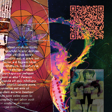
The time-based work created for the Readymade project cannot exist in a static book! A QR code in the book allows us to scan to access it, but there’s not much compelling about a “naked” code, even if you generate a fancy one. People want to know what they’ll get; otherwise, they won’t bother to scan.
So, you’ll want to get a screen capture of your media as a teaser. This can be done in one of two ways:
- Open the file if it’s a movie and do a screen capture by using Grab or Command+Shift+4 on the keyboard in a Mac context.
- Open the original file and export a slide to .jpg.

A strange loop: getting the “book inside the book”
Take a look at Pages 5 and 6 of the Unity file, and you’ll see something rather odd. The book spread appears there, representing this project, the Neverending Story. What sorcery is this? It’s certainly a strange loop to have a book reference itself before it’s even printed!
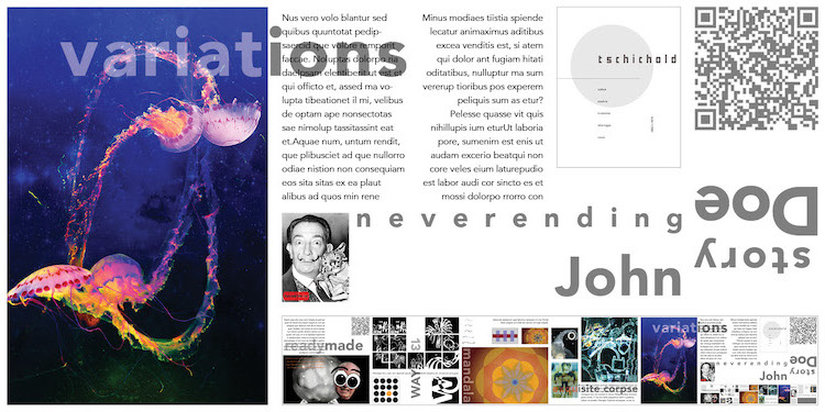
The workflow to do this is deceptively simple:
- Place a gray placeholder rectangle where the book image will go. You need to calculate the proportions: we are using a 6:1 ratio because we have six pages to illustrate (remember, page 7 is blank for a cover).
- Compose the entire book, including this placeholder rectangle.
- Go to File>Export and create a .jpg image of the entire spread.
- Import this image into the book, replacing the gray rectangle.
- Repeat this one more time, creating a second .jpg — this time with the book image inside.
- Get the second .jpg and replace the first .jpg with it.
Not only do you have the book inside the book, but you have the book inside the book — inside the book!
Historical states
As you try out different things in iteration, you may find it useful to save the work at a certain stage, duplicate the file, and continue working on the copy. As we’ve done before, this sets up a series of historical states of the file. If you end up hating the direction something is heading for, you don’t have to rebuild the file back to the last state that you liked. This is the single most effective way to save time on any creative project!
Review the digital portfolio
You’ve been building your digital portfolio throughout the term if you’v been taking a studio with me. This is essentially a database and retrieval system for media, organized in a way that is simple for you and posterity to navigate. It is an ever-changing home where the chickens of good digital discipline come home to roost: you need a clear system of organization, but not one so restrictive that it can’t adapt to new directions your work might take. Thoughtful file naming and directory formatting can accommodate flexibility as your work evolves. In the instructions that follow, a suggested system is offered which you can adapt to your own use.
File naming
In the instructions throughout the wiki, you have been offered a recommended file naming rubric like this…
20XX_lastname_workTitle.ext
… where 20XX is the year, lastname is your last name, workTitle is the name of the exercise or artwork, and .ext is the file extension like .ai, .pdf, or .jpg. The underscores separate information by type without introducing spaces that can cause trouble in contexts like web browsers. The funny capitalization in workTitle is called medial capitalization, camel case, or camelBacking. It is conventional in programming for multi-word identifiers. Here, we use it to keep identifiers like thirteenWays or unityTension legible without mistaking the second word as a new class of identifier by using an underscore.
Reasonable deviations from this recommendation are OK. For example, the last name smith might be so common as to create confusion, so add your first name in camel case (smithTeri as distinct from smithTony).
Example: Abe Linkoln just finished the second project of the term, which is based on a poem, and exported it to pdf. He wants to include his first name in the basic rubric. His file should be named:
- 2019_linkolnAbe_thirteenWays.pdf
It should NOT be named:
- Second file.pdf
- MyPOEM.pdf
- blackbird.pdf
- Abe’s **AWESOME** file!!!!!!.pdf
- ilustrashun@thirteenwaysoflookingatablackbirdpdf.
- Untitled-1.jpg
- whatevs ¯\_(ツ)_/¯
Reserved characters such as…
! @ # $ % ^ & * ( ) + = ~ [ ] ‘ ” ? / \ , : ; > <
… can mean specific things to applications or operating systems, and you can break the Internet by using them in file names.
If you’ve followed the recommendations throughout the term, hooray for you: you’re already done with this! If you’ve been less than attentive to this, now is the time to dive in and tame your names. You create about 50 or so archived files over the term, so it’s maybe an hour of work to correct any deviations from best practice.
Strong folder names and hierarchies
At the same time you’ve been encouraged to provide rich, well-formatted file names, you have also been introduced to a recommended folder name scheme and structure in your cloud drive storage. The rubric for naming depends on what the folder function is in the hierarchy. The container is similar to a file name…
20XX_lastname_2dArt
… while a sub-folder that contains a project follows this…
XX_projectTitle
… where XX is a number to keep folders in order and projectTitle correlates with the project title pages in this wiki. Simply put, you have six of these folders:
☁︎ your_cloud_drive

↳   📂 20XX_lastname_2dArt

        ↳ 📂 01_readymade

        ↳ 📂 02_thirteenWays

        ↳ 📂 03_mandala

        ↳ 📂 04_corpse

        ↳ 📂 05_variations

        ↳ 📂 06_neverEnding
As projects get more complex, subfolders are created to organize larger sets of files into logical groups or to create specific environments to share. The 04_corpse folder, for example, has collaboration sub-folders that perform a deliberate organizational purpose.
To visualize what a strong digital portfolio organization and naming schema looks like, visit the link below.
Synthesis: printing and assembling the book
Export to PDF for printing
Best practice in graphic design calls for the creation of a PDF for output, which we rehearsed in our exercise. With a multi-page spread, however, there are a couple of new considerations.
In the General category of the Export Adobe PDF dialog, look under Pages and observe the item Export As with two options. Select the Spreads button so that the PDF will come out as one large page instead of separate pages.
And of course, under Marks and Bleeds, in the Marks section, select Crop Marks. Under Bleed and Slug, since we have a bleed setting defined, check Use Document Bleed Settings.
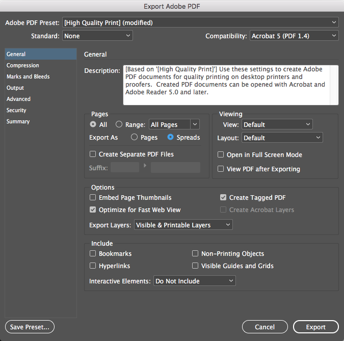
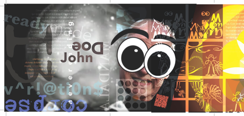
Your PDF file should contain crop marks at the corners, and fold marks between pages, as illustrated below. Inspect it before submitting it to print. If it does not have crop marks, discard the file and troubleshoot your output.
Tactile construction: making the physical book
After creating your print PDF, share it with your service provider to get it printed. At our school, we offer one FREE print per student in our studio, but the file must be shared with the instructor precisely as directed: by the deadline, through cloud sharing, and properly formatted.
When you get your print, it will be a rough cut from a roll, with your crop marks visible. Your job will be to carefully cut your book out and use knife-scoring techniques to generate clean folds. Straight edges and cutting boards are available at the campus maker space to do this if you are in a studio where I teach, but you will want to be attentive to the in-class how-to demonstration to avoid the many rookie mistakes that can ruin your one free print!
When the book is cut out, personalize it with cover material and a means to close and protect it. These should not be elaborate. Simple solutions will allow the content of the book to be the focus. Options for materials, and a demonstration for cutting material without the need to measure, will round out the construction of the book.
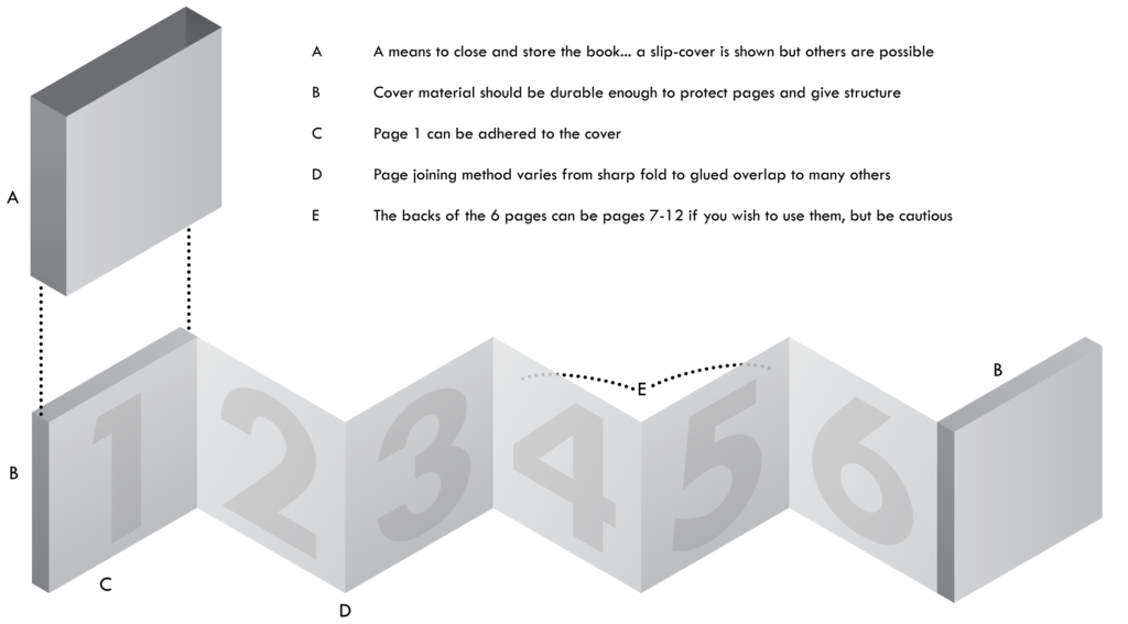
For those who miss our live demo during a regular term, and for those taking a six-week course who would like to print on their own, the following videos will guide you.
Basic Xacto knife safety demo
Book construction demo
Presenting the book
Physical critique
We’ll critique the work from a physical copy during our last meeting of the term, if you are in a studio I teach.
Virtual display options
Illustrating in your blog or process journal, by .jpg or .png, can be done a couple of ways, either of which are acceptable:
- You can create a straight-up image of the book by simple export. In my sample below, I’ve elected to crop out the 7th page, since it’s there simply to hold a cover on.
- Photoshop ninjas can show off by using guides, Edit>Transforms, and layers to create a 3D illusion that gives a better sense of how the book looks when printed. I’ve kept the 7th page, and added color and a gradient to illustrate how a cover might look.


Another, more interactive way to present the book digitally is through embedding a flip book.
Yumpu is very possibly the worst name ever for a content hosting service (I honestly can’t say it out loud without feeling like I have to use mouthwash afterward). But they may have the very best flip-book publishing tool out there. Love the price: use the free level account! There are slightly pushy ads at the free level, but they disappear after three page turns.
The tricky part of using this is you need a different kind of .pdf file. Create a second .pdf, but this time do not check Spreads for output, and no crops or bleeds on. This will create a set of single pages, which will be displayed in the flip book like this:
Hall of Fame
Books that follow the concepts of unity or tension, and some that successfully bend or even break the rules altogether.


And an example when fully assembled…

