

Personal logo

Introduction: a personal logotype
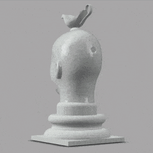
Inspiration
Logo case studies
Logo design looks pretty easy, but to do it well is one of the most challenging design problems in graphics.
Arguably the most recognized brand in the world belongs to Coca-Cola. Despite its seeming lack of modernity, the Spencerian penmanship prevalent at the time of Coke’s invention in the late 19th Century persists as a universal signifier, along with the red and white palette, bottle shape, and dynamic ribbon (although the ribbon has recently been dropped).
From AT&T (designer, Saul Bass) to IBM (designer, Paul Rand) to rival Pepsi-Cola (designer, Arnell Group), brands ditched their old logos for brand-new concepts to keep up with the times. Not so Coke (designer, Frank Mason Robinson, a bookkeeper for the company who had excellent penmanship, with the most recent refinements by Turner Duckworth). Why does the Coke brand identity maintain its appeal and identity where others become dated?
Personal logo examples
If designing a logo is hard for a client, it’s even more difficult to do one for yourself. You can become your own worst critic, and it’s hard to maintain critical distance.
A personal logo can be used on your resume, your business card, your website or blog, as an icon in social media, and other professional contexts. It can even be used to personalize ubiquitous products like a car or a Macbook laptop.
While we will consider all of those functions, our goal will be to produce vinyl decals at 3 scales.
Before we begin, for inspiration visit:
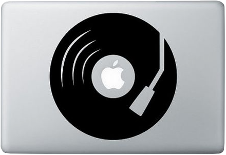
Stephen Edward Graphic on sale at Etsy
is a commentary on the historically uneasy branding relationship between Apple Music (the Beatles’ label) and Apple Computer.
This decal is similar in size to the largest
one you’ll create among many below.
Concept
Identity
Coming up with a unique identity can be the hardest part of the job. The blog at Design your way has an excellent discussion of the process if you need a kick-start.
Sketching
Your sketchbook or an equivalent ideation tool becomes the place to try out ideas before committing them to vector. This makes people anxious in that “but I can’t draw” kind of way. It doesn’t matter! Good sketchbooks can be random and ugly… and full of concepts. Don’t fear the sketch!
Flexibility
Don’t get stuck on one idea. In your sketchbook, come up with a minimum of 3 ideas you’d be willing to commit to, then discuss these ideas with others. Sometimes several ideas will synthesize into one better idea. Be flexible and willing to experiment!
Iteration
Preliminary digital draft
After discussing ideas and settling on a concept, begin working with Illustrator to develop it:
- Open a new Illustrator file and select the Essentials Classic workspace. Give it a logical file name, using 11 X 17 horizontal format and RGB color space (yes, it’s vector, so size doesn’t matter, and the output for the decal will be in black and white, but you don’t want to feel cramped, and other graphic iterations of the logo might incorporate digital color).
- Explore available fonts! If you don’t see a font that works, use the searching techniques we learned in our exercise and install whatever you nee.
- Remember to Create Outlines to turn type to geometry if you are manipulating a letterform, for example with PathFinder.
- Avoid overlapping, redundant vectors (which can often happen using the Paste in Front [COMMAND+F] command).
- You can use color in your design, but see the advice below.
- Be ready to critique the design “in the box” before final output.
Your preliminary design might look great, but for a logo to work, it needs to pass several tests below. Go through a process of iteration to test for success in each of these variables:
Scale
A logo must be legible and functional at many scales, from the size of the favicon in the tab of your browser to a billboard. We’ll be creating decals at 3 sizes that will test the viability of the logo:
- Fit within a 1″ square (slightly larger than the icons at the top of this page when displayed on a laptop)
- Fit within a 3″ square (3X the size of the smallest)
- Fit within a 9″ square (3X the size of the middle and 9X the size of the smallest)
This will quickly reveal details that become too small to work at a small scale, or simplicity that becomes too simplistic at a large scale.
Color > BW
You are welcome to design your logo in color for use in print and web contexts, but at the end of the day the vector interpretation of the vinyl cutter depends on pure, simple figure/ground relationships. To test your design, convert a copy of the color version to pure black-and-white to see how the decal will function.
Media
By exporting the vector file out to various file types such as we learned about in our exercises, you can test how the logo lives in various settings: on a business card, resume, website, etc.
Iconic quality
Test the memorability of your logo by showing others copies at various sizes and asking if they recognize it. Ask people who know you if the logo “reminds” them of you, or if they recognize you in it.
No two logos will be exactly alike, so it becomes difficult to provide more granular guidance here!
Synthesis
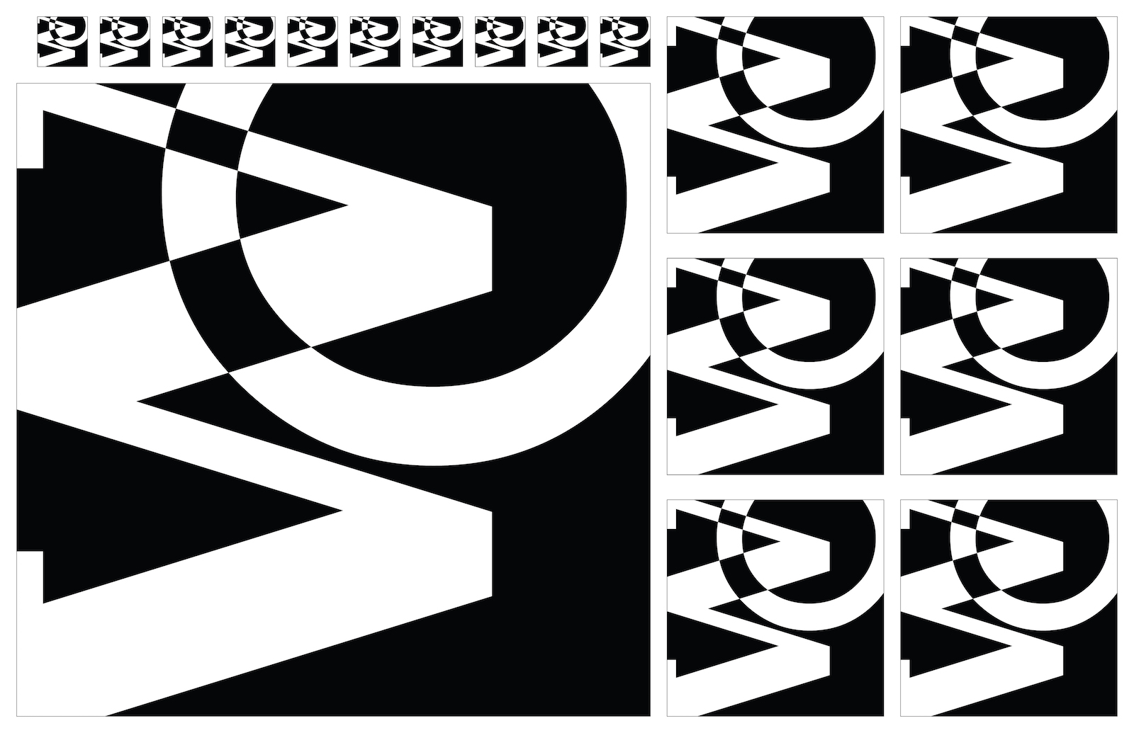
An ordering system in a fabrication-ready file
Once you’ve tested the logo iteratively and arrived at a satisfying design, you’re ready to set up the file for output. You’ll save your design file as an .ai file but you want to save in several fabrication-ready and presentation file types.
For your fabrication-ready file: save as .pdf and .svg. You’ll create an ordering system like we’ll see below.
For presentation: save as a .jpg at a minimum, but you may also want a .png or .gif version if you want transparency. You’ll want one version of your logo as a single image, AND one of the ordering system.
For fabrication-ready AND presentation:
For presentation ONLY – not fabrication:
The fabrication-ready version you are saving as .ai, .pdf, and .svg is placed in an ordering system known as a compilation file or a comp. If you lay out some copies of the file in an 11 X 17 art-board, you can fit 1 giant decal, 6 mediums, and 8 to 10 smalls inside the area—with enough area between to cut and separate the decals. Our comp above is laid out with a 9-inch, 3-inch, and ¾-inch scaled versions. Mine are square — yours will vary depending on format.
Recommendations for layout
- Your file should have a horizontal orientation. We’ve used 11 X 17 as a pre-formatted standard, but you can use any horizontal layout 26 inches wide or smaller. The more horizontal the format, the more efficient the cut.
- In our sample, I’ve left at least ¼ inch between each copy — any closer, and it’s difficult to cut down into individual decals.
- Sizes will depend on ratio. The sample is a square, a 1:1 format, but yours will vary. When trying to figure out your comp, use the rule of one-thirds:
- Make the largest about 80-100 square inches. For a square, 9 X 9 equals 81 square inches. For a 2:1 ratio, 13 X 6.5 equals 84.5 square inches.
- Scale the middle size about one-third the size of the largest — about 9 or 10 square inches give or take. My 9 inch square scales down to 3 inches. If I scale the 2:1 example down to about 4.5 x 2.25, that’s just over 10 square inches.
- Make the smallest one about one-third the size of the middle — maybe about 1 square inch in size. My sample ended up at ¾ X ¾, or just over ½ a square inch, because any larger and I would not have room for spaces in between. If I scale a 2:1 down to about 1½ X ¾, this equals just a bit more than 1 square inch.
If you’re a math nerd you can see this rule of one-thirds trick approximately changes the order of magnitude of the area: the smallest is about 1 square inch, the middle about 10 square inches, and the largest about 100 square inches. Changing order of magnitude is a great way to guarantee a range of scales!
Next: Fabrication
The black areas in your file indicate where your figure will be—the part of the vinyl you will want to keep. The white represents ground material you will peel away, a process known as weeding. We’ll cover that when we get to the final step in the project: fabrication!
Embed and link your files
- Embed or link (as appropriate) both presentation and fabrication-ready versions of the project in your process journal or blog. For embedding assistance, use the Embeds guide.