Multiples
Clones, copies, variations
It is the nature of digital material that it can be cloned, copied, and multiplied: download an artwork from the Internet, and the 0s and 1s in the binary code are identical to the file on the server it came from. Variation, repetition, and multiples in art are a time-honored idea. You will exploit Photoshop’s manipulation, repetition, cloning, and masking capabilities in a project designed to employ multiple-image-making strategies found in several art contexts throughout history.
Out of one image, many
Working serially
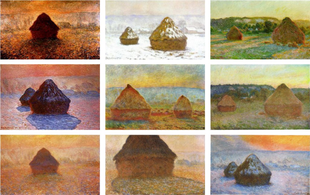
Modern art’s love affair with variation began with Impressionism. Claude Monet was famous for visiting cathedrals, trees, and grain stacks at different seasons and times of day to capture the fleeting changes of light that are the hallmark of Impressionist analysis.
Working a process
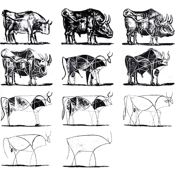
While Monet had to start fresh in everything but memory with each new haystack painting, Picasso exploited the working properties of lithography to achieve variations on his image of a bull. Drawing on a litho stone allows for great ability to erase and remake one image right on top of another… almost like editing of layers in Photoshop. Read Picasso’s master printmaker Fernand Mourlot’s account of the process.

The modernist take on variation was all about expressing graphic essences of color or geometry. When Jasper Johns got hold of a subject, painting was no longer an issue of expression, but a means to defamiliarize a ubiquitous graphic element. In his flag paintings, we find an example of the modus operandi he inscribed in his sketchbook: “Take an object. Do something to it. Do something else to it.” These richly layered encaustic (wax-based) paintings belie their graphic origins. Like Duchamp below, Johns defies category. His use of common icons of culture associates him with Pop, but his strategies ally more with the conscious control of Conceptual art. Conceptual and Pop art could not be more epistemologically distant, but they share a common ancestor in Johns.

Out of many images, one
Polyptych
Some artworks are made up of more than one artwork. A polyptych is a way of transcending limitations of workable size, developing a narrative like a storyboard or comic book, creating tension, or otherwise making a whole greater than the sum of parts.
Multiple images were a staple of fresco work adorning late medieval churches in Europe. Giotto di Bondone became a master painter with the creation of his fresco cycle in the Arena Chapel (or more formally, the Scrovegni Chapel) in Padua, Italy. In a detail of this work, note how the Seven Virtues and Seven Vices use a rigorous format. Various figures occupy a uniform dark, rectangular ground, and a monochrome color scheme unifies the various allegorical concepts.
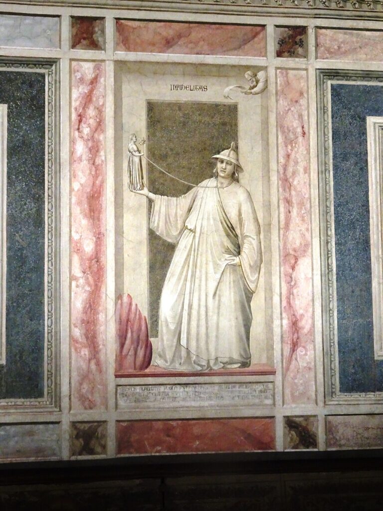
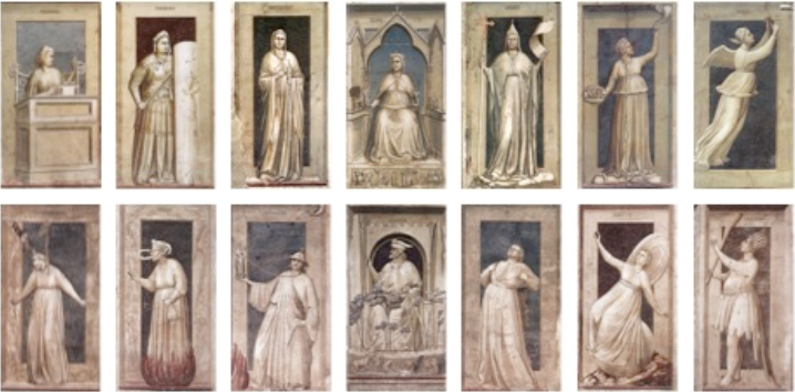
left to right | Prudence, Fortitude, Temperance, Justice, Faith, Charity, Hope
bottom row | Giotto, Arena Chapel Frescos, The Seven Vices, 1303-6
left to right | Desperation, Envy, Infidelity, Injustice, Wrath, Inconstancy, Foolishness
As an extension of fresco practice, multiple panels in a single work can be seen taking root in the Renaissance. The Ghent Altarpiece by Hubert and Jan Van Eyck marked a major turning point toward realism in ecclesiastical work. But it takes on the same task as its medieval forebearers: to tell the stories of the Bible to a largely illiterate population. The panels act like graphic novels do today, even with the altarpiece opening like the pages of a book to reveal more panels…
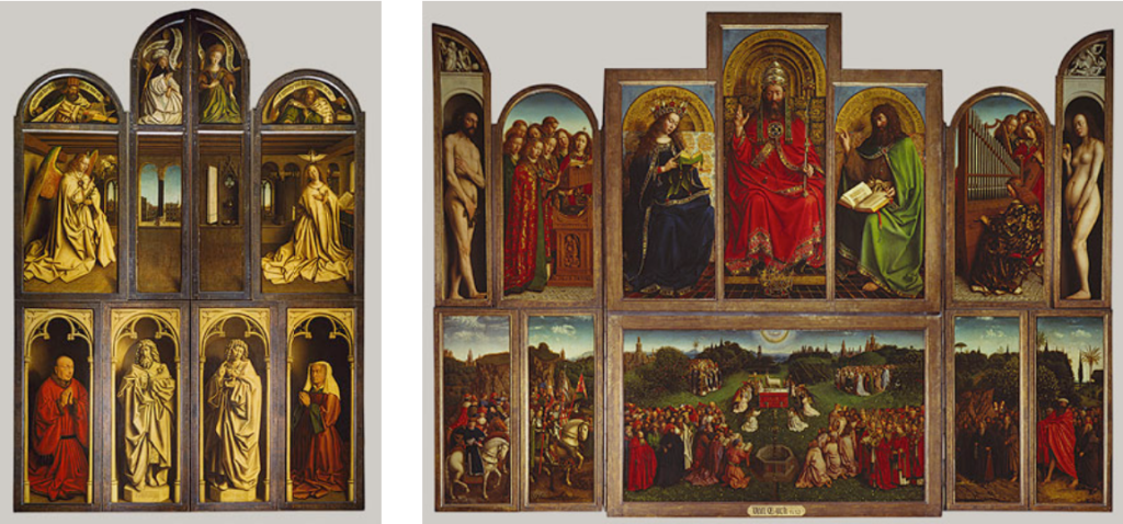
Diptych
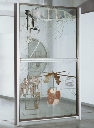
In the Modern era, Marcel Duchamp created a vertical diptych (a two-panel polyptych) in his Large Glass at the Philadelphia Museum of Art.
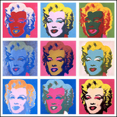
Andy Warhol uses the panel idea, formerly reserved for altarpieces, in his Marilyn Diptych, at the Tate in London. It is an obvious gesture to elevate a dead celebrity to the status of worship-worthy. And it’s not even that tongue-in-cheek, as Andy did worship celebrities. Compare it to the quite different treatment of the same photographic source in Marilyn (the icon for the Variations project at the top of the page), done 5 years later. Marilyn died in ’62; by ’67 she was a mythic polychrome angel.
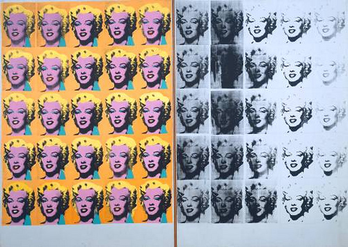
In that 1967 work, Warhol creates variations on a theme, individual images exploring aspects of the original through choice of color to create shifts in perception. Nine compositions are organized to be seen as variations of one, not as one composition as we see in the diptych.
Joining
Another way to make many one is by joining, which can include strategies like grouping, collaging, deconstruction, or conceptual association. Conceptual artist Joseph Kosuth generates multiple semantic manifestations of an everyday object, and brings his dissection of it back together again:
“I used common, functional objects – such as a chair – and to the left of the object would be a full-scale photograph of it and to the right of the object would be a photostat of a definition of the object from the dictionary. Everything you saw when you looked at the object had to be the same that you saw in the photograph, so each time the work was exhibited the new installation necessitated a new photograph. I liked that the work itself was something other than simply what you saw. By changing the location, the object, the photograph and still having it remain the same work was very interesting. It meant you could have an art work which was that idea of an art work, and its formal components weren’t important.”
— Joseph Kosuth
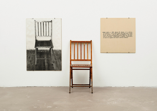
One and Three Chairs was a reaction to what Kosuth saw as the commercialist excesses of Pop. But not all Pop artists celebrated consumer culture as Warhol did. David Hockney, long associated with Pop, began a series of photo collages he called joiners in the early ‘80s. Using a multitude of humble photos, from instant to commercially processed drugstore prints, he reconstructs our perception of reality through the camera’s recording of the same. Jumps in perspective create an almost cubist vocabulary, reconciling visions of realism and abstraction.
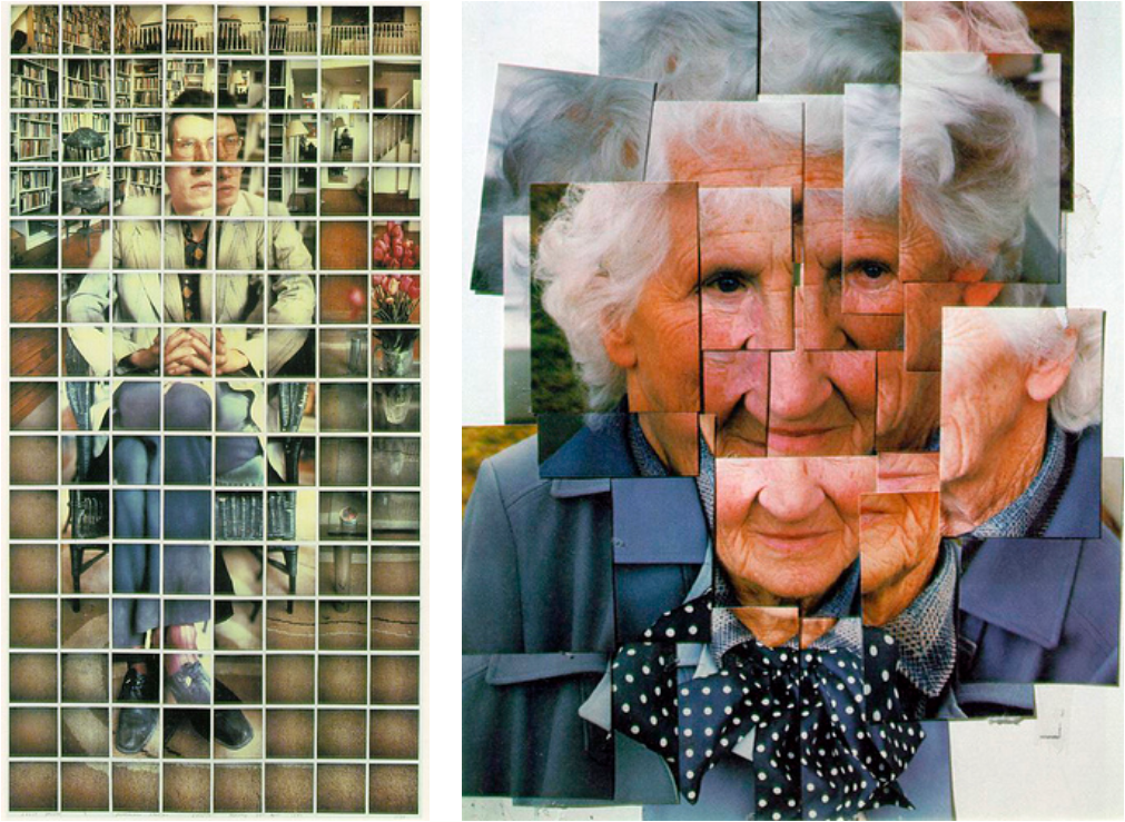
right | David Hockney, Mother I, Yorkshire Moors, August 1985 #1, 1985
One set of Hockney’s photo collages pays respect to a grid, while the other denies it. By adding incidents of joining — cellotape, gauze, glue — to the actual image, the Starn brothers, identical twins Doug and Mike, overlay another kind of system on the grid. Fascinating because they are multiples: they’re twins! Twins working with multiples: themselves as subject, and fragments of images pieced together with many pieces of Scotch tape.
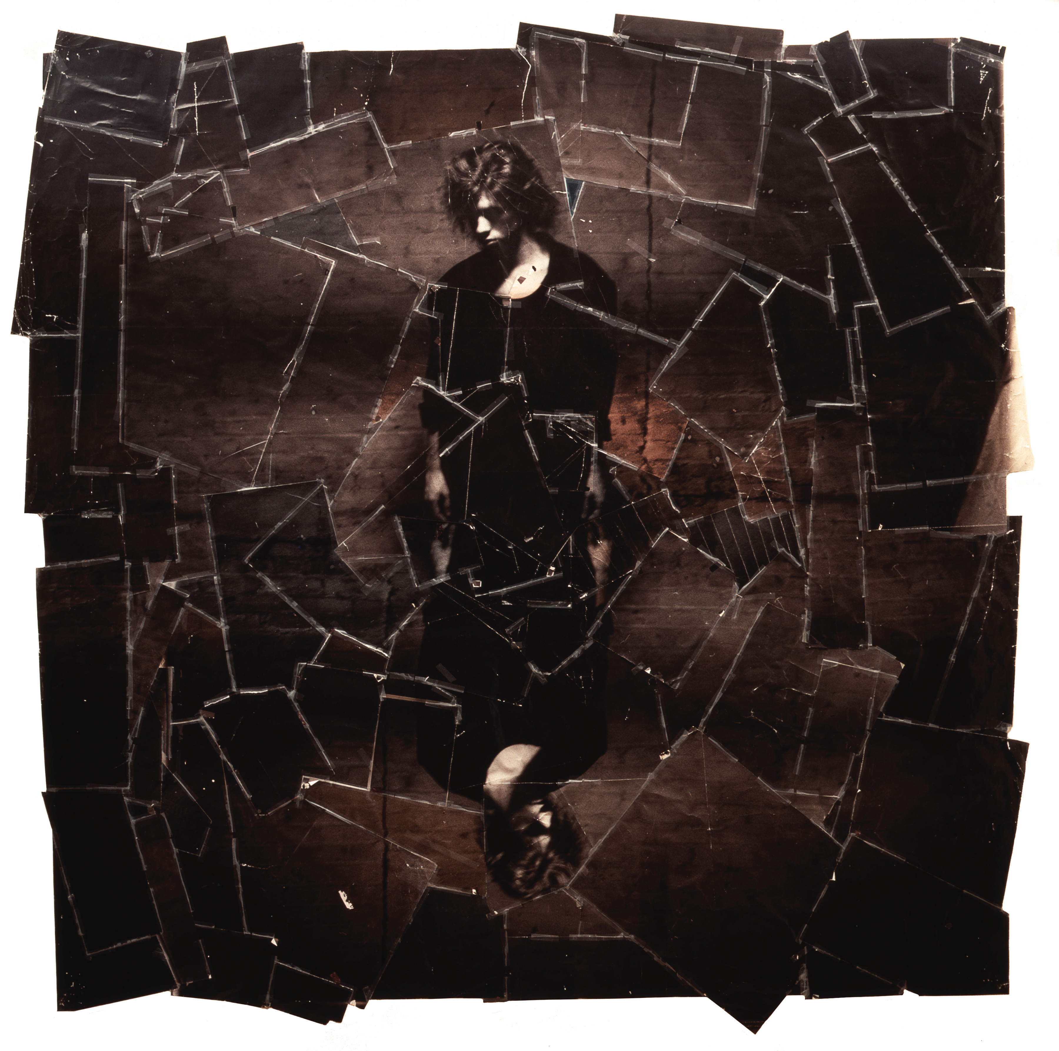
Take a look at Doug and Mike Starn’s website. See how they work with a very tactile, grunge aesthetic employing both grids and random fragments, often in tension with one another. Especially useful is the series Attracted to Light.
