

Line art
Back to…
Introduction
This set of exercises will introduce you to the powerful drawing tools in Illustrator:
- If you are here for the Mandala project in 2D Digital Art, do Parts 1, 2, and 3 below and download the sample file above.
- If you are here for the Point to Line project in Fabbing, do only Part 1 and download the sample file from DF Wiki, not here.
- In either instance, SKIP the final DF Wiki exercise 5 Tracing an Image and Creating a Clipping Mask.
Part 1: Digital Foundations
We visit Digital Foundations Wiki again for an exercise that will introduce us to the Pen Tool and the power of Bezier curve drawing and editing.

Chapter 6
Visit the DF wiki and do the exercises in Chapter 6, but SKIP the final exercise (5: Tracing an Image and Creating a Clipping Mask):
If you are only doing Part 1 here, make sure to find and download the sample file when you see a link with a name similar to Click here to download chapter X work files. If you have difficulty with the download, do the following in a Chrome browser:
- Right-click the download link, and in the dropout menu select Save Link As…
- Save this to a logical place like the Desktop or the Downloads folder.
- At the upper right-hand corner of the Chrome window, see the following:
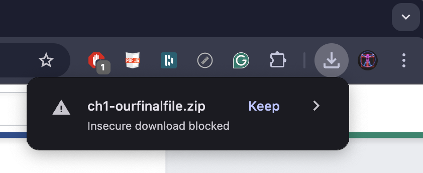
Select Keep then open the file, or unzip a compressed file.
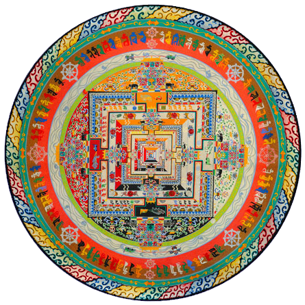
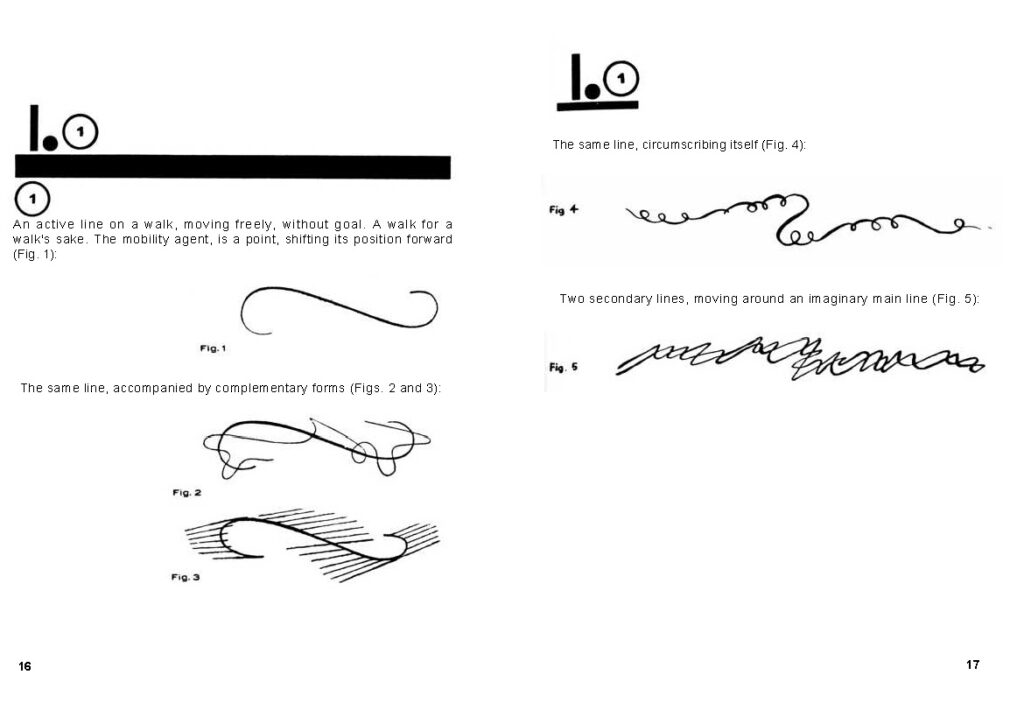
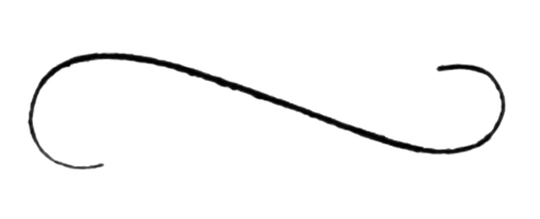
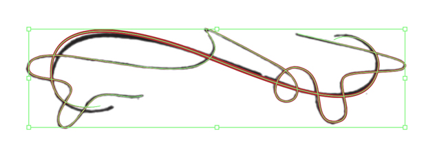
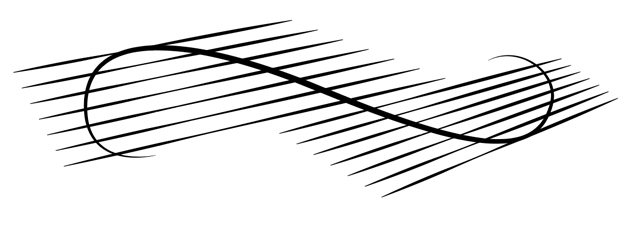
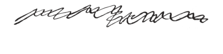
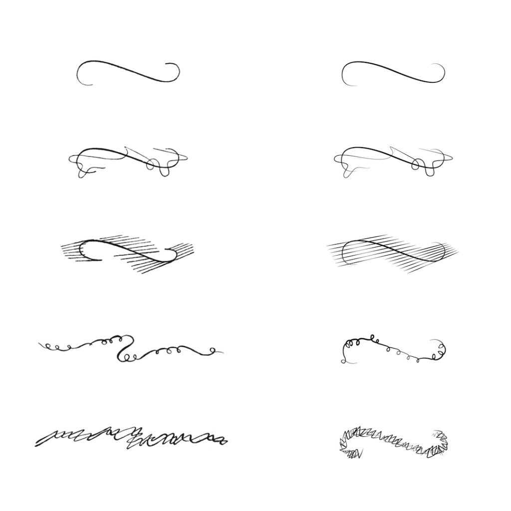
The results of the exercise should look something like this:
Save a .pdf and a .jpg version, and embed on your blog. Refer to Embeds if you need assistance.
Part 2: Paul Klee and the Pedagogical Sketchbook
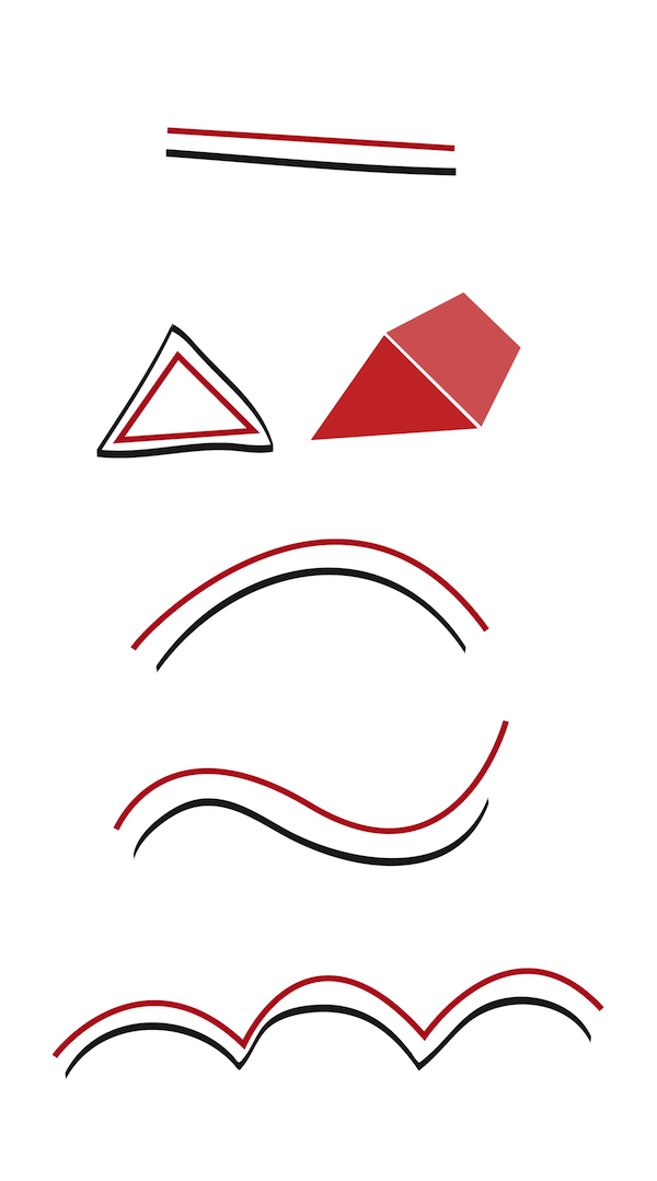
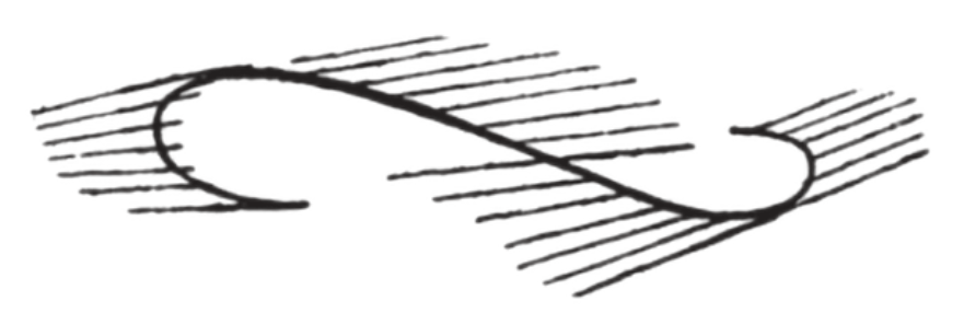
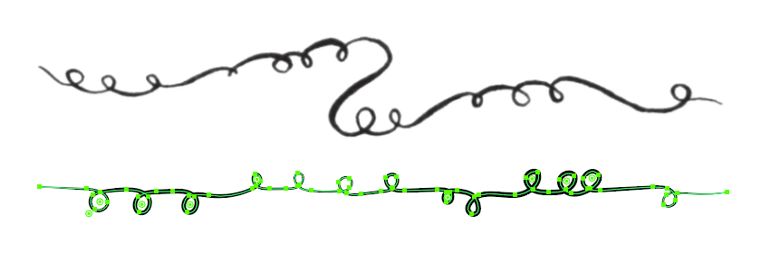
Although line art and flat graphics are especially utilized for the commercial purposes of logo and identity pieces, the outcome of drawing a single line is as personal as your signature. Bauhaus Master Paul Klee is an artist whose work is immediately identifiable by his line quality. In this exercise we will draw inspiration from his sketch as seen here. These are examples he created for his Pedagogical Sketchbook, a “textbook” for his foundation course at the Bauhaus, a school that influenced Modern art and design.
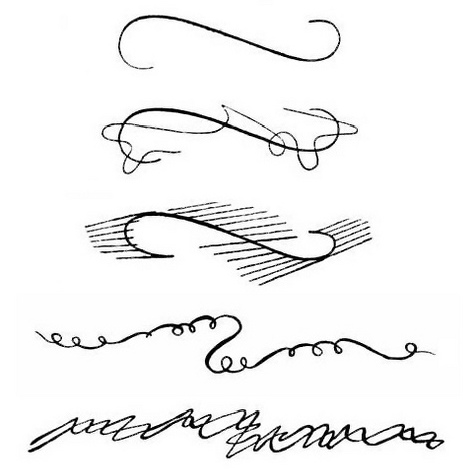
In his Sketchbook, Klee talks about the artist “taking an active line on a walk, moving freely, without goal.” Much of the language he uses anticipates the idea of vector drawing. Let’s use Klee’s lines to develop our own vector and brush expressions, in a page from the book:
In discussing the line at the top left, Klee says, “The mobility agent is a point, shifting its position forward,” anticipating the very idea of a vector.
For the lower pair at left, he says, “The same line, accompanied by complementary forms,” anticipating the idea of copying and modifying a vector line.
About the upper right line, he says, “The same line, circumscribing itself,” anticipating a vector line creating a brush, which in turn is applied to a vector.
For the lower right, he says, “Two secondary lines, moving around an imaginary main line,” presaging the actual conditions found in creating a vector scatter brush.
You can use the downloadable sample at the top of this title as a guide for this section.
1 — Set up the file
- Open Illustrator, set your workspace for Essentials Classic, and create a new file, 11×17 inches, horizontal format, and 300 ppi raster effects.
- Create two Layers: one called klee, and the other emulation.
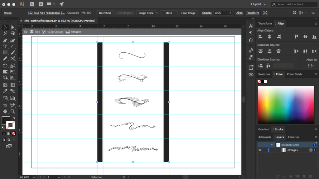
- With klee layer active, use Guides to create three 7″ wide columns with one inch margins at art-board edges and a one inch gap between the columns. Create five 2″ tall rows, with half inch margins at artboard edges only. See the sample file to illustrate.
- Select Klee Pedagogical Sketchbook.png from the zipped file above and drag it from Finder window over the art-board to import it into the file on the klee layer.
- Align the image with the center of the left column. The top and bottom of the image object align with the edge margin guides, and you’ll see a dark stripe aligning with the border to either side. We need to get rid of these stripes!
2 — Embedding and masking a bitmap image
- It’s possible to edit the stripes out in Photoshop, but we have tools to do it in Illustrator. First, embed the image. Embedding means that image data is merged with the Illustrator file, so you won’t have to worry about maintaining an externally referenced image file.
- With the image object selected, find the Control Palette near the top. Find Embed and click it.
- Next, we’ll get rid of the stripes. There are three options for getting rid of unwanted portions of an image:
- Select image and use Crop button in the Control Palette
- Select image and use Mask button in the Control Palette
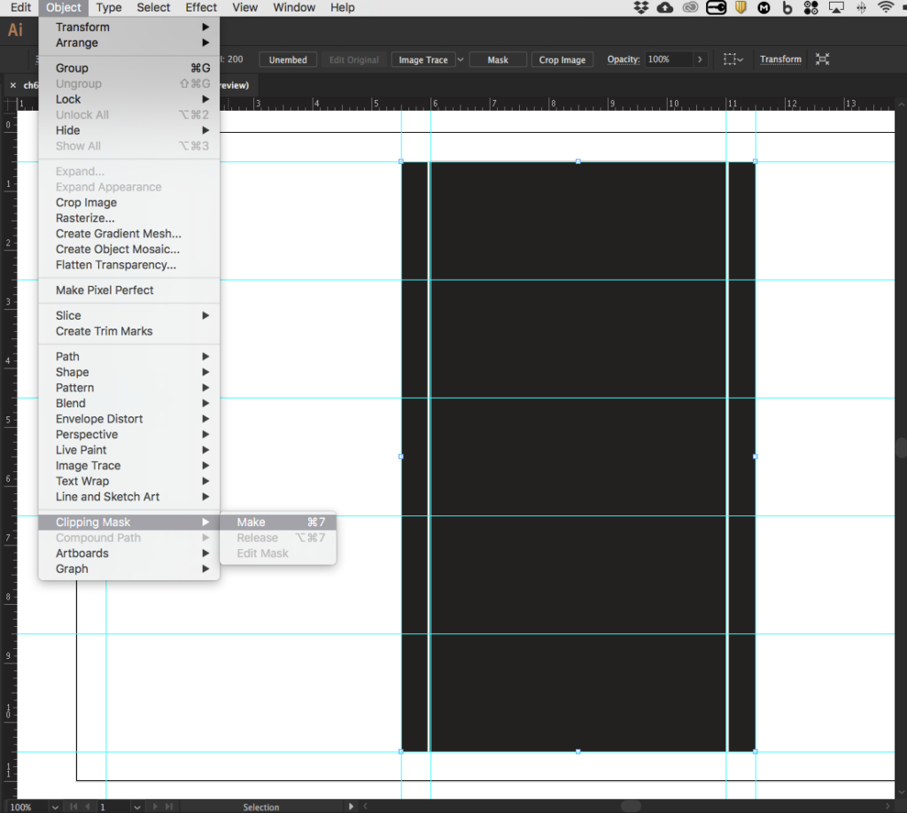
- Make a shape and use menu Object>Clipping Mask>Make
- The first two need almost no explanation. The last one is the most flexible, since the clipping mask can be any kind of shape, but it’s less intuitive—so we’ll do this one just for practice.
- Create a rectangle that aligns with the guides for the center column. This rectangle is on top of the image object. Use an object with a contrasting fill (like black) to make it legible. Select Object>Clipping Mask>Make, and the black bars disappear. To undo a Clipping Mask, select the object and in the menu select Object>Clipping Mask>Release.
- When done with this step, lock the klee layer.
3 — Tracing with Pen Tool
- Work in the emulation layer. Using the Pen Tool skills you acquired above, trace the path of Klee’s first “active line on a walk.”
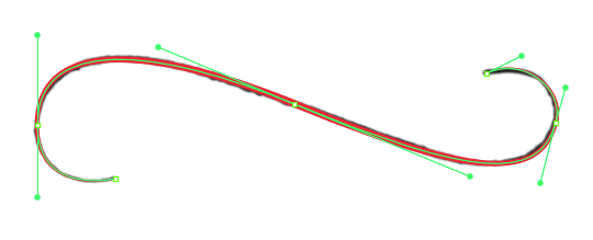
- As you work the line, use a stroke color that allows you to distinguish your work from Klee’s black line. In the sample, I worked with a red stroke, then changed to black when satisfied.
- One secret to good Bezier line work is to work with the fewest possible anchor points. In the sample file, this curve was recreated accurately with 5 anchors.
- Another secret: to keep a curve in good shape, don’t overlap Bezier handles. If you find you must do this, add an anchor.
- As a finishing touch, use Stroke width and a Variable Profile, both found in the Command Palette, to emulate the changing line weight of Klee’s active line. In the sample, a stroke width of 2 points combined with a profile that tapered to either end.
- When you are satisfied with your first line, Shift-constrain move it over to the third column and center it in the top row. Option-drag to copy the line four times and move each copy to the row below, until you have five identical lines stacked in the third column.
4 — Adjusting anchors, weights, profiles
- The second of Klee’s lines involves a “complementary form” in the manner of a second, thinner line darting around the first. We can imagine the second path as a dog running around its master on a walk. Bezier handles will be the leash that keeps this pet in line!

- Recalling the lines you copied from the previous step, select the second line down in the far right column and move it to overlap the second drawing in the middle column. Give it a red stroke for contrast.
- Now, start to carefully plot out the more complex complementary line. Look carefully at the strategic location of anchor points and Bezier handles in the sample. Even if you come up with different anchors and handles, possibly even better ones, the goal is to emulate the line with the fewest anchors possible. Take particular care with the loop near the right side, dragging the Bezier handles out in the direction the line is moving.
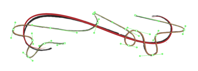
- Give this second line an appropriate weight and profile. In the sample, this line received a one point stroke weight, a barbell-shaped profile, and a basic brush style.
- When done, group the two lines together, and give them a black stroke.
- Return this line to the third column, centered in the second row adjacent to Klee’s model line.
Part 3: Advanced line and Brush techniques
The last three drawings present unique challenges that call for advanced solutions beyond simple tracing. Here, we’ll introduce three new tools: Blends, for creating repeating elements, and two custom brushes, an Art Brush and a Scatter Brush, for special line effects.
In these solutions we are less concerned with precision—minutely copying each stroke and weight. We are interested in capturing the essence of Klee’s idea, so some deviation from slavishly copying the drawings will be fine.
1 — Using Blends for repetition
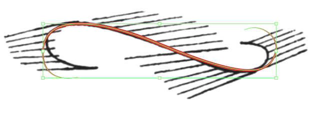
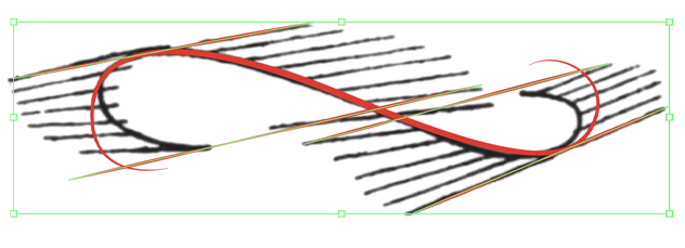
Klee’s third drawing, another “complementary element” example, presents a series of parallel lines that seem to converge in strange perspective. For the parallel lines, we’ll introduce the Blend Tool.
Move the primary curve
- As we did above, move and center the copied line adjacent to it over Klee’s third drawing.
- Give it a red stroke for contrast. We don’t need to worry about matching it up perfectly with Klee’s drawing.
Create the first straight line
- With Pen Tool, create a line with two anchor points, without developing Bezier handles.
- Style the line to match the character of the drawing. In the sample, we have a stroke weight of 1 point, a barbell-shaped profile, and a basic brush.
Copy the line
- There are many more roughly parallel lines, and it would be very time consuming to copy/paste/move/adjust for each one. Instead, copy the first parallel line three times, for a total of four lines.
- Move and scale them into place approximately, as shown. Our goal is not to slavishly copy the Klee drawing, but to capture its essential organization.
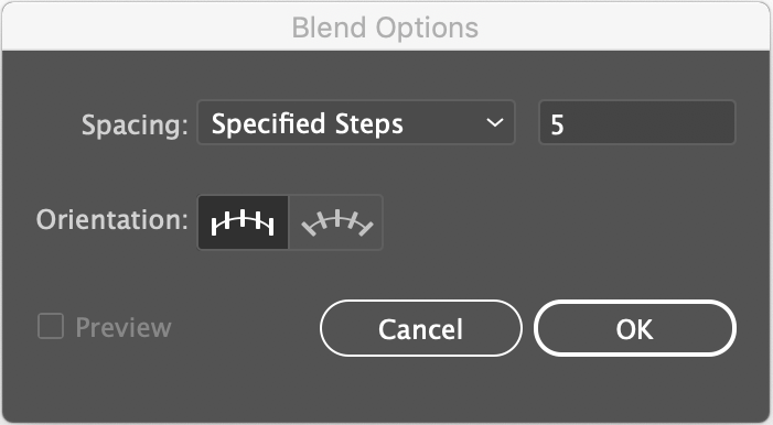
Set the Blend Tool
- Before we use the Blend Tool, we need to set it. Go to menu Object>Blend>Blend Options. In the dialog box that opens, set the Spacing parameter for Specified Steps, and enter 5.
- Then set the Orientation parameter to Align to Path by clicking the second icon available in the dialog box.
Create the first Blend
- Select the first two pairs of parallels at upper right of the drawing. Go to menu Object>Blend>Make and watch as five lines appear between the first two. As a Blend, these lines will develop a subtle, incremental pattern of variation that responds to the two origin objects.
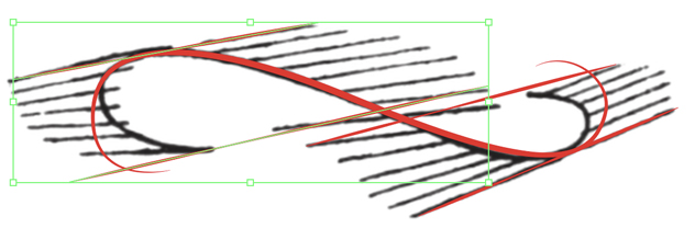
Create the second Blend
- Select the second pair of parallels and create the second Blend.
- You’ll notice an accurate, but not precise, interpretation of Klee’s parallels are developed this way. The most noticeable difference is that our lines cross all the way through the figure, where Klee’s disappear and reappear, creating a Gestalt continuation. We appreciate these subtleties in the original, but for the purpose of the exercise, accuracy suffices.
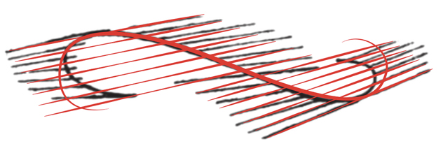
If you don’t like the way your Blend develops, you can move the anchor points of the original lines using the Direct Selection Tool (white arrow) until you achieve a spacing and frequency that approximates the Klee drawing the best. As you move the anchor points, the Blend will recreate itself to follow the new organization.
Wrapping it up
- Select all the red line objects and convert their Stroke color to black, then select all the objects and group them.
- Move the finished group over to the third column and center it in the third row. Done!
2 — Creating a custom Art Brush
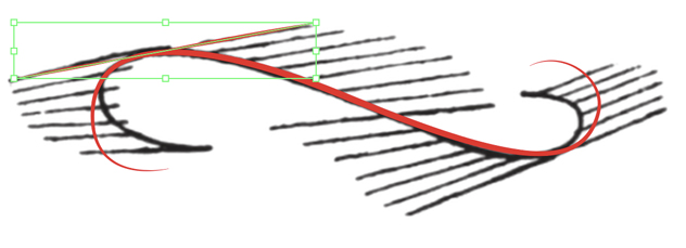
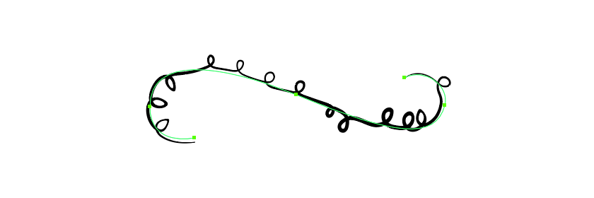
Klee’s fourth line, the “same line, circumscribing itself,” has implications for making a line controlled by another line. This can be accomplished with a custom Art Brush.
We won’t move the line over and perform adjustments this time, but we will create a new vector.
Visualize the Brush vector
- Key to understanding this strategy is the ability to conceptually identify and separate the small curlicue calligraphy of Klee’s line from the larger, implied vector they follow. Imagine taking the center of each curlicue “hole” and connecting them like dots—the thing connecting them is an implied line.
- Notice also the pattern: some curls go up, some down, some are in pairs, some in trios.
- Once you have this visualized, use the Paintbrush tool with an appropriate stroke definition to emulate the scale and pattern of Klee’s curls, but do so along a relatively straight implied line. Remember: we are going to turn this vector into a brush that will be applied to a curving line. We don’t want to express the curve in the brush: only the pattern of curlicues.
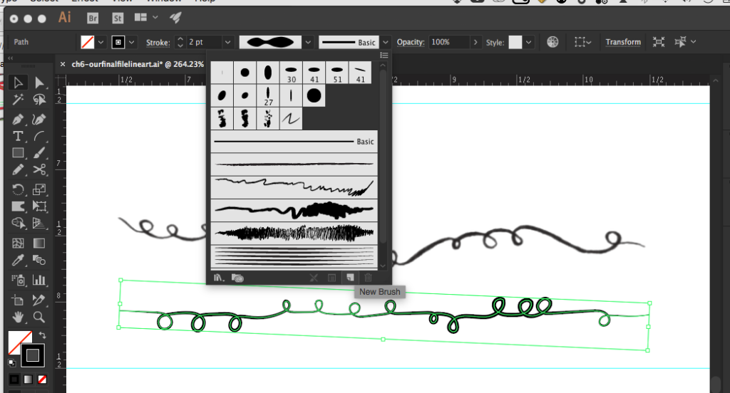
Create the Brush
- Click on the Brush Definition dropdown in the Command Palette. At the bottom of the dropout, look for the New Brush icon (next to the Trash icon).
- Click on it, and in the dialog box that opens, select Art Brush.
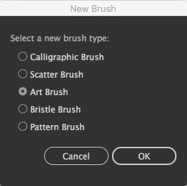
- This opens a new dialog. Note there are various parameters that can be set, but we don’t need to fool with much here. We’ll keep the defaults and click OK.
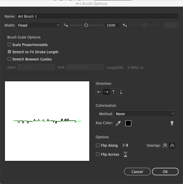
- Now return to the Brush Definition dropdown and note the presence of your new Art Brush, down at the bottom of the long brush icons.
- Move your art brush vector off the art-board, but keep it off to the side.
Apply the Brush
- Head over to the third column and select the vector in the fourth row. Now select your new Art Brush, and this will replace the existing brush with your curly one.
- If you wish, you can reverse the direction of the brush by selecting the vector and going to the menu for Object>Path>Reverse Path Direction
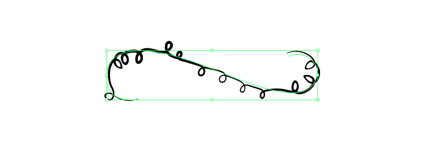
We’ll conclude by pointing out that the vector we applied this to is a different shape than the implied vector in Klee’s original drawing, so while it won’t be absolutely identical in form, it will be similar in character.
3 — Creating a custom Scatter Brush
Klee’s final line, which he describes as “two secondary lines, moving around an imaginary main line,” suggests the creation of a Scatter Brush, a very similar strategy as the Art Brush, but with very different consequences.
Visualize the Brush vector
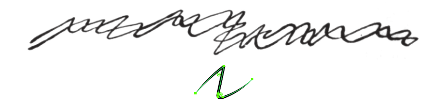
- Again, we need to separate the sharp, aggressive texture-line from its general direction of motion as a larger form. We don’t need to be as fastidious as we were with the Art Brush, however, because the Scatter Brush is hard-wired to create randomness and repetition. All we need is one characteristic stroke. In the sample we made a rough Z shape.
Create the Brush
- Do this as you did with the Art Brush above, only select Scatter Brush as the new brush type in the dialog box when prompted.
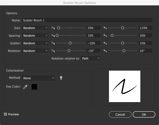
- The new dialog that opens has many variables we need to tweak to get the characteristic scale, repetition, and random force Klee creates. Note the values for Size, Spacing, Scatter, and Rotation are all set to Random, and with the exception of the Size values, percentages and degrees stay in the 10 to 30 range.
- Set the Rotation relative to Path in dropout below the value sliders.
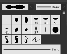
- The finished brush looks like small square icon in the Brush Definition dropout when you inspect it.
Apply the Brush
- Head over to the third column and select the vector in the fifth row. Now select your new Scatter Brush, and this will replace the existing brush with a set of random marks.
- If you repeat this action, you’ll note that the marks change order, orientation, and pattern, but they stay consistent in character.
- Move the little vector used to make this brush off the artboard, but keep it off to the side.

You’ve made it: taking Klee’s line on a long digital walk and becoming a bezier line expert in the process! Your final file should look something like this:
Save a .pdf and a .jpg version, and embed on your blog. Refer to Embeds if you need assistance.