Graphic units
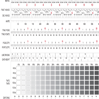
The system fits the situation
You could measure a football field in light years. Or you could measure the distance from our Sun to the center of the Milky Way galaxy in yards. The results would be mildly amusing, but not practical. Practical reality demands standard units of measure that are appropriate to the scale of a task.
In the Metric System, these units are related decimally up and down from the meter. Smaller increments include the centimeter and millimeter, and larger ones include the kilometer.
The Imperial System is still stubbornly used only by the USA and Liberia — yep, that’s it. Even that other holdout, Myanmar, recently jumped ship. Larger units include the mile and smaller include the foot and inch. We deal with anything smaller than an inch by using powers of two to derive fractional values of ½”, ¼”, ⅛”, and so on. Converting these to their decimal equivalents can be painful for smaller increments. And getting from a rational round number decimal to a fraction is just plain luck:
- 19/64” decimal equivalent is 0.296875″
- 0.30″ fractional equivalent in the powers-of-two schema is… uhh… 77/256“, sort of…
Enter the punto
It’s pretty clear that, for the kinds of small-scale decisions made in typographic design, this doesn’t cut the mustard. Franciscan friar Francesco Torniello da Novara first proposed the punto as an incrementally small unit of measure appropriate to his tiny craft in the early 1500s. However, the point it eventually evolved into remained an elusive standard, with most typography shops using a unique in-house value. Even as regional or national standards emerged, they tended to resolve the point to an inch or millimeter in values tending toward 6 or more significant decimal digits. Bleah.
Amazingly, the point was not rationalized to the inch until the 1980s with the advent of the DTP point (desktop publishing point): 72 points are equal to 1 inch. We consider it a part of the aforementioned Imperial measuring system. Thus, it remains wonky in metric, with 1 point equalling 0.3528 mm. Even this breakthrough was not enough, since point values begin quickly stacking up into unwieldy large values, so the pica was introduced.
Points
Points are the most common reference for the size of type and are also used to describe the leading: the space from baseline to baseline of set type. They can also be used to define the width and depth of a column of type. The abbreviation for point is pt, as in the 12pt type beloved by professors to keep student paper length honest.
POINTS + PICAS
1 inch = 72 points
and: 1 inch = 6 picas
so: 1 pica = 12 points
Picas
At 6 picas to the inch, this larger unit is used when point values get wonky, describing such decisions as column or gutter width, page size, and so on. The abbreviation for pica is p, as in 66p describing an 11″ high page.
In combination
Just as you may say 1′-6″ instead of 1.5 feet, the units can be combined. InDesign and other DTP applications indicate the pica with p followed by the point unit implied. For example, the standard width of one column in a three-column grid on a letter size (8.5″ x 11″) document is 14p4, or 14 picas and 4 points.
Units in the app
We use InDesign in our studio, and controlling and defining these units for various contexts tends to lurk about in seemingly random places in the UI, although there is a logic to it.
Document setup and bleed settings
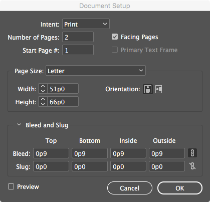
Open File > New > Document in the menu, and get the welcome screen below. Units are set in a dropout at the far right: select picas, which for a letter size document yields 51p0 for 8.5″ and 66p0 for 11″. Toggle document Orientation to change from portrait to landscape format.
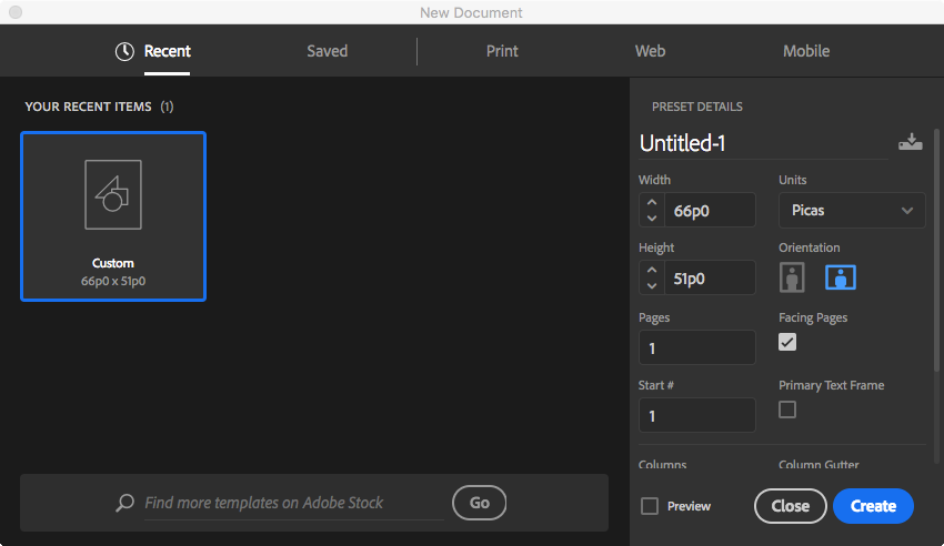
If you choose the wrong size or orientation, don’t worry. Head to File > Document Setup… and fix it. You can also create document Bleed settings here.

Document units and grids
Indesign CC > Preferences will lead you to unit settings for Units & Increments… and Grids…. All the Preferences show up in one window with a left-column menu.
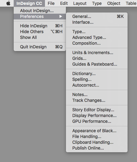
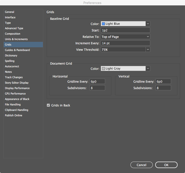
If you didn’t set new document units correctly, you can use Units & Increments… and look for the Ruler Units dropouts. Don’t forget to change for Horizontal: as well as Vertical: in here.

While here, head to Grids and rationalize the Baseline Grid and Document Grid settings if necessary.
Margins and columns
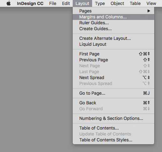
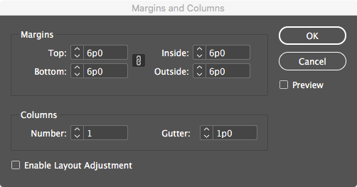
We find margin values — the offset of content from the page edge — in Layout > Margins and Columns… and we can link or unlink these to set common or unique values.
Columns are weird but logical. Column size is a function of dividing the page size into several equal divisions with a common gutter (space between) size. It feels odd not defining this by unit but InDesign automatically calculates it for you — and if the document size changes, automatically updates.
Variety in column width is handled by most designers grouping the columns — say in a three-column layout, one might group 2 columns for a major content area and keep 1 column as a minor one.
Ruler shortcut
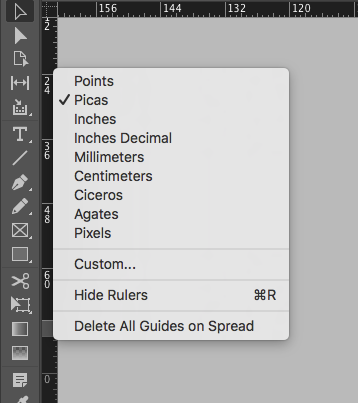
Quickly change ruler units when working in InDesign by CONTROL+clicking (Mac) or Right-clicking (Windows) on a ruler. Change both horizontal and vertical units simultaneously by clicking at the upper left intersection.
