Digital color
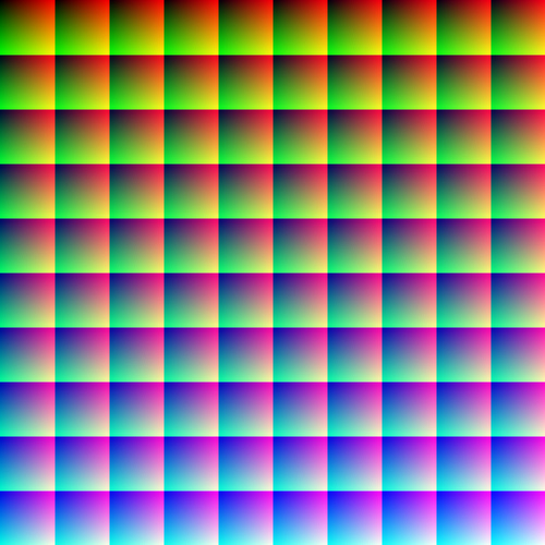
One million colors
Click on the image above and it will take you to a full resolution of an image that contains one million individual colors. When viewed at full resolution (1000 pixels wide and high), the image contains one million pixels. By changing values incrementally for red, green, and blue, each pixel contains a unique color value. The human eye is sensitive enough to detect about 10 million colors. However, the number of colors possible is theoretically infinite.
This exploration of color will place traditional color theory side by side with the computational realities of generating color. You’ll find out that much of what you think you know about color is … well, let’s just say there’s more to color than meets the eye.
Color and physics
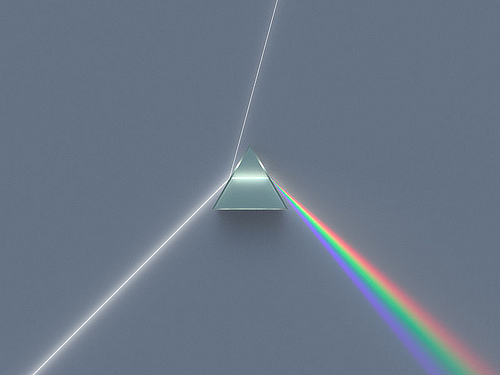
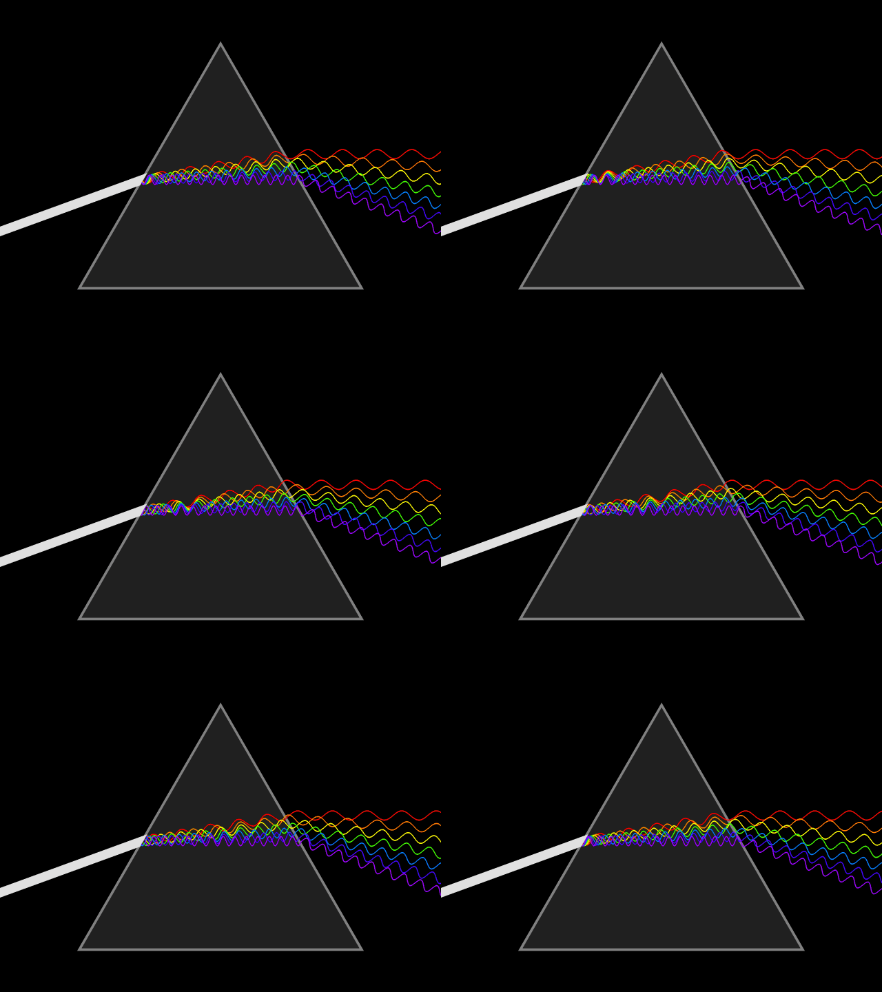
Color is a property of light. Our eyes perceive and distinguish different wavelengths of light. We categorize these by names such as red, green, blue, and other hues. Color is associated with material as well as light source, and the color is generated by the physical properties of the material such as light absorption, reflection, diffusion, and other optical properties. The nature of physical optics was revealed by Sir Isaac Newton in Opticks. His experiments with prismatic dispersion of light into the spectrum led to understanding one aspect of light as a wave phenomenon, with longer frequency waves yielding human sensations of reds, and shorter yielding violets.
Color models and terminology
The technical jargon used to describe color can be contradictory and confusing! This may be because perception of color is a subjective condition. These terms are often used without precision, yet even when they are precisely defined, their specific use depends on the color model being used. A color model is a mathematical description of the components of a color. Multiple color models exist, not because they compete with one another, but because each has proper use in a certain context. In our work, we will explore three kinds of models:
- the additive model, known as RGB for Red-Green-Blue
- the subtractive model, known as CMYK for Cyan-Magenta-Yellow-blacK
- and the HSV model, based on three properties of color known as Hue, Saturation, and Value.
Before we explore the models, let’s define those three terms from the HSV model a bit more.
Hue
Hue is the degree by which we can distinguish one color wavelength name from another. The International Commission on Illumination (abbreviated CIE) defines hue as “the degree to which a stimulus can be described as similar to or different from stimuli that are described as red, green, blue, and yellow.” These colors are singled out as psychological primaries or unique hues that humans perceive to be irreducible. Other hues on the spectrum have names, to be sure… orange, violet, and so forth… but they are perceived as hues built from other hues.
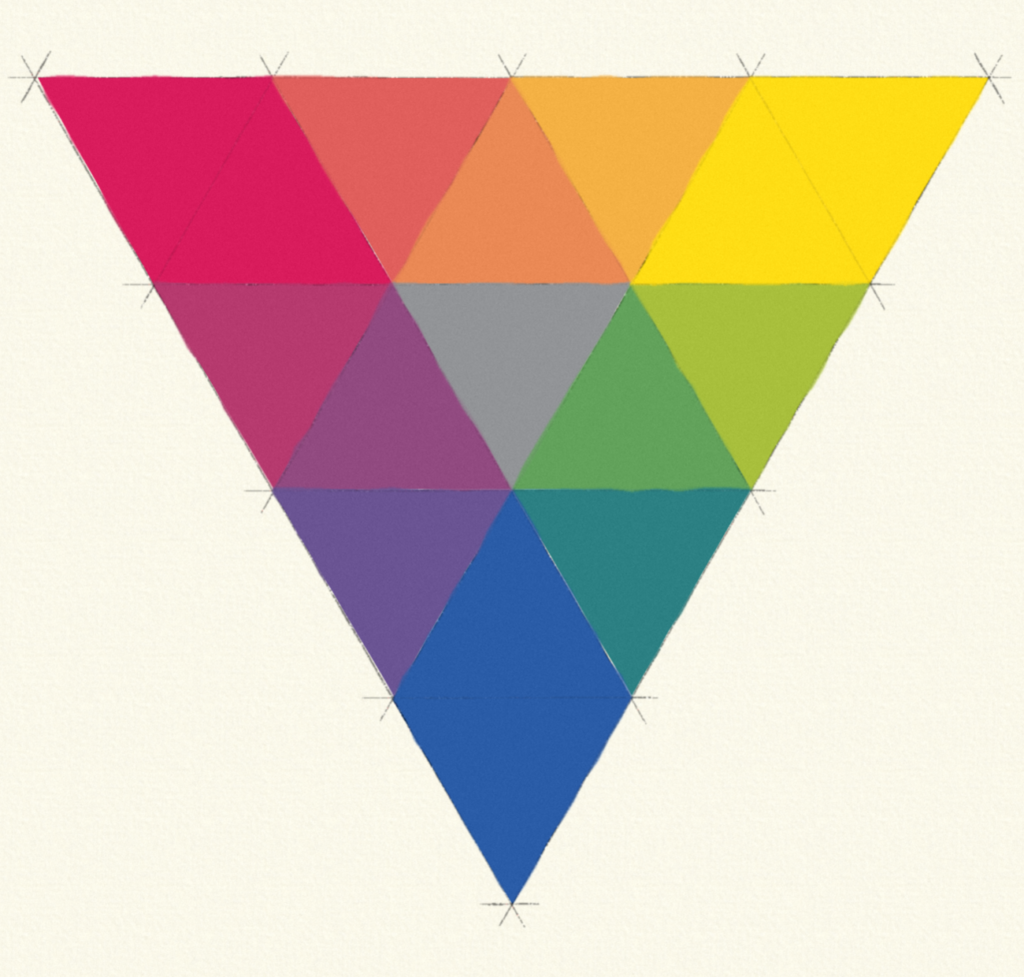
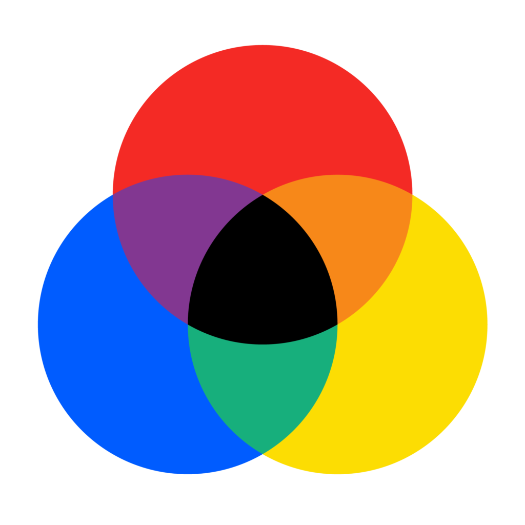
Here we see a color triangle, similar to a color wheel, has been made from three of these primaries: red, yellow, and blue. This is known as the RYB color model, familiar to most people from kindergarten. Note the presence of a middle value gray in the center triangle, important for understanding saturation.
Saturation
Saturation describes the amount or intensity of a hue present in a color. Synonyms in various color models include colorfulness and chroma purity. A red’s red contains the brightest possible hue at the narrowest possible wavelength with no presence of a value bias. That is, there is no white (tint) to pink it up or black (shade) to darken it down.
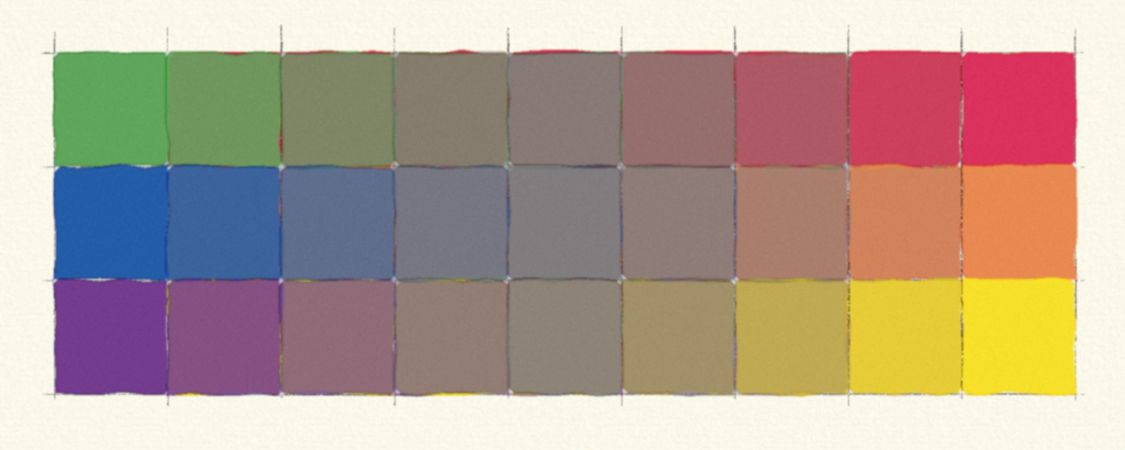
To desaturate a color means to run, not around the periphery of the color triangle, but rather through it to reach the opposing color, known as its complement. In the RYB triangle above, note the complement for red is green. To desaturate the red, a painter will add green. When the two hues are balanced, a middle-value gray is achieved. While imperfections in pigments can bend this “gray” toward olive or some other tinted grayishness, good quality paint will achieve something very close, as seen in the center column in the painted study at left.
Saturated
Desaturated
Saturated
Value
We define Value by the relative perceived lightness or darkness of a color. Depending on the color model, value is also known by the synonyms lightness or tone. Photoshop uses the term brightness. The term shading is also used, usually to describe subtle gradient manipulations of value in a drawing. Sadly, the lack of standard terminology makes this confusing. In this wiki, we always use the term value (except when talking Photoshop!).
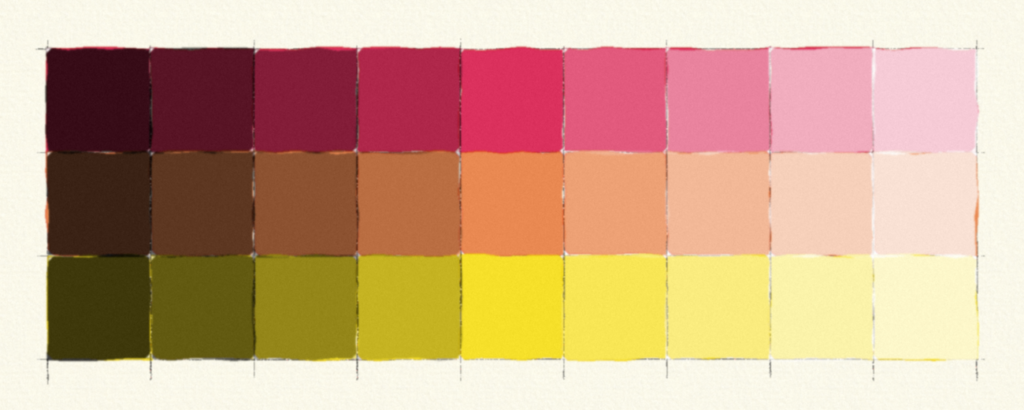
In the painter’s study at left, the pure hue is found in the center column. Black is increasingly added toward the left to create shade. A maroon color is a shade of red. White is increasingly added to create tint. Pink is a tint of red.
Shade
Pure Hue
Tint
Pure value scale
When we assess a value with no hue present, it essentially becomes a spectrum of gray values from white to black. This is a value scale or a grayscale. Note the interesting property of relativity demonstrated by using the middle value gray as a frame. Does it appear to change?

The problem with primaries
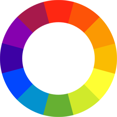
From grade school, we are all familiar with primary colors… red, yellow, blue, right? The so-called secondary colors are mixtures of primaries. Red and blue mix to achieve violet, blue with yellow to get green, and yellow with red to find orange. If we bend a spectrum around to create a circle and stitch violet to red, we get the artist’s tool known as the color wheel. This is the traditional color model we know as RYB or Red-Yellow-Blue.
Although every model has usefulness, in some ways the RYB model is as dangerous to a digital artist as flat-earth theory is to a sailor.
First, we need to understand that the primary color concept is not a fundamental physical property of light. Rather, it is based on the physiological response of human eyes to light. Human sight is trichromatic. We have receptors in our eyes that absorb light in three different frequency ranges. These combine to create the millions of colors we can perceive. The spectrum of hues is not itself made of mixtures, but are pure, discrete wavelengths. Primaries are a phenomenon of biology, not physics.
Gamuts
Because we mix three colors in our eyes, we psychologically react to colors with the sense that some are irreducible. Now, the choice of any three primary colors is arbitrary, but some colors function better as primaries than others. The mixture of primaries creates what is known as a gamut: a useful, wide range of mixable colors. The larger the gamut, the more useful the set of primaries. The RYB model is very satisfying from a psychological standpoint, which is why it persists. However, RYB is not a useful set of primaries from a technical standpoint, because the gamut it creates is fairly small.
So, how do we determine a good set of primaries? By studying how colors mix. There are two ways we know how colors can mix in the material world. We can mix colors by projecting colored lights, and we can mix them by mashing compounds like ink or paint together.
Primaries in the additive and subtractive color models
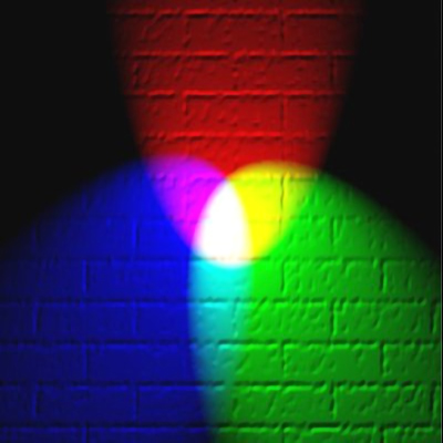
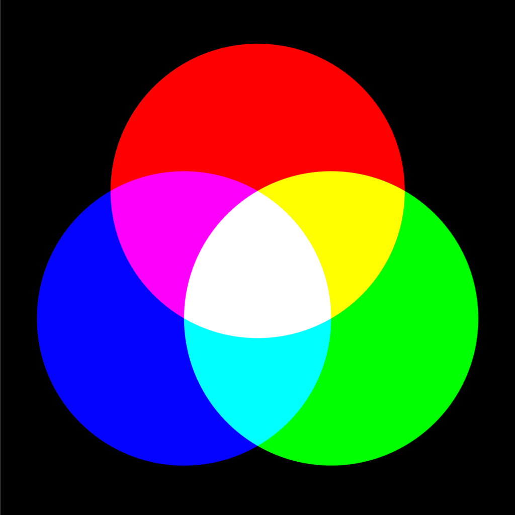
When colored lights are combined, they mix to form a new color. When enough of the correct primaries are added together, they combine to form pure, white light. The light mixture is therefore known as an Additive color model. In an additive model, primaries that yield the largest gamut are red, green, and blue, making up the model known as RGB.
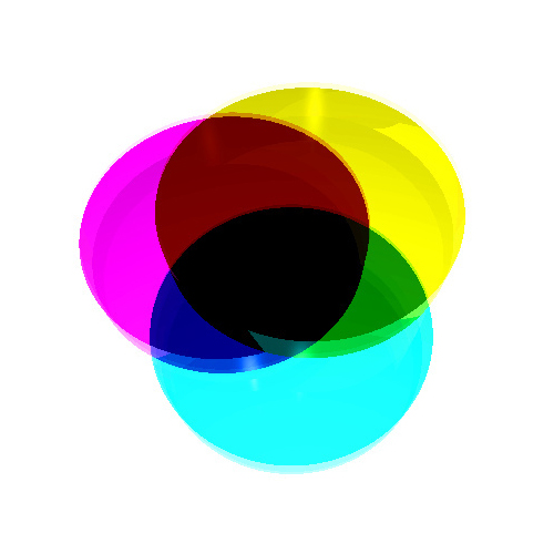
When we mix pigments, they form a new color as well. As we combine more pigments, they subtract the amount of light reflected off the white surface. A pigment mixture is therefore known as a Subtractive color model. The largest gamut we can achieve in a subtractive model uses cyan, magenta, and yellow as primaries, and we call it CMY.
It’s possible with very pure pigments to achieve a black. However, in most color mixing, an undertone of black pigment makes color mixing more economical. This adjusted model is known as CMYK, with K standing for Key Black. In the four-color printing process, the black printing plate is the one used to line up, or key, the other plates.
Traditional
(but somewhat flawed)
RYB model
Additive
RGB
model
Subtractive
CMY
model
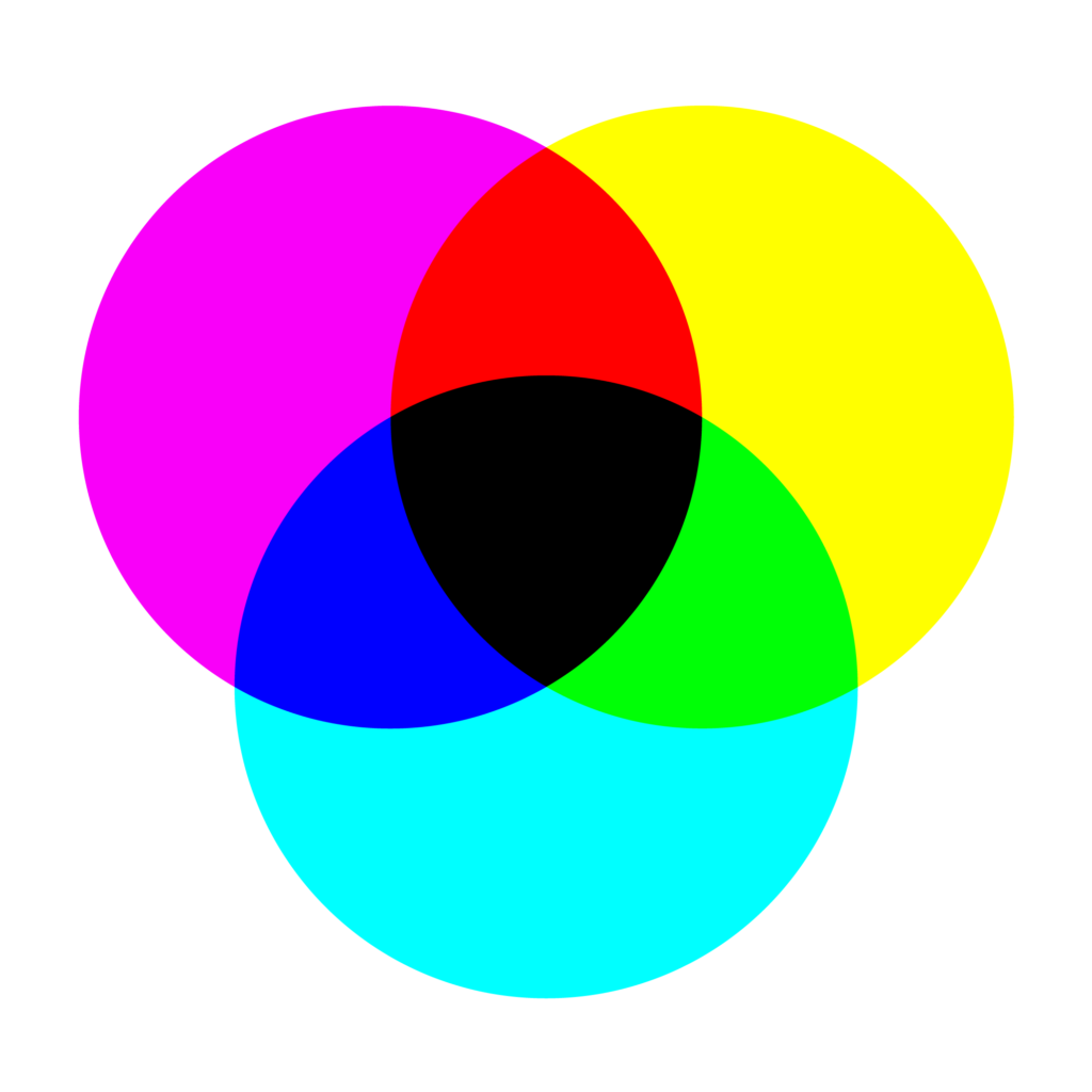
Integrating the models: a digital color wheel
Note something very unexpected here: when we mix primaries of the additive model, they create secondary colors that are none other than the primaries for the subtractive model, and vice versa! Additive red and green mix to form yellow, green and blue making cyan, and blue and red create magenta. Subtractive cyan and magenta combine to make blue, magenta and yellow make red, and yellow and cyan generate green.
This reciprocity among the two models makes it easy to combine them into an integrated color wheel. Thus, when we shift our orientation from one color model to the other, we simply shift the identity of primary and secondary triads.
In our new color wheel, observe sets of numbers that show you the mixture of values in the respective color models. For CMYK, these numbers are expressed as percentages of hue present. We express RGB values in increments from 0 (no illumination) to 255 (maximum illumination). These are typical of how monitors, televisions, and projectors process information. We can identify the third set of “numbers” as the hexadecimal system. This encodes standard RGB values for use in web design. F, equivalent to 16 in base 10, is the highest value, and 0 is the lowest. Hexadecimal #FFFFFF is white; #000000 is black.
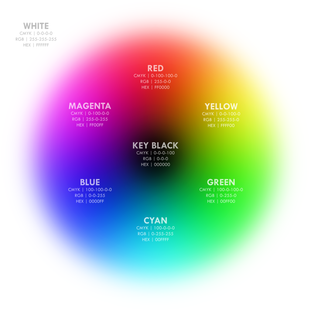
The integrated wheel gives us a standard set of hues that work in tactile color mixing as well as across computer applications. This wheel acts like the traditional wheel, but we need to reassess some traditional relationships. Complementary colors, for example, are shifted (the complement for blue is yellow, not orange, for example).
With hues well-defined by modern optical science, we can use the new color wheel as the basis for one particularly useful color model.
From color wheel to color space
One limitation of a color wheel is its ability to model all of the properties of color. As a flat plane, it has area, and can therefore show two variables. For example, one can create a wheel that shows all the hues as one variable, and the saturation level as another. Or, one can show hue and value… or saturation and value. But it’s impossible to show all 3 variables without turning to a 3 coordinate system. Imagine trying to describe 3D space while only using an XY coordinate system! It’s like trying to get a sense of a building’s spaces by only looking at the floor plan.
Hence, we have developed color standards known as color spaces. One common cartesian-based, 3-coordinate color space uses RGB as values along the 3 axes and is computationally very useful, but the resulting RGB color space is extremely unintuitive and makes it difficult to visualize neutral gray tones in a graphic way (the gray values run along a diagonal bisector of the RGB color cube).
The HSV color space reorients the geometry of the RGB space to solve these perceptual deficiencies. How? It creates a radial coordinate space that maps well with the flat color wheel.
The HSV color space
HSV stands for Hue-Saturaton-Value, as we’ve previously learned. In some applications (like Photoshop) this model is called HSB, where value is replaced with the synonym brightness. The HSV model creates a cylindrical “space” that we can conceptualize as containing all “possible” colors in the gamut. The cylinder is useful because we can recognize the color wheel as the hue values march around one set of radial coordinates. We can perceive saturation as most intense at the skin of the cylinder and desaturated at the center. Finally, we can see the grayscale of value from black at the bottom to white at the top. The brightness of pure color in the HSV model is equivalent to the brightness of white.
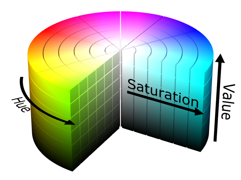
Unpacking the HSV cylinder
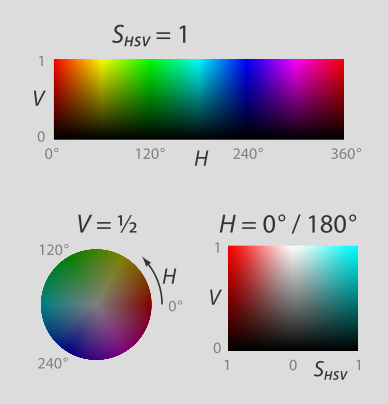
The unwrapped “skin” of the cylinder describes the high saturation (S) of all hues (H) and values (V) together, with S values on a decimal scale from 0 (no color) to 1 (full color).
A horizontal section of the cylinder describes all hues and saturations present for a given value, here a middle value gray, with V quantified from 0 to 1.
A vertical section — like a cake sliced in half — describes all values and saturations for a given hue pole. In our example, a red-cyan pole demonstrates that red and cyan are complements in the integrated RGB-CMY color model. We describe H values as degrees, with 0 and 360 being red, 60 yellow, 120 green, 180 cyan, 240 blue, and 300 magenta.
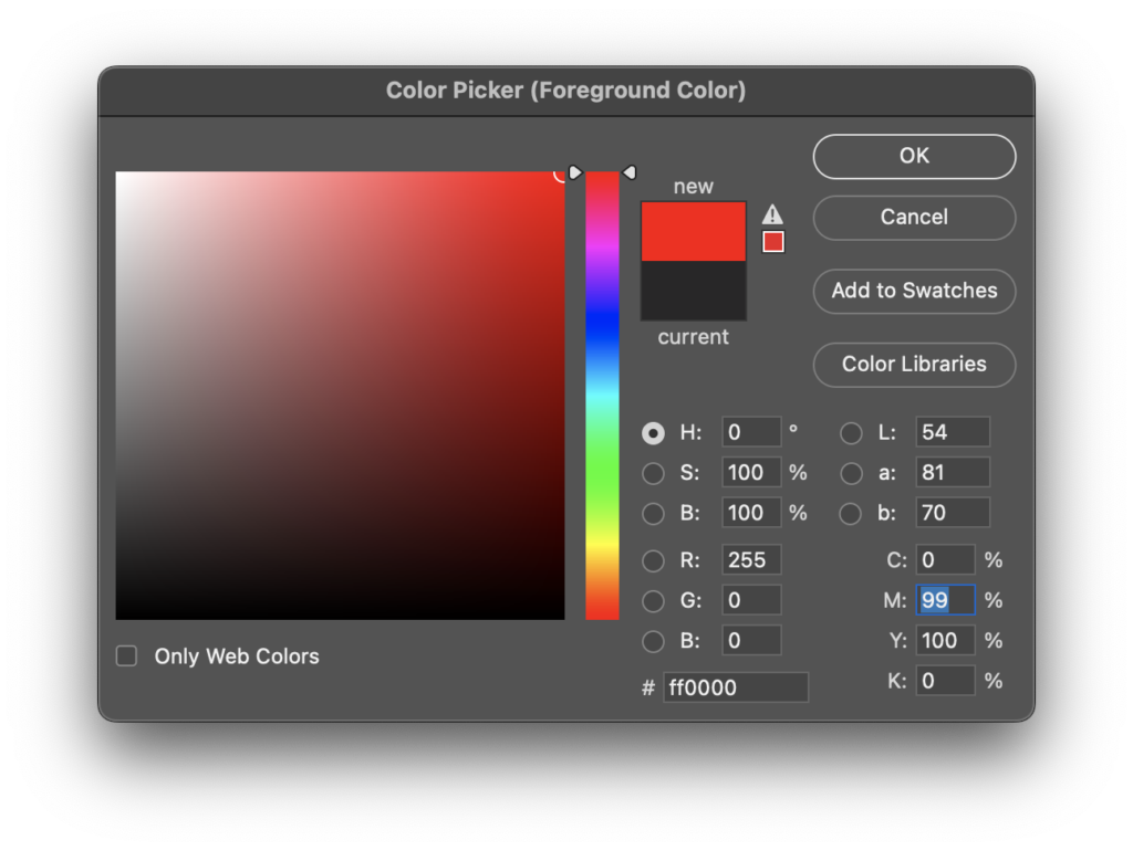
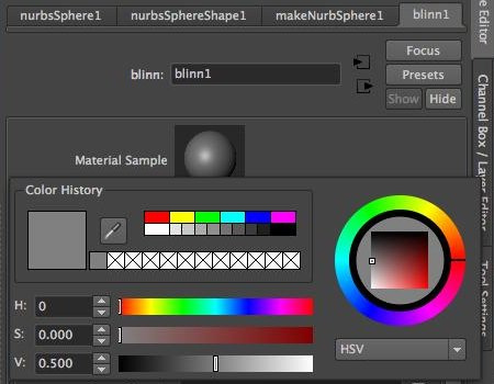
The HSV cylinder aspect used in color pickers such as we see in Photoshop, was specifically developed for computer applications, but it is very intuitive for artists and not difficult to understand once it is visualized as a “space.” In the Maya material color picker, you can change the selector from an RGB cube to an HSV cylinder at the lower right drop-down.
The phenomenology of color
Color and the illusion of space
Warm and cool push and pull
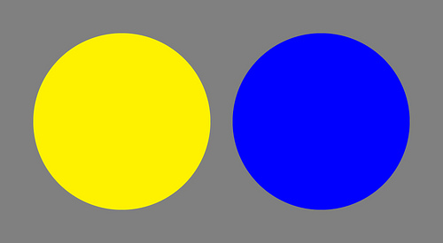
We sometimes limit color as a purely graphic phenomenon, but as colors begin to interact, they suggest spatial relationships both actual and illusionistic. One way that color generates a sense of space is through the juxtaposition of warm and cool colors. Warm colors (based on magentas, reds, and yellows) tend to advance visually in most contexts, while cool ones (based on greens, cyans, and blues) tend to recede.
In the graphic at right, yellow (HSV values 60-1-1) and blue (240-1-1) represent warm colors (those that visually advance) and cool colors (those that visually recede) at their most extreme, seen here on a neutral, middle-value gray (HSV = 0-0-0.5) field. Can you perceive the push and pull?
Phenomenal transparency and layering
The color abstractions of Josef Albers present us with a sense of layered space through color interaction and an illusion of transparency fostered by color relationships. Here we see the first of three colors: in the smaller middle square is a high-saturation, lighter red (HSB values 359-99-62). Surrounding the red is a high-saturation, darker shade of orange (a.k.a. brown, HSB 13-96-34), and lastly, we see a high-saturation, middle-value cyan-blue (214-100-55).
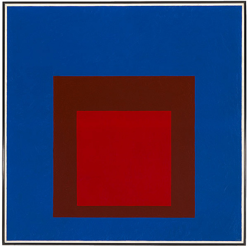
As we observe, a strange phenomenon begins to take place: the brown, containing a high level of red, begins to associate with the top square, while at the same time, its darker value begins to associate with the cyan-blue. We start to see the cyan-blue as a transparent filter, laying on top of a red square sitting behind it, with a hole—the smallest square—opening to it. Albers makes three squares become two and makes one square feel like a hole. But he also makes the “advancing” warm color appear to sit behind the “receding” cool one. Even more astounding, he makes the dark orange (technically a warm color) feel like it contains cyan-blue… its complement! These are byproducts of color interaction and phenomenal transparency techniques, of which Albers was the acknowledged master.
Palettes
Many other color relationships generate a sense of pictorial space, but we can also use them to manipulate actual space in a 3D model. Among the many are these:
Monochrome palette
A monochrome palette uses tints, tones, and shades based on the same or nearly the same wavelength of light. These palettes tend to create a sense of color unity that binds and camouflages form, compresses space, and develops a psychological sense of relative stability.
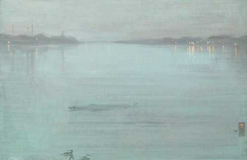
Analogous palette
An analogous palette uses hues adjacent to a dominant color to create variety, hierarchy, balance, focal points, and other visual phenomena. Analogous colors create a more distinct form but maintain a sense of spatial and pictorial unity since the colors on either side of the dominant color contain some aspect of it.
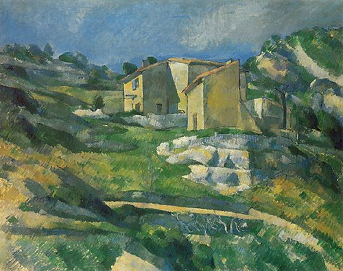
Complementary palette
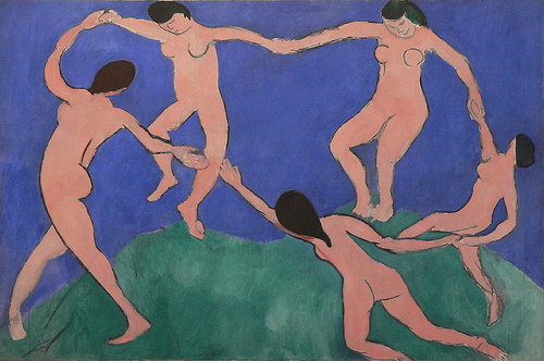
A complementary palette creates stronger figure-ground relationships that tend to develop tense spatial depth through contrast. Interesting situations can develop with complementary palettes whereby a hot color rendered on a far-away object can tend to shoot forward in a cool environment, creating a strong sense of spatial tension and ambiguity.
Upending hierarchies and balance with color
As the use of these various palettes establishes spatial relationships for the artist, we begin to better understand how form and color interact to manipulate visual phenomena in complex ways. Revisiting the illustration from our discussion of asymmetrical balance, we can perhaps better appreciate how the “rules” can be overturned by the perceptual changes color brings to the compositional mix.
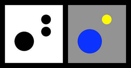
At right, we balance a large object with a group of smaller ones.
But on the left, a receding blue applied to the large object is balanced by visually advancing yellow applied to only one small object.
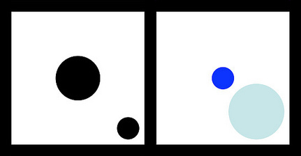
At right, we balance a large object at the center with a small object near the edge.
But at left, this reverses when a highly saturated color is applied to a smaller central object, now balanced by a larger, lighter object at the edge
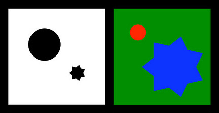
At right, we balance a large simple object with a smaller complex object.
But at left, color changes balance: on a green background, the complement red emphasizes a smaller, simpler object, now balanced by a larger, complex object rendered in green’s analogous color, blue
Color creating texture
Like light and color, texture is an element of visual design. In concert with other elements, it is used to generate emphasis, contrast, rhythm, and the spectrum of other visual principles we’ve encountered. As a visual element in art, we appreciate texture in three overlapping categories: physical texture, visual texture, and implied texture. These can all be created through the use of contrasts in hue, saturation, and/or value, tending toward smaller-scale mark-making.
Physical texture
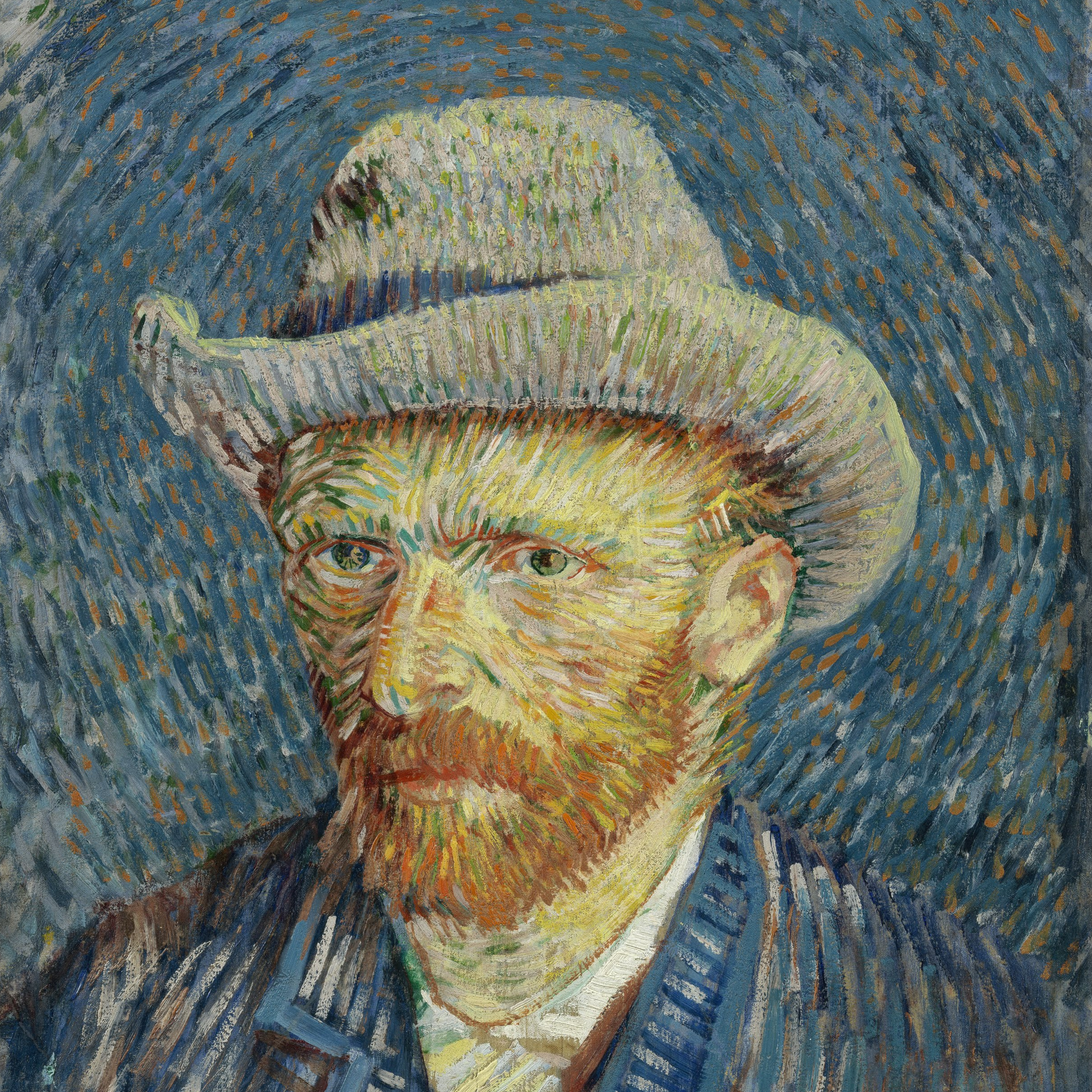
A physical texture is tactile, one that can be felt as well as seen. Although it would get you in trouble with museum guards to touch a Van Gogh, you can imagine what the texture of his impasto painting technique would be like to “see” with your fingers.
Visual texture
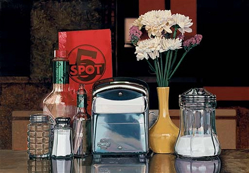
The brushwork of this Photo-Realist painter is physically smooth, yet Goings creates many textures the eye can “feel” ranging from the reflective smoothness of metal to the grittiness of pepper. The texture is an illusion: we see it, but only by mentally referencing physical texture.
Implied texture
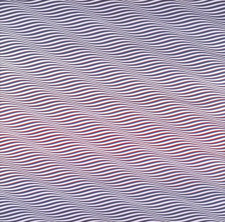
Riley uses line, repetition, and high contrast to create the visual conditions of texture in her abstract Op-Art work. The working visual definition of texture is present—we see it as a texture quality, but not referencing physical texture in objective ways.
For more…
Color is a fascinating topic, of which we’ve only been able to scratch the surface. If you wish to go in greater depth, visit David Briggs’ comprehensive website The Dimensions of Colour.
