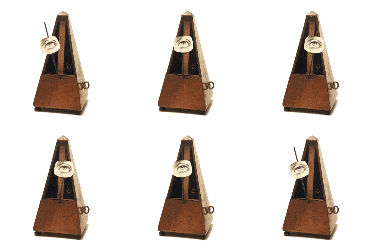
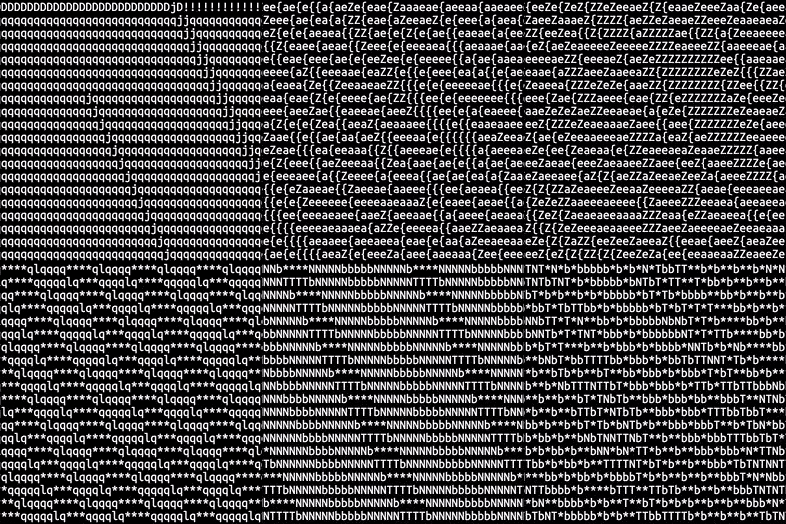
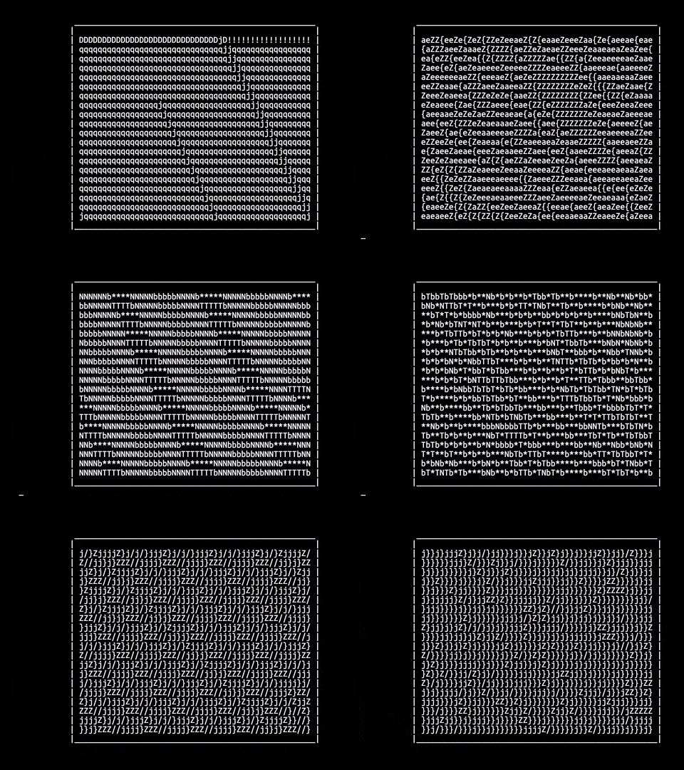
.code {is: poetry;}
“Code is Poetry” is one of the evocative and thought-provoking taglines coined by WordPress, one of the most popular content management systems on the web — it’s the one we use for this wiki.
Reflecting on the WordPress tagline, Matt Ward writes:
If a poem is written for a particular purpose, then the composition should reflect that purpose. The structure, word choice, subject and tone should all work together to support the primary purpose. …
Our code should be much the same. …
The Poetics of Coding

Matt extends the metaphor: poetry and code share aspects of semiotics, structure, and conciseness that inevitably lead one to be “surprised by just how deep the similarities run. In some ways, the metaphor almost blurs into reality.”
Jay Hoffman expands this further:
… Poetic flow is different from prose because it is not determined simply by grammatical structure, but by the way each word naturally bounces to the next, unveiling something more essential through their juxtaposition.
Code has the same effect; each function, each coding phrase infuses with the words around it to create meaning. Each line, juxtaposed with the next, is able to do something that neither could do on its own. …
Code Poetry
In our project, framed by this metaphor, we will create concrete poetry through the medium of code.
Every website is concrete poetry
Concrete poetry? That’s a funny term. What is it?
Superficially, it can be defined as words making form. There’s nothing particularly radical about that: we see this sort of thing occur all the time in advertising and logo design. Some critics of concrete poetry claim it is little more than a bunch of truisms with clever graphic design applied, like advertising. Concrete poetry does borrow from visual design strategies in the manner of advertising because it has to: both are visual media. But the best concrete poetry, like the best in any creative output, is transcendent, ineffable, and richly layered—in fact, the opposite of characteristics we often find in advertising. Concrete poetry is a kind of visual poetry.
So there’s always a relationship between text and image in a concrete poem. We might say the same thing about every website that combines image-based and text-based content. We can draw a fairly densely connected set of dots between concrete poetry and like-kind forms, such as micrography and the calligram.
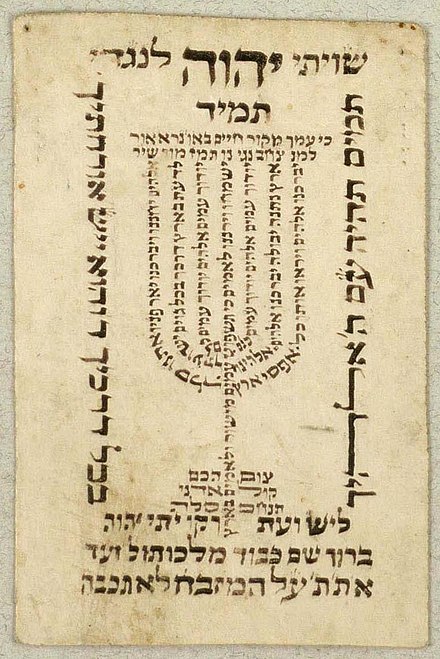
Micrography: a Hebrew text in the shape of a menorah.

An Arabic calligram in the shape of a peacock.
By transcending a singular focus on words or pictures, but combining and intertwining both, we can argue that a concrete poem and a web page are both manifestations of intermedia — the combination of multiple media expressions — and transmedia narrative — a story told across various means of writing, drawing, time-and-motion graphics, and audience interactivity, all enabled by today’s digital media.
Concrete vs. abstract
The term concrete poetry develops a distinction between concrete and abstract image-making through words. The term abstract refers to ideas or concepts that have no physical referents. Say a poet wants to write about love. She can’t hold this in her hand or describe its form: it’s an abstraction. But when she generates a visual poem, through wordplay, typography, figure-ground relationships, and other phenomena, she gives form to this idea of love. This form-making makes the abstract idea available to the senses: it makes it concrete.
History
Although concrete poetry was a term coined in the 1950s by the Brazilian literary group Noigandres, the idea of suggesting shape with words has a long history, from prehistoric petroglyphs and Egyptian hieroglyphs through Celtic Ogham script, right up to hip-hop graffiti, the simple emoticons we adorn our text messages with ; ), and their more elaborate cousins, the Japanese kaomoji (^_^).
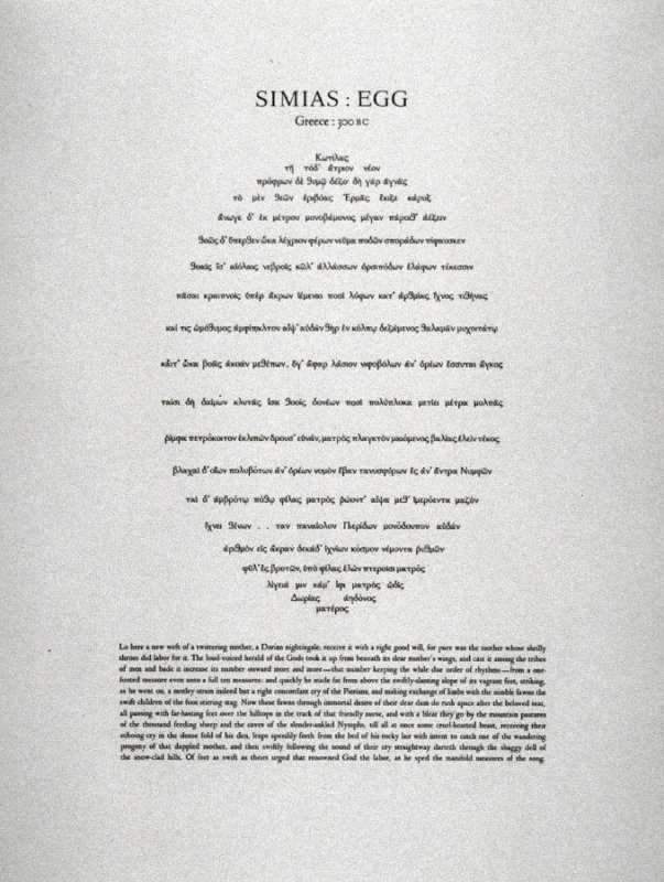
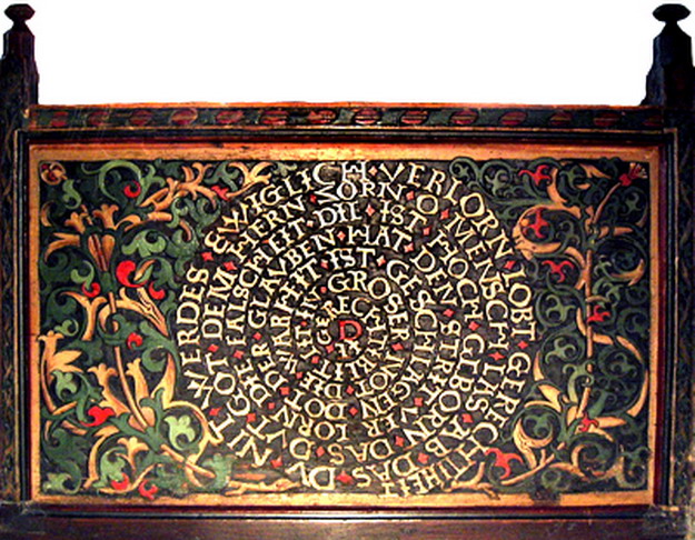
UbuWeb is the premier web archive for concrete and visual poetry, and it’s fascinating to see what we think of as a radical mid-twentieth-century invention permeating all times and cultures. Some examples from UbuWeb’s early collection and Wikimedia Commons:
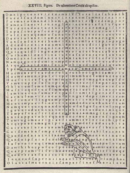
Hrabanus Marus, “De adoratione crucis ab opifice / De Laudibus Sanctae Crucis” Augsburg, circa 845 C.E.
Erhart Falckener, Gerechtigkeitsspirale (Spiral of Justice), St. Valentin, Kiedrich, Germany, 1510 C.E.
Word as image…
The most salient feature of concrete poetry is how word becomes image, clearly expressed in the examples below. The earliest of these, Lewis Carroll’s The Mouse’s Tale, is a typically Carrollian quadruple pun: part of a tale about a tail, the poem is typeset in the shape of a tail, with the rhyme occurring at the end of each line (known as a tail rhyme). It is structured with an AABCCB rhyme scheme which is easier to see unformatted (akin to HTML content without CSS applied):
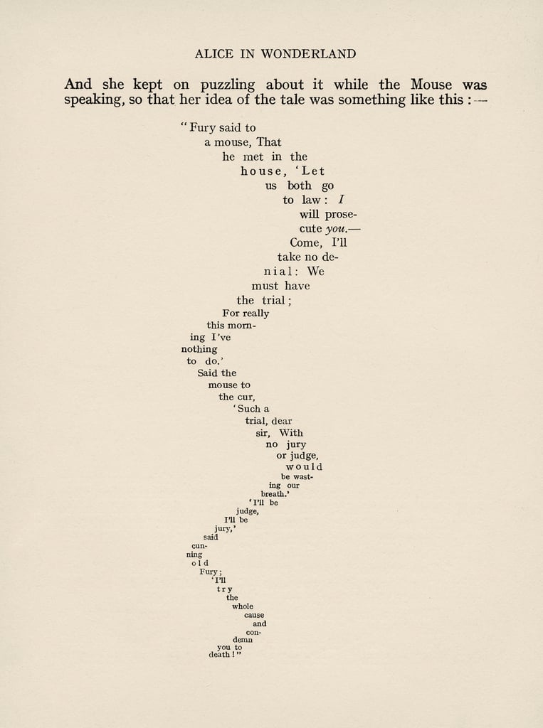
Fury said to a mouse,
That he met in the house,
‘Let us both go to law: I will prosecute you.—
Come, I’ll take no denial:
We must have the trial;
For really this morning I’ve nothing to do.’
Said the mouse to the cur,
‘Such a trial, dear Sir,
With no jury or judge, would be wasting our breath.’
‘I’ll be judge, I’ll be jury,’
said cunning old Fury:
‘I’ll try the whole cause, and condemn you to death.’
Although still witty, without the form, the poem takes on a more superficial and conventional character.
Appolinaire in CSS
As you analyze the examples below, try to imagine what you’d need to do to set it in CSS. Some seem impossible! For example, the Appolinaire poem is typeset on a curve, like text set on a vector path in Illustrator. Cutting-edge CSSWarp can do it! As we get into our project, we’ll be introduced to CSS code generators and tutorials that will allow you to style just about any effect you see in the poems below! After all, remember that the Marinetti exercise was based on a concrete poem.
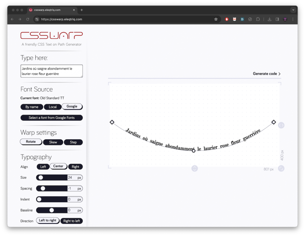
Screen capture showing the use of CSSWarp
e. e. cummings in CSS
Don’t use a lot of non-breaking spaces to typeset this poem by e. e. cummings! Instead, it can be set by using the shape-outside property to create the diagonal margin. The trick is to include the float property with it! If you incorporate a float to the left and right with two separate shapes, you can create the illusion of shape-inside, a property that is not in the W3C standard (yet?). Look at the CodePen resource below to see how.
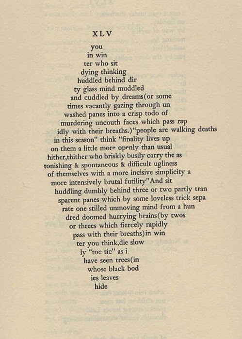
e. e. cummings, XLV, 1925
Visit the website with the code >
Our code was developed by adapting techniques from the shape-outside diamond Pen by Chokcoco, seen adjacent
bpNichol in CSS
Blues by bpNichol is here set using the CSS Grid property, which is the first CSS module created to solve the layout problems developers have been hacking their way around for as long as they’ve been making websites. Strangely, it hasn’t caught on since it was introduced around 2017, perhaps because it has what people perceive to be a steep learning curve. Sarah Edo offers the CSS Grid Generator as a visualization tool to get past the somewhat abstract coding exercise.
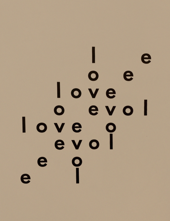
bpNichol, Blues, 1974
Bob Cobbing in CSS
Some of the more intimidating works to emulate are Bob Cobbing’s typewriter poems. Impossible? We created a similar rotation blurriness by using the transform property to rotate blocks of divs, in combination with some opacity changes.
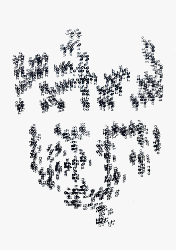
Bob Cobbing, Music for
Dancing, 1971
In many of the examples above, we used helper sites created by developers to assist each other and ease the workflow. Smashing Magazine has collected several in this article, and Tiny Helpers has collected a few hundred (!), organized by kind. Everything from blending modes to animation has a visual generator to shortcut lots of code-writing!
… or image as word?
In the examples above, we note how poets approach image-making, but visual poetry works both ways. Artists of many stripes permit visual work to take on the poet’s task.
Cecil Touchon recombines poster material until type leaps over legibility. Imagine how you would set one of his works in CSS. Think large-scale, sans-serif type in white on a red field, transform-rotations, hidden overflow, and a CSS grid, this time with divs spanning across cells to randomize the basic module.
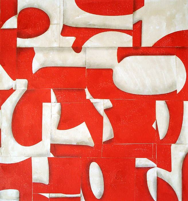
Cecil Touchon, Visual Poetry, 2008
- Francis Picabia combines drawing and text — you could create an
svgas a background image overlayed with divs containing text. - Musician John Cage applies his famous chance and scripting operations to language — you could call a dozen
font-familyinstances to create a similar visual effect. - Bruce Nauman applies commercial neon to a mystical message — the CSS
filterproperties could create the glow, andmix-blend-modecould generate an overlay. - Jiri Kolar applies his collagist sensibility to sculpture in a text-as-texture work — you might be able to set the Kolar as a 3D object using WebGL and the threejs Javascript library!
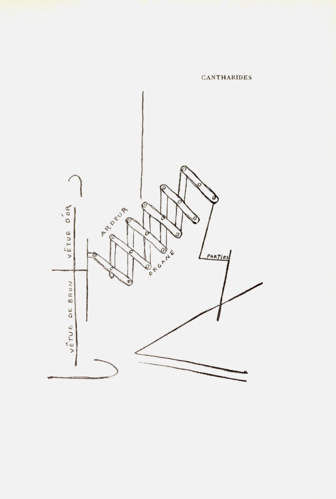
Francis Picabia, Cantharides, 1918
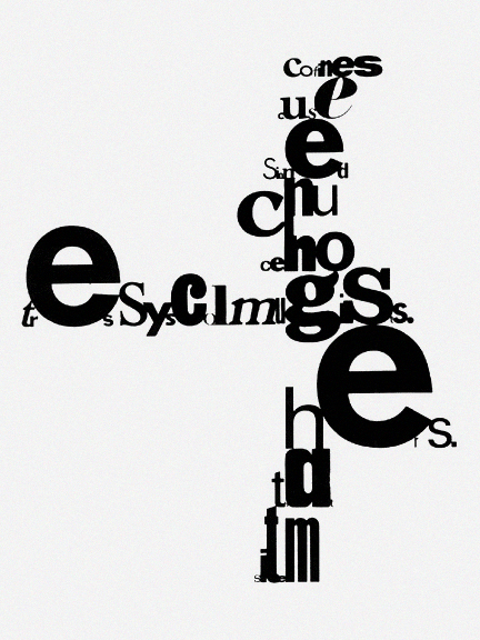
John Cage, mesostic, 1967
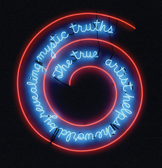
Bruce Nauman, The true artist helps the world by revealing mystic truths, 1967
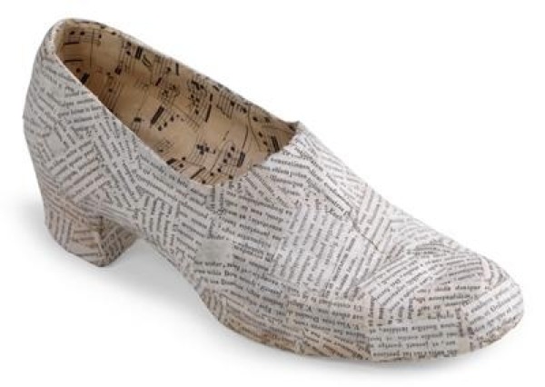
Jiri Kolar, Shoe With Dedication, 1986
If Kolar brings a concrete poetry sensibility to sculpture, Conceptual artist Joseph Kosuth brings it to architecture in his work a labyrinth into which I can venture (a play of works by guests and foreigners). Although we won’t go THIS deep into the possibilities, know that the bleeding edge of the most highly experimental CSS can create spatial modeling in the most modern browsers.
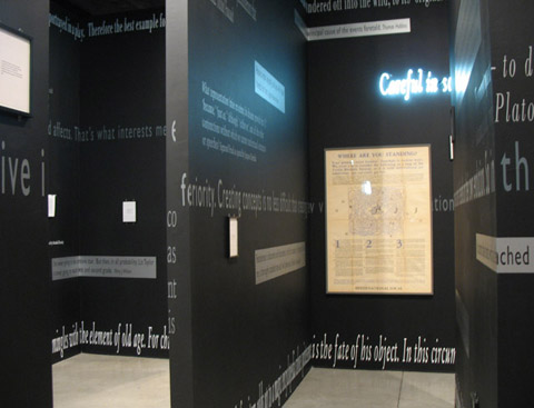
Joseph Kosuth, “a labyrinth into which I can venture (a play of works by guests and foreigners)” installation view, 2006
Typography = type drawing
But no matter how enthusiastic the poet may allow himself to become about the potential … of the new visual poem, when he gets down to practicalities, he is confronted with certain problems inherent in his materials. If he is going to find poetry in the visual dimensions of words, he must learn to handle them typographically. In the world of advertising where visual communication with words is a cut-throat business, it is the designer’s job to decide which type face or type faces will best persuade the viewer… . The poet’s typographical concerns are far more subtle and significant, and he should exercise even more care, perhaps, in making typographical decisions; for the form, weight and scale of letters and words can be used to heighten, can at best become physically part of what he has to say; they can unobtrusively have little effect upon what he has to say; or they can intrude a discordant note into what he has to say.
—Mary Ellen Solt
To illustrate the power of typography, let’s return to the Brazilians. Solt continues:
A bold, penetrating type face has come to be associated with Brazilian concrete poetry; but within the framework of this over-all characteristic style, the poets have been able to work with a great deal of typographic freedom and individuality.
We can see this in these samples:
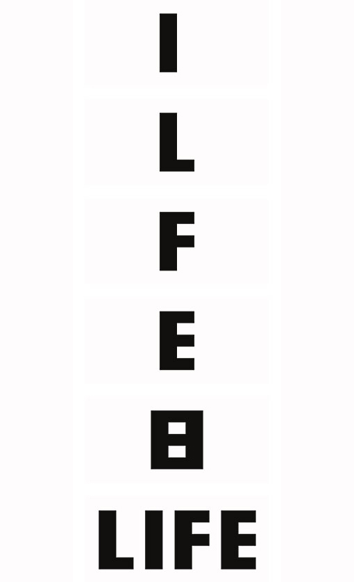
Décio Pignatari, LIFE, 1957

Life Magazine Logo, used to generate Pignatari’s poem
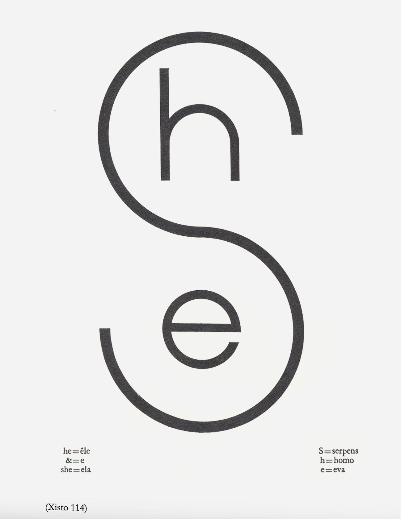
Pedro Xisto, epithalamium, 1969
An epithalamium is a poem traditionally written for a bride on the occasion of her marriage night. Note the table with interpretations of the elements.
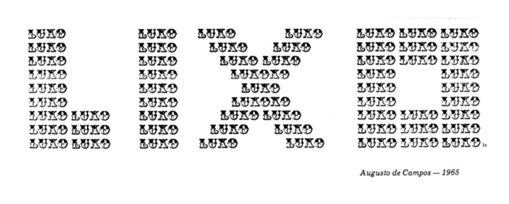
Augusto de Campos, Luxo Lixo, 1965
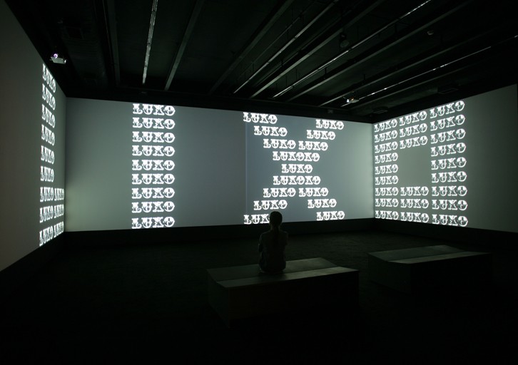
Museum installation, 2007
Perhaps inspired by the Brazilian concrete poets, how do these artists use attention to typography to inform their work?
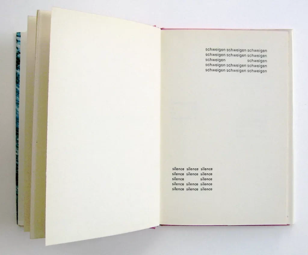
Eugen Gomringer, Silence, 1968
A Pen demonstrating a simple CSS setting of Silence
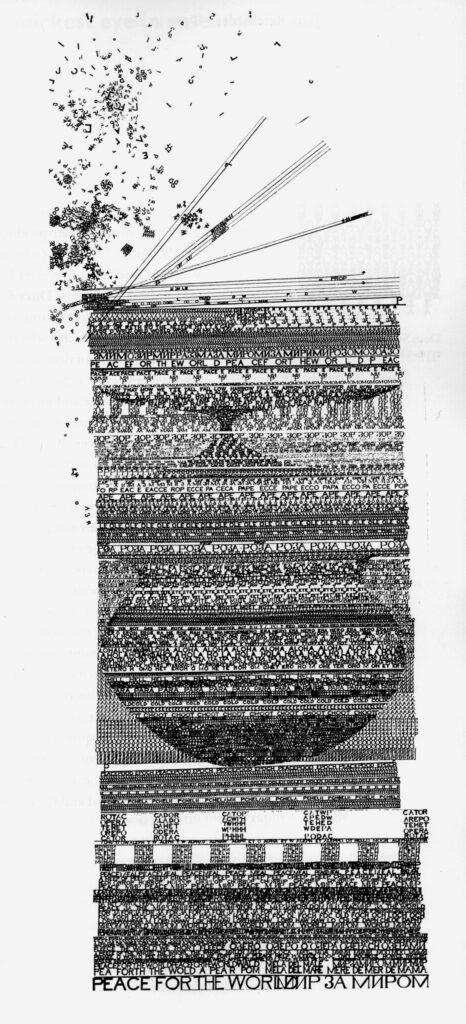
John Furneval, The Tower of Babel, 1964
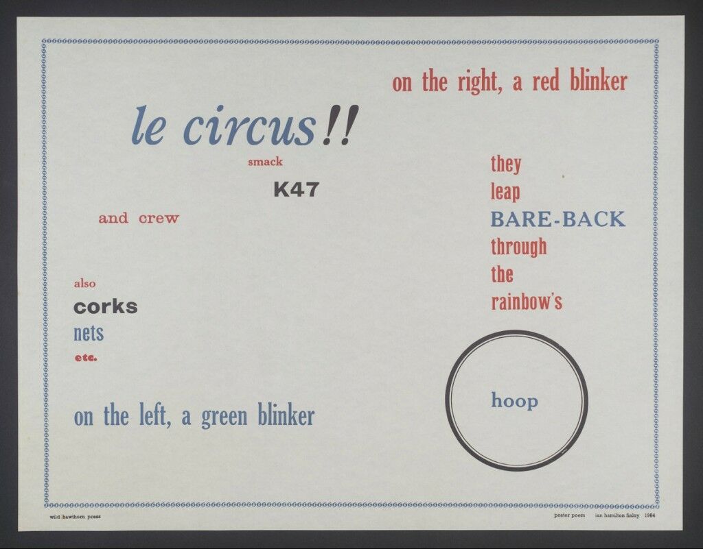
Ian Hamilton Finlay, Poster Poem, 1964
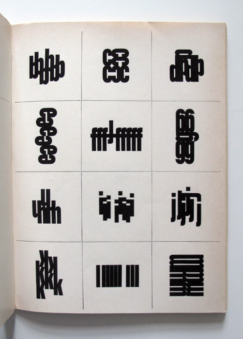
Herbert Mayer, , 1962-3
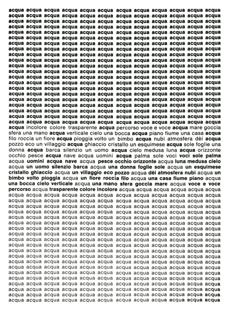
Carlo Belloli, acqua, 1961
Some artists must resort to the very invention of a typeface to bring their work to bear. James Johnson developed one of the early masterworks of interactive web-based art in his work A Thousand Words using a font he created from contorted skeletons posing to form letters. The spectator clicks on the letters to create a new, random set, with associations conjured by the viewer’s own history.
Sadly, the work, a Shockwave .dcr format, is no longer playable online, though you can trick it if you’re adventurous.
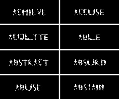
James Johnson, screen capture from A Thousand Words, 1991
A genre waiting for a medium
Johnson’s work is notable among this group, in that it started as a physical installation: lots of words in a grid on a wall. Typical at the time and typical still, an accumulation of material filling a room makes for a fairly run-of-the-mill installation strategy. It was the transition of the work from physical to digital that gave it power… as if it were a work waiting for a medium. This can be said of concrete poetry generally:
… Décio (Pignatari) saddled up to the stage and began recalling the history of concrete poetry as it applied to the Noigandres group in São Paulo in the early 1950s. I was stunned. Everything he was saying seemed to predict the mechanics of the internet in so many respects: delivery, content, interface, distribution, multi-media, just to name a few. Suddenly it made sense: like de Kooning’s famous statement: “History doesn’t influence me. I influence it,” it’s taken the web to make us see just how prescient concrete poetics was in predicting its own lively reception half a century later. I immediately understood that what had been missing from concrete poetry was an appropriate environment in which it could flourish. For many years, concrete poetry has been in limbo: it’s been a displaced genre in search of a new medium. And now it’s found one.
—Kenneth Goldsmith
A House of Dust by Alison Knowles and James Tenney is an early example of a poem generated by an algorithm, which came into being (hard to say it was “written”) in 1967, opening up the possibility for computers and poetry to coexist. Forty years later, the web has exploded as an arena for concrete and visual poetry and literature, combining sound, design, image, and text in ways the Noigandres group could only dream of. Aside from UbuWeb, several institutions curate this ambiguous genre mashup, including PennSound and Electronic Literature Organization.
ELO’s Electronic Literature Collection, Volume 2 contains lots of James Johnson’s heirs. Start with The Sweet Old Etcetera by Alison Clifford (sound alert!).
Note: to interact with much of the content at the Electronic Literature Collection, you’ll need to be on a desktop device using a browser with the ruffle Flash player emulator. Much of this early material was built in Flash and therefore deprecated in 2020. The ruffle emulator allows Flash content to be played without the security concerns that eventually led to the death of Flash… a topic we’ll cover in a future project!
For a fuller history of the relationship between computers and poetry, find a copy of Prehistoric Digital Poetry: An Archaeology of Forms, 1959-1995 by C. T. Funkouser.
Hypertext: fold-ins and n-narratives
We tend to think of that relationship as being a one-way street: computers came along and upended the world. But it was William Burroughs, with his invention of the fold-in method in literature, who has been credited with the conceptual framework for the hypertext. Part of what makes the web the web is the simple, clickable link that fast-forwards us out of one context and into another: a kind of open-ended, spectator-driven narrative with many possible outcomes.
Anyone who plays a video game understands this concept: this author calls such a story a nNarrative, where n is the number of stories allowed by the “programming” of a game-tale by an author. By comparison, most literature throughout time has been a one-way, linear narrative. Enter the hyperlink, and this multivalent storytelling style becomes an incredible extension of an already rich genre.
Visit the Reading Room at Eastgate, publishers of hypertext: of all the worthy options, start with HELP by dane — sound alert (playable with ruffle — see above).
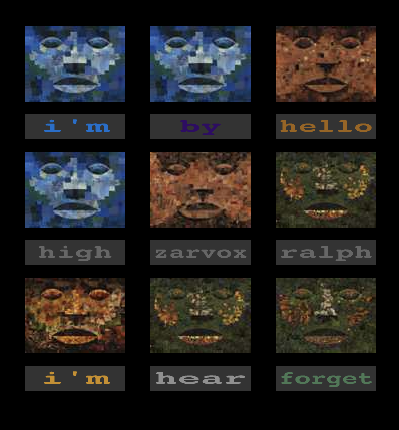
**Hit your browser’s refresh button to reset the frame if you wish to stop the sound**
Follow up with a return visit to UbuWeb, this time to the contemporary section. Of the many to choose from, begin with Brian Kim Stefans and the dreamlife of letters (playable with ruffle).
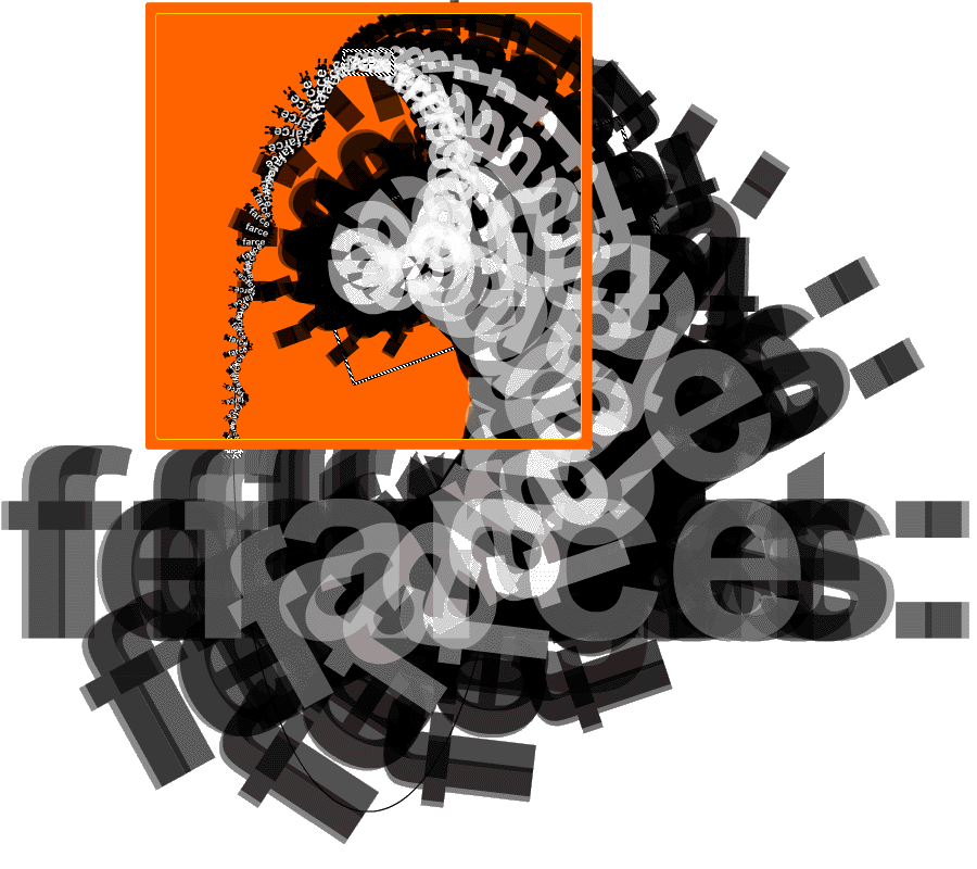
Finally, return to the ELO Directory and find the link to With love, from a failed planet by Jason Nelson — sound alert (also playable with ruffle).
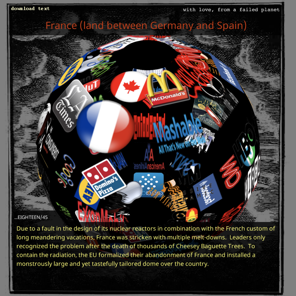
**Hit your browser’s refresh button to reset the frame if you wish to stop the sound**
With the multi-narrative power of the hyperlink firmly in your grasp, let’s begin the project. For more inspiration as you work:
- http://www.anatol.cc/
- https://visual-poetry.tumblr.com/
- https://www.typeroom.eu/article/twenty-things-you-must-know-about-concrete-and-visual-poetry
- https://www.theartstory.org/movement/concrete-poetry/
Our project
The .code {is: poetry;} Project involves both individual and collaborative activity. You will create an original work of art as part of a larger hypertext.
Collaboration
First step: receive a unique number from the random number generator.
Next, receive a set of words from the random word generator at quite possibly the world’s best-named website: watchout4snakes.
Next, use Visuwords as a visual way to find synonyms, antonyms, and multiple meanings.
As you develop, note that a link needs to be created to every other poem file with one of your shared words. The group will also collectively agree on an overall navigation strategy to code and include on every page. This should at minimum be a link of some kind, placed in a discrete div with the same location on every page, back to the home page.
Finally, the home page will also need to be collectively designed and will be hosted by the instructor.
Concept
In your conceptual sketch, develop ideas for a visual poetic work using your words. You may use more words, but you must use the words you received. As you work think about the possibilities for formatting, linking, and other content manipulations unique to the HTML, CSS, or JS environments as discussed in class. Take authorship over this and don’t be intimidated by perceived limitations. CSS can do some pretty amazing things on the cutting edge, and there are several code generators on the web to take the headaches out of some of the wilder coding scenarios you might dream up.
As part of the concept, you will also do some team management to create common assets:
- A home page, which will be hosted by the instructor but designed and built by some members of the team.
- A common navigation tool, which will be comprised of a container div to be shared with every person, is designed and built by other members of the team.
In addition to ideas for individual pages, you’ll develop sketches for these shared assets.
Iteration
In iteration, you will experiment a lot with code. You’ll likely work on several historical states of your page, much like you saw in the development of the Video Mash and Marinetti exercises. As you experiment, you’ll want to borrow some code that you know “just works.” We have some samples linked below, as well as some cool helper sites for generating code.
In Dreamweaver, translate your idea to layout and code as you did for the Marinetti exercise.
- Set up a new site named cip20XX
- For your file name, use the following naming convention: username_word.html, where username is your school usernameword is the random word you received. Your group may choose a different convention if you wish.
- You’ll find creating links to be tricky because the files are not yet uploaded. You’ll have to prefabricate a URL for each person with whom you share a word… that will be up to four URLs. Work together to make sure these are correct because if not, the links won’t work on upload!
We will also develop the home page and common navigation div in iteration.
Good basic code samples
Centering anything in CSS | Sticky responsive navigation bar | Using aspect-ratio CSS | Clipping path in CSS | Knockout text | Mask an image using text | CSS Blend modes | CSS Filters | Draw using JS | Erase using JS | Image swap using JS (on click – better for tap action on mobile)
Many of these are demonstrated in my CodePen.
Code helper sites
Code generators and code advice on the web can help you bring your vision to life in the iteration stage. There are too many to list here but here are some of my current favorites:
- Clippy: A browser-based clip-path and polygon shape generator: https://bennettfeely.com/clippy/
- Text Flow: Using the shape-outside property: https://blog.logrocket.com/creative-text-flows-using-css-shapes/
- Text Flow: Faking a “shape-inside” property: https://www.html5rocks.com/en/tutorials/shapes/getting-started/#toc-inside-shape
- Blend Modes: two kinds of blend properties explored here, mix-blend-mode and background-blend-mode: https://alligator.io/css/exploring-blend-modes/
- Link Styles of many varieties: https://freefrontend.com/css-link-styles/
- Hover Effects for rollovers on color backgrounds and images http://www.corelangs.com/css/box/hover.html
- Embedding a Font in your website: http://www.fontsquirrel.com/fontface/generator
- Text Warp: functions like the text-to-path tool in Illustrator: http://csswarp.eleqtriq.com/
- Transforms, Gradients, and other tools: http://westciv.com/
- Animation Generator: https://animista.net/
- CSS Animation Easing: You’ll never do ease-in-ease-out without beziers again: https://matthewlein.com/tools/ceaser
- iFrame Generator: not exactly CSS but quite useful: https://www.iframe-generator.com/
- Button Generator: https://cssbuttoncreator.com/
- Tons of ideas: https://css-tricks.com/
And if you don’t see a helper site here that gives you what you need, you can do a global search of hundreds of these and other tools at:
- Tiny Helpers: All the tools at one site: https://tiny-helpers.dev/
This will be a highly visual, time-based, and interactive project, and it’s difficult to hold to accessibility standards, but these are some tools to help you understand accessibility issues:
- Web Accessibility in Mind – all about selecting fonts
- Typetester – helps you compare screen fonts
- Juicy Studio Luminosity Analyzer – helps you see the contrast between background and font colors (and many other tools on the Quality Assurance page)
Synthesis
Upload and share the final work:
- Using SFTP in Dreamweaver, upload your portion of the site to your server space. Make sure to follow the folder organization and naming conventions strictly!
- Your instructor will host the home page. Share the files so they can upload it to their server.
- Test drive the site after you upload it. Check all the links emanating from the home page. Check all the links from your page to the others.
- If there are any bugs, find them and fix them, or work with your colleague to fix them. Debug! Check the site all around to ensure links work, code files connect, and images don’t break. Debugging is part of the process. There isn’t a single project in the world that doesn’t fall prey to bugs. And never forget my favorite dad joke about coding:
Q: What is the one language used by every computer programmer?
A: Profanity.
