CHAPTER 8 — Visual Principles
11-minute read

Principles are enzymes
We can manipulate and organize Elements by using Principles. Easy enough, but here’s the confusing part: some Principles can also be manipulated and organized using Principles! For example, Shape (an Element) can be organized into Pattern (a Principle) that is generated through the use of Symmetry (a Principle). In other words, we can use any one Principle to effect the presence of another. Thus, if we can turn to a molecular analogy, a Principle can act like an enzyme, a molecule that converts other molecules into new compounds.
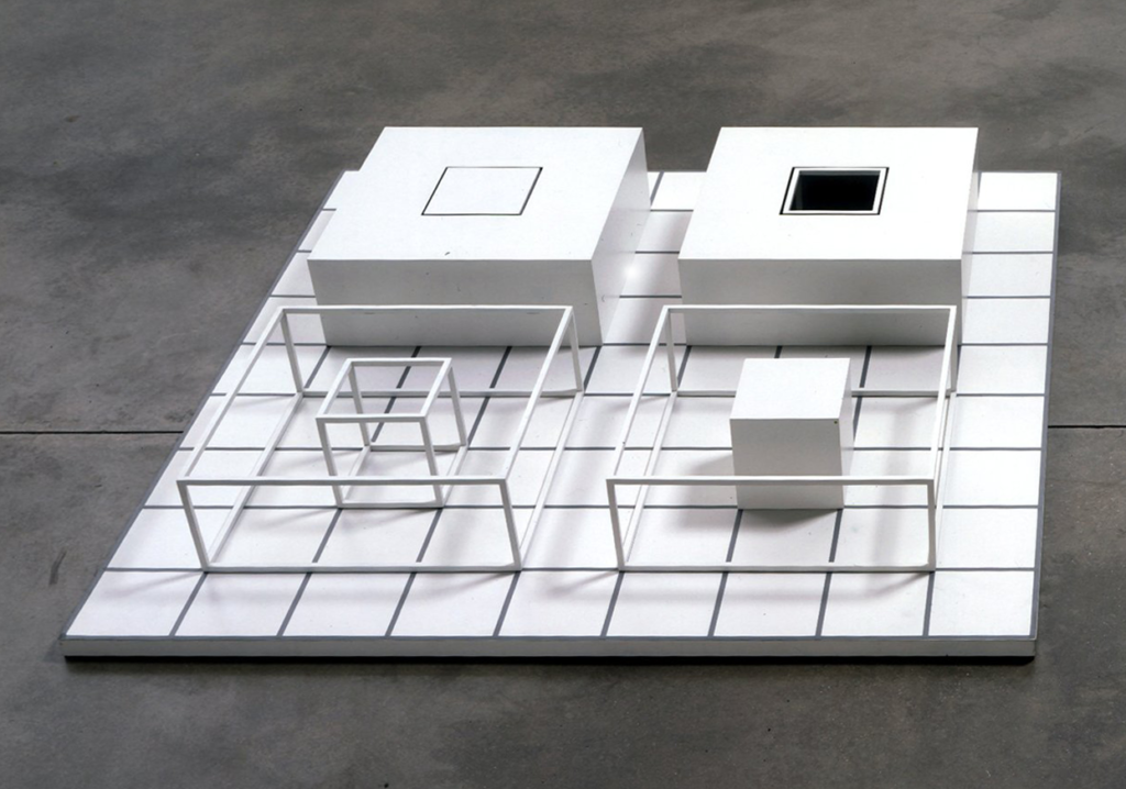
As with Elements, not every Principle needs to be present for a work of art to be considered whole. By analogy, when one drinks milk, the enzyme lactase breaks down the sugar lactose. A lactose intolerant person lacks the enzyme, but can still thrive without lactase by avoiding milk. So too it is with the presence of Principles. An artist or designer can be intuitively selective, using Principles that support a particular work’s narrative or behavior and avoiding those that don’t. And, it should be noted that such a selection is intuitive — artists certainly don’t indulge in an explicit internal dialogue such as “I think I’ll use Scale and Balance here.” Lists like the one below are useful to inform intuition, not replace it.
Principles are hard to pin down because they are often used to express dualities, dichotomies, or the extremes of a spectrum. It is difficult, for example, to think of spatial Contrast without developing a mass with a void, or to think of Unity without its counterpart Variety. Further adding to the confusion, Principles can be applied to objects or events — it’s easy to talk about Rhythm in terms of both space (think grid) and time (think beat).
Our working list of principles
The icing on the confusion cake is this: every author seems to have a slightly different list of Principles by name or number. Some limit the list to four or five, while others include a dozen. Sometimes, an author will use the word Direction while another author uses Movement — somewhat synonymous terms, but this lack of consistent terminology makes the discussion of Principles difficult to parse across the literature. Because different lists also appear in somewhat arbitrary order in most texts, it’s difficult to understand the reciprocal, cause-and-effect relationships that might occur among the Principles. This text will attempt to model a coherent set of Principles in an intuitively useful order.
Among the more commonly cited Principles are Unity, Contrast, Hierarchy, Economy, Balance, Pattern, Direction, and Scale. These names have many related terms, synonyms, and antonyms. These will be described below, but the list above will become the standard for this text. Unity, Contrast, Hierarchy, and Economy are Principles more often applied globally; that is, to an artwork as a whole. Balance, Pattern, Direction and Scale are more often employed locally or internally; that is, to parts of a work in relation to its sense of wholeness.
As with all generalizations, there are exceptions, but it’s not a bad way to attempt to order a long, undifferentiated list of eight Principles into a taxonomy of two succinct groups. Along with related terms and antonyms, we can compile the list as seen in the table.
| Principle | Subsets | Application |
| Unity | Wholeness, Variety | Global, external |
| Contrast | Complexity, Harmony | |
| Hierarchy | Emphasis, Subordination | |
| Economy | Essence, Less-is-more | |
| Balance | Equilibrium, Symmetry | Local, internal |
| Pattern | Repetition, Rhythm | |
| Direction | Force, Movement | |
| Scale | Proportion, Ratio |
Relationships among principles
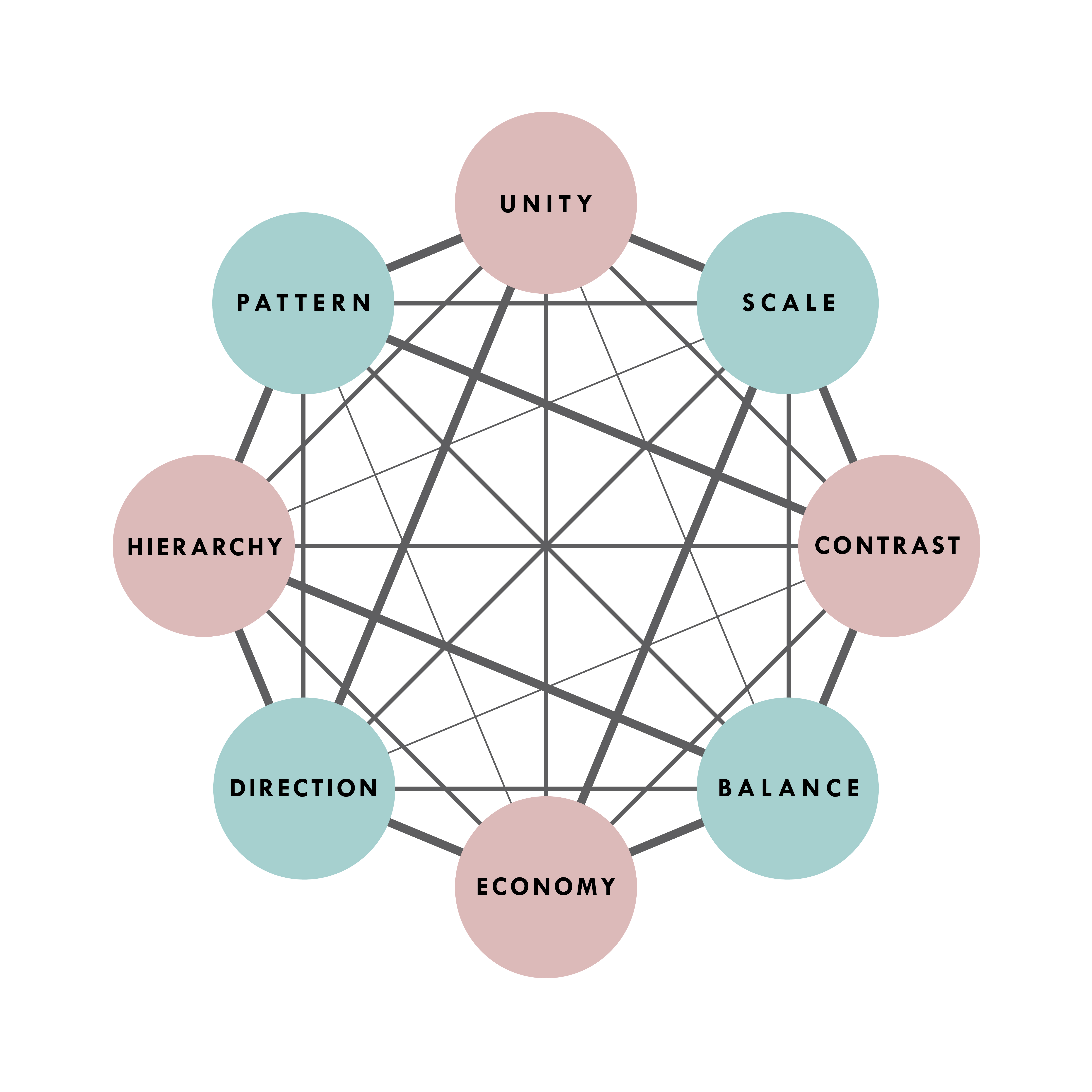
The table, while useful, implies a false sense that some Principles do not relate to others, when in fact there is the potential for direct and reciprocal cause-and-effect relationships among all of them. To illustrate this, we create a web of connections as seen here.
This web is meaningful but difficult to read. It is a fortunate coincidence that the pattern is a 2D expression of vector relationships that exist among the vertices of a cube. 1 Thus, the purpose of the diagram is easier to see in a 3D model:
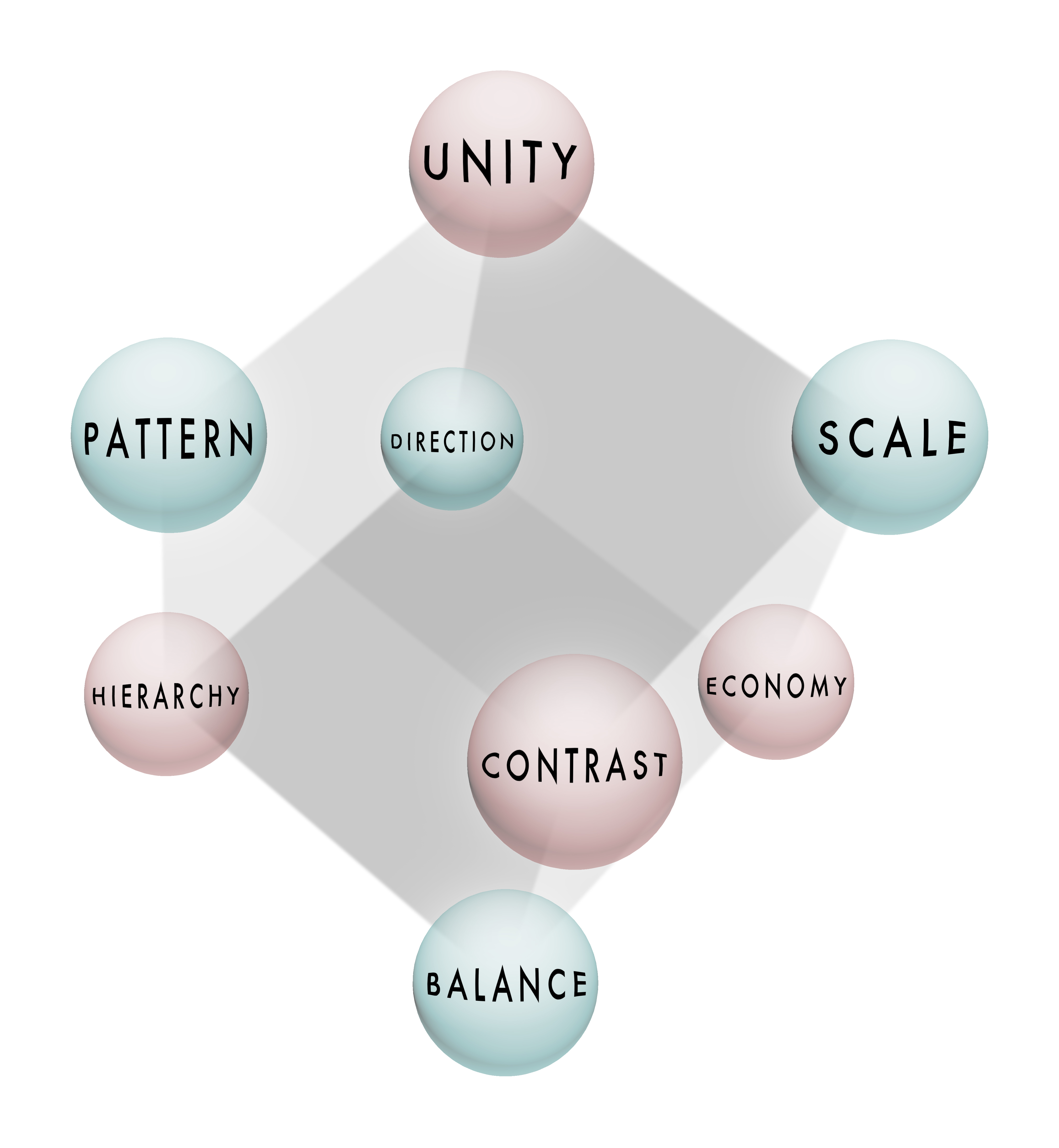
As the Principles are defined below, examples are selected from tactile 3D disciplines like sculpture and architecture and related to the world of 3D modeling, in specific, but certainly not exhaustive, ways.
Unity
Related terms: Wholeness, Variety
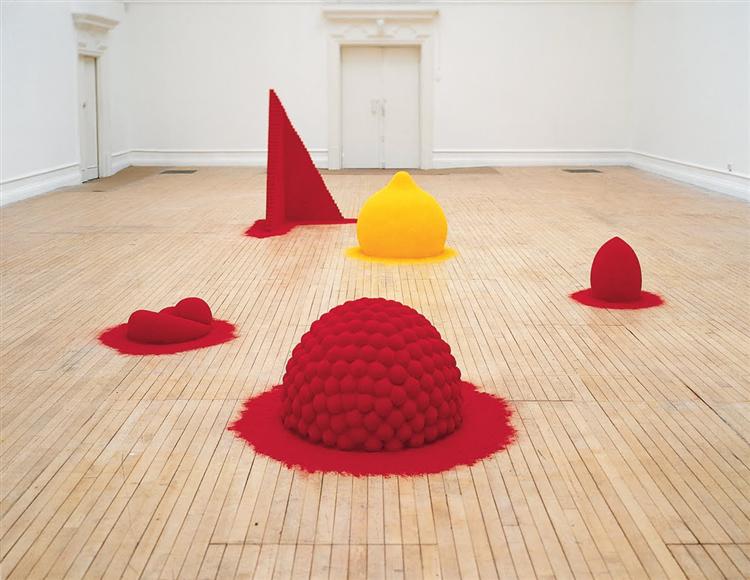
Unity and Variety are a duality, and it is difficult to express one without at least implying the other. Unity is a quality of wholeness and completeness, providing the viewer with the perception that nothing needs to be added or taken away. Variety is a quality of harmonious difference without which it is difficult to achieve visual or conceptual richness.
Contrast
Related terms: Complexity, Harmony, Simplicity
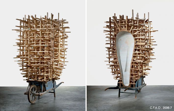
ontrast occurs when objects or events that contain elemental or qualitative degrees of difference combine within a visual field.
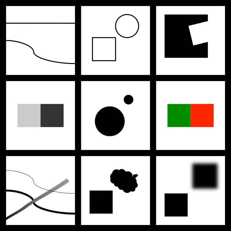
In the diagram, a few of the innumerable possibilities of Contrast are illustrated.
Reading the top row, left to right, we see straight vs curved line, round vs square form, and figure vs ground.
In the middle, light vs dark tone, large vs small size, and color complementarity.
At the bottom, light vs heavy vs gradient lines, geometric vs amorphous planes, and hard vs soft edges.
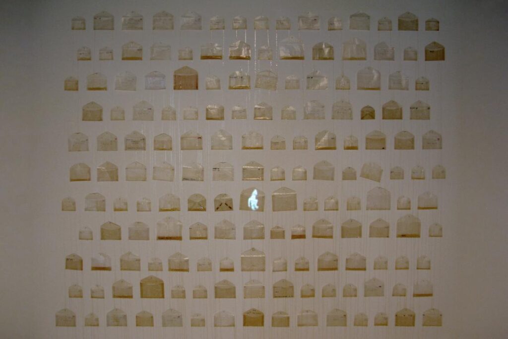
Harmony occurs when objects contain elemental degrees of similarity. The use of adjacent colors on the color wheel, similar shapes, and repetition of a texture will tend to visually link elements in a visual field. Like Unity and Variety, consider Contrast and Harmony as two sides of one coin — that is, it’s hard to have one without the other in a given work.
Hierarchy
Related terms: Emphasis-Subordination, Focal Point

Emphasis and Subordination are relationships of order among objects or events that can occur within a Hierarchy and are a visual analog to grammar. Like a main clause in a sentence, a primary object or event is given Emphasis, while Subordinate entities are dependent on and either modify or complement the emphasized feature. All elements are necessary for a Hierarchy, even as we govern degrees of importance by manipulation of other Principles.
In modeling, Hierarchy takes on a special meaning, as we graft NURBS patches onto one another, Boolean operations occur, characters are rigged for animation, a higher resolution of polygon density is set for proximity to a camera, and so on. These dependencies permit making complex objects out of simpler ones.
Economy
Related terms: Essence, Less-is-more
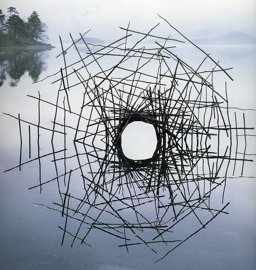
Economy is an approach to making where, in the words of architect Mies van der Rohe, “less is more.” Ambiguity, resonance, frugality, essence, and richness of concept are all byproducts of working with an economy of means. Here, the circle is completed through reflection, leading to an ambiguous spatial reading through an efficiency of effort. In 3D modeling, frugality of description and simplicity of geometry pay off in processing time and workflow.
Balance
Balance in 3D design is both a physical and visual attribute. Dynamic physical forces are usually expressed as masses under the influence of gravity. These achieve stability through Equilibrium, while we can achieve harmony among visual elements through the use of Symmetry or Asymmetry.
Equilibrium

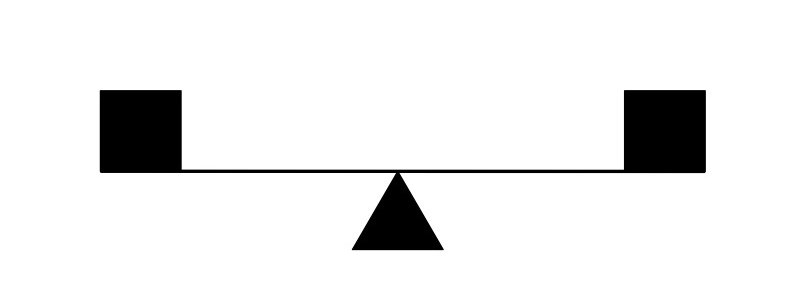
Equilibrium is a state of physical stability, where dynamic forces hold each other in check. Equivalent masses achieve balance channeling through equal distribution of structure, as seen here, and is the physical equivalent of Symmetry.

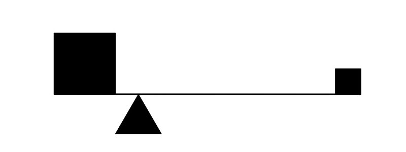
In a system where unequal masses achieve Equilibrium, forces stabilize at a center of gravity, creating the equivalent of Asymmetry seen here. There is a sense of inherent risk and dynamism about a system of equilibrated, unequal masses, but in 3D modeling, there are no laws of physics! The modeler must use their judgment, based on experience in the tactile world, to achieve a correct sense of equilibrium among competing forces.
Symmetry
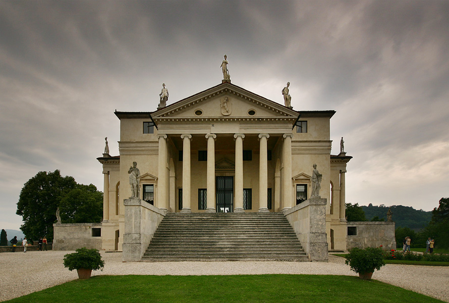
Symmetry is a stable, visual condition of Balance, achievable by correspondence of elements placed on opposing sides of a center point, axis, or plane. We always feel the presence of this controlling geometry, even if we don’t see it visually expressed. We govern Reflection symmetry with an axis in 2D and a plane in 3D.
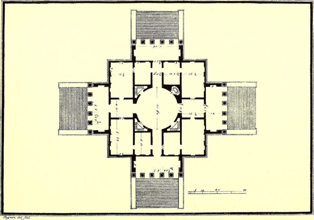
Radial symmetry is governed by a center point or axis or rotation. In modeling, taking advantage of symmetry is useful, as a portion of an element can be modeled, then copied, mirrored, and moved to complete the whole.
Asymmetry
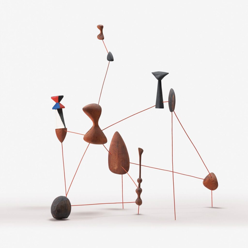
Asymmetry can create Balance by developing harmony among unequal visual elements. Dynamic, diagonal implied lines replace the stable, upright axis of Symmetry as a controlling geometry. Asymmetry is highly relative. The terms of balance can change radically with the introduction of a variable condition such as color.
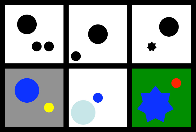
In the upper left panel, we balance a large object with a group of smaller ones. Below it, a receding blue applied to the large object is balanced by visually advancing yellow applied to only one small object. In the upper center panel, we balance a large object at the center with a small object near the edge. Below, we reverse this when we apply a highly saturated color to a smaller central object, now balanced by a larger, lighter object at the edge. Lastly, at the top right, a large simple object balances a smaller complex object. Below it, color changes balance: on a green background, the complement red emphasizes a smaller simpler object, now balanced by a larger complex object rendered in green’s analogous color, blue.
Pattern
Related term: Repetition

Pattern or Repetition occurs when an original element or event is copied and multiplied in a recurring arrangement, or when a quality is held in common by entities within a composition. When we control such a composition by mathematical or geometrical relationships, this creates a predictable visual Rhythm or Progression.
Rhythm

Rhythm in art is a visual analog to music, where the placement of visual elements occurs in a composition in a mathematical way, creating a predictable flow or regularity. A grid or module governs the visible work much as a beat or meter governs music. The use of reference planes and a workflow including copy and move makes achieving rhythm possible in digital 3D modeling.
Progression

When we control a pattern by regulated change, adding or multiplying each element in a sequence by a constant value, Progression occurs. In modeling, adding the scale function to copy and move facilitates the development of a progression out of a rhythm.
Direction
Related terms: Force, Movement
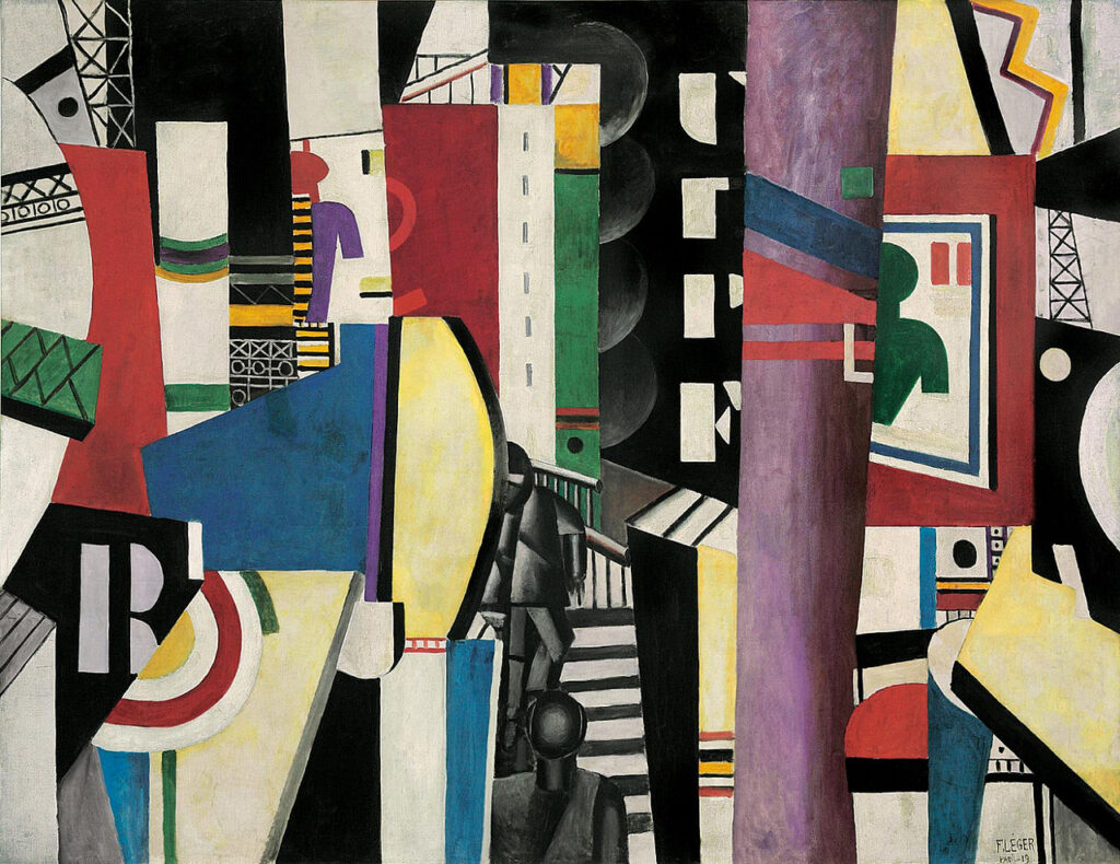
Directional Force and Movement influence how we pay attention to focal points and visual structures by creating implied paths for the eye to follow through the work.
Scale + Proportion
We often confuse Scale and Proportion with size, and with each other. Size is merely the dimension of an object when we compare it to an abstract standard modulus like an inch, meter, cubit, or furlong. Scale and Proportion describe different relative conditions of size, described below. We can express Proportion regulated by mathematical precision as a Ratio.
Scale

Scale expresses the relationship of the size of an object to context or external relationships, for example with the human body. Changing the size of an object changes its scale in a fixed environment, but changing the environment can also change the object’s scale without changing the object’s size.
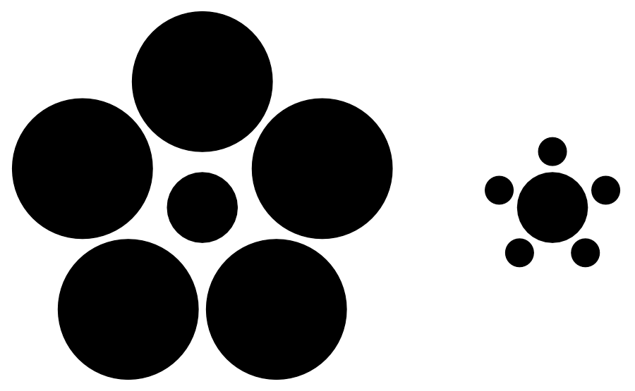
The Ebbinghaus illusion demonstrates the power of context to change perception of scale. Circles surrounding a pair of central circles mask the fact that the central circles are identical in size.
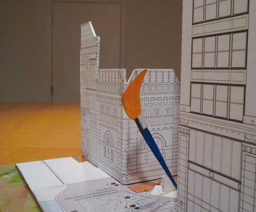
Oldenburg and van Bruggen illustrate the use of a scale model. In an interesting twist, a scale model transports an entire environment to another context where we can appreciate relationships internal to the scale model.

Digital models are not scale models. We create them with a 1:1 relationship to an intended actual size — an inch in the model environment represents an inch in real space. However, we can scale a digital model in the same way a physical model can, by expressing a smaller unit representing a larger one, a useful conceptual trick for 3D physical output. That said, the model environment exists in a mediated world, abstract and apart from human scale and physical space. To appreciate the scale of objects created in a digital model, the modeler must appreciate the size of the modeled objects. One way to do this is to mock up an object using cardboard; another is to use a tape measure to see what size actually “feels” like in real space.
Proportion

If Scale is the relationship of an object to its context, Proportion describes the relationship of part to part, or of part to whole. This occurs internally within an object and is independent of scale. Visually “correct” proportion can involve actual distortion that supports structure and narrative, such as here, where the figure of Mary is about 3:2 larger than the figure of Christ, almost 3 feet taller if the figures could stand up.
Ratio
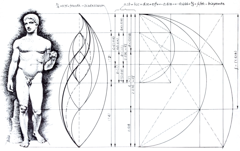
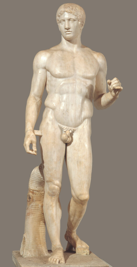
Ratio is Proportion that we govern mathematically. When measured, Proportion can be a statement of equivalence between two or more ratios (i.e., all squares are 1:1, regardless of size). Ratio therefore expresses a quantifiable and scalable relationship, usually expressed as a quotient.
Note the significant proportional constants expressed by √2, π, the Fibonacci Sequence, or the Golden Ratio (also known as phi or ϕ). We find these in natural patterns of growth and many artworks, although some claims of their use border on the mystical and must be approached critically. The diagram demonstrates a reasoned application of the Golden Ratio (1.618…), an irrational number, to Classical sculpture. Digital modeling, by nature, is where art and mathematics collide, and these numbers become useful.
Format
We use Format to describe a conventional ratio for a two-dimensional picture plane. Nonetheless, in modeling, the format is an important consideration: much of what the artist generates either occurs on a monitor or laptop screen, like the monitor pixel resolution of a MacBook Pro, which by the way yields a 1:1.6 ratio, very close to the Golden Ratio! Much of the output for modeling occurs in still renderings that emulate standard formats for photographs (like 8-by-10) or videos that work with standard screen formats (like 16:9). Be aware that format can subtly affect the way you model — know when to acknowledge and when to ignore this on your result. Especially with photograph-like imagery, we can orient a format horizontally or vertically. We call these orientations landscape formatportrait format respectively, for reasons you can easily deduce.
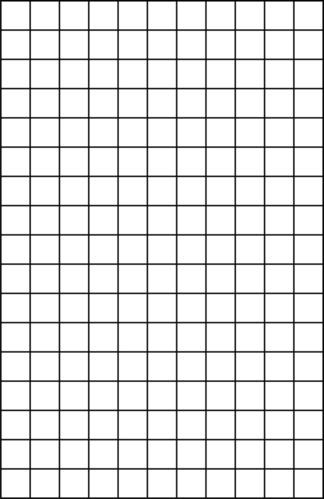
You’ll notice a relative rarity of the 1:1 format — a square. It’s surprisingly hard to work with. Rarer still are non-rectilinear formats, such as the circular format known as the tondo or the oval format (sometimes called a vignette image in photography when the oval results from blurred edges). Again, all of these choices are of primary concern when still rendering is the output goal, but remember: rendering starts in the model but ends in Photoshop. We can achieve many of our format choices more easily through a raster-image editor.
- For the geometrically curious, this relationship begins as a cubical graph. When lines representing all edges, face diagonals, and cell diagonals are added to the cubical graph, it becomes a complete graph. The web in this figure is based on an octagon in which all vertices are thusly connected, and such a graph is denoted K8 in a mathematical convention. For more, see Wolfram MathWorld at http://mathworld.wolfram.com.[↩]

