CHAPTER 4 — Visual Elements I: Point, Line, Plane
22-minute read

You, who are blessed with shade as well as light, you who are gifted with two eyes, endowed with a knowledge of perspective, and charmed with the enjoyment of various colours, you, who can actually see an angle, and contemplate the complete circumference of a Circle in the happy region of the Three Dimensions — how shall I make clear to you the extreme difficulty which we in Flatland experience in recognizing one another’s configurations?
— Edwin Abbot, Flatland 1
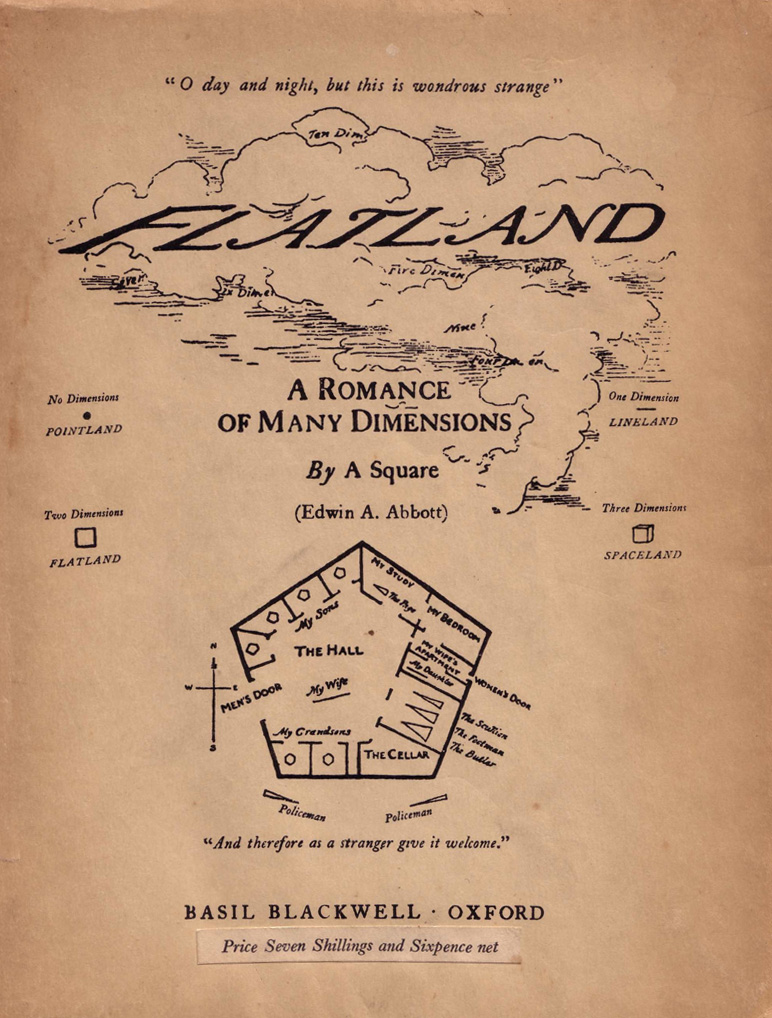
In Flatland, Edwin Abbot writes a story from the point of view of a two-dimensional being who encounters three dimensions. But it turns out that it’s our story! By analogy, he demonstrates how to understand elements that lie beyond our ability to perceive.
Even those with which we are familiar can be hard to grasp. However, understanding visual Elements will allow an artist to see and use them.
Dimensional elements
This chapter concentrates on the phenomena of Point, Line, and Plane. But let’s first, let’s contextualize them. We’ll note all the elements below. In this chapter, we cover those highlighted in red.
| Chapter | Element | Subsets | Dimension |
| 4 | Point | 0 | |
| Line | 1 | ||
| Plane | Figure/Ground | 2 | |
| 5 | Volume | Mass | 3 |
| 6 | Kinetics | Time/Motion | 4 |
| 7 | Light | Value | Optical |
| Color | Hue, Saturation, Brightness | ||
| Texture |
Example: a Line, having length as a property, is a one-Dimensional entity. Color is Optical, meaning it is an innate property of material and therefore something we see regardless of a thing’s dimension. In other words, a line of a given length can be either blue, yellow, or red. This sounds simple, but this property will change our perception of the line.
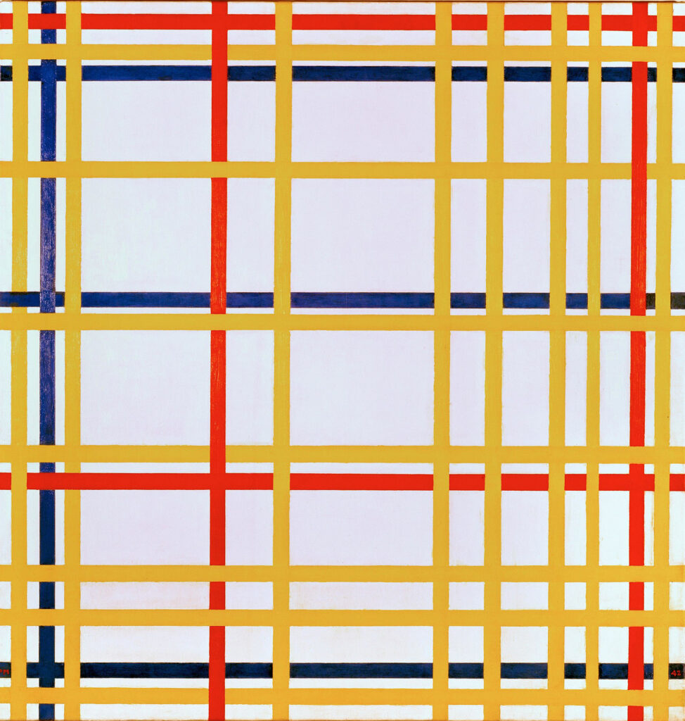
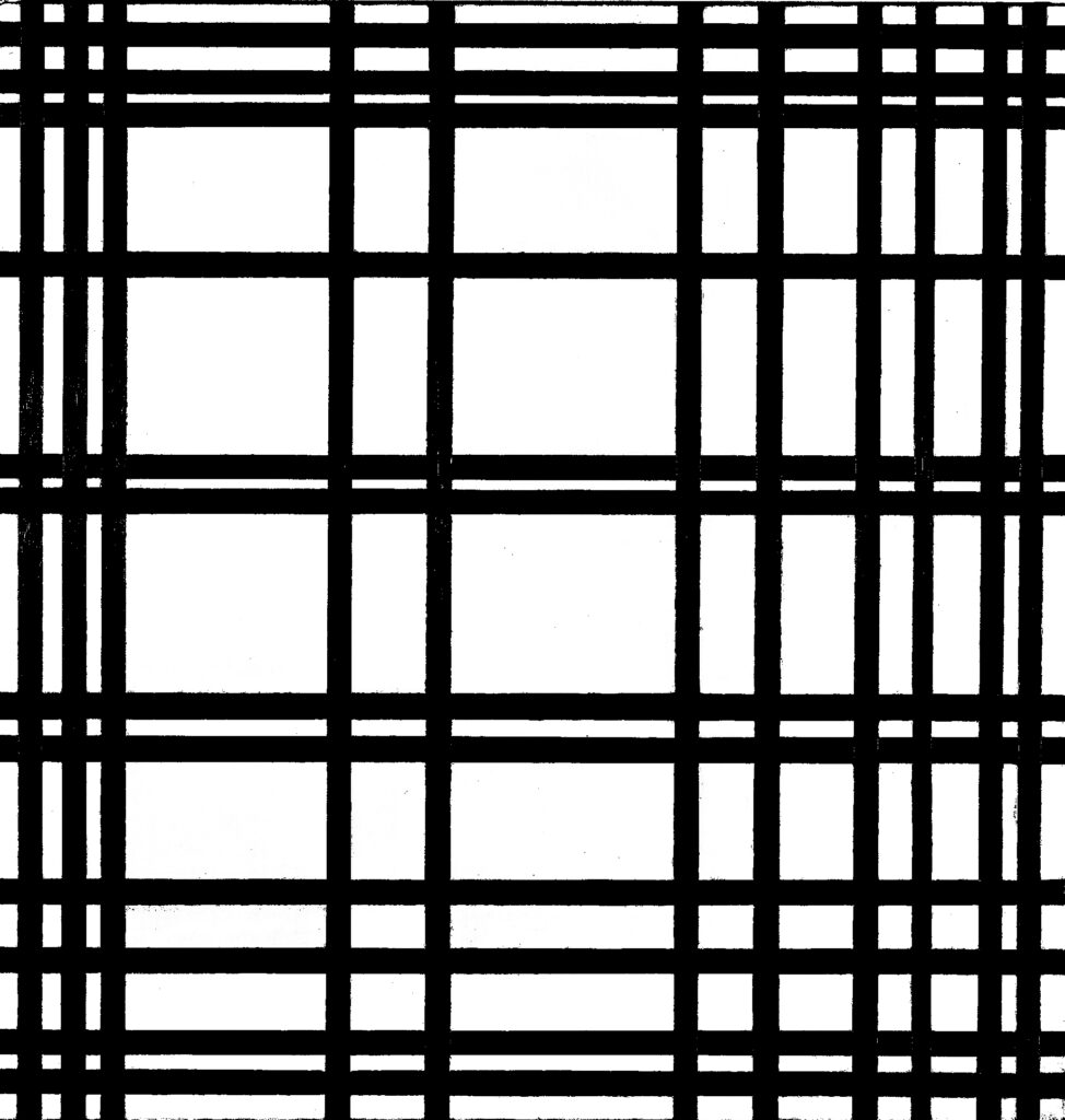
To some, it seems paradoxical to speak of a 1-D Line in a 3-D context. To others, it’s tempting to neglect the use of Color, on the belief the power of Volume alone will do all the heavy lifting for 3-D. In this chapter, we’ll demonstrate that, just as they have a place in 2-D visual design, all visual elements are relevant to 3D visual design for modelers.
Cartesian coordinate system
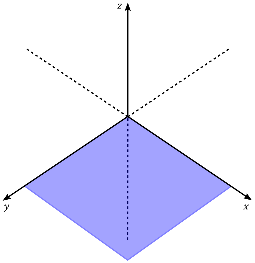
The Cartesian coordinate system. The X-axis typically describes width, Y depth, and Z height. The XY plane is usually horizontal like the ground (but in the modeling program Maya, it’s the XZ). Where all three axes intersect is the Origin, where all values are zero.
As we focus on Dimensional visual elements, we’ll do so through definitions, metaphors, and examples from tactile 3D courses. Using a mathematical vocabulary of point, line, and plane, the Cartesian coordinate system, discussed in greater depth in Chapter 13, creates a parallel universe wherein one develops masses and voids (Volume). But there’s more. Many so-called 3D programs can create Kinematics to put these volumes into motion using a timeline. Thus, in reality, these function as 4D modelers for animation. These dimensional entities can remain stubbornly abstract until we can find their tangible expression in our universe, so let’s review what we encounter in various dimensions, illustrated below.
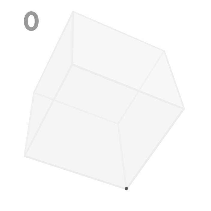
Point
An entity with no dimension. Mathematically, the only property a point can have is location. In digital modeling programs, we describe a point by one Cartesian coordinate (X, Y, Z). A particularly privileged point is the Origin: 0,0,0 in Cartesian space, located at the mutual point of intersection of the reference axes and planes.
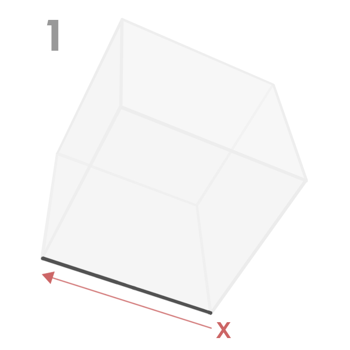
Line
An entity with one dimension. A line is a point we push along a vector of some length. Any line of any length contains an infinite number of points and subdivided lines. Digital modeling programs associate length with the direction of the X-axis. However a line can be created in any direction, can be associated with straight or curved vectors, and can be created by many forces, such as translation (movement along a line), rotation (movement about a center), or scaling (changing relative size).
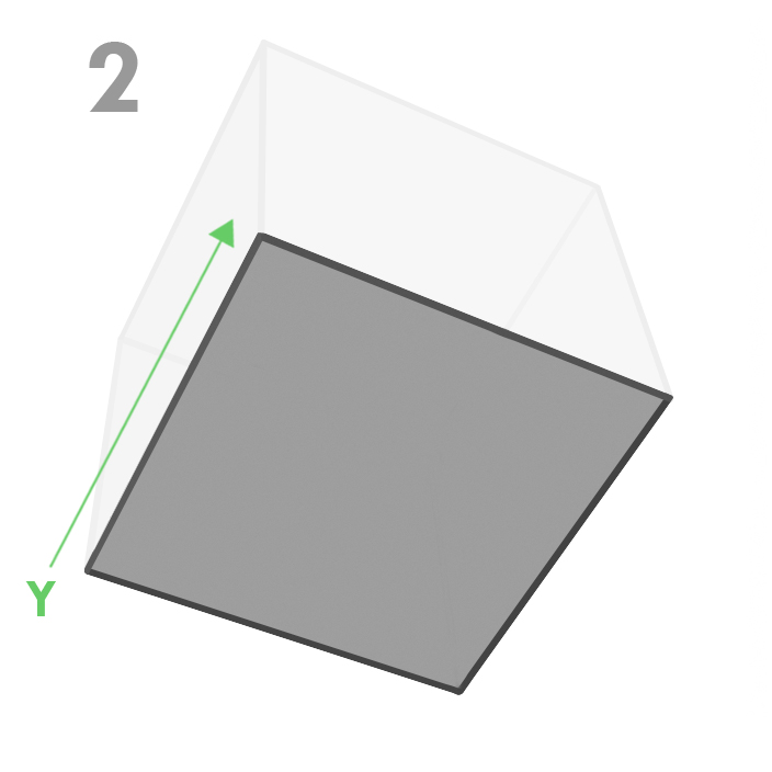
Plane
An entity with two dimensions. A plane is a line we push along a vector of some length. Any plane of any size contains an infinite number of points, lines, and other subdivided planes. Programs associate an XY plane with width and depth. However, a plane can be created in any direction and can be associated with many shapes, not simply rectangles or regular polygons. A plane can be curved and closed to imply volume.
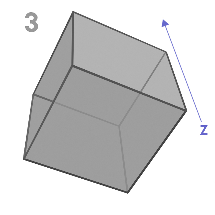
Volume
An entity with three dimensions. A volume is a plane we push along a vector of some length. Any volume of any size contains an infinite number of points, lines, planes, and other subdivided volumes. Programs associate the development of depth with the extrusion of an XY plane through the Z direction. However, a volume can be created in any orientation, using virtually any kind of vector and any kind of force.
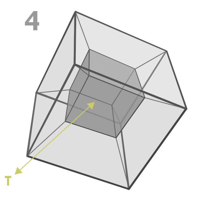
Kinematics
Entities with four dimensions. A kinematic element is a volume we push along a vector of some length and duration. However, we should also understand that an object at rest also exists in time. An entity existing for any duration contains an infinite number of points, lines, planes, subdivided volumes, and potential locations while it exists. Programs often associate motion (T) with units called frames in a timeline. Frames are not referenced with spatial coordinates, although events resulting from frame manipulation are seen as spatial manipulation in the viewport.
Kandinsky’s Basic Plane
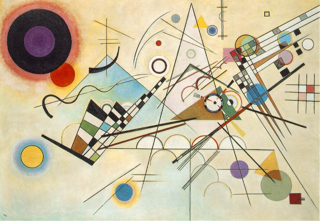
It is fairly easy to see the systematic development of Dimension in a mathematical setting. The way artists deal with dimension also follows a system, albeit a more intuitive kind. In the very title of his book Point and Line to Plane, abstract painter and Bauhaus Basic Course instructor Wassily Kandinksy suggests emotional and spiritual relationships in the geometrical elements which underpin every visual work — point and line — in relationship to the plane of infinite potential he calls the basic plane. 2
For Kandinksy, the basic plane, or BP, is the painter’s canvas. By analogy, for the digital modeler, it is a Cartesian reference plane like the horizontal XY plane seen in the viewport. The most obvious difference between these two BPs is that Kandinksy’s is a material surface, while the digital one is an untouchable, pure state of geometry.
The problem for the digital artist is how to bridge the conceptual gap. We can’t make the digital BP into an object (at least not right now). However, we can “see” manifestations of dimension in artifacts and objects that possess their character. With some help from his fellow painter and Bauhaus instructor Paul Klee, we can extend Kandinsky’s logic and make the metaphorical leap of association between the mathematical and the physical, the digital and the tactile.
Kandinsky’s dimensions
Point…
Here, find an illustration of a point. Well, actually, an infinite number of points. Yes, they’re there, but you can’t see them: they have no dimension!
As a practical matter, when Kandinsky discusses a point, he’s not discussing the mathematical abstraction we “see” above.
He rather talks about a dab or stain of pigment placed on the canvas, a physical event that at a certain scale extends the point to a form with color or even texture or thickness, and this physicality can give the point an emotional charge. As Ellen Lupton and Jennifer Cole Phillips describe it, “Graphically, … a point takes form as a dot, a visible mark. A point can be an insignificant fleck of matter or a concentrated locus of power. It can penetrate like a bullet, pierce like a nail, or pucker like a kiss.” 3
Examples
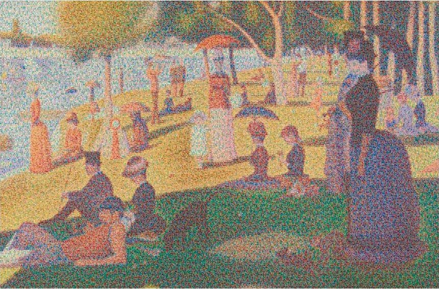
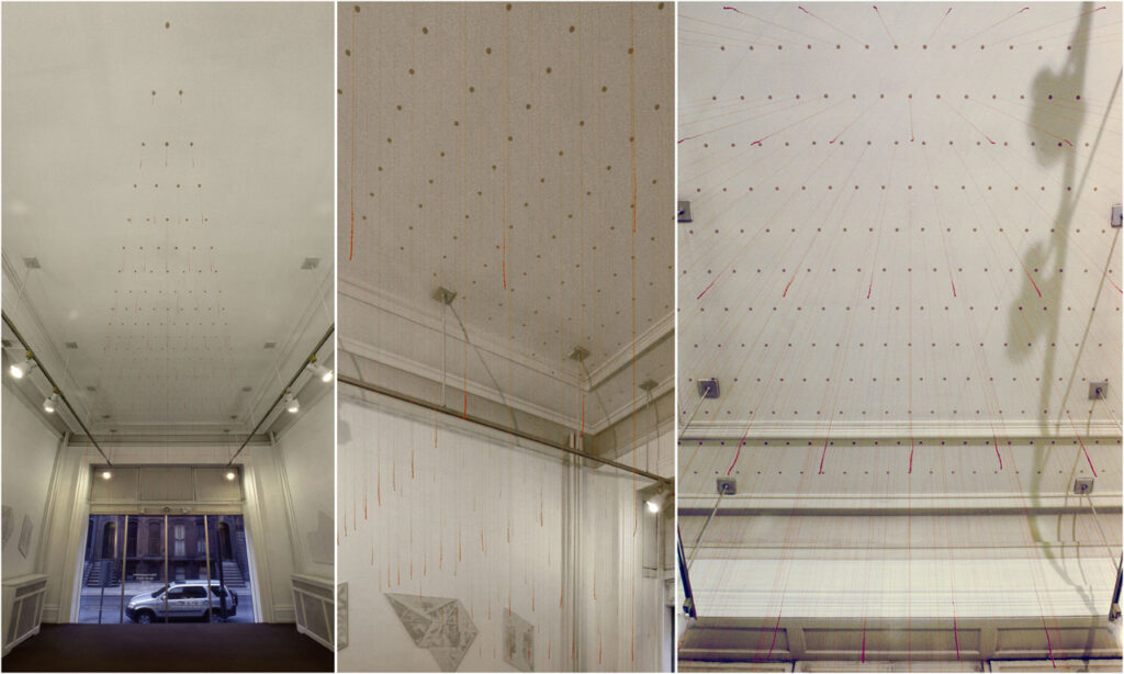
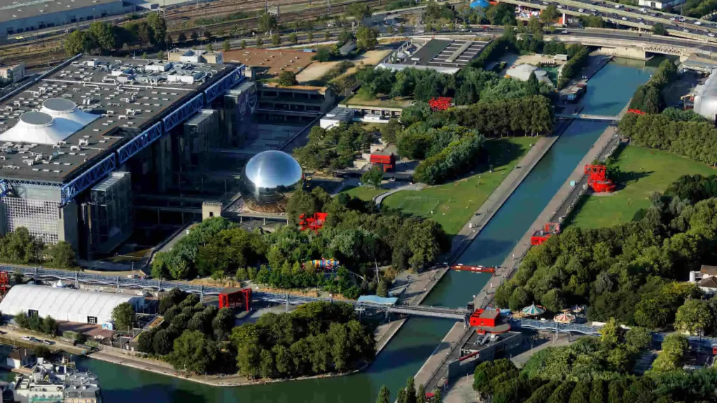
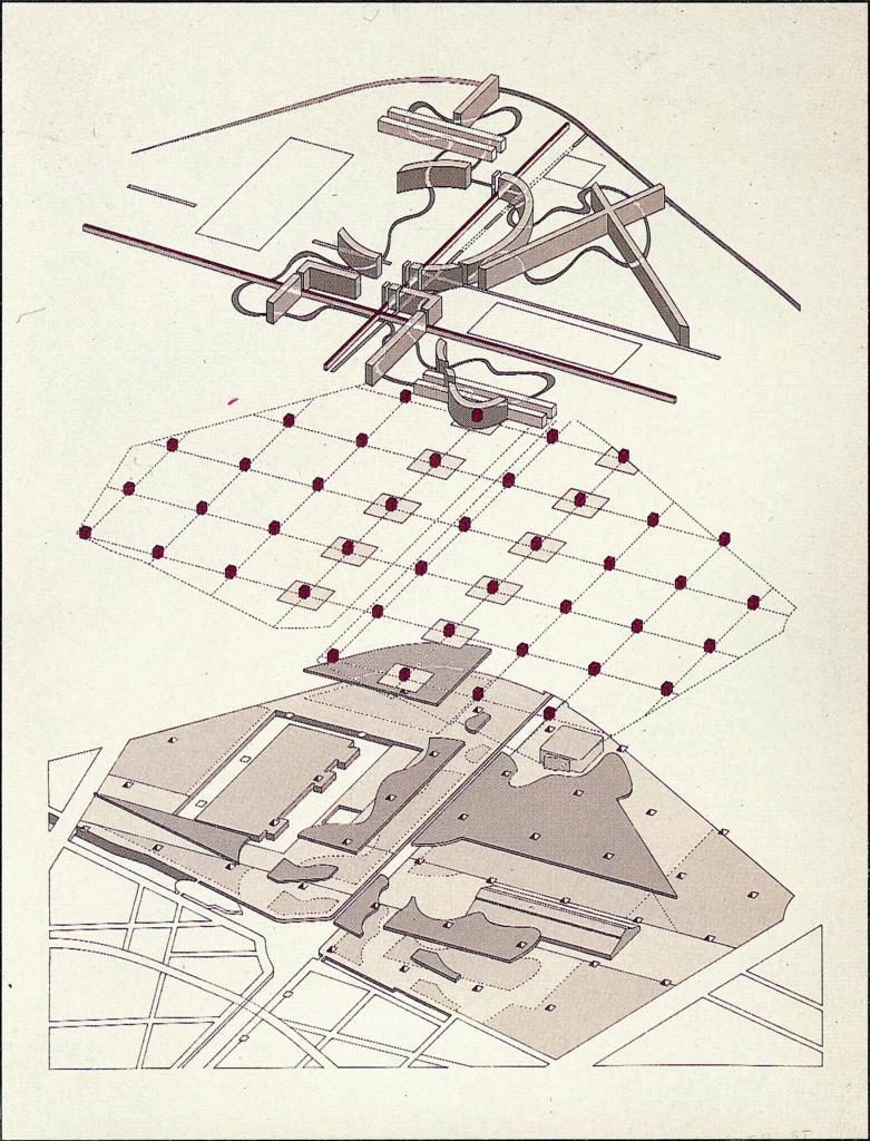
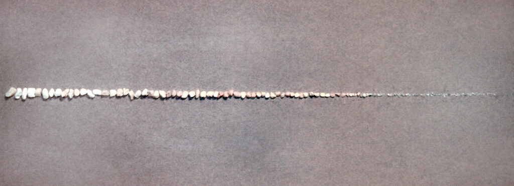
So if you try to model a single Cartesian point and render it, prepare for an exercise in futility. However, using the point locus to create an entity that has attributes of material, color, and texture applied to a volume, and placing it in a context where its scale and ability to focus is manifest, the point will acquire character and meaning. A few examples:
In the studio
Point examples from traditional tactile 3D design studios:
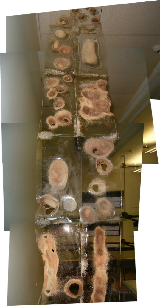
James Leng, Point Cloud, 2012, marries weather data and the concept of a point cloud with a microprocessor to create an undulating, kinetic dot matrix that responds to weather.
…and Line…
A line is an infinite series of points. Understood geometrically, a line has length, but no breadth. A line is the connection between two points, or it is the path of a moving point. A line can be a positive mark or a negative gap. Lines appear at the edges of objects and where two planes meet. Graphically, lines exist in many weights; the thickness and texture as well as the path of the mark determine its visual presence. Lines are drawn with a pen, pencil, brush, mouse, or digital code. They can be straight or curved, continuous or broken. When a line reaches a certain thickness, it becomes a plane. Lines multiply to describe volumes, planes, and textures.
— Lupton and Phillips 5
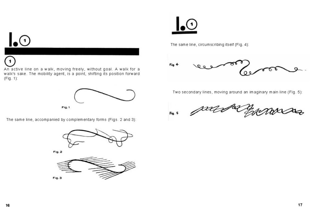
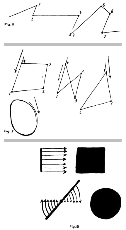
For Kandinsky, the line suggested the presence of directional force acting on a point. Paul Klee, another Bauhaus Basic instructor and painter, speaks poetically about that force, in the development of a moving dot as a “line out for a walk.” 6 We can see in the illustration from his Pedagogical Sketchbook that the character of the drawn line suggests the nature of the journey: a random meander, a deliberate goal-oriented stride, a welcome encounter interrupting the path.
Examples
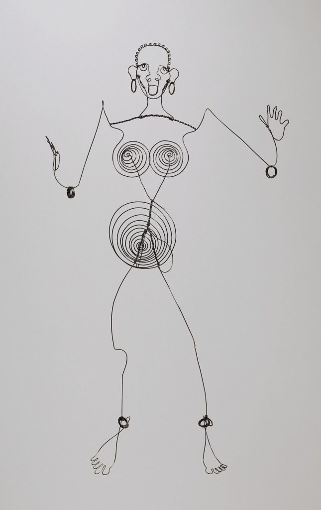
In our first example, observe the “inventor” of wire sculpture, Alexander Calder, creating a drawing in space with his full-body portrait of the dancer and entertainer Josephine Baker.
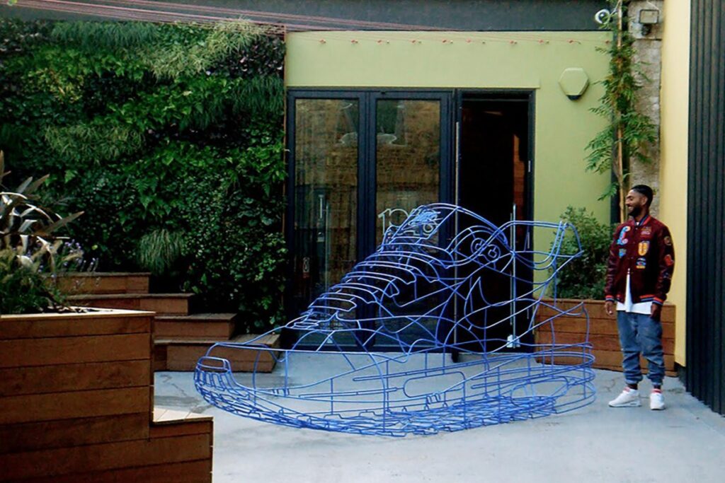
In another visualization of digital wireframing, we note sculptor Benedict Radcliffe’s surreal Nike Air. It’s not Photoshop: instead, he carefully crafts wireframe physical models from observation of digital media in a culturally significant role reversal.
Despite its contemporary cachet, the wireframe debuted over 500 years ago! We see it first in the chalice study attributed to Paolo Uccello. His drawing is a pen and ink study of Renaissance perspectival geometry. This drawing so precisely foresaw the convention of digital wireframe modeling that Angela Eames was able to create a contemporary digital homage. In response, this author created a physical sculpture, no mean feat for a wireframe!
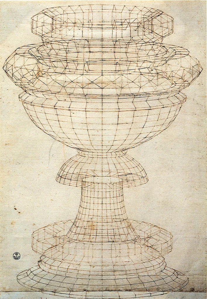
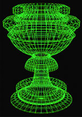
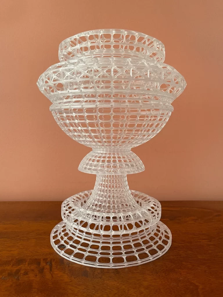
Model for sculpture
A line can suggest the direction of a force. Innovative for its era, an architectural structure for La Sagrada Familia is determined by the funicular (rope and sandbag) model of the church by Antoni Gaudí, projected to be the tallest church in the world once it is completed sometime between 2026 and 2040.
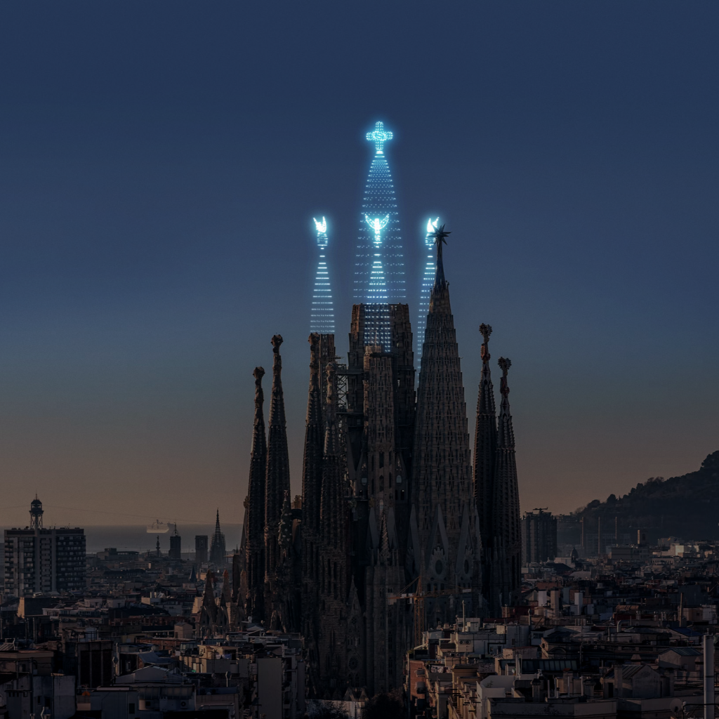
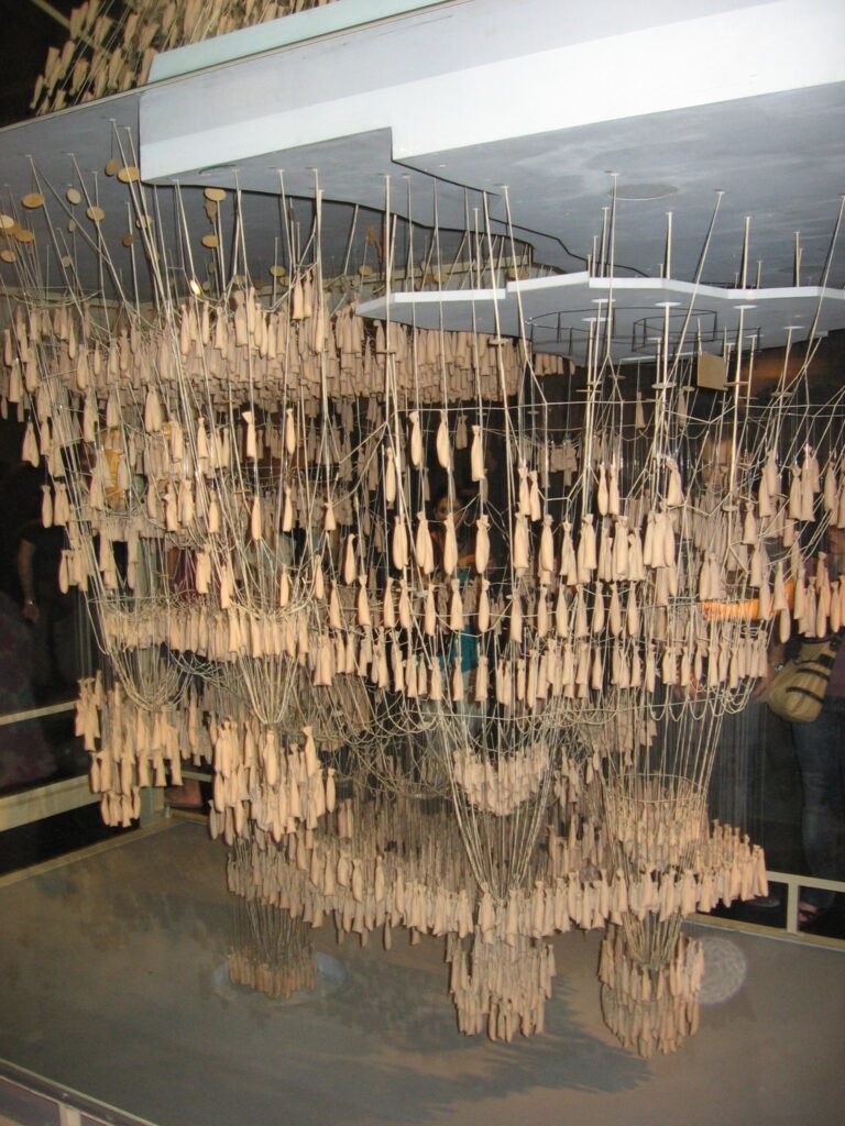
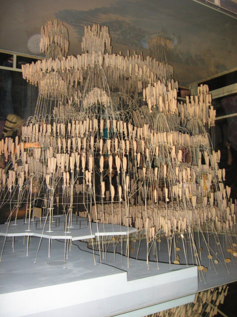
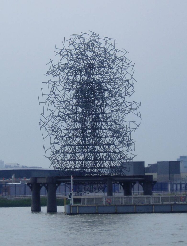
The sandbags are reminiscent of another kind of structure: quantum probability, suggested by the work of Antony Gormley. How does the human figure emerge from a density of lines bordering on texture?
In the studio
Line examples from 3D design studios:
A common exercise in tactile 3D design is the wire “drawing in space,” often paired with figuration, to explore the use of lines. In this example, student used copper wire to create a life-size self-portrait. She was allowed to bend the wire over her features — not cheating, incidentally, as we’ll see when we discuss concepts in the process of casting in Chapter 14. She still had to figure out how to relate wires to achieve a proportionally accurate result. The most important decisions included intuiting where topological lines should best be placed economically to achieve a phenomenon of implied mass.
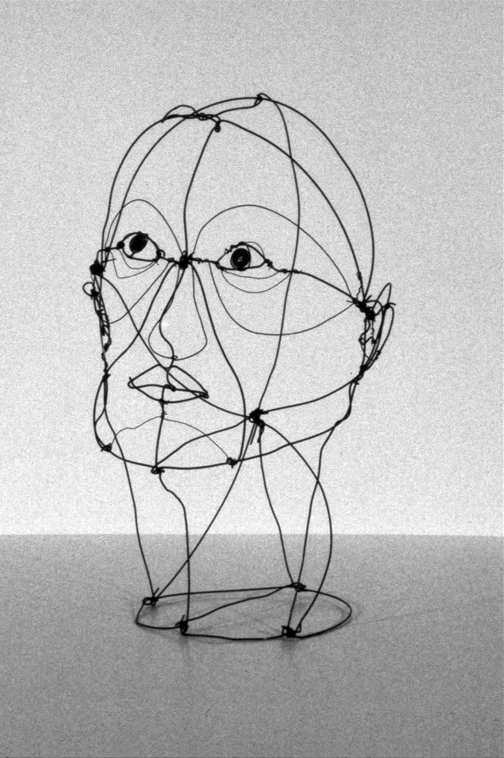
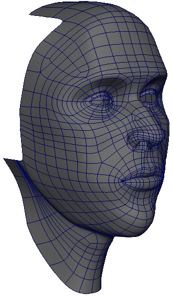
When you compare the tactile wire figure with the digital figure study here, you’ll note many important points of reference are found in both. For example, a central axial line dividing left from right exists in both, alluding to the principle of symmetry discussed below. Note also how the ridges above the eye and at the cheeks are similarly modeled in tactile and digital modes. Another interesting similarity occurs in the density of data. Where significant events such as the eye or ear occur, the geometry gets denser. When digitally modeling from life, the artist will find it necessary to create tactile studies — sketching or physical modeling in clay — just as they do when modeling for a final product in plaster or stone.
…to Plane
Related terms: Figure-ground | Form | Shape
Paul Klee, diagrams of line-to-plane relationships, 1925. 7
Top active and open-ended line — implied and passive plane.
Middle active and closed line — linear character in the act of being created, planar character once completed.
Bottom passive lines — angular or circular force applied to create active planes.
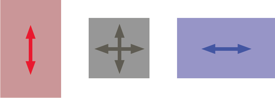
We may recall Kandinsky’s basic plane mentioned earlier. His pre-existing, autonomous world is defined by proportion — a square, vertical, or horizontal format to the canvas. Point and line also react to what Kandinsky calls the effective “tonality” determined by this proportion. For him, the horizontal suggests the kind of passive, restive state generated by cool tonality, while the vertical implies the active state of the warm. 8 It’s impossibly reductive to talk about Kandinksy’s geometry without referencing tone and color, but we’ll reserve a deeper discussion for that in Chapter 7.
In a set of illustrations we mentioned earlier from the Pedagogical Sketchbook 9, Paul Klee posits three states of line-to-plane relationships, which Lupton and Phillips describe:
A plane is the path of a moving line; it is a line with breadth. A line closes to become a shape, a bounded plane. Shapes are planes with edges. In vector–based software, every shape consists of line and fill. A plane can be parallel to the picture surface, or it can skew and recede into space. Ceilings, walls, floors, and windows are physical planes. A plane can be solid or perforated, opaque or transparent, textured or smooth.
— Lupton and Phillips 10
Examples
Constructivist Antoine Pevsner’s exercises in translating lines yield overlapping 2D graphic planes, except the operations occur in multiple axial orientations, making transparent, spatially ambiguous objects.
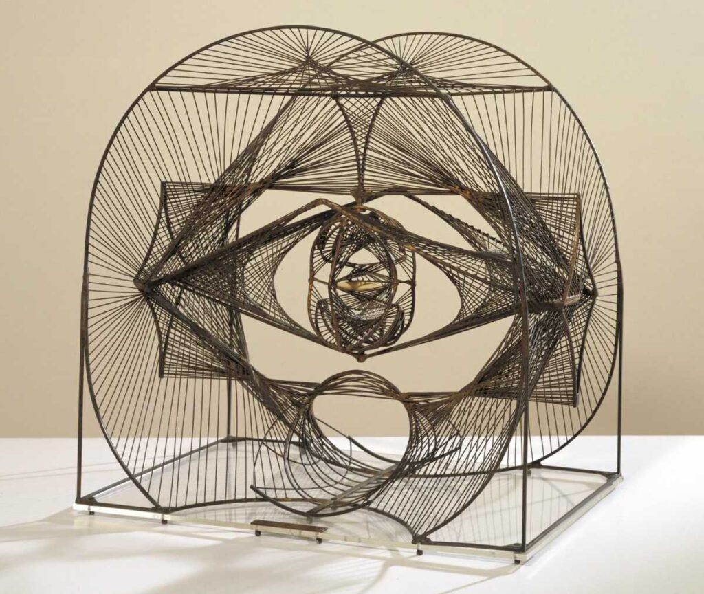
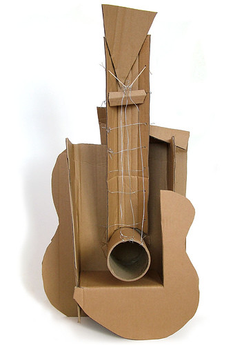
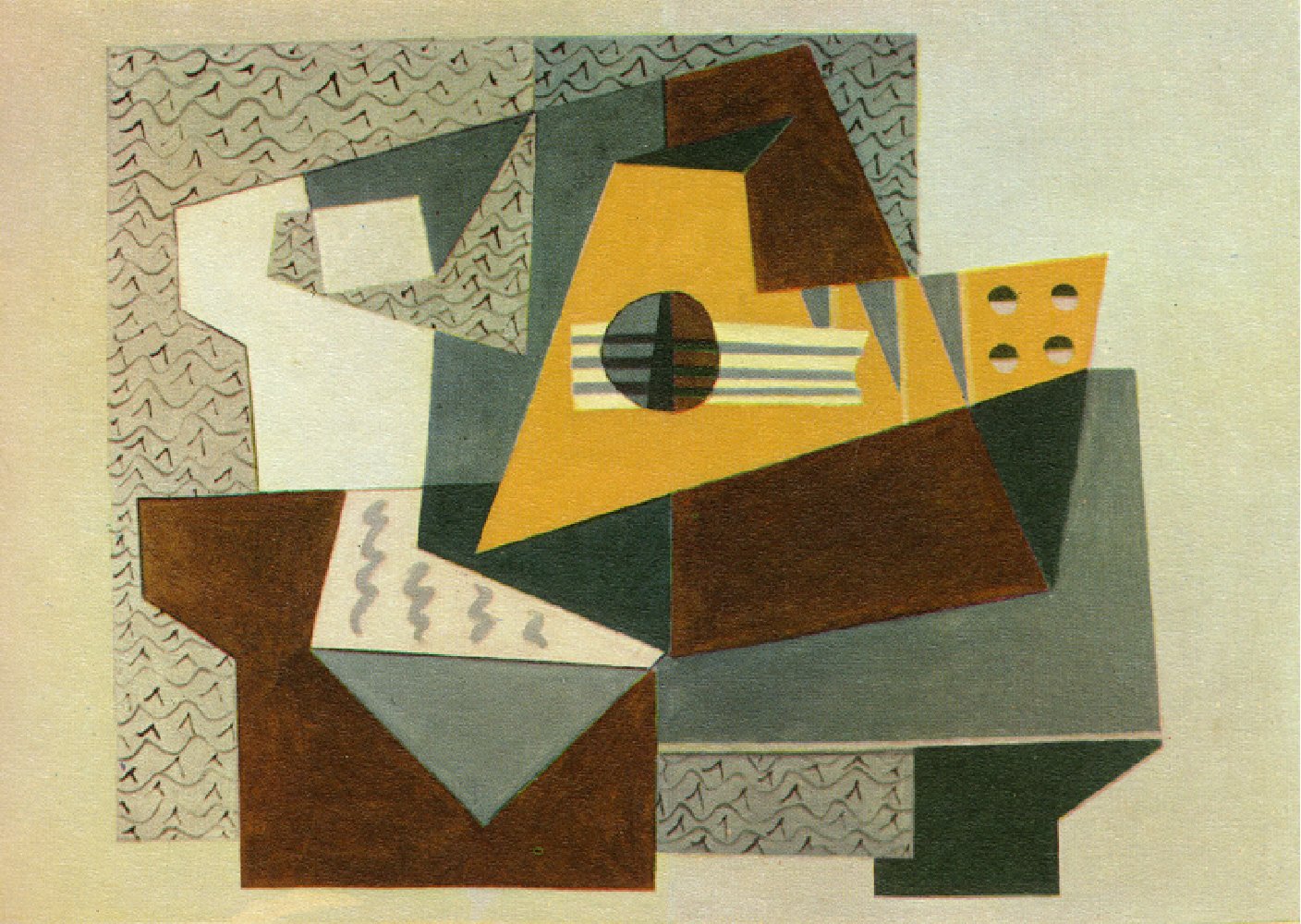
In another example, Pablo Picasso’s exploration of a guitar engages in a play of solid and void in which volume is ambiguous and implied: note how the sound hole, ordinarily perceived as receding, projects outward as a cylindrical plane. Picasso also completely redefined the terms of sculptural production away from traditional additive or subtractive modes and into a new technique of assembly, the 3D equivalent of collage.
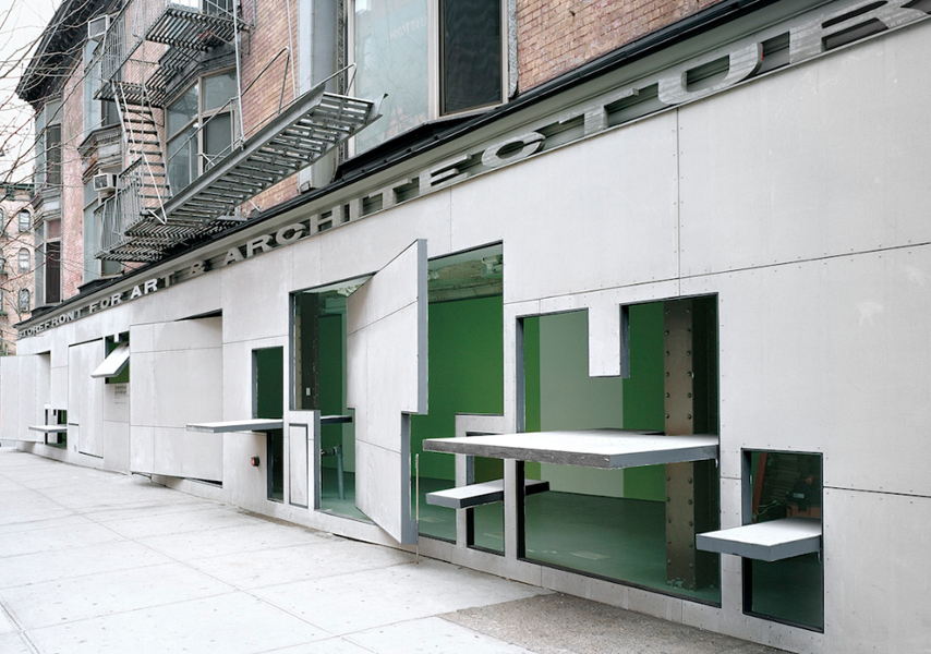
It’s surprising to note that furniture design sometimes outstrips sculpture as a laboratory for innovation. De Stijl designer Gerrit Rietveld concocted 3D planar relationships in furniture and as well as in architecture. At first glance, Frank Gehry’s cardboard chair and ottoman seem made of planar slabs slipping past one another to accumulate mass, but we see those planes are in turn built up of smaller laminated planes, in turn built of the smallest plane: the thickness of cardboard.
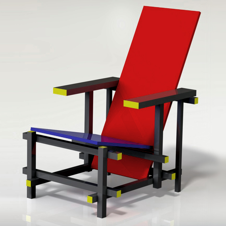
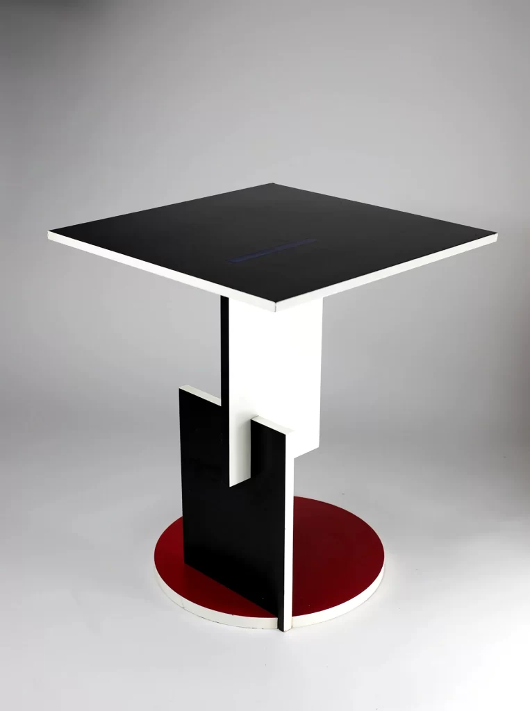
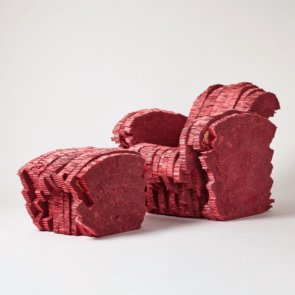
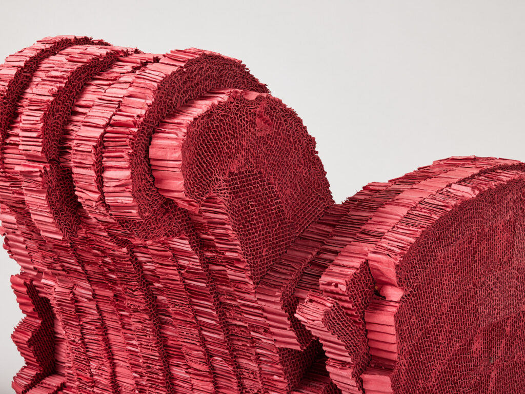
Unlike the polygon plane created in digital modeling, these plane examples all contain thickness, and hence are technically volumes. When modeling situations where a planar element can be seen from multiple sides, be sure it is given a requisite mass. For ground planes, sky domes, or any other situation where you might create a “stage-set” surface, all of these can create the illusion of mass or space without actual thickness or depth. But if you are modeling Rietvelt’s table and your camera would see the thickness of the table planes, they’d better be modeled as masses.
In the studio
Plane examples from 3D design studios:
Sectioning and serial planes
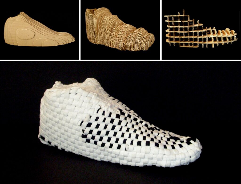
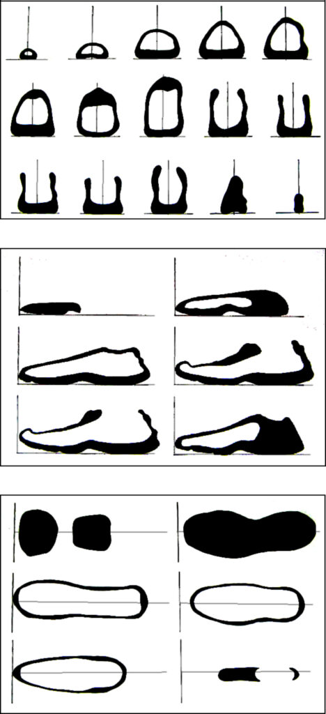
Like the one-dimensional line, it seems counter-intuitive to talk about the two-dimensional Shape in a 3D world. A common 3D design exercise reconciles it by analyzing a volumetric object through the use of Plane, specifically serial planes, a series of imaginary parallel planes that metaphorically put the object through a bread-slicing machine, ending up like the shoe seen here. Thus, these regular planes become a way of rationalizing organic Form, as seen in the orthographic projection drawings generating Figure-ground relationships. By studying the shoe in this way, this student was able to see topological relationships that could be rendered in a new material. His example also shows a clever material choice, weaving flat shoelaces. The pattern the weave creates is suggestive of a 3D modeling polygon mesh, one way of creating a form in a digital modeling program.
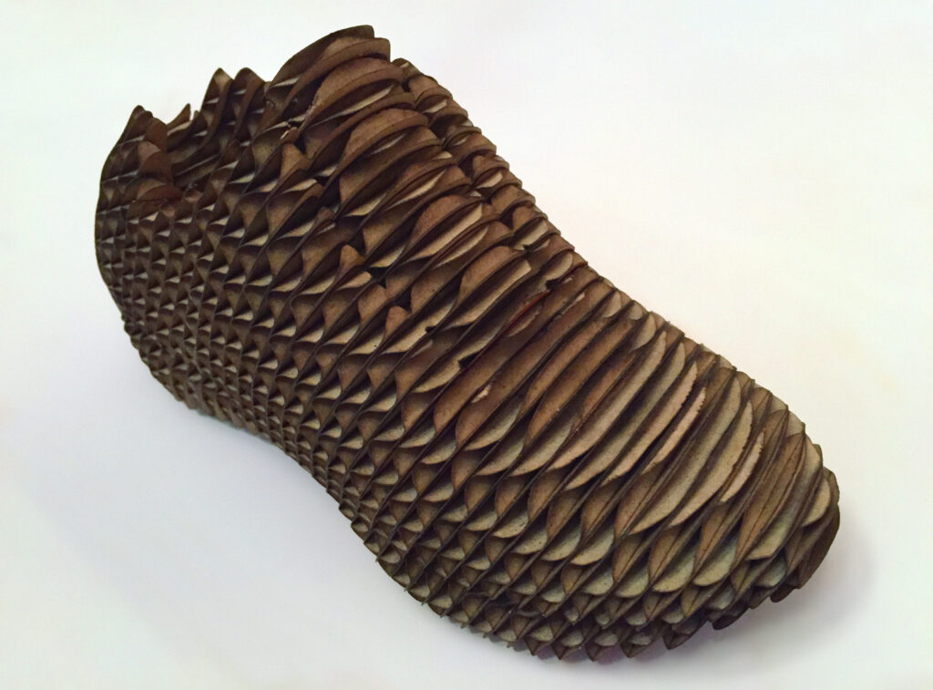
A similar student project, but this time using 3-D modeling and a laser cutter. From a studio by the author.
Surface mesh
In digital modeling, serial planes and structured right-angle grids like the egg-crate model are sometimes used to define shape, but the Polygon Mesh model is more often an unstructured grid of triangles or quadrilaterals: simple convex polygons. A combination of triangles and quads is seen in the digital shoe. Like the analysis in cardboard, a polygon mesh rationalizes complex form by simplifying it or changing its resolution (the amount of detail seen).
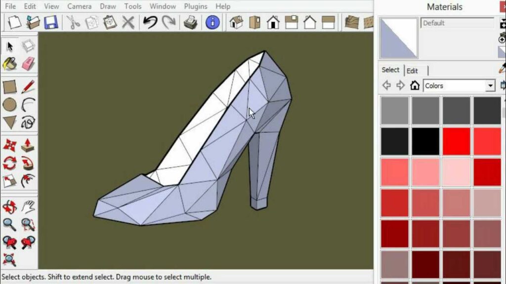
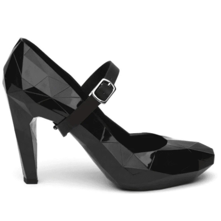
The Lo Res Project by United Nude reverses the conventional relationship: instead of making a complex physical form by smoothing a simple polygon model, it literally builds the low-resolution polygon model of a shoe, for example, into an actual shoe you can buy. Retail, it goes for — well, if you have to ask you can’t afford it! This is high, fashion-forward fashion by architect Rem Koolhaas, slumming in product design.
Implied volume
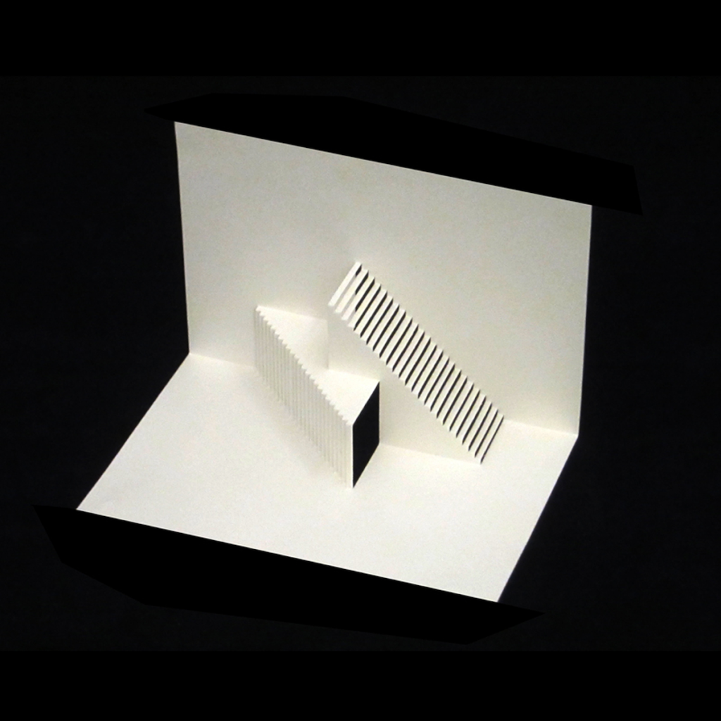
Another kind of shape study common to 3D design courses poses the problem of creating spatial relationships through a hierarchy of non-serial planes that imply the volume of an object. We can see this technique applied in origami or pop-up architectural sculptures like those created by Japanese architect Masahiro Chatani. One inspiration for these kinds of projects is the work of Russian Constructivist sculptor Naum Gabo. Gabo demonstrated it was possible to evoke volume without creating mass in works like the Constructed Head.
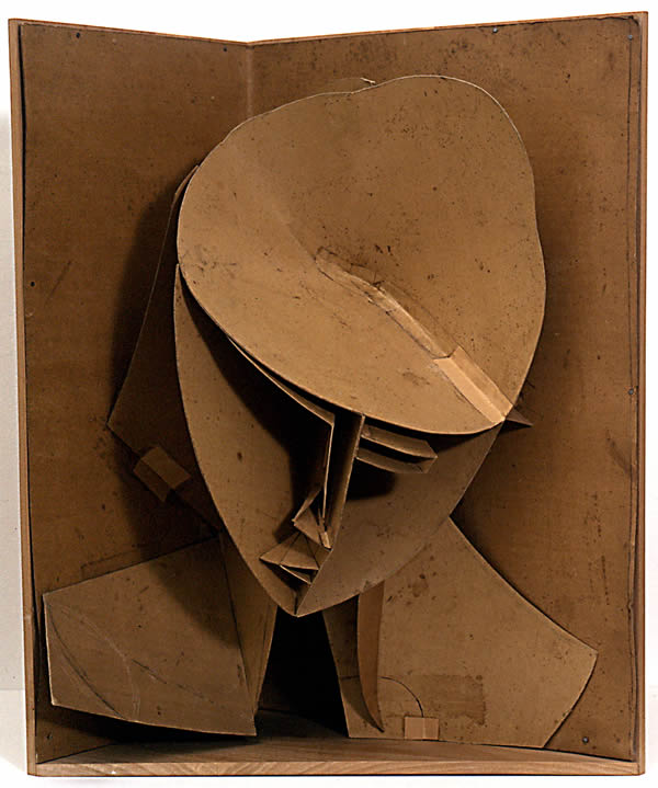
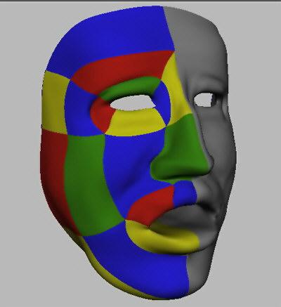
A structure defined by an economy of means, the edges in Gabo’s head are evocative of the stitching edges between surface patches in a NURBS-based 3D model. In the digital model we see here, color represents a different curving surface plane, and the edges between them define a curvilinear slicing plane that cuts the volume into these surface patches. In both the tactile and digital versions, divisions need to be carefully planned based on the features of the analyzed, implied volume.
Graphic shape
A point is given presence by expressing it with optical properties such as color and texture, while a line can be appreciated additionally by observing thickness or length, straightness or curviness. For a plane to achieve expressive character, the possibilities are mind-boggling by comparison. Even when color and texture are reduced to black and white, the shapes and forms possessed by expressive planes are infinite. In 2005, artist Allan McCollum began the Shapes Project, developing a simple system that yields enough unique shapes so everyone alive on earth can be given one. The shape elements are created and combined in Adobe Illustrator by an intuitive system, not a computed algorithm.
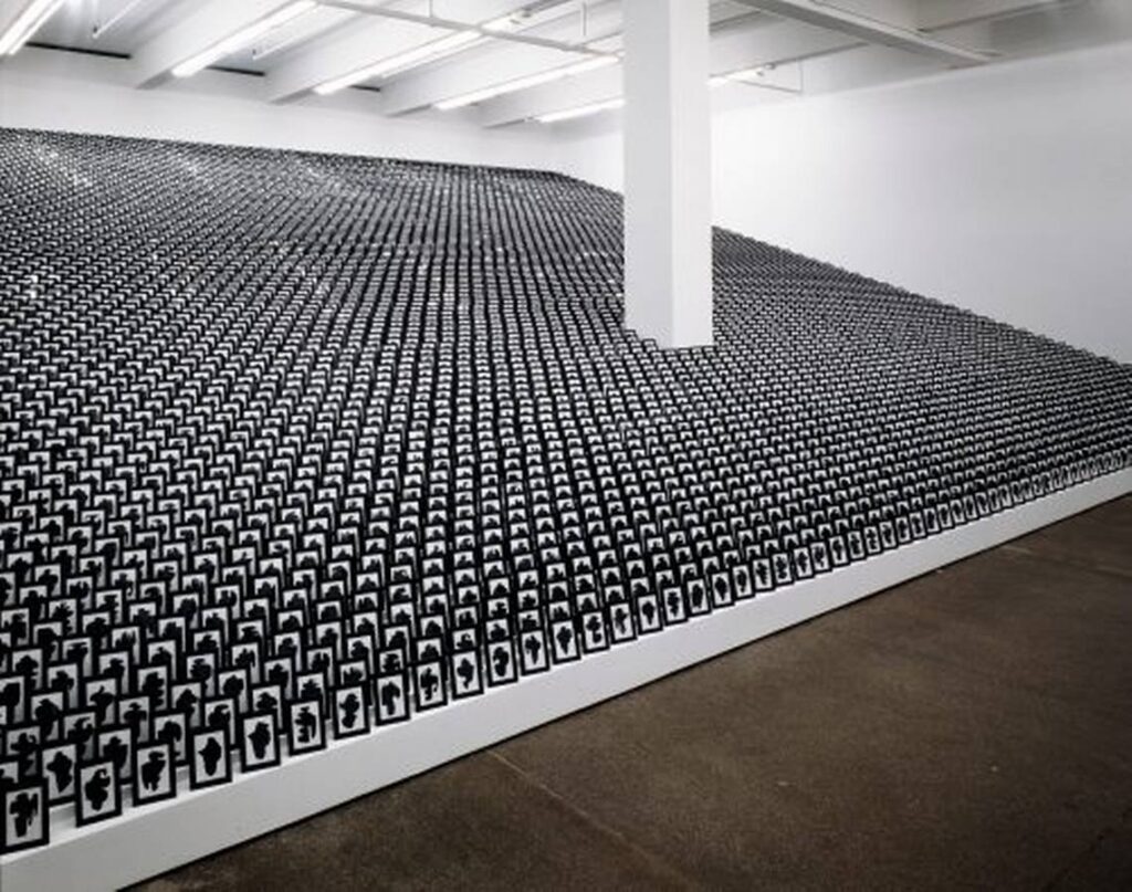
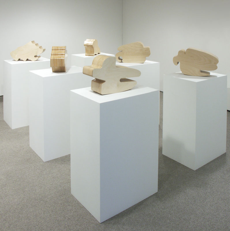
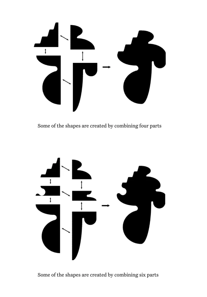
Each of McCollum’s Shapes is a Graphic or Geometric Shape. Graphic shapes can be generators for symbols, logos, or icons, and are often created from a compound of simpler, geometrically defined planes.
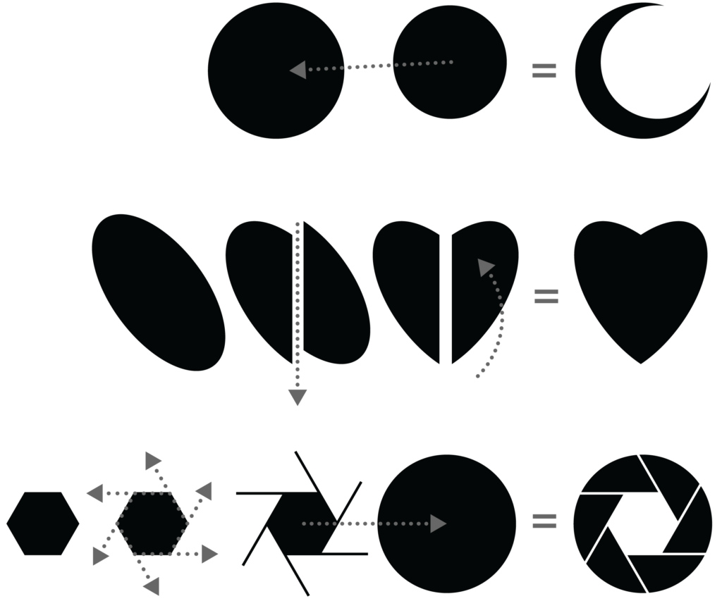
Simple geometric planes are combined to create more complex graphic shapes. At the top, two circles superimpose. In the center, an ellipse is cut on the bias, and half is mirror-rotated. At the bottom, a hexagon’s edges are extended, and the result is superimposed over a circle. All of these compounds generate a graphic shape that has a specific symbolic meaning. Do the results mean anything significant to you?
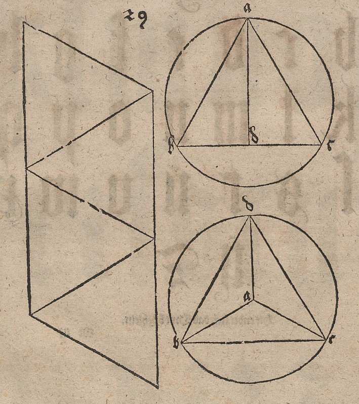
Nets
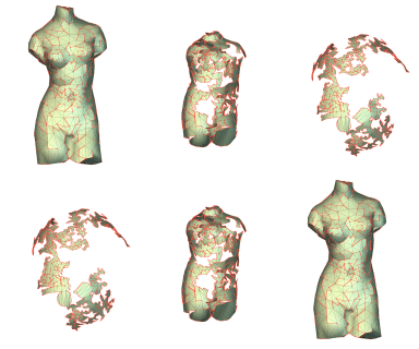
Oddly, the world of polygon modeling is a world of graphic shapes. So how can that be? Take a simple cube, and imagine it as a cardboard box that we cut along the edges, unfolding and flattening. This is a process we call finding the net of a polyhedron. When flattened, the cube becomes six squares. German artist Albrecht Dürer was fascinated by nets. He produced many for his treatise on geometry, Four Books on Measurement, which among other topics discussed the Platonic Solids we’ll explore in Chapter 5. A net can be generated out of more than regular polyhedra; a highly complex net results from unfolding an irregular polygon solid such as a torso.

Organic form
In the torso example above, the polygonal graphic shapes become increasingly complex and randomized. So, they are characterized less by their sense of geometric order. Instead of feeling human-made, they take on an aura of the natural: they approach a sense of organic form. Claiming that he and his fellow Dada artists “aimed to destroy the reasonable deceptions of man and recover the natural and unreasonable order,” 11 Jean Arp uses organic form to reinforce the non-mechanical origin of many of his compositions.
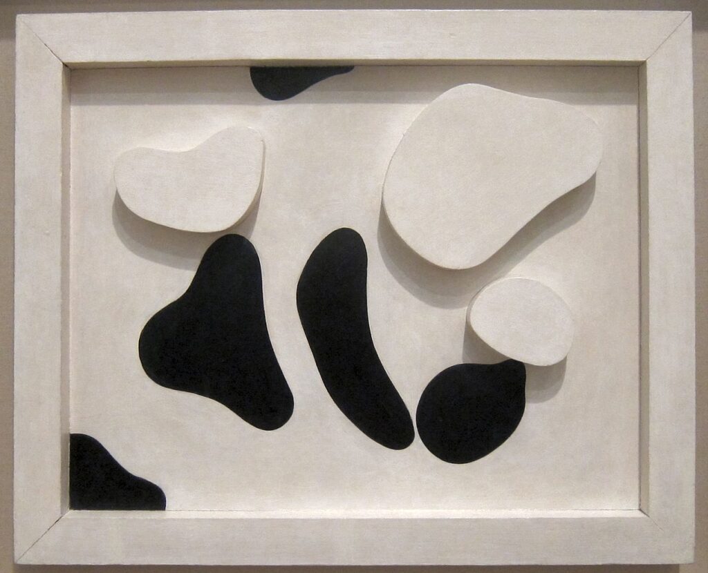
It took architects about three generations to catch up to Arp: compare his forms Zaha Hadid’s Pavilion for the Burnham Plan Centennial in Chicago. Supporting but in contrast to the organic form, Hadid uses digital modeling to develop a rational, geometric system of a structure akin to the ribs of a boat. The Pavilion is also comparable in section to the student drawing of the shoe, which shares the same strategy — parallel Cartesian planes — to rationalize an intuitively understood organic form.
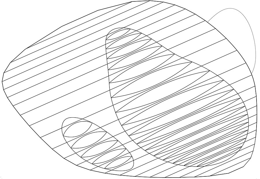
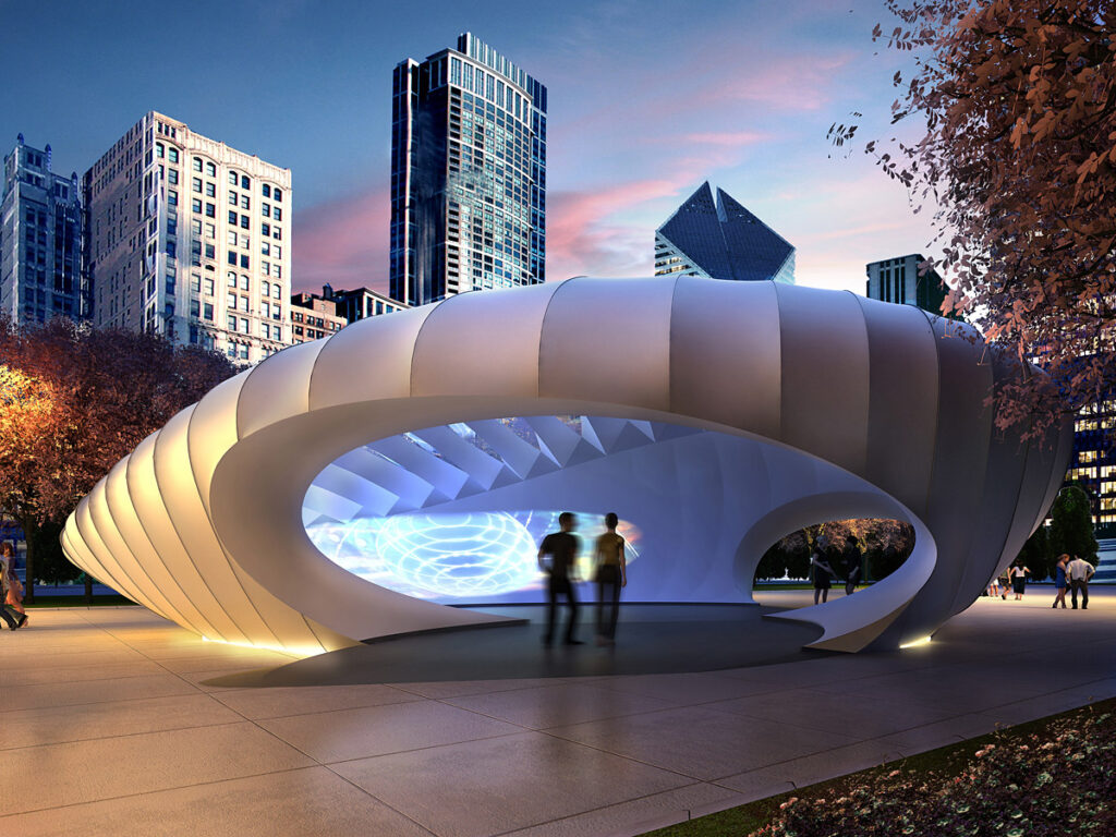
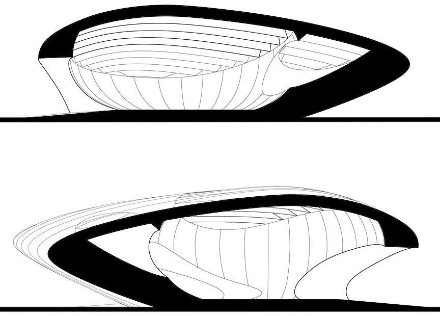
Figure and ground
In the shoe drawing and Hadid’s section mentioned earlier, we observe a way of drawing that has a long history as a convention for architectural representation and is quite useful to 3D modelers. This is a drawing that seems to slice through an object. So, how does this work? We blacken in the mass shape and we allow white to represent open space. Architects in the academy of the École des Beaux-Arts called this technique poché, from a French term meaning pocket, implying an enclosed space. Thus, graphically, it allows a viewer to understand the shape of space and structure in an architectural drawing. When we see a poché plan drawing of Sant’Andrea al Quirinale by Gian Lorenzo Bernini, we appreciate how Baroque architects play eccentric, distorted forms off one another to create dramatic spaces.
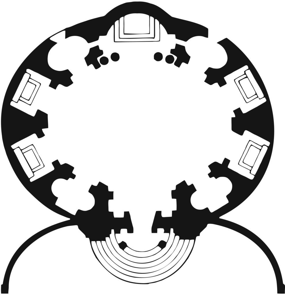
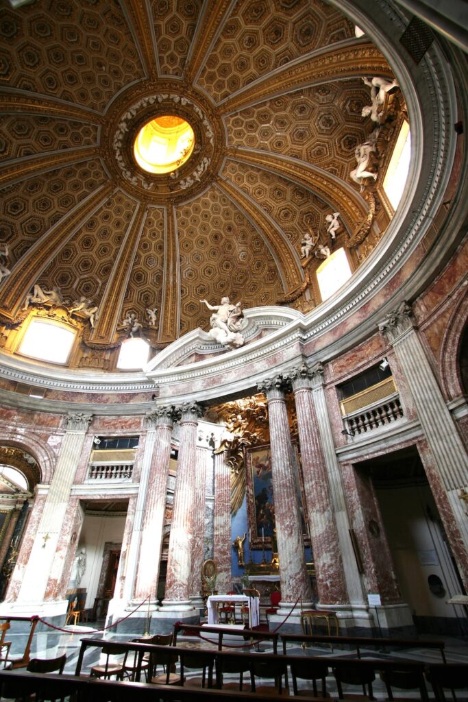
The poché drawing is an example of a Figure-Ground drawing, which some artists call a Positive-Negative Shape drawing. When we speak of the Figure (or Positive Shape) in a drawing, we usually refer to meaningful marks made on the Ground (or Negative Shape), what we’ll recall Kandinsky calls the Basic Plane. We can say a positive shape represents a figure drawn inside the visual field of a ground, while a negative shape is everything the figure is not. But that can be a crude distinction. Here we see a simple drawing of a group of black figures on a white ground. But what else can you see?
Reification
Here we see an example of a visual phenomenon known as Illusory Contours. In the Kanizsa Triangle, named after psychologist Gaetano Kanizsa, we see a white, downward-pointing triangle. Many even observe this white “figure” as somehow whiter than the ground! This is an example of Reification, which in Gestalt theory identifies a perceptual experience that contains more information than the stimulus actually contains. We’ll consider Gestalt (German for shape) more deeply in a future chapter.

Mulltistability
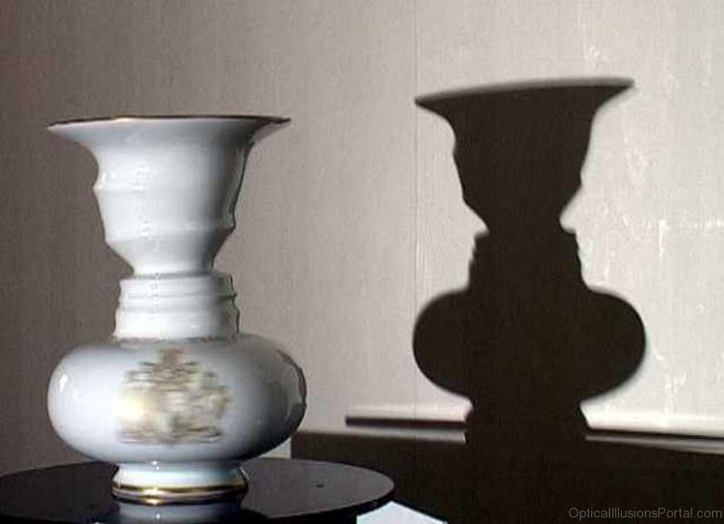
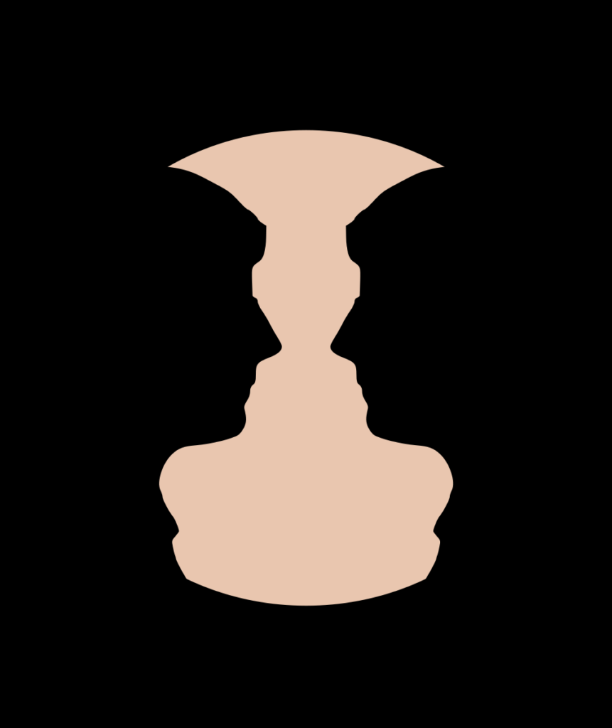
We can see another Gestalt concept, Multistability, in the Rubin Vase, named after Danish psychologist Edgar Rubin. In the illustration, notice how his illusion bounces between the perception of a vase and the profiles of two faces as our brains try to “shape” the ambiguous relationship between figure and ground. This is a mass-void analog in 3D, a vase created for the Silver Jubilee of Queen Elizabeth II in 1977. It generates the illusion through the spatial equivalent of figure and ground, which we call mass and void, as discussed in the next chapter.
Figure-ground relationships
An artist working with positive and negative shapes can create impressive interactions generating various figure-ground relationships.
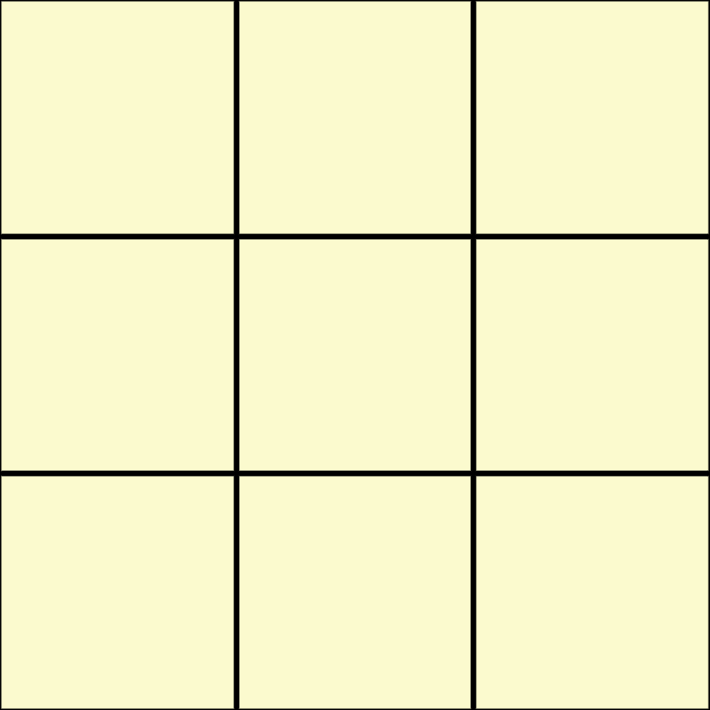
Starting with a nine-square grid, we’ll generate 3 states: stable, reversible, and ambiguous.
Stable
STABLE figure-ground relationships derive from a singular figure disengaged from the edge of the ground, making the figure a clear, dominant focal point.
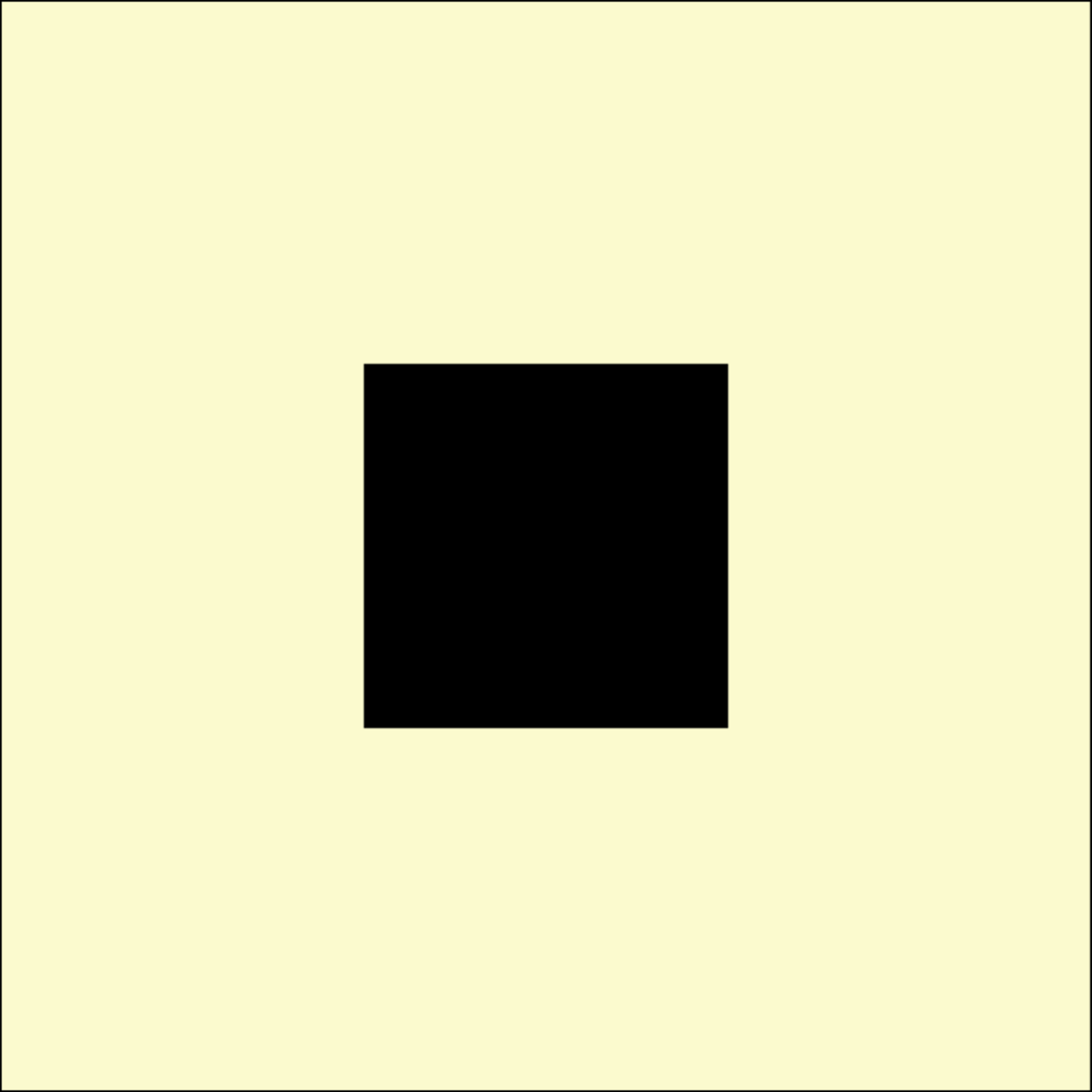
2D Example
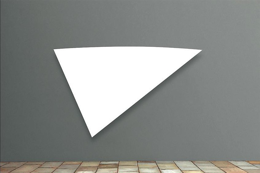
3D Example
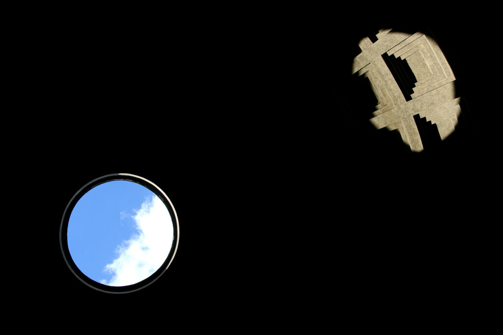
Reversible
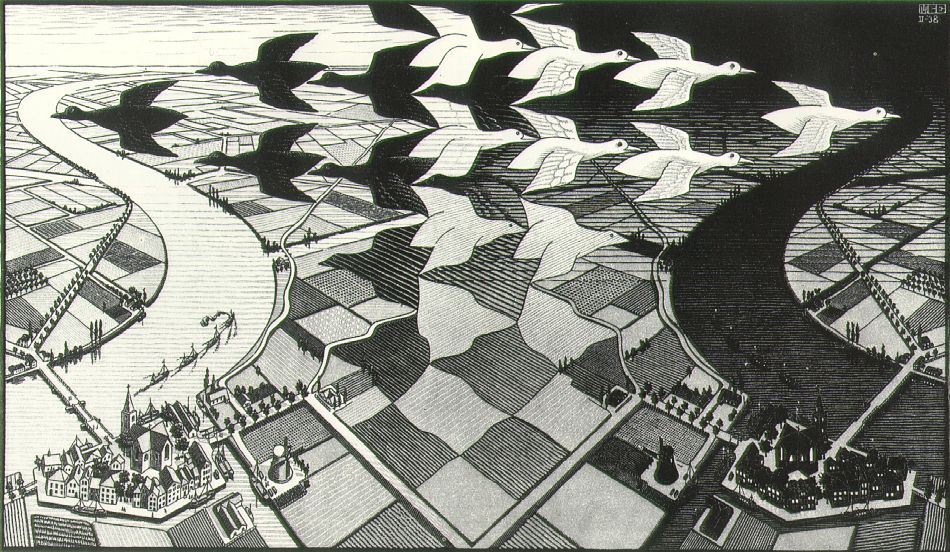
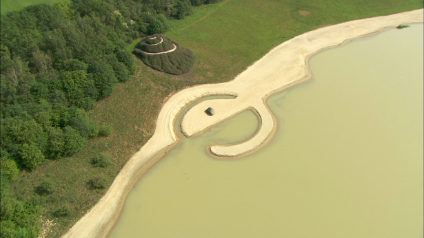
Engaging the ground edge and alternating the squares yields a REVERSIBLE dominance — the eye may alternate between interpreting dark and light squares as figure.
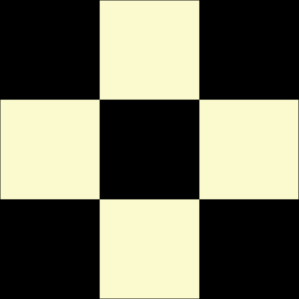
2D Example
3D Example
Ambiguous
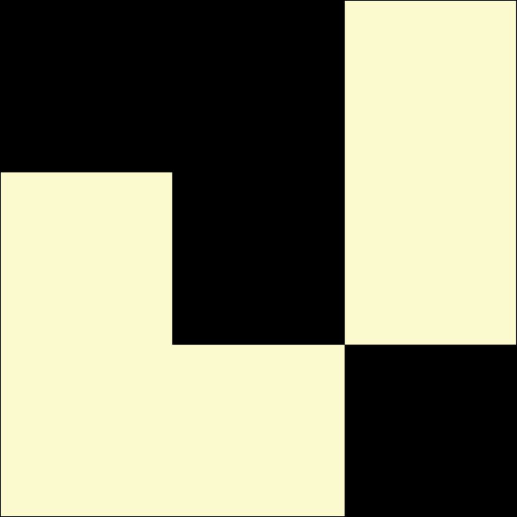
We completely intertwine figure with ground in an AMBIGUOUS figure-ground relationship that contains the visual tension of no apparent focal point.
2D Example
3D Example
- Abbot, Edwin. Flatland: A Romance of Many Dimensions. Seeley & Co., London. 1884. Re-published Prometheus Books, Amherst NY. 2005. p. 17.[↩]
- Kandinsky, Wassily (trans. Rebay, Hilla). Point and Line to Plane. Dover Editions. 1979. p.115.[↩]
- Lupton, Ellen and Phillips, Jennifer Cole. Graphic Design: The New Basics. Princeton Architectural Press. 2008. p.14.[↩]
- Klee, Paul. Pedagogical Sketchbook. Praeger. 7th ed. 1972. pp. 16-17.[↩]
- Lupton, Ellen. Graphic Design: The New Basics. Princeton Architectural Press. 2008. p. 16.[↩]
- Klee, Paul. Pedagogical Sketchbook. Praeger. 7th ed. 1972. p. 16.[↩]
- Klee, Paul. Pedagogical Sketchbook. Praeger. 7th ed. 1972. pp. 18-19.[↩]
- Kandinsky, Wassily (trans. Rebay, Hilla). Point and Line to Plane. Dover Editions. 1979. p.115.[↩]
- Klee, Paul. Pedagogical Sketchbook. Praeger. 7th ed. 1972. pp. 18-19.[↩]
- Lupton, Ellen and Phillips, Jennifer Cole. Graphic Design: The New Basics. Princeton Architectural Press. 2008. p. 18.[↩]
- Quoted in Moszynska, Anna, Abstract Art, Thames and Hudson, London, 1990, p. 66.[↩]
