ABCnimation
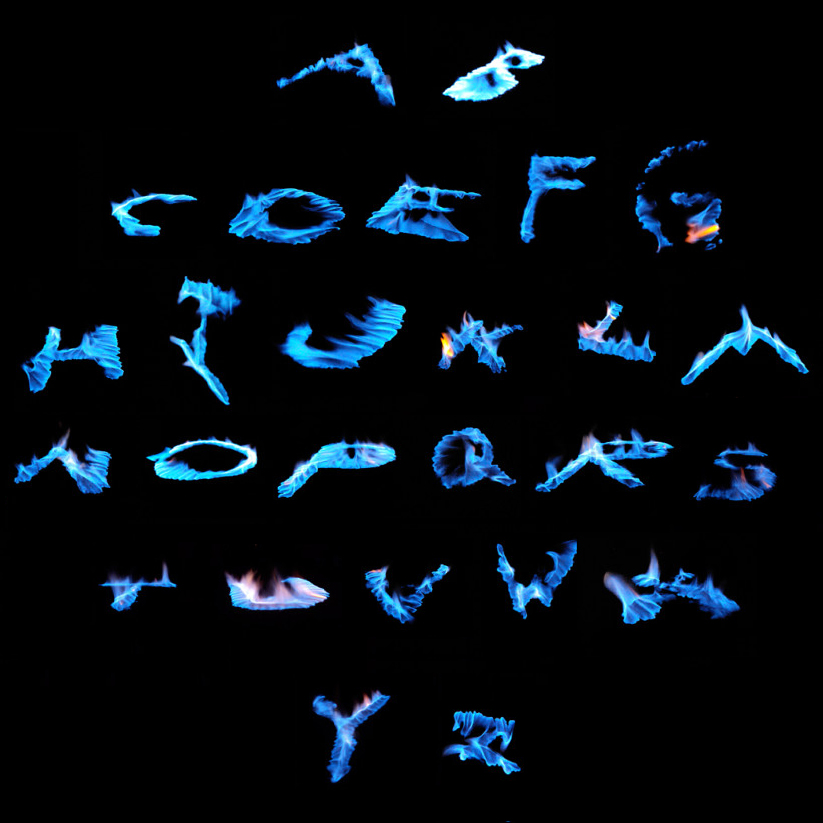
Sterno alphabet, from a studio by the author
Animate the alphabet
Synthesize your knowledge of e-typography, web file options, sophisticated web graphics, and animation in a project that reinvents the alphabet as a new image.
Concept
What kind of alphabet do you want to design? Do you want to try a hand at real typography and generate a vectorized font design that can be hosted at a font distribution site? Or are you interested in a theme that could be expressed through drawing? Perhaps a thematic approach might be best approached as photography?
Creating a font
Creating a professional quality font for distribution requires a bit more research and acquisition of a font design tool:
- Read Part 1 and Part 2 of So you want to create a font by Alec Julien at I Love Typography.
- Download and install the open-source FontForge software.
- Read the FontForge introduction before developing your own font.
While this option requires more technical know-how, it has many advantages. The chief advantage is getting to distribute your font through a site like DaFont, Font Squirrel, and similar distribution sites. A font designer often offers their font under a Creative Commons license that permits free use for non-commercial purposes, and a fee for licensing for commercial use.
Research licensing, EULA, and pricing schemes by visiting a few fonts at distribution sites and see what the market is doing.
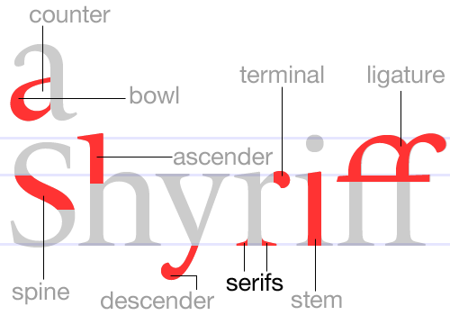
Creating letterforms through photography
If you choose a photographic solution for a live shoot, use a good-quality camera. Pay attention to details! Lighting, composition, contrast, context, and consistent image formatting are critical. Find your raw material in the environment around you, or create a carefully controlled studio contrivance.
Another approach involves appropriation of existing photographic imagery. You may find raw material on the web or scan photographic material to digitize.
Regardless of your approach to photography, you’ll recall that in the inspirational samples seen in Alpha Bravo, successful ones have a strong conceptual framework. Other technical considerations:
- Be mindful of image resolution. Your images should work at all scales and in all contexts, print and web. Assume the largest letter size for print — for example, 10 inches square — and multiply that by 300 to arrive at a target pixel dimension of 3000 pixels high and wide.
- Create a consistent format (we recommend a 1:1 ratio, but a portrait 2:3, 3:5, 5:8, or similar ratio based on Fibonacci sequencing will work as well).
- Consider the figure-ground relationship between the letterform and the edge of the format. Avoid letterform tangency (touching the edge), but also avoid a massive margin.
- Should there be background imagery for the letterform, or should the background be transparent?
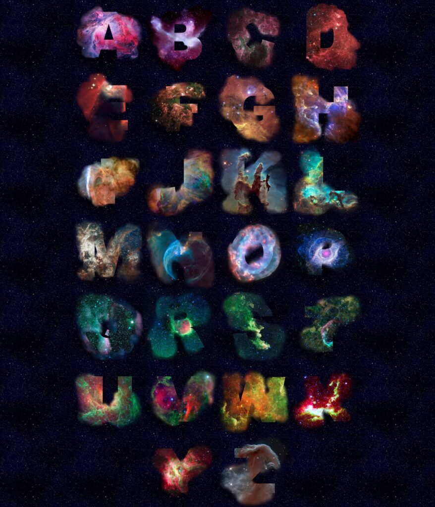
Hubble alphabet, from a studio by the author
Creating letterforms through drawing
Drawing an alphabet can take on many forms. In a digital drawing, you can create a vector, raster, or a combination of techniques. Using tactile media, a drawn or painted alphabet can be scanned to digitize.
Technical considerations will be similar to a photographic solution, although with a vector drawing solution comes the advantage of infinite scalability. If drawing from scratch, you need a way to create 26 discrete drawings of letterforms — layers come in mighty handy!
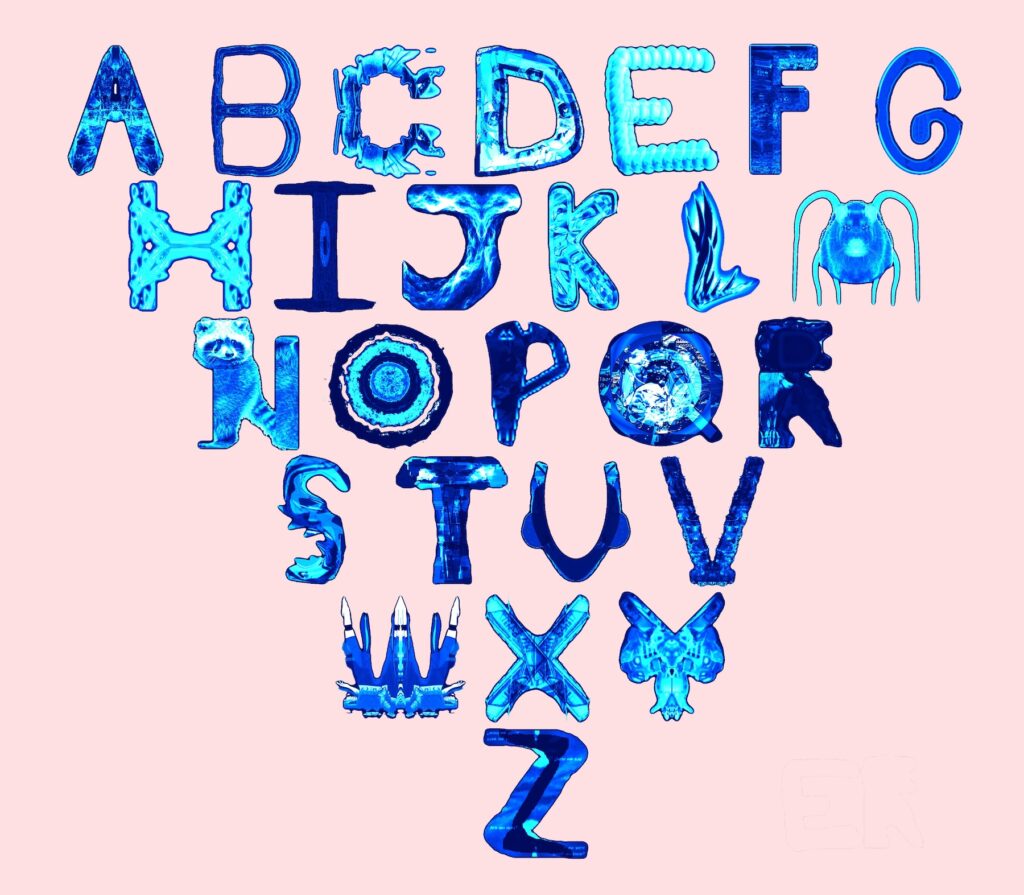
Critter alphabet, from a studio by the author
Start with a sketch
We usually establish the conceptual framework for any project through an initial sketch. In our studios, we define a sketch very loosely. Various media expressions are valid in a preliminary draft, including but not limited to:
- A drawing on paper
- An inspiration board on a digital whiteboard like a Google Jamboard.
- A vector or raster sketch in desktop software or a tablet app.
- Initial photographs
Find a “sketch” style that best represents your media expression, and develop at least 3 unique concepts to take to the next step.
Static and animated
Your alphabet will be presented as a static graphic AND as an animation. Knowing this will affect your approach. Keyword a browser search for alphabet, select GIF under Tools > Type in the Google advanced search tools, and you’ll see plenty of inspiration to create an animated alphabet from your alphabet imagery! Add these sources of inspiration to your sketching or inspiration board creation.
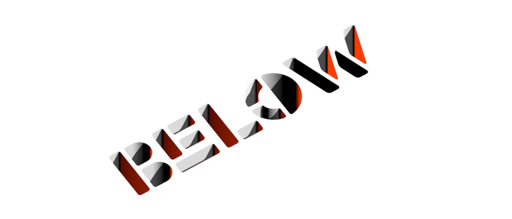

A static and animated use of the typeface Randomize by Ion Lucin, with many more examples found at Behance
Regarding appropriation
If you use appropriated content, remember your obligation toward the source: your work should be transformative. You should be careful to respect copyright, the limits and permissions of Fair Use, and proper citation.
How does one visualize the role of generative AI in a project like this? After all, it’s quite easy to head to a site like Adobe Firefly, which can apply a texture to text with a simple prompt.

A generative AI alphabet was created with the prompt “brown hair”
Well, it can be considered a kind of appropriation — except that it’s generally impossible to account for sources that machine learning has provided for the AI to do its job. So the rule of thumb here is that you can use genAI as a brainstorming tool (citing the tool, of course!). But for you to be the artist, you need to be the one making choices and knowing sources. The final work has to be authored by you. When looking at the sample alphabet illustrated here ask yourself: does it pass the smell test, or does it feel more likely than not to be a genAI product?
Iteration
One way to avoid your work being misidentified as AI is to demonstrate your process and cite any sources for research or derivative material.
First draft…
When designing your alphabet, you’ll start with a first draft of the project. From your sketches, consider the relative strengths and weaknesses inherent in the concepts you are testing. Choose one that seems promising, or combine elements from different sketches. The first draft should represent a strong commitment to one concept.
… And beyond…
The first draft might be created in the actual software you intend to use, but by the second draft, you should be deep in the tool you intend to generate the final work. Among other things, you may find that the idea requires further research into specific software techniques, like creating a pattern brush in Illustrator or working with Photoshop masking techniques. The number of drafts required by a project may vary greatly depending on its nature.
…Towards a final draft
As you approach a final draft, keep the following technical criteria in mind for the creation of presentation-ready or fabrication-ready files:
- Save the edit files in native format (for Photoshop-based projects, as TIFF or PNG; for Illustrator, as AI, SVG, or PDF).
- Export the files to an appropriate presentation or fabrication file (JPG, PNG, GIF, SVG, or possibly multiple versions in multiple file types). You’ll want to present the still images in three ways.
- Assume that vector-based work is scalable for various output options, but be aware that elements like stroke width may ultimately render out to a raster environment in which the scale of the pixel may not create the desired outcome.
- Assume the largest imaginable print size for raster output. If your letter is 3000 pixels tall, the largest it can ever print will be 10 inches.
- Your alphabet will be presented in 4 different ways:
- As a set of individual letterforms, scaled for print and web-ready graphics.
- As a group in a printed poster or other tactile fabrication purposes such as vinyl cutting or embroidery.
- As a means to present your full name, like a sign or a headline, as a web-ready graphic, and/or for tactile fabrication purposes.
- As an animated alphabet in GIF, PNG, WEBP, and/or AVIF format.
Synthesis
After developing a final draft in your edit files, it’s time to format for presentation — and possible fabrication. The four ways to present your alphabet are expanded upon below.
Individual letterforms
Present your letterforms as appropriate for your media type:
- If yours is a font design, it should be formatted to work as a TrueType (.ttf) or OpenType (.otf) file which is publishable as a downloadable font. From this, you can install the font on a computer to create output of individual letterforms in Illustrator or Photoshop.
- If yours is a vector build, pay attention to extremes, both large and small, to determine how details will scale.
- If yours is a raster build, be aware of pixel dimensions for the largest case and work to those pixel dimensions.
Alphabet as a whole
The alphabet as a whole should be presented in a tactile output. The most common of these is a printed poster, but there are other options:
- For a poster-size composition of all letterforms, choose 18×24 at 300 ppi, or some other standard poster format in the 300-500 square inch range. This should be a print-ready file with crop marks, bleeds, or borders as appropriate, in native and viewable (specifically PDF) file types.
- You should also create a lower resolution 72 ppi file for display on the web.
- For vinyl transfer graphics, the file must be in vector format and high contrast (black and white). Raster files can be traced in a vector program. Provide an SVG and PDF version for a fabrication-ready file. You can produce vinyl transfers at our maker space if you are taking a course at our campus.
- For CNC embroidery, the file must be in vector format with clear color separations articulated. Raster files can be posterized and traced in a vector program. You can produce embroidery at our maker space if you are taking a course at our campus.
Name or headline

Snow Alphabet, from a studio by the author
Spell out a full name or headline phrase between 10-ish and 20-ish letters long using your alphabet. The most common use for this is a web-ready graphic, but there are other options:
- For a web-ready banner, create a 72 ppi JPG, PNG, GIF, WEBP, or AVIF as appropriate. Size should reflect responsive design, aiming for a maximum width of a full-screen browser window on a retina monitor (no more than 2880 pixels wide). You should also include downsampled versions at 50% and 25% of the maximum size.
- Alternatively, if your work is pure vector, you can create one SVG at any size, since vectors are scalable.
- You may also produce this group as a vinyl transfer or an embroidery as described above.
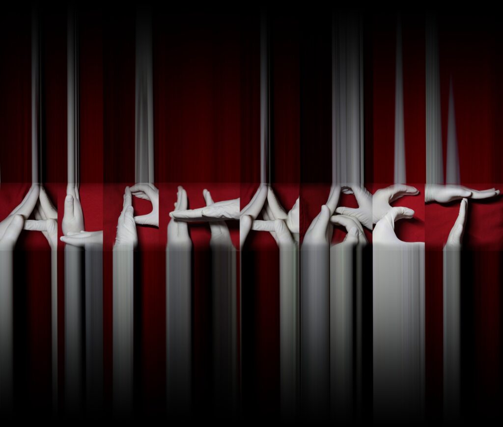
Glove alphabet, from a studio by the author
Animation
A simple time-based presentation of the 26 letters is the default, but you can propose another way to deploy your alphabet in an animated format. The adjacent Pentagram project is an extreme example of variations on one letter, as opposed to the entire alphabet. Consult with your instructor if your idea takes you into non-standard territory:
- Using an appropriate file type, generate an animation in GIF, APNG, WEBP, or AVIF.
- Consider pacing, timing, and order, as well as practical matters of pixel dimensions and file size.
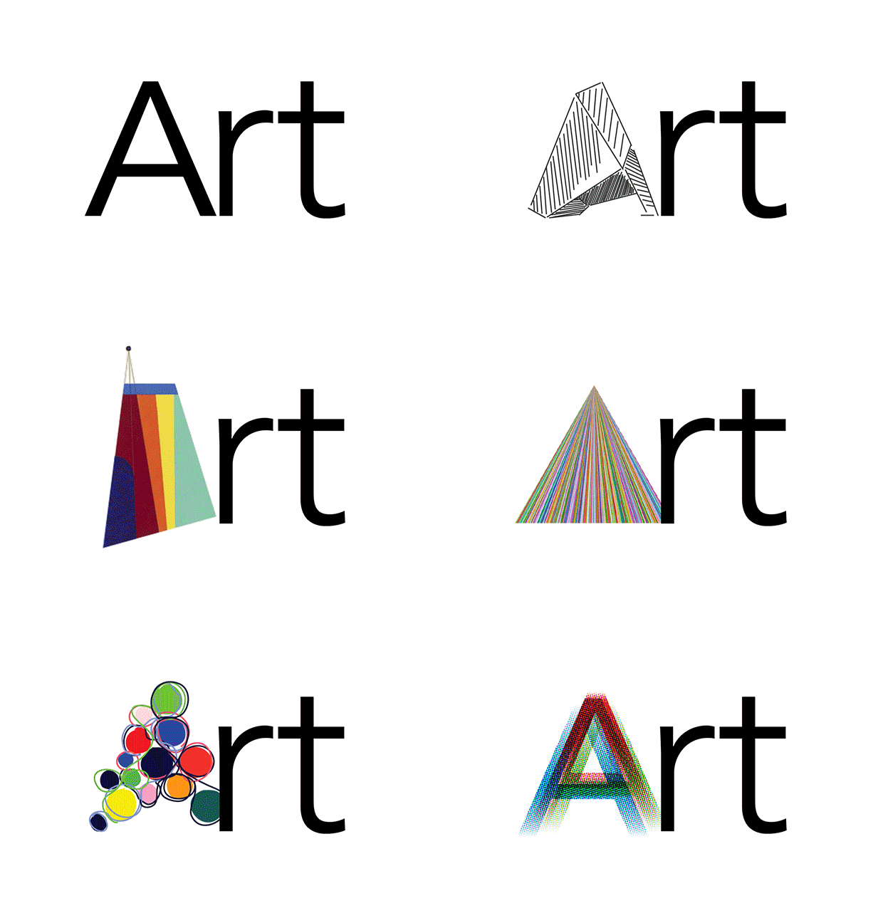
The Philadelphia Museum of Art’s new logo by Pentagram features 200 variations on the letter A, in animated GIF format.


Publishing
Find a host
Once you’ve completed your assets, find a place to host them on the web. Decide on the best means for uploading: should they live in a blog media library? On Flickr or Imgur? Hosted on a server? Some of these questions may be answered in the way you intend to publish your work.
Distribute your work
Once hosted, how should they be published on your blog, your website, and your social network?
On the blog, should you create individual image posts out of the images, or should you create a blog-based slideshow? Go to this link to learn about creating slideshows on blogs if you decide to do so.
Do any issues crop up with hosting and posting animated GIFs or APNGs to the blog? What is the compatibility for WEBP or AVIF support? How can you solve any problems as they occur?
What is different about posting on a blog, and inserting it into a webpage? Given your limited knowledge of web coding, what is the best way to insert your alphabet into your website?
By what means — social-media-wise— should people learn about your new creation? Is Instagram a good solution? Flickr or Imgur? Do you convert your GIF to video to host on YouTube or Vimeo? How do you use a social media presence to drive traffic to your blog or website for people to find out more about your design or process? If you create a TTF or OTF, how can you introduce it to a font distribution site?
Find a way to appropriately present your alphabet in at least three publishing environments. Come up with a solution that takes advantage of what each environment does best. Social media is best for a quick take, while your website is a good, more formal finished portfolio. The blog is best for allowing people to know more about your process, while a font distribution site is good for cultivating a potential client base.
