wordImages
Word images
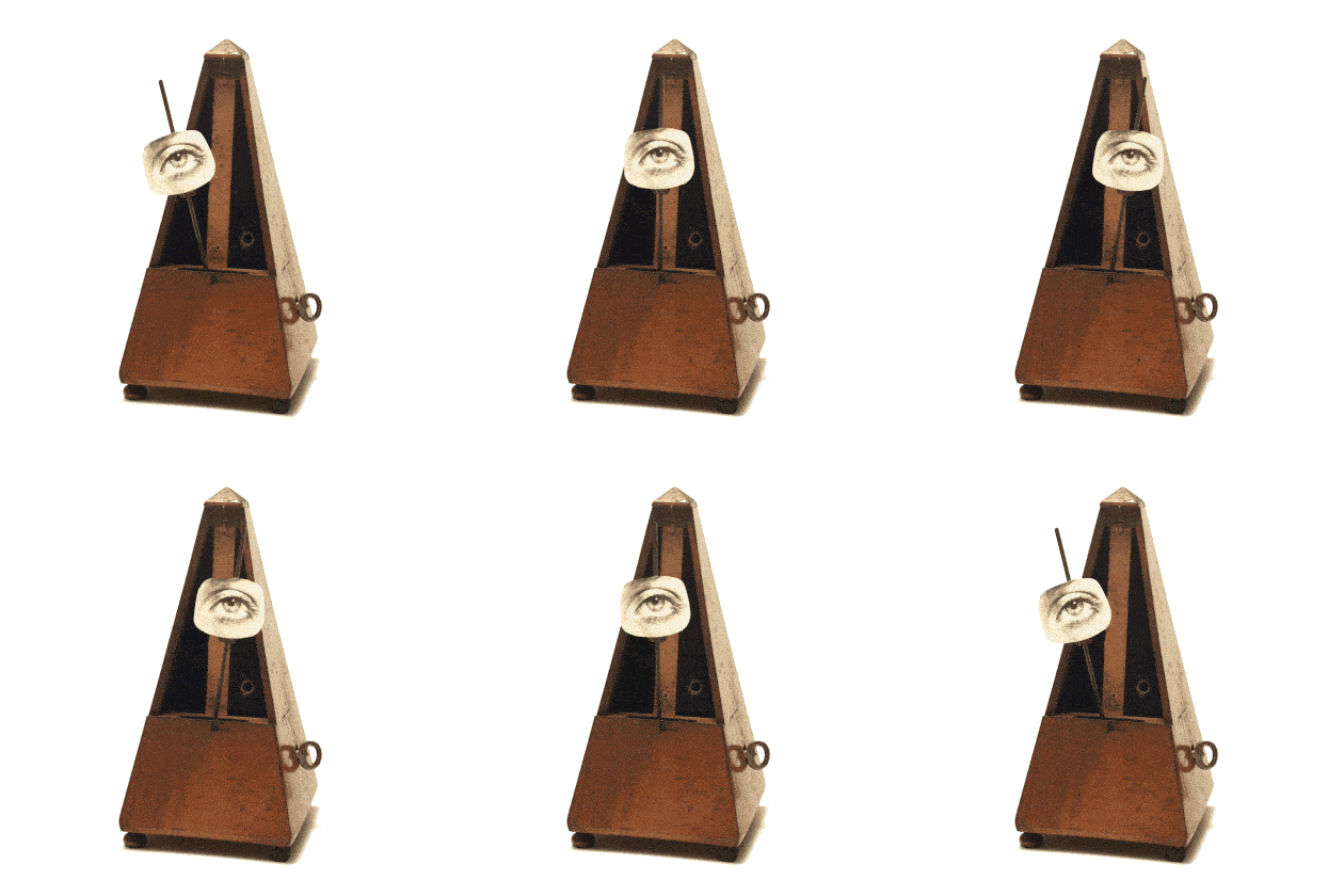
When words and images are placed near each other in a composition, a relationship is formed between the two elements. In addition to formal properties, both words and images are loaded with meanings. Words have verbal or literal meanings while images are “read” as visual messages. Metaphor and puns can be created within the verbal/visual reading to make the relationship between words and images even more complex. In Dada and punk cultures collage images were created from words and images. Words were used as elements that added meaning to the visual collage.
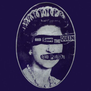
Hannah Höch’s Cut with the Dada Kitchen Knife through the Last Weimar Beer-Belly Cultural Epoch in Germany (1919) and Jamie Reid’s God Save the Queen (1977) single record cover for the band The Sex Pistols are examples of a Dada collage and a punk collage, respectively, where words and images are used to create a visualverbal message full of chaos and anti-order, as opposed to unity and stability. Hoch’s collage relied upon cuttings from newspapers and magazines to critique the contemporary culture. Reid’s image was purposefully degraded or reproduced with low fidelity and a ransom-note typographic sensibility, a rebellious action towards the glossy look of popular albums during the same time period. Both counter-culture groups were interested in developing an aesthetic of protest. But it didn’t start with Dada! Combinations of word with graphics have been a staple of the very human act of protest for centuries.
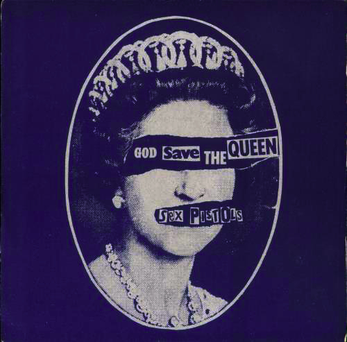
Jamie Reid, God Save the Queen, 1977
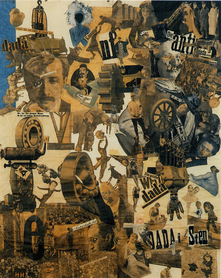
Hannah Höch, Cut with the Dada Kitchen Knife through the Last Weimar Beer-Belly Cultural Epoch in Germany, 1919
The art of protest
Artists speak truth to power through art inspired by social critique and protest, often combining text and graphic content.
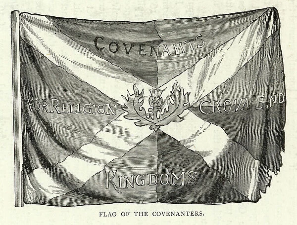
The Flag of the Scottish Covenanters, 1643.
The Covenanters were Presbyterians sworn to defend their religion, part of a Protestant effort to seize power in Scotland against the English. The flag was a mashup of the Scottish Saltire flag with the thistle and text: Covenants for Religion Crowne and Kingdoms
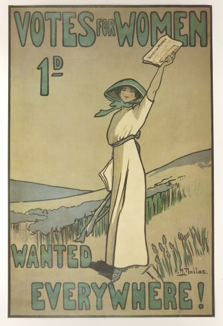
Votes for Women, c. 1907, Hilda M. Dallas, Poster
This poster advertises the official newspaper of the Women’s Social and Political Union, a suffragette organization advocating for women’s right to vote.
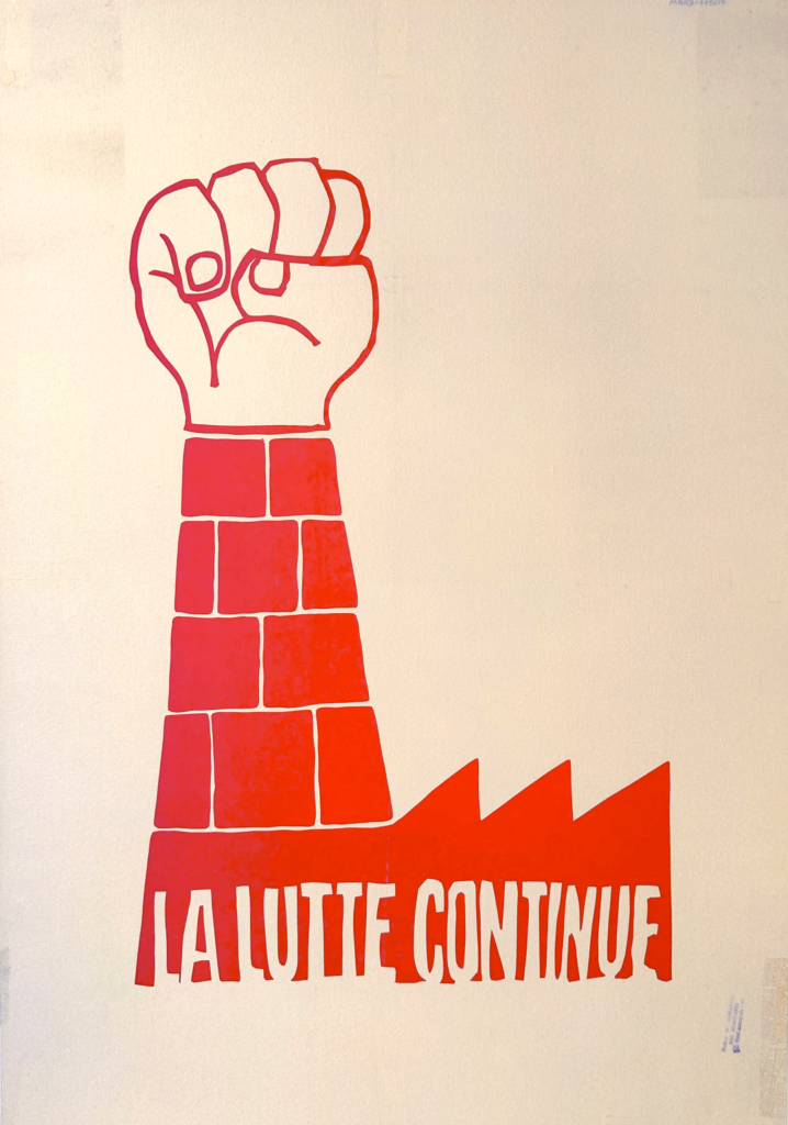
Students and faculty at the L’ecole des Beaux-Arts, “La Lutte Continue”, 1968.
In May 1968, protesters took over a lithography studio and established the Atelier Populaire, where they produced silk screens expressing their disillusionment with Charles de Gaulle’s administration.
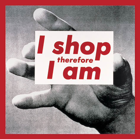
Barbara Kruger, I Shop Therefore I Am, 1987

Keith Haring, Ignorance = Fear, 1989
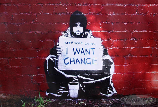
Banksy, after Meek, Keep Your Coins I Want Change, 2004
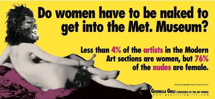
Guerrilla Girls, Do Women Have to be Naked to Get Into the Met. Museum?, update 2012
Adding type and graphics to images: vector work — in Photoshop?
In contrast with low quality images due to repeated photocopying or simply a poor image quality at the input level, typography is often reproduced with smooth edges. Photoshop is commonly thought of as a purely bitmap application because images created and edited in Photoshop are built from grids of pixels. Each tiny pixel contains a unit of color information. While scanned or digitally photographed images are indeed made of pixels, it surprises some to learn that vector shapes can be made in Photoshop.
Vector graphics are created by using mathematical algorithms: formulas that describe where points, lines, and planes exist and how these elements relate to one another in coordinate space. Vector graphics can be scaled up to any size and retain their smooth edges. Typography created in Photoshop is considered a vector graphic. The Layer panel contains both bitmap and vector layers, as we will see in the following exercises. Bitmap images and vector graphics (both shapes and typography) contrast one another because of their differences in texture. Even the sharpest photograph will contrast with the smooth edge of typography or a vector graphic.
Photoshop is not often used to create or edit typography. Long passages of body copy should be handled in a vector-based application such as Illustrator or InDesign; but sometimes Photoshop is effective when just a few words, a headline, or a small amount of text is used as part of a composition with an image.
We’ll do three exercises that will result in three kinds of word-images, a JPG, a PNG, and an SVG. In the case of the last two, we’ll be creating shapes with transparent backgrounds, sometimes known as alpha channels.
JPG: Nevermind
Download the sample file
A .zip archive of this exercise (10MB) is available at the top of this wiki title for you to download and inspect. You’ll need to acquire and install a font from Getty Fonts and Dafont, in order to see the file properly. You may need other sans-serif fonts as well, or substitute similar. More about these fonts below…
Punching above your weight with low resolution images
Prepare your workspace by choosing the Graphic and Web mode from the Application bar.
In these exercises we will be using a low resolution version of the popular Blue Marble photograph of Earth taken from Apollo 17. NASA photographs are usually in the public domain unless noted.
Download the image from the wiki and open it in Photoshop. The final image will be a 6 by 6 inch print, emulating a square-format graphic like one might see for a vinyl record album. You can also find this image at Wikipedia here.
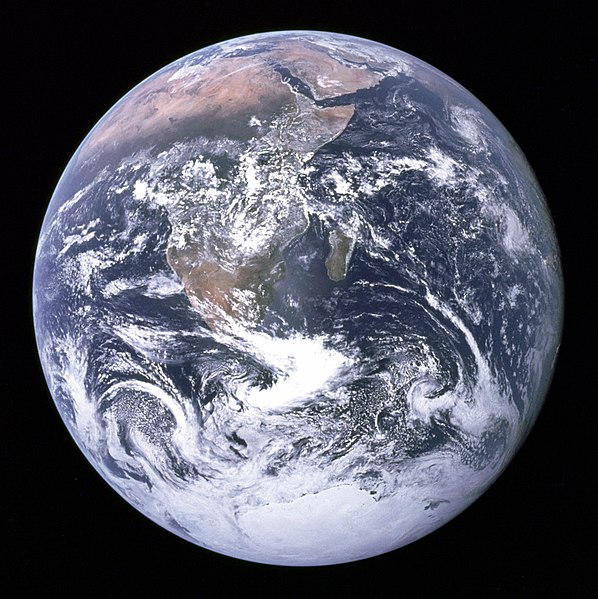
NASA, The Blue Marble, 1972
Notice that the image has a low resolution — its file size is small and its pixel dimensions are just under 600 by 600 pixels. Look inside the Image Size dialog box (Image > Image Size) to see that unchecking the Resample Image button and setting the printing DPI to 300 will result in a print close to 2 by 2 inches. Press Cancel to return to standard editing mode.
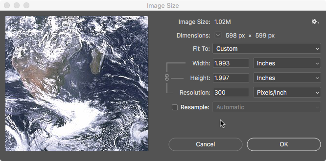
Dirt Style: breaking the upsampling rule
Since we are planning to use this image for a 6 by 6 inch composition space, we have come to a common digital imaging challenge: What do you do when the image you want to use is not even half of the size you need it to be in the final print? Normally, the solution to this challenge is: don’t use the image. Or, use the image in a small area of the composition, but plan to use other compositional elements within the space. The number one rule is not to upsample — that is, not to scale an image larger than it can be printed without pixelation.
However, most rules — once they are understood by applying them — can be broken. In this case, we will use a filter to compensate for the fact that the image is low resolution. It is important to note that in this specific case, the image is inspired by early punk rock record covers and Dada collages, where the aesthetics can be described as gritty, dirty, or low-fi. Dirt Style digital graphics, as described at Rhizome, “counter the impulse to upgrade.” Artists or collectives like Paper Rad, whose website defines Dirt Style, or Michael Bell-Smith, whose video imagery works in a deliberately lo-fi resolution, are digital extensions of this aesthetic.
The concept of our image pays homage to gritty, anti-establishment, anti-order ideologies and aesthetics, and it’s in tune with the way that the final print will look once the image is treated with a filter and new pixels are added.
Filters
In this exercise, a filter is both a conceptual and practical solution to the digital imaging challenge. Filters are not always the solution to digital imaging challenges. In fact, filters are almost usually not the solution. Having said that, here is a short list of the filters we feel are valuable:
- Unsharp Mask | This filter finds edges by looking for contrast and increases the contrast of those pixels, while leaving the flat areas untouched. When not overused, the resulting image looks sharper without introducing noise into the image.
- Gaussian Blur | Use this filter to apply a soft blur to an image. This is quite handy, but it creates a soft focus effect that is not useful in our context.
- Despeckle | Helps in removing a moiré pattern when scanning material from printed matter such as magazines or books.
- Video De-Interlace | Use this filter to remove pixelization resulting from saving individual frames from digital video files.
- Color Halftone | Use this filter to create the halftone effect visible when large prints are seen from a closer distance than they were intended to be viewed or in very cheaply printed media such as photographs printed in older newspapers.
Our goal will be use the Color Halftone filter to create a low-fi illustration of the earth. Before we apply the filter, we need to **gasp** upsample. However, we’re going to do this carefully by adding pixels in a particular color mode.
Choose Image > Mode > Grayscale, and press the Discard button at the Discard color information warning. Then, choose Image > Mode > Bitmap, and press OK through the Flatten layers dialog box. Type 300 in the Output Resolution box. Press OK to exit the dialog box and your image will have a dot pattern throughout. The results are below.
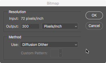
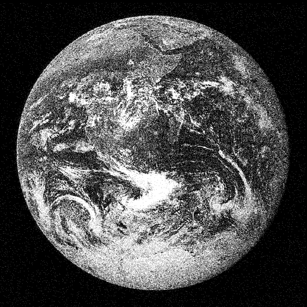
Upsampling
Return it back to RGB mode. Choose Image > Mode > Grayscale and leave the default 1 in the size ratio field. Then choose Image > Mode > RGB Color.
Choose Image > Image Size to sample the RGB image to the correct size and number of pixels for out intended output. Check Resample using Nearest Neighbor (hard edges) to preserve the pattern created by the bitmapping. With the chain link between Width and Height deselected, set each to 6 inches. This will correct the small deviation from square formatting to a perfect 6 X 6 image.
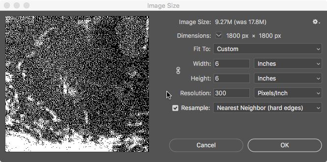
You might have noticed how the file size has whipsawed from an original size of 1.02MB, to a bitmapped version at 760.5K, to now a file around 9.27MB (these are the sizes displayed in Photoshop, not in the Finder window). More pixels in the image, and color channels increasing from 1 in bitmap to 3 in RGB, translates to the file taking up more file space on your drive.
Half-toning
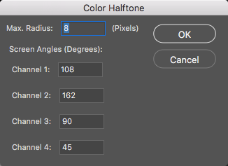
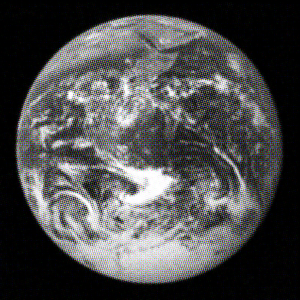
Apply the Color Halftone filter by choosing Filter > Pixelate > Color Halftone. Here you can alter the Max Radius, which changes the size and spacing of the dots that the halftone produces. When the dots are closer or further apart, the resulting image becomes more or less obvious due to abstraction made by the dots. We set the Max Radius at 8, as the results fit our expectations for this image.
Creating vector shapes
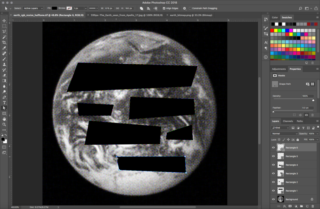
Make sure black is loaded in the foreground color chip by pressing the letter D shortcut on your keyboard. Create six rectangles with the Rectangle tool. The Rectangle tool produces vector shape layers. Vector art is defined by a formula, rather than by pixels. Since the rectangles are not comprised of pixels, they can be scaled or skewed without degradation to their image quality. This smooth, high resolution quality will add contrast to the bitmap halftone image. Each rectangle is defined by the four anchor points at the corners of the shape. These anchor points can be repositioned, and the shape will continue to be filled with the fill color, in this case, black. Notice that each time you draw a new rectangle, a new shape layer is added to your Layer panel.
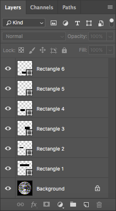
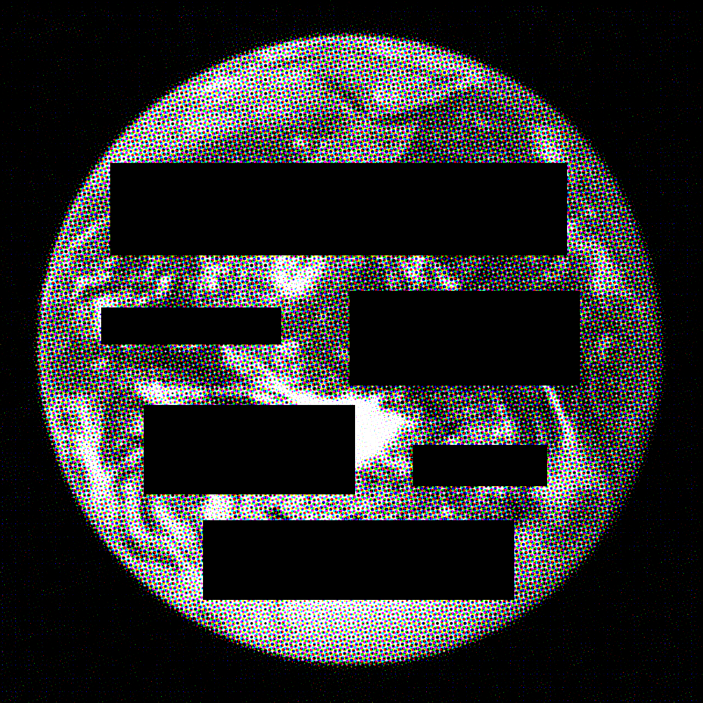
Use the Direct Selection tool to adjust the anchor points at the edges of each rectangle. Remember that each rectangle is on its own layer. Start by adjusting the anchor points for any of the rectangles. The Direct Selection tool will select the anchor points of shape layers even if the layer was not previously active in the Layer panel. Notice that the active layer in the Layer panel corresponds to whichever shape you are modifying. By skewing the shape of the rectangle, the dark areas in the foreground of the composition become shapes that are less predictable. The overall result is a composition that feels chaotic and unstable. Adjust all of the rectangles so that none of them are predictable shapes.
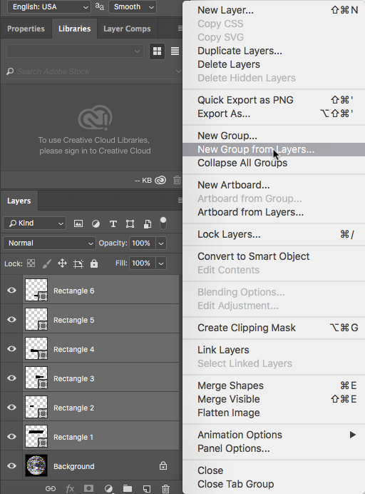
Organize the Layer panel. Shift+click the shape layers: activate Shape 1 then Shift+click on Shape 6. Use the Layer panel pull-down menu to choose New Group from Layers. Name the new layer group shapes.
Creating type
In the typographic portion of this work we’re going to play with a popular culture reference from another Jamie Reid album cover, taking the linguistic meter of Never mind the Bollocks, here’s the Sex Pistols and applying it to a climate crisis theme:
Never mind the profits, save the planet.
We’ll also wink and nod toward Nirvana, who was winking and nodding at the Sex Pistols with the title of their album Nevermind, by changing the phrase Never mind to the one word Nevermind.
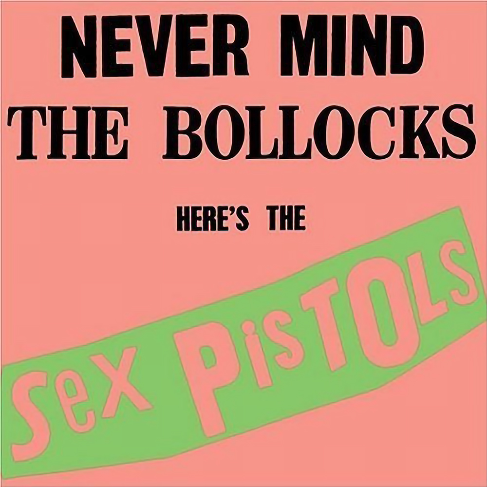
Jamie Reid, Never Mind the Bollocks Here’s the Sex Pistols, 1977
Press the letter X shortcut on the keyboard to toggle the default colors in the color chips. Now you should have black loaded into the background color chip and white in the foreground. Load the Horizontal Type tool. We will use the Horizontal Type tool to create six separate type layers for each of the following:
- Nevermind
- the
- profits,
- save
- the
- planet
Punk typography
Click on top of the first rectangle in the composition and type the word Nevermind. Since our inspiration is a punk rock album cover or a Dada collage, there are no rules about capitalization. You can set some of the letters in a different font face (for example, you could use Helvetica and Courier) or a variety of font styles (such as bold or italics). Click and drag over the type to select it and use the Font Family, Font Style, and Font Size pull-down lists from the Options bar to modify any selected type. You can also use the Character panel for theseother type-related options. Notice that creating typography results in new type layers. Set the opacity of the new type layers to 80%.
In the Layer panel, double-click on the T icon on a type layer to easily select all of the type in the layer. This will make editing the type on the layer simple. You can use the left and right arrow keys to move the type cursor within the selected type. Command+A will select all of the type while you are editing with the Type tool. The Enter key will also commit changes made with both the Type tool and transformations such as Free Transform.
Installing fonts
In our sample, we included a font called Newcastle, which originated as a Chank Diesel design at Chank.com but is now available at Getty Fonts. We also used Blackletter, available at Dafont.com. Both of these fonts are licensed for non-commercial applications, and because the license prohibits redistribution by third parties (such as this wiki), you must go to the sites at the links above to download and install it.
To install a font on a Mac, double-click the font to open it in the Mac application Font Book. Then click the Install button in the Preview window of the font inside Font Book.
Other than that, our sample used fonts available on our system, including Arial Black, Arial Bold, Arial Narrow Regular, Avenir Light, Futura Medium Italic, Futura Medium, Futura Condensed Medium, Futura Condensed Extra Bold. We enjoyed the play between random fonts and the order of using sans-serif wherever we didn’t use the contrast between these sans-serif, mostly bold-ish fonts and the blackletter style of Newcastle and Blackletter.
But, really, there are no rules here, you can do what you wish. A detail of our sample is seen below.
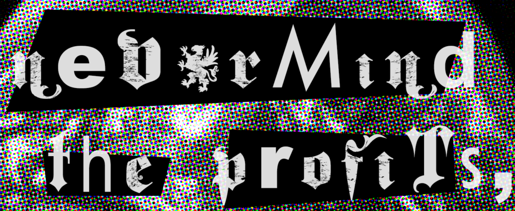
When done with typography, organize you type layers by selecting them and creating a group as you did with the shapes. Call the layer group type.
Output to JPG
When satisfied, save the file as a layered TIFF to keep for archiving and any future revisions. Because there is no transparency in this image, use File > Export to create a JPG version for distribution. Use a Quality of 100% for compression and select Export All… . In the Save As popup, name the file nevermind.jpg and hit Save.
The finished JPG is seen below. It will print as a 6 inch square.
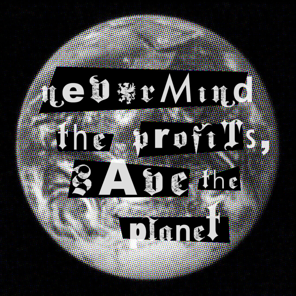
PNG: 1984
Download the .zip file
A .zip file of this exercise is available at the top of this wiki title for you to download and inspect. This project will combine the formal properties of a double exposure with the conceptual framework of art-as-protest, yielding a PNG file with transparency.
Double exposure with transparency
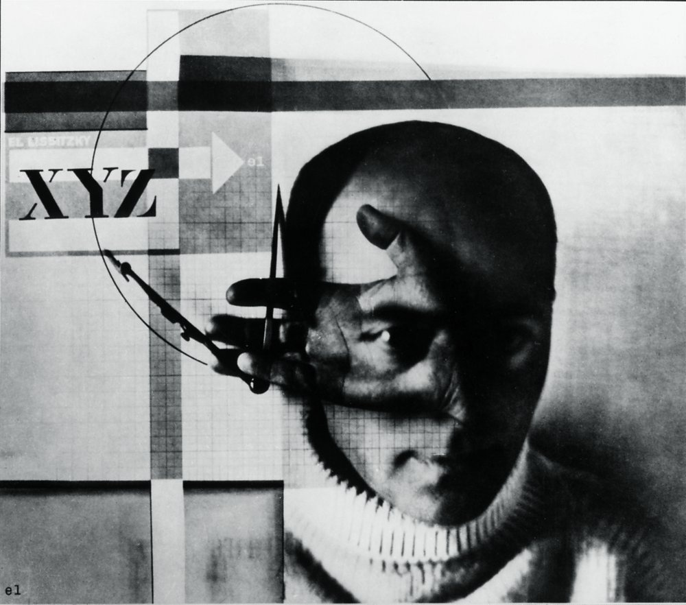
Double exposure is an interesting photographic technique that combines two or more exposures into a single image, either in the photographic negative or by exposing light-sensitive paper to more than one negative. El Lissitzky’s image at right was produced by superimposing two separate photographs :
- The Architect’s Equipment (showing Lissitzky’s hand holding a compass against graph paper with an arching line) and …
- his Self Portrait, both taken in 1924 while Lissitzky was recovering from an illness.
The resulting image fuses the artist’s head, hand and tools.
Assets needed
For the image below we used the following items:
- A text from 1984, the famous dystopian novel by George Orwell, illustrating his concept of doublethink: War is Peace, Freedom is Slavery, Ignorance is Strength.
- A font with a non-commercial free use license: Peace Sans, at Fontsquirrel
- A Creative Commons CC0 licensed image of an eye from Pixabay
- A public-domain image of the Women’s March, 21 January 2017, from Wikimedia Commons. The Women’s March was the largest single-day protest march in U.S. history.
Creating type
Create a new Photoshop document at 2000px x 2000px at 72 ppi resolution, with a white-filled Background layer. Create Guides set at 0.25 inches in from every edge. Save it right away as a TIFF file named 1984.tif.
Create text in all caps using the Peace Sans font at about 250 pt to start, with returns as follows:
- WAR IS
- PEACE
- FREEDOM IS
- SLAVERY
- IGNORANCE IS
- STRENGTH
The goal is to size, track, kern and lead the text to densely fill out the square, with the type touching (and in the case of curved letters, slightly overlapping) the guides at the edges. The values we applied in the Character palette ended up as follows in our sample, after much experimenting. In the table for kerning, >X means “apply kerning value before the X” and X-Y means “apply kerning value between X and Y” where X or Y are variables:
<< Scroll table on mobile >>
The sample looks like this, and if you apply the values in the table, yours will too:
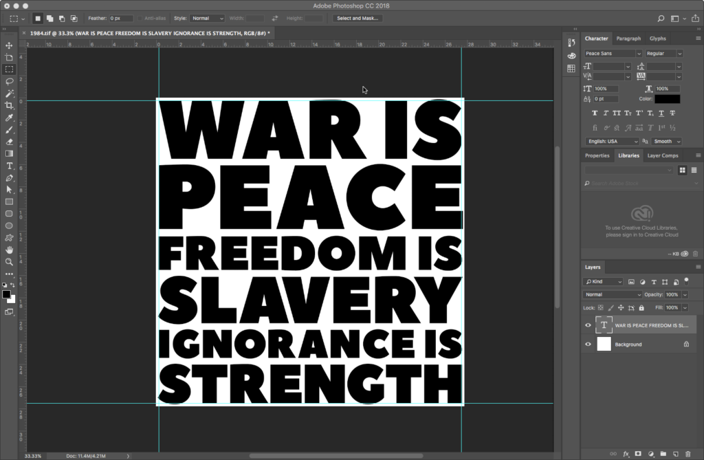
Creating an image mask from text
Using text as an image mask is a common graphic design technique we’ll explore next.
Place the eye image on top of the text layer by dragging the eye image icon from its Finder window over the Photoshop viewport. This creates a Smart Object layer. A Smart Object is a layer that externally references another file. If the file linked via a Smart Object is edited, those changes will automatically update in the layer. As is the case with all external references, the eye file referenced by the Smart Object layer needs to stay in the same folder as the 1984.tif file. If you move either file from its project folder, the external reference will break. So in such instances, remember: the project is the folder, not the file.
The Smart Object comes in with a Transform marquee. Use the handles to scale the eye image to fit the Canvas.
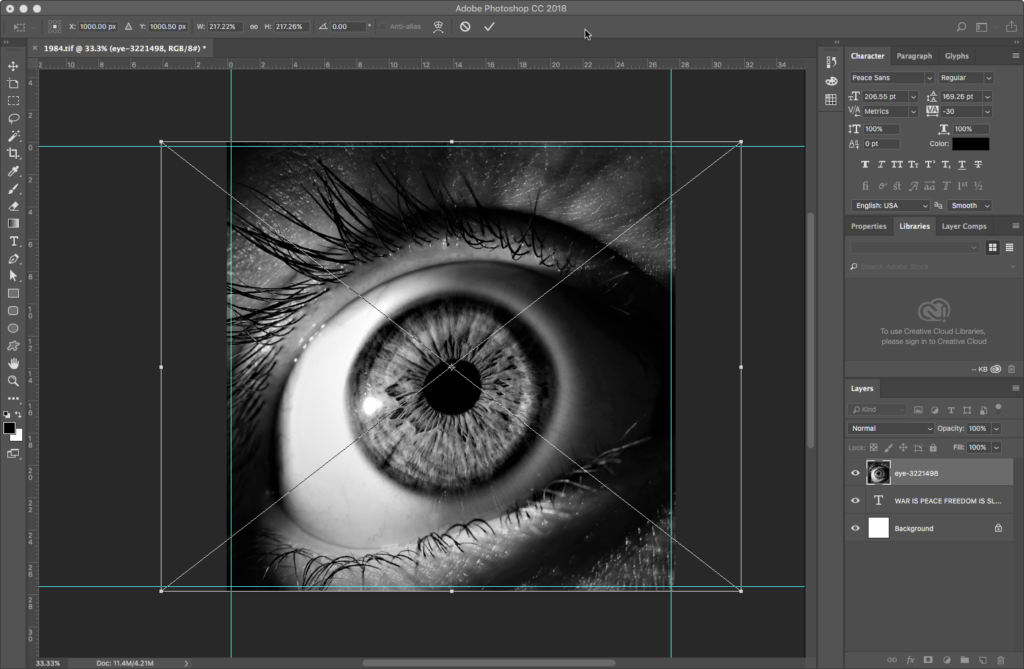
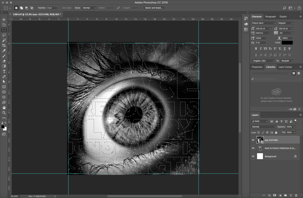
Command+click the T (the text layer’s thumbnail icon) to create a selection out of the text:
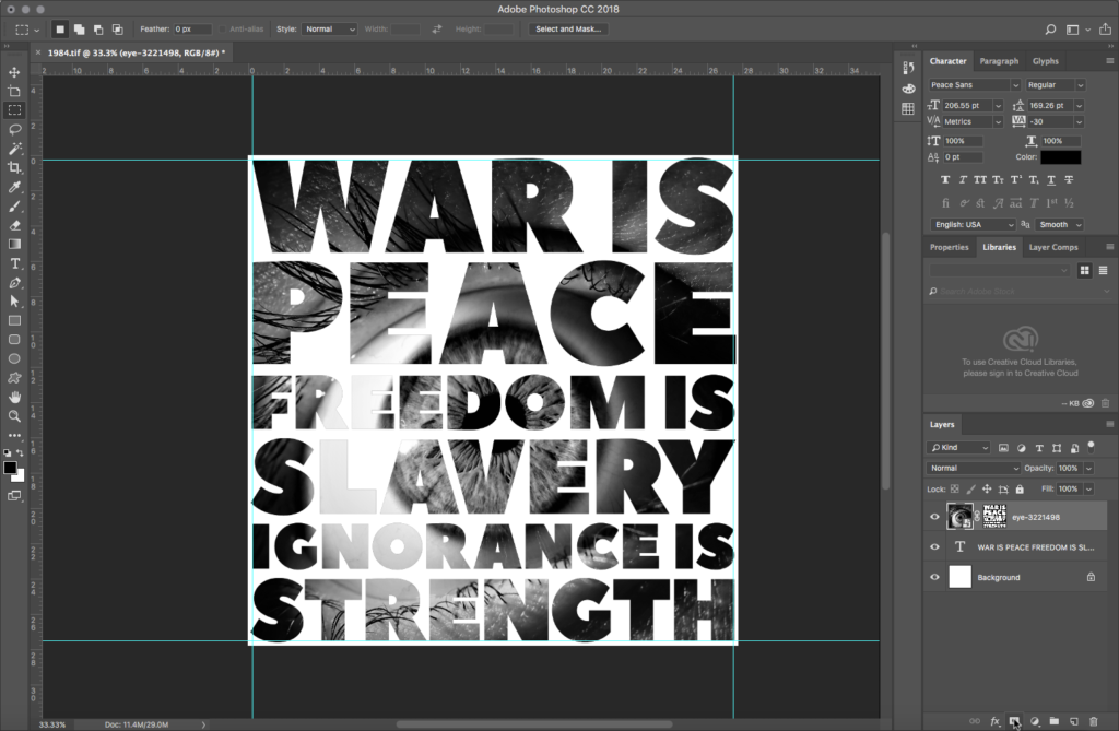
With the eye image layer selected, click on theAdd layer mask icon (kind of a square donut with a round hole) at the bottom of the Layers palette:
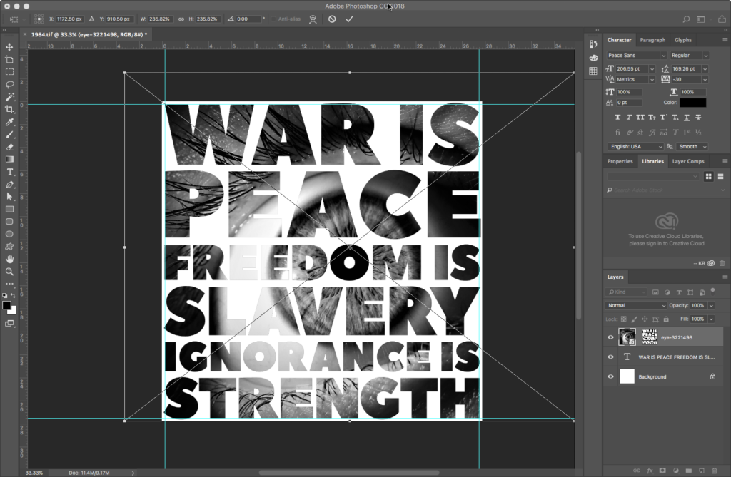
Un-link the eye’s mask from the image by clicking on the Chain icon between them. This allows you to move the image independent of the mask. Move and/or scale the eye image so that the black pupil is directly over the O in FREEDOM. Hit Return or Enter to apply the transform:
Adding a second image with blending mode
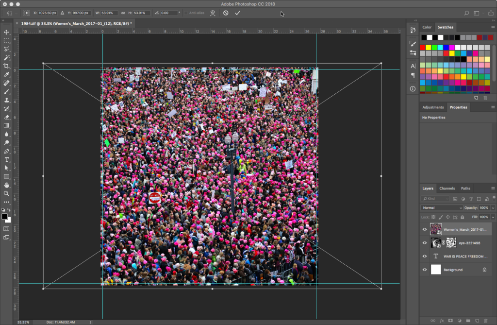
Place the women’s march image on top of all layers the same way you added the eye image, creating another Smart Object. Resize as needed:
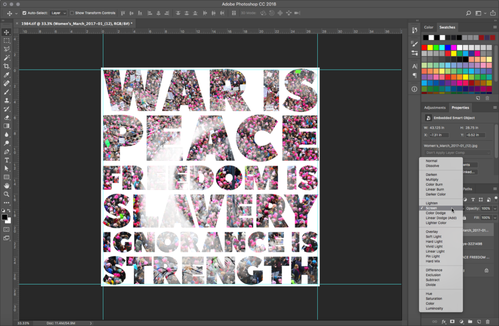
Change the Blending Mode for the march image to Screen:
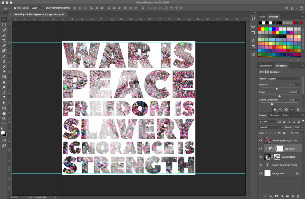
Select the eye layer and apply an Exposure Adjustment Layer. In the Propertiespalette for the adjustment layer, select the This adjustment clips to the layer icon (a tiny square with an arrow) at the bottom of the palette. This isolates the effect of the adjustment layer to the eye image layer only. Experiment with values to allow more of the march image to show up in the white of the eye. In our sample, Exposure was set to -1 and Gamma Correction to 1.75:
Masking the second image
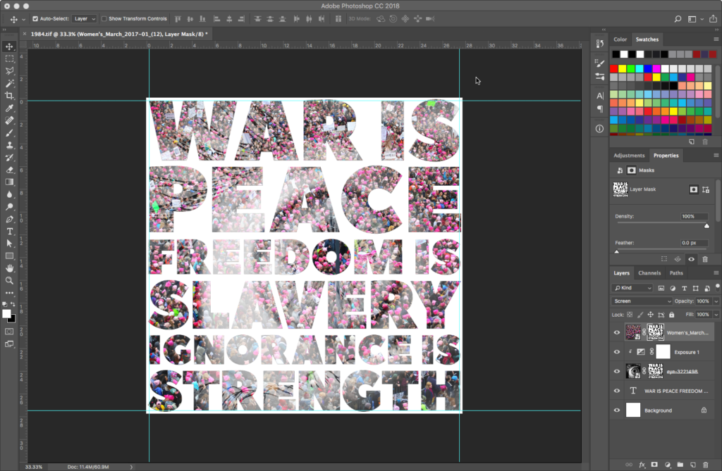
Apply another text-based image mask onto the march layer, in the same manner you created the mask for the eye layer:
Output to transparent PNG
Turn off the Background and Text layers:
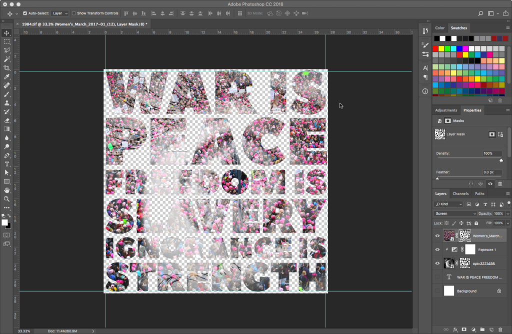
With those layers off, you’ll see the checkerboard that signifies transparency. Go to File > Export > Export As… and select a PNG. Check the Transparency ON.
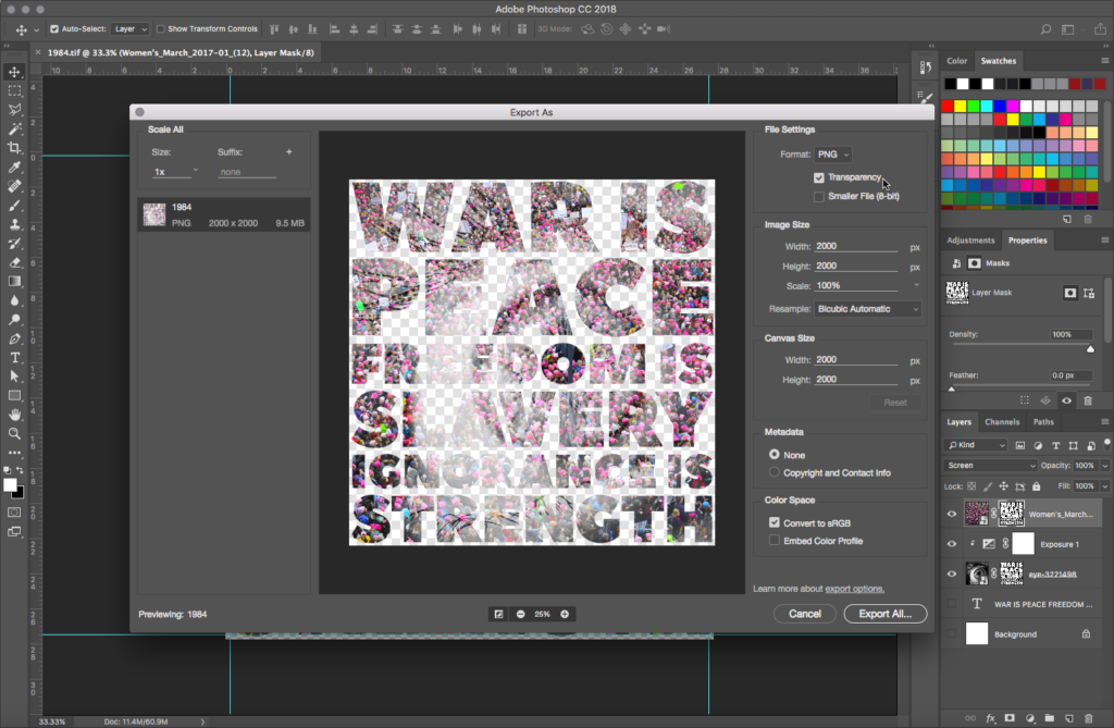
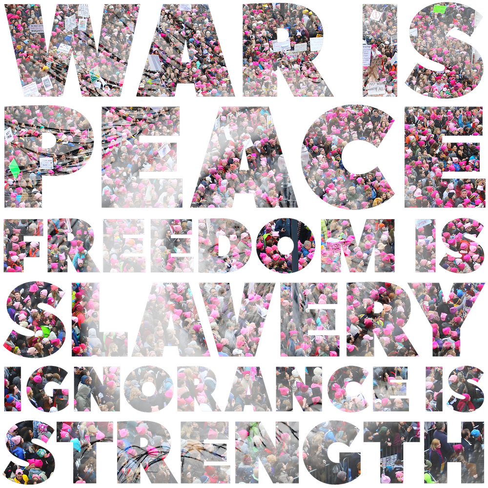
Hit Export As, and name the file 1984.png in the Save As dialog that pops open.
With the transparency built in to the file, it will interact in interesting ways with any background color that it may be placed on:

SVG: Your choice
Download the .zip file
Download and have a look at the construction of our sample file, located at the top of this wiki title.
Find an Illustrator tutorial
The goal of this final exercise is to find and choose a web-based tutorial creating text in Illustrator that can be exported to an SVG with transparency. To achieve this goal, you’ll need to hone another skill: adapting and changing the techniques found in a tutorial to a different circumstance. In our example, we took the techniques described in this tutorial found at aivault.com, and changed them up as follows:
- Changed the text and font
- Eliminated the background color layer to achieve a transparent background
- Simplified the suggested layering
We chose this tutorial as an example for a couple of reasons, not only for the cool water effect:
- One, it was written in 2008 (although as of this writing it appears to have been edited in 2022). As a tutorial that’s more than a decade old, we expected some techniques to be out of date, and we weren’t disappointed. Advanced software users should expect to have enough knowledge to adapt older instructions to a new UI or UX.
- Two, it appears to be written by someone for whom English may be a second language — meaning the instructions were a bit vague or confusing. Advanced users should be able to pick through oddly-worded tutorials to get to the sense of what the author is after, especially if the final product is worth the extra effort.
Finding Illustrator tutorials to create an SVG with transparency is as easy as a Google search. We found a reasonably recently-authored compilation of 80 Illustrator text effect tutorials at 1stwebdesigner.
Adapting to SVG output
Feel free to look there for a tutorial, or go digging for your own “illustrator text effect” search on the web. Everyone’s workflow will be unique for this exercise, but one common technique will be the process for SVG import. Recall that you go to File > Export > Export As… and select SVG as the output. In the SVG Options dialog, uncheck Minify but keep Responsive checked on.
One of the great things about transparent SVGs is that transparency effects are, size-wise, pretty lightweight. Our final file size for the SVG output is less than 600K for a file that includes random shapes, gradients, multiple layers, gaussian blurs, and transparency. We’ve placed our example on a gradient background so you can see the effect of color change in the semi-transparent water droplets.

For portions of these sections:
- JPG: Nevermind
Contents adapted from materials created for Digital Foundations by xtine burrough and Michael Mandiberg, modified by williamCromar to update to current Adobe Creative Cloud. Please see the newMediaWiki Licensing & Citation Notes regarding Digital Foundations derivatives, which are governed by a Creative Commons Attribution-NonCommercial-ShareAlike 3.0 Unported license.
