eTypography
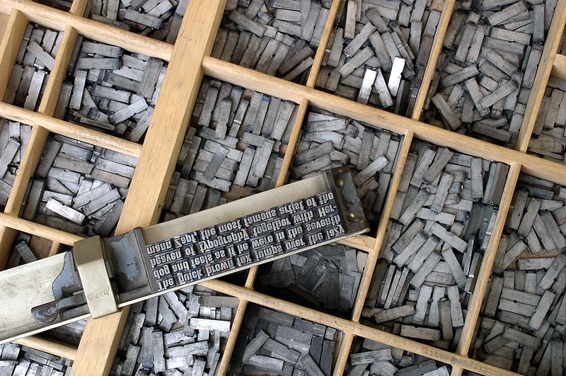
Typesetting tools for movable type. From Wikimedia Commons.
eTypography
Type spec’ing and setting
Before the desktop publishing revolution, type specification and typesetting was a laboriously hand-crafted affair. In his illuminating blog post on The Lost Art of Type Spec’ing, font designer Mark Simonson says:
We are so spoiled nowadays. We can set the type ourselves, right at our desks (or laps), and instantly see what it will look like. No more spec’ing, or waiting, or paying big typesetting bills. On the other hand, you do have to know a lot more about setting type than you did back then to get the same level of quality. 1
At UCLA, Professor Johanna Drucker’s appreciation for what she calls “slow technology” 2 has revived the lost art of typesetting for a new generation. Visit the article here to learn how she did this.
Are these musings of an older generation who romanticize obsolete technology, or is there any value to knowing about old-fashioned typesetting? Well: if you spend any time with graphic software you know many of the commands and tools are based on metaphors to older technologies. And if you don’t understand the metaphor, it’s hard to understand the software! So let’s dig in.
Metaphors in Web type
In the typesetting studio at UCLA, students learn:
- The terms upper case and lower case refer to the drawers that the type was stored in. Capital letters were in the top case, others were in the bottom case.
- Leading — the vertical space between baselines of type — refers to actual strips of metal inserted between rows of set type. Back in the day, that metal was (yikes!) lead.
- Tracking — the spacing between letters — refers to the track in which movable type is set.
- Kerning refers to the part of a letter that overhangs the edge of a type block to allow for individual space adjustments between overlapping letters (like A and T), as seen here.
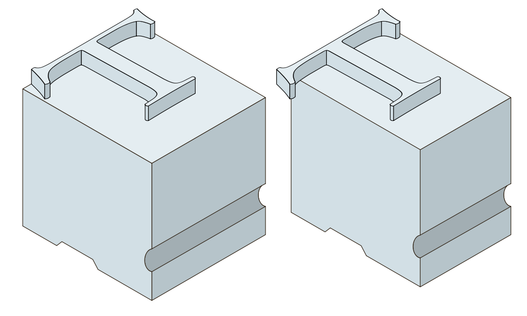
The little overhang at the T on the right is a kern. From Wikimedia Commons.
These terms, embedded as they are in the materiality of typesetting, persist as metaphors in the UI of software like Photoshop, Illustrator, and InDesign. So, when we arrive at type on the web, we gradually see these metaphorical terms get discarded. In CSS properties you will learn about in this course, tracking gives way to letter-spacing values applied to divs, kerning is done through the application of the same through spans (although there is also a property called font-kerning), leading becomes line-height, and so on. Uppercase and lowercase are maintained in CSS vocabulary, however, showing up as values in the text-transform property. Such is the persistence of metaphor!
The bottom line is that the technical terminology becomes a parallel universe. In software, you need to know the older terminology; in code, not so much. But you do need to know when to use each, and how they translate.
Text-based type: fonts
In the days of movable type, a font was a specific size and style of a typeface. With digital typesetting, the terms are now interchangeable. In this title, we defer to “font” for both. Back in the day, a typesetter would purchase a massive set of letters in a font from a type foundry, so called because the letters were cast in metal. The term foundry persists for commercial type designers, who now supply fonts as digital files that live on a hard drive.
This made things a bit tricky for the web designer working in 1995 who wished to spec a particular font size, weight, or style. It was possible to specify a font using a <font> tag, but the font file had to be installed on the client’s drive for it to display. This remains one of the prime phenomena that distinguishes graphic design from web design.
Web-safe fonts
Thus, the concept of web-safe fonts emerged as a partial solution which assumed a set of fonts most likely to be present on a client drive. This concept allowed the substitution of a generic font family if a specified font was not installed. These five families persist in the CSS specification as follows:
Serif
Designed in antiquity in response to the need for text inscriptions carved in stone, the extra serif stroke would neaten up the ends of the carved letters. A well-designed serif font aids legibility in body type.
Sans-serif
Used to convey modernity, these fonts grew in popularity with mass-printed headlines and advertisements a century ago. Some sans-serif fonts are based on simplified serif font proportions, while others take on a more geometric form.
Monospace
(Non-CSS AKA Modern)
Typewriters could not accommodate proportional-width letters, and this persisted with the graphical limitations of early computers. Monospace is now used for typing code or terminal emulation.
Fantasy
(Non-CSS AKA Ornamental or Decorative or Display)
Fonts that carry a theme or specific cultural allusion, these fonts have specific uses that make them less suitable for body type.
Cursive
(Non-CSS AKA Script or Handwriting)
Based on the letterforms made with calligraphy pens or casual mark-making tools, some script fonts contain varied strokes that suggest handwriting.
.
Depending on the operating system or device, the large letterforms above will display the default it prescribes for each generic font family. On my Macbook Pro in 2023, the fantasy font-family displays Impact, while my iPhone displays Papyrus.
The fonts specified in Microsoft’s Core Fonts for the Web initiative in 1996 ensured that all Web users had the following fonts installed:
|
Serif |
Times New Roman
Georgia
Trebuchet
|
|
Sans-Serif |
Arial
Verdana
|
|
Monospace |
Courier New
|
|
Fantasy |
Impact
Webdings
|
|
Cursive |
Comic Sans
|
You can see which of these fonts persist as de-facto Web standard fonts by looking at this page on a desktop versus mobile device — on your phone, you’ll probably see the fantasy and cursive fonts show up as a fallback font instead of the actual Webdings or that most unfortunate of choices: Comic Sans.
The Core Fonts initiative was an imperfect, incomplete solution to a thorny problem, which by the early 2000s left designers and clients wanting more than the very limited palette of options it provided.
Cloud to the rescue: font libraries
Between CSS properties that allow a variety of styling options and the development of browsers that support them, the increasingly urgent need for a better font solution came to pass with the advent of downloadable fonts hosted on the server. This was controversial because it became so easy to download and install proprietary fonts elsewhere in breach of licensing. It became clear that cloud-based web font servers, in combination with free (as in speech) software licenses, were the only reasonable solution. Several have opened up to serving designers in the past decade, including but not limited to:
- Google Fonts – serving over 800 fonts
- Adobe Edge Web Fonts – serving over 500 fonts, some of which are shared with Google Fonts
- Font Library – serving over 1400 font families
These services and others give designers the option of “calling” fonts from their servers or downloading the fonts to host on (and call up from) a personal server. With web fonts becoming the rule rather than the exception, designers have nearly the degree of control graphic designers enjoy for font selection, at least.
In addition to these services, other sites have sprung up that are indispensable to typographic design on the web. Just for starters:
- Understanding Fonts Font Test – allows a drag-n-drop inspection of your system fonts in a browser
- Host your own web fonts – Mike Solomon’s tutorial for self-hosting free license fonts
- Font Squirrel – a curated set of free fonts, as well as several tools: a web font generator, a font identifier, and more.
Generative typography
At the cutting edge of web font design, we find generative typography. While not strictly generative, in the sense that letterforms are not being redrawn by an algorithm, the “averaging” experiments of some designers lead to a methodology of making fonts look less mechanical and more human. Dan Sayers created his Avería Font by algorithmically averaging all the fonts in his font library. It is strangely super-legible, modern at the same time it evokes Poor Richard’s Almanack typesetting. Meanwhile, a similar experiment emerged from Process Studio, whose Average Font has the visual tactility of charcoal drawing.

Averia font is seen in the adjacent magic square, with Average font in the gray squares
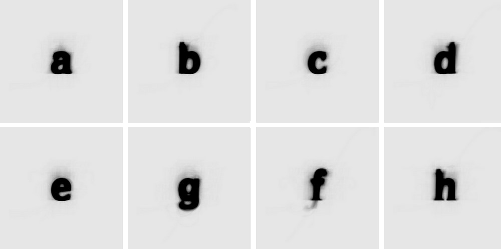
But these were not the start of this methodology. Uncertainty and imperfection in the final product had always been the norm in the physicality of the printing process from the time of Gutenberg’s invention of moveable type to Steve Jobs’s embrace of typography in the graphic user interface of the Mac. It was only with digital type that “perfect” rendering of type was possible. Before digital type, the popular minimalism of Swiss design trends had been technically challenging to pull off, so many designers found the easy perfection afforded by digital design to be icy and sterile.
David Carson shook up the design world with his “digital grunge” aesthetic in the 1990s. Layered, textured, fragmented, collaged, type in Carson’s work takes on an entirely different role. He famously said:
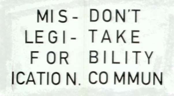
“Don’t mistake legibility for communication.” Just because something’s legible doesn’t means it communicates. More importantly, it doesn’t mean it communicates the right thing. So, what is the message sent before somebody actually gets into the material? 3
From “generative” to generative
Carson’s “generative” work depends on a lot of massaging of otherwise “perfect” type in Illustrator and Photoshop to achieve visual tension. But truly generative type in Carson’s generation was not a dream: in 1990, Erik van Blokland and Just van Rossum of the graphic design firm LettError developed the FF Beowulf font. They achieved truly randomized type by hacking the PostScript code of a standard font, such that no two settings of Beowulf would yield the same result.
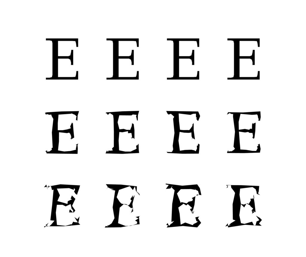
Settings of Beowulf generative variations
Generative Sans
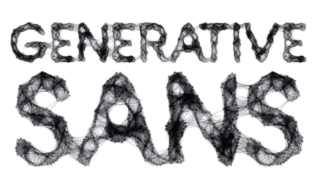
More recent experiments include a randomizing script for selecting letterforms in Local Gothic by Christian Schwartz. Generative Sans by Leon Butler takes this a step further by programming unique ligatures (connectors between letterforms) based on the geometry and proximity of each letter. Joshua Davis, meanwhile, uses programming to create compositions in his series Type as Texture.
Image as type
Image-based substitutions for text are sometimes necessary but always come at a price. Text selection becomes impossible. It’s a disadvantage for SEO (search engine optimization). And it carries significant barriers to accessibility, which we’ll discuss below. Nevertheless, there are aesthetic purposes that are well served by the judicious choice of image-as-type, particularly when text is combined with other pictorial elements, as in a logo, a button graphic, text masking a photograph, and so on. These images can be developed in both vector and raster contexts.
Vector type
Creating SVG image replacement type
(Note: not to be confused with a property callout in the @font-face CSS rule, for those in the know)
Creating vector-based image replacement type is one alternative to dependency on a font or font library. This involves generating an image in a vector program like Illustrator or Inkscape and exporting it to the SVG filetype. The clear advantage of vector work is scalability: regardless of size, it renders well, it’s low-budget bandwidth-wise, and vector art always looks amazing on a retina-screen device, even when zooming in deep. Below, observe the same SVG file incorporating text scaled from 18 to 288 pixels. Zoom your browser window way in on these babies, and they stay crisp at almost any scale. The only liability occurs at smaller scales on lower-resolution screens: the 18-pixel image begins to shed its border, but this is a function of available pixels on a monitor, not the scale of the image.
28 pixels
56 pixels
112 pixels
224 pixels
Illustrator and SVG
You’d think that, like other file type exports, you’d find SVG under the list at File > Export, but the .svg extension is a non-proprietary XML-based vector alternative to .ai, so technically it’s not an exported image. You’ll create an SVG under File > Save As.
Be aware of the Use Artboards option in the Save As dialog. Check or uncheck it accordingly. A nifty time-saver, if you’re making a batch of individual symbols, is to create one individual artboard per symbol and Save As with Use Artboards checked. This will output individual SVG files for each symbol in the batch.
If you need a bit of padding around your image, say if you have a drop shadow effect that you want to fade at an edge, create a rectangle with no stroke and no fill that is slightly larger than your image, keeping the edge of this geometry wider and taller than the image by a small but uniformly distributed dimension, then Save As with Use Artboards unchecked. Alternatively, size the artboard itself slightly but uniformly larger than the centered image and Save As with Use Artboards checked.
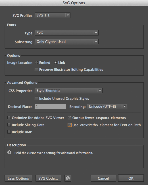
Once you click on Save in the Save As dialog, inspect the SVG Options dialog that opens:
Use the options as shown on the screenshot at right:
- Profile: SVG 1.1
- Type: SVG
- Subsetting: Only glyphs used OR Convert to outline (see below)
- Image location: Link OR Embed
- CSS Properties: Style Elements
- Decimal Places: 1
- Check Output fewer <tspan> elements
- Check Use <textPath> element for Text on Path
Some detail on these settings is described below.
Profile
SVG 1.1 is the option recommended by the W3C. The others were created for first-generation mobile devices — think old-timey Blackberry — and are not relevant unless you’re aiming at that kind of device for whatever reason.
Fonts Type and Subsetting
Under Fonts, web designers MUST choose the SVG option to enable the font format recommended by the W3C. This will embed the font in the resulting document. Embedding affects file size, so if you don’t need the entire glyph set embedded, selecting Only glyphs used will save space.
Alternatively, choosing Convert to outline changes the font into geometry, much like the Create Outlines function. This is a great choice for simple type, but if you are using a complex script or ornamental type that results in complex vector paths, it can increase file size.
Image embedding versus linking
If you are combining SVG text with a raster image in Illustrator and then outputting an SVG, you can choose between embedding the raster information within the SVG file or linking to an external file. This is a tough call. Embed leads to a larger file with a wall of human-unreadable raster code, but it’s unlikely you’ll ever have to look at it. Linking leads to a much smaller file size, but the link Illustrator creates points to a raster file on your local hard drive, not a web server, and this needs to be hand-coded to correct. As you become more comfortable with code, the best way is to select the Link option, then modify the href tag to point to your image file, which you can control the compression for in Photoshop.
Note underneath these options is a check box for Preserve Illustrator Editing capabilities. Generally, you want to uncheck this. The file is living on the web and read by a web browser, not Illustrator, and the proprietary data this adds to a file can increase the file size by 1000% — that’s not a typo!
More options
Under the More options button, you’ll see important goodies to help a web designer reduce the weight of an SVG file:
- Choosing Style Elements under CSS Properties for images destined for the web means Illustrator will translate graphic styles created in Illustrator into CSS properties at the top of the code. Highly useful as you become increasingly CSS savvy.
- Decimal places will control the precision of the vector paths exported. Selecting 1 can dramatically reduce file size, and even with complex paths, it’s hard to detect a difference.
- Checking Output fewer <tspan> elements and Use <textPath> element for Text on Path dramatically reduces the size for embedded fonts or text created on paths. Use as appropriate.
Raster type
Raster-based text images still significantly outnumber their SVG-base siblings on the web, and there will be many times you’ll be called upon to generate a GIF, JPG, or PNG-based image replacement solution. Raster remains a viable option for certain aesthetic outcomes, especially when combining text with photos.
The big foe with raster-based images remains, as always, scale. The raster image below is 112 pixels square. It’s only sharp when downsampled:
28 pixels

56 pixels

112 pixels

224 pixels

One can argue that working with a giant file solves this problem, but there are issues with this lazy fix, not the least of which is performance on a mobile device. Working close to the intended size and screen resolution is preferred, although an exception can be made for an image that is served up at multiple sizes on a page. Be aware that retinal screen resolution, which doubles the traditional 72 ppi resolution for Mac monitors, can affect how the browser renders an image.
Tweaking raster type for the web
When creating raster type, some subtle but important tweaks affect legibility, especially as the type becomes smaller on lower-resolution screens.
Anti-aliasing
Anti-aliasing allows one to produce a smooth edge by partially filling in the opacity of edge pixels. The effect causes an optical illusion whereby the edges of the type blend into the background. Using anti-alias edges on a GIF increases the number of indexed colors in the file, so you want to be aware if keeping a small file size is critical.
To apply anti-aliasing to type when working in Photoshop, open the Type Tool and observe the Options bar. We find the anti-alias options at the little aa icon to the right of the font-size dropout. With text selected, you can choose None, Sharp, Crisp, Strong, or Smooth among anti-aliasing options.

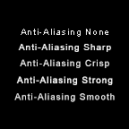
Let’s apply all of the anti-alias options to a condition that is at the edge of legibility: a line of 10 pt Arial type at 72 ppi. This results in capital letterforms that are a glyph-decimating 7 pixels tall. Below, we enlarge them to show the effects of anti-aliasing, and next to that, we display them at the true intended size. It may seem counter-intuitive, but that “blur” that seems so terrible when zoomed in creates more readable letterforms:
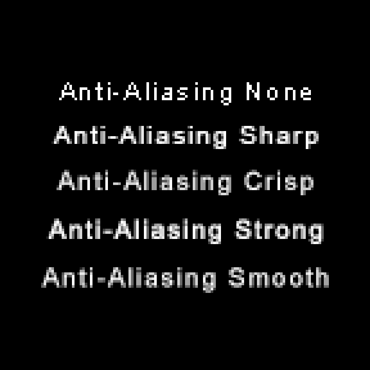
Which option produces the best results in this context? None is a non-viable option, but we can debate the merits of the others. There’s another trick that can help us decide…
Tracking
Recall tracking as the manipulation of negative space between letterforms on an entire line of type. Kerning at this scale is too subtle, but tracking creates a remarkable difference. To the same sample as above, apply a tracking of 100, and compare side by side:

Tracking = 0
Tracking = 100
Wide tracking is the same trick used for highway roadsigns to allow letterforms to be legible from a distance, where they appear to be quite tiny. In our tracking sample, we can still debate the merits of the various anti-aliasing options, but Sharp appears to have the best balance between crispness and maintaining the glyph design. Strong almost borders on a bold styling. Smooth and Crisp seemed like better candidates before the tracking was applied, but now seem a bit blurrier than desired.
This is counterintuitive, but at these tiny scales, it can often be true that a smaller font with wider tracking is more legible than a larger font with narrow tracking!
Resampling in Photoshop
We try to avoid resizing blocks of text whenever possible, but from time to time you will encounter line art or scanned graphics that contain a block of type it’s just not practical to rebuild.
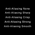
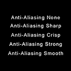
Below we resample the 6 X 6 block of type from above down to a 2 X 2 size. After selecting Image>Image Size… in the Image Size dialog box we first resample by using a Resample: Bilinear option. Then, we resample using Bicubic Sharper to compare:
Resample: Bilinear
Resample: Bicubic Sharper
Neither result is better than the file that was produced originally at 2 X 2, but here we are pretending this is line art or a scanned graphic we can’t otherwise reproduce. The moral: when resampling, don’t assume the default option for Resample: will automatically yield the best results. Experiment with a couple of options and choose the best result.
Photoshop text tutorials
To prepare for our upcoming image-based text exercises, take the Photoshop text tutorials found at Photoshop Essentials. These tutorials are presented in reverse order: the first one you should take starts at the bottom, and then move your way up to the more advanced tutorials at the top!
Regarding accessibility
We mentioned earlier that image replacement text can adversely affect a variety of functionality, including how your web page shows up in searches. Some of that can be dealt with using other SEO (search engine optimization) strategies, but one issue that it’s hard to work around is accessibility.
In web design, accessibility is a principle responding to the Americans with Disabilities Act, a legislative initiative protecting the civil rights of alternatively abled citizens. In some contexts, client needs require that web designers adhere to accessibility guidelines for vision, hearing, touch, and other conditions that their clients may need accommodation for. This is especially true in corporate or public institution contexts.
At the Web Accessibility In Mind (WebAIM) website, there is a wealth of information on achieving an accessible site. Here you’ll find tools that allow you to check the contrast of text with background in your design and other useful helpers.
One of the keys to accessibility regarding images on the web is the use of the alt=" " attribute in the <img> tag for images. The HTML standard requires the presence of an alt attribute, and it can be used to help sight-challenged clients using screen readers understand where an image is placed and what that image might contain or do. So for a text-heavy logo image, you’d need to include an alt="Joe's Logo" or an alt="click here to go to Joe's website" to assist those clients.
- Simonson, Mark. “The Lost Art of Type Spec’ing.” Mark Simonson Studio, 27 September 2008[↩]
- Hewitt, Alison. ” Prof revives lost art of printing press.” UCLA Newsroom, 9 October 2009[↩]
- David Carson. “Design and discovery” TED, February 2003[↩]
