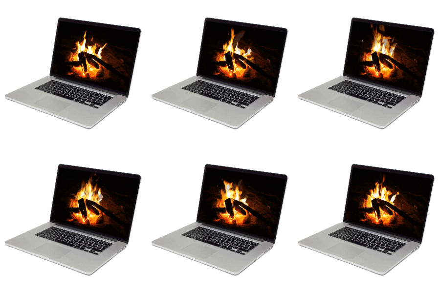
Tension
Multiples: creating tension
For this exercise, we will use the untouched Page 2 from the Unity exercise. This will become the platform for an approach to graphic design that resists the rules of the grid. Creating tension with a sense of chaos among type and images was part of the Futurist, Constructivist, and Dadaist anti-art aesthetic in the early 20th century.
The urge to stray from the rigid surface of the grid resurfaced in the latter part of the 20th Century. Designers started taking a vested interest in a more subjective interpretation of the content that they were designing. Punk, Grunge, graffiti, and Hip Hop began to infuse visual design with a street sensibility. Neville Brody’s work on Fuse Magazine and David Carson’s Ray Gun Magazine are examples that define this aesthetic.
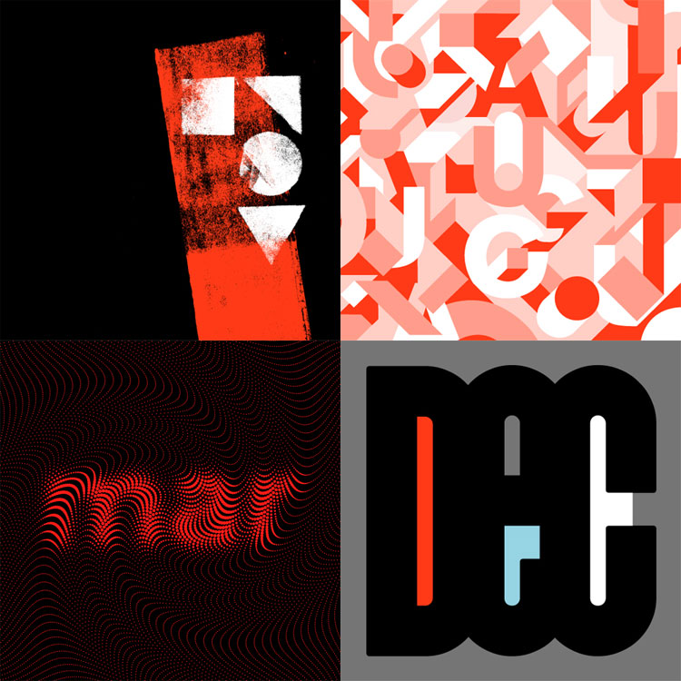
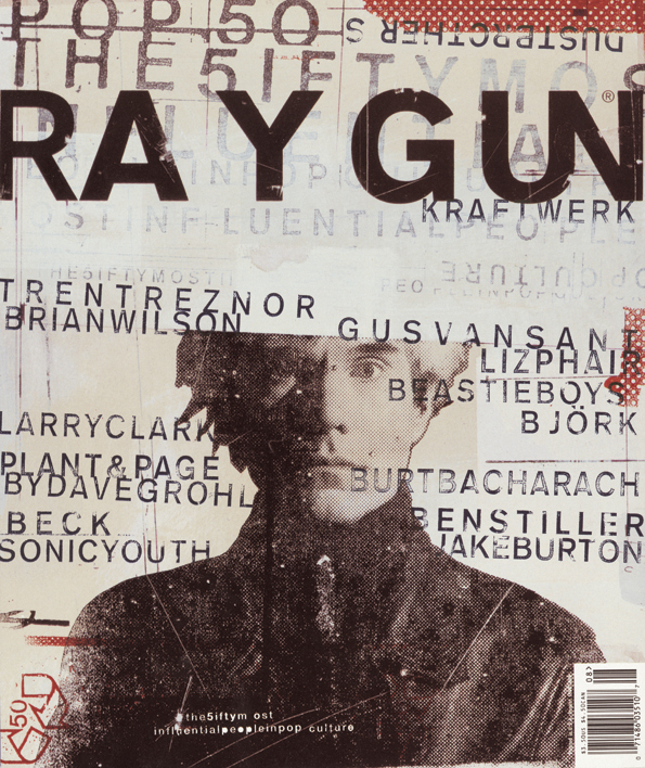
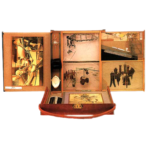
It is important to note that Brody’s and Carson’s work can feel as chaotic as a montage by Hannah Hoch or Raoul Haussmann. But the Dadaists—especially the Germans—were motivated by their passionate feelings about World War I and the Industrial Revolution. The designers in the late 20th century were responding visually to a sense of stagnation in graphic design, as computer graphics made Modernist minimalism a little too easy for anyone to achieve. Today’s Deconstruction and Neo-Expressionism are descendants of these trends toward visual tension.
Deconstruction
Carson’s work is often referred to as deconstruction in graphic design. In the Hillman-Curtis documentary short film about him, Carson says, “When I started doing magazines I just did what made sense to me. I read an article and tried to interpret it… So as we get more computerized, I think it becomes more important than ever that the work become more subjective, more personal… so that you pull from who you are as a person and put that into the work.”
Deconstruction is also a philosophical movement led by Jacques Derrida in the 1960s in which the structure of a linguistic system is revealed through a critical analysis of how it is being used. Carson’s interpretation of the essays he designed in Ray Gun attempted to expose the underlying meaning of the copy with graphic design. His method of using graphic design to reveal the hidden meanings of a text is similar to Derrida’s notion of deconstruction, albeit by using a visual methodology.
First things first: a controversy
In our exercise, we will approach a provocative text with a deconstructivist mindset. The copy we will design in response to is an essay by David Carson. Published on his website, the essay is titled first things first: the men in the mirror, recent thoughts on some old ideas. In the essay, Carson critiques the First Things First Manifesto 2000. This manifesto was an initiative of Adbusters magazine and others to renew the ideals outlined in an earlier manifesto, First Things First, created in 1964. The manifesto encourages graphic designers to take a critical position against value-neutral design and sparked a great deal of debate. Some designers, Carson among them, did not sign the manifesto. Carson’s essay revealed some of his thinking regarding why when he posted it in 2002. Originally destined for publication in Adbusters, it was never published. As Carson comments:
note: this piece was orginally [sic] submitted as requested to adbusters magazine.they refused to publish it saying:
“The point of the manifesto was not to hold up 33 shining examples to the design world, but to stimulate much-needed debate,……”
go figure-dc
— David Carson
How to approach this exercise
Our exercise encourages you to take a subjective approach to Carson’s essay. Read it!
Then come up with a design based on your subjective understanding of the text.
That means you won’t be emulating what you see below! Instead of following all the data and exact design decisions in the sample file, you’ll do something else. You’ll apply a set of required skills in InDesign to your composition and organization. In other words, you are required to include every software skill we cover in the exercise, but you are free to do so in your own way.
Required skills to demonstrate
There are 8 software skills required to demonstrate in a successful response to this exercise. We cover how to do each of these in our sample:
- Manipulate an existing Master page
- Create and manipulate layers
- Create text boxes with a variety of justifications
- Manipulate images by understanding the difference between the frame and the content
- Use Direct Selection to create non-rectangular text boxes
- Apply effects like transparency, blending modes, and drop shadows
- Create a QR Code
Along the way, remember skills you already have, such as:
- Changing fonts and character styles
- Linking text boxes
- Creating shapes
- Applying colors
- Working with InDesign menus, toolbars, and palettes.
Our sample: general conventions for faster workflow
The design approach in our sample file creates a sense of chaos, tension, and disarray. Some of the text is covered by other portions of the text. Images may obscure words. The type is set in non-rectangular columns. Nevertheless, there is a visual hierarchy, established through contrast, scale, and value.
The following global instructions will help speed up the workflow.
Font styling
When we refer to defining text stylings in this exercise, we’ll be defining the font face, style (regular, bold, etc.), point size, leading (space from baseline to baseline), and if necessary tracking (spacing among a group of letters). This can get quite wordy, so we will refer to the values in a common rubric as follows: font style size/leading tracking. So, for example, if we define the typeface
Helvetica font in Regular style at 24 points and a leading set at 28.8 points with a tracking of 200
we’ll simply say:
Helvetica Regular 24/28.8 200
Layer locking and hiding
The exercise depends heavily on complex layering that would quickly overwhelm simple Object>Arrange options like Send to Back. To ease the workflow, we’ll rely on the Layers Palette to lock objects, hide or make them visible, and allow other manipulations. Note that in the screenshots below, you will often see objects locked or hidden without this operation explicitly being mentioned in the instructions. In general, things should always be locked if you’re not working on them, and things should be hidden if helps to understand an active operation.
Effects palette
Layering means some objects will outright obscure others, so we’ll rely on the Effects Palette to provide quick access to blending modes like Multiply or Hue, as well as effects like Drop Shadow or Transparency. Effects is not a default palette, so go to Window>Effects to open it, then drag it by the top bar over the right-side palette column until you see a blue field appear. Release the palette, and it docks for quick access during your working session.
Precision versus accuracy
Unlike the Unity exercise, which relied on an easily quantifiable sense of precision and order, some of the manipulations here are intuitive and a little hard to express in terms of data. Putting it another way, you can build your file so that it is about right and accurate in terms of instructions and illustrations. Know the difference between precision and accuracy, and aim for accuracy!
With that, we’re ready to dive into tension!
Creating tension with Master pages
Recall your unity.indd file had a blank Page 2 linked to a B-Master page, which itself was generated from an A-Master. Recall also that we performed a minor manipulation of the text on B-Master—changing the color — to demonstrate that the placement of A-Master items could be modified. We’ll take that a step further in this new exercise.
Find your copy of unity.indd and save a copy, renaming it as tension.indd. Open this new file.
B-Master text manipulation
Look for the B-Master in the Pages Palette, and double-click to highlight it and present it in the viewport. You’ll see our old friend “tschichold” in 15% value for all channels in CMYK.
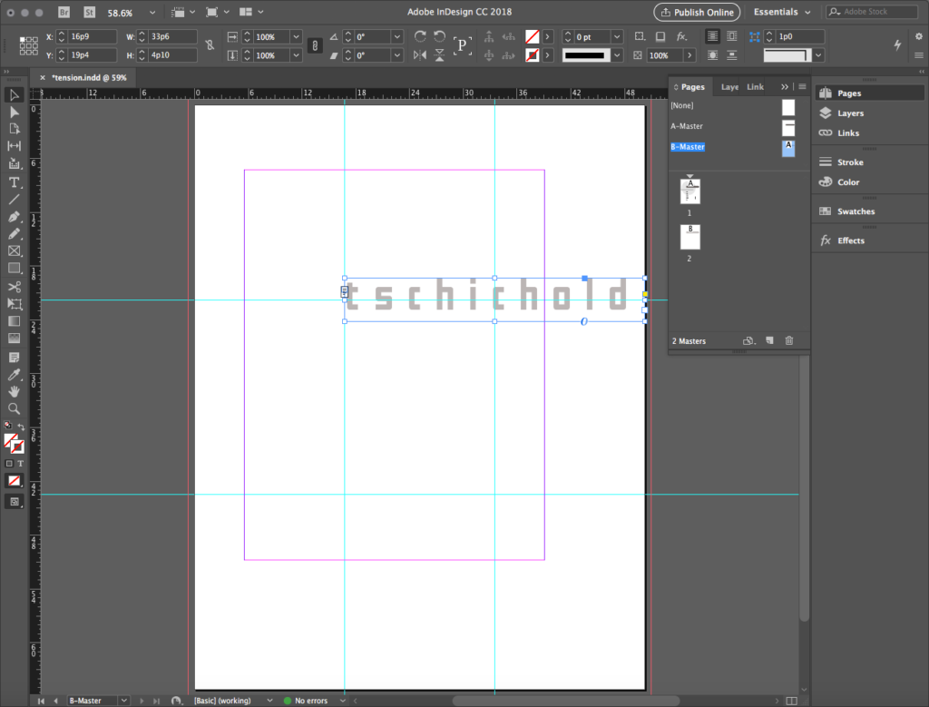
It’s possible to alter this text radically from this original placement of the A-Master text element. Select the type and change it to something that honors Carson or his essay.
In our sample this is what we do:
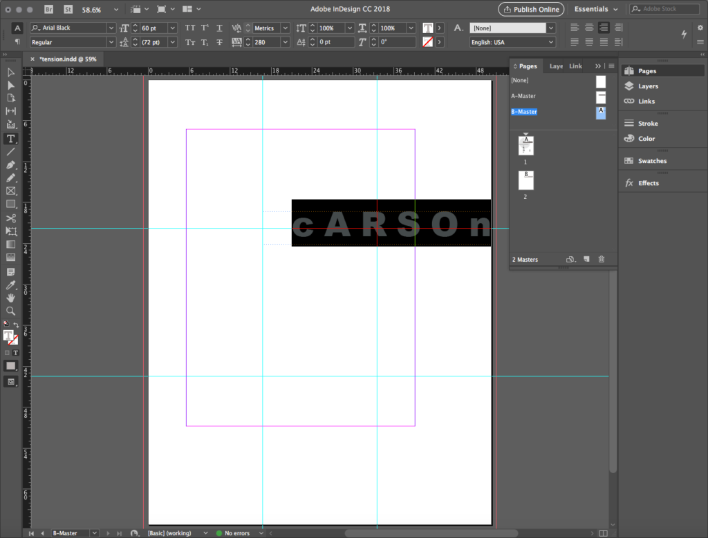
- Change the text to “cARSOn” with the “c” and “n” lowercase, all others uppercase.
- Change the font to Arial Black or a similar bold sans-serif font.
- Change the paragraph justification from left to right.
Highlight Page 2 to see the changes displayed there. Ours looks like this:
Creating tension with type
Creating type layers and boxes
We copied the text of Carson’s essay into the cloud-based text file we used for the Unity exercise. Open this document in another browser window to copy and paste from as instructed below.
Placing and styling the essay text
Create a large new text box on the Artboard outside of page one. While the cursor is blinking in the text box, go to the text file and choose the text labeled for PAGE 2- archive review layer- copy and paste text below the line, starting with “‘First Things… ” and ending with “… repeating itself.” This body text is ten paragraphs long.
Choosing and spec-ing a font
Style this text with a font of your choosing.
In our sample, we used a freeware font called Adler, designed by Carini Type Foundry in 1997, inspired by Carson’s style of digital grunge. It can be found at many free font sites. We downloaded ours from Fontspace.com. If you don’t find a font you like for this text, go ahead and install one you like in your font library. Add it to your computer using the same Font Book method you learned in the Unity exercise.
Select the contents of the essay text box and define the type. In our sample, we defined it: Adler Regular 8/9.6 (Remember our type spec convention described above!).
Creating frame breaks
When working with body type this long, it’s nearly inevitable it will break into many separate text boxes. InDesign allows a designer to not only link the text boxes but also set breaks in the boxes so the amount of text in the box does not change when the shape of the box is modified. This kind of text box is called a frame. A frame break is like a page break in Microsoft Word. You may wish to break the text into one or more boxes controlled this way.
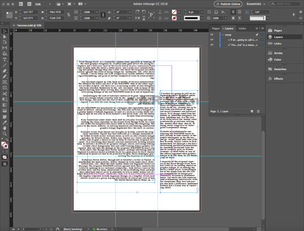
In our sample, we put the cursor at the end of the 7th paragraph, right after the phrase “should shape up…’” and click Type > Show All Menu Items > Insert Break Character > Frame Break. The frame ends at the end of this word. Use the Selection Tool to click on the red plus sign at the right edge of the frame, the cursor is loaded with the rest of the body copy. Draw a new text box, and the remaining 3 paragraphs will occupy this. Be sure to not modify any of the text as it will cause the text in the following frames to move.
Columns and justification
Move and resize the two frames so that they are organized into approximate columns, something similar to the illustration below. In our sample, we create two columns, one larger and one smaller. In our larger frame at left, we set the paragraph justification to Right Justify and keep the justification set to Left Justify for the smaller frame. If you want to set this for your exercise, Justification icons are found to the far right of the Options Palette when text is active.
Placing and styling featured text
As mentioned, layers will help keep work organized and accessible, so we’ll start to develop the layer structure for the next set of text frames. Thus far, all operations have occurred on Layer 1. Open the Layers Palette and change the name of Layer 1 to essay. Turn this layer off, by clicking the eyeball icon next to the layer name just as you do in Illustrator. You can also lock the layer in the same way Illustrator functions.
Create a new layer — again, similar to the method in Illustrator — and rename it archive review.
With this layer active, create a new text box. Go to the cloud-based text file and find the material under PAGE 2- archive review layer- copy and paste text below the line, select it, starting with the word “archive” and concluding with the phrase “go figure-dc” and copy it. Back in the new text box, paste the text.
Split the text into two linked text frames after the phrase “david carson usa” and move the first half to the top of the page, the second half toward the bottom.
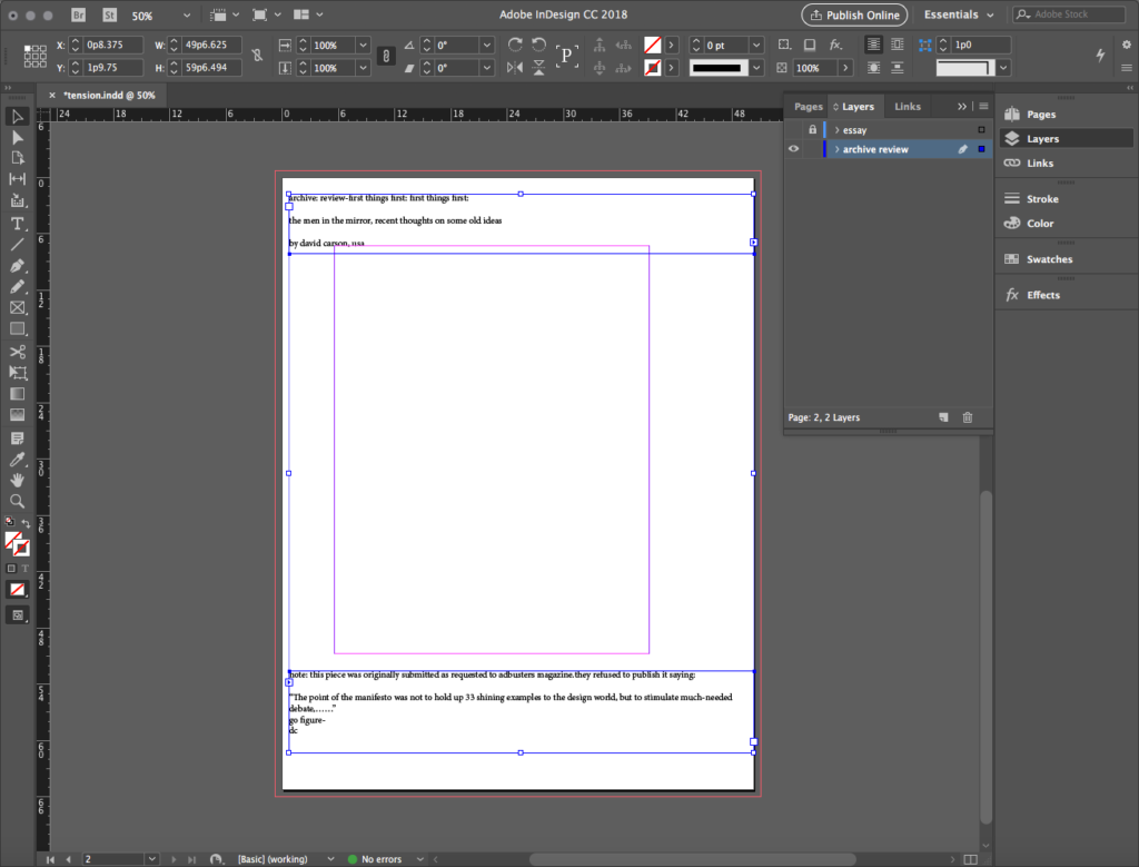
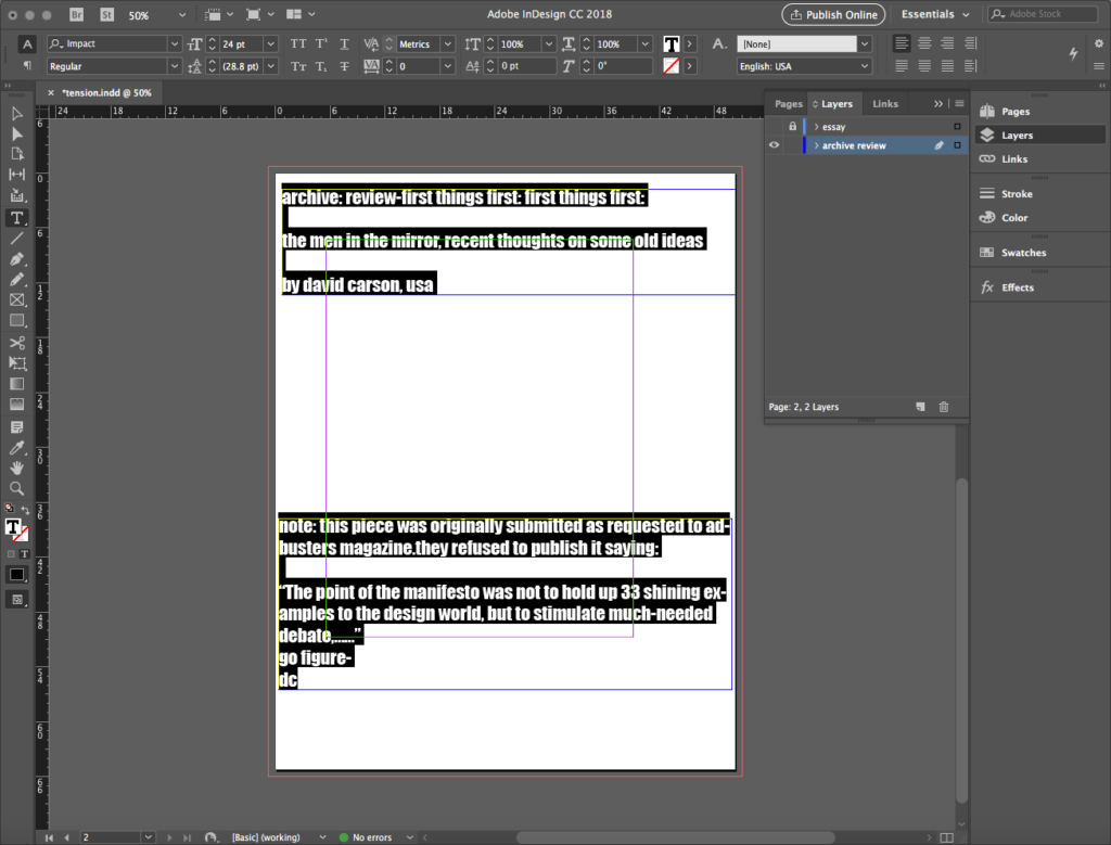
Style this text as you wish, but use a font that gives the feature text a hierarchic emphasis.
In our sample, we use Impact Regular 24/28.8 and we place the text boxes approximately as seen below.
Creating tension with images
Creating image layers and frames
There are two images in the folder you unzipped from your download. You may use these, or you can search for and use your own images. If you find your own, make sure they are similar in size and resolution to our samples.

light-tan-grunge-texture/

http://photogabi.com/free-friday-
stenciled-numbers-on-asphalt-textures/
Create a new layer for a texture background image and give it a name.
In our sample we name it grunge 2 and move it to the bottom of the list in the Layers Palette, because it will be a background. Then we place grunge-texture.jpg in this layer.
Understanding image frame and content
When you place an image in InDesign, you can manipulate it in two ways. This can be confusing if you are used to manipulating placed images in Illustrator.
- By default, the first manipulator is the frame. It functions like a clipping mask in Illustrator. The frame, expressed with borders and anchors that match the layer color, can crop the image contained within it.
- The second manipulator is the content, the image object itself. To access the content, look for the double circle at the center of the image, and click on the inner circle. The content, expressed with borders and anchors that are a complementary color to the layer color, can now be resized or moved or rotated within the frame.
- Once you’re done with the content, return to the frame by deselecting and reselecting. With the frame active, you can do one of two things:
- Crop the content. To do this, grab a handle and drag it to hide a portion of the image.
- Resize the frame so it doesn’t interfere with other objects in the file. To do this, right-click on the selected frame, and in the dropout menu select Fitting>Fit Frame to Content.
Now that we understand the role of fame and content, you may rotate, scale, and position the image as you wish.
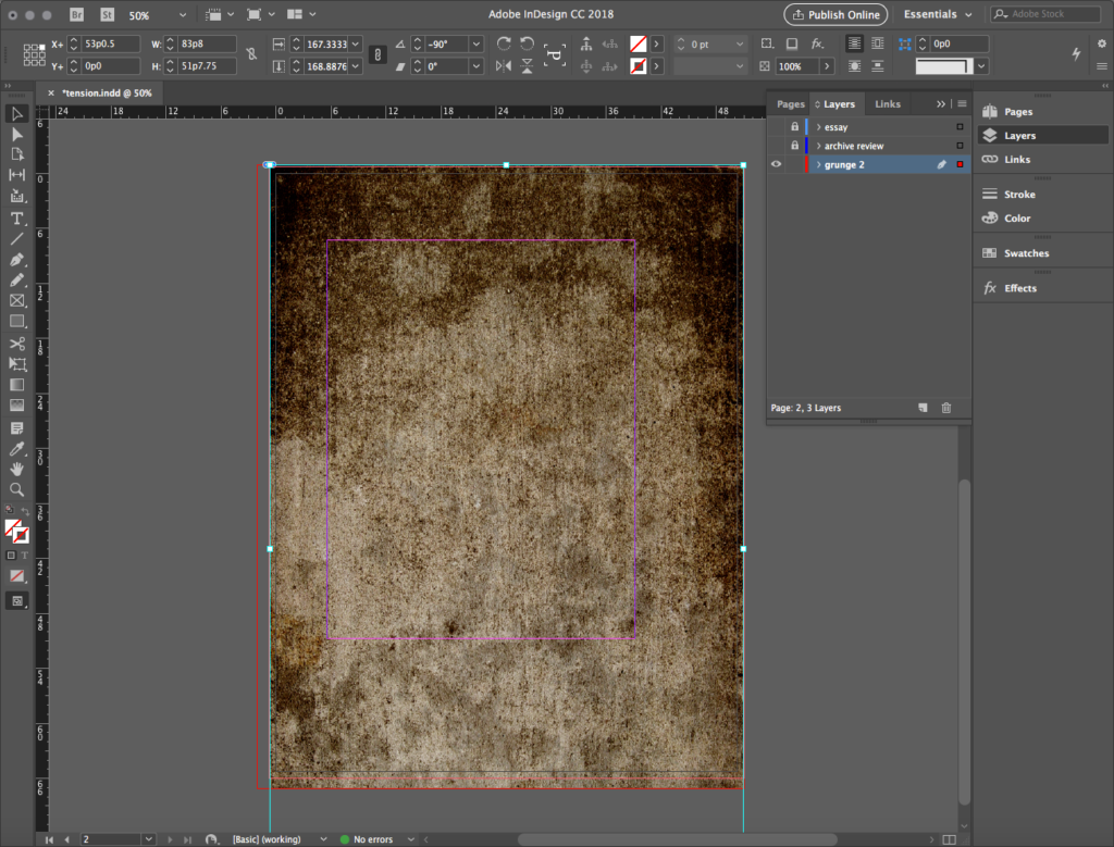
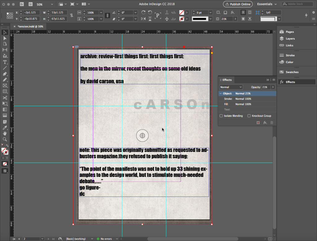
In our sample, to fill the page size, we make sure to overlap the edge for bleed. To reduce the contrast, we set the Opacity for this element to around 20%.
Creating a second layer and image
Create another new layer, name it grunge 1 (because it will be in the foreground), and move this layer below essay but above archive review. Place an image on this layer.
In our sample, we place grunge_1.jpg. We move the image so the top of the “1” lies adjacent to “cARSOn” and approximately centers on the left-hand Rule of Thirds grid. We want the whole “1” to be visible in the frame and on the page, as seen below.

With the Free Transform Tool, we finish up by rotating the image about 2 degrees counterclockwise.
Using a Hue Blending mode
You might start to notice conflict in your file layering. In our sample, we sure did!
One way to solve that is by moving layers. But just like Photoshop, we have access to blending modes that allow information in lower layers to interact with the information above.
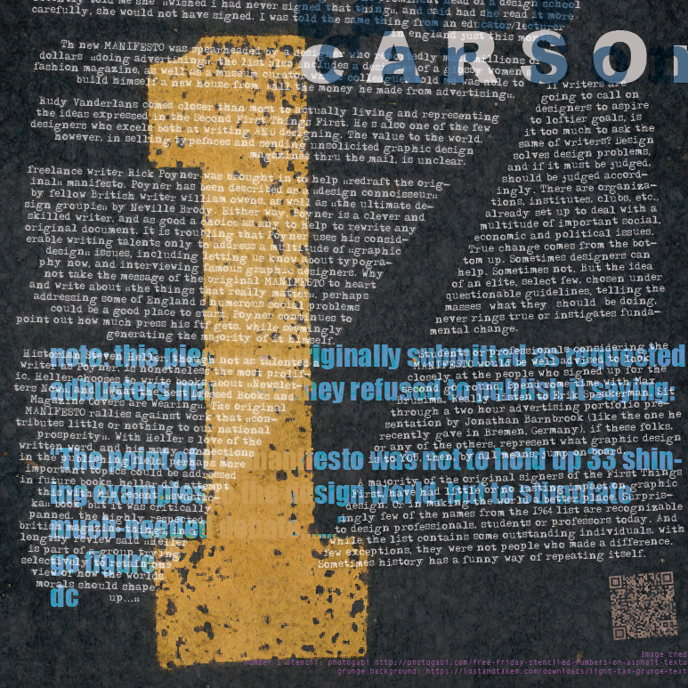
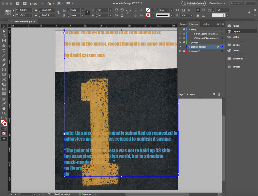
In our sample, notice the image completely obscures the bottom text frame for the archive review layer. So, we apply a Hue blending mode to the image in Effects, and the hidden text appears! We lock the grunge 1 layer, keep the essay layer locked and hidden, and select all the text in the remaining visible frames. With the text selected, we use the Eyedropper Tool to capture the yellowish “1” color and apply it to the text.
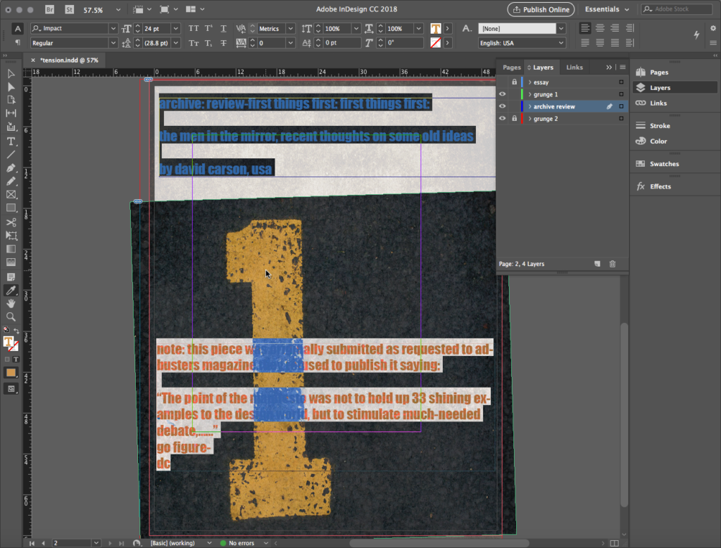
We deselect the text and note the interesting effect the blending mode has on this operation. The text behind the layer turns bluish at the asphalt, and yellowish where it intersects the “1” in the image.
As a finishing touch in our sample, we move and scale the layer frames to compose as seen here:
Creating tension with effects and manipulations
In this section, we cover several techniques that may — or may NOT — work with your version of the exercise. Read them over, and decide if any or all or none of them are appropriate for your version of this exercise.
Manipulate text box anchors for non-rectangular shape
Our next job is to manipulate the text boxes on the essay layer, so turn this on and unlock it. For clarity, turn off and lock the archive review layer.
Your first job will be to change the color of the text in response to the colors and values of the image underlays.
In our sample, we change the color from black to white. We select all the text and use the Color Picker as we do with other Adobe applications to generate white text.
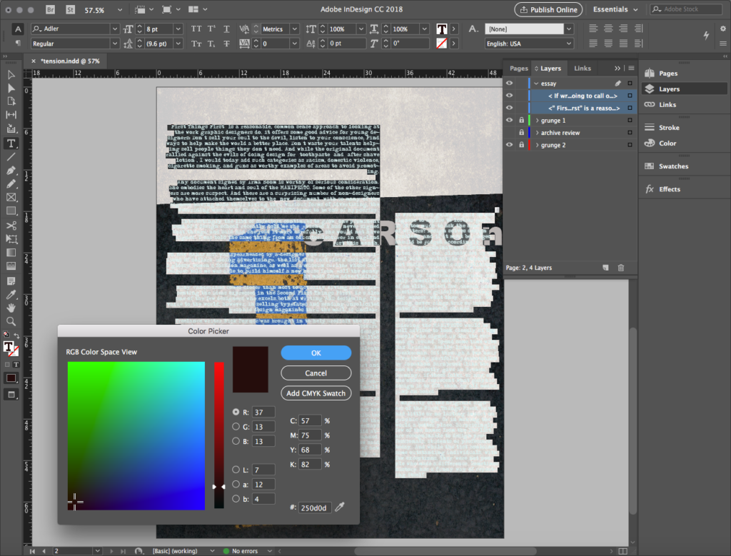
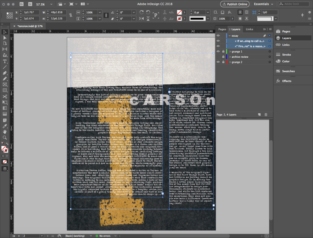
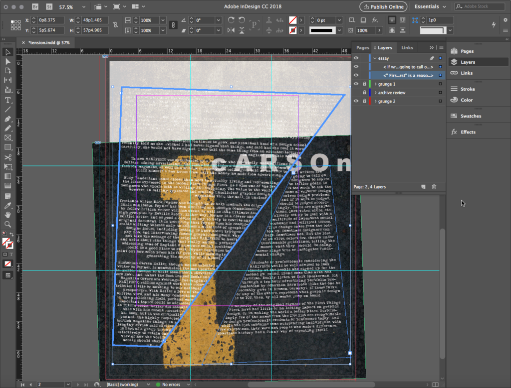
Text boxes don’t have to be rectangular! To create dynamic trapezoids or other more complex, non-orthogonal shapes, use the Direct Selection Tool on the corner anchor points of a text box.
This manipulation is highly intuitive, and does not have to be precise (although the data is available in the sample file if you want to know the precise location of each anchor point — but that’s not the point here!).
In our sample, the first visual goal is to take the base anchor points of each justified edge to roughly coincide or intersect with the interior corner between the serif and the upright stroke of the “1” in the image.
The second visual goal is to have the two justified edges taper toward each other toward the upper right, nearly intersecting each other at the “S” in the “cARSOn” text.
The overall effect is an odd, perspective-like negative shape, almost alluding to a long shadow cast by the “1” in the image.
So we use Direct Select, move, and rotate manipulations to create the conditions you see illustrated below, making sure that all the text is visible.
Manipulate text legibility
Don’t mistake legibility for communication.
— David Carson
This quote may be a good summary of Carson’s entire design philosophy. He even once infamously typeset a Ray Gun magazine interview with singer Bryan Ferry using Zapf Dingbats font! What do you think his opinion of Ferry is with a punk choice like that?? Let’s lean into this.
There are places where this page will toy with legibility. By now, you probably already see instances of that in your file.
We certainly see it in our sample! The white font on the light background in the top quarter of the page is one of those places. To keep this white-on-white schema but not lose legibility altogether — we just want to make the reader work a bit more — we’ll apply an effect below. This is a fairly common technique and one you’ll want to look for an opportunity to use.
Creating a Drop Shadow Effect
In our sample, this is the workflow we used for a drop shadow. First, we turn the archive review layer back on, but keep it locked.
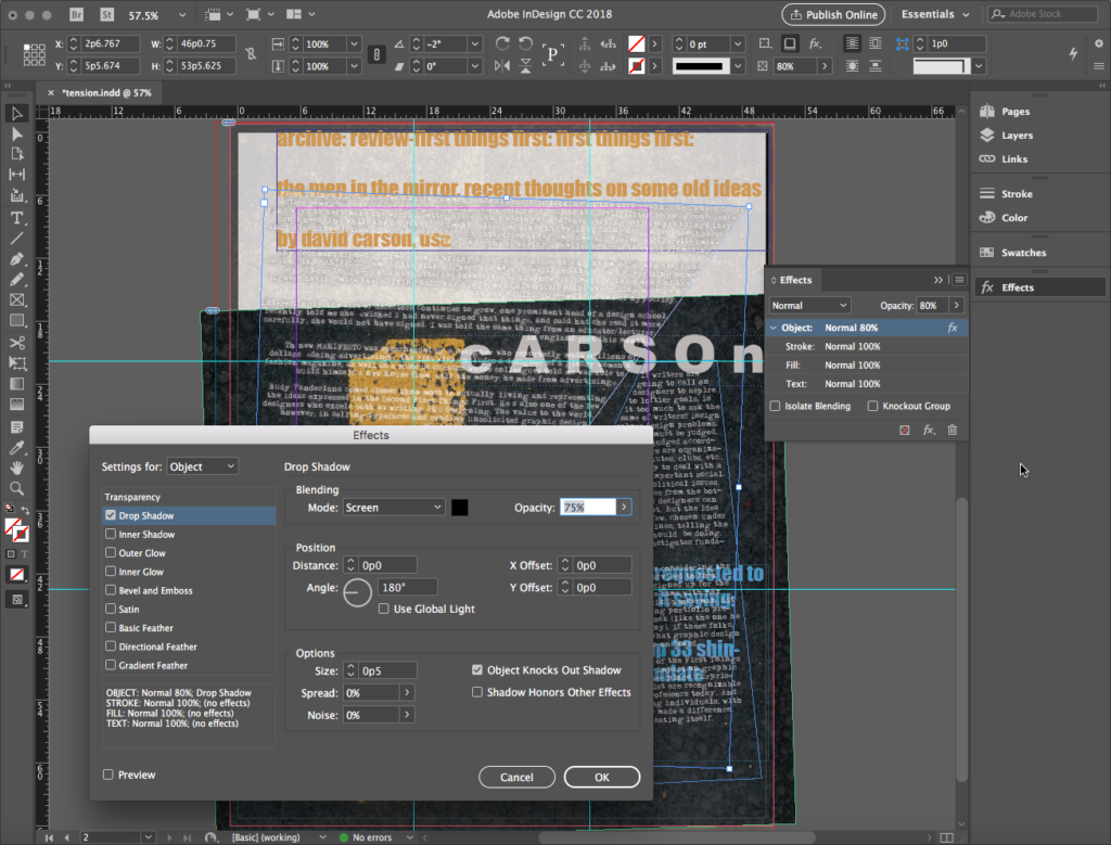
With the essay layer text boxes selected, we enter the Effects Palette and change Transparency to 80%. This seems incredibly counterintuitive, but wait…
While still in Effects, we click on the dropout menu at the upper right-hand corner of the palette and select Effects > Drop Shadow from the options. In the dialog that opens, we set the Blending Mode for Screen and set the Position Distance, X Offset, and Y Offset all to 0p0. Again, very counterintuitive, but…
The net effect of this manipulation is to create a subtle, shadowy anti-glow around the letters, to help them stand out just a bit. The effect is subtle enough that it’s visible in the light ground areas, but not visible at all in the dark ground asphalt image areas!
Making a “double exposure” technique
In your file, you might wish to play around with featured text as well as body text. We did so in our sample.
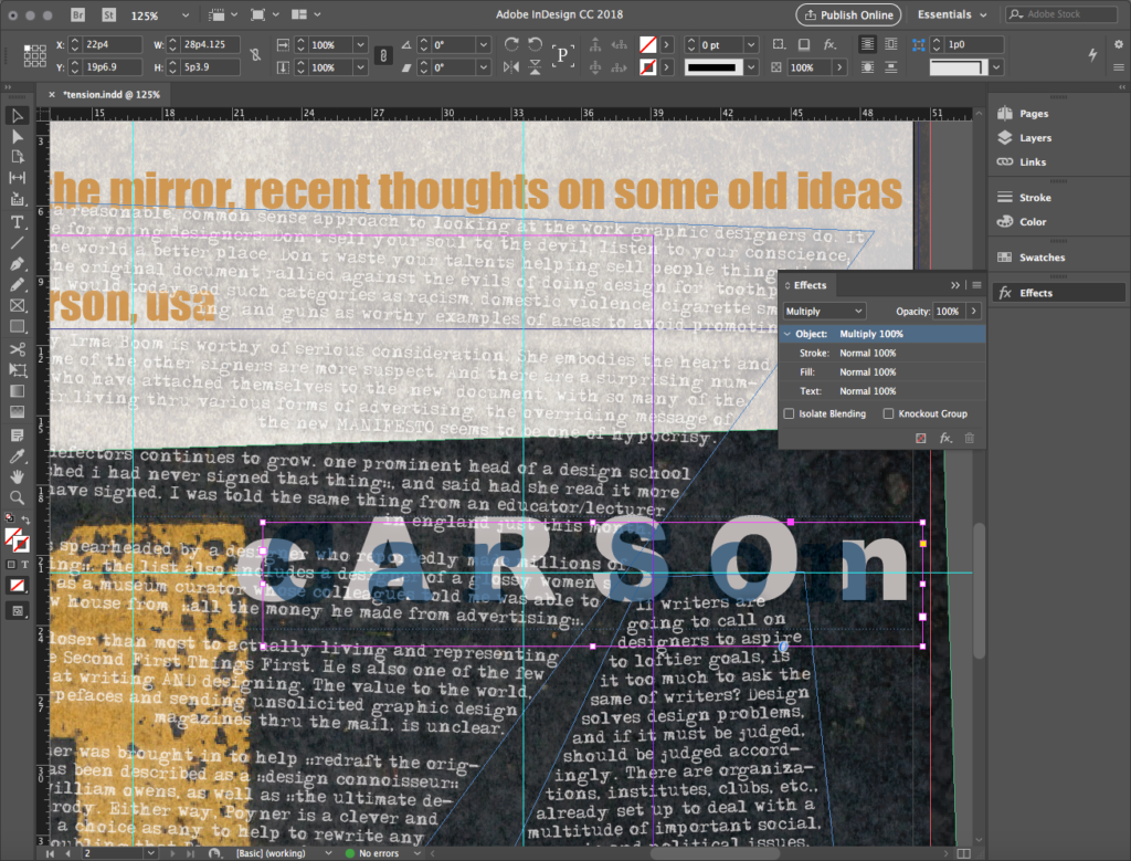
First, we want to toy with the legibility around the “cARSOn” text brought in by the master layer. We can overlay text boxes and apply colors and blending modes that create interesting effects with the essay author’s name as a featured text element.
So we create a new layer, rename it david carson, and place it at the very top of the Layers Palette list. We make all other layers visible and lock them.
Next, we create a new text box and enter the text “Car Son” with a space between “Car” and “Son”… an interesting visual pun. We style the text American Typewriter Bold 60/72 240.
With the text selected, we use the Eyedropper Tool to apply the bluish color at the archive review Impact-styled text under the asphalt image. We move the text box so it obscures the “cARSOn” text.
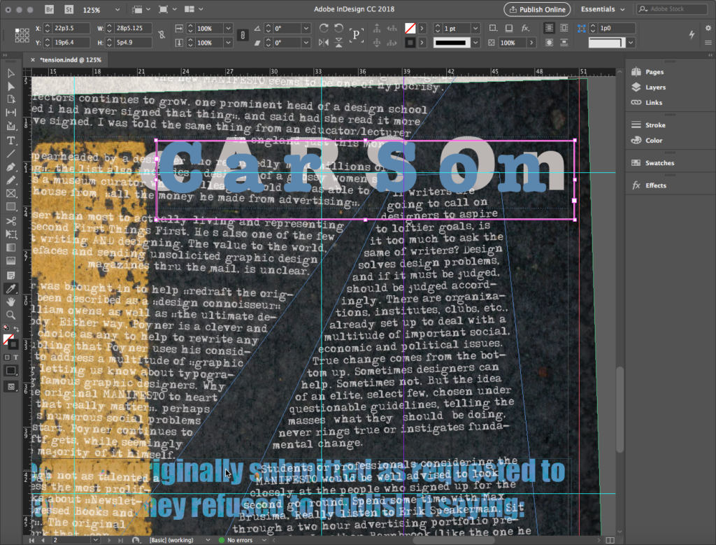
Finally, with the text box still active, we enter Effects and apply a Multiply blending mode. Hello, double exposure!
Drawing with type using Create Outlines
Remember the drawing with type technique we learned in Illustrator or our second project? We can do that in InDesign, too!
In our sample, we stay in david carson the layer, and create another text box. We enter the text “baVID” with a b suggesting a backward “d” and the last three letters in uppercase. We apply the same styling and color used for “Car Son.”
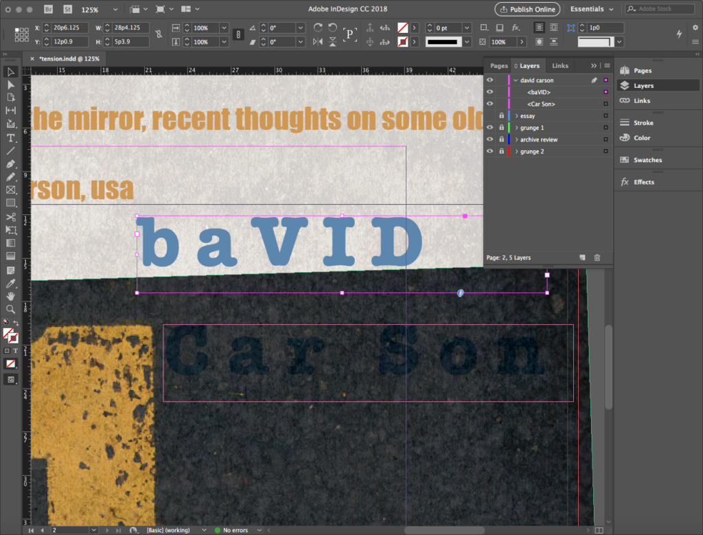
With this selected, we go to Menu and select Text > Create Outlines, a process familiar in Illustrator. This converts the type to editable geometry.
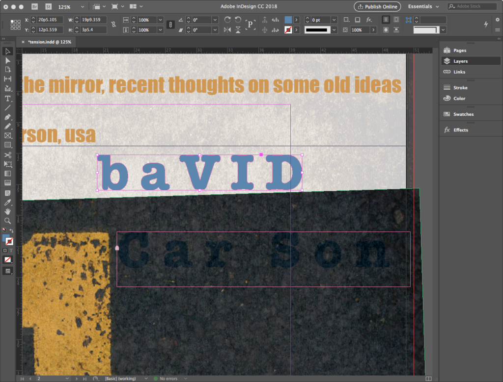
In typography, any area entirely enclosed in a letterform or symbol is known as a counter. The “b,” “a,” and “D” in our text all contain counters. Using the Direct Selection Tool, we select the anchor points for the counters and delete them. The net effect of this manipulation is to create a bold figure out of each of these forms. The counter-less “b” is illustrated below — but we eventually do all countered letters.
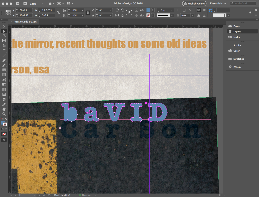
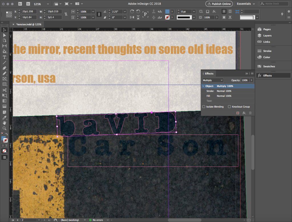
Our final manipulations here will be to rotate the element about 2 degrees, align it with the top of the asphalt and the “1” in the image, and apply a Multiply blending mode in Effects. Below, we’ve turned off the essay layer temporarily to see our work.
It’s a wrap!
We’re back to some mandatory moves in this final section. Two more items will go into david carson layer to finish up the exercise, then we can output it as a PDF.
Image credits
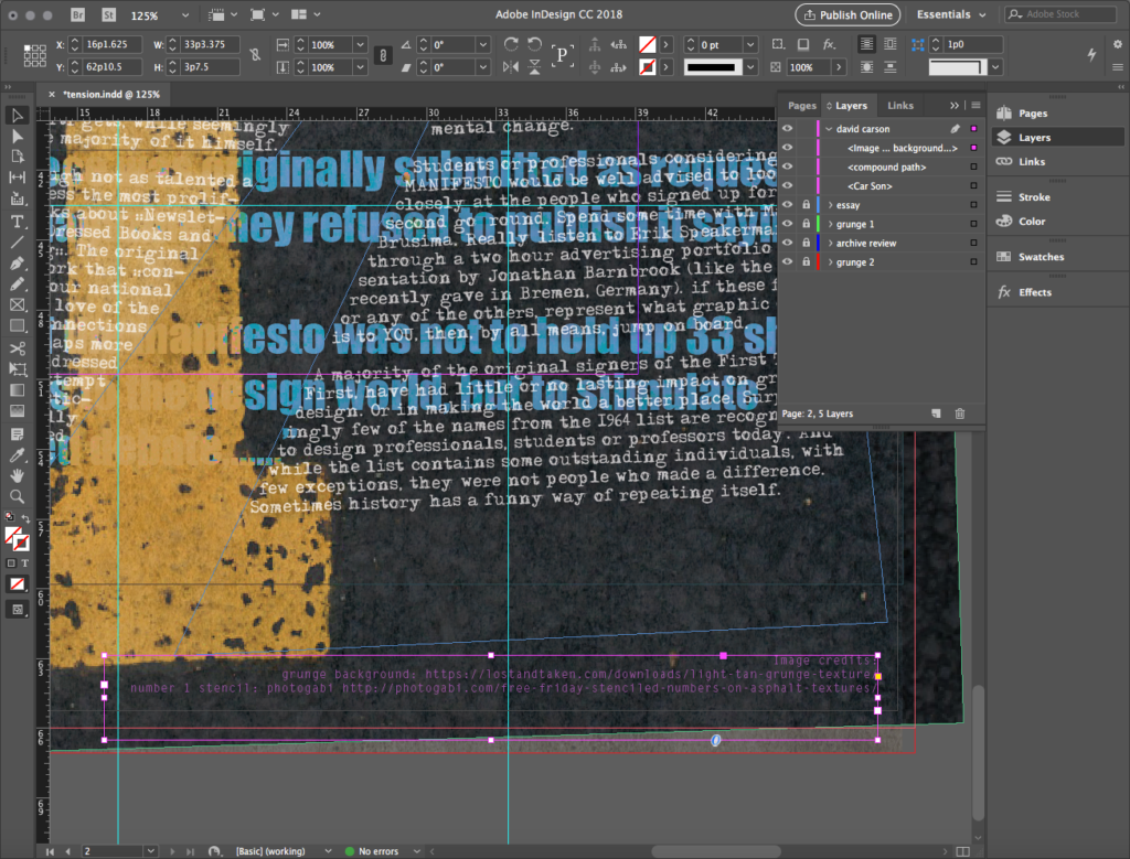
Always credit illustrations or photos used in any work. Here, create a text box near the bottom right corner of the page, then copy and paste the information from the cloud-based text file found under PAGE 2 – image credits.
In our sample, we styled the text Letter Gothic Standard Medium 6/7.2 50, with CMYK values 47/82/0/0, and a paragraph right justify.
Creating a QR code
InDesign supports the internal creation of a QR code that can be scanned with a mobile device to access websites and other goodies. Find this in the Menu at Object > Generate QR Code…
In the dialog that opens, select Type: Web Hyperlink, then copy the URL for David’s essay
http://www.davidcarsondesign.com/t/2002/05/19/first-things-first/
and paste it into the URL field. Finally, choose a Color and hit OK. In our sample, we selected white in response to our use of a background image.
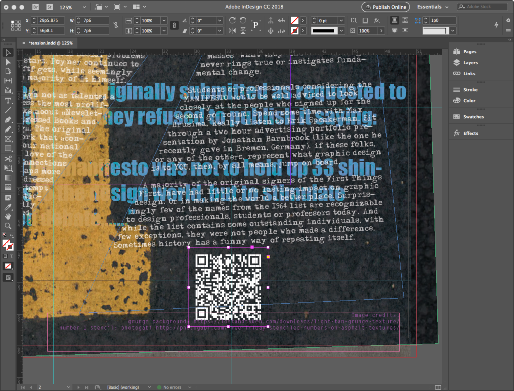
Scale and place the code in response to your design.
In our sample, we place it above the image credits and below the last line of the essay, applying a slight rotation.
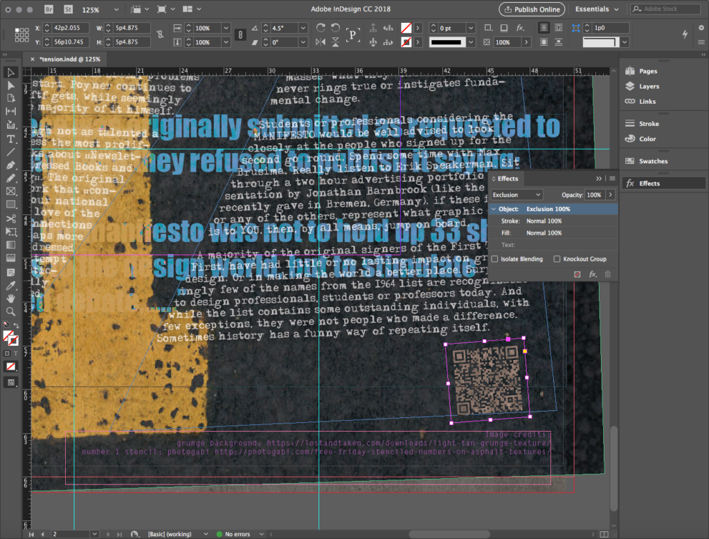
The white is rather stark. QR code scanners use contrast to read these two-dimensional bar codes, but the codes are quite redundant and can withstand some manipulation. To make it interesting, we apply an Exclusion blending mode under Effects. But CAUTION: ALWAYS test the scan to make sure it still has enough contrast for a mobile device scanner to read it.
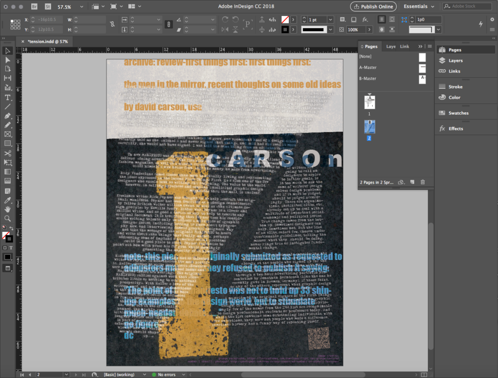
The file design is done! OUR Page 2 appears like this in the full viewport:
Sharing the file: PDF
It is important to always save a file as you are working on it. The InDesign file, designated by the file extension .indd, is the native file. A .pdf file is most commonly used for sharing a document to view or proof and it can also be used for printing. When a .indd file is exported as a .pdf file, the graphics and fonts are embedded in the document, making it a portable package that is easy to share with others. While printers can print .indd files, we often suggest sending a .pdf file to your printer to avoid common problems such as:
- the service bureau does not have InDesign (or maybe not the version of the application you used)
- the service bureau does not have the fonts you used in your layout
- links to externally referenced objects such as fonts and images can easily be broken by sending the native file without the project folder containing all that stuff.
Sending a PDF file is more efficient—you only have to send one file containing the whole package.
Save the native file
Save the InDesign file by choosing File>Save As. Specify a name and location for the file and then click the Save button. The .indd file should land in your project folder.
Export the PDF
Now we’ll export a copy of the file as a .pdf file for sharing, viewing, or printing purposes. Choose File>Export. In the Export dialog box, choose Adobe PDF (Print) from the Format pull-down menu. Specify a name and location for the file and click the Save button.
In the Export Adobe PDF dialog, there are many categories in the menu at left:
- In the General category, notice the Pages area, which contains three choices: All, Range, and Spreads. For this exercise, leave the All option selected so that all the pages are exported. Leave the Spreads option deselected since we did not design the layout with facing pages.
- In the Marks and Bleeds category, observe the different options under Marks, which you select or not depending on the goal of your output. To send to a client, leave alone. To send to a service bureau for printing and trimming, you’ll choose several. For this exercise, because we have a bleed on both pages, select Crop Marks. Under Bleed and Slug, since we have a bleed setting defined, check Use Document Bleed Settings. Otherwise, you can define a Bleed: value of 0p9 for all four options.
Notice the Compatibility pull-down menu at the top right corner. If you know that the person you are sharing this PDF with has an older version of Acrobat, or if you need to comply with specifications from a commercial printer, choose an option from this pull-down menu to format the PDF document for a particular Acrobat version. For now, just be aware of this.
Click the Export button. When the process is complete, open the file in Acrobat or Preview. You can view the file and see the bleed with crop marks.
Make images to share
Lastly, do one final Export to .jpg or .png to create an image of each page, the Unity page, AND the Tension page, to post to your blog or process journal.
Credits
For portions of these sections:
- Multiples: creating tension
- It’s a wrap!
Contents have been adapted from Digital Foundations by xtine burrough and Michael Mandiberg, modified by williamCromar. Please see the newMediaWiki licensingNotes regarding Digital Foundations derivatives, which are governed by a Creative Commons Attribution-NonCommercial-ShareAlike 3.0 Unported license.
