Cloning
We found Amelia Earhart!
This exercise introduces you to Photoshop’s powerful image cloning abilities.
For this exploration you will need two images:
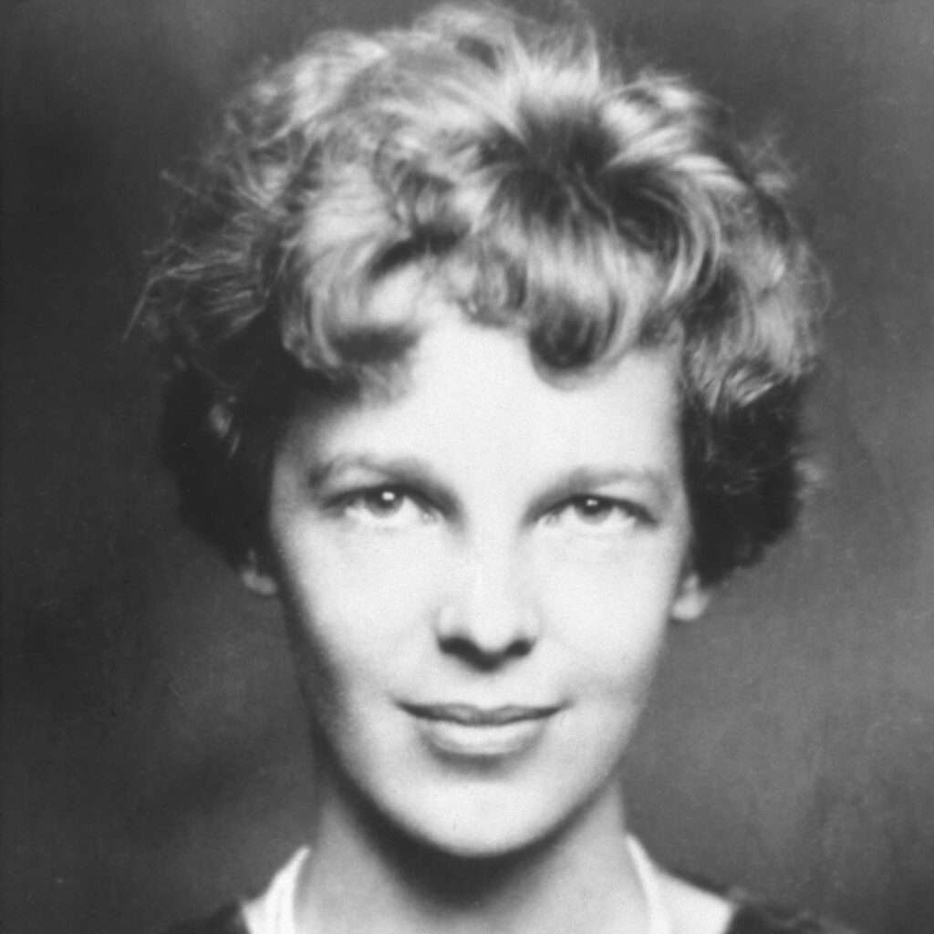
- A photograph of aviation pioneer Amelia Earhart, and…
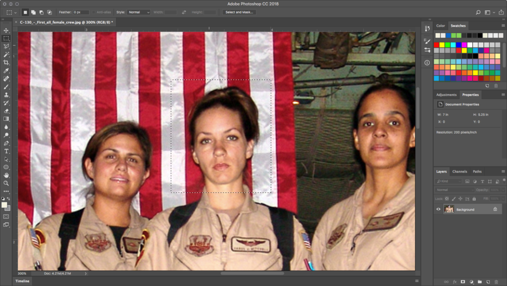
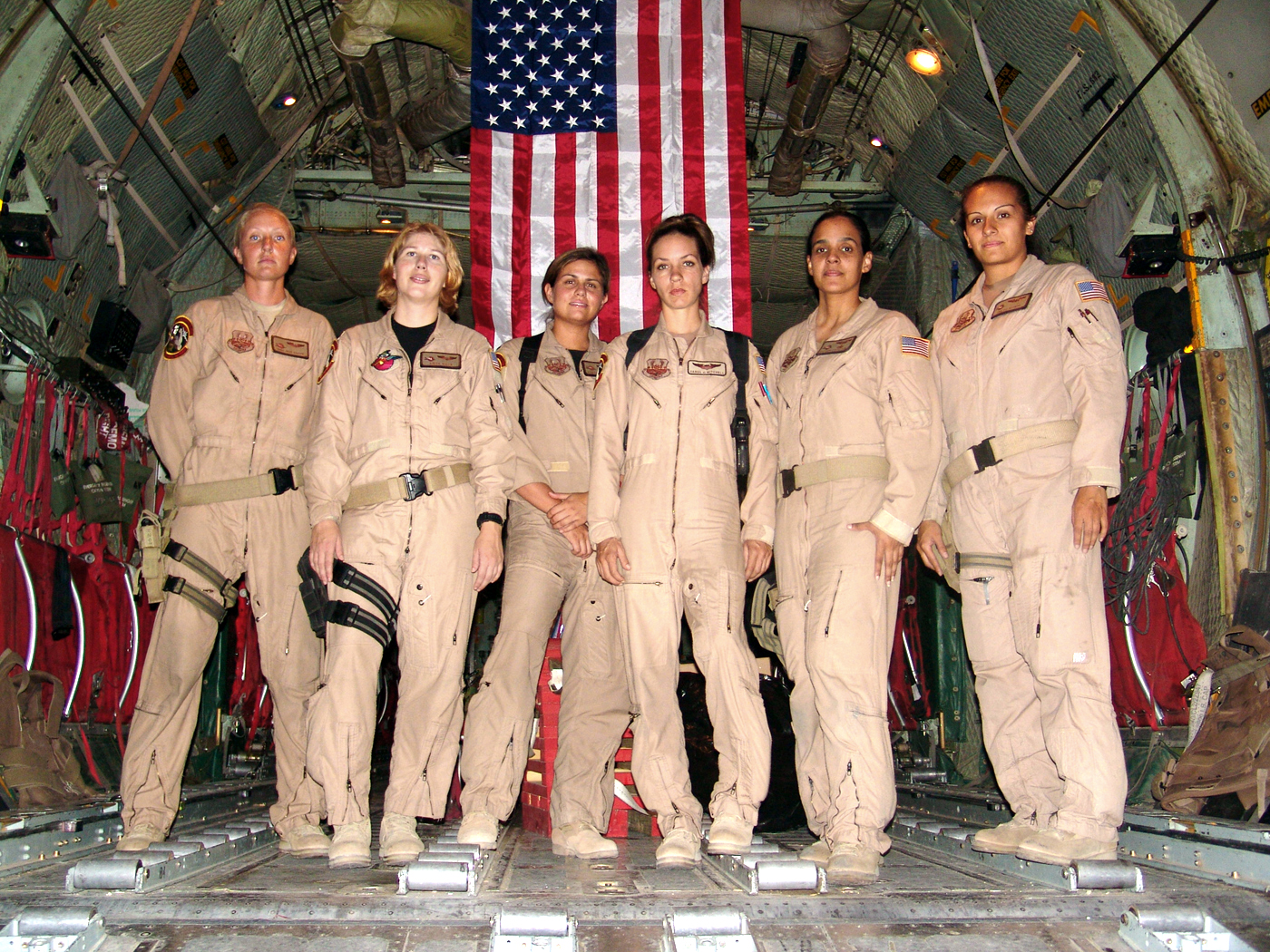
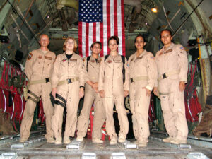
- A photograph of the first all-female US Air Force flight crew.
Downloads are available at the link above.
Varieties of visual commentary
Digital tools empower culture producers to create visual commentary using graphic content both on and off of the screen. Media makers can change the appearance of virtually anything with tools such as copy, paste, mask, and clone. So the question is: given the opportunity to change any image, message, or text, where would you begin?
Subversion
Your answer depends upon your interests but often emerges from social forces like political tension. In other words, an oppressed group can reclaim messages of a dominant paradigm. This can be done by altering the symbolism embedded in words or images in the physical and/or digital world. These messages might appear in museums, on city streets, or in cyberspace. The “subversive” part of the message-making is the manner in which the aesthetics of the altered media rely upon the viewer’s visual and intellectual understanding of the dominant culture prior to the subversive media confrontation. The Billboard Liberation Front and The Anti-Advertising Agency create work that illustrates this idea.
The Billboard Liberation Front is a group of San Franciscan message-makers who aim to repurpose and “improve” billboard messages by painting or pasting them on top of preexisting billboards. The group began their mission in 1977 and has grown into a worldwide phenomenon by collecting images on the web. From The Billboard Liberation Front Manifesto:
“And so we see, the Ad defines our world, creating both the focus on “image” and the culture of consumption that ultimately attract and inspire all individuals desirous of communicating to their fellow man in a profound fashion. It is clear that He who controls the Ad speaks with the voice of our Age.”
Read the entire manifesto at The BLF Manifesto
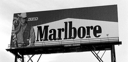
In No Logo, Naomi Klein illustrates how advertisers are utilizing methods common to contemporary artists to create brand awareness. She writes:
“Pepsi’s on-going threat to project its logo onto the moon’s surface hasn’t yet materialized, but Mattel did paint an entire street in Salford, England, ‘a shriekingly bright bubblegum hue’ of pink – houses, porches, trees, road, sidewalk, dogs, and cars were all accessories in the televised celebrations of Barbie Pink Month. Barbie is but one small part of the ballooning $30 billion ‘experiential communication’ industry, the phrase now used to encompass the staging of such branded pieces of corporate performance art and other ‘happenings.’”
— Naomi Klein
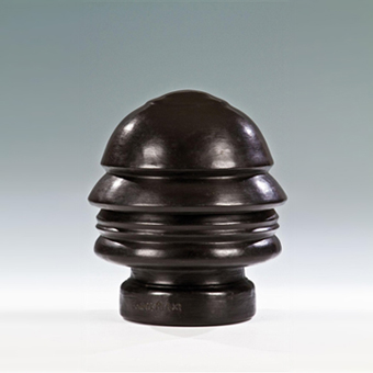
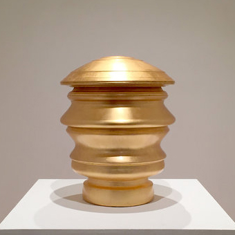
Despite this co-opt, satire and parody are still potent artistic devices in an era of political uncertainty. In 2016, williamCromar created continuous profile (head of drumpf) as a satirical commentary on a contemporaneous figure’s authoritarian communication (and later, governing) style. The work was a conceptual “clone” of a famous work by Italian Futurist sculptor Renato Bertelli, the Continuous Profile (Head of Mussolini). Unlike the head of drumpf, which was a subversion, Bertelli’s portrait of Mussolini was an honorific commemoration of the Italian Fascist dictator, whom the Futurists adored.
Commemoration
So we can see that subversion is just one way to use visual commentary! Our motivation in this exercise will not be satirical. Rather, we will create a celebratory commemoration, not of a dictator, but of someone we think is deserving of a tribute. As a young woman, legendary aviation pioneer Amelia Earhart attended The Ogontz School, which later became the campus of the school where I teach studios. To honor her legacy, we will create an image using cloning. By placing her face among the first all-female flight crew in the US Air Force, we can imply a spiritual lineage between these women and the trailblazing Amelia.
Using the Clone Stamp Tool
In this exercise, we will use two images in the public domain.
The first all-female crew can be downloaded at the link above or from Wikimedia Commons at this link.
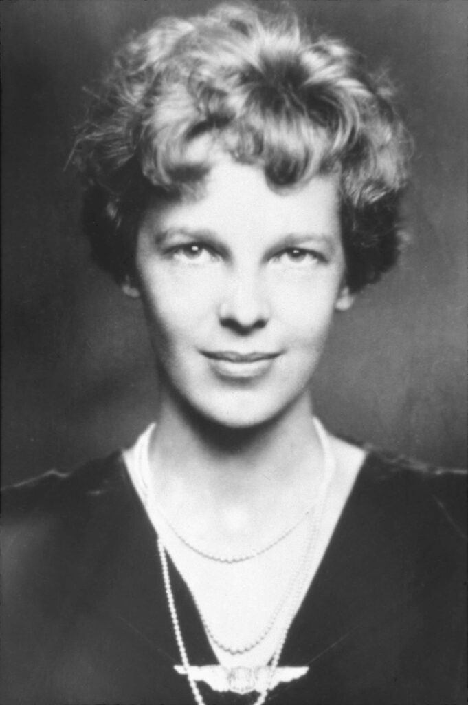
A historic image of Amelia Earhart can also be downloaded at the link above or from Wikimedia Commons at this link.
Copy the background pattern
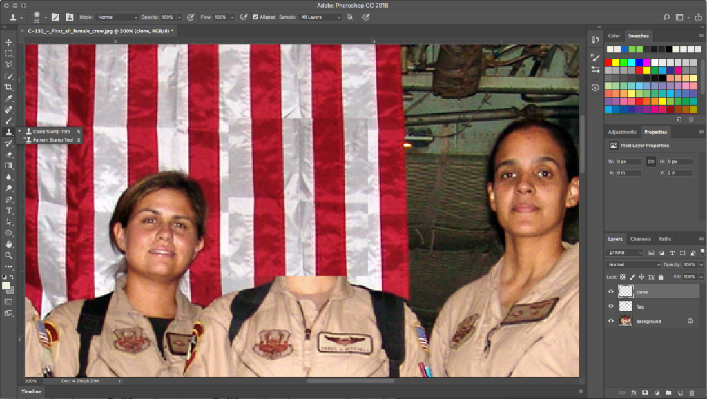
Open the file C-130_-_First_all_female_crew.jpg in Photoshop. Zoom in on the central figure, the commander of the crew. We will start by replacing her head with a sample of the flag from the background. To size the selection correctly, create a rectangular selection around her head with the Rectangular Marquee Tool.
As long as any selection tool is active (and, more specifically, when the Move Tool is not active), when you place the cursor inside the selected area the tool changes into a white arrow with a small rectangular selection icon. Click and drag the rectangular selection straight above the figure’s head—notice you are only moving the selection. No part of the image is moving.
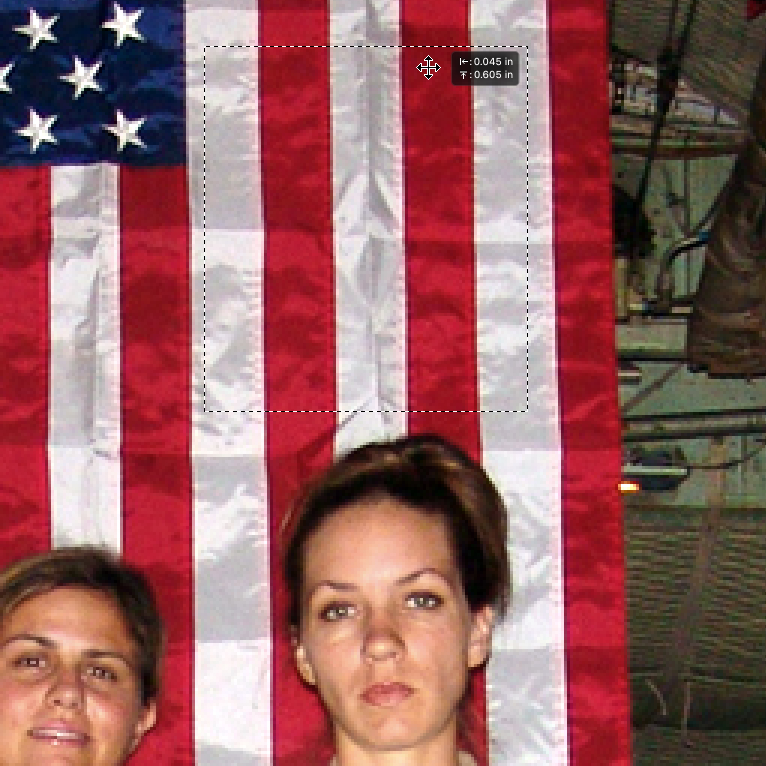
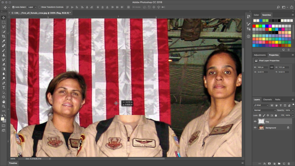
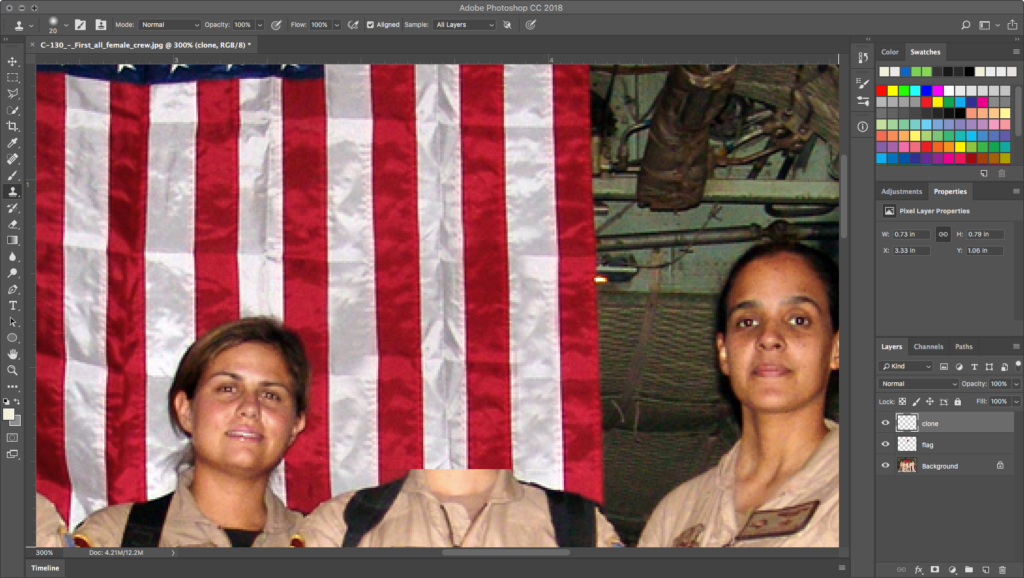
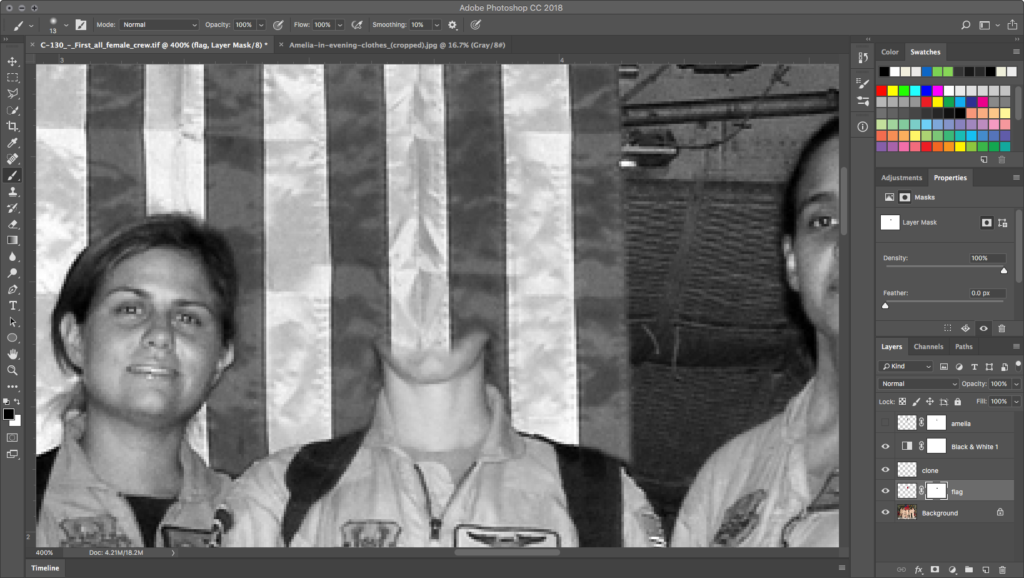
Copy the flag from the background layer and paste it. Edit > Copy followed by Edit > Paste will create a new layer. Name the new layer flag. Move the new element down so that the sample of the flag covers the face and some of the neck. Align the stripe edges as best you can. Notice, however, that there is still a distinct rectangle for the copy.
Hello Clone Stamp Tool
Create a new layer called clone, to avoid cloning operations that destroy pixel information in an existing layer. Notice the Clone Stamp Tool in the Toolbar.
The Clone Stamp Tool is used to replace small areas of a layer with a sample of an image and is applied with a brush that can vary in size and edge quality. Using a soft brush will make the cloned sample appear to blend into the original image, even though we do all of our cloning on a new layer. Be careful with your application of the Clone Stamp Tool, since the soft brush creates a little bit of a blur on the image, and clicking with the soft brush repeatedly will result in a blurry area in your image. The purpose of cloning here is to create an undetectable image transformation. Creating a blurry area on the image will draw attention to that area. To achieve the transformation, the clone must be made in such a way that the viewer is unaware of the manipulation.
Pick up the Clone Stamp Tool from the Tool Palette. In the Options Palette, set the brush to about 20 pixels. Check the Align button and make sure that Sample All Layers is selected from the pulldown menu.
Set the sample origin
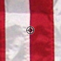
The Clone Tool has a fairly unique two-part operation: 1) setting a sample origin and 2) applying the sample to the target in another part of the file. A good strategy is to find a sample origin at an edge or visual landmark that’s easy to align and apply elsewhere. Here, we will create a sample origin in the flag at the edge between the red and white stripes. To create the sample origin, press OPTION while Clone Stamp is active. You’ll see the cursor turn into a crosshair, as seen in the adjacent image. OPTION+click when you find the origin you like.
Apply the sample
After setting the sample origin, release OPTION but keep the Clone Stamp active. Since we used the visual edge between red and white stripes, position the mouse on top of a target red-white edge. You’ll see your sample origin “ghosting” inside the brush diameter, and this will help you align the edge of the sample with the edge of the target.
But our actual goal is to clone around the edge of the rectangle where we sampled the flag so that the soft brush cloned area blends that hard edge away. So after aligning with the red-white edge to align the tool properly with the image, click-hold then drag over the nearest visible boundary of the rectangle in the flag layer. If done correctly, you’ll see that edge seem to blend and melt away.
Mind your History Palette!
Pay close attention to your brushwork and the amount of history it uses in the History Palette. Determine if the first click is blended or not by looking at the surrounding values. Decide if your new sample is blending in. If it does, move on to the next area. Always OPTION+click to create a new sample before brushing. If the first click does not blend perfectly, use COMMAND+Z or the History Palette undo the last step, and try it again.
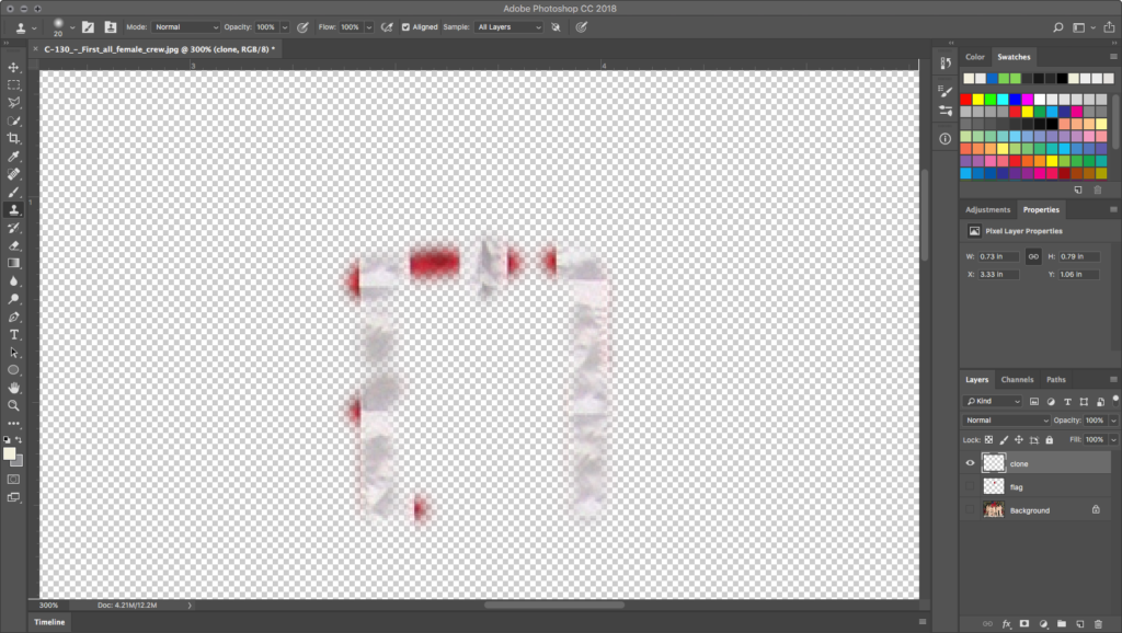
Work around all of the obvious rectangle edges to blend them into submission. You will probably need to create several new OPTION+click sample origins for the flag, each time clicking afterward with the brush to apply the clone. We finished the clone using about 15 precise mouse clicks or short click-drags, enough to get the job done without overfilling our History.
View the clone layer by turning the eyeball icons off of all of the other layers. Here is what ours looked like when we were finished:
Adding Amelia
Black and white
Since the image of Amelia Earhart was originally a black and white photograph, we change the image of the Air Force crew into grayscale—but do so non-destructively. Use a black-and-white adjustment layer on top of the clone layer. Apply the adjustment in the Layers panel. At this point, save your work in TIFF format.
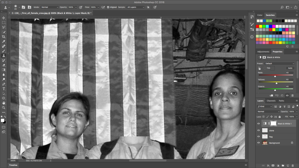
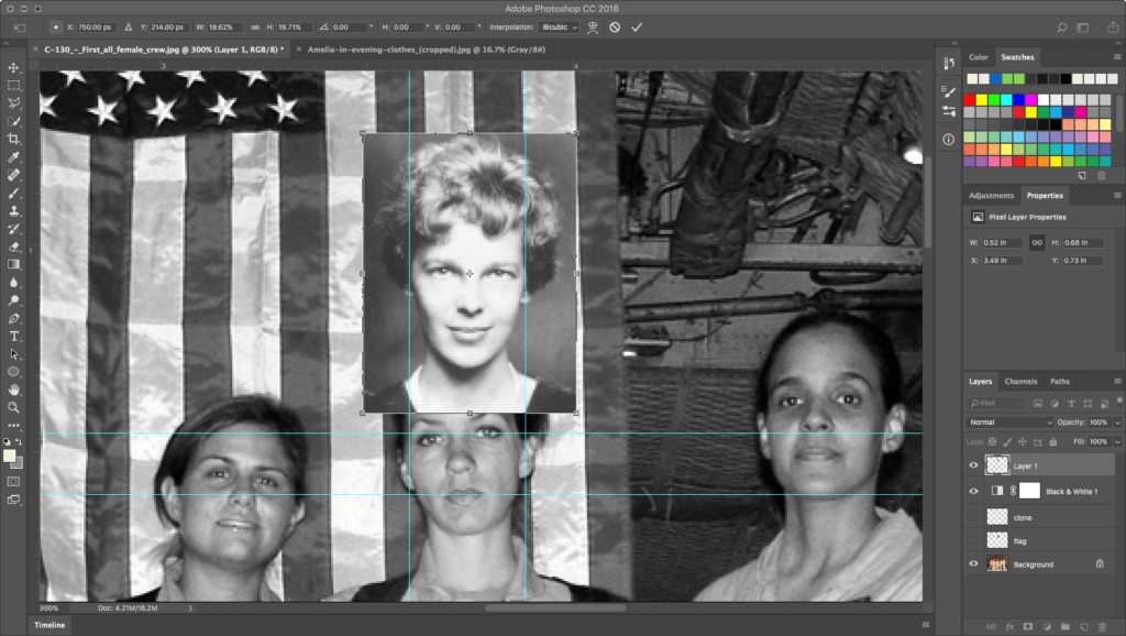
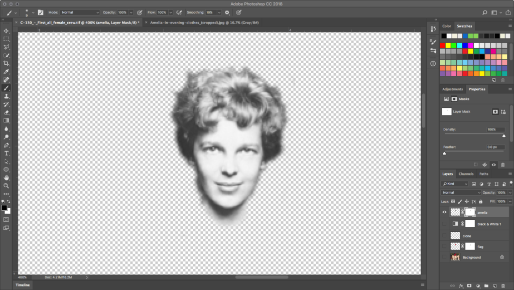
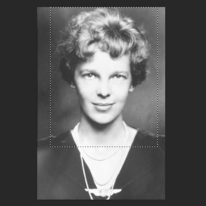
Open the image of Amelia Earhart, select her head and neck with the Rectangular Marquee tool, and choose Edit > Copy.
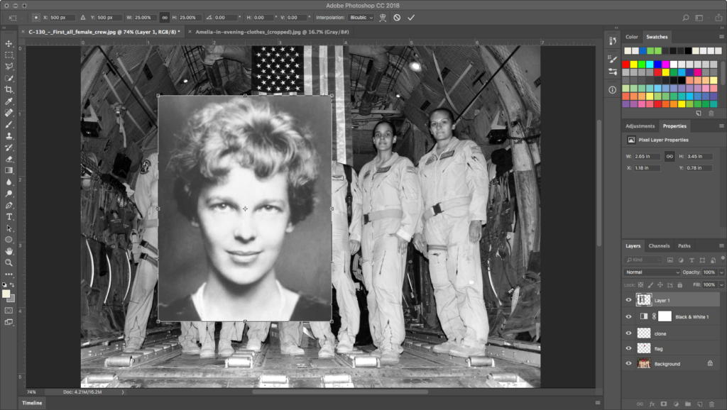
Toggle back to the crew document and choose Edit > Paste. Don’t be shocked: because of the resolution of her original file, Amelia’s head will be enormous!
Scaling Amelia’s head
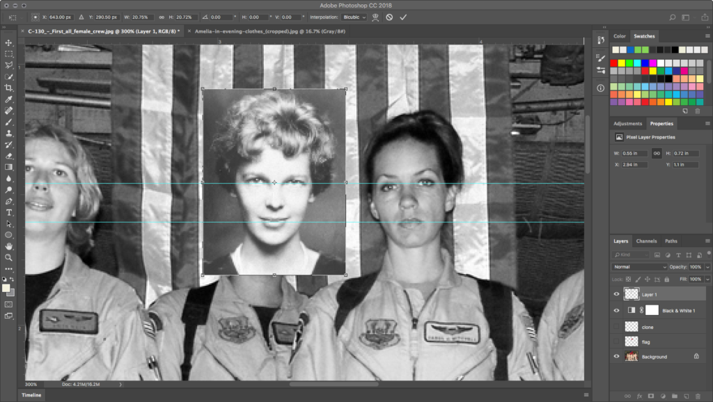
Use Edit > Free Transform and, in the Options Palette, link the Width and Height fields and type in 25%, then in the X and Y locator fields type in 500 px. You’ll see all of Amelia’s head now, and all of the corner anchors are accessible.
Now you can hold SHIFT while selecting corners of the Transform box, scaling Amelia’s head down so it is in proportion with the commander’s body. To help with this, use Guides. First, turn off the clone and flag layers to reveal the commander’s face. Let’s check the height scale by dragging guides centered on the eyes and on the mouth of the original commander. Align and scale Amelia’s head off to the side so her eyes and mouth also match up with the guides.
Now, similarly, check the width scale. Drag guides to both earlobes of the commander, then align Amelia above the commander’s head to see how her earlobes align. If satisfied with the scale, hit Enter or Return to accept the Transform. Name the new layer amelia.
Moving Amelia into place
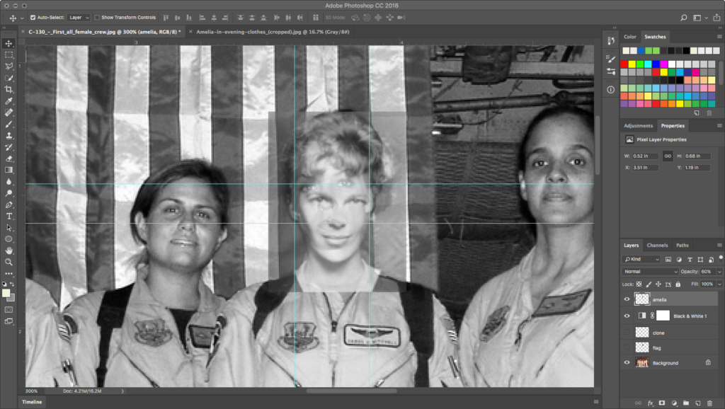
In the Layer Palette, set the Opacity for amelia to around 60%. With this semi-transparent element, we can use the Move Tool to position Amelia’s head. Note the positions of the two heads are quite different: the commander is looking slightly down at the camera, while Amelia is looking slightly up. This doesn’t affect our montage poorly, but it does mean: don’t align the eyes and lips! That will give Amelia a giraffe neck. Instead, use the semi-transparency to align the necks and shoulders.
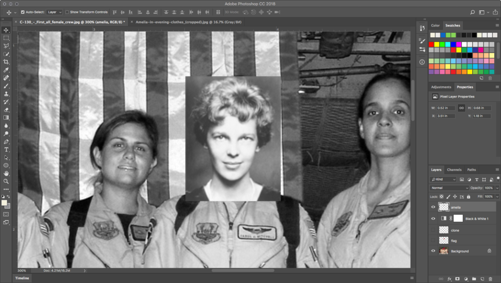
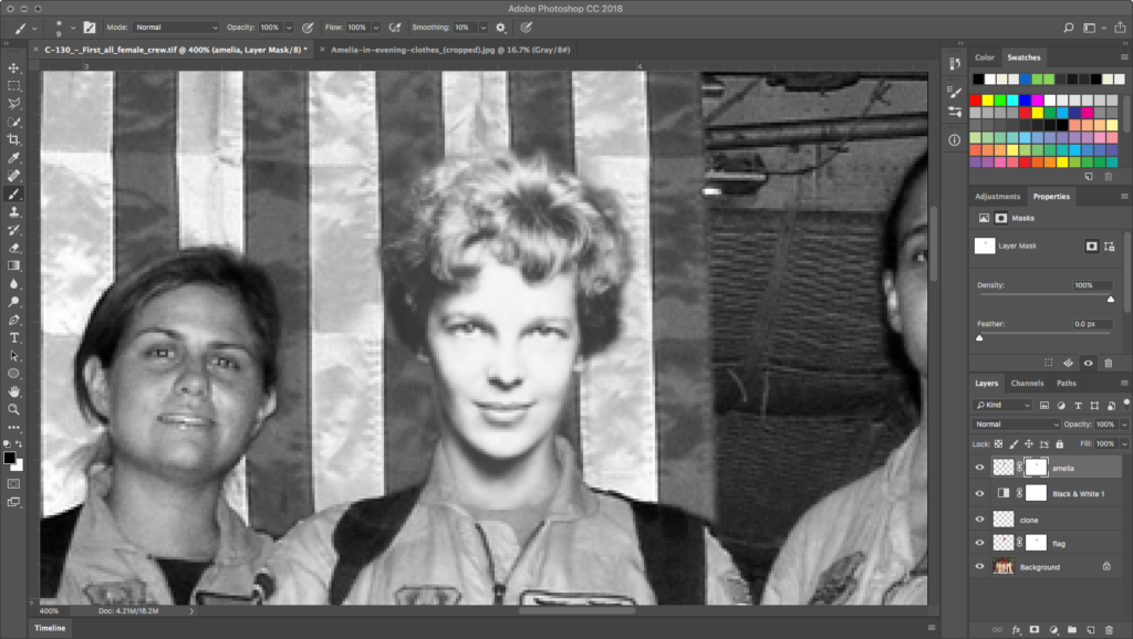
When satisfied with the location, turn the Opacity for amelia back to 100%, and hide the Guides.
Adding layer masks
Do not delete image data. Avoid the eraser. Using the eraser is destructive editing, a cardinal sin of image editing. Instead, you will learn to use masks, which allow non-destructive edits.
Add a mask over an image to hide part of it, instead of destructively erasing pixel data. Masks do not delete or alter image data, they simply hide or show parts of images. Masks operate in black (hidden), white (revealed), and shades of gray (transparent, partially hidden). We will use a Layer Mask on the amelia layer to blend her into the new background.
First, use the key command letter d, which loads black and white as the default foreground and background colors, then practice pressing the x key to switch the foreground and background colors. You’ll be able to quickly switch from painting black to hide and white to show information with the mask.
Paint the mask
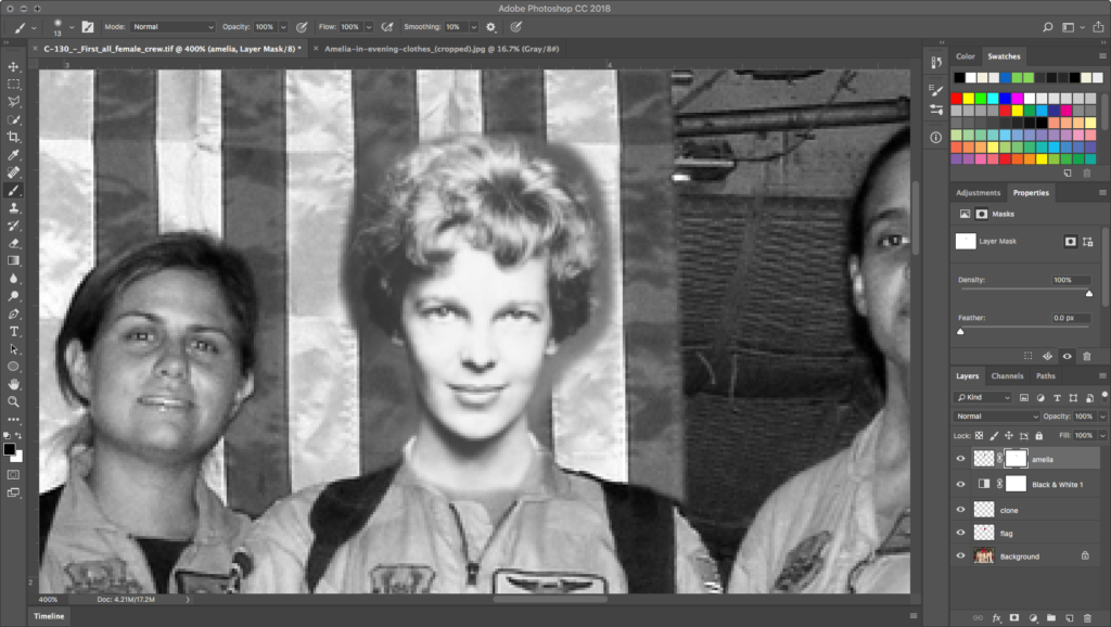
Create a layer mask on the Amelia layer with the Add Layer Mask button at the bottom of the Layers panel: it looks like a square donut with a round hole. This mask will hide the background around Amelia’s head. Notice that the layer now has an icon for the image and an icon for the mask. The mask is currently active — there is a white frame around the mask icon.
Click on the Brush tool and make sure that the default colors are loaded into the foreground/background color chips (black as the foreground, white as the background color). Besides the key commands mentioned above, the colors can be reset by clicking on the small black/white color chip icon in the top left area of the actual color chips in the Tools panel.
Observe the icon for the mask in the Layers panel. Since everything on the layer is revealed, notice the entire mask is white. Use the Brush tool with black paint while the mask is active, to hide the background. If you make a mistake, switch to white paint to retrieve hidden parts of the image. Practice painting with black and white paint. Paint with different size brushes and notice what happens with a soft or hard brush or with the brush set at different opacities.
Masking Amelia’s head
We used a soft brush for the background area and kept it far away from Amelia’s head. As we brushed closer to her hair, we reduced the opacity of the brush in the Options Palette to about 40%. At a reduced opacity, clicking a few times near her head with black paint removes the background while keeping her hair from being cut to an unnatural shape.
Masking the flag at Amelia’s neck
To get a seamless joint between the body and the head, we need to turn off the Amelia layer briefly and make flag active. Create a layer mask on flag. Hide parts of the flag sample where you know you’ll need to see the collar, and neck from the original image. We even mask out portions where the neck shadow hits the original flag image.
Refine the mask edges
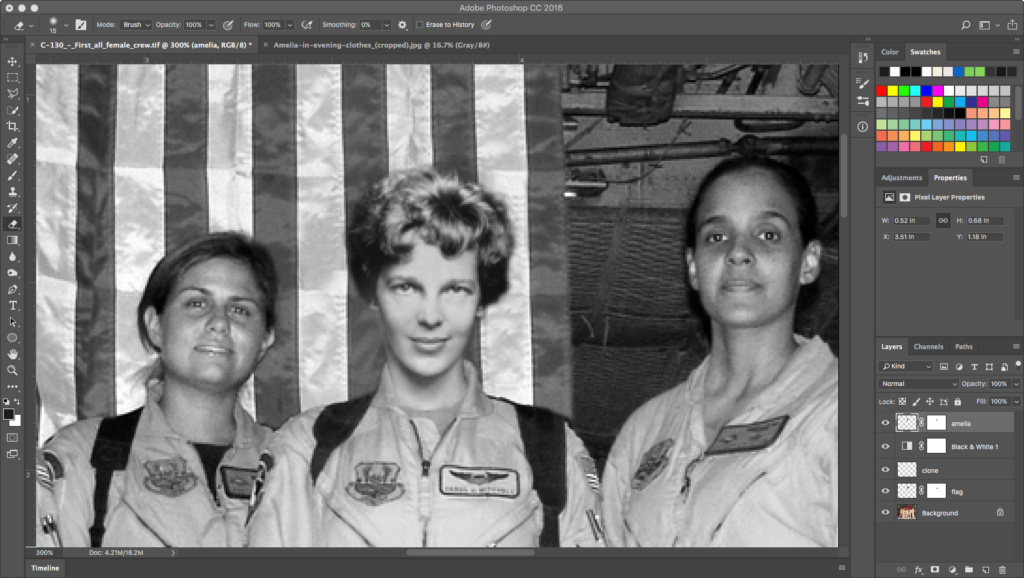
Return to the mask in amelia, after turning off all the other layers. Reduce the size and opacity of your brush and begin to carve away the remaining background close to the edge of Amelia’s neck, jaw, and hair. This is difficult work, but remember you can paint in white to restore areas that you mask poorly. Keep the hair looking natural by not dragging in long outlines, but be aware that lots of picky click-click-clicking will eat up the History.
Tonal and lighting adjustments
The scale and edges are great but the image still looks fake. Amelia looks like she’s glowing. We need to adjust the tone and light of Amelia’s photo to match the conditions in the crew shot. This takes a bit of analytical skill and a trained eye, both of which you’ll acquire by the end of this section.
First, do an analytical comparison of the photographs:
Everything is different!

- Environment: Portrait studio
- Photographer: Professional
- Lighting: Soft box, soft shadow, upper right downlight
- Camera position: Eye level
- Camera quality: Pro large format
- Contrast: Higher contrast
- Tonal range: Higher key histogram:
- Darkest shadow 60
- Lightest skin highlight 244
- Environment: Plane interior
- Photographer: Amateur
- Lighting: Direct line of view flash, harsh shadow, bottom center uplight
- Camera position: Knee level
- Camera quality: Point+shoot
- Contrast: Lower contrast
- Tonal range: Full histogram:
- Darkest shadow 6
- Lightest skin highlight 215
There are a lot of inconsistencies between the images, which is why the results are still unconvincing.
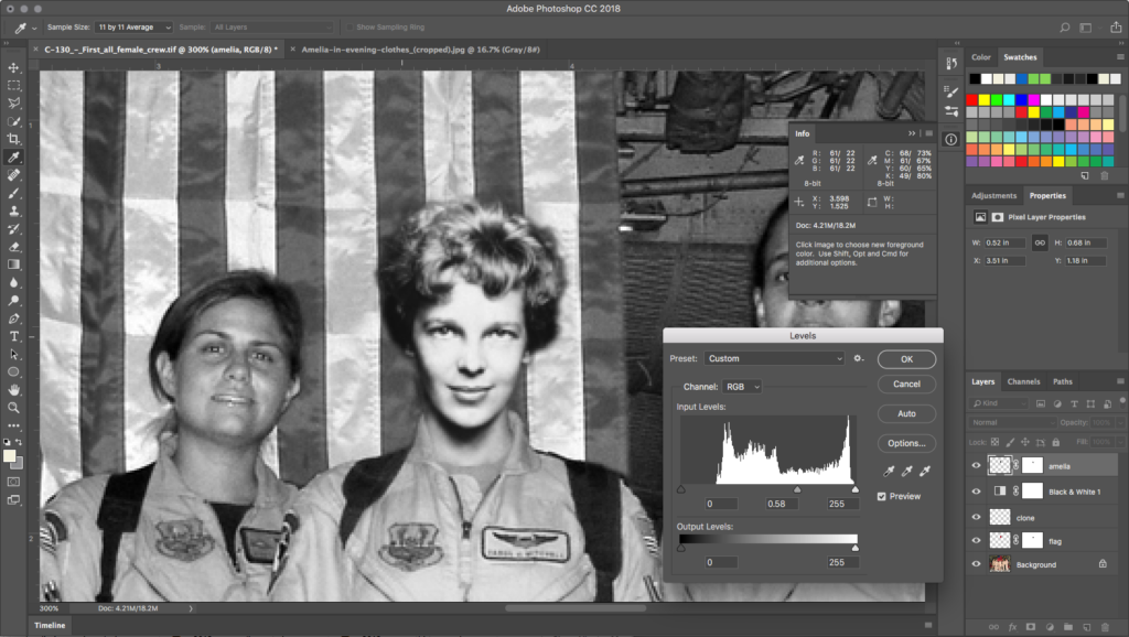
Before starting the tonal manipulations, you will have to click back on the content portion — leaving the mask — of the Amelia layer. Photoshop indicates which part of the layer you are working on by bracketing the corners of its icon in the Layers panel with a white frame. The title bar in the document also reflects the area that is currently active. If the mask is active, the Burn tool used in the next step will affect only the mask, so make sure Amelia’s layer content is active by selecting it!
Reconcile shadow tone
The quickest fix to the amelia layer content portion is to tweak the high-key histogram by selecting Image > Adjustments > Levels… in the Menu. Intuitively, you’ll want to drag the shadow slider in the Levels dialog box to eliminate the gap in the dark areas, but this makes the image way too dark. Instead, grab the midpoint slider and push it up to about .50 or .60.
Reconcile brightness
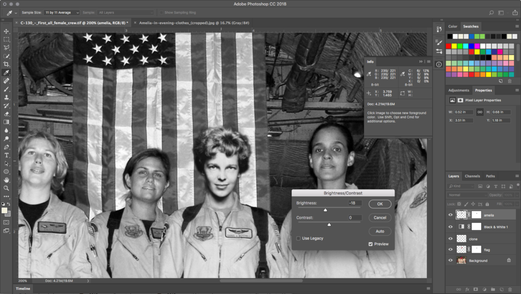
Somewhere along the way, poor digitizing of an old photograph made Amelia’s skin tone highlights quite bright at 244. In the crew’s image, they’re in the 215 to 225 range. Luckily, it’s not blasted out to 255, so some useful image data present in these bright areas can be toned down. Use Image > Adjustments > Brightness and Contrast… and knock the Brightness down about 20 or so.
Reconcile lighting with Dodge and Burn
Burning and dodging are photographic manipulations native to the traditional darkroom. In the darkroom, additional exposure time increases the amount of light hitting the paper. This can be done selectively with physical masks, resulting in a burned area of the image. Burning darkens the value of that portion of the print. Light can also be blocked during the exposure by dodging over image areas where the tonal values are too dark with a small tool, resulting in a lightened area of the print.
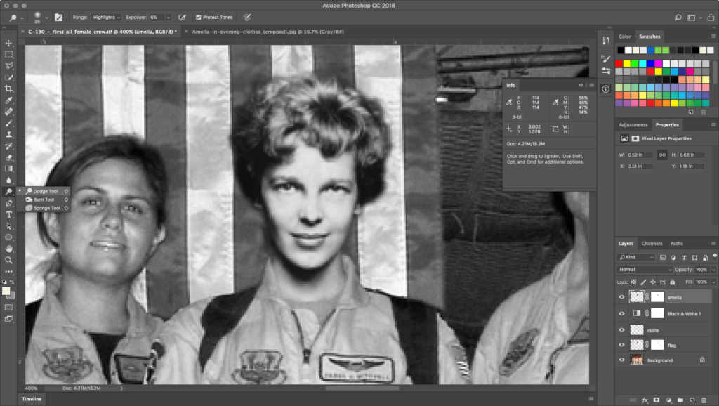
The shadow on Amelia’s right jaw, under the chin and nose, and around the eyes are all too dark. Find the Dodge Tool in the Toolbar.
The Dodge Tool can really eat up History! Keep the History Palette open so you can control it. By experimenting with brush size, softness, range, and exposure values in the Options Palette, you can find the right dodge settings to avoid overuse of the tool. In our sample, we found the following to be optimal:
- On the right jaw and under the chin, 4 click-hold-drag passes with a 36 px soft Dodge brush with Range: Shadows and Exposure: 60%.
- On the eyes, 2 clicks with the same settings.
- On the nose, 4 clicks with the same settings.
Using the Burn Tool to highlight areas at the forehead and cheeks will bring definition to the areas.
We experimented with these steps:
- On the forehead, 1 click-hold-drag pass with a 36 px soft Burn brush with Range: Highlights and Exposure: 10%.
- On the left cheekbone down to the mouth, 1 click with the same settings.
- On the right cheekbone down to the mouth, 1 click with the same settings.
Final tweaks for a pro finish
You might be satisfied after the last step, but a couple of minor refinements will complete the job.
Highlights and shadows
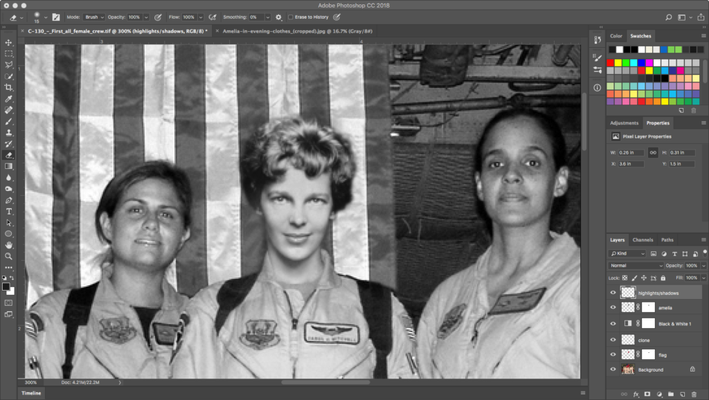
The first of these is to give Amelia’s face the highlights and shadows one expects from a flash uplighting a scene. Flash illumination causes specular highlights, very bright points of light reflecting off of smooth surfaces. Amelia’s face has practically no specular highlighting. Flash illumination also creates strong, sharp shadows, of which we see none near Amelia’s neck. So we’ll do the following in a new layer called highlights/shadows:
- The specular reflections in Amelia’s eyes are in the wrong place. Use the Clone Stamp Tool to copy the irises and highlights from the woman standing close to her over Amelia’s original irises.
- Use the Clone Stamp Tool also to borrow a specular reflection from her neighbor’s lips and place it on Amelia’s lips. Do the same for the highlight on the end of the nose.
- Use the Paintbrush tool with black, a soft brush size of about 6 px, and an Opacity of about 50% to draw a shadow at Amelia’s right neck, to emulate the shadow created by a flash.
Noise
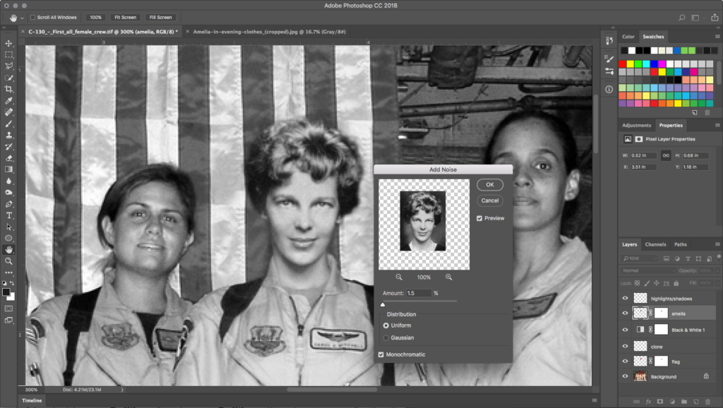
Noise in a digital image is a visible randomization of tone at the pixel-by-pixel level. There is a good bit of noise in the crew’s point-and-shoot, lower-resolution image that doesn’t appear in Amelia’s professionally shot, higher-res file. Select the amelia layer and go to Filter > Noise > Add Noise.... In the Noise dialog box, add Amount: 1.5% with Uniform selected and Monochrome checked. While very subtle, this gives Amelia’s face a texture that is similar to the texture found in her new colleagues’ faces.
Save and share
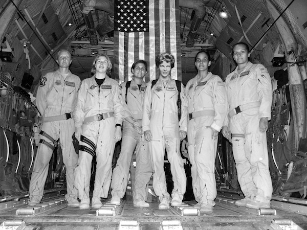
Amelia’s journey is complete, and she’s found her place among her fellow female aviators at last! The final file is zoomed out below to place all this detailed work in the larger context. When you are satisfied with your results, save the TIFF file one more time, then save it as a PNG file to post.
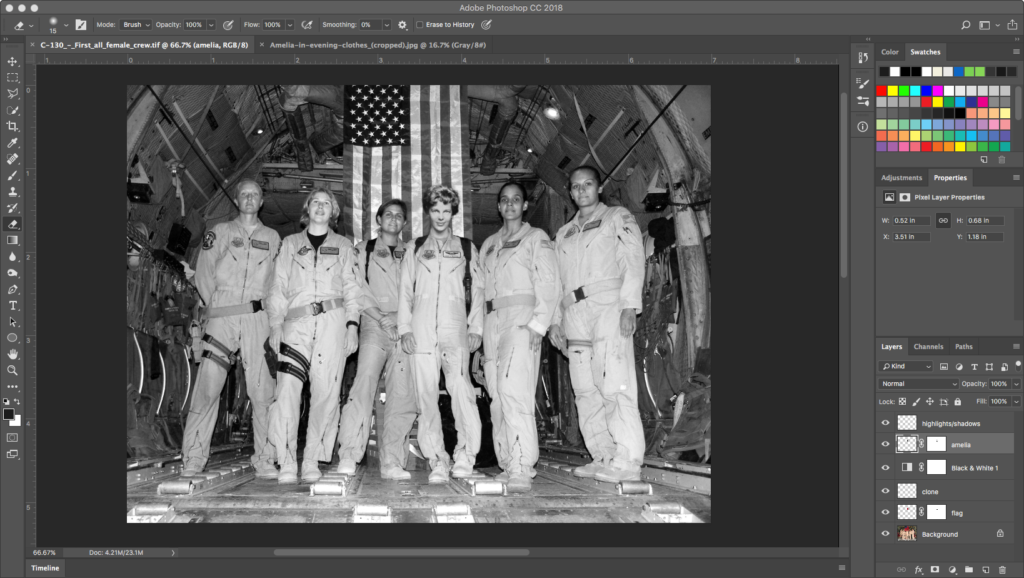
As you post your work, consider the philosophical questions Photoshop has raised in its storied history as an image editor: When are manipulations of reality ethical? When are they not? What percentage of images online, in magazines, and advertising do you think are manipulated by image editing? How does image editing affect our sense of security in our own self-images? What responsibility do artists share?
Credits
Contents have been adapted from Digital Foundations by xtine burrough and Michael Mandiberg, modified by williamCromar to include a different image of Amelia and more refinement steps. Please see the newMediaWiki licensingNotes regarding Digital Foundations derivatives, which are governed by a Creative Commons Attribution-NonCommercial-ShareAlike 3.0 Unported license.
