Prototyping
4 | prototyping

The work that makes the work work
Perhaps the most misunderstood part of art and design praxis is prototyping: the work that goes into making your work work. What does that mean?
Five percent
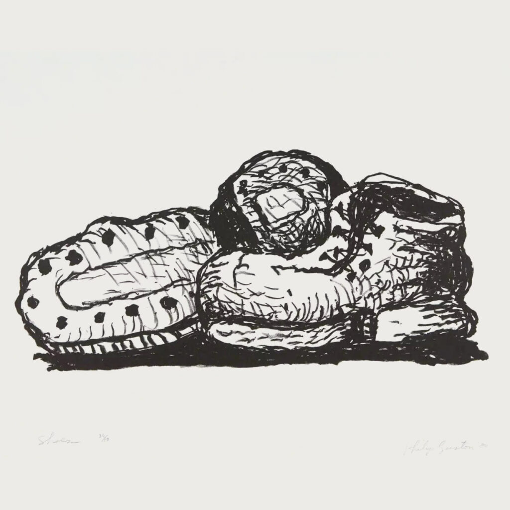
This anecdote, which Robert Reed told us in grad school, may be instructive. Robert described the artist Phillip Guston, perhaps best known for his idiosyncratic late work, reacting to a question. Guston, you see, was prolific. He would draw hundreds of drawings of some kind of mundane object, a shoe. Piles and piles and piles of drawings of a shoe. One scoffing individual asked about one of these: “How long did it take you to draw this?” in a skeptical tone. Guston’s droll reply: “Twenty minutes… or maybe twenty years.”
In other words, very little of the artist or designer’s work is actually seen! To get to the position of making “finished” work that works, the never-ending cycles of sketching, modeling, observing, distilling, digesting, testing, iterating, destroying, rebuilding, destroying again, and rebuilding again mostly happen unseen, in the studio, the sketchbook, or the trial balloons that are floated and abandoned. Maybe your audience sees 5% of the work you do. The rest is prototyping.
Embracing failure
Another anecdote, this time from the Renaissance, helps us embrace the idea of constructive failure that often lurks in prototyping.
In the late 15th century B.C.E., the techniques of painting developed at that time were the new media of their day. Leonardo da Vinci, the famed creator of The Last Supper, favored either egg tempera or the relatively new medium of oil paint. When he was commissioned to paint the mural, he ignored the traditional use of fresco, a proven method of permanent painting on walls, instead using the riskier tempera technique.
Humidity in the wall took its toll almost immediately. Finished in 1498, the paint was flaking off the walls less than 20 years later, even before Leonardo’s death. Ham-handed restoration in oils did not go well in the 18th century. By the 1970s the painting looked like this:
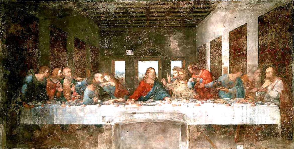
He learned from this mistake. When he tried a large-scale mural again, in 1505, he abandoned tempera. However, instead of using tried-and-true fresco techniques, he gave oil painting a try, with even more disastrous results! He had to abandon the work on The Battle of Anghiari before it was complete.
There’s no debate that Leonardo was a genius. Yet, in the search for a new vision of painting, he failed again and again. Such is the price of taking risks. And if a genius like Leonardo is willing to risk failure… well at least this makes me feel better about my own!
We should embrace failure, or at least the risk of failure, as a constructive learning event!
Completion is better than perfection
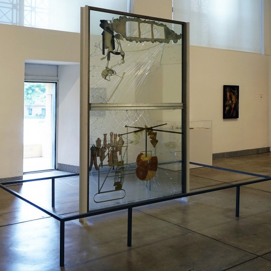
We’ll conclude with a story about Marcel Duchamp’s masterpiece, The Bride Stripped Bare by Her Bachelors, Even, a work also known as The Large Glass. Duchamp worked on this project from 1915 until he abandoned it in 1923.
He decided it was no longer purposeful to continue work on the Glass when, after showing it as a work in progress, it was returned to him in a crate, busted into shards. After meticulously putting this lethal jigsaw puzzle back together, and sandwiching it in a glass and aluminum frame, he declared the piece “definitively unfinished” in a delicious, Duchampian paradox.
The moral of this story: Duchamp understood that completion was better than perfection. He could choose to continue working and working for the rest of his life, or he could allow fate to finish it for him. He wisely chose the latter.
The power of prototyping
However, trickster that he was, Duchamp wasn’t quite done with this subject. Many are unaware that the long title of The Glass is also the title for another work, which also has a shorter title: The Green Box. This 1934 edition is a collection of reproduced preparatory notes, sketches, diagrams, and photos of preliminary studies, encased in a green box emblazoned with La mariée mise à nu par ses célibataires, the French version of the full title.
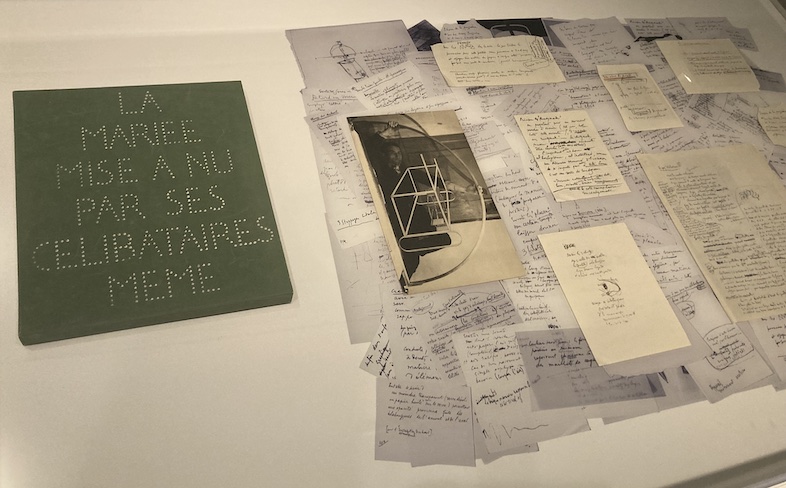
The box is one instance where an artist decided to reveal that 95% of work ordinarily not seen by audiences, in fact making the prototype for the Large Glass into a new work itself. The work you do in your process journal or blog is not unlike Duchamp’s box.
Types of prototypes
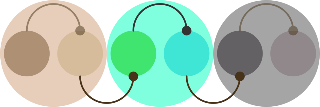
As your project develops, consider what kinds of prototypes you need to create to get closer to the thing inside your head:
Sketches
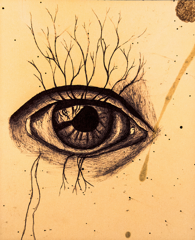
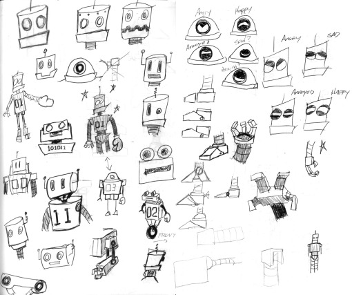
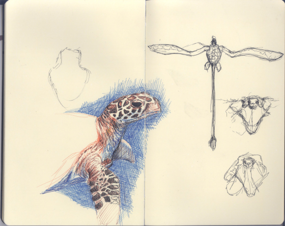
Sketching is the basic building block of all prototyping and most of the examples that follow probably had their first iteration as a sketch.
A sketchbook allows you to observe the world in a safe place untouched by social media or digital reproduction, and they also allow you to test a far-fetched idea without pre-judgment. It’s a reminder to show up, be present in the now, and maybe even take time away from the demands of software. Instead of pulling out your phone, pull out your sketchbook!
Sketching is a low-risk, high-reward prototyping activity that allows you to see the evolution of your thinking.
Diagrams
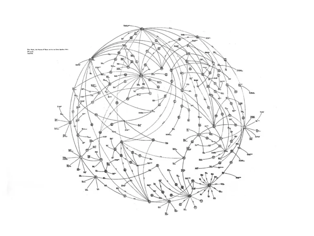
A diagram is a way of making non-visual things visual. Examples of diagrams include mind maps, flowcharts, hierarchies, causality (think family trees), and networks, also known as Lombardi diagrams. These were named in honor of Mark Lombardi, a Neo-Conceptual visual artist whose work asked uncomfortable questions about the abuse of power by financiers and politicians. He called these diagram-infused artworks Narrative Structures — were he still alive, one can only imagine the bizarrely baroque narrative structures Lombardi would have created based on Trumpian shenanigans! Such a feat has been attempted here.
Concept Art
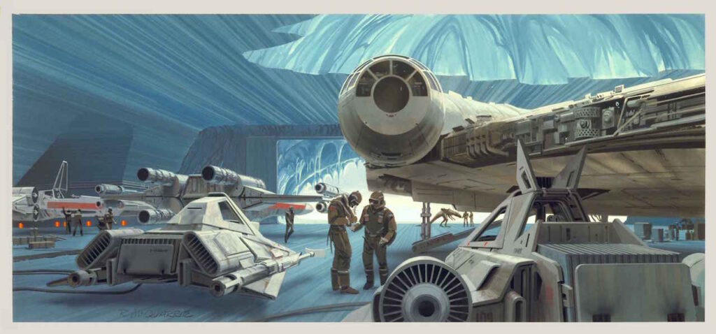
Concept art is a visual design for something that does not exist yet. Film, animation, video game development, and industrial design are a few of the fields where concept art is a necessary prototyping tool.
Hardcore fans of Star Wars know that almost every visual aspect of George Lucas’ canon was created by concept artist Ralph McQuarrie. Lucas described it, but McQuarrie brought it to life. That is how powerful a prototyping process can be.
Get a sense of the possible at ConceptArtWorld.
Blue-lining, under-drawing
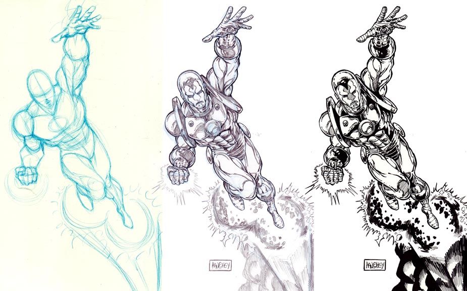
In commercial art, we often see a pre-visualization of the final work. Known as blue-lining, it takes its name from the physical process of laying out a drawing using a blue pencil which does not photographically transfer.
This kind of under-drawing is an old tradition. Oil painters commonly draw in pencil or wash to establish the composition, then paint over it. This drawing is lost to history, though older paintings with fugitive pigments later reveal these drawings, a phenomenon known as pentimenti.
The digital artists have an advantage here, in that layering is something that can be turned off or re-ordered, revealing the process.

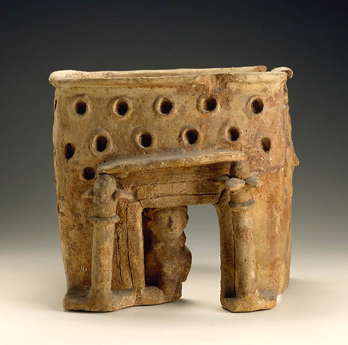
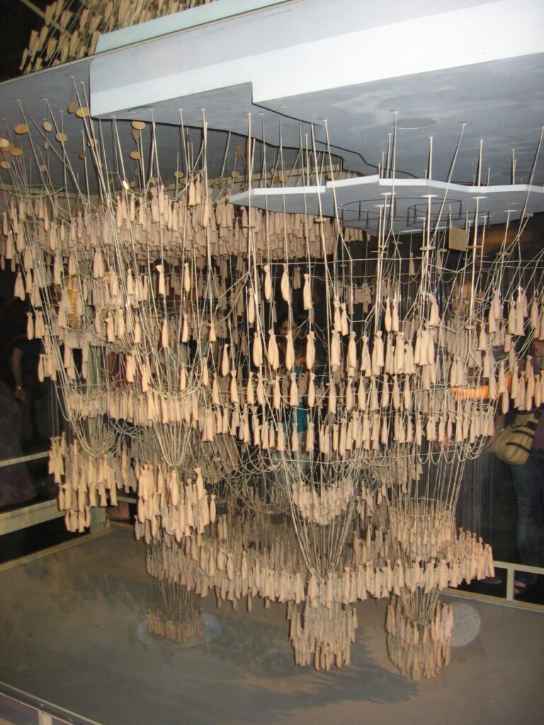
Models
So much can be said about modeling as a prototyping tool, it’s probably better to defer to the titles in parallelUniverses under Part I — Before and After the Computer, where you can explore the history of modeling, concepts of modeling, and the future.
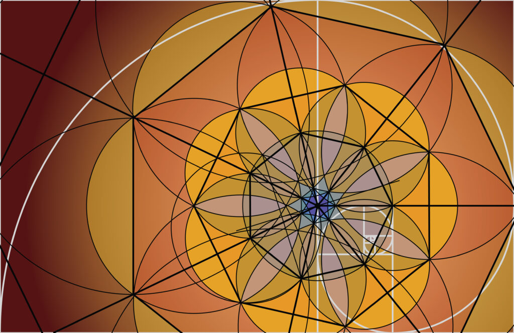
Suffice to say here that models can be physical or digital, low-fidelity or high-resolution, conceptual or working prototypes.
williamCromar, model for ucello chalice, © 2022
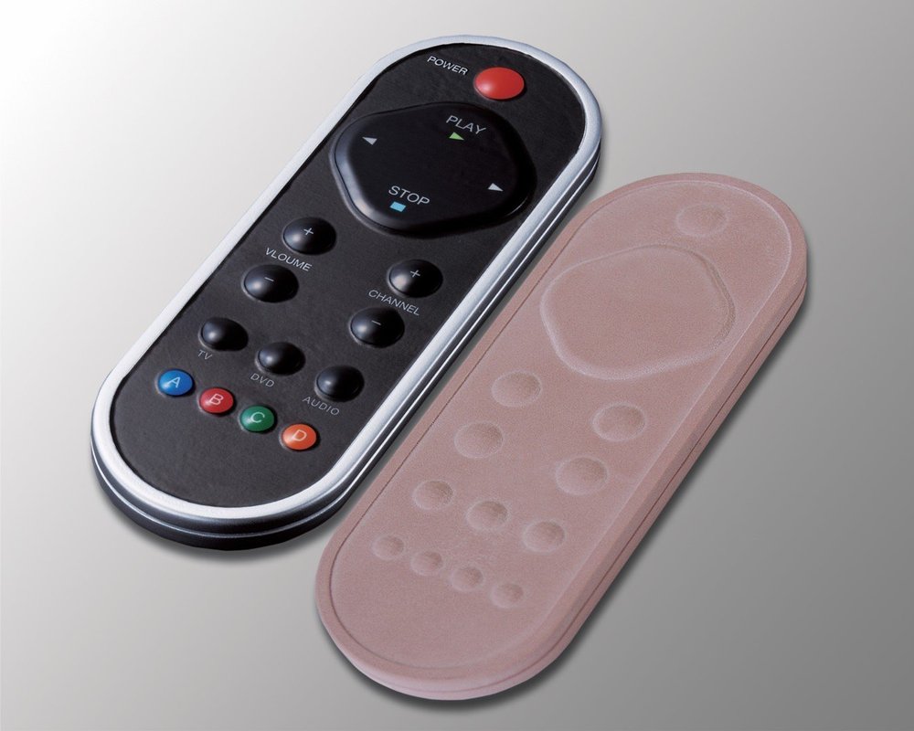
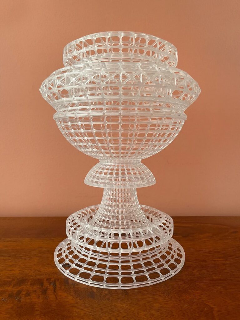
Rapid prototypes (digital fabrication)
From digital models, we can make physical objects through digital fabrication processes like 3D printing. These can range from formal studies through structural analysis to working prototypes made from assemblies using actual materials.
Storyboarding and animatics
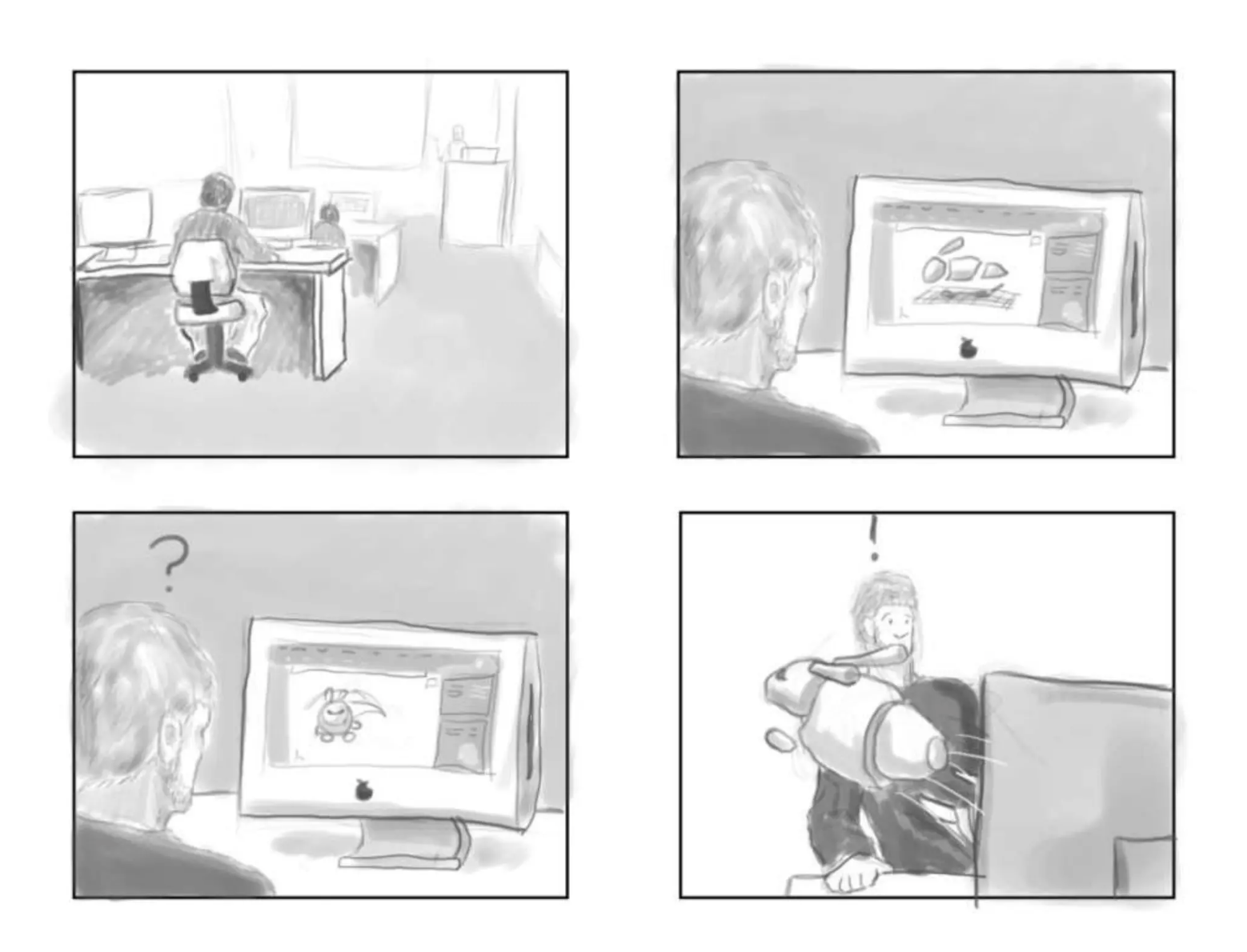
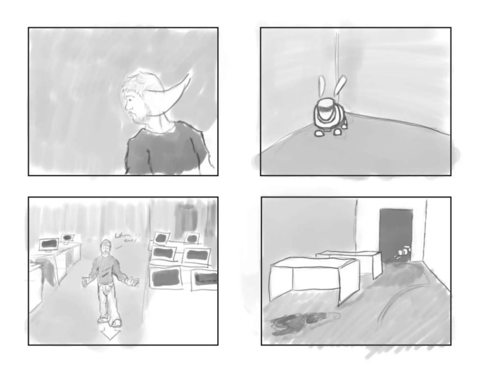
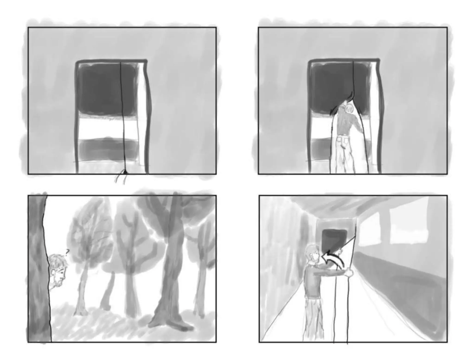
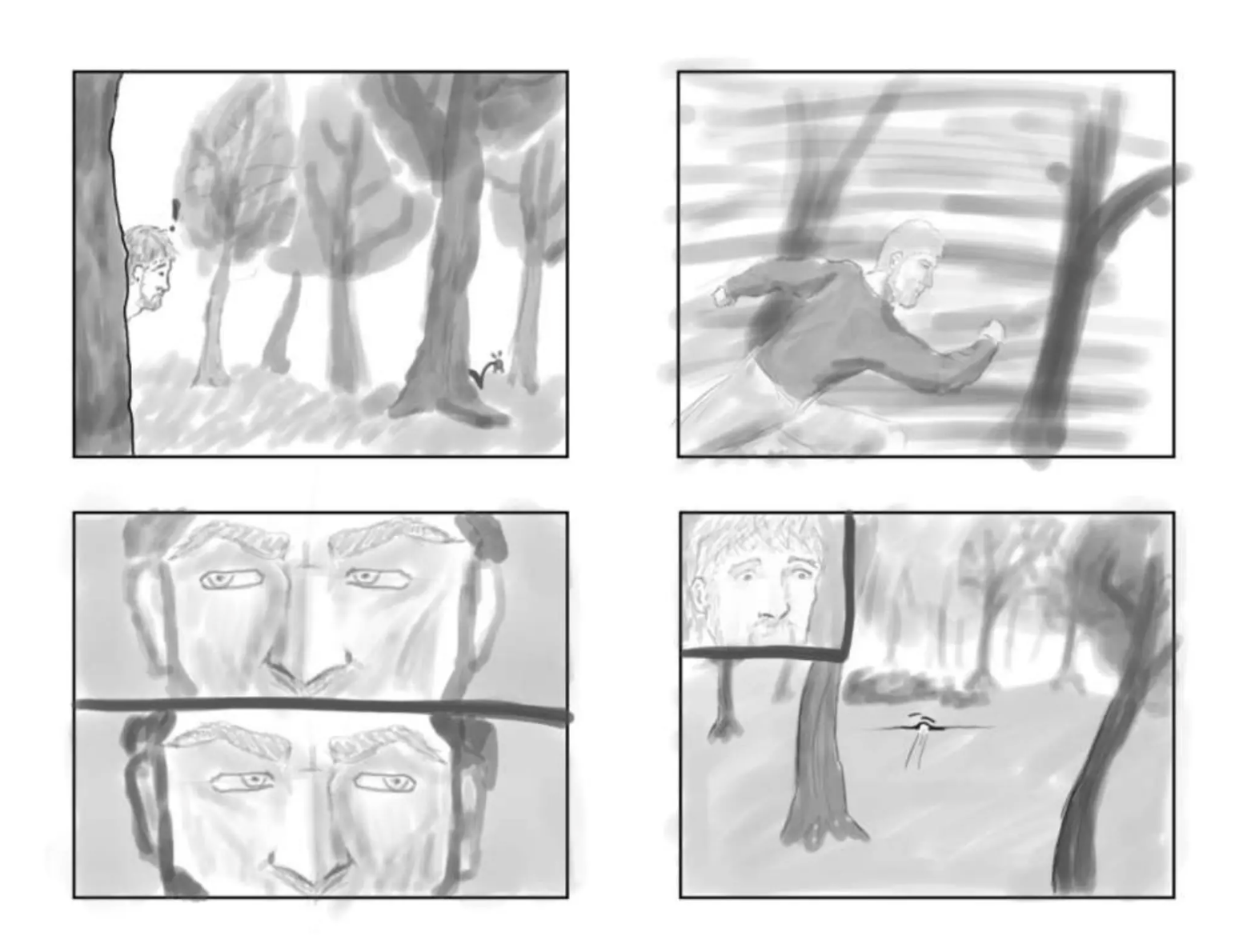
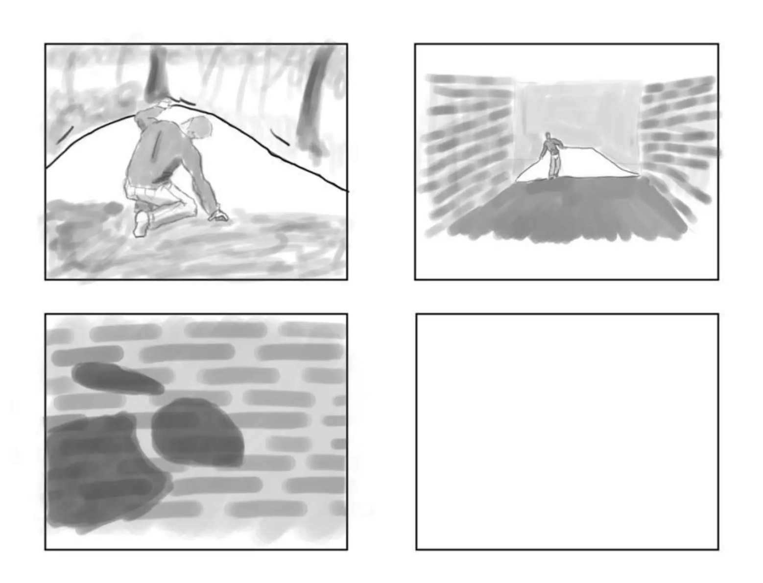
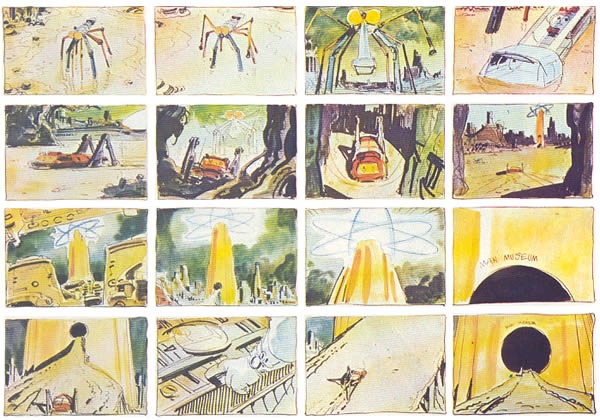
A storyboard is a pre-visualization representation of the scenes and actions in a video or animation. Panels that represent framing and show how the action occurs often look like comics. Panels can be drawings, photographs, or even video clips. You can also include text notes for dialogue and sound direction. Many templates exist on the web, and there are even sketchbooks with pre-formatted 16:9 rectangles to keep the aspect ratio of your images in line with high-definition video.
An animatic is an animated storyboard, a series of images played in sequence, often with a soundtrack. It helps integrate non-visual aspects of a project like sound, shot design, and pacing.
Shot Design
From a storyboard emerges another kind of film prototype. Shot design is the blueprint for setting up relationships between and within individual scenes in a time-based narrative.
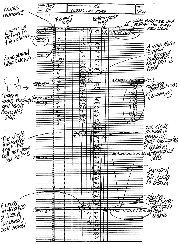
The traditional shot design was a dope sheet, a kind of spreadsheet—rows are time, expressed in frames. Columns are elements and instructions. We reserve the first column for frame numbering, and other columns keep track of individual elements or layers in traditional hand-drawn cel animation. The exact timing and positioning of elements are noted, frame by frame. The final column at the far right contains instructions for secondary movement—camera pans, dollying, zooms—and transitions like fading, dissolving, or quick cutting.
Time-based programs like Animate, Premier, Audition, and Maya use the metaphor of the dope sheet as a familiar interface: the timeline, seen below right. If you turn a traditional dope sheet 90 degrees, you will see the similarity.
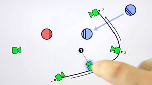
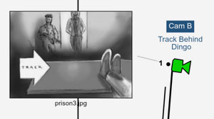
Modern apps have sprung up that help auteurs do this diagrammatically. Hollywood Camera Work Shot Designer is rapidly becoming an industry-standard tool that uses icons for cameras and elements, vectors for movement, lines for walls, placement for light, and imported images to generate a top view of a scene that will be very familiar to users of modeling programs.
There is a learning curve for Shot Designer, but not a steep one. Visit the tutorials, and in a half hour, you are a director!

Cartooning and modelli
No, not cartoons… cartooning is the creation of a work at a smaller scale, to be studied and scaled up to complete the final work. Large graphic works like murals are designed using a cartoon. If we speak of a 3D work, it is known as a modello.
Wireframes and site maps
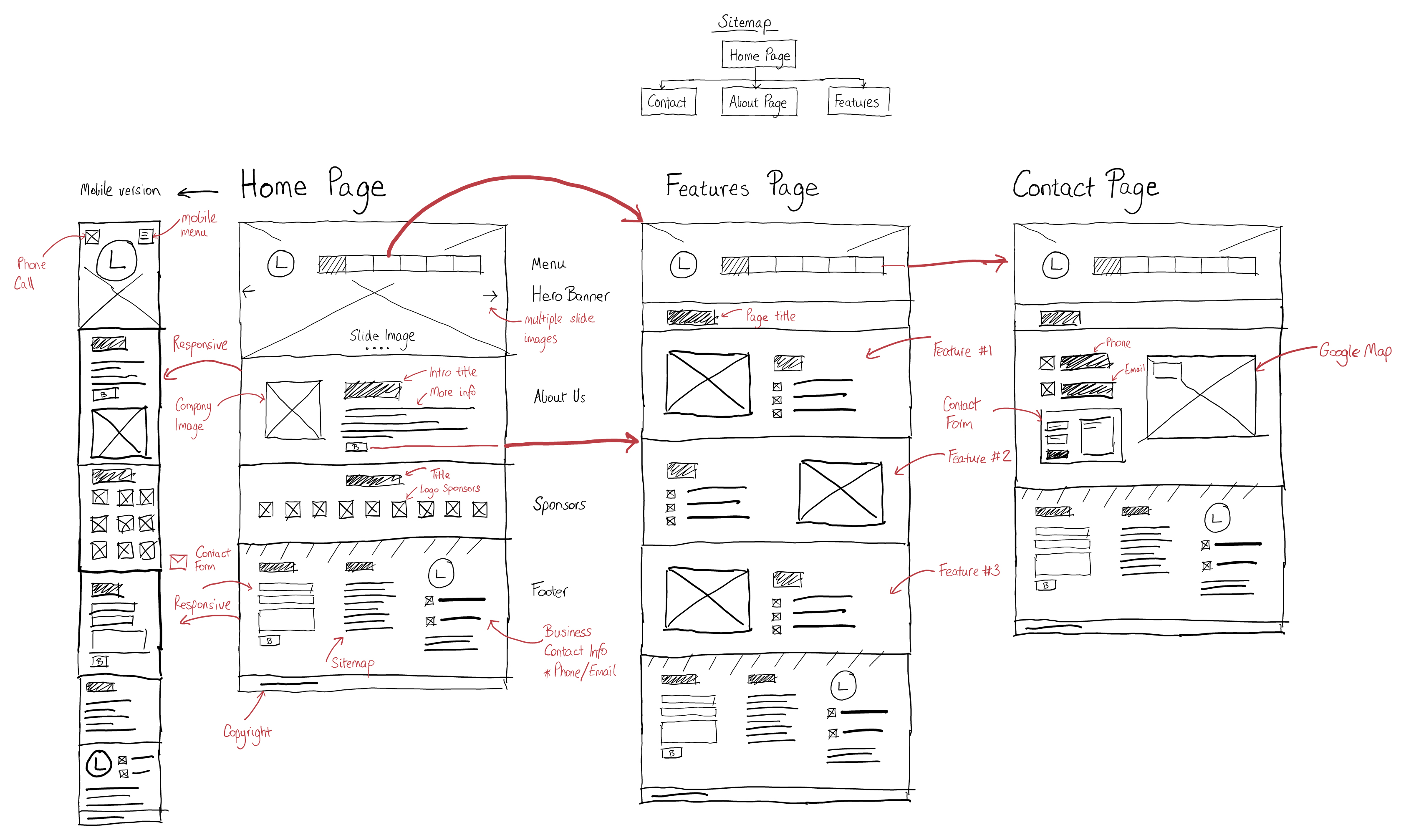
We use a wireframe to plan the features and navigation of a website. It provides an idea of the site’s functionality before developing content, color palette, or interactive elements. Think of it as a painter might think of an under-drawing, or an animator might think of a storyboard.
A website often involves more than one page in some kind of hierarchy. A site map can help design effective navigation at the wireframe level.
In responsive design, plan multiple wireframes for desktop, tablet, and mobile views that are compositionally compatible with the device accessing the site.
UI/UX mockups and prototypes
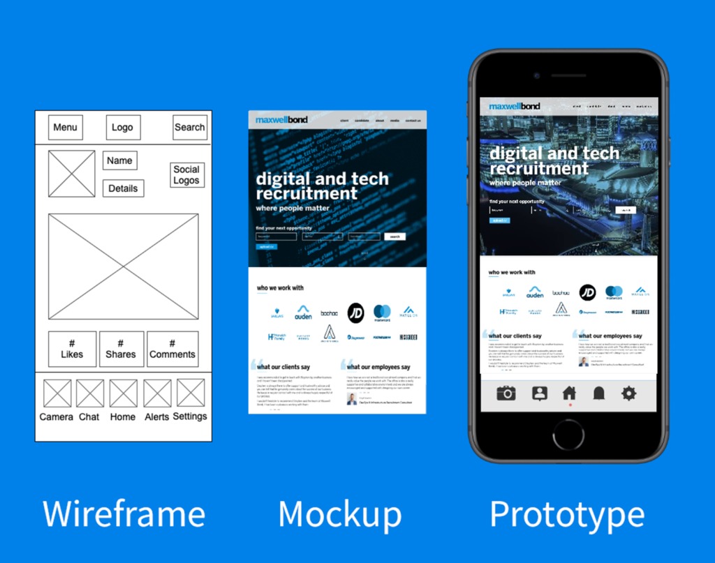
Beyond basic wireframing, a mockup of UI/UX design elements for a website begins to address content and visual design, albeit in a static way.
UI/UX prototyping, on the other hand, introduces interactivity like clicking or tapping to navigate.
More sources
This paper at University College London provides an interesting study of the relationship between art and industrial prototyping at the dawn of Modernism.
