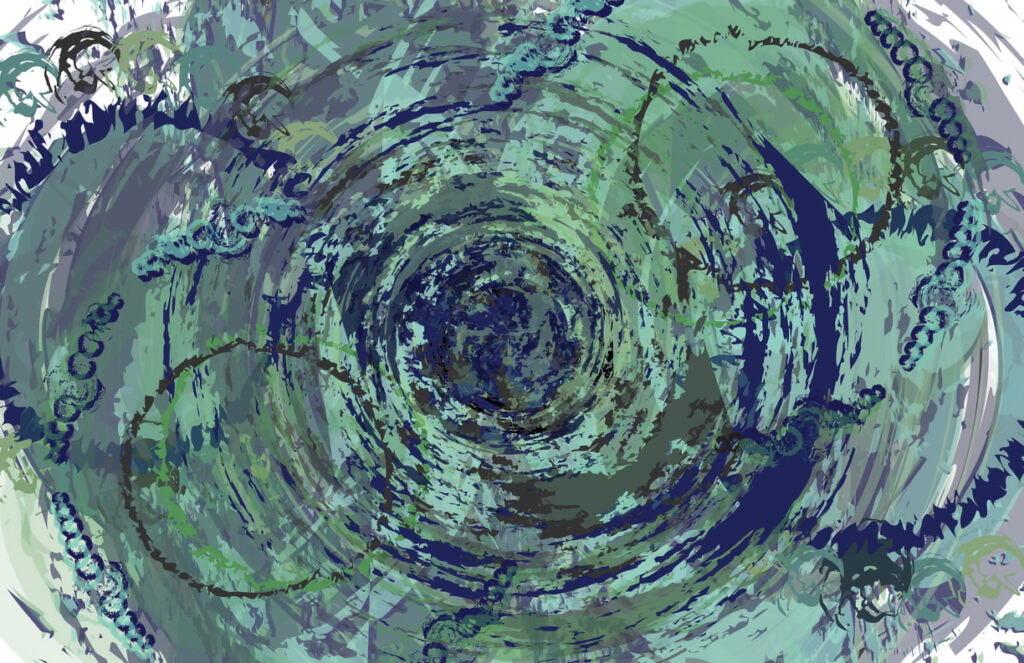
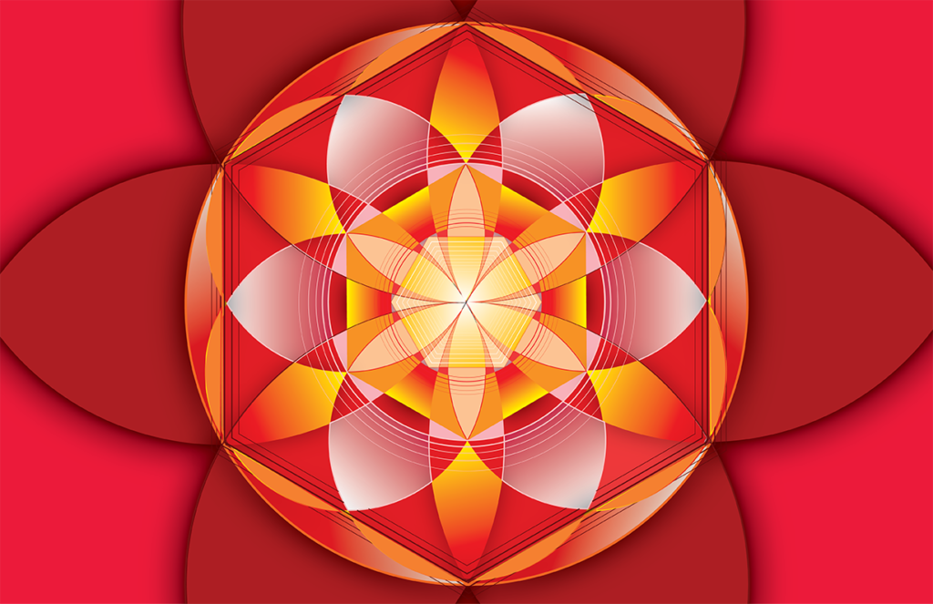
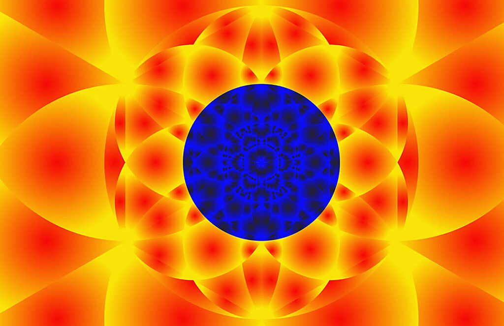
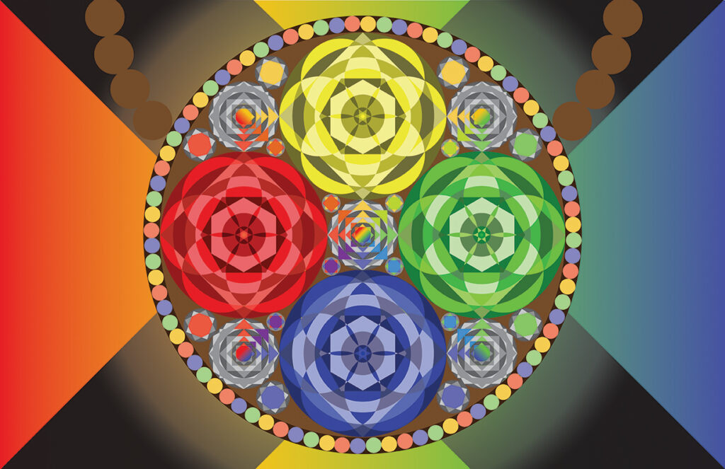
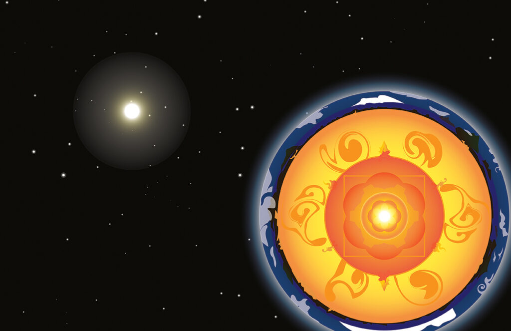
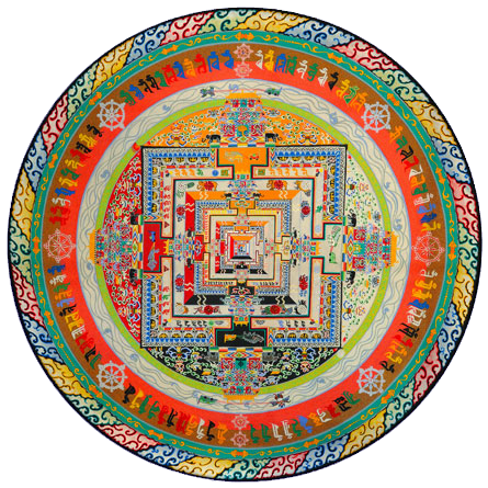
Mandala of the Elements
Advanced tools demo
Before you start your project, let’s review what you know about Illustrator. If you’ve come this far you know how to:
- Create simple and complex shapes
- Create text and transform it into shapes
- Create simple and complex lines
- Draw and edit Bezier curves
- Apply fill and/or stroke colors
- Use or design your own special line styles
- Work with precision tools like grids, guides, rulers, and snaps.
You can do a lot with Illustrator!
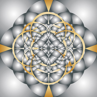
But that list is maybe 3% of what Illustrator can do. It’s that powerful!
While we can’t go over every tool available in this robust program, there’s an old saying: you use 20% of a program 80% of the time. So here’s that 20%, in demonstration form, instead of tutorial this time. These are examples of some of my favorite go-to tools in Illustrator.
Open the file named advanced_tools.ai from the zipped demo files downloaded from the link above.
A wide range of tools
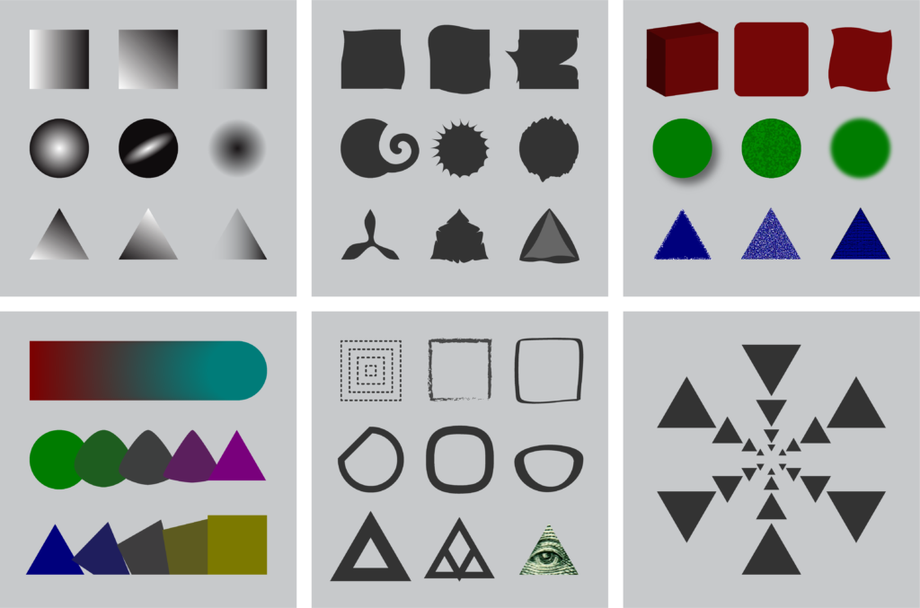
This demo file contains:
- A samples layer with examples, from top left to bottom right, of:
- Gradients
- Deform Tools
- Effects
- Blends
- Path manipulations, and…
- a special Rotate/Scale workflow using the Transform Again (COMMAND+D) function: perfect for making mandalas!
- A labels layer, where you can show and hide explanatory text for each sample
- A layer named your_turn! which contains primary forms you can manipulate to practice the demos found in the samples.
If you are in one of the studios I teach, we will demonistrate each of these 6 manipulations in studio. Those demos are basically replicated in the video below. If you miss the demo, or if you forget to take notes and need a reference, you can reference the video or cherry pick tutorials by searching for the relevant topic at LinkedIn Learning, remembering to log in with a school account if you have one.
- 00:00 Intro
- 01:32 Gradients
- 03:22 Blends
- 05:10 Deform Tools
- 06:49 Path Modification
- 10:06 Effects
- 12:27 Rotate-Scale Workflow | Using Command+D in combination with Rotate and Scale
Concept: expressing the Elements
Don’t jump right into stereotypes when thinking about an expression for one or more of the four Classical elements in your mandala! The best way to avoid this is to model your idea through observation. You don’t necessarily need a sample of actual material to do this: a simple web search can yield surprises that open up your imagination.
Earth
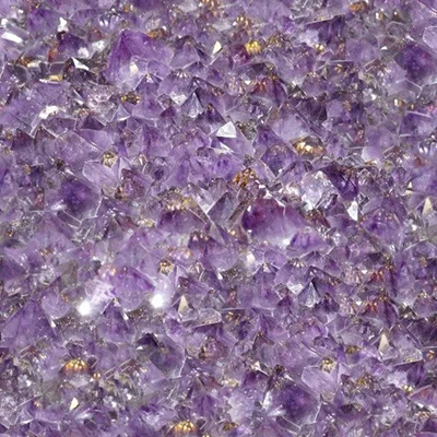
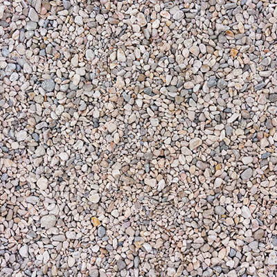
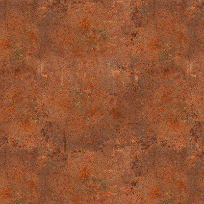
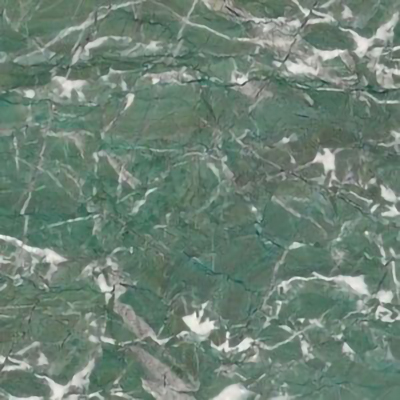
What are the colors, textures, and forms that come to mind when you think about this Element? There are as many colors present in Earth as there are in any color wheel:





Air
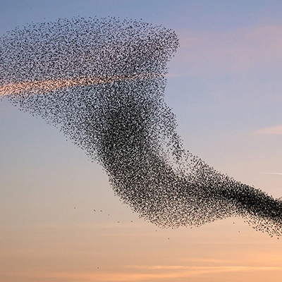
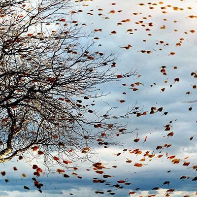
A most problematic element, with no inherent color or form! We can, however, indicate its presence. Avoid the stereotype of drawing “swooshy” shapes for wind. Think about the things it acts upon to signify the force.


Fire
Red-orange flames exist, but is that all there is? Don’t think about the obvious!


Water


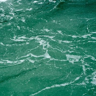

And water is almost always typecast as a “blue” 💧 when the reality is: it’s both clear and reflective while it takes on the form and color of its environment. We see blue so often because it reflects the sky. But Lake Michigan, blue from the shore, at the same time reflects the blackness of space from a satellite view.
As you come up with ideas for expression of one or more elements in the mandala, document them in a sketch. Create a Jamboard. Compile a collection of images (some designers call an inspiration board). Any or all of these can articulate your ideas in the Concept section of your journal or blog post.
Iteration: constructing the file with 3 geometries
Format
Create a new 11×17 Illustrator file to be named 20XX_lastname_mandala.ai. Even the very first dialog box presents an authorial choice: horizontal or vertical? This creates what is known as the format: the basic ratio relationship of height to width of the visual field. While there are unusual formats to be found in the world (square, diamond shape, ovals and circles), the most common choices are these:
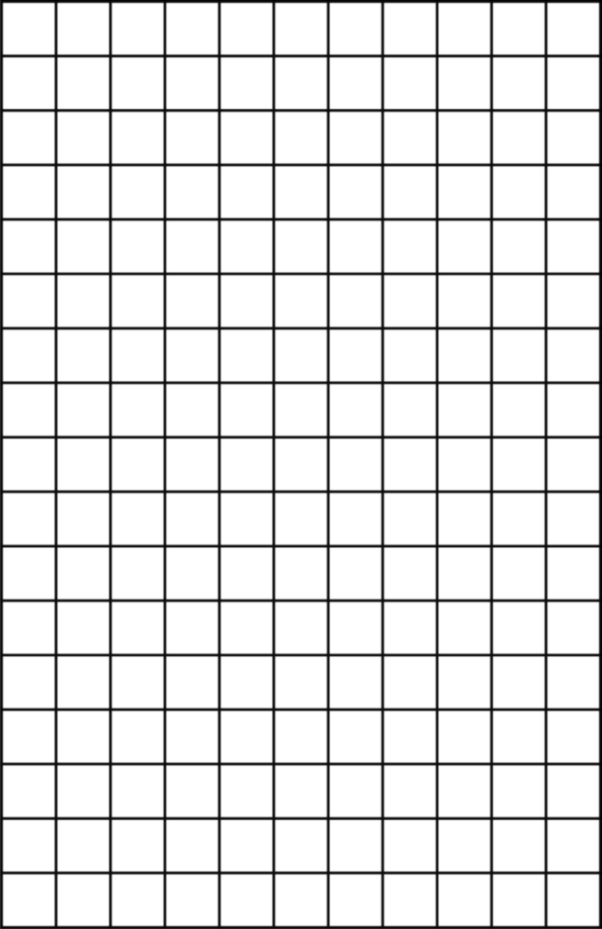
Bauhaus Master Wassily Kandinsky, who calls the visual field of the paper or canvas the Basic Plane, described vertical and horizontal as having an innate character he terms tonality. He considers the vertical basic plane to be warm and therefore active, while the horizontal is cool and therefore passive (with the square, of course, being neutral). So make your first decision, the format, based on whether you wish to develop an energetic or calming presence in your work.
Filling two out of three layers
After selecting a format, if you are starting from scratch create three layers in the Layers palette according to the logic of Frascari’s GEOmater:
- The MANTIC layer, where a compositional proportioning system will be discovered.
- The STRUCTURE layer, where nested polygonal relationships and radial lines of symmetry will be developed.
- The BODY layer, where the final drawing will be generated.
If you are using the template file, you’ll see several choices for the MANTIC and STRUCTURE layers. Make a selection and delete the other layers, then add the BODY layer.
One major advantage a digital artist has is that the basic structuring information developed at the Mantic or Structure geometry stage does not get permanently over-written by the final drawing. The layers can be turned off and on, made locked or active, and their order can be changed, depending on the need to see, use, or even change them. We find this kind of work, known as underdrawing, in paintings by scanning them with infrared light. With layers, the digital artist has X-ray vision!
Mantic Layer: create a compositional grid
When most people see a blank piece of paper, or in the case of an Illustrator file an empty artboard, they freeze, not knowing where to make the first mark. They don’t realize a blank page is really not blank.
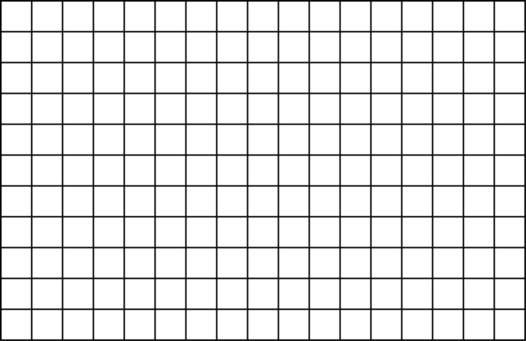
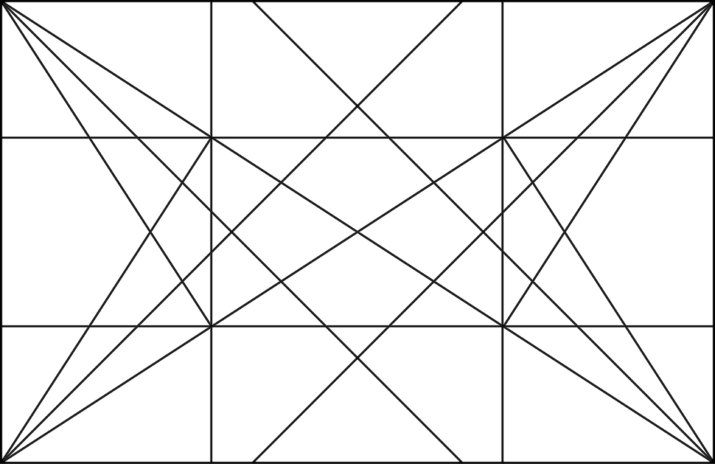
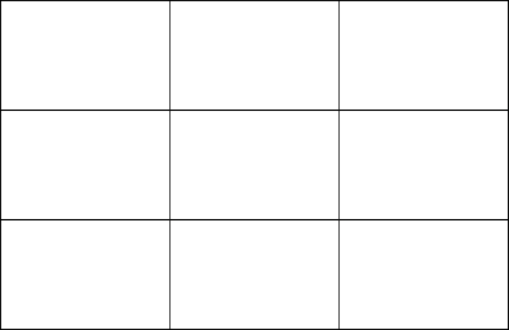
Any visual field format contains innate geometric relationships that can be expressed by drawing controlling grids or geometries. Just a few of the major types:
Dynamic Symmetry Grid
Rule of Thirds Grid
Golden Ratio ( ɸ )
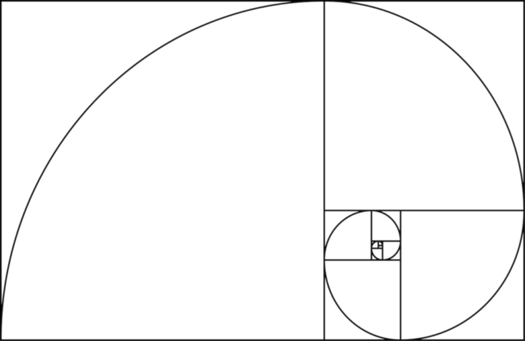
Fibonacci Sequence ( Fn )
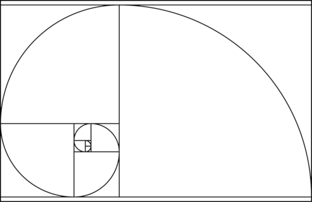
Some smartphone photo apps contain these types of grids, and later you’ll see a rule of thirds grid in the Crop tool when we use Photoshop. The various geometries help to predict symmetry or asymmetry, stable or dynamic compositions, focal points, and hierarchies. They can be flipped horizontally or vertically, and can even be combined.
Decide what kind of geometry or geometries will work for your image, and develop it in the Mantic layer.
Structure Layer: create a grid for rotation, reflection, and concentricity
Recall the expanded square or hexagon arrangement you created in our Euclid exercises. We can use one of these like a giant piece of sophisticated clip art.
Open the Euclid geometric construction file and select either the expanded square or hexagon and then open your mandala file and paste it into the Structure layer. Using copy and paste-in-front (COMMAND+F) combined with scaling and rotation, you can create a very sophisticated nested concentric grid structure to guide your mandala.
Alternatively, if using the template, you can simply choose either the Square layer or the Hexagon layer.
Finally, position this Structure grid in a meaningful and interesting way relative you your chosen Mantic grid. You can transform by moving and rotating to achieve dynamic or stable relationships. A very dynamic solution is shown in the example:

In the Mantic layer, a compositional geometry has been developed. Here, the artist has chosen a Golden Ratio spiral as a generator.
This will develop a dynamic composition and asymmetrical balance, creating an interesting tension with the passive horizontal format.
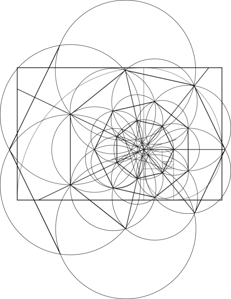
In the Structure layer, the artist has placed a polygon construction. Rather than creating it from scratch, she has copy-pasted the construction from her geometric construction file. Easy!
Copy the construction and paste it in front, then scale from the center.
We can move, rotate, and scale this nested, concentric Structure to relate to the Mantic geometry.
When the Mantic and Structure layers are complete, this is a good point to insert them into an Iteration section of your post in the process journal or blog and reflect on how you made them.
Synthesis: composing the visible mandala in the third layer
Body Layer: create expression of the elements
From here forward, specific instructions only limit your creativity. You will determine how to use the geometry of the construction to form your visual expression.
The only stipulation with color is that it should exhibit the quality of transparency as we’ve explored in our exercises. How you otherwise relate color to geometry is a matter of choice:
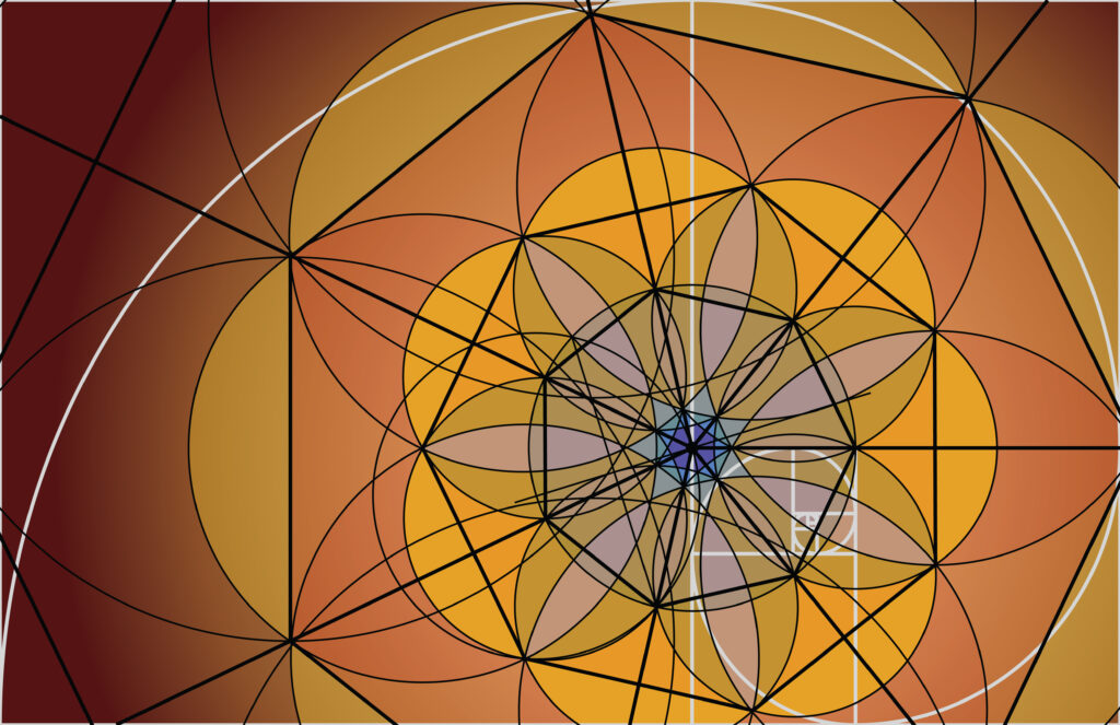
In the Body layer, color and expression, guided by geometry…
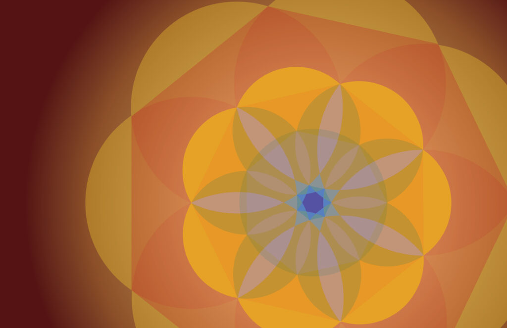
… create the final work. Here is a very simple example. Note the use of color transparency and relativity.
Don’t forget things you’ve learned in earlier exercises and projects. For example, the sample seen above was generated by copying the Structure geometry to the Body layer, and then applying Pathfinder Divide functions to create separate geometric forms to which differing color fills could be applied. We see such projection of the Structure geometry in most mandalas.
But that’s certainly not ALL you see. Expressive lines and other forms can be generated using the knowledge gained from our tutorials, and this can be supplemented by additional options that are covered in the advanced demos at the top of this title.
Exporting two alternate file versions
When you complete your mandala, save the final .ai file and export it to TWO high-quality, 300 ppi .jpg files with Use Artboards checked in the Save As dialog box as follows:
- Turn Mantic and Structure layers OFF, and export to a file named 20XX_lastname-mandala.jpg. This will show us the mandala as you intend for us to see it.
- Move the Mantic and Structure layers so they are on top in the Layers palette. This will show us how you structured the geometry on the Body layer. If the black strokes on your Mantic and Structure layers are too dark to be seen against the contents of the Body layer, change the stroke color for proper contrast. You can also play with different stroke colors for the two layers, to differentiate them, as seen in the example above. With all layers ON now, export to a file named 20XX_lastname-mandala-geometry.jpg.
Post both the “on” and “off” images to your Synthesis section of the process journal or blog post and reflect on the journey you’ve made to become an Illustrator master!
Hall of Fame
A baker’s dozen of delicious mandalas by students:
