Color relativity
Color Theory
German Bauhaus school educators Josef Albers and Johannes Itten helped define and expand upon color theory during the years 1919—1923. Albers created a course in color theory that inspired the tutorial in this chapter. Students who attend art and design universities typically complete these color studies using pigment and brushes or with Color-Aid paper. However, formal color studies can be demonstrated in the digital environment. The following four exercises use hue, value, and contrast to achieve various color relationships.
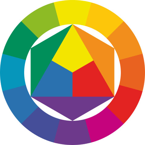
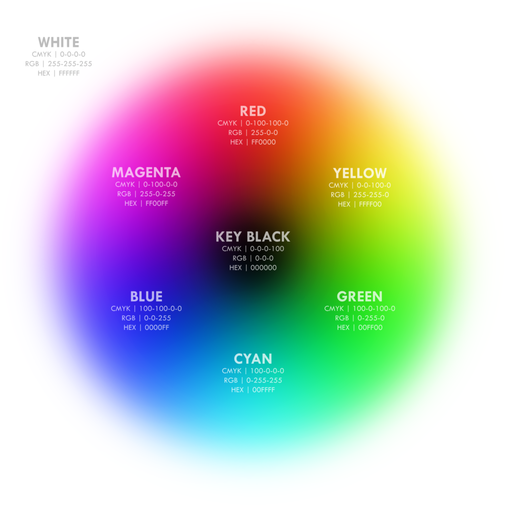
A variety of color models and color wheels were explored in our Reference section. Here, we will put into practice the integrated RGB-CMY color wheel that works with both the additive RGB and subtractive CMYK processes.
If you need to review vocabulary and concepts related to such terms as complementary or analogous colors, feel free to refer back to Digital Color.
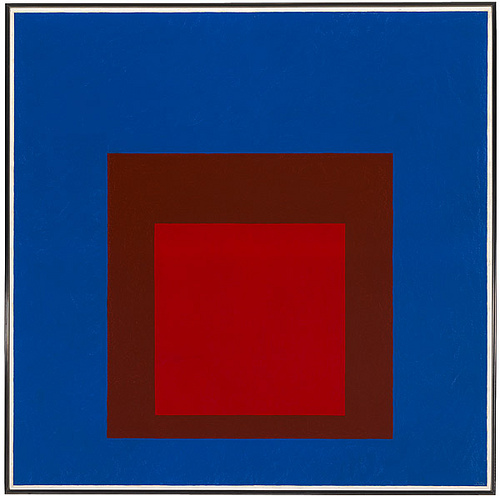
Homage to Albers
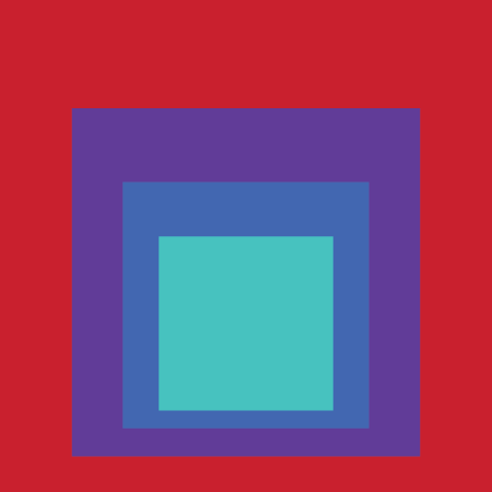
A high-saturation, high-value red meets a high-saturation, middle-value blue-cyan in this example of Albers’ Homage to the Square series. Albers began working on this series in 1950 and made thousands of works addressing the square over the course of twenty-five years. In this one, a complementary palette in high saturation makes a hot red feel weirdly like it’s peeking through a hole in a larger blue-cyan square, situating the normally advancing red behind the normally receding blue.
Using four of Albers’ exercises, we’ll learn how this kind of color wizardry can happen. Welcome to Color Hogwarts!
Create a new file
No template this time: create a horizontal 11X17 Illustrator file. Use the RGB color space, and divide it into four equal quadrants using guides. Then subdivide each quadrant with a centerline guide. You’ll have vertical guides at 4.25, 8.5, and 12.75 inches, and horizontal guides at 2.75, 5.5, and 8.35 inches. Change the default Layer 1 name to base. Draw a 1 point black stroke line segment along the the 8.5 vertical guide and the 5.5 horizontal guide to express the four quadrants. If you want to see what these guide lines look like, inspect the downloadable sample file found above.
The following four exercises will be generated in this file, each in its own quadrant.
Exercise: Hue has value
The first exercise will be placed in the upper left hand quadrant of the Artboard. Create a new layer and name it hue-value. Lock the base layer.
Create squares and fills
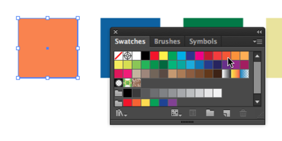
Using the Rectangle Shape Tool, draw five 1 inch squares on the Artboard. Hold down the shift key (SHFT) while dragging each square to keep the proportions equal; you can also use grid snaps. Evenly distribute the squares by clicking Horizontal Distribute Left under the Align Panel (Windows Align) as we did in the Gestalt tutorial. For each square, assign a fill color.

Choose fill colors with a range of different hues, saturations, and values. Do not use a stroke. Remember to select the shape before you select a new color from the Swatches or Color Panel. Tweak the color variables in the Picker, available from the Fill option in the Tool Palette. If you see a ⚠️ symbol, drag the value until it disappears.
Duplicate the squares
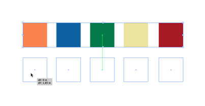
Select all of the shapes by marqueeing over all of them with the Selection Tool or hold SHFT and click each shape with the Selection Tool. Hold the option key (OPT) while dragging the squares to create a duplicate set. If you hold the shift key after you begin dragging the mouse, the duplicate copy will move only in straight or 45-degree movements.
Convert to Grayscale and group columns
Select one of the duplicate squares with the Selection Tool then click on the Color Palette pull-down menu (located in the top right corner of the Color Palette) and choose “Grayscale.” This removes the Hue from the square and results in demonstrating the value of the associated hue. Repeat this step for each of the squares in the duplicate set.
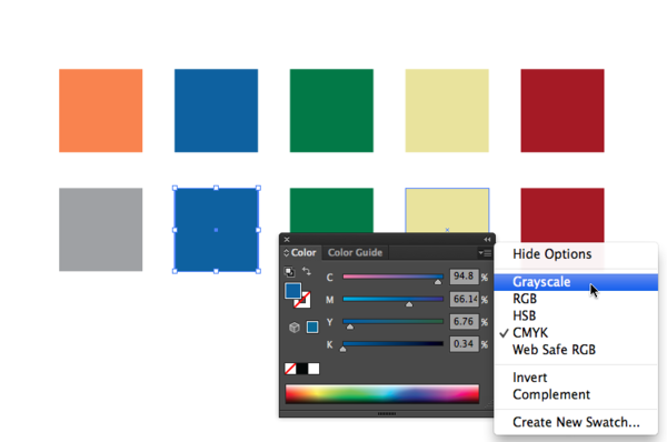
Observe how each hue has an associated value. Select each vertical pair, and group the top with the bottom for each of the five pairs: Object>Group.

Reorder columns according to grayscale
Rearrange the color-grayscale pairs according to the grayscale value, with the closest to white at the right, and black at the left. Select each pair (either by marqueeing with the selection tool, or SHFT-clicking on one square followed by the next) and drag it left or right in the grayscale order. Be sure to hold down shift once you have started to drag the mouse as this will keep your movement strictly vertical or horizontal.

Exercise: Phenomenal transparency and spatial depth
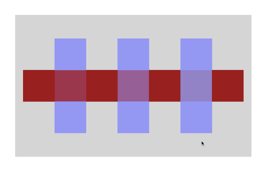
This exercise uses the upper right quadrant of the file. The purpose of this exercise is to see how hue and value can be used to create an illusion of transparency combined with space or depth within a color field. You will create color relationships to see how vertical planes can be pulled forward or pushed back in space, in relationship to a horizontal plane.
This exercise uses the upper right quadrant of the file. Create a new layer and name it transparency.
In your new layer, add two vertical guides to the existing guides: one at 10.75 and one at 14.75. These, plus the existing guides that bisect the quadrant, will become centering axes for the elements below. Create the guides by clicking on the ruler and dragging the cursor onto the artboard. If you don’t see your rulers, turn them on by clicking View>Rulers>Show Rulers (CMD+R).
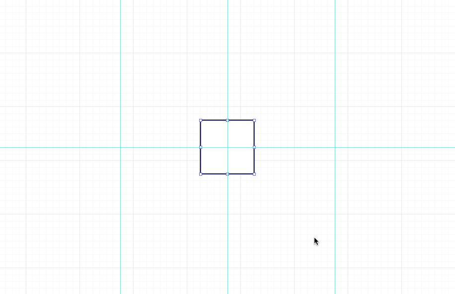
Create a 1-inch square and place it at the center of the quadrant using guides. To make the square exactly 1 inch, double-click on the art board with the Rectangle Tool to see the Rectangle Options Dialog Box. Type 1 in into the horizontal and vertical measurement boxes.
Select the first color
Recall the three properties of a color: Hue, Saturation, and Value. Hue is the name used to define the color. For instance red, yellow, blue, and so on, are hues. Saturation is the level of intensity of the color. The color of a pale winter tomato is less saturated than the color of a ripe summer tomato. Value refers to how much white or black is mixed into the color. Baby blue has white in it, while navy blue has a greater black value.
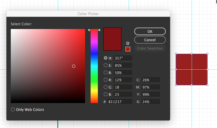
Double-click on the fill color at the bottom of the Tool Palette. The Color Picker dialog box appears. This is another location for choosing colors. The Color Picker has controls for all three properties: H, S, and B (for Brightness a synonym for Value). Choose a hue on the vertical slider to the right of the color selection area. Then choose a value by moving the color selection circle up or down vertically. The higher you move the circle, the higher the value and the lighter the color appears. The lower the circle is placed correlates to a lower value and the color becomes darker.
Choose a saturation by moving the color selection circle left or right horizontally. The further to the left the circle is moved, the lower the saturation. The color becomes more gray. The more right you move the circle, the higher the saturation value, and the more intense the color becomes.
Watch for ⚠️!
Make sure that the square is selected before choosing a color in this step. Use the Color Picker to choose a hue with a high saturation (higher than 60% but lower than 90%) and a medium value (around 50%) for the fill color of the square. Do not assign a stroke. If you see a ⚠️ symbol, drag the value until it disappears.
Organize the composition
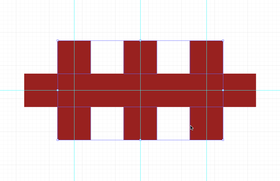
Option-drag this square 3 times horizontally to the left and the right, aligning their edges so that there are a total of 7 horizontal squares. Holding down the SHIFT after you start dragging will retain it to a movement along the x-axis. The 2nd and 6th squares should be centered on vertical guides.
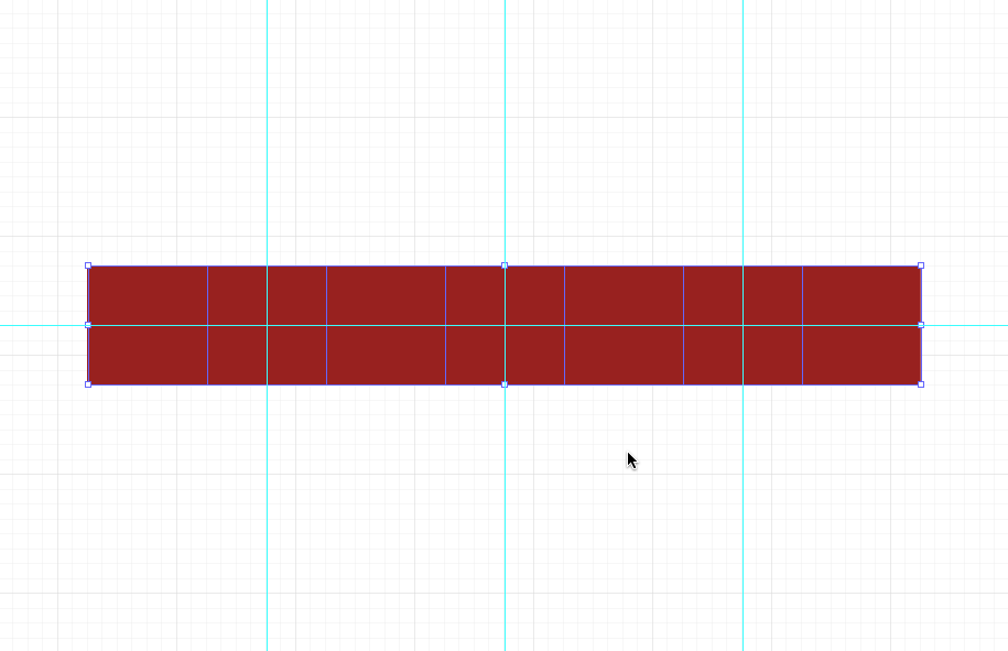
Now select the 2nd, 4th, and 6th squares and option-drag them once up and once down, aligning their edges so that there are three columns of squares, each with three squares vertically.
Select the second color
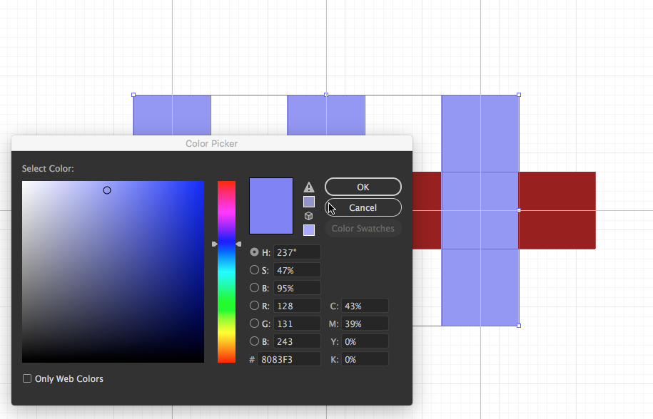
Select ALL the column squares and give them a different hue with lower saturation and a higher value from the original color.
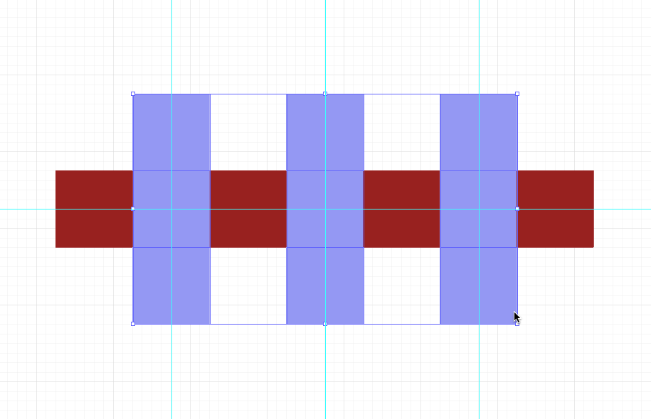
With all these squares selected, double-click on the fill square to bring up the Color Picker to help you make this choice.
Creating literal transparency as an intermediate “cheat”
Now we will modify the color of the intersecting squares, starting with the center square. The purpose of this exercise is to see how hue and value can be used to create an illusion of transparency combined with space or depth within a color field. You will set the intersection square colors to see how that vertical planes can be pulled forward or pushed back in space, in relationship to the horizontal plane.
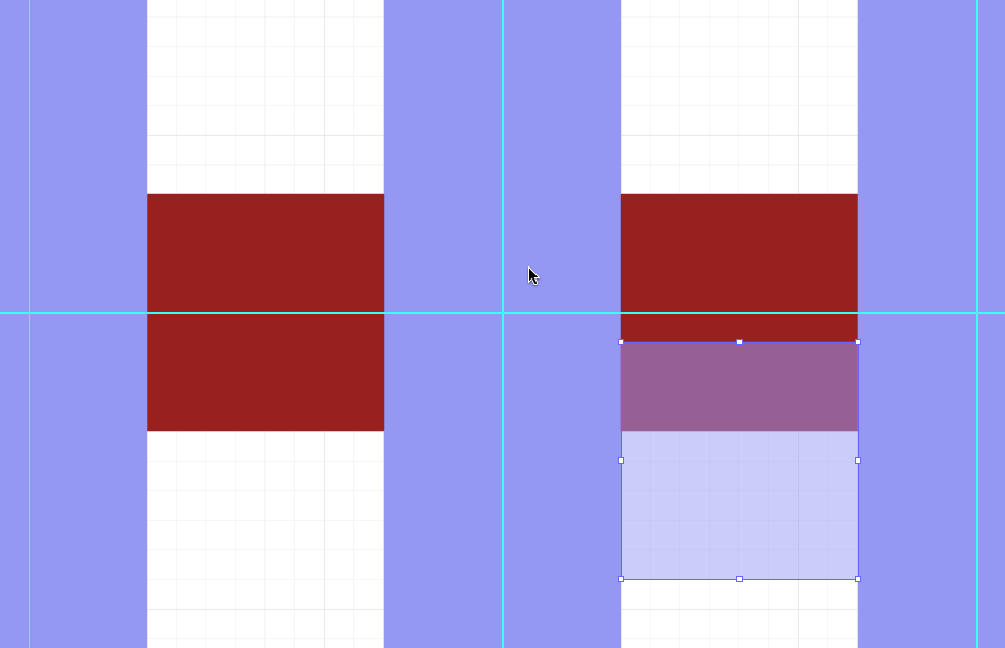
To understand what color to apply to that center intersection, we’ll use literal transparency first. Make a copy of the intersecting square with the second color and move it so it partially overlaps one of the squares with the first color. Apply a 50% Opacity value to it in the Command Palette. Note the color that results from this action: it is what Albers called a “middle mixture” and is exactly halfway between hue, saturation, and value from the original two colors. It’s a bit of a “cheat” that will save boatloads of time searching in the next step.
Creating phenomenal transparency for a middle mix
Nudge this transparent square until its edge is adjacent to the edge of the center square. Now, select the center square and call up the Color Picker. You can attempt to visually match the color you see in the overlap. At first, this is tricky, but after some practice, you begin to understand how to tweak the Color Picker to find a very close, if not exact, match with the transparency overlap… except yours will be an actual color, not a mix.
Applying this phenomenally transparent color to the center intersection will achieve a sense of spatial ambiguity: we are not sure whether the horizontal or the vertical plane dominates spatially — which one is in front or behind — since the mixture is absolutely in the middle.
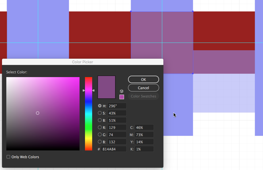
Creating spatial depth
Take your transparent square and move it over to the left side. Here, we will try to get the vertical plane to appear as if it is sliding behind a translucent but dominant horizontal plane.
Change the Opacity setting from 50% to 20%. This decreased the influence of the second color on the literal mix. Using the same technique as for the center vertical, find the actual color that matches the overlapping transparency.
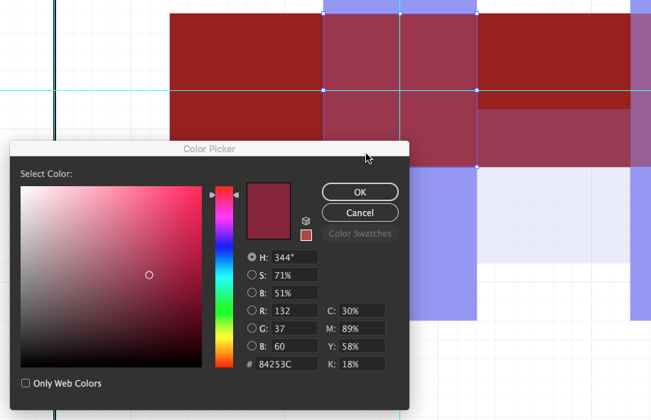
Now move the transparent square to the vertical plane at right, and set the Opacity up to 80%. This will increase the influence of this color in the mix. Again, using the same technique as for the other intersection squares, find the actual color that matches.
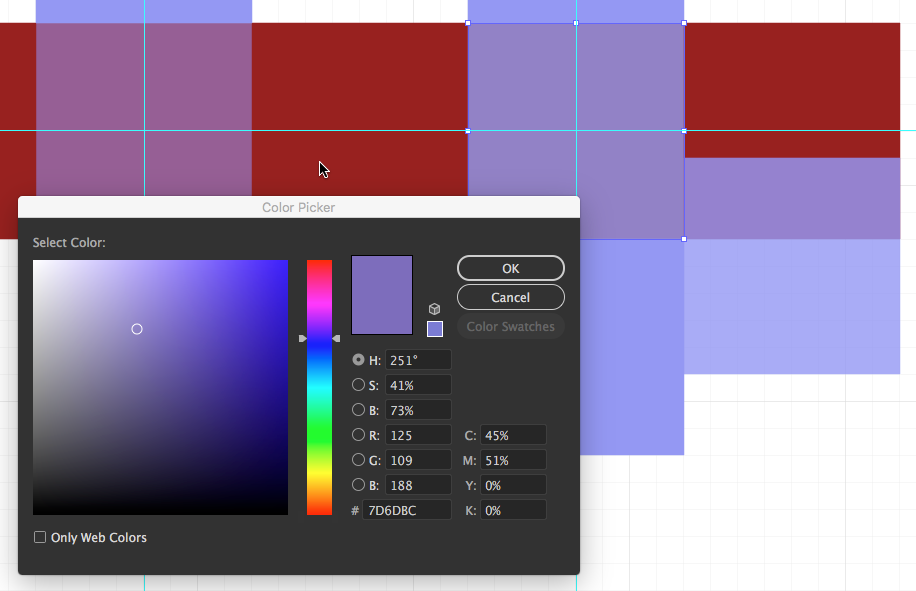
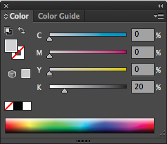
When you are satisfied that you’ve found the correct mix of colors, delete your transparency square. If it helps to see your colors, you may create a 4.5 X 7.5 rectangle with a 20% gray fill and arrange it to the back of the composition. Create the 20% gray fill by using the Color Palette (Window>Color). Open the drop-down menu in the top right corner of the Color Palette and select CMYK as the color slider option, as well as Show Options.
Turn off guides and grids, zoom in on the composition, and take a long look. Do you see an illusion of transparency and a progression of the vertical plane from back to front of the horizontal plane?
Interaction of values
This is the first of two exercises that demonstrate the relative nature of color phenomena; that is, how color depends on its context for its identity. We limit ourselves to a pure value study first, with no hue.
This piece is developed in the lower left quadrant of the file. Create a new layer named value_interaction.
Copy the 20% gray 4.5 X 7.5 rectangle from the previous exercise and move it to your new layer, centering it in the lower left quadrant. With the object still selected, use Object > Lock > Selection so that the gray shape does not move while completing the following steps.
Create large squares
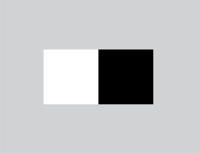
Create two 3 X 3 squares on top of the gray background. Fill one with white, eliminate any stroke color, and fill the other with black. Place the squares side by side, so that the left edge of one touches the right edge of the other in the very center of the gray area.
Create small squares
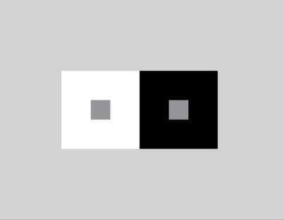
Create one .75″ x .75″ square in the center of the white square. Fill the square with 50% black (middle gray). Option-drag a copy of this square to the middle of the black square with the Selection Tool.
Notice how the middle gray squares inside the black and white areas appear to have different values. When values are placed near or on top of each other, we perceive their values as interacting and affecting one another. It is important to keep this in mind when choosing hue and value combinations, as one value will always influence the appearance of another.
Interaction of color
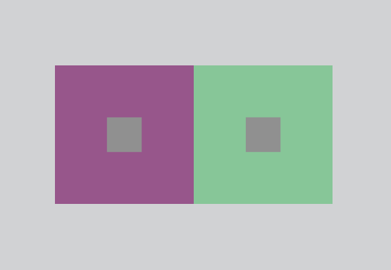
And now for the magic. Is it possible to make magenta look green? Can red look like cyan? Can yellow be made to look like blue?
In this exercise the small middle-value gray squares will take on a dual identity: it will appear to be both a color with hue in one square… and its complementary color in the the second square.
This piece is developed in the lower right quadrant of the file. Create a new layer named color_interaction.
Copy the contents of the previous exercise and move it to your new layer, centering it in the lower right quadrant. Remember to unlock the gray rectangle to move it also. Once in its new quadrant on the color_interaction layer, use Object>Lock>Selection once again so that the gray shape does not move while completing the following steps.
Set a color
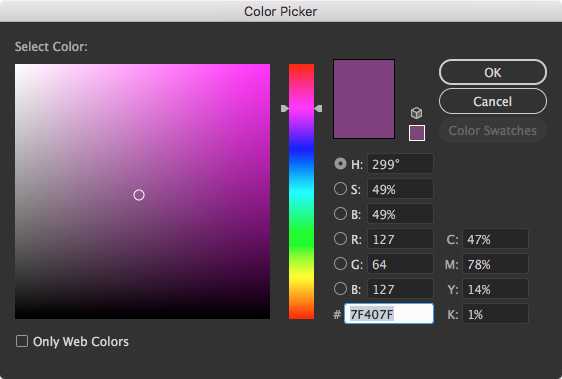
Select both the large white and black squares, but do not also select the small middle-gray squares. Use the Color Picker to fill both large squares with a hue of medium saturation (S around 50%) and medium value (B around 50%). Here, the example uses a magenta. As before, if you see a ⚠️ symbol, drag the value until it disappears.
Invert the color
Select one of the squares, and in the dropdown menu at the top right of the Color Palette, select the Invert option. Choosing the Complement option only changes the hue, whereas the Invert option affects all three properties: hue, saturation, and value.
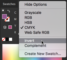
In the example, this changes the magenta in the selected square to green. This is both a bit less saturated and a bit more bright in value when you inspect it in the Color Picker.
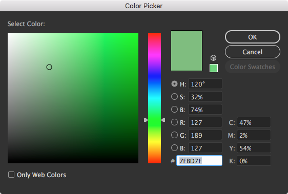
An automatic middle mixture
Recall that it is one of the interesting properties of complementary colors that their middle mixtures are always a middle-value gray. No matter what hue you start with and whatever complement it creates, the middle mixture is already created in the small gray squares, which remain untouched.
For the proof, turn off all Guides and zoom in until the exercise fills the screen. Stare at the middle line dividing the complementary colors. The two smaller squares should be in your near periphery vision. As if by magic, you will see the gray turn into seemingly opposite, complementary hues!
Click or tap on the sample image to open a large version. Expand the image to full screen, and see if you can’t see it happen!
Why does this happen? Color is relative. It relies on context for its identity. In the sample, the two squares are middle-saturation, middle-value magenta and green. On the magenta square, the gray figure feels green because:
- the heavier presence of magenta in the ground diminishes the magenta element within the gray and
- the adjacent presence of the green influences or suggests how we should read the gray figure—as green.
The opposite is true on the gray ground, where the gray feels like magenta.
Save and share
Your finished exercise will look something like this:
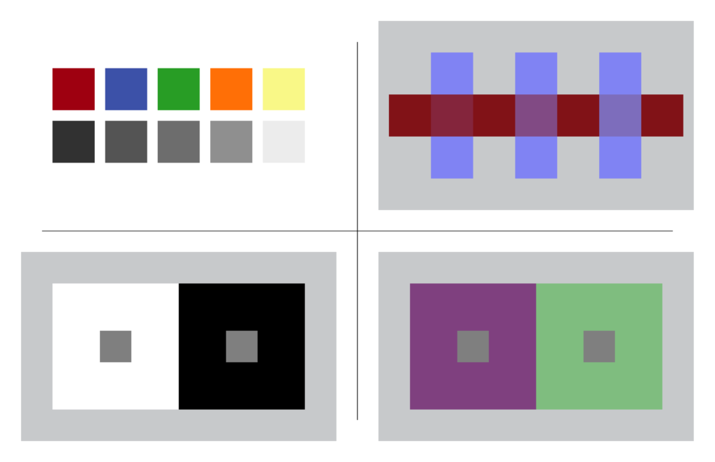
Save the file as a native .ai file, and export a .jpg. The .ai file should be archived, and use the .jpg to illustrate your work as an embed in your process journal or blog.
Credits

For portions of these sections:
- Color Theory
- Hue has value
- Interaction of values
Contents have been adapted from Digital Foundations by xtine burrough and Michael Mandiberg, modified by williamCromar. Please see the newMediaWiki licensingNotes regarding Digital Foundations derivatives, which are governed by a Creative Commons Attribution-NonCommercial-ShareAlike 3.0 Unported license.
