Looking glass
Through the Looking Glass
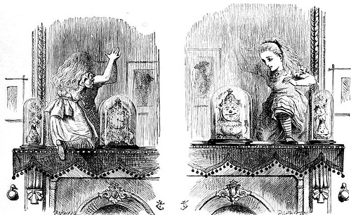
In another moment Alice was through the glass, and had jumped lightly down into the Looking-glass room. The very first thing she did was to look whether there was a fire in the fireplace, and she was quite pleased to find that there was a real one, blazing away as brightly as the one she had left behind. ‘So I shall be as warm here as I was in the old room,’ thought Alice: ‘warmer, in fact, because there’ll be no one here to scold me away from the fire. Oh, what fun it’ll be, when they see me through the glass in here, and can’t get at me!’
Lewis Carroll, Through the Looking-Glass, and What Alice Found There
In Through the Looking-Glass, and What Alice Found There, Lewis Carroll creates a surreal world that mirrors our own… to a degree. We tend to misread Carroll’s chronicles of Alice as fundamentally children’s stories. This is probably because more people have seen the Disney movie than have read the work. It’s kind of a world with surprisingly dark undertones.
Along with Alice’s Adventures in Wonderland, Carroll’s tales are better understood as existentialist absurdism. Carroll paved the way for such very adult authors as Franz Kafka and Albert Camus. Without Carroll, it’s hard to see how Federico Fellini, Tim Burton, or Guillermo del Toro could make movies. And artists like André Breton, Max Ernst, René Magritte, and Leonora Carrington were inspired to invent Surrealism as an artistic movement no one would confuse with childishness.
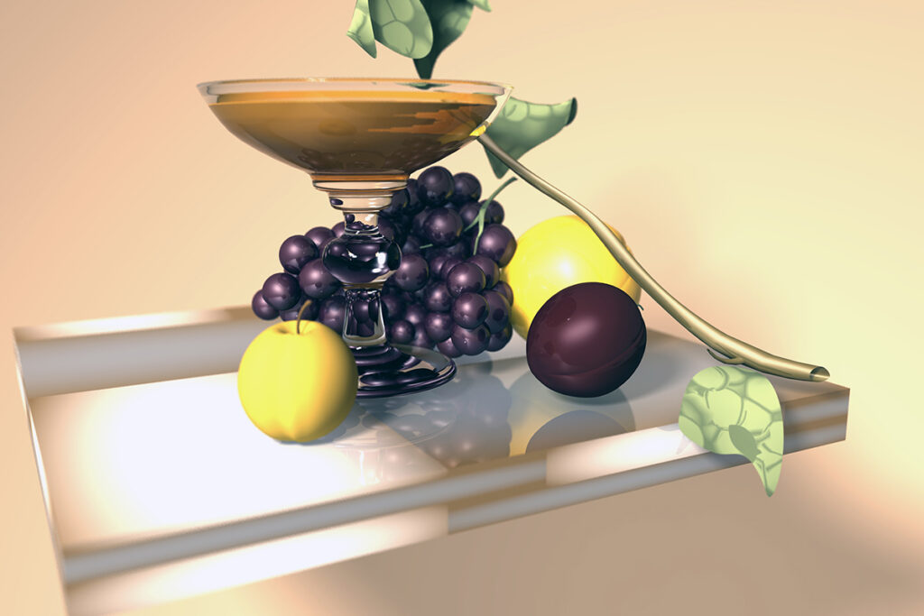
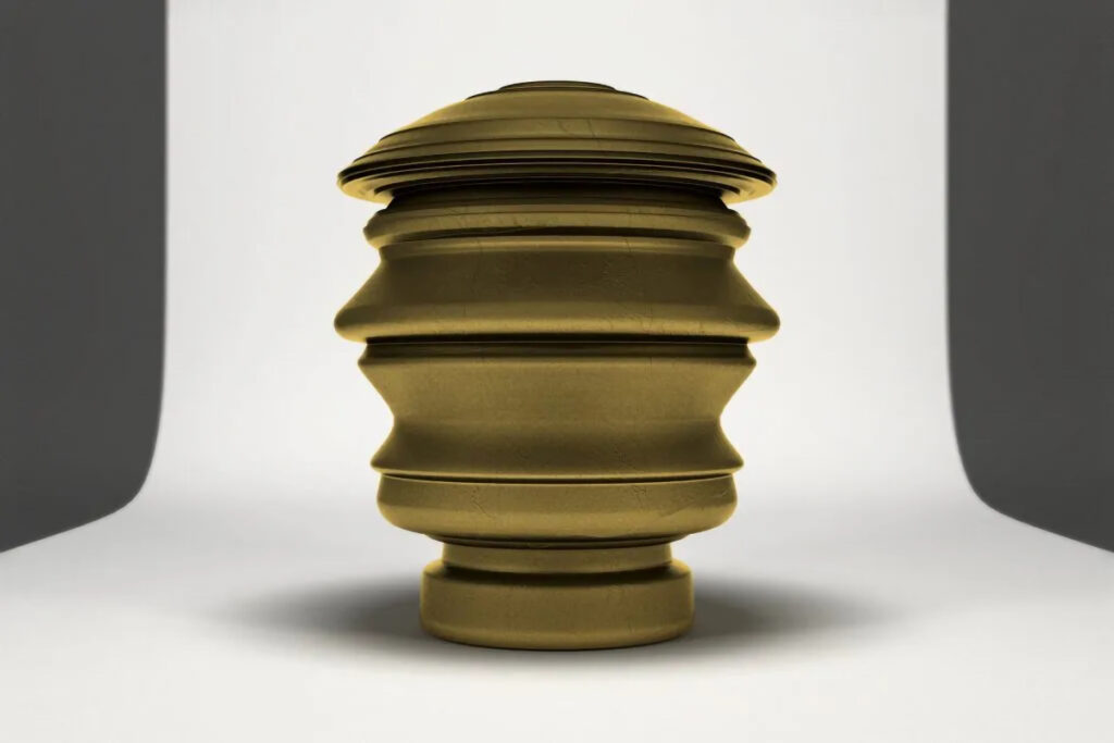
Entering the Maya viewport is a lot like entering a Looking-Glass Land of our own creation. We may use camera effects like depth of field to fool the eye. Or we might use motion blur to create a surreal atmosphere. Or we might develop a sense of light and space that seem tangible, but a material condition that seems otherworldly. We might also choose a world so hyperreal that it seems more real than real. Whatever brand of realism you choose, in our project, we’ll use high-resolution still imagery to generate narratives that toy with the depiction of reality in the inherently surreal looking-glass of the Maya viewport.
Go ask Alice…
Take a look below at several project frameworks inspired by Carroll. Like the artists, novelists, and directors listed above, you can be inspired by Carroll’s alternate realities without explicitly referencing them (though that’s fair game, too). It’s interesting to see how many classic “hello world” modeling projects align with themes and subjects encountered in Carroll’s strange imagination.
Technical specifications
The project must meet the following technical requirements:
- Model: Maya project folder with a master scene containing approximately a half-dozen unique instances of referenced objects, with 2 light sources and material assignment as appropriate to the subject.
- Image Resolution: 2 images from separate locked and dedicated cameras at different points of view at 3000 X 2000 minimum. Rendering should not occur from the Perspective view.
- Fabrication: 1 object conforming to the requirements spelled out in Fabrication (the next wiki title) and published at p3D or similar model hosting site.
Concept: Enter the glass…
Your first task is to find a framework for your concept. Alice inspires four different scenarios that align well with first-time modeling projects:
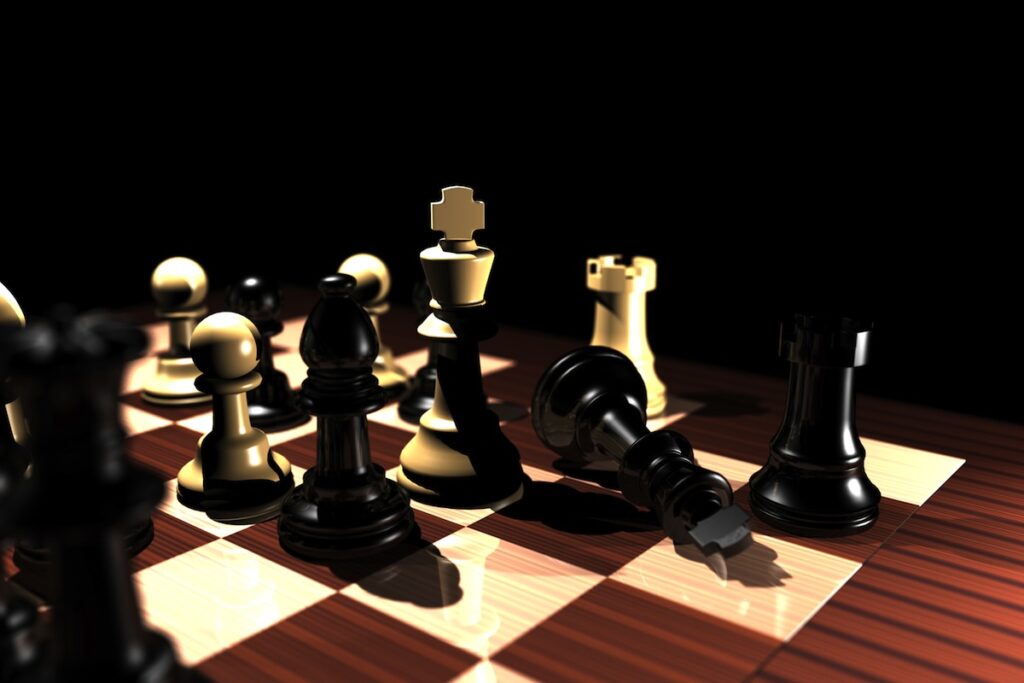
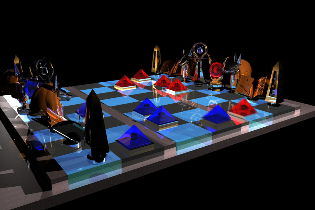
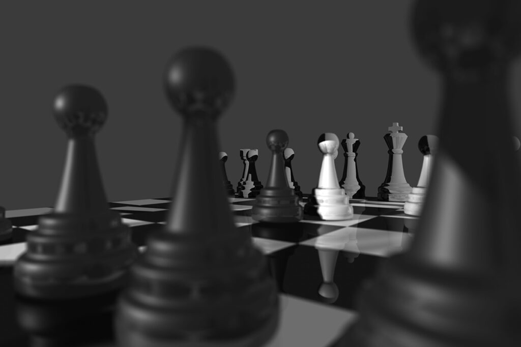
- Checkmate: design a chess set with unique elements.
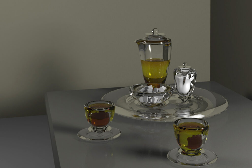
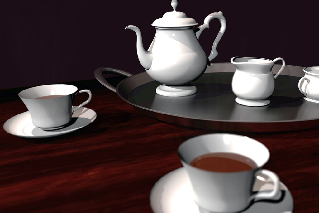
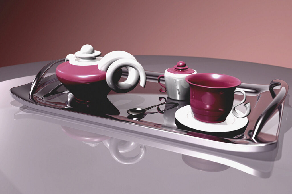
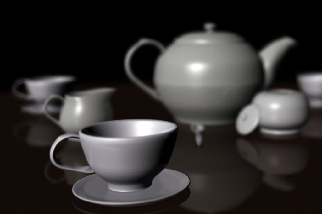
- Tea Time: design a tea setting with pot, cups, saucers, creamers, and the like.
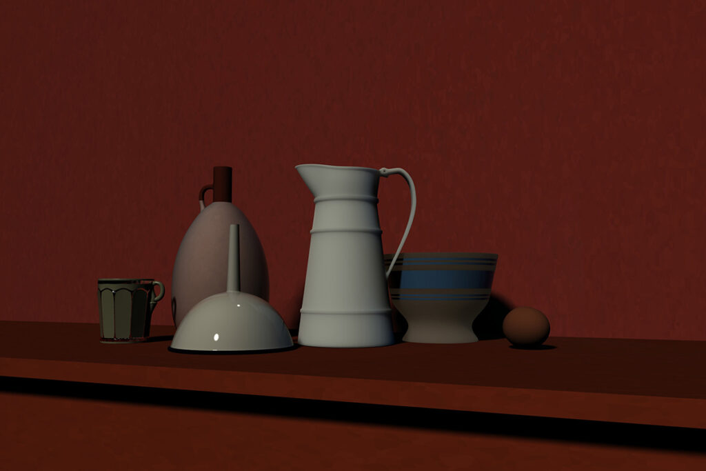
- Still Life: base your work on a still life painting, or come up with your own composition.
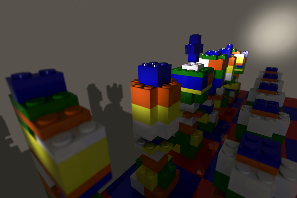
- Collage: Mash together unusual juxtapositions of objects to create new things.
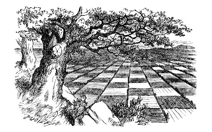
and What Alice Found There, 1871
… And make a choice
Checkmate
From my close contact with artists and chess players I have come to the personal conclusion that while all artists are not chess players, all chess players are artists.
Marcel Duchamp
Alice’s chess game
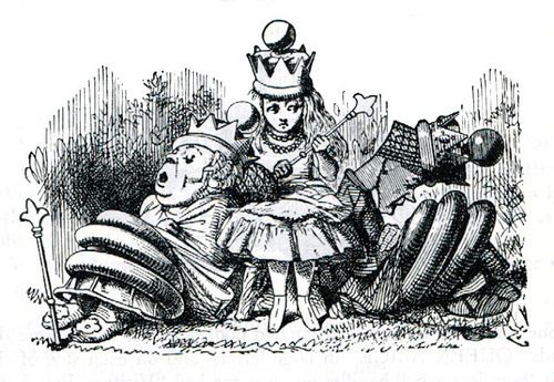
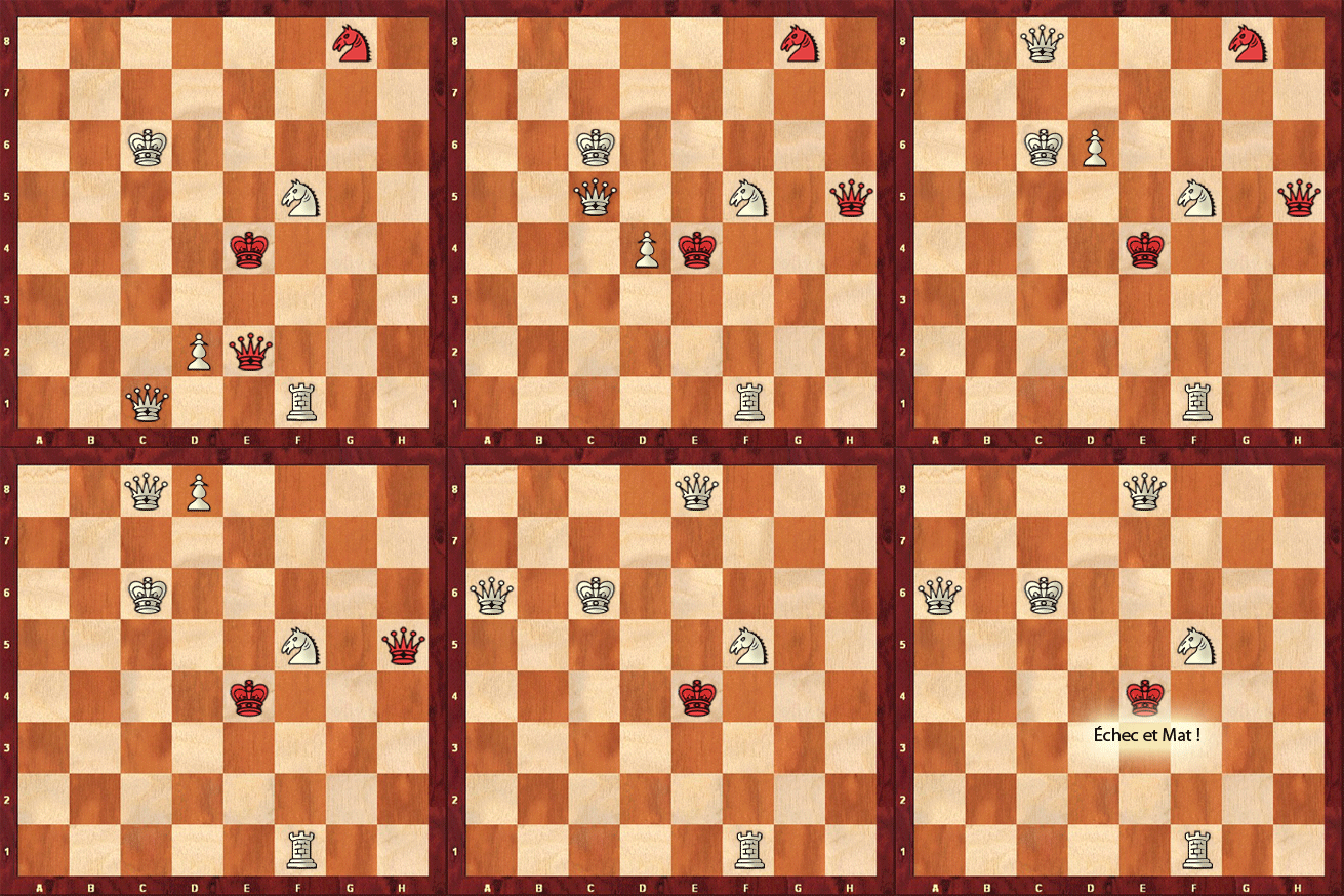
Looking-Glass Land is crisscrossed by small streams that run perpendicular to each other, creating a pattern akin to the divisions of a chessboard. It turns out that this world is a chess game, and Alice figures in it as a pawn who, in reaching the royal row, turns Queen. The story is loosely based on a slightly flawed endgame illustrated in the book. If you are a chess novice, the animation here helps interpret the arcane chess notation.
Artists and chess
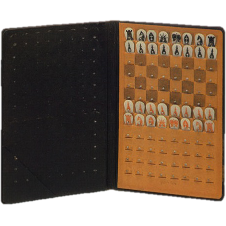
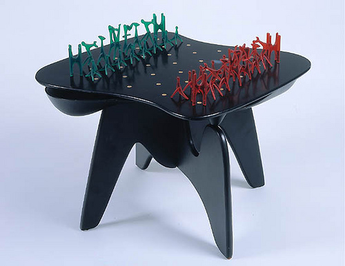
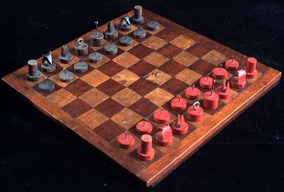
Since the turn of the century, we’ve seen several exhibitions dedicated to the intersection between art and chess. One of these was modeled on a show that Marcel Duchamp had curated in the mid-1940s. Duchamp, a famously avid chess player, had devised a few chess games himself, including the traveling set that functions as our Elements project icon above, and he invited several artists to reinvent or otherwise comment visually upon the game. Read about one of these more recent shows, exhibited at the Noguchi Museum.
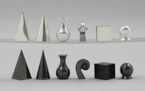
Your design
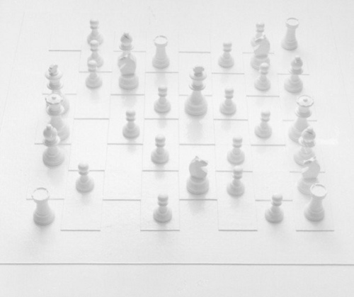
If you choose to create a chess set, you’ll design all the pieces and a playing surface. It looks like a lot of work! But remember, there are only six unique elements — king, queen, bishop, knight, rook, and pawn.
Make a separate file for each piece, then bring them into a simple environment, where you can differentiate material. Like the artists illustrated here, you need not make a classic set, simply one to which you assign values understood through visual hierarchy, the visual emphasis of this particular version of the project.
Tea Time
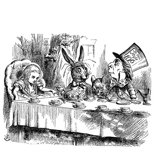
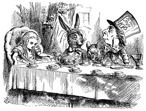
Carroll makes a tea party in one of the central episodes of Wonderland, the adventure that presages the Looking-Glass world. The party devolves into something other than a proper tea time as the Mad Hatter, Dormouse, and March Hare unravel the ceremonies normally associated with this uniquely English ritual.
The Utah Teapot
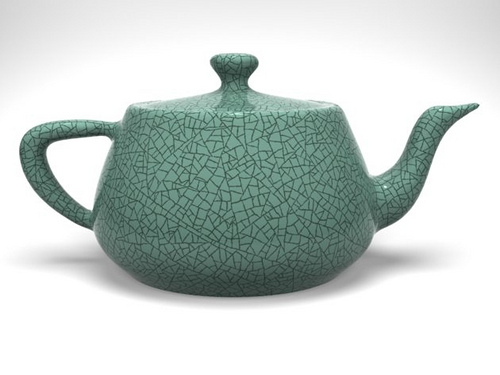
Tea is a pivotal element in the history of 3D modeling as well. As we’ll recall from earlier reading, Martin Newell created the Utah Teapot as the first standard reference object database back in the days before packages like Maya were available (if you think it’s tough to model in Maya, try figuring out its data set by hand!).
Artists and tea
Like the chess set, teapots have been an object of consideration for artists and designers throughout history.
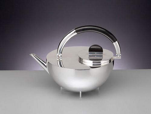
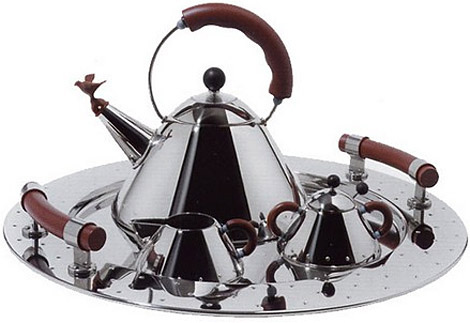
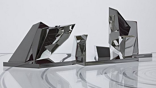
Your design
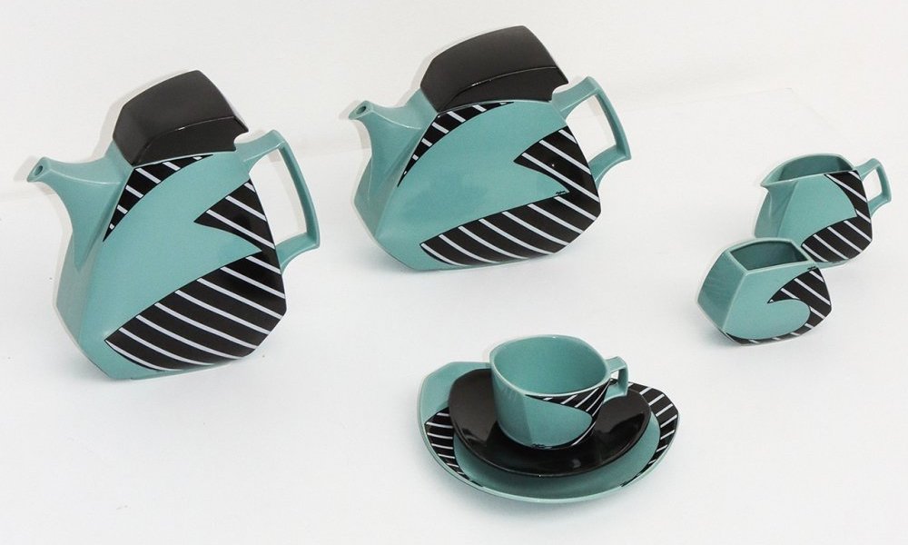
A typical tea service includes a teapot, sugar bowl, creamer, cup, saucer, and perhaps a spoon or tray. You’ll design about a half dozen unique objects. The cup/saucer pairing can be copied to generate as many place settings as you wish.
Make a separate file for each piece, then bring them into a simple environment, where you can differentiate material.
One caution: Antique tea sets, and even some modern ones, can contain elaborate forms and finishes. It’s OK to challenge yourself but make design choices appropriate to your level of experience.
Still Life
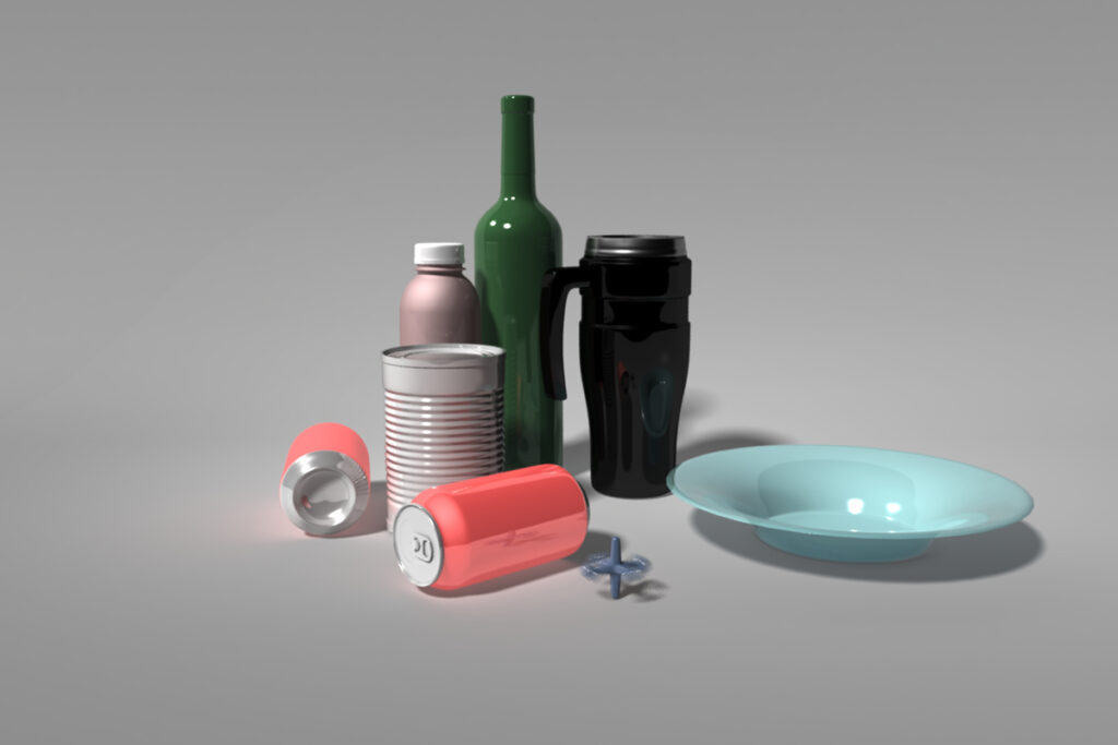
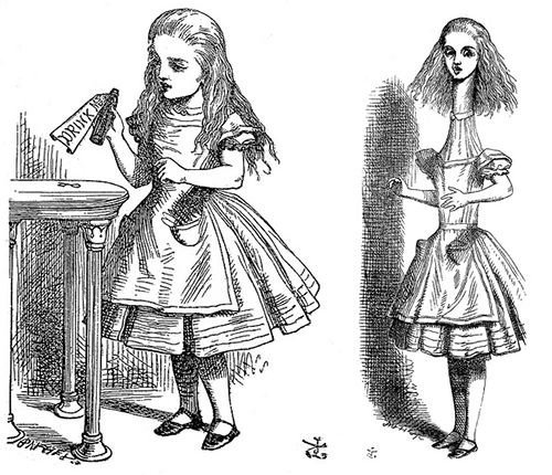
In Wonderland, Alice encounters “normal” objects that are far from normal. A bottle, typical of one found in still life, famously says “Drink Me” on its label, the consequences of that action being a physical shift in scale. In Wonderland and Looking-Glass Land, normal rules of size and scale are out the window. One of the strange aspects of Maya’s measuring system as we are using it: it is inherently unit-less and therefore more about proportion than scale — 1 unit can be a centimeter, an inch, a cubit, a mile, or a kilometer. If you choose a still life, you’ll have the opportunity to toy with this idea of inherent scalelessness.
Artists and the still life
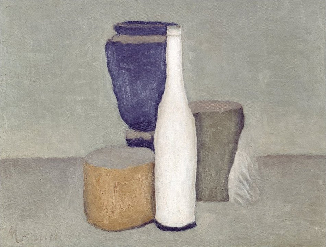
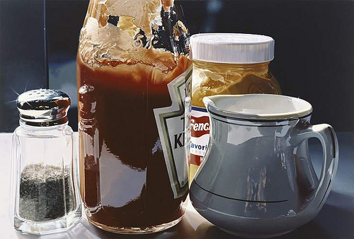
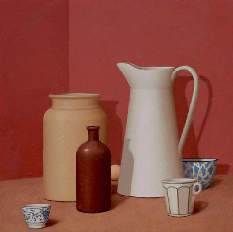
For inspiration, take a deeper look at the work of a still-life artist working in the past century. We’re familiar with realists like William Bailey and Ralph Goings. Another modern still-life painter, Giorgio Morandi, creates work that approaches abstraction in its economical use of color, value, texture, and formal relationships. His paintings reconcile an otherwise traditional pictorial convention with Modernism, and his spare use of color and form has been hailed by some critics as a forerunner to Minimalism.
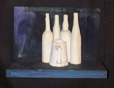
As Morandi himself observed, “Nothing is more abstract than reality.” George Segal, a sculptor whose work also toys with this edge between figurative and abstract visualization, recognized this in his sculptural tribute to Morandi
Painting and sculpture
As Morandi himself observed, “Nothing is more abstract than reality.” George Segal, a sculptor whose work also toys with this edge between figurative and abstract visualization, recognized this in his sculptural tribute to Morandi. Like painting, sculpture can also be a source of inspiration for your project
Your design
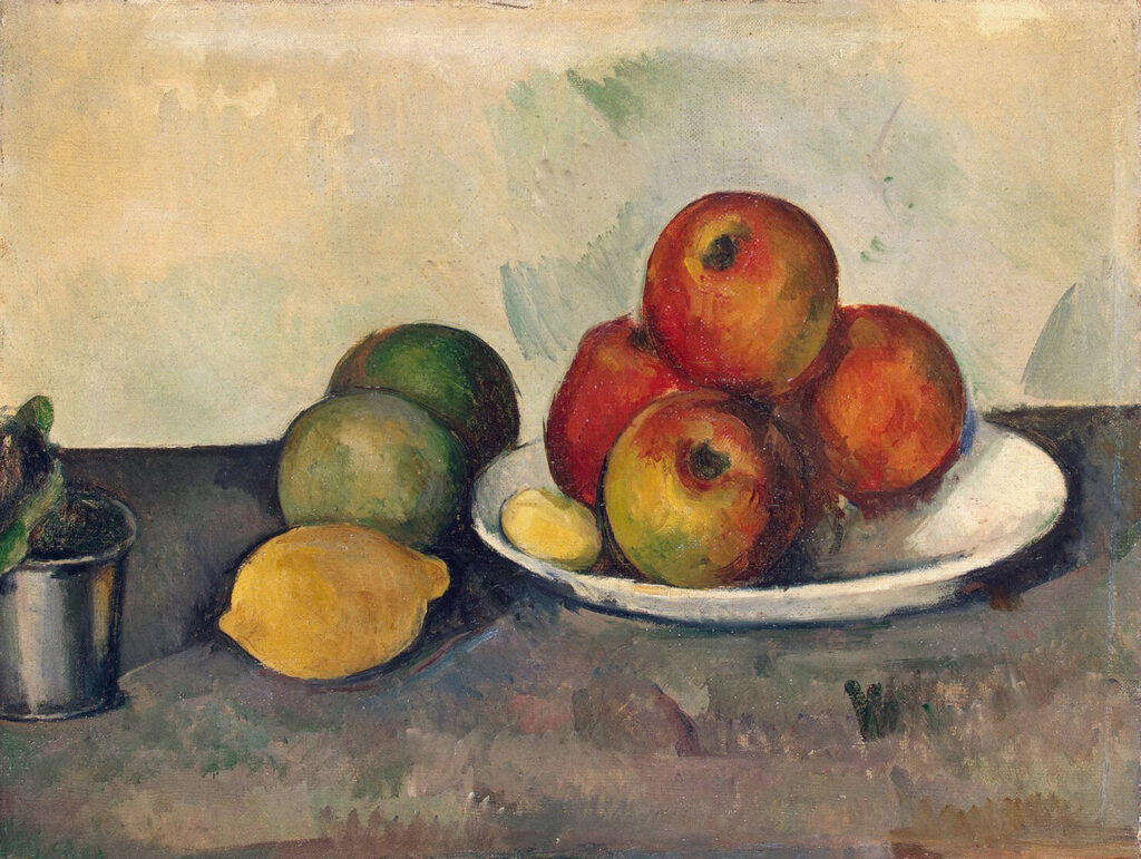
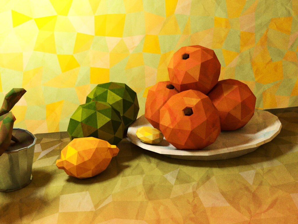
Perform an internet image search for a high-resolution image of a still-life by Bailey, Goings, Morandi, or another artist that contains between 5 and 8 objects. Just as Segal used a Morandi painting as a source of inspiration for sculpture, you’ll use your selection as a source for your 3D model.
Alternatively, you can compose a still life using simple geometric objects in the manner of these artists.
One caution: Still-life paintings of a Neoclassical nature can contain elaborate chunks of meat, fruit, highly textured materials, and other conditions that go beyond your current knowledge base. Be aware of this as you make choices. Keep it simple!
Collage/montage/assemblage
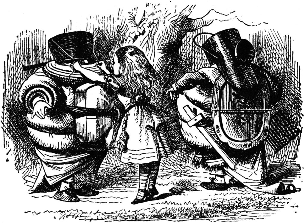
Preparing Tweedledum and Tweedledee for their absurd fight, Alice collects an ad-hoc collection of armor and weaponry, figuring out on her own what will work.
If you wish to do it yourself and develop your theme instead of the suggestions above, consult with your instructor and follow these criteria to maintain a consistent scope of work:
- The scene must integrate between 5 and 8 discrete, simple objects
- Materials are uniform and do not involve texturing
- Environment is minimal
A “new” way of making work
Pablo Picasso is given a lot of credit for “inventing” collage and assemblage, but many artists were instrumental in developing this Modernist idea. In the reactionary anti-art work of Dada, artists such as Raoul Hausmann refused to play the role of artist by playing with refuse.
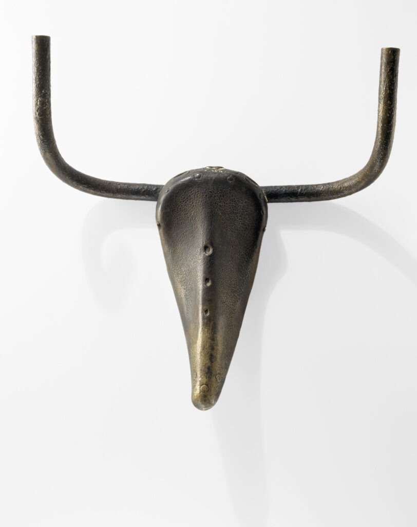
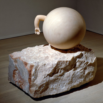
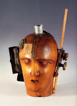
Your design
This project is unusual, in that your several objects should come together to create a unified whole — a single object.
Make a separate file for each piece, then bring them into a simple environment, where you can differentiate material.
One caution: Our examples contain things like hands and materials like wood. Be aware these kinds of things are not in your current knowledge base. Judge accordingly!
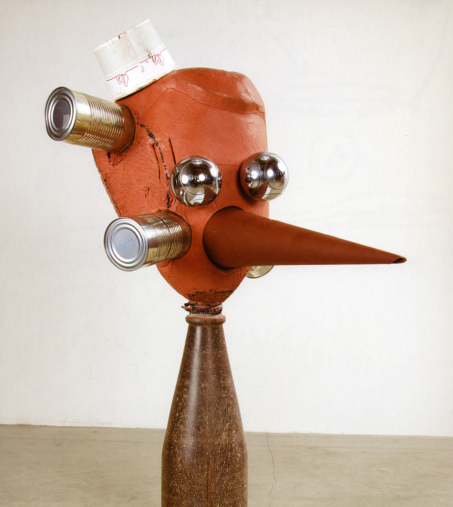
Reference images and project management
Any of the above choices will include five to eight unique instances of modeled objects, and some of them will be populated by copies of these objects to which material may be applied as directed below. The scope of work otherwise being similar, it’s your choice, and once you’ve chosen every project will follow the general instructions below. For your concept, develop as follows:
- Use drawing and/or physical modeling in plastelina, clay, wood, etc. to develop the basic 3D idea. Elaborate the idea into a set of orthographic reference drawings to import into a new Maya project. Challenge yourself to use a range of the tools you learned in the tutorial, but avoid an overly complex solution that completely frustrates you (like making a chess set out of Star Wars characters, a Fabergé tea set, or rococo beer steins in still life).
- Create a new Maya project. Name the project using intelligent naming conventions.
- Create a scene for every element, and one master scene to import them into, keeping the scenes in the scenes folder.
- Import your ortho reference drawings as image planes into the scenes associated with the project.
Document your process so far in your process journal or blog. At a minimum, include your ortho sketches as embedded images.
Iteration: developing the objects
Each object you create will be developed in its own Maya scene. Do not model everything in one scene!
- Using an appropriate model basis—polygons and/or NURBS—for your concept, create the element geometry. If you need to, review in LinkedIn Learning or search for online tutorials to help you figure out the workflow.
- Be aware of and use visual principles and the metaphors to sculpture that you’ve encountered in your reading: is your modeling appropriate to the forms, materials, and processes you envision your objects to be made from?
- Remember: if it’s appropriate, use historical states to develop your models. If something goes wrong, you don’t have to start over.
When the objects are ready, use referencing to bring your objects into the master scene. Our demo file, available for download above, will illustrate this concept.
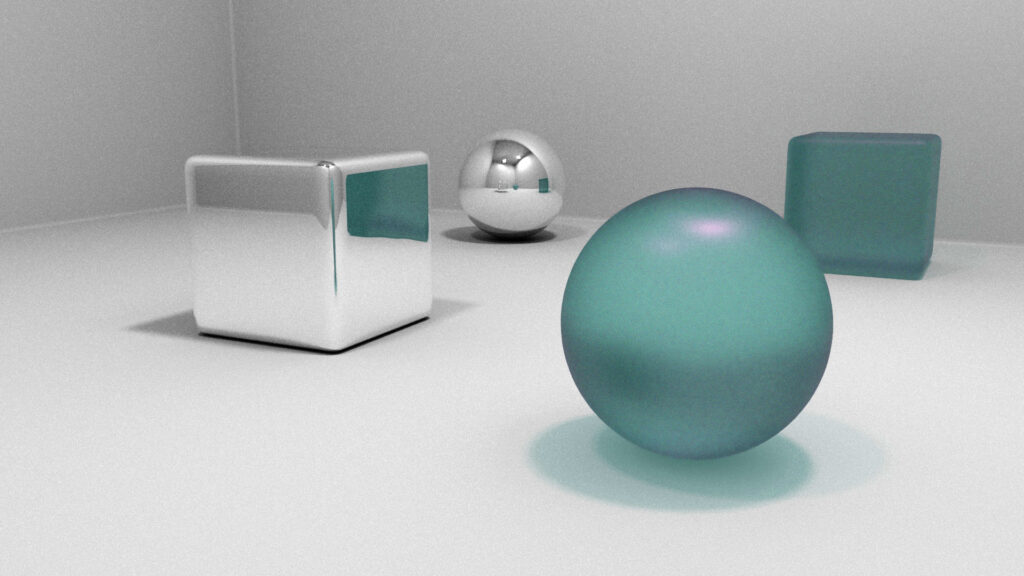
- A very SIMPLE environment can be made from polygon planes or rectangular volumes that suggest a tabletop and/or basic room shape. You’ll apply a basic material to this when we get to it below, but keep this environment very stripped down.
- Import the geometry for each element from their respective scenes into the master scene. Remember: develop and keep all of these scenes in the Maya project scenes folder!
At this stage, you can document your iteration process in your journal or blog.
Synthesis: staging, material, and composition
Following the workflow we learned in our Material culture exercise, bring everything together:
- Creation of lights and cameras:
- In the master scene, generate lights and cameras appropriate to a high-quality, professional photo shoot. Use a minimum of 2 light sources (a key and fill light), but avoid an overly complex lighting solution as this creates rendering processing issues.
- Create one camera for each of a minimum of 2 views you wish to generate for the object.
- Composition of images:
- This has less to do with software and more to do with your skill as an artist, and this is what people really see: here, you are acting like a photographer composing images. Sketching your ideas for image composition before you compose in the viewport vastly improves your work.
- You might notice we have not yet created materials. If your composition depends on the presence of colors or transparency, create simple placeholder materials using Blinn (glossy) or Lambert (matte) and dial in a color or transparency level for that material in the Attribute Editor. You will replace these placeholders in the next step.
- Be aware of and use visual principles and the metaphors in photography that you’ve absorbed. Is the relationship between your camera and elements yielding a plausible result? Our means of expression are realism, photo-realism, or surrealism: compositionally speaking, are you achieving your goal?
- Creation of materials:
- Always think of material assignment as a three-part process: define lighting, then render settings, and only then the material.
- Remember the setups from the Material Culture exercise.
Rendering requirements
- Rendering and use of photographic effects:
- Create 3 high-quality, high-resolution (4000 X 6000, landscape or portrait format) TIFF images from your model using Arnold. Be prepared for it to take a long time, especially if you are using transparent, refractive, or reflective surfaces. There is always a trade-off between rendering time and image quality, and we want to emphasize quality. However, if rendering times are excessively slow, simplify lighting and material modeling to reduce rendering time. If this doesn’t solve the problem, reduce the Arnold Camera (AA) sample value in Render Settings. If all else fails, reduce the resolution down to 3000 X 4500, or 2000 X 3000.
- In rendering, define photographic parameters for your cameras that are appropriate to the situation you are trying to describe. Pay particular attention to the use of:
- depth of field
- focal length/angle of view relationships
- perspective in creating a composition
- One special rendering for the motion blur effect:
- If it’s appropriate: one image should exhibit a motion blur effect. To generate the motion blur effect as you learned how to create in the LinkedIn Learning tutorial, create a timeline of 24 to 48 frames. Effective use of motion blur recognizes that such an effect occurs when the shutter speed is slow and that such a slow speed creates certain depth of field conditions which should be present in a convincing motion blur image. This requirement will not apply to all projects!
Presentation
The presentation will include at minimum the 2 rendered views embedded in your journal or blog. Additional presentation options include a large-scale physical 2D print and/or a small-scale 3D print of ONE of your objects. Time constraints may limit what is possible for a mid-semester critique, but any additional output can be included at end-of-term crits.
