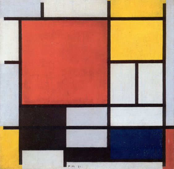
This is not a non-objective object

This is not a non-objective object …
When painters like Johannes Itten, Paul Klee, and Wassily Kandinsky were inventing the Bauhaus Basic Course, they were strongly influenced by developments in the Russian Constructivist and Dutch De Stijl movements. Walter Gropius, head of the Bauhaus, recruited some of the principal artists from these movements to teach. One notable exception was Piet Mondrian. Mondrian lectured at the Bauhaus, and he had a publishing and print-making relationship with the school. However, he was conspicuously not a member of the faculty. In spite of this, his work deeply influenced Bauhaus aesthetic, arguably more than the work of the painters who taught there.
Here we can see the development of his formal language, which he eventually called Neo-Plasticism, from about 1908 forward:
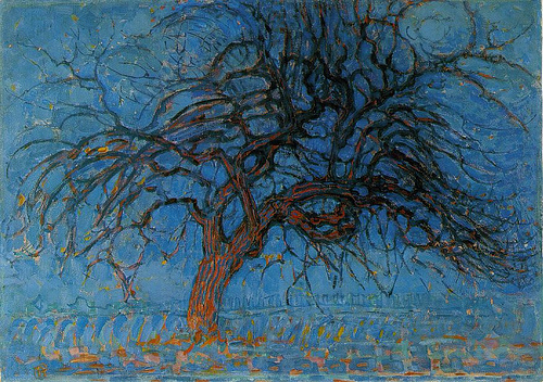
- 1 | Avond (Evening); Red Tree, 1908
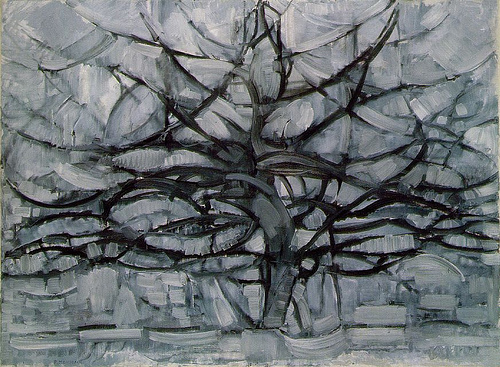
- 2 | Gray Tree, 1911
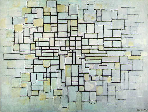
- 3 | Composition No. II; Composition in Line and Color, 1913
- 4 | Composition with Gray and Light Brown, 1918
- 5 | Composition with Large Blue Plane, Red, Black, Yellow, and Gray, 1921
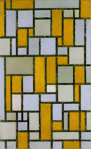
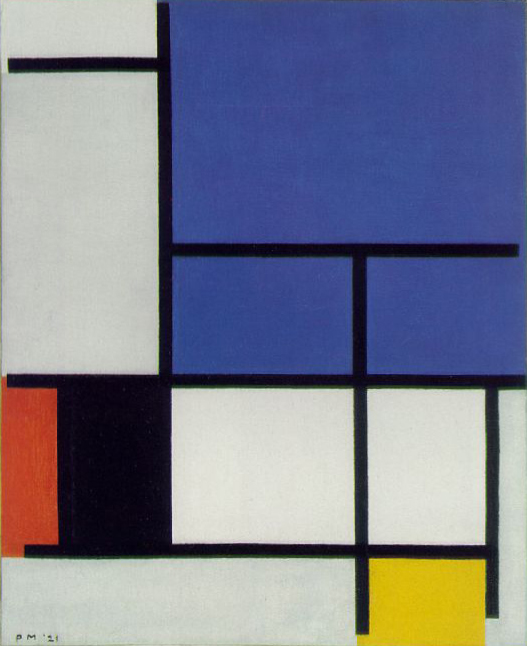
… it’s a non-objective space …
We can deduce the formal lattice structures found in a canonical Mondrian painting have their origins in structures he observed in nature, particularly the spatial layering and directional visual forces found in bare tree branches. It’s not correct to say his later paintings are abstractions of trees. But they evolved from that into his classic, strict vocabulary.
By late 1920, he had refined the form language of Neo-Plasticism to pure non-objective expression. Most people who encounter a classic Mondrian such as Composition with Large Blue Plane, Red, Black, Yellow, and Gray, 1921 read the painting as flat, but an ambiguous space is revealed when viewed in the context of their development. Avond; Red Tree, 1908 reveals the origin of Mondrian’s pictorial strategy: how to achieve a sense of equilibrium among opposing visual forces.
In Red Tree, Mondrian achieves this through the exploration of visual forces found in the lattice of branches. We witness a seeming dissolution of space where foreground and background are ignored. That reading of space is valid only if we use the criterion of traditional Renaissance perspective, however. By using the hot visual push of red and the cool pull of blue, Mondrian indeed develops a sense of space, albeit a decidedly non-traditional one. It is through a visual hierarchy determined by color and a latticed figure-ground relationship that it’s possible to “read” a later Mondrian as a post-perspective spatial artifact, and the early tree paintings allow us to decode it.
Decoding
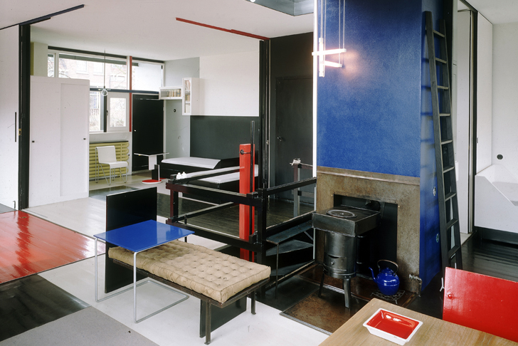
If he were an architect, Mondrian might have come up with something like his De Stijl associate Gerrit Rietvelt’s Schröder House, seen below, using color as a way to create space.
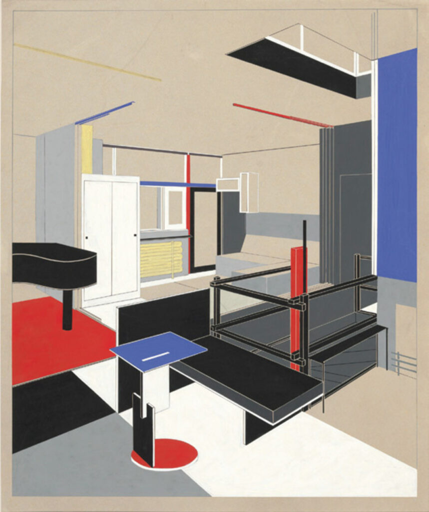
- 1 | Gerrit Rietveld, Schröder House, 1924: rendering
- 2 | Gerrit Rietveld, Schröder House, 1924: photograph
As it turns out, Mondrian did that.
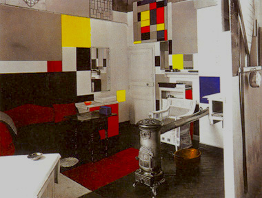
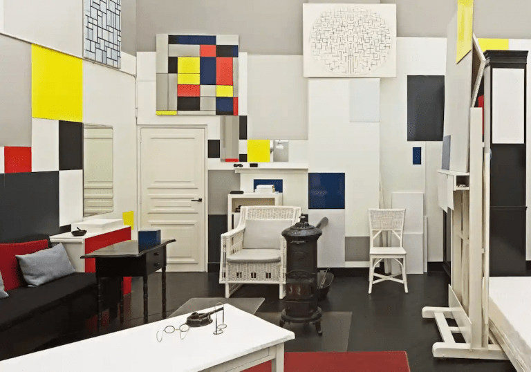
His studio was an installation of color planes that seemed to act like an exploded 3D version of his painting language. Below, we see a study of vintage black-and-white photographs of Mondrian’s Paris studio by Frans Postma and Cees Boekraad. From tonal analysis, they were scientifically able to determine the color scheme of the room. The Tate in Liverpool was later able to reconstruct a spatial facsimile of the studio.
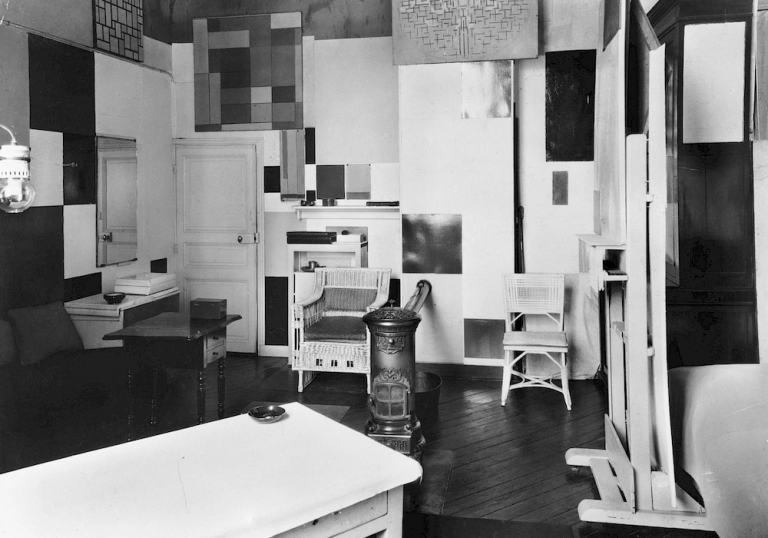
- 1 | Original photograph, Mondrian’s Paris studio in the 1920s
- 2 | Postma and Boekraad, Mondrian’s Paris studio color reconstruction, 1995
- 3 | Tate Liverpool, reconstruction, 2008
It’s not difficult, then, to imagine a Mondrian painting as a drawing of a 3D object, much like an architect’s elevation or section orthographic drawing. This imagined state will become the seed for our modeling project.
… containing an infinite reality …
Mondrian thought of his paintings as describing a fully alternative reality. To allude to the vastness of his world, he thought of his compositions the way photographers do: as cropped fragments. In the catalog accompanying the exhibition Mondrian: The Diamond Compositions, art historian E. A. Carmean, Jr. describes this cropping idea:
The solution to this problem is … the idea that reality could be understood by a fragment. That Mondrian took this ontological position is most directly spelled out in a statement of 1926: “… my painting is an abstract surrogate of the whole… ,” His canvases are meant to be read … as an integral creation which shows—or in Mondrian’s case corresponds with—reality and emphasizes this metaphysical fact by containing only part of the whole, by being a cropped section of a continum [sic].
E. A. Carmean, Jr.
He goes on to explain how Mondrian emphasizes the crop concept using the alternative format of the diamond, a square canvas rotated 45 degrees:
In Mondrian’s rectangular canvases this idea is more difficult to perceive, as the horizontals and verticals parallel the framing edges, a relationship which suggests repose and containment. But the cutting lines of the diamonds make the fragmenting of reality explicit. “I think the destructive element is too much neglected in art,” Mondrian wrote to Sweeney in 1943. The diamond edges served this purpose, they destroyed; as he said to Seuphor in the 1920s, their function was “to cut [couper].”
E. A. Carmean, Jr.
Carmean illustrates the idea that “the extension of certain shapes past the boundaries of the picture is implied” in a diagram, which I have updated below:
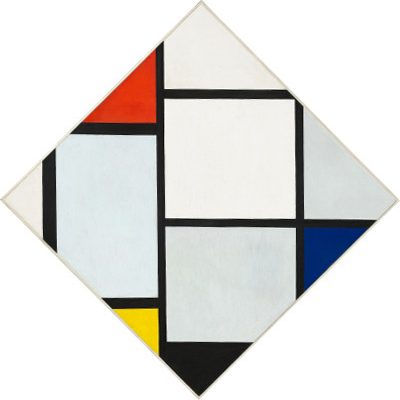
with Red, Gray, Blue, Yellow, and Black,
c. 1924/1925
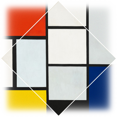
rectangles extending beyond the
crop of the diagonal frame,
after a diagram by Carmean
… filled with dynamic energy …
For Mondrian it was necessary that his works present … a reality which he believed was both constant and always changing, a combination of immutable laws and continual energy. Painting had, in this sense, a problem; it could be composed and balanced on one hand, yet could not be particular or static on the other.
E. A. Carmean, Jr.
Mondrian was a serious man, both aesthetically and personally; his manner of dress was as formal and tidy as his paintings would suggest. But he harbored a love of modern jazz music and dancing. In jazz, he found a kindred musical spirit with his painting, especially in “the music’s concentration on complex rhythms and contrapuntal structure rather than the tune.”
There is a clear analogy to the vital, dynamic energy of boogie-woogie jazz in Mondrian’s New York paintings. His last, unfinished masterpiece, Victory Boogie-Woogie, reflects as much, not only in the explicit reference in the title but in the emphasis on visual counterpoint. If the black lines of the earlier work are the beat and the colored planes counterpoint, this final painting is pure syncopation. Most commentators agree that the multiple rhythms and overlaid grids of New York are reflected in the work.
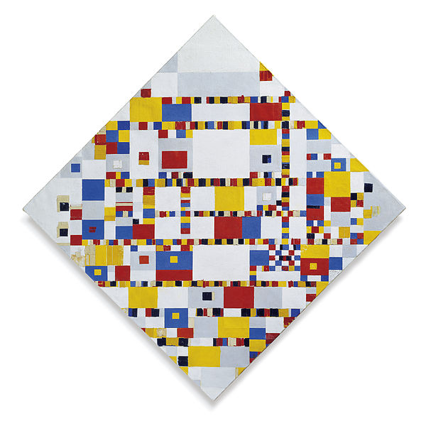
… that implies time and motion
This relationship to music, dance, and urban energy provides an open door to the interpretation of Mondrian’s reality in expressions through time and motion, and animators have tried their hand at synthesizing the implications of space and dynamic tension present in these paintings.
In Brandon McFarland’s Mondrianimation, we see a two-dimensional interpretation that has the same spirit and scope that you’ll attempt to create in three dimensions.
