Time is the Space that may not be seen. — William Emerson
From Thomas Pynchon’s Mason & Dixon, p. 326
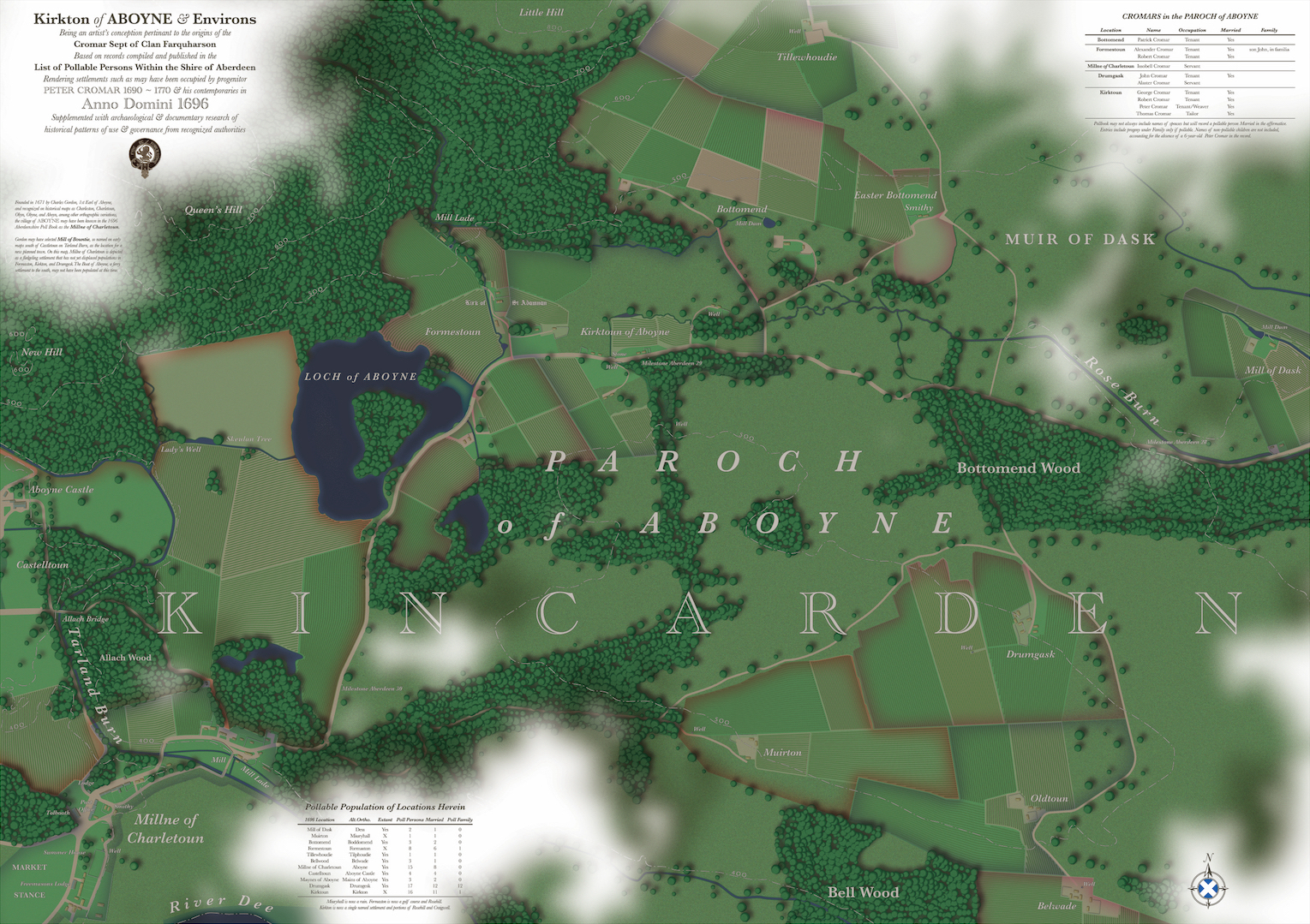
At the beginning of my last post, Mapping 1696: Cromars and Robbs in the Poll Book, I imagined what an incredible map could be produced by synthesizing historical map information and place-name orthographic study with the now-searchable database in the List of Pollable Persons Within the Shire of Aberdeen. My absence from this journal for the past 3 weeks is a testament to the enormity of the task, but it’s finally complete. Without further ado, I present Kirkton of Aboyne & Environs, Being an artist’s conception pertinent to the origins of the Cromar Sept of Clan Farquharson.

For those who wish to view a printable resolution image of this large-scale map — 16 inches is equal to 1 statute mile! — you can find it at these links below. Nota bene: these are HUGE files and not mobile-device friendly, and Google Drive will warn you it cannot create a preview or scan for viruses, but don’t worry:
Image 36″ x 48″ at 300 ppi | 160 MB
PDF with printer’s marks | 1.57 GB
If you’re a nerd like me, you’ll want to dig deep into the wonky bits. How did I make this and why?
Methodology
Concept
The concept was to create a map that accurately depicts the Kirkton of Aboyne and other locations within the parish of Aboyne in which my ancestors were recorded in the Poll Book, a time when our progenitor, Peter Cromar, was a small child. I chose to include every settlement in which Cromars could be found in the parish of Aboyne in 1696, which determined the extent, and therefore the scale and size, of the map. Whether Peter could be found in Kirktoun or, as I conjectured in my previous post, in a place such as Drumgask, I wanted to make sure I was able to capture the place where he was raised.
I stress accuracy over precision in the project. While much of what is particular in the map is unknowable or unprovable, research into the general living conditions of Scotland in the late 17th century yields an artist’s interpretation which reasonably illustrates a probable reality. How’s that for a heap of hedging language?
But really, such hedging should be applied to any map, even one based on satellite imagery. All maps contain the biases of the maker, abstractions based on the purpose, or limitations of resolution and scale. Therefore, no map contains an absolute truth: as Alfred Korzybski succinctly notes, the map is not the territory. And while some maps are used to lie and distort reality, a map like this one intends to reveal a probability of truth, through research and synthesis.
Sources
In the fifty-odd posts in this journal, there are myriad sources — books, libraries, websites, museums, site visits — that inform my own mental map of what life in this corner of Aberdeenshire at this time must have been like. If I’m being academically rigorous, I’m listing all of them here… but this is not an academic publication, and I have a life outside of the blog! So I’ll invite the reader to peruse pertinent posts (which are nearly all of them) to learn about some of the more obscure historical facts that inform decision-making here. Having said that, aside from the obvious data in the Poll Book cited above, there are a few primary resources that have been used to craft the map, including but not limited to:
- Canmore: National Record of the Historic Environment | Several recorded archaeological sites like this one reveal structures like the house of the Knights Templar, a mill, earthworks, and houses, many of which identify the locations of now-defunct buildings in Kirktoun and Formestoun on my map.
- National Library of Scotland Map Collection | I used this to explore every map discussed in the next section — this work would have been impossible without these historical maps.
- ScotlandsPlaces | Such an amazing resource! Records of tenancies, land holdings, and other legalities reveal much about the lives of people.
- GENUKI | Another indispensable resource, with every tiny fermtoun, millne, kirkton, and settlement listed.
Synthesis
Essentially, I worked backward in time, comparing maps of today as found in Google Maps and Apple Maps satellite imagery to mid-19th-century Ordnance Survey 6-Inch and 25-Inch Survey maps. From those, I traveled all the way back to Robert Gordon’s map circa 1636-52, which unlocked the mystery of the spatial relationship between Obyne, Formestoun, and Kirktoun of Obyn, seeing as how time has utterly and cruelly erased a clear expression of Formaston from the current environment. Along the way, maps like Roy’s military survey of the mid-18th century helped immensely.
By comparing these maps in reverse chronology, I got a reasonable sense of how the land may have been settled during the time in question. Many other maps in between helped to clear up any orthographic anomalies between “modern” versions of place names and those found in the Poll Book. It’s startling, but not entirely surprising, to see how places and names evolve over time, yet how persistent patterns of land use and property can be over the centuries.
Making aesthetic choices about the map was a challenge. I wanted the exquisite “trueness” of modern satellite imagery, but I didn’t want that to drive a false sense of precision. I was also captivated by the intelligence of graphic decision-making in these Scottish maps, particularly in the OS maps from 150 years ago. At the same time, the expressiveness found in earlier maps like Roy’s is undeniably beautiful.
Layered anachronisms
So I aimed for a layered set of anachronisms, deliberately reflecting all the documentary sources for the map. Typographically, there are nods to the conventions of labeling and scaling from the OS maps, while the coloration of the map reflects satellite imagery. Turns of phrasing in the text, such as the flamboyant title of the map, reflect the use of language found in the 17th century. At the same time, I wanted my own sense of visual expression — my own mark-making and style — to remain evident. I’m reminded a bit of the task Thomas Pynchon set for himself when he wrote Mason & Dixon (a novel which is more relevant to the state of American culture now than when it was first published), a fictionalized account of two historical figures who mapped one of the most famous lines in all of cartography.
Pynchon demonstrates a deep understanding of the use of language in the 18th century time frame of the story, at the same time this language comes off as pure Pynchon. I’m daring to dream I can approach even a tenth of that sensibility of a mash-up between the personal and historical in this work. Pynchon’s is a literary attempt, while mine is an exercise in graphic design, but our goals are similar, I think: not to make time seen so much as to generate meaning from time, as the evolution of the space of our ancestors that we occupy now makes its passage manifest. You, the reader, can be the judge.
PS: I’m a big believer in free culture, but this took hundreds of hours I’ll never get back. It is original work. Please respect my claim of copyright. If you’d like to use it, or if you’d like to commission a similar map, let’s discuss.
Leave a Reply