
Will they tell your story? Time
— Lin-Manuel Miranda
Who lives, who dies, who tells your story? Time
Will they tell your story? Time
Who lives, who dies, who tells your story?
Genealogy is data…
… but what does this data do? Well, for starters, it can tell your story.
Data, alas, does not willfully do so. Left by itself, it simply sits, opaque as mud. We have to know how to condition it, turn it into moldable clay, pound it or pinch it or turn it into a legible form.
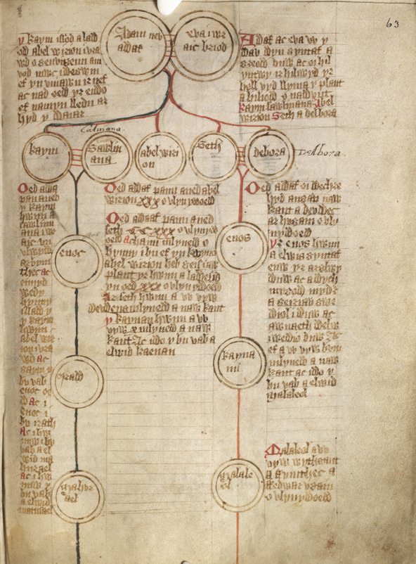
Genealogical data is superficially perceived as interesting only to those persons for whom it is personally relevant. This was certainly my position on the topic, if I even thought about at all it before I caught the genealogy bug. As I continue to develop a dataset in the Cromar-Robb line and the descendancy study for Peter Cromar 1690, I now understand that when data reaches a certain threshold, covers a sufficient territory and timespan, it transcends the compilation of raw facts. Data becomes a language of pattern, an an eloquent expression of social, economic, ethnographic, political, and religious realities, among the vast array of historical forces that define our collective experience. Patterns in rich, complex data can foster an entirely different way to look at history.
Each family history is a synechdoche of human history
We tend to think of history as a chronicle of kings and battles, empires and robber barons, the famous and the notorious, but it is the everyday — even banal — activities of multitudes of common folk that aggregate to tell a more genuinely human story. Family history is often disparaged as a “lite” version of “real” history, a melancholy domain of retirees with too much time on their hands, narcissistically projecting themselves into the past.
There may be a grain of truth in that stereotype, but it is far from the whole truth. On the contrary, when taken up as a serious inquiry, genealogy is a quite different lens through which to understand our collective selves. Genealogy is data, but at a certain threshold it allows each family history to become a synecdoche for human history itself. The Cromars, for example, landed everywhere the Diaspora took Scotland, and we thus become a part that speaks to the whole of the Scottish Diaspora experience.
Massive data
For genealogical data to rise to such a level, it requires the laborious accretion of massive amounts of data, carefully investigated using sound research methodologies filtered by a healthy, objective skepticism. For the Cromar-Robb line, let’s assume we conclude our research at about 4000 persons with possible data-points including name, birth date and place, death date and place, and marriage and place. Now assume we collect 5 out of 7 of these data-points for each person, and we arrive at 20,000 pieces of information to sift through (and likely much more than that, if accounting for census data describing residence, migration, occupation, etc.). As any data visualization professional will tell you, it is quite a trick to render thousands of data-points comprehendible in an eloquent and intuitively understandable way.
Data visualization
The super-hero of data-visualization is Edward Tufte. ET, as he likes to refer to himself, has a practice that is an interesting synthesis of art and data. Whether busy authoring one of his several brilliantly designed books on data visualization, or creating a large scale sculpture that toys with physics, Tufte employs a way of seeing that intensifies our understanding of the world — we might call his a practice of cognitive art. Because he enjoy the intensification of this experience, he loathes the reductionist tendencies that plague the current practice of data visualization, in particular that which is found in slideware — he has famously deemed PowerPoint to be irredeemably evil. He argues:
Visual reasoning usually works more effectively when relevant information is shown side by side. Often, the more intense the detail, the greater the clarity and understanding. This is especially so for statistical data, where the fundamental analytical act is to make comparisons.
— Edward Tufte | PowerPoint Is Evil
At the same time Tufte relishes density of information, he also makes the case for simplicity and visual salience:
If your words or images are not on point, making them dance in color won’t make them relevant. Audience boredom is usually a content failure, not a decoration failure.
— Edward Tufte | PowerPoint Is Evil
More with less is even more
ET essentially riffs off of Mies van der Rohe’s famous “less is more” dictum: he believes more (data), filtered through less (eliminating visual irrelevance), is even more (understanding).
Now, my dataset is large and getting larger, but it is not particularly exceptional (though as mentioned in a prior post, I have the indoctrination of one Cromar branch into the LDS movement to thank for an exceedingly meticulous curation of family history, thus making my task much easier — thanks, cousins!). Anyone with enough curiosity, a verifiable ancestor ten or so generations behind them, and access to records can generate an equally dense pile of data.
Even a humble family history like mine, containing little in the way of brushes with fame or infamy, can develop a dataset with Tuftian richness and complexity, leading to an intrinsically good story. Rescuing our ancestors from the “enormous condescension of posterity,” as so eloquently formulated by E. P. Thompson, is a formulation that cautions against framing history as the singular provenance of nobility. It is an invitation to walk with those who lived through the social turmoil we can more often than not thank the said nobility for creating. Who makes more history: the king who declares a war, or the humble foot-soldier who fights it?
Who tells the story?
Of course, collecting the data is one problem: expressing the data is quite another, but that’s how the story gets told. So as I’m absorbed with the sometimes surprising, sometimes tedious, and — I won’t lie — sometimes boring task of compiling and generating a GEDCOM file, my mind turns to the question of what to do with all this information. How do I make it legible, clear, intuitive? Can I visualize the patterns that emerge in massive data? How can the experience of my family amplify a broader understanding of history, becoming more relevant than it ever could be as a self-indulgent hobby? Can I be the one who tells the story?
To begin this effort, people often turn to online tree-building platforms and genealogy software, as I am currently doing. Some of these are fairly useful tools, and some do a better job than others at expressing data, but I’m a stickler for visual meaning, and I’m often left less than satisfied by the graphic products that emerge from these platforms and applications. At the moment, I’m settling for Family Search as a proofing tool, Ancestry to isolate my descendancy study and generate a GEDCOM database, and GRAMPS as a tool for manipulating the data.
Each has their pros and cons, and as a visual person I’m always nitpicking at something each one of these tools doesn’t quite do as well as it could. Nevertheless, the best of them attend to data’s visual expression: Ancestry, for example, evidently has a team of front-end designers collaborating reasonably well with their database and programming folk, and though I can quibble with aesthetic choices in their recent update — SangBleu Republic and Suisse Int’l is a paint-by-number font combo, for starters — I do appreciate the new line labeling and expandable interactivity.
So many bad tools, so little time
Having said that, what can I say about the tools I avoid? There are so many genealogy tools in this overcrowded market, and for the vast majority of them, I harbor the same grudge that Tufte holds against PowerPoint. Godawful reductionist graphics, arbitrary color “themes,” misleading iconography, absurd fonts, poor navigation — I could go on, but WordPress servers simply lack the room. Too many appear to have been designed using Microsoft Paint. I suspect a programmer — who, in defense, may have done a decent enough coding job — assumes the role of visual designer instead of collaborating with, oh, say for example, a visual designer (this is a tale as old as time in web and application design at large, and certainly not a sin limited to the genealogy space).
The power (and limits) of metaphor
When designers tackle the problem of data visualization, they often turn to metaphor. A good metaphor often goes unnoticed because it seems so naturally correct. In a computer’s graphic user interface, for example, we use a “folder” to put “files” in, and work on a “desktop,” all metaphors to physical office work. Graphic applications have “palettes,” a reference to working in a physical art studio. Such metaphors help a user understand something new or abstract by relating it to prior concrete experience.
In the world of datavis, these metaphors often relate a formal characteristic of a graphic expression to an observable phenomenon. Just a few examples include:
Six metaphors


Six of the the more common visual metaphors found in genealogical data visualization. | All images courtesy of The Noun Project, a great resource for icons and abstractions of things and ideas.
Each of these metaphorical expressions contains a powerful way to reveal relationships among data-points. A tree metaphor, perhaps the most common and easily understood in genealogy, is one example of what Edward Tufte defines as a causal diagram: something happens, causing something else to happen. Along with trees, other metaphors that express causal relationships are timelines and networks. Fans, quilts, and rivers can reveal patterns emphasizing growth, which descendancy charts certainly do!
But with each metaphor comes limits. In a tree, for example, causal relationships are expressed at the cost of obscuring time spans and generational drift, because time data is presented only as numerical text. So if we are aiming for Tufte’s goal, conveying rich layers of information in an elegant and succinct visual field, we’d have to find a way to combine a tree with a timeline, a fan with a river, a node with a trellis. In short, to express the data, we have to mix our metaphors.
Ripe for exploration
We don’t see this happen in genealogical visualization often enough, which leads me to conclude this is a territory that is ripe for exploration. In my next post, we’ll explore each metaphor, with examples from both graphic and fine art history, then explore how these might be synthesized into a Tuftian ideal.
Now, for those who wonder where the heck my family’s history just went, please indulge me: there is a method to the madness! The Anns and Peters and Christians and Roberts haven’t disappeared. It is through this process that we’ll actually be able to see them with greater clarity. Like so much mud spattered over five centuries and five continents, my family’s data has been sitting there waiting for someone to scrap it together. With the help of many, I’m managing to collect it, but it’s still a pretty misshapen lump of clay. So let’s find a way to get it into shape. Let’s go mix some metaphors!
Leave a Reply